
Closed (won't fix)
Project:
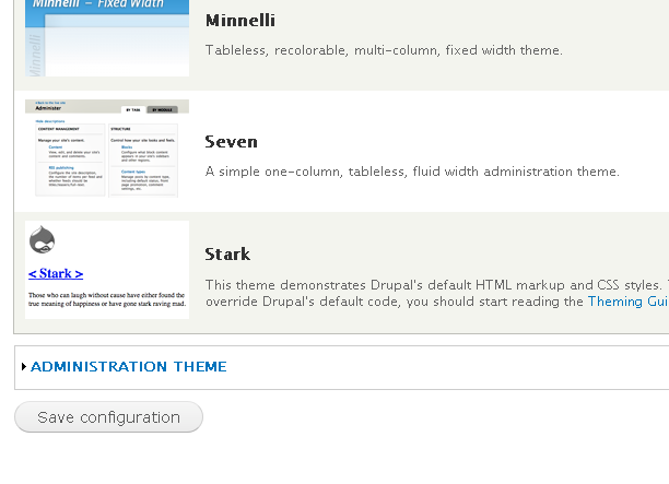
Drupal core
Version:
7.x-dev
Component:
Seven theme
Priority:
Normal
Category:
Bug report
Assigned:
Unassigned
Reporter:
Created:
9 Sep 2009 at 22:25 UTC
Updated:
30 Sep 2010 at 16:27 UTC
Jump to comment: Most recent, Most recent file

Comments
Comment #1
heather commentedI thought a different title might help?
Light grey often denotes disabled functionality. This may mislead the user.
Comment #2
eigentor commentedSome of the bottons are blue (upper right save button on node form). Is there an explicit concept as to which button gets blue and which doesn't? Apart from making the gray buttons a little darker, IMHO the main submit button should always be blue.
Comment #3
seutje commentedsubscribe
I wouldn't go for blue, as this would clash with the rest of the theme, but it could definitely use some depth
in addition, when making a button disabled in seven, NOTHING changes, it looks the same, and when u click it, it'll look exactly like it would look if one was to click it without it being disabled, xcept nothing happens... huge WTF!
see style.css lines 552-584, mainly:
unfortunately the
:disabledpseudo selector is CSS3 and obviously won't work in all browsers, and neither will[disabled]so I'm affraid we'll need to slap a class on disabled inputs if we don't do that alreadyComment #4
Bojhan commentedThis seems by design? I dont think this will really be a problem
Comment #5
eigentor commentedWell, for me this still should be optimized. When you scan across the page, you hardly notice the buttons. Actually people find them, but it would help to find them more easily.
Replace buttons.png in themes/seven/images with attached file and apply the patch to make the button text a little bit darker accordingly gives the second screenshot. This is a rather soft change, for me personally it could be even more.
I still lobby for blue (only if there is one main save button), but a least a darker grey.
Before
Before

Comment #6
eigentor commentedset status to needs review
Comment #7
dries commentedI don't see a difference in the screenshots in #5? In a lot of the administration screens, the buttons are not the main 'attraction' so it might be OK for them not to stand out. For example, on the screens you used, the focus is not on the filters, but on the table below the filter.
Comment #8
seutje commentedI'd just like to point out this might cause a lot of annoyance for people who do a lot of fancy js stuff with their forms, as disabled buttons look exactly the same as enabled ones
or should I make a separate issue for that?
Comment #9
Bojhan commentedAs said before, and Dries hereby confirmed it - this is really by design.
Comment #10
eigentor commented@bojhan, please stop closing this issue. It won't be cluttering the issue queue that badly. You don't find it that important, I do. If five more people comment that this is nitpicking and useless, I am fine. But not as only three people have commented, I'd like to have some more eyes on this.
There are examples of forms where the submit button stands out very much, some make it even red. Lots of possibilities from invisible to dominant.
Even though mark may have made them like this in his layout, they may not be optimal. Especially in the small nitty-gritty typography and single elements like these the final implementation may differ from the layout and for good reason.
@seutje actually I think there is a look for disabled buttons: the delete button on the node add/edit form looks to me like a disabled button could look like. But probably a seperate issue would be good since this needs a little code to enable themers to give a disabled button a different look. Or is the disabled state already there in code and nust needs the button?
@dries well I deliberately made the difference not very strong, could do more. Maybe my old CRT screen is tricking me again because it has lower contrast and more difference in midtones. Ah, now being on a notebook screen the original buttons look darker - well still we should optimize them across screen types. Some have softer gamma...
Yes, maybe I did not choose a good example and should rather choose one with one submit button at the end of a big form, there the button can use more weight. Still probably we should stick to one grey and the blue not to confuse people. Maybe not. Have to study different web applications how they handle buttons and if more than two colors are justified or confusing.
Comment #11
eigentor commentedComment #12
mcrittenden commentedI agree with Bojhan that this is not an issue. They're big and round and have large text, so that alone should be enough for them to say "click me". But that's just another opinion, and user testing might prove me completely wrong.
Comment #13
eigentor commentedO.K. this probablay a bit of an edge case because probably more than 80% of the people will be on a TFT screen that shows the original button darker and hardly a difference between the two.
Hard data: in the darkest spot the old button is #ededed and on the darker one #dadada
So if TFT onviewers do not see a difference anyway: commit the image provided in #5 and tht slight css change and I am fine :)
To give you an impression of how it looks on my screen, and sure quite some more: wide gamut, professional graphics screen or just different gamma setting. With a growing trend since color display of screens becomes better and better.
I tried to mimick it by egaggerating the color difference a bit:
Original
Proposed Solution
Comment #14
eigentor commentedthe other image...
Comment #15
mr.baileysNot a duplicate but related to this issue: #544398: Delete buttons look disabled in Seven theme even though they're not
Comment #16
Jeff Burnz commentedWith many months of no updates and no significant UX issue endorsed I think we can close this out. Time will tell of course, possibly, so perhaps at some later stage (D8) we might revisit this issue.