

Closed (outdated)
Project:
Drupal core
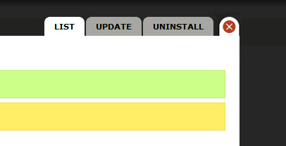
Version:
7.x-dev
Component:
overlay.module
Priority:
Normal
Category:
Task
Assigned:
Unassigned
Issue tags:
Reporter:
Created:
13 Sep 2009 at 04:21 UTC
Updated:
16 Jun 2010 at 21:52 UTC
Jump to comment: Most recent, Most recent file




Comments
Comment #1
eigentor commentedMore ideas for emphasis: other coloring? Also write "Close" next to the button? (suggestion of a user).
Comment #2
naheemsays commentedapart from colouring, what about giving it a fixed position? If you scroll down the page, the close button should IMO not disappear "above the fold", but track the scrolling and stay present.
That should help some IMO.
Comment #3
eigentor commentedSo, played around a bit. Actually I like a bright Drupal baby blue the best. Red and green do not feel right, yellow is totally ugly, any shades of grey don't cut it for more obtrusiveness.
click for full size image
Attached also the png to stick in /modules/overlay/images and try out the change. It is a straight PNG 24, I remember there are some clever fallback solutions for IE6, but there is sure someone who can fix this when we can agree upon color...
Here is a comparison gallery of color variants:
original, black
http://www.screencast.com/users/eigentor/folders/Jing/media/c2c57c65-aee...
alarm red
http://www.screencast.com/users/eigentor/folders/Jing/media/88bf0aa6-483...
darker red
http://www.screencast.com/users/eigentor/folders/Jing/media/8711490a-5ed...
happy fimo green
http://www.screencast.com/users/eigentor/folders/Jing/media/29dcf425-26d...
Submarine yellow/orange
http://www.screencast.com/users/eigentor/folders/Jing/media/375a5a18-d9e...
and the drupally druplicon blue for comparison:
http://www.screencast.com/users/eigentor/folders/Jing/media/363d3c5a-28f...
Maybe show it to your everyday Drupal Newbie user, which button he would most likely click. Cause it is only for the first time, that you need the color. After a user clicked it once (or twice, as a confirmation it was the click on the button that closed the overlay), the job of the color is done. So maybe a fine adjustment of the right level of jump-to-the eye is necessary...
Comment #4
eigentor commentedfor image improvement
Comment #5
Bojhan commentedI would like to see this tested more, before we make any calls on it.
Comment #6
Bojhan commentedNot really a bug, I would like to still do more testing.
Comment #7
casey commentedPatch in #655722: Changes made in an overlay session are not reflected when the user closes the overlay keeps the close button visible while scrolling.
Comment #8
Fannon commentedI dont like the button to be right beside the overlay. I would expect it to be in the top right corner, like in every application windows.
This is not very special, but this will be where the ppl expect it to be.
I'll attach a conceptual screenshot.
Comment #9
David_Rothstein commentedRe #7, I think @casey actually meant to link to #655514: Usability issues with overlay close button