
 Come together with the global Drupal community in Rotterdam, 28 Sept – 1 Oct 2026. Sessions, contribution, connection, and Early Bird savings until 8 June.
fact: People like eyecandy
fact: Drupal attracts more people. Yes. Those with that eyecandy fetish
fact: We want to attract not only developers who know Drupal insideout.
fact: All such (as in like this) issues go trough some "noWeMustDoThisBetter, CanWeNotGetSomeSIGForThis, PleaseThisIsSoSmall, AaaghFSKIT" cycle.
This patch is small. It adds a little spice for those with a new Drupal site. It is far from Perfect (as is Drupal, innit?).
And no, it is not a bug. And neither is it critical. But it is important enough to make it noticable to those preparing the 4.7 release.
Lets improve the welcome message a little
| Comment | File | Size | Author |
|---|---|---|---|
| #60 | welcome_message_css.patch | 514 bytes | Jaza |
| #57 | welcome_message_br.patch | 2.11 KB | Jaza |
| #54 | warmer_welcome_3.png | 19.03 KB | webchick |
| #53 | welcome_message_2.patch | 4.72 KB | webchick |
| #47 | warmer_welcome_2.png | 18.65 KB | webchick |

Comments
Comment #1
Bèr Kessels commentedand here is tah patch
Comment #2
Bèr Kessels commentedtah patch without debug stuff :D
Comment #3
eafarris commentedmelikes. Thanks, Bér. A couple of notes on the language and syntax:
The comma between "need to do" and "to start enjoying" should be removed. "Here is what you need to do to start..."
In the "And last, we suggest...", who is "we?" The Drupal team? that's nice, but it doesn't say so. Maybe just "And last, you should look around the administration..."
I get the idea with the steps being slightly larger than the surrounding text, but, personally, I don't like it. I think it looks like a mistake.
And I think we could do more work with styling that even nicer.
Comment #4
Jaza commentedBig +1. Much nicer message. The tone of the text reminds me very much of the text used to guide users through the WordPress installer - and considering the user-friendly reputation of WordPress, I think that's an indication that this new message is a step forward! The bigger font, and the 5 EASY steps™, also seem to me more Web 2.0-ish (take a look at http://flickr.com/learn_more.gne and you'll see the similarities).
I think that this patch is small enough and important enough to warrant getting in for 4.7. But seriously: it's not critical, and it's not a bug.
Comment #5
Bèr Kessels commentednot a bug, and not critical indeed.
But as stated. I am 100% that this would be Yet Another Dead Born Issue had I not marked it this way. This is my third (!) patch/issue/thread to make this small thingy nicer. All of them went unnoticed, or marked duplicate, or postponed, or need work because either other people though it could be done better, or that we needed to fix it at a lower level etc etc. All of wich are true, but resulted in us still having this ugly welcome. Sorry for abusing the status to get this into the spotlights.
@eafarris: I changed the comma and the «we».
@ all others: yes, the styling could be nicer. Yes, we can make the text even better. Yes we can move this to other places. Yes we can pull this trough a complete Documentation committee and Marketing department. But alas! this is what we have. If you know how it should be done better, please, I beg you, either do so, or at least provide VERY concrete (as in patches, or example code) solutions.But please, I beg you even more, do not make your "ideas to make it even better" hold this solution from getting in alltogether. :)
Comment #6
Bèr Kessels commentedoh: FYI: I got this idea after I was very pleasantly surprised, everytime I started off some new Ruby on Rails. Compare this screeny to what people get when they start riding the Drupal road, and you see that we (Drupal) are way behind in this particular battle. :) (if you can call it a battle at all is another discussion :)).
Comment #7
simeI've tested this patch. It works, and I like it.
Comment #8
webchick-1 to the bigger list items. It's dorky, and like others pointed out it looks like a mistake. I think ROR gets away with it because the text around it is big as well. I also noticed it also only does this in IE and not Firefox, so the CSS needs to get fixed one way or another to make it consistent.
The message needs some work as well. For instance, when items are in a list like that, they should all have a similar grammatical style. For example, they should all contain a command (do this), not a mix of commands, explanations, and sentence fragments.
IMHO, this is not the kind of thing we want to rush through days before a release. I would prefer taking our time and getting it right. I also kind of resent the fact that the critical bug queue was abused in order to draw attention to this patch.
But whatever, here's my attempt at re-wording...
---
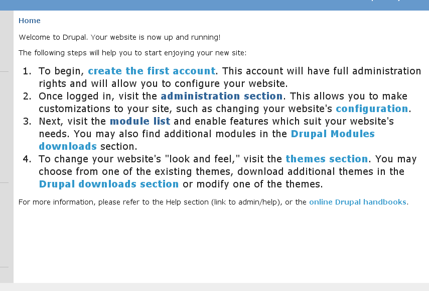
Welcome to Drupal. Your site is now up and running!
The following steps will help you to start enjoying your new site:
For more information, please refer to the Help section (link to admin/help), or the online Drupal handbooks.
Comment #9
webchickSomething I also noticed after the fact of posting this -- we should pick one word: either "site" or "website" and use that consistently to refer to what Drupal is.
Comment #10
Bèr Kessels commentedmarking this critical bug to put in on the radar once more.
Comment #11
Bèr Kessels commentedwebchick, please make a patch for this.
Comment #12
Bèr Kessels commentedComment #13
Bèr Kessels commentedChanged all the words "site" into "website". Used webchicks text instead. Only one difference: i left out the reference and link to the developers handbook. DIY is not appropriate when welcoming ppl, I think.
Comment #14
Bèr Kessels commentedand a new screenie.
Comment #15
Bèr Kessels commentedand an alternative w/o the bigger font and the style.
Comment #16
Bèr Kessels commentedSepeck suggested a better phrase for the #4 point about themes.
This patch has that included. But this patch also still has the style (IE bigger font)! Previous patch was only for reference.
Comment #17
sepeck commentedThe larger text doesn't bother me so much. You only see it once (until you generate content). It is very very obvious. How many questions have existed that were answered by that very same welcome message in previous versions?
THe only thing missing is the 'how to make this message go away' which we can add a handbook page explaining it in the settings section?
-sp
Comment #18
bonobo commented+1 on these changes --
I have two small suggestions on the text:
Change the opening two lines to read as follows:
"Welcome to your new Drupal website!
To begin setting up and using your website, follow these steps:"
Comment #19
Jaza commentedI agree with sepeck - the 'how to make this message go away' bit is missing, and really should be there. The current welcome text has this line:
We definitely need to keep this in the new welcome text, even if we reword it in one way or another.
Comment #20
Amazon commentedWhat would be useful is to install Mambo and Wordpress and show their welcome messages in a image. My initial reaction is that of the an additional item on Ber's page I would include support as one and I would call say applications, called modules in Drupal and I would say webpages, refered to as content so that novice users were explained basic concepts right away.
In the support section,let's say item 5, I would say in your administration menu block you can click on help to learn how to use the applications, known as modules, and features you can also read the handbooks, list the handbooks titles, and review the community support options including paid support that are available to you then link to the support page on Drupal.org.
Comment #21
Bèr Kessels commented@jaza, sepeck and others: that message about the first piece of content post == message dissapear is NOT true. Hence i left it out. It is only true if people :
* post content that is promoted to frontpage
* and is not in moderation
* and is published
* and the frontpage is left to /node
This is too complex to explain in a welcome message!
Unless I get a clear message, or a ready-to-go-sentence about *what* the #5 support should be and contain, I leave the patch as it is now.
For now, I changed the first two lines as proposed by bonobo. His proposal is 1) clearer and 2) sounds more professional while using 3) less words.
@amazon. I don't have time+resources to investigate how the other CMSes do it right now. After 4.7 (if ever) we can still start a new project or SIG to enhance the total "welcome" experience. This patch is NOT about that. It is just to fix the, IMO, bad welcome we give people right now. Not to come witha perfect solution, but to come up with something less bad as we have now.
Comment #22
Bèr Kessels commentedafter so much polish, I think it is read to go.
Comment #23
chx commentedBer, the first time user this is pointed won't do any of those so I added back the disappear message and rerolled. Nice work, folks.
Comment #24
drummThe
<div id=...goes outsidet().Comment #25
tenrapid commentedSorry, I could not resist. The larger list item text still looks like an error to me. So I tweaked the styling a little and added the keywords 'User account', 'Administration', 'Modules' and 'Themes' as a run in to each list item.
Also the div is moved outside t().
Comment #26
tenrapid commentedA preview of the above patch.
Comment #27
webchickIn the interest of doing this 'right', I am going to do as Amazon suggested and do some research on other CMS/blog/whatever stuff. Screenshots will be posted within an hour, and then I'll review the patch.
Comment #28
Bèr Kessels commented@chx: you are right about the fact that *if you leave all the config in place* the message will dissapear. But I am confident, from experience, that the message does more harm then good. The message will *not* go away, if you have followed our instructions, which include changing the config!!
@tenrapid your pathc looks great. I am setting the status to RTBC for his or her patch now. It is fabulous. Not perfect, sure, but we will not get to the perfect state anyway.
@Neil. you are right. Please provide a patch that takes the divs out of the t().
Comment #29
webchickOk, here is WordPress's "welcome" screen. They call it a "dashboard" and it is available all the time from the admin section. During the course of the installer, you are assigned an administrator username/password. Your first step after completing the installer is to login, and then you are presented with this.
The "Welcome to WordPress" section consists of a brief listing of 4 links:
- Write a post
- Update your profile or change your password
- Add a link to your blogroll
- Change your site's look or theme
It then also contains things like recent WP blog posts, a dynamic listing of "WP in the news" type things, etc. But the actual "welcome" part is very short, sweet, and to the point.
Comment #30
webchickJoomla! takes a different approach, and rather than give functional areas in which you can begin, they make their welcome message more or less a big marketing spiel. I think this is because their administration panel has candy buttons that link off to various tasks, but there definitely is no feel of "Step 1, Step 2" here (though their installer has this, and is very nice).
Text of welcome message follows:
If you've read anything at all about Content Management Systems (CMS), you'll probably know at least three things: CMS are the most exciting way to do business, CMS can be really, I mean really, complicated and lastly Portals are absolutely, outrageously, often unaffordably expensive.
Joomla! is set to change all that ... Joomla! is different from the normal models for portal software. For a start, it's not complicated. Joomla! has been developed for the masses. It's licensed under the GNU/GPL license, easy to install and administer and reliable. Joomla! doesn't even require the user or administrator of the system to know HTML to operate it once it's up and running.
Joomla! features:
* Completely database driven site engines
* News, products or services sections fully editable and manageable
* Topics sections can be added to by contributing authors
* Fully customisable layouts including left, center and right menu boxes
* Browser upload of images to your own library for use anywhere in the site
* Dynamic Forum/Poll/Voting booth for on-the-spot results
* Runs on Linux, FreeBSD, MacOSX server, Solaris and AIX
Extensive Administration:
* Change order of objects including news, FAQs, articles etc.
* Random Newsflash generator
* Remote author submission module for News, Articles, FAQs and Links
* Object hierarchy - as many sections, departments, divisions and pages as you want
* Image library - store all your PNGs, PDFs, DOCs, XLSs, GIFs and JPEGs online for easy use
* Automatic Path-Finder. Place a picture and let Joomla! fix the link
* News feed manager. Choose from over 360 news feeds from around the world
* Archive manager. Put your old articles into cold storage rather than throw them out
* Email-a-friend and Print-format for every story and article
* In-line Text editor similar to Word Pad
* User editable look and feel
* Polls/Surveys - Now put a different one on each page
* Custom Page Modules. Download custom page modules to spice up your site
* Template Manager. Download templates and implement them in seconds
* Layout preview. See how it looks before going live
* Banner manager. Make money out of your site
Comment #31
webchickAnd here's Joomla's admin panel. (kind of unrelated to welcome message, but you can see the types of things they 'jump' off to).
Comment #32
webchickAnd finally, here is the welcome screen from e107. More of a jump-off to the admin section and other e107 support resources.
Welcome to your new website!
e107 has installed successfully and is now ready to accept content.
Your administration section is located here, click to go there now. You will have to login using the name and password you entered during the installation process.
Support
e107 Homepage: http://e107.org, you will find the FAQ and documentation here.
Forums: http://e107.org/e107_plugins/forum/forum.php
Downloads
Plugins: http://e107coders.org
Themes: http://e107styles.org | http://e107themes.org
Thankyou for trying e107, we hope it fulfills your website needs.
(You can delete this message from your admin section.)
Comment #33
webchickI am going to grab a quick supper, but when I come back I'll take a look at the patch and review it with these other projects in mind.
Comment #34
tenrapid commented@webchick
While you were collecting the various welcome screens I improved my patch a little.
I separated the 'create first acount' part from the rest. So unless the first acount is created this is the only link that is displayed.
After registering the steps 'admin', 'modules' and 'themes' are visible. This gives room for clearer instructions or whatever will be in that place.
Comment #35
webchicktenrapid, I like the idea of making creating uid 1 a separate step. Not sure if that is too 'feature-y' for the present time, though. There is a spelling error right on the front page, however ("Yor"), and we do _not_ have time for stuff like "(insert emotional blurb here)" ... take a stab at filling this stuff out, or don't put it in at all. It's much easier to tweak text than it is to invent it.
I will take a look at the other patches as well.
Comment #36
webchickHm. Upon further trying tenrapid's last patch, I'm not crazy about the changing welcome message after all. While I do still think this account creation process should be separate, that is probably the task of an installer, rather than the welcome message. As-is, it's rather confusing, because it jets you off to go create an account, and never takes you back to the welcome screen to get the rest of the steps. When you do find your way back there again, the message has changed, which is a bit disorienting.
So -1 to latest approach. Sorry. But good ideas, let's get this into an installer for 4.8.
Testing your patch from before that Ber RTBC'ed now.
Comment #37
webchickAlso, on the note of "how to get rid of this message", the way other CMS systems handle this is actually create a piece of promoted content in the database creation process. Then it can be treated as any other piece of content and deleted/edited at-will. Again, way too late in the release cycle to mess with this now (and probably something else for a 4.8 installer to do), but figured I would mention it.
Comment #38
webchickK, tenrapid's earlier attempt breaks XHTML compliance.
I'm going to attempt to roll a patch that gets the best of all worlds.... we'll see. :P
Comment #39
webchickGrrr. Ok, seriously guys, I know this patch is important and all, but you need to be *much* more prudent when you're setting stuff RTBC. There were spelling errors, the inclusion of the actual text "insert link to admin/help here" and other stuff. This would've been a freaking travesty had this gotten committed to CVS in its "RTBC" state!
Anyway, I've reworked tenrapid's "welcome_1.patch" with the following changes:
Now please _seriously_ review this, folks. This is going to be a user's very first impression to Drupal. If there are glaring errors I haven't found, these absolutely need to be pointed out before it gets committed, not after! I've tried to be thorough, however, so I hope it's RTBC. I'll post a follow-up with a screenshot and the text.
Comment #40
webchickHere's the screenshot. Text is as follows:
----
Welcome to your new Drupal website!To begin setting up and using your website, follow these steps:
Create administrator account
To begin, create the first account. This account will have full administration rights and will allow you to configure your website.
Configure your website
Once logged in, visit the administration section. This allows you to make customizations to your website, such as changing your website's configuration.
Enable additional functionality
Next, visit the module list and enable features which suit your website's needs. You may also find additional modules in the Drupal modules download section.
Customize your website's look
To change your website's "look and feel," visit the themes section. You may choose from one of the included themes, download additional themes from the Drupal themes download section or modify a theme to suit your needs.
For more information, please refer to your website's Help section, or the online Drupal handbooks. This message will disappear once you have posted your first piece of content.
Comment #41
webchickHm. It occurs to me that we never go and tell people how to post their first piece of content. :P~
Added a step 5, "Start posting content" and also changed "change your website's look" to "change your website's design"
New patch, w/ new screenshot coming up.
Comment #42
webchickHere we go. Text is the same, except for the end:
5. Start posting content
Visit the create content section to begin posting content to your website. This message will disappear once the first piece of content has been posted.
For more information, please refer to your website's Help section, or the online Drupal handbooks.
Comment #43
sepeck commentedJust commenting on the text, it looks good.
@Berkes, I know what you mean about all the different conditions of post to the front page, but there's no time and we need at least the framework of the instructions in.
For 4.8 perhpas we can get a better starting point.
-sp
Comment #44
webchickThe way we should handle this in 4.8 is #37, imo.
But at this stage, we need to indicate at least _some_ clue on how to get rid of the welcome message. "posted your first piece of content" at least gets them in the general vicinity and will work as intended as long as they don't futz with the default options (which most brand newbies probably (maybe?) wouldn't).
I talked to Michelle and sepeck about this and apparently this does come up from time to time on the support forums, etc. but it didn't sound like it was a chronic problem. The former welcome message sentence:
"This message will guide you through your first steps with Drupal, and will disappear once you have posted your first piece of content."
therefore seems to have done its job "ok" for the past however many months/years that's been there.
Comment #45
webchickThis is for 4.7, btw, not CVS (well, CVS too, but.. ;P)
Comment #46
webchickOk, new and improved version after talking w/ Zen/|gatsby|:
1. no more \" escaping in the t() block anymore. Minor rewording changes to accommodate this.
2. Create your administrator account
3. H3s make no sense. :P Changed them back to strongs, but put some formatting in drupal.css (moved from bluemarine's style.css for consistency across themes) to display them as block, and put some padding around them so they look similar to what they did as H3s.
4. Other wording changes I forget now.
New screenshot forthcoming.
Comment #47
webchickWording is as follows:
----
Welcome to your new Drupal website!
To begin setting up and using your website, follow these steps:
To begin, create the first account. This account will have full administration rights and will allow you to configure your website.
Once logged in, visit the administration section, where you can customize and configure all aspects of your website.
Next, visit the module list and enable features which suit your specific needs. You can find additional modules in the Drupal modules download section.
To change the "look and feel" of your website, visit the themes section. You may choose from one of the included themes, download additional themes from the Drupal themes download section, or modify a theme to suit your needs.
Finally, click the create content link to begin posting content to your website. This message will disappear once the first piece of content has been posted.
For more information, please refer to the Help section, or the online Drupal handbooks.
Comment #48
chx commented/me purrs.
Comment #49
Bèr Kessels commented[+digg] :)
I like it. After some discussion, I feel too , now that leaving the "how does this go away" sentence in, is the best.
Anything else I should do?
Comment #50
markus_petrux commentedLooks great, thought I have a minor comment, that may not be so important. I'm not english, so...
"To begin" is repeated twice (or too close from each other) on top of that message.
I would prefer the first sentence, just below the title to read "Please, follow these steps to setup and start using your website:".
...or maybe even: "Thanks for choosing Drupal for your CMS/Framework solution. Please, follow these steps to setup and start using your website:"
Comment #51
dwwyeah, in addition to "to begin" happening twice at the front (which webchick says in IRC she's got a better version of), i found the following potential snags:
"Finally, click the [create content] link to start posting to your website. This message will disappear once the first content has been published and promoted to the frontpage."
that's still using "content" twice, but it's better than what we have now.
-1 on the "thanks for choosing drupal" stuff. they haven't chosen it, yet, they're just looking at the front page after setting up their first set to investigate if they want to use drupal or not. let's keep the welcome warm and useful, but not presumptuous. ;)
otherwise, for the record, THANKS a TON to webchick for all the hours she's poured into this (and to everyone else who contributed to this issue). but webchick is clearly the superstar of this show. ;)
-derek
Comment #52
dwwzen/gatsby has an even better version of the text for step #5:
that seems pretty good to me. ship it! ;)
-derek
p.s. webchick apparently has a new patch forthcoming that addresses most/all of these concerns... stay tuned.
Comment #53
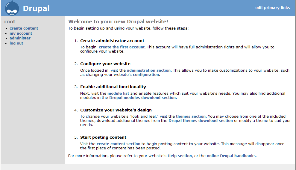
webchickOk! Here is the final version!
Comment #54
webchickScreenshot
Comment #55
dww+1. applies cleanly, everything works, everything looks good. ship it! ;)
Comment #56
dries commentedCommitted to CVS HEAD. Thanks.
Comment #57
Jaza commentedI just tried out the new welcome text, and it looks great, except for one minor cosmetic issue. The bold text and the plain text in each list item need to be separated - at the moment, the plain text on each list item starts with a capital letter, and there isn't even a full stop separating it from the bold text.
I tried using full stops, line breaks, dashes, colons, and various combinations of these, and in the end decided that a
<br/>between the bold and the plain text looks best (in Bluemarine anyway - and let's face it, this is the welcome text, so that's what users will see!).Like I said, just a small issue - should be fine to go straight in. Leaving as RTBC.
Comment #58
webchickJaza, your drupal.css file is probably cached? There is CSS to separate the strong text from the rest of the list item.
Comment #59
Jaza commentedNope, my css file is not cached - I emptied my cache (just checked out core straight from CVS), same result.
I just checked the commit details - http://drupal.org/cvs?commit=30881 - and the part of the patch that added "#first-time strong" to drupal.css was not committed.
Setting this to critical bug, as we now have "half a patch" that's been committed. Can one of the core maintainers please commit the drupal.css part of this patch? Only the node.module part has been committed so far.
Comment #60
Jaza commentedThis is what still needs to be committed.
Comment #61
webchickMoving version to cvs.. this wasn't committed to 4.7.
Comment #62
gerhard killesreiter commented#53 committed to 4.7 branch
Comment #63
Jaza commentedDries has committed the drupal.css part of the patch to HEAD.
Comment #64
(not verified) commented