

 The 2026 Drupal Business Survey is open. Your response will help shape the future of the Drupal business ecosystem.
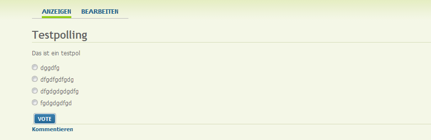
Although anybody can override the CSS provided by pollfield I think the default styles should be optimzed. Attached is a picture of the current state of the result display.
- I think the "Cancel" button should be placed under the results.
- Moreover the results should be left aligned.
This would conform with the design of the poll itself (pic2).
| Comment | File | Size | Author |
|---|---|---|---|
| Poll.png | 12.29 KB | dddave | |
| pollfield-block.png | 24.47 KB | dddave |


Comments
Comment #1
portulacaCancel vote button is shown in place of Vote button, but Since Vote button is beneath the Responses and above the Results, it makes it weird for Cancel button to be shown there. This will be fixed to show the Cancel vote button bellow the results.
The results are now not aligned, they appear to be to the right because the Responses in your screenshot are short (one word). I will try to tweak it though to satisfy both cases (short and long Responses) appropriately, and adjust IE CSS as well.
It may take a couple of days to get this published in the dev version.
Comment #2
dddave commentedGreat. I am looking forward to it.
Comment #3
portulacaChanges to CSS are now in the dev version, it should look ok in all modern browsers (FX, Safari, Opera, IE8). IE6 and IE7 need to be tweaked separately, you can get a reasonably ok look if you set the Response in the Results to align left. I tried to do it all but no go, I used the new method display:table-cell but I guess I need to learn more about it.
New feature is a CSS class of the chosen results, so users can see what they voted for even if they forget :) This is also in dev.
Cancel vote position is still on to-do list.
Comment #4
dddave commentedYeah!
The aligned results look much better. Thx for the effort so far.
Comment #5
bryan kennedy commentedMarking as part of the "user interface" component, specific to the latest version. We need to evaluate the current interface to see if this is still an issue.