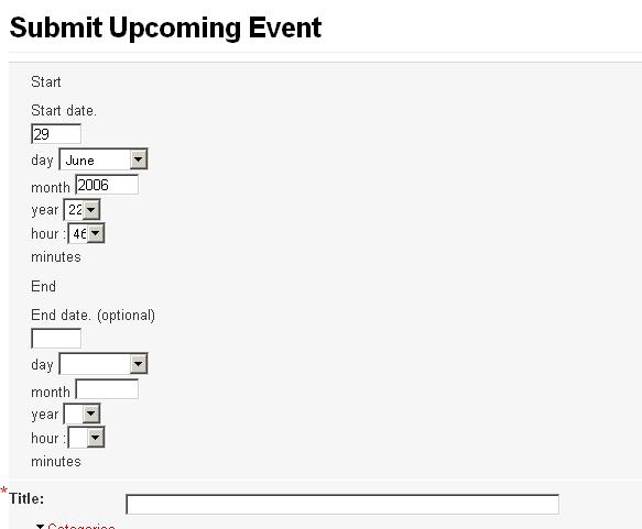
This is so silly that I feel like it must just be my setup somehow, but here is what my event creation dialog looks like: link.
As you can see, the labels for the various fields appear to the right of the fields they are meant to label, making it quite difficult to understand at first glance which field is which. I feel like they should either be above the actual entry widgets (as most forms in the rest of Drupal are) or to the left.
I'm going to work on a patch for this, and I'll post it here once I finish up.


Comments
Comment #1
killes@www.drop.org commentedI look forward to a patch, the current layout is indeed not good.
Comment #2
benwei commentedSo after some preliminary work, it looks like the reason this form looks so strange is that the '#description' instead of '#title' keys are being used to label for form elements. Descriptions are supposed to appear below form elements.
I tried just using '#title' in place of '#description', but this is not really an improvement, because the titles are then wrapped in 's, which are treated as blocks, so the form gets laid out vertically.
I will continue to play with this, in the meantime if anyone knows of examples from other modules where forms with a similar layout are generated nicely, posting them here would be a great help.
Comment #3
netbjarne commentedField titles should appear above the fiels, just as it does in the attached screenshot :-)
Comment #4
cutesimaus commentedMine looks bad too.
Please refer to the attachment.
I think its with the template, I am using mollio's..
It's really a pain for the users and I have received a lot of complaints about it..
I am looking into editing event.css but I havent hit the right buttons yet.
Hope somebody can help.
Comment #5
benwei commentedA patch is attached.
The solution turned out to be pretty simple, especially when I blatantly stole it from the project module. I just wrapped the fieldsets containing the date selectors in divs with a custom CSS class 'date_selector'. I then added a CSS class to event.css which made elements of class form_item under this float left.
Thanks netbjarne for attaching that screenshot and pointing me towards the project module.
The only issue with this patch is that it does not preserve the ':' between hours and minutes. Nevertheless, I think it is a huge improvement over the previous layout.
To apply:
Download, cd to the modules/event directory and run
patch -p1 <path/to/event_form.patchBen
Comment #6
killes@www.drop.org commentedDoes anybody object to this patch?
Comment #7
gerhard killesreiter commentedI received another suggestion: Do away with "hour", "mnute" etc entirely. I think that's a great idea.
Comment #8
benwei commentedGerhard, do you think you could explain this idea a bit more? Do you mean to have a text entry box for the time instead of the dropdown menus?
Comment #9
m3avrck commentedI will post my new patch soon that makes it even more intuitive. I'm using this interface on a site exclusive for *very non technical* people and it's working well. Patch to follow.
Comment #10
m3avrck commentedThis is the current, clunky interface.
Comment #11
m3avrck commentedHere's the new, cleaner interface.
Comment #12
m3avrck commentedHere's the patch.
Comment #13
killes@www.drop.org commentedapplied
Comment #14
(not verified) commented