
 Come together with the global Drupal community in Rotterdam, 28 Sept – 1 Oct 2026. Sessions, contribution, connection, and Early Bird savings until 8 June.
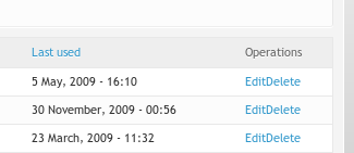
Operations such as Edit and Delete appear bunched up - See attached screenshots which show a comparison of the URL aliases and path redirect list screens. I think you should give each operation it's own table cell like URL aliases - this provides a clearer interface and more opportunities for tweaking with css.
| Comment | File | Size | Author |
|---|---|---|---|
| url-aliases.png | 4.55 KB | mrfelton | |
| path_redirect.png | 8.29 KB | mrfelton |

Comments
Comment #1
dave reidThis is actually the new standard set by core and the best way I could get a tableselect element integrated.
Comment #2
mrfelton commentednot very usable like that though... maybe it's my theme that is causing them to be so bunched?!
Comment #3
dave reidThose elements are td > ul.links.inline > li. Here's the CSS from Garland that gets used for this element:
I think the important thing is padding-right: 1em; Maybe you need to add something like this to your theme? Are you using a custom theme or one from drupal.org?
Comment #4
dave reidI just tested it with Zen and it works by default. However, in my testing I noticed that the operations would wrap if I moved collapsed my window, which was not a desired behavior. Not sure if I should force it to not wrap or not via a new path_redirect.css file.
Comment #5
mrfelton commentedI'm using the Rubik theme, that is recommended for use with the admin module (dev seed). Maybe I should file a bug with them (haven't looked at their css yet though)
Comment #6
dave reidWhere can I file issues against Rubik? It's not hosted on drupal.org.
Comment #7
mrfelton commentedMy guess is http://github.com/developmentseed/rubik/issues
Comment #8
dave reidIssue filed at http://github.com/developmentseed/rubik/issues/issue/81