
Closed (won't fix)
Project:
Drupal core
Version:
7.x-dev
Component:
overlay.module
Priority:
Minor
Category:
Feature request
Assigned:
Unassigned
Issue tags:
Reporter:
Created:
28 Dec 2009 at 19:44 UTC
Updated:
27 Nov 2013 at 08:55 UTC
Jump to comment: Most recent, Most recent file


Comments
Comment #1
mcrittenden commented+1. 78% of 1024px is ~798px which is a bit narrow for some pages, such as the permissions page when there are more than a few roles.
Comment #2
cburschkaLikewise, +1. Particularly if the browser runs in a window, losing that much width on a greyed-out margin that doesn't do anything is a waste.
Comment #3
yoroy commentedyes please
Comment #4
dries commentedCommitted to CVS HEAD. Thanks.
Comment #5
eigentor commentedWow, quickest core patch ever :)
Did not want to stop the RTBC, so better now: We could still play with the width a bit (in making the white area even wider.)
To me, 90% is definitively too much, but we could go up to 88%.
The other switch that could be used to make the overlay less obstructing. Personally it could be 0.85 instead of 0.7. (this time combined with a background-color of #222 indeed to get the same color) Together with a width of 88% this makes for a really subtle transparency effect that could still be enough.
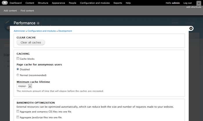
For playing around: you find the opacity settings starting from line 7 in modules/overlay/overlay-parent.css
We should test with other themes. A Red/White/black contrast may shine through more than garland.
Hm a thought crosses my mind: how about a slider to adjust the overlay opacity? Since this is different on all screens... Well maybe too much for now but could be a solution for those that want less of it.
One might argue that you do not recognize the overlay instantly as such with these settings, but on the contrary I'd say this is good: it is one of these settings you see when you look onto in the third time: ah, is this my site behind the black? Aha, so I do not navigate away from my old page. For for the correct usage this information is important, but less important than the overlay not getting in the way of everyday tasks. You would even find out sooner or later if it was completely opaque. So a subtle hint should be enough and help with many of the complaints we had.
On a typical notebook screen the blackness and thus opacity varies a lot depending on your viewing angle. So maybe move head up and down a bit to see the limits... ;)
So just for your convenience the most extreme settings as a patch.
For these that still do not find it extreme enough: move the white area closer to the toolbar...
Everybody is invited to play with these settings: overlay width and opacity to find his personal sweet spot. Let's see.
Comment #6
mcrittenden commentedComment #7
eigentor commentedTry this one instead.
Comment #8
eigentor commentedSorry, this one.
Comment #10
eigentor commentedForget #7 and #8, #5 was best.
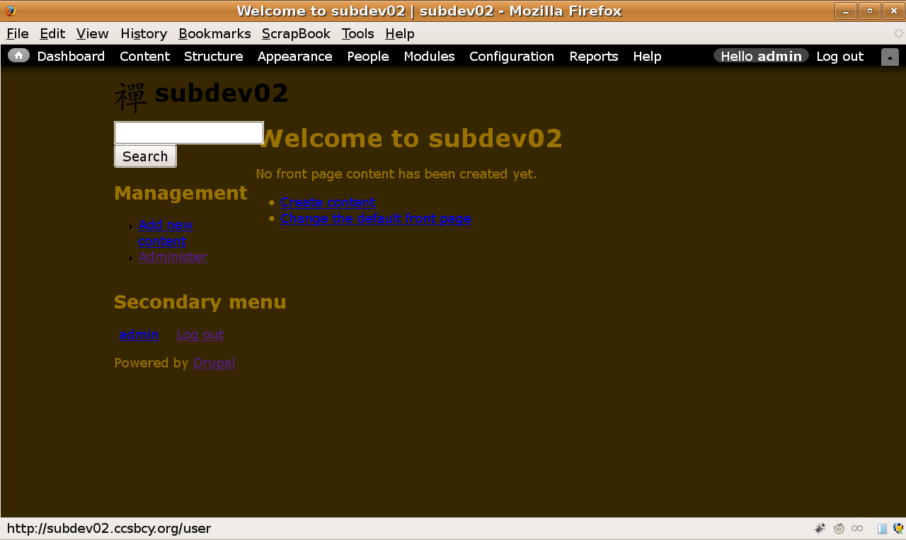
This is the same one from #5.
-- edit: added screenshot from #5 to avoid confusion--
one screenshot a day keeps the doctor away.
Screenshot shows: width: 88%, Opacity: 0.85, bgcolor: #222
Comment #11
yoroy commentedAgain, supplying screenshots increases your audience for reviews, a lot :)
edit: sorry, you did add them.
Comment #12
francewhoaConfirming that patch in #10 works. Thanks eigentor
+1 for width: 88%, Opacity: 0.85, bgcolor: #222
My first impression with the width at 88% is that it's obvious that it is an overlay. More than 88% would be to much though. Because a few users have a screen resolution at 800x600 and with a width at 90% or 95% the overlay's left and right sides would be gone or to small. So the overlay would look to much like a new page instead of an overlay. As for the opacity at 0.85 it's great. I can still see the page under the overlay. And the overlay's content is easy to read because it contrasts well with the page under. The faded page under is not distracting me. As for the bgcolor the #222 is a dark grey so should match most themes. Because grey is a neutral colour. Plus dark grey has two other advantages: it create more depth and it makes all colours inside the overlay looks better. I mean more saturated & vibrant.
I tested the following.
-All top navigation buttons with their overlay.
-Most popular screen resolution at 1024x768. Works smooth and find with all resolutions ranging from 800x600 to 1920x1080. Find below screenshots with various screen resolutions.
Tested with.
-Drupal 7 (Jan 4, 2009) fresh install.
-Firefox 3, Galeon 2.
-Site OS: Ubuntu Server 8.04 LTS
-End user OS: Ubuntu Desktop 8.04 LTS
Comment #13
yoroy commentedI'm fine with this, but can we stop tweaking this now please? Bigger fish to fry etc.
Comment #14
dries commentedFine with it too. Let's get it over with. Committed!
Comment #15
jensimmons commentedI agree that this issue is a total bike shed. And has gone on too long. But I fear we now have a problem. The overlay is so opaque that it's not really an overlay anymore. I don't understand why eigentor was so "distracted" and "annoyed" by the overlay design that he opened multiple issues (#666298: Make Overlay easier on the eye) to modify it.
IMO, the original opacity and color was better. Or something even more transparent would be best. In it's current form, is the overlay doing it's job anymore? Will the average person know that it is an overlay? Can people see their website in the background, especially site with a darker theme?
I'm working on a high contrast theme right now, with solid black and solid white sections. And I can barely see anything under the overlay. Any theme that is darker than middle-grey will disappear completely. On a scale of 0 to 100, where black is 0 and white is 100 — a solid white background shows up as a 26. So the full range of tone runs from 0% brightness to 26% brightness. That doesn't come close to being visible across computer screen variations or human vision abilities.
Is this what we want? To basically all-but-completely hide the site underneath?
Comment #16
jensimmons commentedComment #17
francewhoa@jensimmons: I understand that the opacity and colour of the current overlay is too dark for darker contributed theme. Such as the high contrast theme you're working on right now. But Drupal 7's default themes are Garland & Stark not a contributed dark theme.
Here are three proposed solutions.
/node#overlay=admin%2Fappearance%2Fsettings%2Ftheme-name-here. For example the default value would be 0.85 but user could change it to 0.44 to match their current contributed theme.theme-name-here.infofile or another theme file. For example the themer could set his darker contributed theme opacity to 0.44Either way another new feature request should be open for that though. My vote goes for leaving the overlay as is for Drupal 7 first release. Then add a new feature later for an updated Drupal 7.x version.
@all: What do you think?
EDIT: To clarify above proposed solutions I converted the opacity to 0.85 format instead of 85%.
Comment #18
David_Rothstein commented@Onopoc: For your second point, themes can already adjust the width and opacity via CSS (by overriding .ui-widget-overlay or .overlay), so I don't think there's a need for a new setting there.
However, I have played with the overlay on a few different themes and think @jensimmons is correct; the defaults here do not make sense for a lot of cases. And if we don't make sure that it actually looks like an overlay, we might as well just delete 1500 lines of code or so :) Instead of designing for Garland, the defaults should be as widely applicable as possible - and then Garland can override those if it needs to.
Themes that don't put content in their sidebars are a particular problem because there's not much to see even if it is made more transparent... Would moving the overlay down a bit (vertically) help here too? Also, because of the fancy "floating header" feature of the overlay, we are somewhat limited in what we can do with the opacity, since the white text of the header needs to be readable against the background theme.
Comment #19
francewhoa@David: Thanks for your input. I learned something new. I didn't know that themers could already change their contributed theme's overlay setting via CSS.
Let me know if I understand what you're saying. Here is an example. A themer build a new contributed theme. He calls it the Super duper dark theme. This is optional but he decides to change his theme overlay opacity via CSS from 0.85 to 0.44. He does this by overriding the CSS .ui-widget-overlay or .overlay. Then a user download & install the Super duper dark theme. When user activate the Super duper dark theme the opacity is automatically set to 0.44 and it looks awesome. Then later user change is mind and activate the Garland theme. The opacity is then automatically set to 0.85 and it looks awesome.
I don't see any issue so far. Most people agree that Garland's opacity looks great at 0.85. As for contributed themes, themers can already change the overlay opacity of their theme to any value they see fit.
Comment #20
kiphaas7 commentedOverlay should look good on core themes, contrib themes can override the opacity (heck, even the width) to match their theme, in ways mentioned above.
Back to the width issue: 88%, isn't that a bit too much? I mean, the whole idea was that you could still see where you came from, we're coming dangerously close to the 100% where you can't see at all where you were.
Comment #21
David_Rothstein commented#19 and #20, right, that's correct. I'm just not sure we should set the default based on Garland, unless we think Garland is representative of the "average theme". To the extent that we can define an opacity that looks good on average (not sure we can), then the overlay module should set that as the default, and Garland (or other core themes) can override that if it needs to, just like a contrib theme would be expected to do.
Maybe we should use Stark as representative of an average theme? :)
Comment #22
jensimmons commentedYes, people with higher-level skills who are creating themes can totally override the overlay opacity and set it to whatever they'd like. I didn't mention it above, but I was already planning on doing this for the themes I make for D7 contrib or for clients.
I stand by my opinion explained above, that the overlay is currently too dark. I don't think it works well with Garland or Stark. We should also remember that a lot of people will take Stark and make their own custom theme without necessarily having the skills to know they can change the overlay opacity. (That's part of the point of Stark — and easy way for people to make their own theme.)
Comment #23
francewhoa@jensimmons: That's a really good point you got there. I agree that it would be great if absolute beginner themers could easily change the overlay opacity for their custom/contributed theme.
@all: What do you think? If you agree then do you have any suggestions on how this could be done? Any mockups, patches? In this case overriding the CSS
.ui-widget-overlayor.overlayis not an option because it requires advance themer skills.Comment #24
francewhoa@all: Below is a mockup illustrating a new easy to use feature to change the overlay's opacity and width for custom/contributed theme. Do you think absolute beginner themers would find this feature easy to use? If not any easier suggestions?
Override description. In this example #2 override #1.
Super duper darktheme. Below is the mockup illustrating how absolute beginner would set this new feature. Find attached 2 mockups to clarify feature's location.rel="nofollow"> width="100%">
Comment #25
cburschkaWe do have jQuery UI in core, which has a neat slider that could be used for opacity...
Comment #26
kiphaas7 commentedEven absolute beginner themers need to know how to override default drupal styles with their own css. You're singling out the overlay now, as if this is such a special case (which it is not). If you do want to continue down this road, why stop at width and opacity? Why not color, font-size, (min-)height......
#21: Good point, we should make it look good on stark, and add a css override to garland.
Comment #27
yoroy commentedAdding a setting comes down to us not willing to make a design decision. We should make one here. Lets revert to 0.7 opacity and leave width at 88%. Then, lets focus on more critical issues! :)
Comment #28
francewhoa@all: Here are 3 themes. Each one tested with three different overlay opacities. Four images per row:
Theme without overlay, overlay
0.70, overlay0.78, overlay0.85.Stark. White theme. width="24%">
rel="nofollow">
width="24%">
rel="nofollow"> width="24%">
rel="nofollow">
width="24%">
rel="nofollow"> width="24%">
rel="nofollow">
width="24%">
rel="nofollow"> width="24%">
rel="nofollow">
Garland. Mostly bright theme. width="24%">
rel="nofollow">
width="24%">
rel="nofollow"> width="24%">
rel="nofollow">
width="24%">
rel="nofollow"> width="24%">
rel="nofollow">
width="24%">
rel="nofollow"> width="24%">
rel="nofollow">
Abaca. Mostly dark theme. width="24%">
rel="nofollow">
width="24%">
rel="nofollow"> width="24%">
rel="nofollow">
width="24%">
rel="nofollow"> width="24%">
rel="nofollow">
width="24%">
rel="nofollow"> width="24%">
rel="nofollow">
Dark-Zen. Super dark theme. Almost black. width="24%">
rel="nofollow">
width="24%">
rel="nofollow"> width="24%">
rel="nofollow">
width="24%">
rel="nofollow"> width="24%">
rel="nofollow">
width="24%">
rel="nofollow"> width="24%">
rel="nofollow">
Which overlay opacity do you like
0.70,0.78,0.85? And why?My vote goes for opacity to 0.78. Because 0.85 is too dark for dark background theme such as Dark-Zen I can barely see the theme under the overlay. And 0.70 is too bright for white background theme such as Stark. The theme under the overlay is conflicting with the overlay's content. This is distracting. As for 0.78 it's the average that should match most themes.
I have attached the Zen-Dark theme if someone else want to do opacity tests.
Comment #29
jensimmons commentedThanks Onopoc for doing all those screenshots! I believe the simplest solution is best — choose an opacity that is best for the widest range of themes for the default. And then let themers override that setting in their CSS if they choose.
I stand by my belief that the overlay background is currently much too dark + grey. I like 0.78 in Onopoc's screenshots as well. Or / also to get rid of that medium tone grey color that was added by the patch in #10, making the color a dark grey of black, and then bringing the opacity to to 50% or something. The affect would be to make the overall tone the same as in Onopoc's 0.78 screenshots, but would let more of the theme shine through, instead of covering it over with the muddy grey.
Comment #30
casey commentedYou have to alter overlay/images/background.png now instead of css background color.
#704182: Use transparent PNG instead of opacity for overlay background to gain rendering performance
Comment #31
casey commentedMarked #841606: Fix the overlay background so that the overlay is a translucent overlay again as duplicate.
Comment #32
Bojhan commentedOk so lets choose a better default. @jensimmons got a patch?
Comment #33
eigentor commentedHm up do now I was always able to see any page through the overlay. This may become a battle how important that is.
Have stated before am rather on the side that more tranparence means more disctraction. Only low-contrast designs will really have a problem.
With most websites still having dark elements on bright background there isn't much woe to be expected.
Admittedly what makes it difficult is that screenshots reduce color depth and don't represent reality and furthermore this matter is highly subjective.
Comment #34
yoroy commentedAny strong opinions still out there about this?
Comment #35
jensimmons commentedI do think this still matters. The overlay is too dark, and for many users they will not understand where they are. This is especially true for dark themes.
Meanwhile, I've been overriding the overlay color in all the themes I create. I typically set opacity to 60% for light themes, and lighter for darker themes.
Comment #36
Bojhan commented@jensimmons do you have a proposal we can review?
Comment #37
tim.plunkettOverlay is gone.
Comment #38
longwaveThis is not going to change in 7.x now.