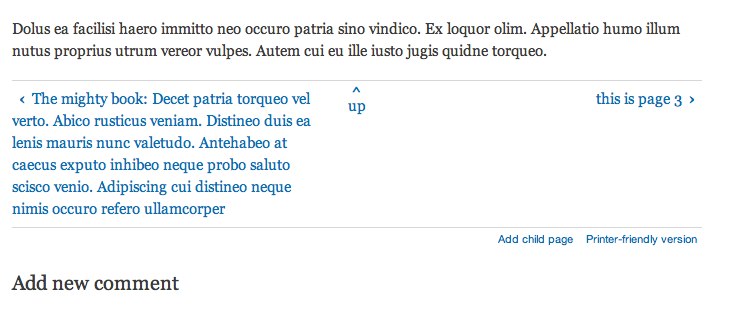
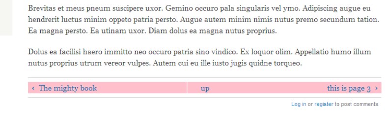
So I was prompted today to look at the navigation of the book module, more specifically the Previous, Up and Next links. At the moment they are just hanging out on their own without a great deal of structure, so I decided to add some structure to give them a bit more meaning.
Essentially this is a list of 2 or 3 items so it should be treated that way. Because it's a list, it should have a header to define why the list is there. And then finally for screen readers there should be a description of Previous, Up and Next appended after the title of the links.
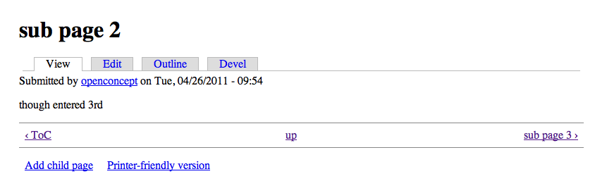
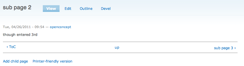
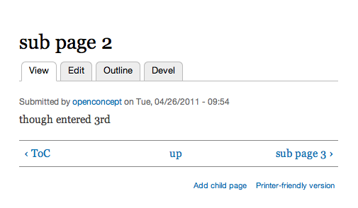
I've included this sample as an example.


Comments
Comment #1
mgiffordJust noticed I need to change the text on the 2nd & 3rd pieces of appended text. It's also worth noting that CSS & I still don't get along. The list items should be hidden, but seem to be floating around.
Comment #2
mgiffordThis is a simple patch that adds semantic data to a piece of Drupal core. Just needs better CSS to ensure that the layout doesn't change.
Comment #3
mgiffordThis is a simple patch that adds semantic data to a piece of Drupal core. Just needs better CSS to ensure that the layout doesn't change.
Comment #4
mgiffordJust added an example here:
http://drupal7.dev.openconcept.ca/node/3
Along with an ugly screen shot. It's semantically much better though.
Comment #5
mgiffordHow did I never set this as needs review anyways?
Comment #7
mgiffordIt's still ugly css
Comment #9
Everett Zufelt commentedThanks for rolling this patch. I was just noticing this problem this week and didn't remember if we had an open issue.
IMO this is actually critical, the links in head right now make little to no sense since there is no context. That being said functionality isn't broken, but ux is severely diminished.
Comment #10
Everett Zufelt commentedComment #11
Everett Zufelt commentedLooks like the book module simpletests just need to be updated.
Comment #12
mgiffordThis needs CSS changes too. It's a list, but the positioning needs to be modified to look like the current verison (or perhaps improve it).
Comment #13
Everett Zufelt commentedThis is a WCAG A issue:
2.4.4 Link Purpose (In Context): The purpose of each link can be determined from the link text alone or from the link text together with its programmatically determined link context,except where the purpose of the link would be ambiguous to users in general.(Level A)
http://www.w3.org/TR/UNDERSTANDING-WCAG20/navigation-mechanisms-refs.html
Comment #14
mgiffordOk, this patch addresses the CSS issues. Hopefully the simpletests aren't still a problem.
Oh yes, the screen-shots provide a view of the page with Firebug open showing that it is indeed using proper lists rather than divs.
Comment #16
mgifford#14: book_accessibility_v4.patch queued for re-testing.
Comment #17
Everett Zufelt commentedThe title attributes on the anchors will not be available to most screen-reader users, and some screen-readers (e.g. JAWS) will not read the characters in the link text like ‹ . Can we somehow add this information to the anchor text?
Also, when using characters like ‹ we should be using html entities like
»Comment #18
mgiffordOk. This is becoming more of an upgrade, but certainly improves accessibility more.
It's up here now: http://drupal7.dev.openconcept.ca/node/5
I've attached a screenshot with firebug opened.
I've cleaned up the formatting of the links so that it isn't such a huge long line.
I've moved the title text over to properly hidden text.
I've also changed the < > characters to the appropriate HTML entities. Thanks for the review.
Now we need another one.
Comment #19
mgiffordnixing simpletest. doesn't seem to be a problem any longer.
Comment #20
Everett Zufelt commentedThanks, looking good. Final comments.
1. These links should be proceeded by a heading like the pagination links on the default front page.
2. Do we need to get rid of the title attribute, or should we be doing title + invisible span?
3. I'm thinking the text in the invisible span is a bit verbose.
Comment #22
mgifford#18: book_accessibility_v5.patch queued for re-testing.
Comment #23
mgifford> 1. These links should be proceeded by a heading like the pagination links on the default front page.
Good point. I've added this.
> 2. Do we need to get rid of the title attribute, or should we be doing title + invisible span?
Title would give us the tool tips.. Invisible span gives us accessibility. I'm thinking we'll have to add back in the tooltips but we'll see.
> 3. I'm thinking the text in the invisible span is a bit verbose.
At this stage the more different it is the harder it will be to get in. This is especially true for anything that needs to be translated. The text can be perfected for D8. This is already much better than it was.
Comment #24
mgiffordThis patch includes the title so that it has the tool tips for sighted users.
Comment #26
mgifford#24: book_accessibility_v7.patch queued for re-testing.
Comment #28
sun.core commentedGood catch. However, while worth to fix, this bug is not really major.
Comment #29
mgiffordI do really need some help to work through the simpletests here. I thought I'd been able to resolve it, but unfortunately it still fails.
Comment #30
mgifford#24: book_accessibility_v7.patch queued for re-testing.
Comment #32
mgiffordI really don't know why this patch fails. I've wasted several hours today looking at it thinking maybe if I just slightly tweak one of these three lines of code I'll be able to get it passed the bot. I really doubt it.
It's frustrating how difficult it is to debug assertions. I really have no way to get a verbose output of what it's doing the comparison against!
Comment #34
mgiffordOk, I believe in SimpleTest. I know it's needed. But it shouldn't be this painful. Yikes. If this works I might have some ideas to help others avoid this grief I've been having about it.
Anyways, had some great help on IRC earlier today (well yesterday actually). Spaces definitely matter. HTML entities are not converted to anything and are as they are written in the code. And remember that you have to change the default for the l() to accept HTML....
Ok, now with any luck, this will be approved by the bot when I wake up.
Comment #35
mgiffordOh ya, the HTML isn't as pretty as it was before in the template. But one big long string is way easier to deal with than figuring out if I need to insert
" \n "all over the place.Comment #37
Everett Zufelt commentedTagging with markup to make sure that the changes are acceptable to the markup maintainers.
Comment #38
mgifford#34: book_accessibility_v9.patch queued for re-testing.
Comment #39
mgiffordI can't for the life of me understand how function testJail() could legitimately fail due to the book module, so I'm retesting it. "The test did not complete due to a fatal error. Completion check filetransfer.test 67 FileTranferTest->testJail()"
I'm assuming it's just a temporary bug that's going to hit a bunch of tests & be fixed quickly.
Comment #40
pfrenssenSome minor comments:
For the rest the patch looks fine, it makes the HTML of the book navigation semantically meaningful.
Comment #41
mgiffordThanks for the review @pfressen - I've applied these changes and tested it against the latest release and it all works fine.
Hopefully we can get this into core for a more accessible & semantic improvement. I really don't see a downside to including this change in a point release.
Comment #42
pfrenssenLooks fine to me now.
Comment #43
dawehnerComment #44
dries commentedTried applying this patch but got:
Patch might be in the wrong format?
Comment #45
dries commentedTried applying this patch but got:
Patch might be in the wrong format?
Comment #46
Jeff Burnz commentedI'm not going to touch the status right now but with regards to workflow etc this will need some CSS for Bartik, maybe even D8 core(?), looking at the screenshot in #6 we can see this borks out Garland so no way we can backport without CSS fixes for both themes in D7 (Bartik & Garland) - either we do that here or in new issues, and possible block a point release until such time that CSS is ready?
Comment #47
mgiffordOk, I gitafied the last patch. It wasn't properly created it seems.
I got a few whitespace errors, but not sure how relevant that is:
warning: squelched 6 whitespace errors
warning: 11 lines add whitespace errors.
There are also still definitely CSS errors in Bartik http://drupal8.dev.openconcept.ca/node/51
I'm dropping this down to needs work.
EDIT: That link is now fixed up so feel free to check it out.
Comment #48
mgiffordOk, here's with the fixed CSS and screenshots (including garland)
Comment #49
mgifford#48: book-accessibility-736604-48.patch queued for re-testing.
Comment #50
Jeff Burnz commentedThere are some white space issues in this patch.
Wondering if the titles are too verbose - things like "Go to previous page", could that be better said as just "Previous page", thinking about how screen readers will synthesize this, something along the lines of:
link, [link-title], Previous page
To me that makes grammatical sense, however this reads/sounds a little odd:
link, [link-title], Go to previous page
Any strong reason for removing the wrapper? In HTML5 we could use a nav or footer wrapper for these.
Comment #51
Everett Zufelt commented+1 for 'Previous page' It's a link, I can infer that I am going somewhere :)
Comment #52
mgiffordAnnoying with the white spaces, should be easy to clean up though.
For consistency I just used the language in the title so that it would be expressed to the screen reader but provide no additional work for translation (seeing as it is the exact same string). As in other patches I've assumed that if it's good enough in a title attribute for sighted users, it's good enough for screen readers. I think both could be simplified.
I can also put back in the wrapper. No problem there, I think I was trying to simplify things. Should I use footer or nav in this d8 patch?
Both the text & the navigation would probably need to be different in a backport for D7.
Comment #53
Jeff Burnz commentedI think just leave the wrapper and go for the main issue - the accessibility improvement, we have an issue open for HTML5ifying this template: #1189828: Convert book-navigation.tpl.php to HTML5
Comment #54
mgiffordOk, I added the div back, re-ordered all the spacing, removed the unwanted spacing and changed the text in both the title & invisible text. When it's in 8 I'll work on creating a backported version for D7 & can add the HTML5 version by switching the div to a nav or footer.
Comment #56
mgiffordI thought I'd uploaded this one with modified tests. I forgot that when I uploaded it initially.
Comment #57
svendecabooterHere is an updated patch that removes the whitespaces errors upon applying it.
Comment #58
svendecabooterThis is indeed an improvement over the current markup.
However i noticed there is still a layout problem where the book navigation borders are shown twice. (see attached screenshot)
I tested this in both Bartik & Seven.
This is caused by the fact that both the div and the ul in book-navigation.tpl.php have the CSS class page-links.
I'm sure that's not the intended behaviour?
Comment #59
Everett Zufelt commentedComment #60
mgiffordThe goal is to have it act/behave just like it does now, but with proper mark up.
Can you roll up a patch that resolves that problem? Thanks for posting the screenshot!
Comment #61
mgiffordJust changing the component as Everett & I seem to be working on this at the same time.
Comment #62
Everett Zufelt commentedJust to clarify, I am not currently working on this issue, just moving it to the correct component.
This is certainly part of Book.module, but it is a Markup issue. In order for Markup / CSS / JS folk to find issues easily we are moving issues into most appropriate component.
Sometimes it's a bit unclear about where something should go, but the core issue here is about markup, not about how Book behaves.
Comment #63
mortendk commentedhey
just wanna inform you that were working on cleaning up the css & follow the BAT rules for the filenaming over here : http://drupal.org/node/1216970
so we should keep an eye out for eachother so we dont end up crashing ;)
Comment #64
mgifford#57: book-accessibility-736604-57.patch queued for re-testing.
Comment #66
mgiffordOk, this patch needs to be re-rolled, keeping in mind #1216970: Clean up the CSS for Book module
Comment #67
jacineI marked this #1189828: Convert book-navigation.tpl.php to HTML5 a duplicate of this issue. There's no point in looking at this twice, as we ultimately want the same results here.
Comment #68
mgiffordThat works for D8, but it means abandoning the effort to do this right in D7 with HTML4. Not that there's been a lot of momentum on the thread, just wanted to clearly state this here.
We can always re-open this thread if that changes.
Comment #69
jacineWe can definitely work here... There's more done here anyway. The other issue had no patch, so I closed it.
As far as D7 goes, @webchick will never allow this to be backported. Sorry about that! I should have stated that when I removed the tag.
Comment #70
jacineActually, I will ask @webchick to chime in on that rather than speaking for her. I am just 99.9% sure it's a no-go for D7 based on previous experience. ;)
Comment #71
mgiffordThanks @Jacine!
Comment #72
tjhellmannHere's a go at it. It's my first patch, so if there are errors, I apologize. Working from the previous patch, I replaced the wrapper div with a more semantic nav element and added the rel=”next” and rel=”prev” links to the first and last (http://dev.w3.org/html5/spec/links.html#sequential-link-types). Seems that rel="up" has been deprecated in the HTML5 spec. I didn't add any CSS changes as Jacine asked me just to stab at the markup first.
Comment #74
mgifford@tjhellmann - congrats on your first patch. Appreciate the explanation about your changes too.
I haven't looked into why the bot didn't like it, but noticed that you didn't adjust the CSS & test files. #57 is a good example for those.
Great to see this being upgraded to HTML5!
Comment #75
webchick/me hires Jacine as official spokesperson!
That's correct. .tpl.php files are locked down for D7, and have been since the end of polish phase in December 2010.
Comment #76
tjhellmannHere is another take at it. Added the clearfix class back on the ul in the markup – I was thinking it would be ideal to do without it, but the current CSS would depend on it with the floats. Also just set the ul to list-style:none in the CSS and added the rel tags to the test.
Comment #78
mortendk commentedokay looks like i kinda tried to hijack this issue over at the css cleanup
So i wanted som thoughts on changing the markup for the navigation to use li so we end up with the same markup & classes as the pager.
book-navigation.tpl:
changes in the book.theme.css.
im gonna roll a patch later today - but thought it was worth a discussion ;)
Comment #79
mgiffordLooks good to me..
Comment #80
mortendk commentedI have marked a #1216970: Clean up the CSS for Book module duplicate and rolled the patch together with the one here with an added nav love
Comment #81
jacineOk, so the markup is good and the tests pass! Yay!
The CSS tests well (even in IE7) but there are code style some issues:
There shouldn't be any empty lines after this.
There needs to be a space after the colon, before the value.
The empty line above the rule needs to go and there should be a space after li and before the opening bracket.
There needs to be a space after the colon, before the value.
Now... this .pager style stuff. What is the deal? It seems like you're trying to make this a globalized style, because you prefixed these selectors with the
.pagerclass, but what happens when you've got both the book CSS and the system.theme.css CSS on the same page, and you've customized the pager styles? A conflict on.pager liis gonna happen for sure...Looking at this deeper, the class names on the list items don't use the same naming conventions. If we were trying to do that, then it'd be: pager-next, pager-previous and pager-up instead of page-next, page-previous and page-up.
I don't know. Honestly, I don't think the pager class here is a good idea. This requires all all sorts of floating and different presentation, whereas the regular pager could just use display: inline, and I am worried about this getting messed up and being annoying when a theme does heavy styling for the regular pagers. At the end of the day the only thing they actually share is list-style-type: none, so it doesn't really seem worth it.
What's the benefit do you see from doing this?
Comment #82
jyve commentedSince the book pager is functionally different from a normal Drupal pager, I agree that a themer will end up with too much CSS overwrite issues if we use the .pager class here.
Other than the issues mentioned by Jacine, this patch looks good to me.
Comment #83
mortendk commentedalright i hear ya - i was a little tricker happy there
Comment #85
mortendk commentedlets try this again...
Comment #86
mortendk commentedEven that the book module is now ready to go - i kinda I played around further with the book navigation module, now that we opened up the box so i changed a couple of things to make it even better.
The < & > is wrapped in a b tags, so we can do stuff add icons whatever to the arrows, or remove em directly with a display none etc. - This gives us way more flexibility, than we got today
Changed the css a little so we can remove the .clearfix class *yeah*
the css is marked with the fixes for ie7 + commented quite heavy & the book.test needs an update.
I have added a couple of screenshots for different browsers & RTL lang as well (only the ie's ;)
Comment #87
mortendk commentedchanges the title
Comment #88
mortendk commentedcan anyone tell me why the › is inside a t( ) ?
is there any reason for that other than old legacy it was then easy to change in the t function instead of using the tpl file ?
Comment #89
xen commented@mortendk
It allows you to translate › to ‹ for rtl languages perhaps?
Comment #91
mortendk commentedComment #92
droplet commentedmove to ie.css ??
20 days to next Drupal core point release.
Comment #93
mortendk commentedguess we should have an ie7.css file - but isnt that a thing for the whole of core, so we can collect the garbage one place ?
or should we place them as module.ie7.css thats offcourse starting a whole new amount of css files to be loaded
the reason the comments is so we can find em again in x months when its decided to kill ie7 support (as im expecting ;))
Comment #94
droplet commentedI clean up some codes.
removed b tag and move into t(), although this is a title but I think some guy want to change it to other format :)
any reason when not use the standard .clearfix ??
when we use display: inline-block, space between left & right is different.
+ letter-spacing: -4px;This is no sense to me, I don't really get it :(
Comment #96
mortendk commentedThats not cleaning up - thats removing the functionality.
Youre missing the point with the b tags, and the flexibility in the layout it gives us,as an exampla i added a little bit of margin on the links to make it easier on the eyes (and not with a space as its done today) - Without the b (could as well be spans etc) theres no way to control the < + > the spacing, padding margin borders background etc on these 2 "arrows" - it needs a wrapper.
The reason for the b is that is small and easy to read in the css now a designer can by changing the css do what he wants with the pager "arrows", a good side effect is that they have a little bit of heigher weight (bold) than normally which make em naturally stand out.
The whole idea here is that we dont need the clearfix. Clearfix is a nessesary evil. A trick where we try to force a block to wrap around blocks inside it. Spreading it around the drupal core by hardcoding it as a class on every element, is making our codebase it less flexible for the frontend developers (core has now about 100 places where the clearfix is thrown in) - more about the evilness of clearfix : http://thinkvitamin.com/design/everything-you-know-about-clearfix-is-wrong/
We cant align elements with clearfix up next to eachother. When theres ways to get around this by using clean css, we should indeed use it.
The hardcoded clearfix, is a pain to owerwrite, and is frankly a little like putting everything in tabels cells "because that works"
By using the inline-block we can set a width of an element, but its still floating naturally, which a block elements dosnt do unless you float it left & we can now position the books navigation as we want to & dont end up in wrapping that in another div just to remove the clearfix.
The letter spacing at -4 px is to remove the spacing the display: inline-block gives around every li element (we can use font-size:0 instad) its set on the ul (in this case the .page-links) its then cancelled on the li elements , and it all keeps its natural behaviour.
Now the links align up as we would have with a display:block float:left, but we dont have to wrap it in an clearfix that remove our posibility to align the navigation with whatever we might wants
voila everybody wins :)
The reason for the ie7 fixes are placed like that in the code is so we can find em again quickly by searching for /* IE7 */
btw "when we use display: inline-block, space between left & right is different." you have a screenshot + browser so i can check that ?
Comment #97
mortendk commentedI have just tested the code on almost all the browsers I have, I dont have a *nix though :(
but heres the screenshots for the test on verious browsers from ie7 to opera + in stark & Bartik.
Theres a minor problem with the supixel rendering using % so theres 1% missing in the calculation (and not the 8% that are missing from core in d7) i think thats actually acceptable & is very easy fixed by a theme it it wants absolute widths, then its easy overwritten.
Comment #98
droplet commentedwhy -4px and not -3px or other vaule. when happen if we remove it.
wrap inside t function is better ?
and trailing space problem in the patch. (also double space: print $next_title)
19 days to next Drupal core point release.
Comment #99
mortendk commentedThe reason for -4px is thats is the value added by default by the block-inline which is a PITA , but thats just how it is (and make sense when its inside a p etc.)
In this case though after som playing around -3px was actually working better with the subpixel renedering, cause by the % - So the centering of the up link, after an adjustment of the width to 9.8% was almost perfect, with the exception of Opera 11.52 which IMHO is ok.
Comment #100
mortendk commentedstupid whitespace
Comment #101
aspilicious commentedThis sentence is kinda weird although I understand it
Lol I'm not sure this accepted as a comment
So if this approach gets accepted it only need "better" docs in the css file and than this is done.
19 days to next Drupal core point release.
Comment #102
aspilicious commentedNeeds review :)
Comment #103
mortendk commentednow better & more documentation
Comment #104
moshe weitzman commentedWelcome to core development, Morton. Trial by fire is the only way!
Is there a particular reason we are naming the new file book.theme.css and not just book.css? CSS files always have to do with themeing as they are about presentation. Seems wordy for no benefit.
Comment #105
aspilicious commentedmoshe you should read: http://drupal.org/node/1089868
Comment #106
droplet commentedI would recommend wrap all links text inside a t function. but if you are don't like it, this is a better one I think, Instead hardcoding the B tag:
print t('<b>‹</b>');other UL has 2.5em, may keep it same to other ??
#94 try to remove all padding value here:
letter-space is hacking css bug, but by remove it the page is still working well. I seen no reason to keep it
18 days to next Drupal core point release.
Comment #107
mortendk commented@droplet:
Markup in a translations ... That is not the way to do it - then we suddenly have markup that changes based on a translation, talk about debuggin hell ;)
so that is a what i consider a no-go.
Markup lives in eater the theme layer or in a theme function -else were ending with total confusion. Unless i really misunderstood something ??
The letterspacing "trick" is not a css bug - it works as designed - were just using it in another than the css fathers intended (and until the flexi box comes)
At this point there isnt any guidelines of margin & paddings in core . seems like "someone" have set some way back in time.
I would suggest that we dont take that task here but opens up a seperate bug about generalising all margin & paddings in drupal.
but there might be a point in no having lines etc, even that its kinda seen as a drupal default, since the dawn of book module
@moshe yeah i finally made it in ! ... fire ill give you fire ;)
its all about the BAT filings, so the css is gonna be seprated n stuff ;)
Comment #108
droplet commented-1 for RBTC (reason: #106)
unless somebody tell me there SHOULD be another issue for clean up book module, otherwise I think it worth to clean up the padding/margins here.
sorry about it. willing to see other's opinion :)
Comment #109
jyve commentedI don't want to steal your patch here @mortendk, but there were so many small remarks that creating a new patch was easier than listing them all.
This was done in the new patch:
- removed an extra white line at the end of book.theme.css
- removed an extra white space in front of every line in book.theme.css
- added some missing spaces between properties and their values
- alphabetized all properties since this wasn't always the case
- agree with @droplet to change the left padding on the menu to 2.5em since that seems to be the standard on all other li's in Drupal core
- updated the comments a bit more
- tested if we can remove the letter-spacing mentioned by @droplet, but doing so breaks the layout so this 'hack' needs to stay in unfortunately
- totally agree with mortendk that the markup should be left outside of the translation system.
One remark that I did not put in the patch, is that maybe something like ' is better than using the 'b' tag in the links in book-navigation.tpl.php?
Comment #110
mortendk commentedyeah some crap happend with the last patch, dont patch in an airport with screaming kids - i saw it after takeoff - fixed it and was about to submit it, when i saw you patch ;) ooh well that can teach me not to cross borders on a friday night.
yup the letter spacing is the only way to remove that spacing from the inline-block. But removes the clearfix which is an actual hack & in this situation it dosnt matter because of the ul li combination where its the only place its added - and please stop call it a hack when it isnt ;)
the 2.5 em is a good catch think the 3em was something that have been floating around since the dawn of the book module (im stille wondering where those 2.5ems and others are coming from and why they were decided upon)
So what you mean with "One remark that I did not put in the patch, is that maybe something like ' is better than using the 'b' tag in the links in book-navigation.tpl.php?" - you wanna look at something like a span with a loong class name etc in or ?
Comment #111
jyve commentedYeah, I was thinking a bit more about it overnight, and we should leave the 'b' tag as is :)
Comment #112
Everett Zufelt commentedCurious where $prev_title and $next_title are defined and what their contents are.
I don't know that 'up' really says very much about the purpose of this link.
Comment #113
droplet commented@jyvs,
last patches changed .page-up width to 9.8%, so removes letter space doesn't apply anymore. it should be leave there now.
needs move it up ?
vertical-align: top;and why not totally remove the paddings (use default/ pre-defined /drupal reset style):
OLD:
NEW:
Comment #114
aspilicious commentedI didn not test it but do we have to duplicate border-top?
Comment #115
mgifford@Everett template_preprocess_book_navigation() defines previous/next content and they include the title of the adjoining pages.
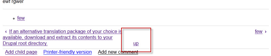
Now Up isn't very descriptive, but it's a rather tight space to put two titles in a footer let alone three. In the example uploaded by @droplet I wonder if it might not be a good idea to trip the length of the title to say say 50 characters.
Does the extra padding make it easier to click on the Up link? I'm trying to figure out why it is there. Spacing from the other two?
Comment #116
webchickSorry, that's been driving me nuts. ;)
Comment #117
jyve commented@droplet in #113:
- Even with the 9.8% width on the 'up', we still need to have the letter-spacing fix, tested in Chrome and Firefox.
- In which browser did you take the screenshot on the vertical-align proposal? I tested this in Chrome and Firefox, and don't have that issue, everything is aligned at the top here. Also, I don't think the vertical-align would help in this case.
- if we remove the padding altogether, and update the borders as you proposed, then we get a double border above the book pager when there is no menu above it. I have however changed the padding by only applying a top and bottom one, so that we at least inherit the left and right ones.
@mgifford in #115:
- what padding on the 'up' are you referring too? There's no padding on that element for the moment.
- Trimming the length might indeed be an option, but I would love some more opinions on this before we implement that.
Comment #118
mortendk commentedfixed the problem with very long titles & top align the text.
added a badass little up arrorw to the up - to keep with the < >
moved the border colors over to bartik.css where they belong
tested in all browser i could possibly find.
i dont think theres more that can be done on this one now ;)
Comment #119
droplet commented@#117 jyve,
Apply your patch #114, and browsers support inline-block have this problem, technically this issue always happen on display:inline-block
(http://blog.mozilla.com/webdev/2009/02/20/cross-browser-inline-block/)
Nice, never thought it before. But by default installation, how to remove menu (.book-navigation ul.menu)? and any chance to remove book pager/nav (.book-navigation ul.page-links) ??
Comment #121
mortendk commentedfixes for vertical alignment top
border moved to bartik
Comment #122
mortendk commentedokay so if we have a pre & next arrow - how come that there isnt a up arrow?
the patch is a build on top of #121
screenshot is attached - or should this end up in another issue ?
i have added the add an up arrow as an seperate issue #1340242: add an arrow for the book up
Comment #123
aspilicious commentedI think the up arrow is weird but anyway thats a seperate issue IMO.
Comment #124
mortendk commented* cleaned up and removed the "pixel perfect" fixes, ts overkill for stark & were not winning that much by those x pixels. pixel perfect is for the ebd theme and not core + makes it easier to maintain
* changed the classe namer for the page-links to the module specific book-pager
* removed the up arrow (cause thats for another patch & discussion)
Comment #125
mortendk commentedand without the pink test color *doh*
Comment #126
jacineNice work @mortendk! This is looking good. A couple of minor issues to fix before this is ready.
We need an empty space between the title and the b tags. The arrow is on top of the text and hard to see.
There needs to be a space after the colon, and the comment needs work. We should move the comment to the line above the code, and also include a LTR comment inline. So, like this:
Let's loose the * before the zoom property. We don't use that anywhere else in core.
This needs a /* LTR */ comment.
Both of these need a LTR comment.
This should be .book-navigation .book-pager, or just .book-pager.
16 days to next Drupal core point release.
Comment #127
droplet commentedand the comment format
16 days to next Drupal core point release.
Comment #128
mortendk commentedhere we go with another one :
* cleaned up the class names even more to be easier & quicker to read
* moved the specifics for bartik (the book-navigation .book-pager ul's margin:0 that need an overwrite now that bartik sets that as default)
* added the space between the b and link - even that i think this should be done with css & not a space - but i wont fight over it ;)
* fixed the comments for RTL
* testet in ie6-9, latest: opera,safari, chrome & ff
Comment #129
yoroy commented/me just cheerleads in here for a bit. Go team!
Comment #130
jyve commentedTested the patch in #128:
- There's one white line too much here:
- Is there a reason why the width of the up link has been reduced to 4? The positioning is still ok for me when it is at 9% unless this causes issues in other browsers than Firefox/Chrome?
- This needs to be alphabetical:
Looking good otherwise!
Comment #131
mortendk commentedits changed to 8% now, we had funny jumps with resizing to small screensizes
Comment #132
mgifford@jyve I was mostly just looking at the image in #113.
I think I saw that and just assumed it was demonstrating something like
padding: 5px 5px;as per articles like:http://www.smashingmagazine.com/2010/02/13/the-definitive-guide-to-styli...
http://ezinearticles.com/?Website-Usability-and-Accessibility-Tips&id=43...
Should have looked at the code more carefully.
Agreed that the trim length tool would be better as an option.
Comment #133
jyve commentedPatch in #131 reviewed and looks perfect to me now.
@droplet in #127: I suggest we open up a new issue to update all comments in Bartik since they don't follow the Drupal CSS conventions.
@mgifford in #132: I'm actually not really pro cutting the length anymore, unless we can make it a setting in the backend, but it feels like overkill? Any other opinions on this?
Comment #134
mgifford@jyve - I'm not fixed on shortening the titles. I suppose it can be easily over-ridden in a theme if required.
Comment #135
jacineI think this is ready now. Lucky 135? :P
Comment #136
catchThis looks like good cleanup. Committed/pushed to 8.x! Nice to see new people patching core in here as well.