

Closed (fixed)
Project:
Drupal core
Version:
7.x-dev
Component:
Bartik theme
Priority:
Normal
Category:
Bug report
Assigned:
Unassigned
Reporter:
Created:
1 Apr 2010 at 20:03 UTC
Updated:
4 Jan 2011 at 11:14 UTC
Jump to comment: Most recent, Most recent file


Comments
Comment #1
aspilicious commentedI think we have to rethink comment structure for forums, current situation:
Comment #2
aspilicious commentedAnd we need to remove border of forum icons
Comment #3
EvanDonovan commentedAgreed in re: #1. The pull quote style looks good for a few comments on a node, but when there's a whole series of comments, I think rounded boxes, in a style somewhat similar to the Drupal.org issue queue, would be better.
The issue mentioned in #2 should be fixed by #750792: #block-system-main img is too generic (once that issue has a patch).
I'll try to test myself later today.
Comment #4
jensimmons commentedBump. Lets fix up forums theming.
Comment #5
EvanDonovan commentedThe patch in #750792: #block-system-main img is too generic got rid of the weird borders. The forum icons still need some margin or padding to the right of them, though, I think. See http://skitch.com/evandonovan/dybrk/forums-main-page.
The text that says what forum a post is in looks really bland, and kind of out of place in my opinion: http://skitch.com/evandonovan/dybrh/forums-text-bland. Not sure what to do about that.
Also, the "speech bubble" style of comments looks a bit strange, in my opinion, on a forum post, and, finally, the headings seem rather large and "interruptive": http://skitch.com/evandonovan/dybfd/forum-headings-comments.
Comment #6
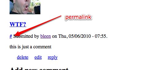
sarah_p commentedI don't know if this is intentional or not, but the # sign is on every post with no number listed. I don't know if this is a core thing or theme related. http://img.skitch.com/20100422-rkusfpm3j6kq9mhdmhsi4wbukg.png
Comment #7
bleen commented@sarah_p .... that "#" is the comment permalink. I'm not sure what how that is supposed to read, but what you've pointed out is definitly wrong. For reference, we are printing that permalink near the top of comment.tpl.php. For comparison, Garland simply ignores this variable.
We need to either
a) kill that permalink (aka dont print it at all)
b) get a fix into core and then figure out how we want this to look and then implement it
Comment #8
jensimmons commentedHow does this look in Stark? That will tell us what Drupal core is doing.
Comment #9
bleen commentedStark includes the permalink and it looks just as weird ...
Comment #10
jensimmons commentedComment #11
bleen commentedThe "permalink" issue here is a duplicate of #819214: The "#" marking comment permalinks is just weird and untranslatable
Other than that the only things left to discuss here are the comments in #5, are they actionable?
Comment #12
rjgoldsborough commentedThis patch provides a new comment structure. Let me know what you think.
It also fixes a bug I found where the save and preview buttons were lacking margin (see screenshots)
It also gives some padding to the forum icons.
Comment #13
rjgoldsborough commentedIgnore #12
Comment #15
Jeff Burnz commentedOne of the screenshots in #12 shows the buttons butting up against each other - thats a bug (what browser is that?).
The forum icon positioning is off also - so thats a bug as well.
The original post is about improving forum styles, however it was posted before the commit to core - IMO its too late for a major design change as we already have a lot of unresolved bugs in Bartik.
Comment #16
rjgoldsborough commented@Jeff Burnz - I'm not sure what browser that was in, but it appears to be gone now. Both of the bugs seem to be fixed actually but I can test and confirm tomorrow
Comment #17
eugene.samoylenko commentedSee the attached screenshots please:
1. add-new-forum-topic.png - as for me, there's no need to make such a large left margin for the "Add topic" button. It looks a little misplaced.
2. published-by-forums.png - highlighted part looks messy. Topic info block should be separated from the first message body. The distance between "Forums:" and "General discussion" is inexplicably large. Also is there a reason why the first letter in "Forums" is capitalized while in "published by" it's not?
3. Just a general suggestion. Why not implement all the "action" links as the buttons with the appropriate styles? As for me "reply", "edit" and "delete" should look like "Save" and "Preview" (maybe just a little smaller). The purpose is to show that it's not just a link to some other page and user is about to do some action by clicking it.
Comment #18
eugene.samoylenko commentedI'm sorry, something went wrong and screenshots were not attached to the previous posting. Here they are.
Comment #19
Jeff Burnz commentedThe terms bit is covered in another patch, its a bug because the terms container is being floated by default which is a mistake and been like this for ages in Bartik...
Comment #20
rjgoldsborough commentedAfter looking at this closer, it looks like the terms container just isn't getting cleared correctly with the elements inside both being floated. I'm not sure if this is a bug elsewhere with tax terms, but this patch fixes it for the forums.
Comment #21
amateescu commented@Jeff: The issue you are reffering to in #19 is #819996: Fix taxonomy term displays?
If that doesn't get in, here is a reroll of #20 as a proper patch.
Comment #22
Jeff Burnz commentedYes, I'm referring to #819996: Fix taxonomy term displays, the most recent patch fixes this issue automagically, so we can consider #20 & #21 as duplicates. Sorry I did not mention this earlier, I was rather in a rush. Also I've totally lost track of what this issue is actually about. Can we just close it?
Comment #23
Jeff Burnz commentedOK, looks like we're done here, everything looks to be either fixed in another issue or a dup.