
Closed (outdated)
Project:
Commerce Core
Version:
7.x-1.x-dev
Component:
Cart
Priority:
Normal
Category:
Feature request
Assigned:
Unassigned
Reporter:
Created:
30 Jun 2010 at 18:52 UTC
Updated:
24 Nov 2019 at 17:14 UTC
Jump to comment: Most recent, Most recent file

Comments
Comment #1
mertskeli commentedShould be!
For example,
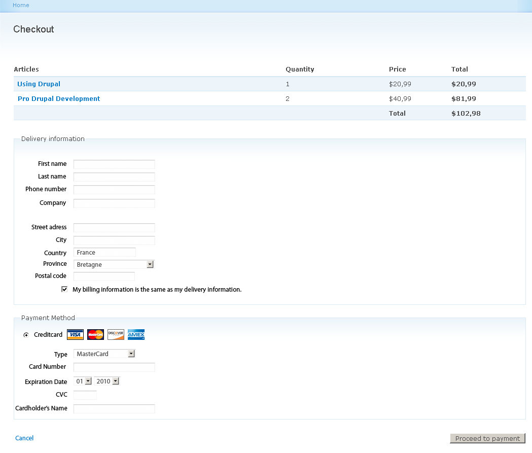
Coloumns per line: ID - Title - Unit Price - Quantity - Total Price - Remove (a link or a button, not a checkbox)
Buttons below: Update (or Refresh) - Clear (or Remove All or similar meaning)
Big button: Checkout (or alike)
Form should be capable of recalculating values upon manual change in Quantity field and pressing Update button.
Comment #2
willvincent commentedIt would be nice if the entire layout of this was based on a template file, so that it could easily be rearranged and customized to the exact specifications of a particular site.
Comment #3
rszrama commentedBonus points if we could make it a View... wondering if Damien has time to work on #842036: Convert the line item manager widget table to a View. : D
Comment #4
Bojhan commentedDon't mind the Delete button, thats out of style - but that will be build with CSS anyway. Other then that I am trying to stay as true to Garland as possible to avoid any hard-coding things issues.
Comment #5
Bojhan commentedWhen you uncheck the "same as box" it will open a shipping fieldset.
Also I only designed credit card, but obviously payment options would expose several radio's and upon choosing one you will get the appropriate forms.
I didn't account for shipping but I imagine that will be a row in the table on top - updated automatically when the user fills out his address.
Comment #6
Bojhan commentedComment #7
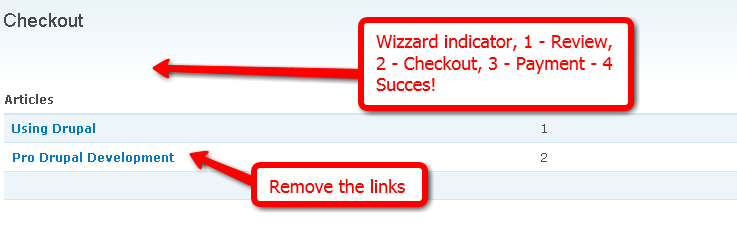
mertskeli commentedFew questions.
1. "Proceed to checkout". Just "Checkout" could not be used? Why?
2. May be better to move "Delete" to the right? It increases line height and not so visible.
3. Still I believe "Quantity" can be placed after "Price", not before... But if it can be re-arranged by template or CSS than no problem.
4. Why "Quantity" is a drop-down field? What if I'm going to buy 78 pieces?
5. "Delivery Information". Buyer is not necessarily a person. It could be a company. Hope you will not make "First/Last Name" field required to be completed.
6. "Payment Method". Hope cards will be not the only payment method. Because cash and bank transfer are also possible in real world. And more of that, some clients (even with PayPal) can deposit some money. Thus payment could be withdrawn from their accounts (balances). Or even credited.
7. Sorry, what's wrong with line items being linked in "Articles"? ("Article" not "Articles" may be? If its singular everywhere else.) May be someone will want to review the item in more details before checking out?
8. Wizard indicator would be most welcomed.
Comment #8
Bojhan commented1. We could do that, I am not sure if just "Checkout" is better? It doesn't imply moving to a new state.
2. No, I don't want a new column. That will take up far more significance than this.
3. Why would it be after price? I dont see the usability win. Its less important and it will be squashed inbetween two dollar ammounts.
4. We can probally do a 20+ option where it says other and ajax it into a textarea. However I don't think its realistic for most shops to sell 78 items of something, smart defaults. For those who want to change, can.
5. Not my call.
6. No ofcourse not.
7. It will take you away from the screen, I dont really think its a valid use case - sure you could review it another time, but no need to have it link off checkout.
Comment #9
mertskeli commentedSorry if my "should" and "better" could sound inappropriate. It is no way imperative and could be ignored :)
1. Was inattentive. Surely, if it is an intermediate page it should have "Proceed". Big fat "Checkout" usually ends the final page.
2. I'm afraid there's no choice other than a new coloumn... The table cell with a product title is not the best place for a "Delete" button. Please try to add a long title, something like "Book by John Longfamilyname "How to get rid of long family names without buying any books"". And a product image. I could hardly imagine where "Delete" button will find its place in this table cell... By the way, space could be saved by using a kind of icon (trash can or "x" symbol for instance). But plain "Delete" button or link is better of course.
3. Because a buyer verifies his choice by Title/Price keeping in mind just a default single piece, and only after that decides how many he needs, if its cheap. Mostly he doesn't care about Quantity and Total at all - just Subtotal... But ok, no problem, it could be rearranged by site admin, as far as I understand. Checked out some online stores: both variants are quite common.
4. Ok, but 30 pcs of a 1$ souvenir for every of my 30 classmates is pretty realistic. Frankly speaking, it is for the first time that I see a Quantity drop-down in a webshop checkout form... Although it could be quite convenient sometimes.
7. I could agree. It is not vital for check out page. There was Review page just before. Not critical.
All in all, it could be a good idea just to peep how that is being done by top online shops. Let's say Microsoft, Apple, Nokia, Amazon, Toshiba, Packt, etc.
Comment #10
willvincent commentedHas there been any discussion yet about handling multiple shipping locations?
For example, when you buy things from amazon you can specify a separate shipping address for each item if you so choose. I could see that ability being very useful even if the majority of people don't use it, it seems to me the ability to do so would be easier to allow for in the core module rather than a contrib.
Comment #11
mertskeli commentedWould be nice.
If not, it is possible to split order to 2 separate orders, each with different shipping address.
Comment #12
redben commentedIf the quantity dropdown's advantage is "point and click" instead of using the keyboard to enter the qty, may i suggest it be replaced by a plain text box and a js controlled "minus" "plus" mini buttons, for convenience.
Author notes :
Delivery info and payment method, too much space to the right, couldn't it be layed out on two columns ?
Comment #13
mimetic2 commentednot sure if I misunderstood the thread or you did this on purpose but having Images on checkout decreases cart abandonment. So they shouldn't be removed.
Comment #14
rszrama commentedFirst pass committed: http://github.com/rszrama/drupalcommerce/commit/ba67c2395e4f1142a184591e...
Comment #15
rszrama commentedSpawned a child issue for the delete button: #916348: Change the checkbox to remove from the cart to a styled submit button
Comment #16
mimetic2 commentedA really good checkout UI that I would highly recommend copying is this:
http://www.magentocommerce.com/magento-connect/One+Step+Checkout/extensi...
They have a screenshot overview but it looks VERY Simple.
Also, there's a check box for "shipping address is same as billing address." This way they only have to enter something if necessary. Also they dont have to scroll down.
Thoughts?
Comment #17
rszrama commentedhehe I always love seeing community edition with a price tag by the download link. So happy we don't have that kind of community. : P
Will definitely check out their implementation... I'm guessing it's technologically possible to transform the multi-step checkout process we have into a single step via some #ajax usage if desired, it's just not the default solution. Worth a second look for sure.
Comment #18
Bojhan commentedI am not sure that from a usability perspective its not too much information, I wouldn't favor going a more adventurous route on this.
Comment #19
mertskeli commented@#16
Very good solution, indeed. Just 1 page for check out is convenient. And that "same as billing address" saves space and reduces mistakes for dual address input.
But please take into account that Magento is a pretty mature solution, dedicated to e-commerce only, and has 50+ core developers. Also I could hardly call it real "open source". It is a 200% commercial product which uses its "community" tag for bug tests and volunteer enthusiasts.
Drupal Commerce is much younger, and has less people involved (actually just few). Besides it is heavily dependant on Drupal.
Comment #20
recidive commentedThe patch #944640: Shopping cart as a view will make the cart a lot flexible.
Can we mark this issue as duplicate, and move the relevant parts to the other one? I say this since this issue is already being implemented as a default view in the other issue.
Comment #21
rszrama commentedI'd say let's leave this one open until some curation can be done to the issue - it has mock-ups that we haven't implemented yet and wouldn't want to lose in the closed status. Ideally we can implement the cart needs in the Views patch and have separate issues for the checkout form and wizard.
Comment #22
rszrama commentedI'm not sure what in here we really need to implement, but I'm still loathe to close the issue entirely (as indicated above). It may be the things remaining in here need to be in contributed modules, but at the very least we can change the name.
Comment #23
queenvictoria commentedI'm very motivated to get this underway again. Having read through this issue and another one here. I don't really get a feeling for how people were thinking about implementing this. Seems like blocks and views have been discussed. Wouldn't a small set of ajax-y forms all on one page be the idea? Or does it need to be one ajax-y form tying up all the pieces?
Comment #24
bojanz commentedTime to close this :)