

Closed (fixed)
Project:
Drupal core
Version:
7.x-dev
Component:
Bartik theme
Priority:
Major
Category:
Bug report
Assigned:
Unassigned
Issue tags:
Reporter:
Created:
5 Jul 2010 at 22:43 UTC
Updated:
1 May 2012 at 05:05 UTC
Jump to comment: Most recent, Most recent file




Comments
Comment #1
johnalbinThe #logo container dips into the header region, which causes the first block title in the header region to be pushed to the right.
So there are two fixes…
opinions?
Comment #2
bleen commentedI think #2 is going to look much better ... clearing the logo will make things look slightly mis-aligned (vertically)
IMHO
Comment #3
johnalbinOk. So system-provided menu blocks was fixed over in #845928: System menu blocks don't get the same styling as menu module blocks.
But this still leaves the issue that the first header block gets pushed over by the logo. Here's an updated screenshot.
Comment #4
jensimmons commentedComment #5
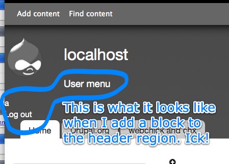
jensimmons commentedHere's another screenshot of how blocks end up in weird places in the header.
This used to look much better, so there is CSS for handling blocks in the header somewhere in the theme. It's likely that a class name changed, and disabled that CSS.
Comment #6
Jeff Burnz commentedmaybe something like this - needs testing, only tried it with a couple of different blocks in Firefox 3.6.8
Comment #7
Bojhan commentedCan we have some screenshots?
Comment #8
Jeff Burnz commentedNeeds some CSS love first, the patch is too rudimentary and there are issues with margins etc.
Comment #9
Jeff Burnz commentedJohnAlbin raises in #1 a very important question here - what hes really asking here is - what is the purpose of the header region in Bartik (at least thats the way I am seeing this).
With the menu block menus styled to be horizontal it makes sense for the header region to clear the logo - essentially to take the position of the main menu and be somewhere to perhaps have a drop menu (aka Nice menu, Superfish menu block etc).
With the header region floated we probably need to think about putting a width on it, so it no longer clears the logo (or wrap around it) but sits beside it - in this configuration the horizontal menu is going to be problematic unless it only has a few items.
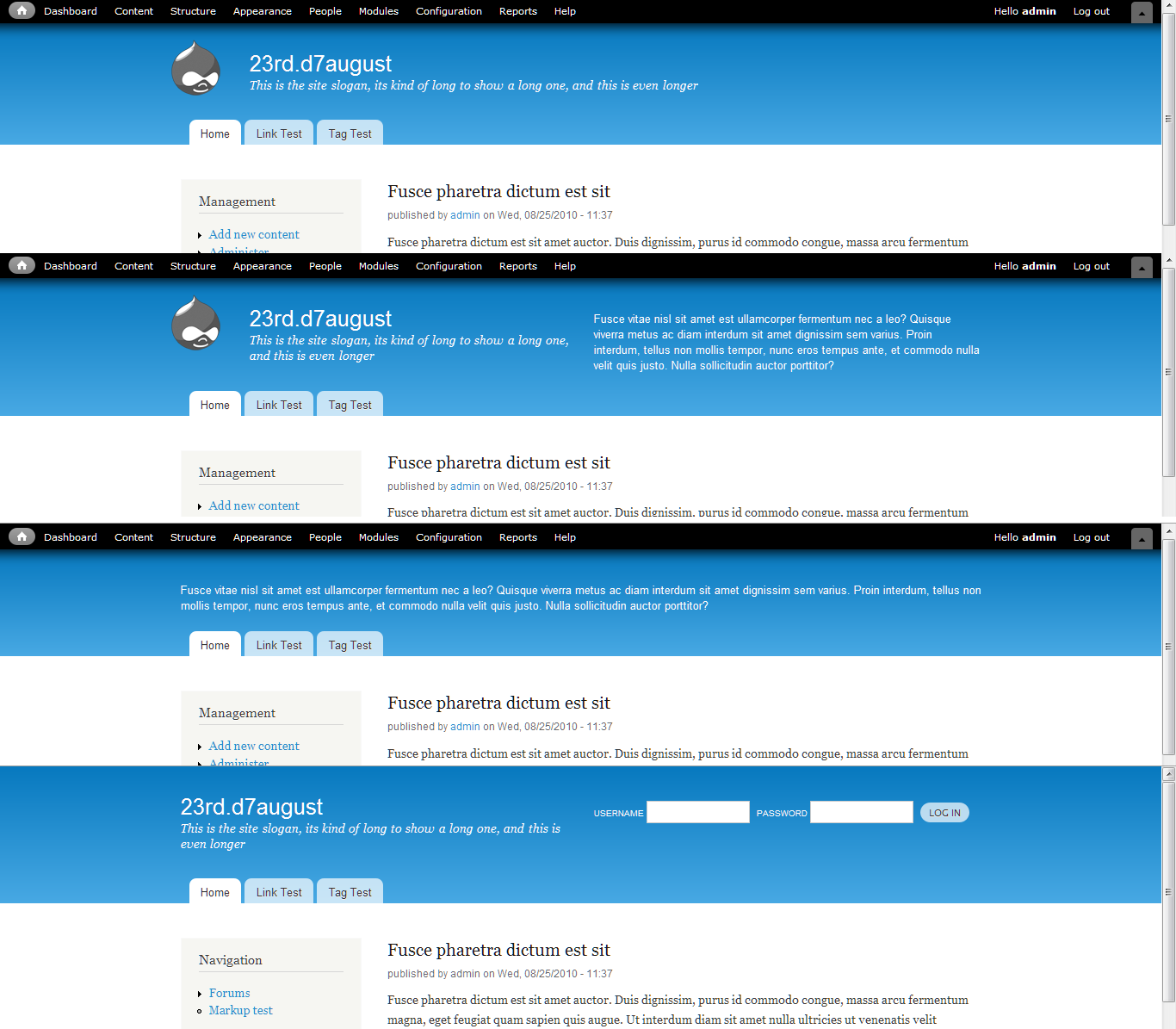
NOTE: in all these following screenshots I have removed the height property/value from the header region menu blocks...
1) Header region floated right, width 480 - the big menu is a mess in this configuration.
2) Here we just float the site name etc, with nothing special for the header region - note how eventually the header region content wraps the site name.
3) Third alternative is to clear both and put them below the logo, sitename, slogan etc - big problem here is we have a big chunk of wasted real-estate in the header.
In all these examples it should be becoming clear that the menu block styles make a lot of assumptions and are a big source of confusion and problems for making the is work.
Right now this can look like this in Bartik - as you can see there are overflow issues, the artificial width of 75% is just weird and its falling down into the Main Menu area (caused by the float:left).
So really I see several issues here we need to fix to make this work, but first we need to have some thinking on the purpose of the header region - is it for displaying a short inline menu, is it for a banner, a message (like a site mission) or is it for all these things and more?
Comment #10
bleen commentedI know that this issue (at least partially) came out of concerns that users will often want to move the user links (login, logout, etc...) links from the footer to the header. IMO that is the main purpose of the header region.
Comment #11
Jeff Burnz commentedMaybe we have to wait for some resolution to #410646: "Secondary menu" exists but is no longer the default source for the secondary links ?
Comment #12
BenK commentedJeff Burnz raises some great points in #9. I'm wondering if we're trying to get the header region to accomplish too many things at once. Is it too late in the game to add a second region in the header area (such as "upper header" and "lower header")?
It seems like more use cases might be satisfied with multiple header regions (like has already been done for the triptych and footer). I could even see a "banner" region that appears above the header altogether (good for placing user menu).
Anyway, just my two cents from a Bartik outsider looking in... There may be some important reason I'm not aware of that the core developers of Bartik want to limit the number of regions in the vicinity of the header.
Cheers,
Ben
Comment #13
Jeff Burnz commentedDrupal cannot ship with the current state of the header in Bartik - there are a number of major issues with it, however they all basically stem from the fact that the header is poorly thought out and not well coded. I know Jen spent a lot of time thinking about the logo, site name and slogan and they are fine (design wise) however we also have to deal with menus, search form, user login block and the various permutations and comibinations of those elements. Right now Bartik does a very bad job of this and its very, very easy to break the design and layout.
1 - User Login block is styled to support one color scheme (a very dark gray), it uses position absolute and breaks the design and layout. This is a must fix critical.
2 - Menus are styled to display inline and have a height set on them - if you set child items as expanded or have more items than can fit on one line the whole thing blows up, floats down into the Main menu and can even overflow into the content area. (Critical).
3 - Search block needs work (it just not presentable at the moment and could break the design depending on the configuration). Major.
4 - Pointless conditional statements (they actually do nothing) and coding standards issues (Major).
Proposal To Refactor the Header in Bartik
Issues:
a) The header layout must work in any configuration - meaning with the site logo, site name, site slogan, main menu, secondary menu, blocks in the header region (including the Login Block, Search Block, Menu blocks and others) - all these things must work in ANY configuration that can be enabled/toggled/disabled in Drupal core.
b) The style of each element must work with the re-colorable header - at a bare minimum text, forms and links must look good and be accessible.
c) The PHP needs a clean up,
d) Of course the CSS needs a major make-over.
The Patch
OK, so this patch does a lot of things and NO it does not kill kittens, well not many (a few RTL kitten get nuked, no biggie).
1) Splits the header into two columns:
- on the left #logo-name-slogan (if active)
- on the right .region-header (if active).
If both are active they are each 480px wide, if only one is active it expands to fill the space (becomes 960px wide). For example if you disable the logo, site name and slogan the .region-header will expand to be 960px wide. It does this via a $classes type variable with the logic in bartik_process_page
2) .region-header layout takes account of the patch in #889982: Move secondary links to the header in Bartik
3) Abstracts the logic for the .element-invisible classes to bartik_process_page, assigning variables to print these classes.
4) Removes the pointless IF conditions being set for things like site_name in page.tpl.php
5) Ads a new wrapper DIV to contain the logo, site name and site slogan.
6) Removes the styles for menu blocks and replaces it with something that will work if menus have child items.
7) Fixes the horizontal user login block - gives it a transparent background, translucent submit button, and it now fits inside the 480px .region-header.
8) Fixes the search block if placed in the .region-header, sets some new styles for it.
Caveats:
Almost no testing out side of Firefox. We need to fix this though, whatever it takes, we have to do this or something very close to it, else scrap the idea of a flexible header and force end users into learning CSS to have the normal Drupal options OR remove the header region from the header.
Zero RTL testing and no CSS written to support it, at all. Someone will need to do this, it wont be that hard or take very long.
The screen-shot shows how this looks in Firefox with the patch - with the the logo, site name, slogan and 3 blocks in the header region enabled. I'll post more screenshots shortly.
Comment #14
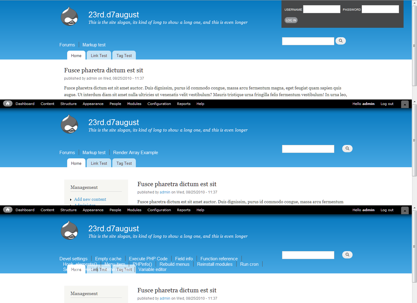
Jeff Burnz commentedOK, so some more screenshots - the first is before the patch showing the various issues (note the very obvious bug with the login block...), the second screenshot shows various configurations, its hard to show a lot because there are many...
Comment #15
Jeff Burnz commenteddang status...
Comment #16
bleen commentedDont have time for a full review .. but this is definitely not right:
+ $variables['hide']['site_name'] = ' class="element-invisible"';I dont think we ever put "class=" in a variable during preprocess
On the whole this is a big improvement though ...
Comment #17
Jeff Burnz commented@bleen18 - bit philosophical for me, patches welcome. With limited time I focused on the big picture - trying to architect a workable solution for a generic theme like this not so easy and lots of thinking & tinkering time required - less time for actually writing code. If you can help out with the finer points that'll be grand.
Comment #18
BenK commented@Jeff Burnz - I really like the direction your new header design is going... lots more flexibility and power. Great work.
Just a quick question: In the new design is there any way to place a block below the logo-name-slogan area? That was a strength of the old design... It allowed you to easily disable the "Main menu" supplied by the theme and place another menu block (supplied by D7 core) in its place. That's actually a common use case for us.
So what I really think is needed is an additional region... so that you can have content both to the right of logo-name-slogan area (such as in your new design) and simultaneously below the logo-name-slogan area (like in the old design).
If we were really getting fancy, I'd probably add a third region above the existing header that spanned the full page width (a replacement region for non-admin users who don't see the horizontal admin menus and shortcut bar going across the top of the page.)
So is there any reason why there are three Triptych regions (first, middle, and last), five footer regions (first column, second column, third column, fourth column, and footer), but only one header region?
It just seems like Bartik gives a lot of flexibility to the bottom of the page, but very little to the top of the page. The bottom line is that I think we need (at least) both a "header first column" region and a "header second column" region. If feasible, a "banner" region above the header area would be the cherry on top.
Thoughts?
Thanks,
Ben
Comment #19
Jeff Burnz commentedA lot of that Ben I can't really answer - I didn't design Bartik and I have only worked on solving the issues with regards to CSS and markup - I've not been part of the overall architecture of the design - so its not really my call although IMO yes, I think it would be useful to have an additional region in the header, in particular for the placement of a dynamic menu or similar.
From my POV I'd really rather not try to get too fancy - this is not really about adding features - its a proposed solution to a set of problems that needs to be solved.
Comment #20
Jeff Burnz commentedI'm thinking we should totally remove any custom styles for Menus in the header and the block_preprocess stuff that removes block titles as well (except for the login block).
The default doesnt look that bad and perhaps custom menu styles will be better served from contrib (eg Skinr).
We could do something like the attached screen shot if we want to get fancy with it (certainly a lot better than the current situation).
Comment #21
pascalduez commentedI've been trying to figure out the best way to resolve this issue, keeping as much flexibility as possible, and I did a try with having two regions for the header. This looks the best compromise if we want to keep a certain level of formatting. It's always hard to understand where to stop in modifying the theme, without overriding previous Themers work... So I tried to modify the minimum, thus some elements like the search block would need more love.
Comment #22
Jeff Burnz commented@21 - adding a new region is a feature request, I cant see how adding a new region helps fix the issues. Also we can't be afraid of changing things - there are lots of special cases that are not going to work in the real world - we have to change it.
Unless Jen and webchick come along and say yes to a new header region I think we need to leave that off the table for the time being - we need to concentrate on fixing the issues - my feeling is adding a new header region may unduly complicate things.
I rerolled the patch in #13 to add:
- RTL support for the layout and fixes a bug with the search button in RTL mode
- Removes all special casing for menus in .region-header
- Gives blocks back their titles (except the login block) - its easy to remove a block title using
<none>If you are posting a report about RTL please be aware that there are many RTL bugs in Bartik so please be sure that it pertains to this patch and not some other issue already posted.
Comment #23
Bojhan commentedI am not so concernd with it looking similair to drupal.org, as far as I see drupal.org has a very distinctive top level navigation - so from that pov should be no problem.
Comment #24
jessebeach commentedOne of the underlying issues is that the CSS is conflating LTR/RTL support with a gridding system. Take this declaration for example:
This code makes it impossible to treat a block as an anonymous container that behaves in a consistent, predictable way. It forces the block to take on the semantics of its contents. From this we will find problems with the order of the blocks and the interactions with siblings blocks, especially blocks that also have a gridding structure conflated into them as well. Following this path, we will end up writing styles to deal with each combination, an unenviable approach. More specifically, this block is floated left to support LTR, but in this particular case, it would be better to not have it floated at all.
The menu overlap issue disappears when we rewrite the declaration like this
targeting the menu inside the block, not the block itself.
Comment #25
Jeff Burnz commented@24 - the problem with your example is that it results in something very different for what is intended and would result in many inheritance issues. The patch in #22 removes all special casing for menu block styles in the header region - they are too fragile and do not account for things such as expanded/nested menus.
Comment #26
jessebeach commentedGood point. Does Bartik have designs or a spec that I could read up on so I'm not tossing out comments without context?
Comment #27
Jeff Burnz commented@jessebeach AFAIK no, I have never seen the original designs or any specs - its just a matter of reading the code and building familiarity + having a rock solid grasp on Drupal 7 core (as in what a user can change, do, output etc). Being the core theme it has to account for all options (which is a lot of permutations). This is where Bartik is falling down right now - that is *the* underlying issue behind many of the recent patches and bugs.
It would awesome if you got involved, we need another front end engineer to help - lots of patches to review and discuss and many more to write also!
Comment #28
pascalduez commented@21 - I did not intend to just pop in and resolve the issue in one finger snap. Take it more as a test, because the two regions solution came out a couple of time in this thread, I though I would give it a try. Of course it's way more easy than dealing with only one region...
I'm not used to work on the issue queue and best pratices for collaboration. So give me some time.
What seems really a pitty with keeping only one region is there's almost no (clean) solution to put content underneath the logo/site name/slogan and on the right side at the same time.
An idea : deciding that certain blocks would be always left or right positioned, i.e. if the login block is placed in the header region always float it right, menus always floated left. Although it would allow to keep a certain control over the formating, it might frustrate the end user.
I would definitely be interested in contributing / helping on Front-end issues, but as for @26 I would love some kind of guideline / tipp to put us on the right track.
Comment #29
Jeff Burnz commented@28 - basically I'm all for another region in there - so you can do exactly as you describe - place blocks/menus etc to the right of the branding elements and then below the branding elements. It definitely can solve that requirement (if you needed it) - however that is not really the issue - the major problem is with the hard coded formatting of menus and other blocks (like the login block) and the fragility of the layout of the existing header elements.
So this issue its about:
1) Removing these hard coded styles for menus, fixing the login block and fixing any other broken block/menu styles.
2) Adding some basic layout and intelligent region handling so a much broader range of layout options are possible (with the existing regions and elements).
I view the addition of another region as a feature request (which are closed for D7), so unless we can show that the extra region is an intrinsic requirement for solving this issue we can't include it. I can't see that it is at this stage.
I think its good to provide some style for blocks in the header, but its a slippery slope. For sure we are making gigantic assumptions about the login block (indeed using display:none; to hide the links in the login block is highly debatable). I think we need to be cautious here and not make too many assumptions, but provide something that actually does work (currently many things are easily broken or are broken strait off).
Heres some links to help out:
Standards, security and best practices
Core Theme Candidate Requirements
Accessibility Guide
Its really hard for me to give much guidance (if you can be specific I can try) - I'm mostly drawing on my years of experience building themes for contrib.
Right now one very important task would be to actually test the patch in #22 and see if anything breaks (especially cross browser testing) and give feedback as to how it might be done better.
Comment #30
bleen commentedthis is a re-roll of #22 (chasing HEAD)
I tested with FF3.6 & 4, Safari 4, chrome 5 and all seems well with the world. I would still like to see the user menu handled better since that is one of the more likely use cases IMO, but in general this patch is a big big improvement and I think it could be RTBC as is.
screenshot A

screenshot B

Comment #31
Jeff Burnz commented@bleen18 - the user menu will be shifted to the top corner #889982: Move secondary links to the header in Bartik so I don't see that as an issue. Menu handling for this region is hard - I'm pretty much out of ideas other than leave them alone?
Comment #32
sunCan someone explain to me why there are so many styles for something that gets hidden in the end?
Powered by Dreditor.
Comment #33
Jeff Burnz commentedLol, no not really, good spotting. Actually the patch updates stem from a strait search/replace - they can most certainly be removed. I recall I was in two minds whether to totally remove those links or keep using display none (kinda of clunky but easily reversible for end users).
Comment #34
Jeff Burnz commentedRe-rolled to account for #32 - removed redundant styles.
Comment #35
Jeff Burnz commented#34: bartik-fix-the-header-845834_4.patch queued for re-testing.
Comment #36
Bojhan commentedSo
Comment #37
webchickI'm officially downgrading this to "major". There's no reason for this to hold up release (Drupal works just fine without this patch), though it's a limitation that we ought to fix.
Comment #38
Jeff Burnz commentedThe patches I have, up to this point, submitted for this issue are pretty radical to be frank, I think we can scale this back to just attack the most important issues:
1) Fix the Login Block styles
2) Remove the custom menu styles
3) Fix the search block
4) give it some sensible layout
The main different between my previous patches is that they have new custom menu styles and some pretty sexy handling of the layout - we don't necessarily need those to fix the bugs.
Comment #39
Jeff Burnz commentedEmbedding an earlier image to show the issues I am referring to:
Comment #40
Jeff Burnz commentedThis will no longer apply since #660614: Remove #block-system-main dependency, fix font sizes, remove crufty CSS landed, re-roll coming with some simplifications.
Comment #41
Jeff Burnz commentedThis patch follows on from #38:
1) Fix the Login Block styles
- removed hard coded background color (was a very dark gray) and other styles
- accounts for OpenID and now shows all item lists
2) Remove the custom menu styles
- remove the horizontal menu style
- added new vertical menu style not unline the footer menu, and its the same width as the sidebar block
3) Fix the search block
- remove styles, thats all
4) give it some sensible layout
- header region floats left, + the blocks float left inside it (LTR)
- site name etc float right
- added two new classes so we can account for when the secondary menu is active
- now hide ALL block headers with element-invisible
Big job this and I have not had time to test it much - only tested with any rigour in Firefox 3.6.x and IE9. The main difference to earlier patches is that we no longer bother with the dynamic layout/splitting the header in two sections etc.
Screen shot shows various blocks and configurations in Firefox.
Comment #42
bleen commentedisnt this redundant?
missing indent
RTL?
Powered by Dreditor.
Comment #43
Jeff Burnz commentedI think the patch is going to fail, I didn't check the times but I think webchick committed something...
IE6/7 will apply the menu list-style-images without that, regardless of the above line, so not redundant.
Admittedly the patch is a little rough, since this needs discussion regarding the design + direction, we can clean up that stuff in due course (for example I did no RTL stuff for this at all, as yet, so yes, it will blow up your site in RTL atm).
Just setting back to needs review cause I want the bot over it.
Comment #44
Jeff Burnz commented#41: bartik-fix-the-header-845834_5.patch queued for re-testing.
Comment #45
Jeff Burnz commentedOK well seems it passed so am moving on with this - this patch brings in the RTL styles, cleans up the spacing reported in #42 + fixes my rather bad oversight of forgetting to make the header region text and links colorable (they get the site name / slogan colors).
In RTL mode IE6/7 get deprecated styles for the login block (basically reverts back to a pretty standard looking login block), it was very hard to trigger hasLayout and we had some other issues, at the end of the day I only have so much time for debugging these old browsers in RTL - but it works, it looks good, I am satisfied with it.
I've tested in FF 3.6.x, Opera 10.62, Chrome 5, IE6/7/8/9.
The patch has special styles for:
- All blocks in header region (hides the title using element-invisible)
- Menu blocks in the header region
- Login block in header region
- Search block in header region
- Language switcher links are displayed inline
I think we're nearly there. This patch touches about half the files in Bartik and there are a lot of little tweaks and changes - while this might raise questions as to why I am adjusting things like the menu alignment - well, to make it all "work" as a design we need a lot of fine details - imo thats what makes a great design - its in the detail...
Comment #46
Jeff Burnz commentedRolling in the fix for active main menu item from #929574: Bartik's main-menu is missing style for active tabs, this is within scope I believe as we are trying to fix everything with the header, apart from the hard core RTL stuff for the main menu which can wait.
Comment #47
tim.plunkettThis patch is phenomenal work. (This bit just slipped in during the reroll, it looks like). I'd RTBC, but it still is tagged needs design review.
Needs line break.
Powered by Dreditor.
Comment #48
Jeff Burnz commentedGood spotting, I re-rolled to account for the code style issue in #47, I also noticed I placed some rtl layout stuff in style-rtl so I moved that to layout.rtl, so should be good to go.
Indeed, its a big patch and I spent a long time thinking about it and even longer writing it...
Comment #49
Jeff Burnz commentedOK, better actually attach a patch...
Comment #50
tim.plunkettThis is ready, both visually and code-wise.
Comment #51
bleen commentedtremendous improvement ... RTBC++
Comment #52
yoroy commentedThe screens in #41 look great and are proof that with this we'll have an actually useful header region.
Excellent work Jeff!
Comment #53
dries commentedGreat! Committed to CVS HEAD.
Comment #54
plachJust stumbled upon this issue. IMO we have a problem with the language switcher: it seems that having inline links don't scale well (see the attached screenshots).
Anyway, Locale can provide an arbitrary number of language switchers (one for each defined language type) so we should be using
.block-localeas CSS selector.Comment #55
Jeff Burnz commentedI agree, it was an oversight in the patch to not prefix the styles with .region-header class.
We should open an issue for quickfix reviews that need to occur before release - there a several issues like this with regards to block lists and list indentation etc that could all go in one patch, we're talking maybe 3 or 4 one liners here as a cleanup.
Comment #56
plachThe attached patch should fix the language switcher. Feel free to incorporate it in a bigger one and close this issue.
Comment #57
Jeff Burnz commentedVery simple, this can go in right away (the small patch in #56).
Comment #58
webchickCommitted to HEAD. Thanks!
Comment #60
brayo4 commentedDrupal 7.12 does not ship with this patch. Will try to manually patch all the current files........