
 Come together with the global Drupal community in Rotterdam, 28 Sept – 1 Oct 2026. Sessions, contribution, connection, and Early Bird savings until 8 June.
It seems to be pretty jarring to me atleast when I hover over or click on buttons in the seven theme.
I think there needs to be some middle ground for when the buttons are being hovered over in order to make the transition seem smoother.
| Comment | File | Size | Author |
|---|---|---|---|
| #57 | seven-buttons-hover-846182-57.patch | 5.31 KB | geerlingguy |
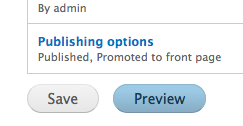
| #54 | ButtonOnFocus.png | 19.76 KB | mgifford |
| #54 | ButtonOffFocus.png | 14.85 KB | mgifford |
| #52 | seven-buttons-hover-846182-52.patch | 5.28 KB | geerlingguy |
| #47 | seven-buttons-hover-846182-47.patch | 5.62 KB | reglogge |

Comments
Comment #1
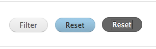
szantog commentedThis patch set the active grey background on hover state.
Comment #3
szantog commentedHmm.. Sorry, a hope, this is correct patch format.
Comment #4
szantog commentedand let's needs review..
Comment #5
Jeff Burnz commentedSelectors all go on new lines to conform to Drupal CSS coding standards.
Powered by Dreditor.
Comment #6
szantog commentedOk, I learned it. :)
Comment #7
mikey_p commentedIt seems that it would be nice to have two separate states for hover and active. Is there anywhere else that does this in core?
Comment #8
reglogge commentedSince the button-background in seven is already set to a slice with grey and blue backgrounds, it would be better to just use this. We can activate the lower half of the background-image in blue for the hover-state (screenshot and patch attached).
The :active styling remains the same as before (dark grey background).
When using the :hover pseudo-class we should also always use :focus for the folks who use the keyboard to navigate.
The styles
with div.node-form input#edit-submitlook like cruft, since on the node form there is no div.node-form anymore...Comment #9
Jeff Burnz commentedI always wondered why that blue bit was not used! This needs broader reviews.
Comment #10
jacineCool! This will need to be updated in jquery.ui.theme.css too. Those buttons are styled for Dialog boxes (not the overlay).
Comment #11
reglogge commented@jacine: where are the dialog boxes used in core? I can't find a place to test them.
Comment #12
jacineI'll get you some to test this with soon, since there is nothing in core. Hang tight :D
Comment #13
reglogge commentedAdjusted the text-color of the :hover state button a little so the buttons pass WCAG AA and WCAG AAA. I tested this with a background-color of #98c4df, which is right in the middle of the blue background-image. Test run here: http://webaim.org/resources/contrastchecker/
Comment #14
reglogge commentedSorry, but the patch in #13 was borked. New, correct patch with the styles also applied in jquery.ui.theme.css.
EDIT: I don't have a way to test/preview the buttons in a jquery control. Jacine will test this over the weekend :-)
Comment #15
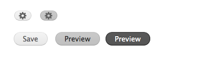
reglogge commentedScreenshot of all three button states (normal, :hover/:focus, :active) attached
Comment #16
Jeff Burnz commentedLooking good, the only thing I am not sure about is the blue, because everywhere else Seven (and Toolbar) are shades of gray, should we be introducing a color here or use another warm gray instead?
Comment #17
reglogge commentedI'm not sure either. The blue was just there already, so I assumed that it was meant to be used...
To me it's rather pretty though.
Comment #18
reglogge commentedAlternative in grey with the :active state button also having his background from the slice.
Patch and the new background-slice attached as well as a screenshot.
All colors pass WCAG AA and AAA.
buttons.png has already been smushed to 503 bytes.
Comment #19
jacine@reglogge I didn't get a chance to test today, and probably wont be able to until Monday, but I DID get you some code to test with. You can either check it out via CVS: "contributions/sandbox/sun/markup_test" or use the tarball I've attached. Once enabled go to markup_test/page/theme-roller.
BTW, don't blame me for those tabs because that's not the code I got committed. :D Not sure what happened there.
I hope this helps!
Comment #20
reglogge commented@jacine: Thanks, that really helps!
So here is the entire shebang, tested with regular buttons and also in jquery-dialogs.
Two versions: blue and grey hover states.
The blue variant (in this comment) consists of:
- The patch seven-buttons-blue.patch
- The screenshot screen-buttons-blue.png
- The new background-image seven-buttons-blue.png that needs to go into sites/all/themes/seven/images and be renamed to just buttons.png there
The grey variant (in the next comment) consists of:
- The patch seven-buttons-grey.patch
- The screenshot screen-buttons-grey.png
- The new background-image seven-buttons-grey.png that needs to go into sites/all/themes/seven/images and be renamed to just buttons.png there
For both variants I now use a new background-image for all the button states.
In the active state, the dark button gets a slightly less dark border to underline its *inverted* character (it has white text on dark background). Feel free to discuss this :-)
All colors in both patches pass WCAG AA and AAA.
Comment #21
reglogge commentedGrey variant as described in #20
Comment #22
mgiffordI like it when it's in hover mode, I don't like how it looks when you click on it.
Comment #23
mgifford#21: seven-buttons-grey.patch queued for re-testing.
Comment #24
mgiffordI think @Bojhan or @yoroy need to give some usability feedback on this I think it's an improvement, but some design folks associated with Seven need to give it the thumbs up I think.
Comment #25
Jeff Burnz commentedyes I think its an improvement also, blue seems be the color of choice for "message display" such as skip link (will likely change to blue), the "show blocks back to the blocks page" reverse tab and the new "disable the overlay" messages. I don't even like the blue hover state at all, it just seems to jump out of nowhere for no apparent reason - the grays are much nicer.
Comment #26
mikey_p commentedThis looks good to me, I'll try to post a video of this shortly.
Comment #27
mikey_p commentedCouldn't post a video, but fwiw, Bartik has a similar hover state, but no active styles :(.
Comment #28
adrinux commentedI found this issue after getting frustrated with the 'manage display' tab when editing a content type - took me ages to figure out I had to use the button with a cog because it looked greyed out and didn't respond on hover - the latter problem is part of this issue.
Patch in #21 does indeed improve most buttons but not these buttons with a cog. Attached images show that it looks bad in blue but worse in grey - unfortunately the background colour chosen by reglogge in seven-buttons-grey.png matches the colour used for the cog pretty closely.
That said, I don't think I'm the only one that thinks the default state of these cog buttons looks 'greyed out'. So perhaps the solution is to use a darker cog.
Currently these buttons are using the core misc/configure.png for the cog. It might be easier to use seven's own cog in ui-icons-222222-256x240.png or ui-icons-454545-256x240.png, but that's also much smaller circa 14px vs 6px. So not a good replacement.
Or perhaps those cog buttons need a different hover background colour - but that seems inconsistent.
Not sure which way to go, but patch needs work :(
Comment #29
reglogge commentedHere is a new patch based on #21 using a new darker image for the cog.
- The attached image configure_dark.png needs to go into /misc
- The attached image seven-buttons-grey.png needs to go into /themes/seven/images and to be renamed to buttons.png there
- The attached screenshot screen-buttons-grey.png shown the normal and hover states of the button with a cog side by side
Comment #30
joachim commentedLooks great, and the fix to the display settings cog is very good too.
But the disabled buttons still change when I hover, which makes them look like they *might* be clickable after all.
Comment #31
joachim commentedOne other thing, the buttons now look pretty weird on click.
Comment #32
reglogge commentedjoachim: Could you be more specific as to which "disabled" buttons still change state on :hover?
I attached a patch that darkens the border for the buttons on the :active state, so that they don't look inverted anymore.
The additional files from #29 would still have to be committed additionally.
Also bumping this to major since missing hover states are pretty bad for accessibility reasons. I think this should get in before release.
Comment #33
joachim commented> joachim: Could you be more specific as to which "disabled" buttons still change state on :hover?
Argh, I can't find any disabled buttons in the UI :/
Comment #34
Josh The Geek commentedSubscribing. Looks good!
Comment #35
adrinux commented@joachim I can't find any disabled buttons either - in fact I don't think there are any, I think the problem may be that buttons you thought were greyed out actually weren't, they *looked* disabled, but actually did something. After all if it's disabled, ie does nothing, why bother printing it at all?
Comment #36
yoroy commentedTagging. Will test this later but could use screenshots 'in action'.
Comment #37
adrinux commented@yoroy doesn't screen-buttons-grey.png in #29 do the job? It's an amalgamated screenshot showing both states, not an image that needs adding to the theme.
Comment #38
reglogge commentedHere is a composite screenshot of the buttons and the cog-buttons in their state from #32
Comment #39
dixon_This seems to be able to still get into D7?
The Drupal 7 release party in Stockholm, Sweden will update, test and review this patch so we hopefully can make some progress on it.
By assigning this to me, I'm by no means stealing this issue. Just stating that I'll coordinate some work on this tonight.
Comment #40
reglogge commented@dixon_: Are you still working on this?
Comment #41
dixon_Sorry, not really. BI tried to organize some work around this on our D7 release party. But the party is over now.
But I'd gladly take on the challange later, though! :)
Comment #42
Jeff Burnz commentedCan we get a re-roll of the latest patch here - the one in #32. UX definitely needs to look at this.
Comment #43
quicksketchI should note that most browsers don't have a "hover" state on default buttons at all. This doesn't seems like a bug at all. The lack of an "active" state (the state when the mouse button is down) is quite annoying however. The discussion in #1050616: Figure out backport workflow from Drupal 8 to Drupal 7 looks as if it's going to make major and critical bugs actually prevent development of new features in Drupal core, so I'm re-categorizing issues to their proper levels (see http://drupal.org/node/45111).
Comment #44
Bojhan commentedSooo many pictures, can we get the final in-action pictures of the hover state?
I feel this is pretty close to RTBC though.
Comment #45
mgifford#32: seven-buttons-hover-32.patch queued for re-testing.
Comment #47
reglogge commentedHere's a new patch that should apply.
I also re-attached the screenshot from #38 that shows the buttons in normal, hover and active state as well as the new darkened cog which also works on buttons in hover state (screen-buttons-seven.png).
Comment #48
mgiffordI tried to port this to the new file layout. Unfortunately Hunk #1 FAILED at 657.
1 out of 1 hunk FAILED for rejects to file core/themes/seven/style.css
So this needs a bit more time.
Comment #49
Bojhan commentedLooks good to me visually, so feel free to put this to RTBC
Comment #50
mgifford#47: seven-buttons-hover-846182-47.patch queued for re-testing.
Comment #52
geerlingguy commentedManual re-roll from #47.
Comment #53
nod_tested and works well.
Comment #54
mgiffordAgreed. I ran it through the color checker too and that went fine.
http://webaim.org/resources/contrastchecker/
Will be great to get this in Core.
Comment #55
catch#52: seven-buttons-hover-846182-52.patch queued for re-testing.
Comment #57
geerlingguy commentedRe-roll (the file
core/themes/seven/jquery.ui.theme.csswas changed at some point to remove the vendor prefixes). Should be good to go again, but letting testbot run first.Comment #58
geerlingguy commentedBack to RTBC, since there were no code changes, just a reroll.
Comment #59
webchickNice visual improvement! Also, I'm shocked that you can get graphics like that into a patch. Let's see if it works. ;)
Committed and pushed to 8.x. Thanks!
Comment #60
geerlingguy commentedNice! And, I've had great success doing
git addto stage new files (and changes), then runninggit diff --cached --binaryto get all the changes (including new files) in one patch file. Makes life easier when you don't have to throw around a bunch of files along with a patch.Comment #61
Bojhan commentedHmmpf, lets discuss this some more. Having it seen in action, its really a bit strong - we shouldn't really be using a plain color, where the rest uses a elegant gradient.
I know I signed of on it, but I was wrong :) Luckily we aren't in release mode, so lets just work on this some more.
Comment #62
mgifford@geerlingguy can you revise the patch (realizing the old one is now in core) to consider @Bojhan requirements.
Any concerns with reducing the contrast a bit so it isn't quite so strong?
Need any help to add in the gradient?
I really wish that for Seven that we had a Inkscape.org vector image that anyone could just download and muck with. I'm not sure how your original images were done, but would be useful to share them if you can.
Comment #63
geerlingguy commentedI think I was using the images from #29 - maybe reglogge has the originals?
Comment #64
Bojhan commentedI will take the time to come up with good alternatives and try to WCAG check em
Comment #65
lewisnymanI'm going to try and find time to come up with a follow up patch for this that makes the active states easier on the eye, this is really bothering me.
Bojhan if you want to find time to throw ideas around and do some quick iterations let me know.
Comment #66
Bojhan commentedI am actually working on this, however I decided to scope it to everything in the Seven world.
Comment #67
lewisnymanLet's mark this as 'fixed', this issue has a spiritual follow up in #1986074: Buttons style update