
Closed (fixed)
Project:
Advanced Forum
Version:
6.x-2.x-dev
Component:
Styles
Priority:
Normal
Category:
Task
Assigned:
Unassigned
Reporter:
Created:
29 Jul 2010 at 20:43 UTC
Updated:
11 Apr 2012 at 22:50 UTC
Jump to comment: Most recent, Most recent file

Comments
Comment #1
michelleThat's pretty cool. Since all the button handling is in images.css, now, we can be more flexible at the theme level without having to change module code. Ideally, I'd like both methods to be possible. Using regular graphics means people can grab graphics from other forum software and pretty much drop it in. This would be a great alternative, though.
I've only given it the briefest looks because I don't have much time right now but I'm definitely interested in learning more.
Michelle
Comment #2
WorldFallz commentedlol, I only ever use core forum +advanced forum so this never occurred to me. ;-)
Do other forum icons actually have the text hard coded into the graphic? Can you point me to some sources of these buttons/styles? I'm curious to see.
Another option would be to use a generic sliding-doors type button graphic that preserves the ability to use custom button graphics but still using drupal's translation facility to place the text.
Comment #3
michelleI've looked at MyBB and PHPbb and they both have buttons with text. They are both GPL and many of the themes for them are also GPL so they make a source for buttons. I haven't had much luck getting anyone interested in making custom buttons for AF beyond the ones that are already there so giving people the option to grab them from other forum software's themes is useful.
What I'm envisioning, but haven't tried, yet, is to just have separate stylesheets for the different methods. The text is already there and the images are added to a span as a background in CSS. So I'm thinking it shouldn't be too hard to adapt that so it works for both methods. Just need to dig in and try it. :)
Michelle
Comment #4
WorldFallz commentedwhat are there like about a dozen buttons or so? Do you already have a complete list of what needs buttons? I'm no leonardo davinci, but I have photoshop and could make you a custom set. Do you have a particular style in mind? Chrome/ metallic? Aqua? Glossy?
Comment #5
michelleSorry, didn't mean to just let this one drop with no response. I'm giving the issue a new title because I think it's worth giving the whole system an overhaul. I'm pretty set on using CSS for the image handling because it make styles so much easier. I know it's not ideal from an accessibility point of view but will do my best to ensure accessibility is maintained without resorting to actual img tags.
So here's some options I'm throwing out there:
1) Pure CSS. That is, no image at all, like the link in the OP.
2) Blank graphic with sliding doors & actual text.
3) Graphic with text as part of graphic.
#3 is the current method and makes for the prettiest option but the other two have merit as well. Regardless of which method becomes the default, I'd like to try and make it possible for a style to implement any of the options.
A couple things that really need fixing:
1) If we keep the graphic with text, the actual text needs to get indented out of the way.
2) I used a lot of extra spans based on what phpbb does but I'm not convinced they're really needed.
@WorldFallz: Thanks for the offer on making graphics. Let's hold off, though, until after this is cleaned up so I know exactly what we need.
One more random thought... Need to check up on what core is doing in D7.
Michelle
Comment #6
michelleOoooh... I remember why the extra spans now. I wanted to keep the text in place so it would show if people turn images off. So I couldn't just set the image as the background of the text. I guess the question is, how much of a concern is that? Do people view sites without images on anymore? Is that an accessibility issue? I'm fairly sure screen readers are ok if you do text-indent -9999 so it isn't visibly on the screen so that shouldn't factor. This would just affect people who turn off image display in their browsers.
Michelle
Comment #7
michelleSince it's taking me a while to get this code changed and committed I figured I should update the issue to avoid having anyone spending time on this while there's uncommitted code. I ended up deciding to go with a no-text button in the background with text on top. Of all the ones I looked at, this method offers the most flexibility and still keeps things accessible and translatable.
Michelle
Comment #8
meustrus commentedI don't know if you've committed anything yet but after installing the latest dev version (last latest dev version, not the Oct 14th one, though that one didn't fix it back) I no longer have image-replace in comments on forum topics. They exist in nodes and on comments in other content types.
Comment #9
michelleNo, I haven't committed anything yet. It's possible something slipped thru when I rolled back my work code to commit some other stuff a few days ago.
Michelle
Comment #10
mpotter commentedConfirmed that the extra spans for the image replace are not being added to the Comments. No matter how this image replacement stuff is fixed, you should not have the raw HTML for this in the *.module file. Should be in a template somewhere. I really hate having to patch the module itself to add these spans rather than just doing it in my own forum style/theme files.
Note: I am not using Node Comments.
Comment #11
mpotter commentedLooks like you lost an entire section in the advanced_forum_preprocess_comment.inc file (comparing Alpha 3 with the 2.x-dev files). Adding the following "Link section" worked for me:
Note that I had to remove the section titled "// Add extra span tags for image replacement." to prevent duplicate span tags since the drupal_alter is already handling this now in the hook_alter_links in the main module file.
Comment #12
michelleThat whole bit is gone intentionally and isn't part of this issue.
Michelle
Comment #13
mpotter commentedUmm, ok, so then why don't comments get the image-replaced buttons without this? Am I missing something else here? What was the "intention" for removing this?
Comment #14
michelleThe code was removed because it is redundant now that link changes are being done via hook_link_alter.
I don't know why you aren't getting images. It's quite possible something is broken in the dev snapshot.
Michelle
Comment #15
mpotter commentedOK, I'll let you look into it then. I looked through the code and couldn't figure it out. The advanced_forum_alter_links *is* getting called for comments, but the $variables['link'] is not getting re-themed with the updated $links array. With my above code, the advanced_forum_alter_links gets called twice for comments, so the important line seems to be the one that sets the $variables['link'] value again. I'll wait till you post Alpha4 and then take another look. Till then the above "patch" will allow my forums to work properly.
Comment #16
michelleI've started work on this. Going to be committing the module changes before the CSS changes are done so things will be messy for a while. Hopefully people will heed the warning I put on the project page and release notes and not use the dev snapshot in production. Not that you should ever do that but, realistically, people do. So I'm going out of my way to warn them that it's an especially bad idea right now.
Michelle
Comment #17
michelleWaiting on someone who's supposed to be working on the CSS for this.
Comment #18
svenrissmann commentedFor my opinion there should be three ways of "link outputting" !?
1.) Simple Text links 2.) Image Buttons 3.) CSS Buttons
I think on the settings page must be a pulldown to choose the linktype. No more silly image-replacing via CSS!
If you agree I would do this workaround.
Comment #19
michelleNo, I don't agree and I don't consider it to be "silly".
Michelle
Comment #20
svenrissmann commentedHum, but why overlaying text if no text is needed?
May be I'm blind on this, but there could be images with out the text!?
Comment #21
michelleOverlaying the text on background images rather than embedding the text in the images is better for accessibility and translatability. Images unrelated to text are not affected by this change.
Michelle
Comment #22
michelleFixing category. I'm filtering out FRs right now and don't wan to lose track of this.
Michelle
Comment #23
greywolfsspirit commentedOk, Michelle, based on your previous comments, with the changes you're working on, the fact that the buttons are in odd positions currently is temporary until you straighten out the css stuff then, right? The reason I ask is the current dev I just looked at has them overlapping the #post/new posts area in the header area and the edit/delete/quote/reply ones are blocking right after my links from the print module (Email this page, Printer Friendly, Send to Friend, PDF Version). Not sure if you have used that module on your site, but just wanted to check about this. If you need a snapshot to see what I am getting, let me know and I will post one.
And no, I'm not complaining, just want to make sure I'm on the same page with the thought process is all. :-)
Jim
Comment #24
michelleThe top one is from #974840: Redo topic header . The node links floating problem is an old one that I haven't figured out a cure for, yet. I don't think there's an actual issue for it but I'm well aware of it because I see it on my own site.
Michelle
Comment #25
greywolfsspirit commentedOk, just wanted to make sure. I'll hold off on the current dev on the active site then and keep an eye on this to see when the css is fixed. Thanks, Michelle.
As for the 2nd.. I wonder if adding a forced line before printing the link buttons would fix it? I think I remember seeing something like a \r\n code needed for a new line on some things in php.. (granted I'm not proficient at html/css/php, but I had to do something like that in the recipe module to move some text down a bit away from included graphics).. let me see if I can find what I did real quick here..
ok.. a few options I see are:
If you are trying to format your HTML source, you should use the constant PHP_EOL. The main reason being that on windows machines the EOL is \r\n and on UNIX machines it is \n. With a properly installed LAMP set up just use PHP_EOL like so.
$html.="
This is my HTML
" . PHP_EOL;
if you are trying to output a textarea, then use nl2br();
Maybe this will spark a few ideas?
Jim
*Edit*
Ok, I tried this approach and it forced each link to be on it's own line..
under near the top, where it assigns $all_classes = ""
at the end of that all before the last }
I added in
$fixedlinks = nl2br($links);
then near the bottom of the file, I changed the
print $linkstoprint $fixedlinksto get this..Again, not quite the result we want, but perhaps I might be onto the fix here..
Comment #26
michelleThanks, but that's for formatting source code, which is a totally different thing than getting floats right. :)
Michelle
Comment #27
greywolfsspirit commentedSighs, dangit.. lol.. thought maybe it was something in there.. Can't blame me for trying though. Seems there should still be some way to check string length and have it toss in an automatic newline then continue with the string.. Oh well.
Comment #28
michelleProgress report:
1) New style Silver Bells has all the new image handling plus the new images.
2) Blue Lagoon and Cloudless Day are now substyles of Silver Bells so they can inherit the images as well as the improved styling.
3) Blue Lagoon has been converted over but desperately needs a replacement "folder" icon.
4) Cloudless Day still needs to be converted.
5) The new way of doing things isn't compatible with the old way of doing things. I'm sure there's a way to make it so you can still use images with embedded text. I could use someone good with CSS to sort that out.
Michelle
Comment #29
greywolfsspirit commentedThese were on a package of GNU icons I downloaded a while back, but see what you think of these, Michelle
The Red halt sign on the folder for locked..
The newspaper on the folder for new messages perhaps?
and the regular folder for no new messages..
Comment #30
michelleHonestly, I don't think full graphics like that look very good as forum list icons. I originally had a full photo-realistic bell image in Silver Bells but the simple line drawing looks much better. I'm hoping someone will do something like that for the default image. Doesn't have to be a folder, even, just something to denote forums with and without new posts.
Thanks,
Michelle
Comment #31
greywolfsspirit commentedOkay I tried. I went and used those on my site for the blue lagoon and it looks fairly nice to me. So that's why i suggested them to you. No biggie, just thought I would give you a suggestion on them. :-)
Comment #32
michelleI appreciate suggestions. I don't always use the suggestions, but feedback is always appreciated. :)
Michelle
Comment #33
WorldFallz commentedsorry I've been out of the loop on this issue-- i can whip up some simple default images/icons. do you already have a starting set you want to extend?
Comment #34
greywolfsspirit commentedNot a problem, Michelle. Right now I'm trying to figure out why all of a sudden, after having to re-install windows on my system, my site is running slow as molassas. Was getting great response time off of it before hand, now it's taking up to 2 minutes for responses back in some areas again. And I'm stumped as to what's causing it. Looks like I will have to sandbox a demo site, and add modules back in one by one to see what is causing it. Whether it's a php extension or an apache module that I don't need, who knows. Sighs, the struggles of trying to run a site lol.
Comment #35
michelle@WorldFalls - Silver Bells uses a very simple image. Here's the version for forums with new posts. The default one is white so you can't actually see it in the CVS browser. :) I'd like to do something similar for the generic "folder" icon. Putting more 3D type graphics there just doesn't look right to me. You can see it here: http://shellsn.com/forum . (And, yes, I know I need to add a background to the legend. :)
@greywolfsspirit - Never a dull moment, eh?
Michelle
Comment #36
meustrus commentedSo, is the dev version stable enough yet that it won't break things (or at least, that I can modify the theme to fix)? I could easily provide CSS to get the old style to work, if I've got specific requirements and the new CSS.
Comment #37
WorldFallz commented@Michell-- ah ok so you just need the 3 forum-list icons (forum_list_default, forum_list_locked, forum_list_new_posts) for the silver bells theme? Or do you want to keep the current white and yellow bells and just need one for locked?
Sorry if i'm being dense... long day, lol.
Comment #38
michelleSilver Bells is fine. I need to clear out references to locked. It's not used by AF and just confuses people because they think AF should be able to lock forums. It was put there figuring it would be possible eventually but I'm just going to take it out until it actually is possible.
What I need is a "no new posts" / "new posts" combo to use as the default images. It can be a folder or it can be something else entirely if someone has a better idea. Right now, Silver Bells is the only one that has different forum list icons so I need something that will work for the rest of them. The background square gradient is done in CSS so I just need a simple icon to sit on top of that.
@meustrus - The dev is working except for Cloudless Day and Boxy styles and as long as you don't use the forum override that you get in conjunction with Page Manager. You can have PM on the site; just make sure the override is disabled. I mean, it's not working 100% as there's still issues but those are the two really big ones left before Alpha 4.
At the moment, I'm trying to finish relaunching my site that has been down 4 days instead of the 2 that I had planned with no end in site so I can only give this minimal attention.
Thanks!
Michelle
Comment #39
WorldFallz commentedwow I totally missed the mark, lol. Working on it now...
Comment #40
michelleAwesome, thanks!
Michelle
Comment #41
WorldFallz commentedOk so something like this with an indicator for the new post?
Comment #42
michelleGot busy with getting my site online last night and the Drupal 7 AF port this morning. Will try to take a look at this later today. Thanks!
Michelle
Comment #43
WorldFallz commentedno worries-- whenever. I'm just trying to get a basic idea of what you're looking for (folder, chat bubble, etc). Color and style can always be adjusted.
Comment #44
michelleActually... A chat bubble might be better. It would go with the topic list icons better. Could you do a couple that are like the bell, just white and yellow outlines, but in the shape of a chat bubble? Even simply graphics are beyond me, I'm afraid. LOL!
Thanks!
Michelle
Comment #45
michelleSumming up:
1) Could use better graphics, especially the "folder" icons. The default folder really doesn't go at all. The sun that I used on Cloudless Day isn't the best, either. Also, the privatemsg graphic isn't very good.
2) Someone with better CSS skills than me needs to figure out how to make the new HTML accept the old way of embedded text graphics for those who already had graphics and want to continue to use them.
Other than that, I think this issue is done. :)
Michelle
Comment #47
WorldFallz commentedfyi i'm working some different icon concepts today-- i should have some choices to post either later tonight or tomorrow.
Comment #48
pawi81 commentedanyone could tell me (newest advanced forum dev from today) - how can I enable 2 "reply" buttons - on top and on bottom? I have only one reply button overt the main post
Comment #49
michelle@pawi81: Please don't hijack issues for unrelated support requests. There's nothing special you need to do to enable it. Just don't have the form on the page.
Michelle
Comment #50
michelleNew summary because I forgot something:
1) Forum icon legend needs the background since the new icons don't stand on their own well anymore.
2) Could use better graphics, especially the "folder" icons. The default folder really doesn't go at all. The sun that I used on Cloudless Day isn't the best, either. Also, the privatemsg graphic isn't very good.
3) Someone with better CSS skills than me needs to figure out how to make the new HTML accept the old way of embedded text graphics for those who already had graphics and want to continue to use them.
Michelle
Comment #51
greywolfsspirit commentedJust wanted to say, the new changes look great so far, Michelle. One or two minor things which I addressed in another message. But great work so far! I'm hoping perhaps this idea might be something you would consider when you have a little time after the main AF is done. Could we perhaps get a 'custom' template, where we could build from it, or a detail commented theme so if we want to add our own, we have a documented out example showing what css stuff does what? Not a biggie, just if you could down the line sometime. I know you want to do away with the more_styles addon, but if we have a way to add in our own additional ones per site, it would be nice to have the ability to have one to work from. Thanks, Michelle.
Jim
Comment #52
michelleThe easiest way to make a new style is to just substyle off Silver Bells and make CSS adjustments as needed. That's really OT for this issue, though. Please lets try to keep this on topic.
Michelle
Comment #53
greywolfsspirit commentedWell thought with the discussion of the graphics I might have been ok sliding that in. :-) Sorry bout that. Will take your suggestion and see what I can do with it down the road. Thanks for the reply.
Jim
Comment #54
WorldFallz commentedok, here's some random trys at some new icons. I kept it simple, but the second row does have some minor 3d effects. Let me know what you think or if you want more options-- i love playing around with this stuff.
Comment #55
michelleCould you do a speech bubble that isn't filled in? Either white or really dark grey so it doesn't get lost in the grey background. Kind of like the star you have there but darker.
The bell icon is just a simple white or yellow outline and I think it works well against the background. A solid grey icon would get lost there, I think.
Thanks!
Michelle
Comment #56
WorldFallz commentedcloser?
Comment #57
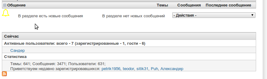
__Sander__ commentedNot sure if this is not a separate issue...
There is something wrong with buttons under posts and comments in forum topics.
Please have a look at the screenshot.
The top-buttons are under the post - almost all of them are ok (the right one is kind of strange)
But the buttons under the comment are of the old style.
I am using a silver bells based style, but the only tpl files I changed are forum-list and author-pane
Comment #58
__Sander__ commentedOne more thing.
The silver bell "no new posts" is invisible in the forum legend on a white background...
Comment #59
michelle#57 is likely a theme conflict. Unfortunately, themes have the final say and they often override bits of AF. Sometimes someone will come back with more specific code AF can use to force the issue, other times people using that theme simply have to add CSS to the theme to fix it.
#58 is point 1 in #50.
Michelle
Comment #60
__Sander__ commented#57 right, there was some theme interference. I switched some option off and it is a little bit better.
Now the post icons are all ok, but the comment icons are missing. And it is not a css issue.
The code produces under the first post looks like
< li class="post_edit">< a href="/node/860/edit?destination=node%2F860" class=" af-button-small">< span>изменить< /span>< /a>< /li>
< li class="post_delete">< a href="/node/860/delete" class=" af-button-small">< span>удалить< /span>< /a>< /li>
and under the comment:
< li class="comment_edit">< a href="/comment/edit/2864">изменить< /a>< /li>
< li class="comment_reply">< a href="/comment/reply/860/2864">ответить< /a>< /li>
while the css says
/* Edit */
.comment_edit .af-button-small span,
.post_edit .af-button-small span {
background: url(images/post_edit.png) no-repeat;
}
And it can't work for comments since the af-button-small and span tags are missing there...
Comment #61
michelleThemes are more than just CSS. I suggest trying Garland and see if it's working there. If not, have a look at your other contributed modules and see if there's anything that would affect the comment links.
Michelle
Comment #62
__Sander__ commentedIt's our friend module forum_access.
And something has to be done about it.
Let me explain my understanding of how it happens.
First there comes advanced_forum_link_alter that adds those divs.
But then there comes forum_access_preprocess_comment that calls module_invoke_all('link', 'comment', $variables['comment'], 0) resulting in links being rebuild.
Where do you think this issue should be addressed, AF or FA?
I copied a part of the AF code into FA and the buttons became visible.
Or shoud FA call something like module_invoke_all('link_alter'... afterwards?
Comment #63
michelleThat sounds like an FA issue. They should be altering the links, not rebuilding them.
Michelle
Comment #64
__Sander__ commentedCreated a FA access issue: http://drupal.org/node/1042746
One small request. Could you please add "comment_mover_node_prune" and "comment_mover_comment_prune" to the list of affected keys at line 454 of advanced_forum.module?
That's for the interraction with comment_mover module
Comment #65
michelleYeah, I guess I could do that. Not super keen on hardcoding support for an abandoned module but it's a pretty minor change.
Michelle
Comment #66
__Sander__ commentedThanks! That module is old and not supported, but I use it because sometimes I do need to move a comment to another topic. It's not user-friendly, but it still works for me.
Comment #67
michelleSpent way too much time tonight trying to get a nice icon legend. I can't seem to replicate the background gradient without making a total mess. Will try again soon but I'd love it if some CSS minded person could jump in with a patch. :)
Michelle
Comment #68
__Sander__ commentedIn responce to #62 and #63, if anybody has those issues, he should update FA to a dev version. I used a dev of 2011-Jan-07
Comment #69
meustrus commentedAlright, so I'm having a small issue. There was the problem with FA, but I've got the -dev version installed now, and it seems that af-button-small is being applied twice to the comment delete button, and not to the edit button. Also, now I'm missing an item that I would really like to have back, the Vote Up/Down vote display. I'm also losing Abuse links, but those aren't as important.
Also, I want more clarification on your desire to have old CSS work with the new HTML. Do you mean you want custom widgets written for the old image-replace method to still work? I don't think there's a way to keep that compatibility, honestly. And besides that, I see no issue. I ask because I may be willing to help if I could understand the need better...
Comment #70
michelleThe old way was to have graphics with the text embedded in them. If people spent time making nice graphics to match their site, they may want to continue using them. I haven't found a way to make the new HTML let you use them that works across all browsers.
Vote Up/Down and Abuse are separate modules. AF doesn't do anything with them.
I don't know why delete would be getting the class twice and edit not at all. I haven't seen that before.
Michelle
Comment #71
__Sander__ commentedMeustrus, and where were yout vote up and down buttons? Just among the buttons such as edit and reply?
Comment #72
meustrus commentedI think it's probably an issue with FA, really. I'm now considering abandoning FA and moving all protected content into groups. And yes, the vote up/down buttons are just among the rest of the buttons.
And about the CSS, it looks to me like you've got the accepted method in place in, say, Blue Lagoon, where you give a.af-button-small.reply-button the Reply image as a background and give a.af-button-small.reply-button some kind of CSS to disappear. I would have just used display: none there, but maybe you have a better reason for text-indent: -9999px
Comment #73
michelleText indent is only used on the forum/topic list icons where having text displayed makes no sense. I don't actually know the reason for the indent vs display none as I copied that technique off some website that claimed it was the accessible way to do it. Aside from RTL problems, that isn't the issue here. The issue is that people with custom graphics that have embedded text will no longer be able to use them because I can't figure out how to make them work properly cross browser. CSS really isn't my strong suit. I could use someone with better skills than me to step up here and solve that problem along with the legend problem.
Michelle
Comment #74
meustrus commentedIf text-indent isn't working well enough, you could try "position: relative; left: 9999px" instead. I don't think there's any way to make existing CSS work for the new HTML, but it is possible for people with the existing graphics to put them in by declaring
a.reply-button { display: inline-block; width: 99px; height: 17px; background: url(path/to/image); } a.reply-button span { position: relative; left: 9999px; }, for example. And what's the legend problem? I like to think I know something about CSS and could help you fix these issues, as long as I understand what your problem is.Comment #75
michelleI'll give that a try and see how it works. I'm fine with a documented solution instead of a built in one. I just need something.
The legend problem is that the actual images for the forum list are just thin outlines, now, with the background being done in CSS. That's great in the forum list itself but I seem to be unable to replicate that background in the legend. Not sure what I'm doing wrong but it keeps ending up a total mess when I try.
Michelle
Comment #76
michelleLegend problem fixed, finally. Wiping out and starting over seems to have done the trick. :)
Michelle
Comment #77
michelle@WorldFallz: I tried the icons in #56 and they are closer but they don't really show up well against the blue (see attachment). They need to be brighter and I'm also thinking I was wrong for saying outline... Maybe solid _would_ be better in this case.
Thanks!
Comment #78
michelleOk, I broke out a new issue for the legacy documenting: #1052488: Document how to use old images with embedded text and I created a new issue for porting the changes here to D7. The only thing left is WF's replacement images and that can be hashed out in a new issue if needed since it's not really part of the image _handling_ anyway. Going to put this monster to rest.
Thanks for the help!
Michelle
Comment #79
meustrus commented#77: I think if you're intending to put them against a blue background like in the picture, white would be best as either outline or filled. The colors in #56 work on a white background, but you'll need different colors for a dark background. I'm no designer, but the first I think of is white and yellow instead of gray and green.
Comment #80
michelleYeah, white and yellow was what I was thinking of as well. I thought I said that but, rereading, I guess it didn't make the transition from brain to keyboard. :)
Michelle
Comment #81
__Sander__ commentedSorry for reopening, but seems that's it's broken again.
You've fixed #58 in a recent dev, but after that the corresponding images near the forums are missing
I think that's because of
there's nothing to correspond to it in css.
The closest is
but then there should be .forum-icon-wrapper instead of .forum-list-icon-wrapper
However even changing this way does not help, since those icons are no longer visible with a transparent background
Comment #82
michelleYour template is wrong. It should be forum-list-icon-wrapper not forum-icon-wrapper.
Michelle
Comment #83
__Sander__ commentedoupc. sorry.
it's not easy to keep them up to date, while it's still in beta
Comment #84
michelleWe're not in beta, yet, actually. You're trying to keep up with the development snapshots of an Alpha version... :)
Michelle
Comment #85
__Sander__ commentedOne more thing.
What if you add something like that to css of silver-bells?
The "first unread" button is is not styled now.
I've added it to my style, but why not have it in the standart theme?
P.S. This link can be seen only if you are reading a node with new comments.
Comment #86
michelleAh, thanks. I noticed that a while back but forgot to fix it. Fixed now.
Michelle
Comment #87
__Sander__ commentedThanks!
Have you got an image for that button?
As for me, I simply recolored the last post button.
And one more thing. Since you are already supporting the comment_mover buttons, could you perhaps add one more css potion and one more image to handle those?
The images are attached. But I am completely unable to draw something myself
Comment #88
michelleYes, there's an image there. Has been all along. I just accidentally left out the CSS that shows it. It's a duplicate of the other one, though, because I didn't have a better idea than an arrow for it. I can try the different colored one and see how it looks.
Setting this back to active because I don't have time to implement this now... Just answering stuff in my queue before I head out for the morning.
Michelle
Comment #89
puravida commentedHello all,
I 100% wholeheartedly and completely agree that this should become an option to put text into the ALT tag and/or optionally place a div around the text separately from the button. That way, we could use the display:none parameter. As it is, a display:none will simply hide the text AND the button.
I am quite strong in CSS techniques, PHP, and general problem-solving. However, there was no easy solution on this doozie. It cost me an extra 10 hours of CSS "heck" to get things lined up and working because I had to resort to using the text-indent method to hide the text and even then it was hours to line things up properly (requiring numerous changes to other CSS parameters). Using text-indent, in my humble opinion, is not good code and should be a last resort only. I would have hoped to find an optional way to disable the text or just place it as an ALT tag, as someone else suggested.
I would think that e-readers, mobile devices, etc should be able to read ALT tags and it's really their problem to accommodate; not webmasters. As it was, I had to resort to modifying some of the AF module core code to eliminate the second "reply link" in the topic-list-view area. There was absolutely no way, with our complex design, to line those up and hide the text concurrently. There was always some weird formatting issue, such as the bottom reply button/text covering the last row or the top one being too low, etc. It was really frustrating. Ultimately, we try to keep all text out of the navigation and just use buttons where possible. Ultimately, I had to give up on the 'Top' button, as it proved impossible to remove the text while leaving the button. It doesn't look horrible, so I left it as-is.
It also took a lot of extra time because the documentation does not specify where certain tasks are handled. So it took quite awhile to track down that $rows handled the topic list but finding where that was built and how it hooked into theme.inc and all that, proved to be quite the undertaking.
Anyway, it's a great module and this is a minor tweak but could go a long way towards allowing "best practices" in my code.
Thanks!
Brandon
Comment #90
michelleEr, no, that's not a minor tweak. That would require undoing all the work I did and that's not going to happen. I will take a look and see if I can make it easier to remove the text. I hadn't considered that use case; usually people want to remove the images, not the text. But I'm not making major changes at this point, especially not going back to img tags.
Michelle
Comment #91
puravida commentedI meant the "output" would be a minor tweak; not necessarily the work involved to make it happen. After having to peruse and search through the huge codebase required to make AF work, I can see how this small change would be a big deal.
Comment #92
michelleWell, the output would be a huge change as well. That would be moving to an entirely different image handling system that would not only be a lot of work for me but would change how people style their forums. I'm not willing to do that for the edge case of wanting to have graphics with no text, but will look and see if I can make that edge case any easier to do from the theme system.
Michelle
Comment #93
meustrus commentedGiven the current code, which looks like
<li class="post_edit"><a class=" af-button-small"><span>edit</span></a></li>, here's some very simple CSS to hide the text and replace it with an image:And of course, you can replace display: none; with any technique for removing the text if that code hides the text in contexts where the background image doesn't display.
Comment #94
g0dxilla commentedHey all,
So we put the advanced forum in place and everything works great with IE and FFX. It took some serious doing to get the buttons to display correct, but I can't get buttons to display in Chrome at all. In the past 12 months i've seen a 74% increase in Chrome users to 23.4% of my total viewers, and a 31% combined decrease in IE and FFX users so this is a pretty significant issue to us. Not to mention the fact that I personally use Chrome and am pretty much castrated as an admin in the forum unable to Delete, Edit, or Quote a comment. I'm going to try to incorperate meustrus's suggestion when time permits, but what can be done to incorperate this into the module permanently. I would think everyone would want to have Reply, Edit, Quote, Delete etc buttons (role based of course) available on each comment.
Thanks for your time,
Frank
Comment #95
michelleI just tested in Chrome on 3 different installations and it works fine on all of them. No other reports of issues with Chrome, either. Looks like it's something on your site.
Michelle
Comment #96
puravida commentedPerhaps it works on very basic implementations with simple layouts.
I just saw meustrus' suggestion and will try that. Thanks.
Comment #97
michelleWell, the images in the styles that come with AF work. If you customize your style, it's up to you to make things work. I can only be responsible for the code I provide.
Michelle
Comment #98
puravida commentedUnfortunately, meustrus' suggestion did not work in our case. Since the image is tied to the span tag, the display:none hides both the image and the text.
The code provided needs to be flexible enough to support the customizations and image-only is something that really enhances the look-and-feel of a site. It may turn out not to be the AF code that is the culprit but it does seem like it at the moment, despite it working for the very basic default styles.
I just spent six(6) hours rewriting our CSS and comparing to the default template stylesheets. While I'm sure there may be some slight difference I am overlooking, I think it should be simpler to hide the text. However, the Chrome browser issue is something new and strange.
By overhauling our CSS to remove a couple of superfluous "text-indent" properties, I have managed to get the block to show in Chrome. However, only the Reply button shows. So this may be a new issue altogether. To my surprise, "view source" in Chrome reveals that there is only code for the Reply button, while "view source" in FF or IE will show the code for all three buttons. So the big question is how in the world is the code output differently (missing buttons in view source) for Chrome??
Even more telling was that even if I copy in and use the exact same blue_lagoon image CSS and style CSS, I only get the reply button in Chrome. So it would seem that the problem has nothing to do with CSS formatting. The code is simply missing for that browser.
Is there somewhere that Drupal, Advanced Forum, Views, etc is giving the browser different output? I would think that would not be the case but I'm unclear how what I'm seeing is possible.
Comment #99
michelleNo, there is nothing in AF to detect browsers.
Michelle
Comment #100
puravida commentedJust a quick update on this... It may be a Chrome issue, because I see only the code for the quote button in my Chrome browser but g0dxilla sees the code for all three buttons in his Chrome browser. We haven't compared differences yet but just letting others know who might face the same issue.
Comment #101
meustrus commentedDo you have any other modules installed that modify the links? forum_access, authcache, etc.
I don't see why your CSS needs to have the image attached to the
<span>tag. Is there a reason for this?How are you checking the code? Are you using Firebug/Chromebug and/or checking the source directly?
Comment #102
puravida commentedWe have the following modules enabled:
Path
Pathauto
Sub-path URL Aliasing (though I'm not sure we use this actively)
I just mimicked the image CSS presented in the blue_lagoon style set. It defines the images on the span tag. When I tried to define the image without the span tag, it would not display. I then tried to specify all link types (a.) tied to the af-button-small class but that also did not display the image.
I am using Firebug (FF & Chrome) and the Chrome developer tools, as well as viewing source directly.
Comment #103
meustrus commentedSo...this wouldn't work:
But this does?
Also, what is the display value for
li.post_editbefore applying this code? Could the background on the link be getting overridden by some other CSS? You can check this using Firebug or Chromebug. If it's getting overridden this could be a theme issue, which could be fixed here by adding additional match rules.It would also help to have a URL to look at.
Comment #104
puravida commentedSorry for delayed responses, but I moved on since the ones affected by the issue are no longer complaining. However, in the interest of potentially improving my theme/css/etc, I have taken a look at this again... I obtained slightly different results, so before I must have missed something or been viewing cached output. Here's what I see this time:
I have no li.edit_post specified anywhere. I checked blue_lagoon (my template reference) and it also does not specify it anywhere, so that explains why I didn't use one.
If I change all references to those buttons (and use the af-button-small code you provided), I still see the buttons (same as last time). Now, though, when I hide the span with "display:none;", it does hide the text properly and it shows the button images but only the tops show and it's not because of any padding or margin (I adjusted, turned on/off using firebug, etc).
However, if I change all references to those buttons and use your af-button-small code without the "display:block;" portion, it looks perfect in FF and IE and hides the text. So that is much better than before. However, when I view it in Chrome, the buttons are missing. The code is simply not there in the view source or within Chromebug (as if the page never output the button code but does for FF and IE).
Update: Oddly now, if I view the pages in FF or IE on my laptop now, I only see the "Quote" button and not the others. It is behaving, in FF and IE, just like Chrome did for me when I first fixed it. I cleared all the Drupal caches, cleared my FF/IE caches, even rebooted, and I now see the different behavior of only the "Quote" button (just like Chrome was doing). Since it happens on two machines at my location, I cannot imagine why but it must be something with caching/location/Internet connection.
Best regards,
Brandon
p.s. Currently I have everything set back to the way it was when it was working in all browsers, but for reference, here's a link to a sample post: http://www.shrinktheweb.com/content/pro-refresh-demand-option.html
Comment #105
meustrus commentedIn your particular situation, try this code:
I haven't tested this for IE6/7, but I think they support
display: inline-blockon anchor tags. The display declaration is important because it allows you to supply a width and height. If you don't supply a width and height, and hide the<span>withdisplay: none, the element will default to zero width and height. Setting display to 'block' would cause strange behavior inside an 'inline' element (which li.comment_reply is from rule "ul.links li" when I check in Firebug) so it has to be an inline-block instead in this case.Changing the values like that with Firebug worked for me, though I can't be sure it will work great for you. I made an account and can only see the "quote" button, which is really a reply button. Did you know that "reply.png" says "quote"? You might also need to clean up some stuff. I see that right now you are "hiding" the text by putting a left padding on the
<span>'s and setting text color the same as background color. That shouldn't interfere but if what I'm suggesting works then it's unnecessary.I don't know what to do for your problems with Chrome though. There's something strange going on based on what you've said. There are a couple of options, of course. Either some module you'd never suspect is causing exactly what you suspect, or your suspicions are wrong and it's some other issue. Are you sure you're logged in exactly the same on Chrome as on FF?
Comment #106
puravida commentedQuick update on this issue. Meustrus' suggestions DID work after all. In fact, I think I had it working before at one point but "thought" it wasn't working (thanks to too many 22-hour workdays).
Anyway, long story-short, Meustrus took a few minutes and showed that the changes do work as intended. We tested across several computers using FF3, FF4, IE8, IE9, and Chrome 11. All looks good now.
Since there is a concrete way to hide the text without the need for text-indent on those "forum post links", this issue can be closed for us (not sure if it resolves everyone else's issue, though).
Comment #107
meustrus commentedThis is the final CSS that was used. It's a bit more complete than what I posted above:
display: inline-blockis pretty much always needed becauseul.links liis usuallydisplay: inline. The only cases I'm not sure it works in are IE6 and IE7, but that display type should work on span's and not be necessary on div's in those browsers.Comment #108
michelleSetting anything with code to "needs review" but a proper patch would be helpful if you're still interested.
Comment #109
mcdruid commentedWow what a long and confusing issue!
I'm afraid this has become totally unworkable for me (despite best efforts by more than one contributor to keep it focussed). If any of many different issues described here still need work, I've not been able to identify what they are, and what work is required.
The only thing that I have been able to identify as a tweak which I think is worth adding would be replacing the text-indent: -9999px with a subtly different technique posted by Zeldman recently, which apparently avoids a performance hit on the client side that the -9999px hack causes - patch attached, which I've committed to 6.x-2.x branch.
I've tested this change in IE7, IE8 and IE9 as well as FF and Chrome. I'm pretty sure it's okay.
If I've missed other things that still need attention, please reopen.