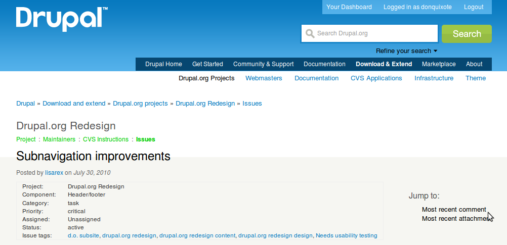
Recently I was made aware that the subsite primary navigation is implemented incorrectly (for example, on Association.drupal.org) and potentially really confusing to visitors.
It's unclear whether subsites were part of the original design brief for Mark Bolton and Leisa Reichelt, but we (the implementers/PMs) made the assumption that the navigation between the main site and subsites should be seamless. During a sprint to implement the theme on Association, we discovered that it wasn't clear where you were on the site, hence why the association's website has the H1 Association top of each page.
The options are to use the primary navigation area at the top of the header for the subsites primary navigation, or work with what we have now.
Usability testing this would be great. I'd like to be involved.


Comments
Comment #1
lisarex commentedGiving title a question mark so the title is less confusing ;)
Comment #2
lisarex commentedtagging
Comment #3
heather commentedAh, that would explain why the page title is so low down on the page. The sub-section navigation seems to be confusing. I can't actually locate how you get between main sections.
The first problem seems to be in having an extra layer in most of d.o
It seems to work OK on the Association site because there are less layers. Digging down to documentation, it appears we have an additional organization.
Three layers 1) Home > Main sections > Sub section page versus
Four layers 2) Home > Main sections > Sub sections > Sub-page
As seen in
1) Drupal.org > Association > Donate page
2) Drupal.org > Documentation > Docs Home > Documentation topic
A second problem is the amount of space required for navigation. The relationship between the header and sectional navigation is not clear. I think the original intention was to work with conventional navigation. But the amount of space between the navigation menus breaks and becomes confusing. It's a weird design. It would work if we had a situation like Option 1, possibly.
So we end up with a large overhead, and no clear relationship between navigational elements.

Comment #4
drummLet's run with the current navigation as we fill out the site. Yes, it is different and will be disorienting at first. But we should give it a chance to work. If it doesn't we can reopen this.
Comment #5
dasjoi think this is confusing, too and also
my suggestions:
- put "logged in/logout" right below the top-links ("about") - users expect these link to appear at the right-top corner
- put the sub-section navigation where we have "drupal homepage", "logged in/logout" now
this would imho safe vertical space while making navigation more intuitive
Comment #6
heather commentedThere is a related issue #939124: Too much scrolling on issue page - less navigation, or more compact navigation
I think the large top header is OK on the front page, but needs to be re-thought for internal pages. Especially considering this "extra layer".
Comment #7
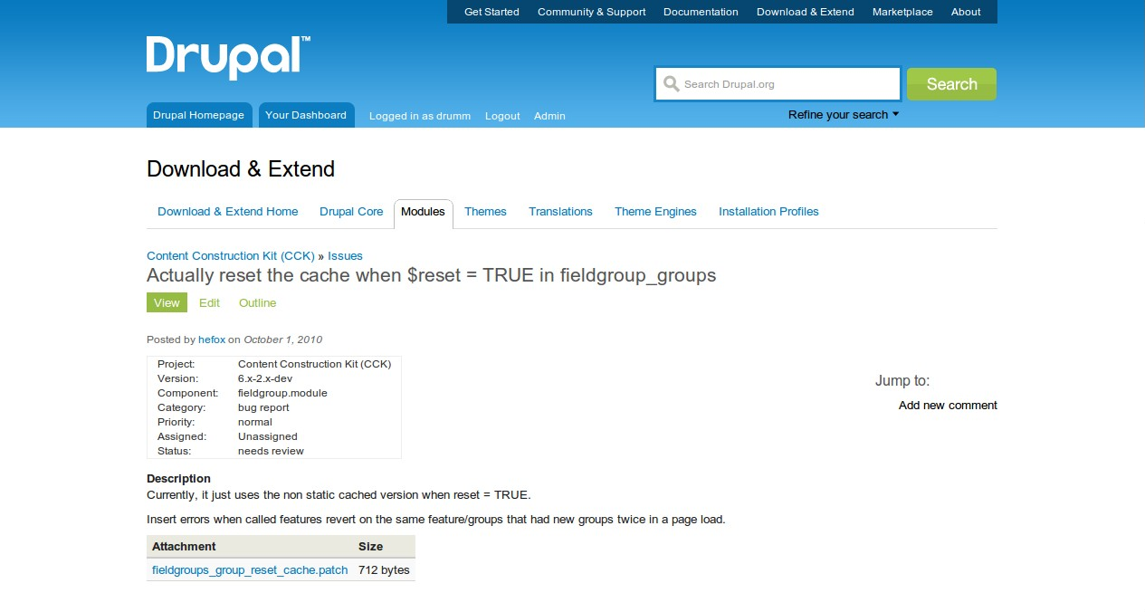
brightboldThis is the only thing I'm not loving about the redesign. Because of the placement and prominence of the Sub-site Title, the actual page title (#page-subtitle) is de-emphasized. On a module page, for instance, the name of the module is no larger than any of the subheads on the page (Example, Usage, Maintainers, Issues, etc.) This makes it difficult to identify which module page I'm on. It's very clear I'm in the D&E section, but beyond that I get lost.
Attached: my view of the problem.
Comment #8
brightboldOK, I took a quick stab at the header prominence and the issue above with navigation space. I don't think it works (the header weights are better, IMO, but I don't think navigation usability is great, and it seems crowded), but it might give someone a good idea so I'm attaching it anyway.
Comment #9
matcheck commentedI think that section header in subsection page should not be displayed. Current section should be highlighted in global navigation (I am not sure if it is possible). This can bring the confusion in a first place.
As for sub-pages of sub-sections, breadcrumbs are really good at helping with this problem. What is the reasoning behind using the tabs (in my point of view secondary navigation) and sidebar navigation (tertiary navigation)? I noticed that they are used in a same context (sidebar for page with more links as Marketplace).
Comment #10
rszrama commentedI also agree this is a confusing element of the new design. For me, browsing to a project page and seeing the page title be "Download & Extend" was very disorienting. I couldn't remember clicking there and didn't know why I ended up on a page title that until I found the smaller, grayer title of the page I was actually visiting.
The mock-up in #8 immediately appears more usable.
Also, just to make sure I'm talking about the same issue here, I'll link to my marked up issue screen.
Comment #11
steven jones commentedYeah, the design is a little confusing. Possibly, because in the old design there wasn't much context about where you where on the site, and now there's loads. But the main page title is really far down, and not actually that big in comparison to the section header. The mockup in #8 does make a lot more sense.
Comment #12
dixon_I also think this is a bit confusing. I really like the mockup in #8.
Comment #13
rszrama commentedI also like how the mock-up moves the local action links into the main content area. It was confusing to me with that link being above the subsite navigation tabs.
Comment #14
lisarex commentedEveryone in comments 7-13, the problem you are describing is over here #939124: Too much scrolling on issue page - less navigation, or more compact navigation (and probably in other issues too ;0)
This subsite navigation issue is regarding Bluecheese theme on subdomains e.g. localize.drupal.org or association.drupal.org (and and so).
Comment #15
rszrama commentedAww, bummer. I was afraid of that. : P
Comment #16
dwwI really like the direction #8 is moving in. I think that'd be a great fix, site(s)-wide. Since this is a general problem, not just affecting issue pages, and this is the earlier issue, I think this is the best place to discuss this. I'm marking #939124: Too much scrolling on issue page - less navigation, or more compact navigation duplicate with this (although there is some other useful discussion over there).
Comment #17
merlinofchaos commentedI love the direction #8 is going as well, and I agree with dww that this issue is the right place to discuss it.
One question about #8: On pages with a breadcrumb, where will that go?
The reason I think this issue is important is that we have all of these navigation elements:
1) The very top level navigation links in the upper right
2) The sort of secondary navigation tabby thing that is spending a lot of horizontal space on a small amount of information
3) A breadcrumb
4) A section title
5) section tabs
6) Page title
7) Up to 2 sets of page local task tabs
8) Possibly a set of local actions
I'm not sure if there are more that I missed.
Comment #18
brightboldSorry Lisa, my bad! I came in not concerned about the scrolling but the relative prominence of the headers, and when I searched for issues on that this looked like the right one! Apologies for conflating two separate issues.
Comment #19
rszrama commented@BrightBold - don't worry, the other issue was deprecated in favor of this one, so your comments can now be considered "on topic." ; )
Comment #20
yareckon commentedYay #8. I know what module I'm looking at again! Please Please.
Comment #21
dixon_And the fix in #8 would probably be quite easy to implement without any bigger changes. Seems "just" to be some CSS. Because the actual behavior isn't changed, if I understand things right.
Comment #22
dwwYeah, although we should also (re)consider some kind of highlight for the active site section in the top navigation links, and drupalorg_crosssite doesn't appear to provide a class for that which could be targeted with CSS...
Comment #23
dasjolike #8
how would it look like with breadcrumbs, as for an issue page?
Comment #24
heather commented#8 By bright bold is awesome. I think we could make the navigation "within a project" more consistent and information.
Using the consistent header and menu tabs. Here is a suggestion:
This is the current situation:
Comment #25
moshe weitzman commentedOk, moving over here.
I really think we need a bold step here, and incremental changes won't move enough content above the fold. My proposal:
I really would rather see this done now, and not "wait until the site fills out with more content." We can make more changes then. I'm happy to work on this as needed.
Comment #26
jbrauer commentedI agree with Moshe @25 that this should be something done sooner than later. I love the new site overall but the headers within the site are extremely disorientating.
#8 looks like a great improvement. I also like the suggestions in #24 though these are less important in my view than making the headers easier to follow.
Comment #27
yareckon commentedI would also support this suggestion moving the subnav up into the site header. But at *least* #8 needs to be done.
Comment #28
dwwBumping this to major. I think we all agree this needs to be solved ASAP.
I'd *love* to see a patch against bluecheese's CSS that at least implements #8 so we can put it on beta and actually play with it.
I think the suggestions in #24 are good, but they're a bigger deal, since it's going to involve bigger changes than CSS. In fact, that should probably move to #96971: make better use of tabs and subtabs on project nodes (wow, there's a trip down memory lane). ;)
Comment #29
lisarex commentedTo clarify my comment in #14, this issue was originally intended to discuss navigation on subdomains (e.g. localize.drupal.org) but going with the flow here and retitling this one. I'll create another issue for subdomain nav.
Comment #31
jbrauer commentedThis applies to areas of the site outside of project/issues. For example Documentation has the same issue in the headers with an additional issue that in the case of documentation critical information about understanding the context of the page is in the block at the right of the page.
Comment #32
lisarex commented@jbrauer, cheers. We've got a separate issue for the docs child page navigation here #946290: Book navigation missing on handbook pages
I'd like the Docs team input in their header issue as well...
Comment #33
geerlingguy commentedLove, love LOVE #8. Please implement if at all possible... I am getting lost in a sea of issues...
Comment #34
dstolI don't have BZR access but I think this works well, at least in the issue queue.
Comment #35
drummComment #36
drummI've been cleaning up some margins in this neighborhood, generally a little smaller, trying to align to a 9px vertical measure where possible. I'll have to pick this up tomorrow. Flipping the two headings around should be a good basic change too, just about done there.
For the larger change, #8, making the first tab more title-like there are a couple edge cases that need thought:
A) User pages, both yours and others, they have different tab sets, do not have a first tab with a similar name.
B) What would the first tab look like when selected?
Comment #37
drummSome screenshots so far, includes fonts from #912936: Change font family
Comment #38
dstol#37 is a decent start but it doesn't address the fact that the download & extend title and tabs don't have a contextual reason for being on an issue page. The context of the issue queue is the issue itself and the project that owns it.
Comment #39
geerlingguy commented100% agreement with dstol - That whole heading needs to be de-emphasized to a much greater extent... if anything, the breadcrumb should read:
Download & Extend » Modules » [Module Name] » Issues
Issue Title Here
Having 5 or so levels of titles/headings/menus is very confusing.
Comment #40
damien tournoud commentedI also think it makes sense to prepend the site breadcrumb with the cross-site one.
Comment #41
donquixote commentedI created a new issue before I found this one..
#948954: Redesign feedback: Visual weight of page headlines
My opinion:
I am most interested in project pages and issue pages, so my opinion is mostly about these:
- "Download and Extend" section title -> remove, or put in sidebar block.
- "D. Core", "Modules", "Themes", "Install profiles" tabs -> remove, or put into a sidebar block. We really don't need these tabs on an issue or project page.
- "Drupal homepage", "Your dashboard" -> This menu has zero value for orientation, and should thus be in a different place (further up, smaller), and not look like tabs.
- "Get started", "Community & Support" -> what about some dropdown submenus? These have two purposes: (i) Navigation shortcuts, (ii) Get a better idea what's behind these items. This menu actually can be a location indicator, if we highlight the "Download & Extend".
- Project name on issue page: Should be much more visible.
- Breadcrumb: Will get more attention, once we have removed other stuff. The breadcrumb can answer so many questions: This is an issue, the issue is for "devel", devel is a module.
#8: Certainly an improvement, but I would go further and totally kick the section nav. At least for project pages and issue pages.
Comment #42
donquixote commented#24: This is an improvement, but there is still 4 levels of tabs + "menus that look like tabs". Far too much.
The in-project nav is really the most important one for pages like these. Other elements should be heavily reduced.
Comment #43
todd nienkerk commentedI think the solution outlined in #8 is a big step forward. It saves vertical space, reduces confusion about document structure/hierarchy (i.e., "Where am I? What is this page?"), is intuitive, and looks snazzy.
Moshe's idea of nixing the section nav (#25) is worth discussing, but only on a section-by-section basis. The section nav isn't terribly useful once you've drilled down to the issue queues, for example, but it's critical in "About"-style sections and subsites like association.d.o.
So let's talk about it per section: Where is the section nav most relevant? Most irrelevant (where does it just seem to take up space)?
Comment #44
todd nienkerk commentedMoshe pointed out that I misread his proposal in #25. He wasn't suggesting the section nav be struck entirely. Rather, he proposed placing it below the nav in the upper right so that the two would be stacked like a traditional primary->secondary nav. Apologies for any confusion.
I'm concerned that stacking the two, as Moshe proposes, would clutter the header -- especially in sections like "Download & Extend" where we have 6-7 links. The section/secondary nav would routinely extend horizontally beyond the width of the main/primary nav and may collide with the Drupal wordmark.
Comment #45
drummAs you may have noticed, I finished and deployed the header swap from #37. Along with fixing things like #936648: Make the "My issues" block (for the dashboard) more beautiful and functional. Should be an improvement, but guessing we aren't done yet.
Comment #46
markabur commentedNoticed the swap in heading sizes. Yay! It's an improvement for sure. Still reading through all the posts..
Comment #47
donquixote commentedNow I know this looks ugly, and does not really solve any "above the fold" space problems.
What it attempts to solve:
- User nav (your dashboard, logout) does not give any location information. Thus, moved to the top right.
- Global nav and section nav are two layers that belong together. They have medium relevance for the user's location. I moved them to the right, so they are not mistaken as primary location hints (such as page title or tabs).
- search goes somewhere in between. could be smaller for my taste
- "Subnavigation Improvements" is the most important page title.
- "Drupal.org redesign" is the second most important page title.
- Project tabs are a relevant location indicator, and it is likely that a user wants to click one of them.
- The breadcrumb goes somewhere in between, and gets a few extra elements. I really want to keep it, just don't know where to put it.
Comment #48
lisarex commented@BrightBold I like your #8... I'm all for "smart consistency" but it's a vast shift in behavior to have the section heading as a link. Hmm.
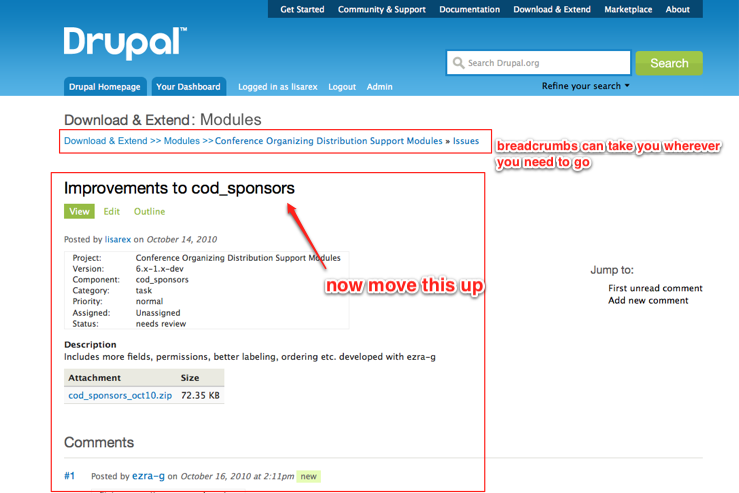
I'm in favor of removing Download & Extend from issue pages.
Currently, this is just overwhelmingly crammed with info:
Here's another suggestion for Issue pages (not the issue main page; that should stay as it is): combine Download & Extend and Modules headings, remove tabs, complete breadcrumbs and move stuff up a bit:
Comment #49
lisarex commentedOops, smaller screenshots
Existing:

My mockup:
Comment #50
rszrama commented@lisarex Regarding BrightBold's suggestion of making the section heading a link, I'd say that it already is a link... it just has the word "Home" after it. What if the tabs were moved inline with the heading as BrightBold suggested but instead of making the heading a link there was a tab that simply said "Home" without the duplication of the site section in it? I'm not sure "Home" is the best word there, but something to that effect.
Comment #51
donquixote commentedThe extended breadcrumbs are good, but they are harder to read than shorter ones.
What about making them more graphical?
And what about dropdowns on breadcrumb items? This would replace the section menu and project tabs.
Comment #52
moshe weitzman commentedI love lisa's proposal in #49.
Comment #53
rszrama commentedYeah, trimming down to a set of breadcrumbs would be nice. With this approach you may as well go all the way, though, and get rid of the section title above the breadcrumbs. The first crumb in the trail lets you know where you are in the site, rendering the title above it unnecessary.
Comment #54
jbrauer commentedI like the full breadcrumbs better than the bar of unrelated things. However the extra space on the screen with the section title doesn't seem useful. I've been using the CSS in #34 in a local style sheet and it makes for a much improved browsing experience. Perhaps the layout in #34 could be combined with the breadcrumbs in #49.
Comment #55
avpadernoI would like better if the subnavigation title could not be confused with the page title.
I am not sure it should be a link, though. Probably it should be rendered with a smaller font, or removed from some pages. The module that handles the subnavigation links has already the necessary logic to decide which subnavigation links should be shown in the page; it can also contain the code to decide when the subnavigation title should be shown.
Comment #56
avpadernoActually, the sub navigation title could be removed in all but the user profile pages. If I look at my dashboard, the only element that appears as page title is the sub navigation title; that doesn't happen on other pages.
Comment #57
lisarex commentedHow do folks feel about this problem now, now that we've gotten used to the reimplementation site?
I need to close down this project, so issues typically will need to be moved to either the Bluecheese project for theme issues or the Drupalorg customizations project.
The navigation on Association.drupal.org has been re-implemented, and other subsites should get the same treatment as time permits.
Comment #58
moshe weitzman commentedIMO this is still an open, major issue with the IA on the site. We should put this issue wherever IA issues for drupal.org go.
Comment #59
dstol+1 for leaving this open. Months and months after the redesign I'm still fumbling with the subnav.
Comment #60
tvn commentedMoving to Bluecheese unless there is some better place for this issue.
Comment #61
mgiffordThe breadcrumbs outlined in #49 would definitely be useful to provide context. What other pieces from this discussion still apply?
Comment #62
mgiffordBreadcrumbs have been added to the API - https://drupal.org/node/1526504
Comment #63
mgiffordComment #64
joshuamiComment #65
drummThis part of the site design is being phased out: #3314554: Remove section navigation