
 Come together with the global Drupal community in Rotterdam, 28 Sept – 1 Oct 2026. Sessions, contribution, connection, and Early Bird savings until 8 June.
In a talk in the Drupalcon CPH, it was mentioned that currently the relation between a selected tab and the content it displays is not clear at all, and that we should perhaps work on this and figure out a better way to make this visual connection.
I've been giving it some thought and went ahead and created a patch to ilustrate the idea I have in mind.
I attach a current (verticaltabs-seven-before.png) and proposed (vertical-tabs-seven-after.png) way to make the user aware of what tab he is using.
I've tried to keep within the current shades of gray we are using, and used borders and opened areas to connect the active tab to the content it displays. I'm stil undecided as to what the hover behaviour should be of non-selected tabs, wether to keep that change from white to shaded gray or to just use an underline on the text. Suggestions are welcome!
Please do let me know what you think.
| Comment | File | Size | Author |
|---|---|---|---|
| #99 | vert-tabs-focus.png | 17 KB | manuel garcia |
| #99 | vertabs-states.png | 22.32 KB | manuel garcia |
| #94 | drupal-896828-selected-focus.patch | 1.1 KB | manuel garcia |
| #84 | vtab.patch | 1.41 KB | bleen |
| #67 | 896828-borked.png | 61 KB | reglogge |

Comments
Comment #1
manuel garcia commentedUnsure wether this is actualy a bug, but well, feel free to slap me with a large trout! :x
Comment #2
Jeff Burnz commentedI think it is a bug - if forces the user to continuously adjust the scroll - for example on every node going from Menu tab to others changes the height drastically (default install). For daily usage this is quickly going to be a huge PITA for content editors.
However this is not just a Seven problem so moving to system.
It would also be very cool if the
vertical-tabs-listwas equal to the height of the tallest pane (make it much easier to theme).Comment #3
manuel garcia commentedAlthough I see what you are talking about Jeff, I think that's not related to this issue. Please take a look at the screenshots to see what I'm talking about, I don't touch the fact that if you open a very long form on a tab (which is discouraged as bad practice afik) you'd have to scroll down, then back up to change tab.
What I'm dealing with is purely a CSS/UI issue, as to visually relating the active tab to the content it displays, in the default admin theme.
Perhaps we could discuss what you talk about on a different issue?
Comment #4
manuel garcia commentedComment #5
yched commentedThis does look nicer. Adding a tag for UX team to chime in.
Comment #6
Jeff Burnz commentedSure, ok. Based on the patch (which is a massive improvement in any regard) I'm not so sure about having the selected tab & pane gray and the inactive tabs/panes white - this seems around the wrong way - wouldn't "grayed" things normally be considered to be inactive?
Not sure about the internal borders - do we really need these. Mark Boulten also said something about borders + background = clutter (or something to that effect).
I attached a screenshot of another approach - what do you think?
Comment #7
manuel garcia commentedI agree on switching the backgrounds, makes sense. However, removing the internal borders makes it real hard to see imho.
I'll wait on some more input from usability/design ppl, then rework the patch
Comment #8
Jeff Burnz commentedOuch, I just looked at the screenshot in #6 in another monitor and the gray is way to light.
Comment #9
Bojhan commentedThis still needs quite some work, let me get back to this later. I like the chosen direction, however I would go with white active rather then dark active, also we need to see how this fits with the overall design of Seven, which for example rarely has such strong corners as this.
Since this creates a usability issue on the content creation, this is always considered major and potentiality critical.
Comment #10
Bojhan commentedComment #11
nick_vhsubscribed! Will try to implement this in the morning
Comment #12
jbrown commentedI already created an issue for the problem identified in #2: #867696: Vertical tabs make the whole page jump around (this is really irritating).
Comment #13
Jeff Burnz commented@#10 - those rounded corners on the active tab are going to be very hard if not impossible to implement using just CSS - it could be done with images I suppose, but do we really want to load it up with images (will probably run into other issues at some stage), be interesting to see what ideas come up for this in any case.
If there was a solution to jbrowns issue in #12 theming vertical tabs could potentially be a whole lot easier imo...
Comment #14
Bojhan commented@jeff We had rounded corners before, we have rounded corners on loads of things? I see no problem in doing it with images if thats needed.
Comment #15
jbrown commentedI'm sure it could be implemented with CSS3.
However, I am not sure it should have rounded corners. It would be good to see a mockup.
Something else that would be really cool is changing the active tabs with the mouse roller.
Comment #16
Jeff Burnz commentedBojhan, I'm not arguing design here - I'm pointing out the technical limitations of the technology (CSS rounded corners), even with images I cant really see a clean solution, its going to be ugly CSS - whats the point of rounded corners anyway - doesnt even fit with Sevens clean square lines.
Comment #17
Bojhan commented@Jeff Thats why I want to prototype it? Design exploration is a phase every design should go through, vertical tabs for Seven didn't do that it jumped to an implementation. I am not taking a guess at rounded corners, I think they would fit in nicely with the rest of the design - Seven isn't squarish at all apart from the fieldsets.
So lets not worry to much about technical implementation and explore the idea, rather then pinning ourselves down on technical restraints before we even have a prototype (great designs fails, when you don't even attempt to explore). For something like this we need a patch to evaluate it in its context. I don't wish to battle the technical argument here, but we have rounded corners on a lot of things (tabs, toolbar, overlay ect) - lets not reject this exploration before we have even seen it.
Comment #18
Jeff Burnz commentedBojhan, you might be interested in having other people prototype your ideas for you, I am more interested in seeing nice clean code, so if I want to argue technical viability I will. We have quite enough messes to clean up in Drupal 7 already (Overlay, Toolbar, Seven...).
I'm not shutting down the concept either - please read my original comment - I actually said it will be interesting what will come of this. I was merely pointing out that this will be hard to do with CSS, which is how we've done almost all other rounded corners in Drupal 7 - a few instances where images are used are currently broken (Toolbar for one).
Comment #19
Bojhan commentedWell I hope someone will :) I hope you understand every design idea, is always challenged by a technical restraint - if I would consider each one before exploring a design, we would never make the many iterations needed to get to a great design, where that one might not even be close to the original idea.
Comment #20
ergophobe commentedFirst, great improvement Manuel!
A priori I agreed with Jeff's comment that light should be active, because the eye is drawn to bright spots. But as Jeff said, his screenshot does not have nearly enough contrast.
After playing around and going a lot darker than what Jeff had, I found that without the borders, it just doesn't have the impact of Manuel's original screenshot. I didn't bother with the colors inside letters, but I've attached a compromise between Jeff and Manuel's idea
Rounded corners: keep it as simple and clean as possible. If someone wants to add in images or use PIE or some such thing in their own theme, let them do it, but as a default option, it seems like bloat to me (and BTW, I've been using something similar to PIE for a while and get pure CSS rounded corners in IE, no problem, all versions).
Comment #21
jbrown commentedYeah - vertical-tabs-darker-inactive-tabs-with-border.png looks good.
Comment #22
bleen commentedI'm also a fan of vertical-tabs-darker-inactive-tabs-with-border.png
Comment #23
Jeff Burnz commentedrick_deckard - the second screenshot with borders is most definitely better. More impact. You also hit on one of my major bug-bears in all of D7 theming - a lot of it looks like crap in IE so all these little touches like rounded corners the vast majority of users will never see...
One of the real bug-bears of this is when the .vertical-tabs-panes is longer than the .vertical-tabs-list - man I spent some time f'ing around with a pure CSS solutions (knowing all along just how fruitless that would likely be...) anyway - what about ye-old faux column?
I could attach the patch for this if you want to test it.
dammit, wrong screenshot (not cropped) oh well...
Comment #24
Bojhan commentedPatches please :) I like jeffs last screenshot, even the 1 pixel rounded corner. The only problem to fix then is how to diffrentiate between tabs, as they are now a big gray area.
Comment #25
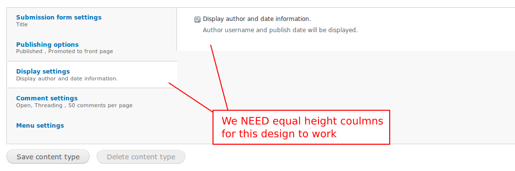
manuel garcia commentedOK guys, I've gone ahead and taken another look at this problem. I've found out that we indeed need equal heights columns. See the screenshot attached for what I mean.
So I've created a patch for vertical tabs' js so we can get this. Please review #867696: Vertical tabs make the whole page jump around (this is really irritating) - this patch needs to get in in order for this design to work, as well as not having the page jump around. Even as it is, vertical tabs behaviour is very unpredictable when it comes to lines and background, because of this. But I digress.
The attached patch puts some sense into how the tab layout is setup, and with the other patch get's us what we want. I've also changed the backgrounds to have the white be the active ones.
Comment #26
manuel garcia commentedComment #27
bleen commentedscreenshot from #25:

Comment #28
Jeff Burnz commentedHow about a different approach with gradient tabs and a faux column on the main div wrapper. The patch also sets the width of the UL to 240px which I think is reasonable enough, I see no real reason why this has to be a percentage (core vertical-tabs.css has it as ems). This would need RTL work but we can see the idea here in any case.
Theres two images - fc.png and tab.png which both go in
seven/images.Comment #29
yoroy commentedI don't think gradients should be introduced to Seven. It does seem that the general approach is good though: making the full vtabs area background white and tint the inactive tabs (instead of overlaying white areas on top of an overall gray area).
Will have a closer look a bit later, but it seems a reroll of #28 using bottom-borders instead of gradients is the next iteration we'd like to see?
Comment #30
Bojhan commented@yoroy Yes. while you are at it, try inverted borders (so white instead of dark) too.
Comment #31
webchickJust a friendly reminder that we are trying to get Drupal 7 out the door and that UI freeze was 9 months ago. So the only thing we should be doing here is the minimal necessary to fix the bug.
Thanks!
Comment #32
Bojhan commentedThe minimal here to fix the bug is to :
1) Fix the visual connection between the active tab and the pane (usability error)
2) Make sure the fix adheres to Seven styling, to not break visual identity this late in the game.
I hope yoroy's patch will do that, I think we are really close.
Comment #33
Jeff Burnz commentedSeven does have gradients - on the buttons - the color values for the gradient I used are pulled strait from buttons.png with a minor adjustment because we need more vertical expansion (button.png is only 80px high). This is actually where I got the idea from - because its consistent with an existing style in Seven.
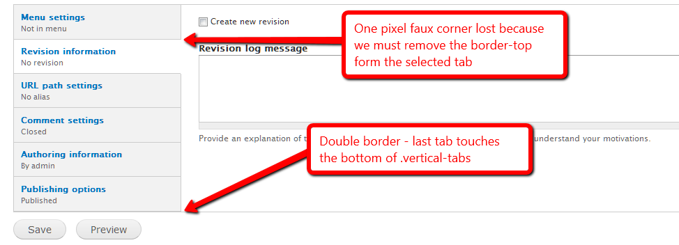
Borders are kind of problematic - see the screenshot - the only way I can see to solve this is 1) the last tab never has a border-bottom or 2) the UL has a margin bottom so it never touches the .vertical-tabs wrapper.
Comment #34
yoroy commentedRemoving the background images in the patch from #28 was almost enough. I looked at some variations for borders but here a darker gray seems to work best.
no border:
http://img.skitch.com/20100911-ttk4p3usun5wa8i5y5m6g2rxfb.jpg
white border:
http://img.skitch.com/20100911-gwjtnk9he2qscc3ebm3qnpjhi4.jpg
In this patch:

Comment #35
bleen commentedI content that #34 fixes the bug that this post attempts to address and could be marked RTBC
however, still looks a but odd if the pane is longer than the tabs:

Comment #36
Jeff Burnz commentedIts kind of a bit odd when you have the fieldset longer the the UL, big white space below and no border on the last tab.
I've attached a patch which I was hacking to together at the same time which is kind of similar but keeps the faux colom and does it with border-top instead - either way I think we're on the right track and getting close.
For this is patch to work you need this image: http://drupal.org/files/issues/fc.png
Comment #37
yoroy commentedbot?
Comment #38
tstoecklerI don't know why it didn't report back, but the test seems to have passed. (Click on the "View details" link)
Comment #39
manuel garcia commentedSo, to summarize, we have two options, go in faking it with an image and fixed ul width, or use JS to get equal height columns for tabs and content. I'll list the pros and cons for each option:
1. Fixed width and image to fake equal height columns:
This decision makes it a bit less flexible, although nothing breaks if you make the text-size bigger in your browser. We also use an extra bg image.
2. Use JS to get equal height columns:
Much cleaner to CSS, no extra images, although the vertical-tabs JS would do a bit more work. Graceful-degradation obviously isn't a problem, since without JS there would not be vertical tabs at all.
Although I don't like having to use another image, it's the only way to solve the equal columns height without patching vertical tabs js, for which apparently there isn't much push behind (see #867696: Vertical tabs make the whole page jump around (this is really irritating)).
I've re-worked the patch on #36, and made it so that the last tab button now has a border-bottom, using a negative margin of the same size in the bottom, to fix the double border it would appear otherwise.
Comment #40
yoroy commentedOption 3: Don't mind about the white space pointed out in #35/#36, I don't think it is confusing. Just add the negative margin to avoid the double-border-bottom?
Comment #41
manuel garcia commentedI defintly agree with Jeff Burnz on #36 that the white space looks odd, and there's a reason why it looks odd: The two regions left and right have different porpuses, one is what changes the other, and we should make this distinction visually clear. Having the content region on the right continue on the bottom of the tabs makes the user loose that distinction, thus translating into "odd", unless you're used to it already of course.
Comment #42
Bojhan commentedComment #43
Jeff Burnz commentedI can't get this patch to apply - head is still at 1.6 so I don't quite get it, grrr.... Sounds like a brilliant idea with the -neg margin fix for the double bottom border.
Comment #44
giorgoskTested both patches #36 and #39
they both look good and behavea as expected
tested in latest firefox, chrome, Opera, IE7
someone please test with IE8 I don't have available at this time
in IE7 the top 2 tabs you need to hover over the text in order to be able to click the tab
just hovering over the tab box does not do it (this behaviour is because of this patch it was not there before)
Comment #45
giorgoskThey both work OK with IE8
so I guess we can mark this a RTBC
Comment #46
yoroy commentedIf something is broken in IE7 because of the latest patch it would need work. Can someone confirm #44?
Comment #47
bleen commentedwait ... what happened to
is this no longer an issue?
Comment #48
bleen commentedcrosspost ... needs review is fine :)
Comment #49
Jeff Burnz commentedGiorgosK can you post some screenshots of your results in IE7, especially with the last tab selected, I applied the patch manually and am getting some odd results in IE7 - when the last tab is selected mystery padding/margin appears below the last tab (screenshot 1). Any chance you could roll a patch off your system, the one in #39 won't apply for me.
I think we should try to solve the link problem in IE7, its very odd.
Showing some mystery padding or margin when the last tab is selected in IE7...
Comment #50
Jeff Burnz commentedKeep meaning to add - needs white space after the colon.
Powered by Dreditor.
Comment #51
giorgoskSorry guys for the "reviewed & tested by the community" but I thought IE7 was not a big deal to worry about since IE8 is out
but I was wrong
@Jeff Burnz
again the mystery padding on IE7 I did see exactly what you see but did not think it was a big deal either
thus I don't think you will need any patch from me (I get exactly what you get)
do we need worry about IE6 ??
Comment #52
manuel garcia commentedYou're right, here is the patch again, with the white space after the semicolon added.
Comment #53
manuel garcia commentedI guess we should work on fixing the IE7 bugs now.
Comment #54
Jeff Burnz commentedAfter a lot of hacking and testing I got at least one of the bugs out of IE7 - the hover bug where for strange unknown reasons the tabs above the selected tab loose display: block; on the anchors (that's the best I can describe it...).
Still have some strange padding/margin bottom on the last tab when its selected, but I've lost patience with IE7 so this is my last shot. Good luck.
BTW - this patch also moves the font sizing for vertical tabs in styles.css to vertical-tabs.css - seems like the right move.
Comment #56
yoroy commented#54: seven-vertical-tabs-faux-column-with-borders-4.patch queued for re-testing.
Comment #57
Jeff Burnz commentedLooks like I've been able to solve the IE issue so this is really close now.
Also added better support for focus styles (focus style will apply to the selected tab also), and removed the line spaces between declarations, cleanup up some other redundant cruft.
The patch needs this image in seven/images http://drupal.org/files/issues/fc.png
Comment #58
Jeff Burnz commentedOK scrap the selected focus styles, that didn't work so well after all, my bad, this is the one, still needs the image fc.png.
Comment #59
Bojhan commentedCan we have screenshots? I am going to be out of town for 4 days soon, I will give it a final review.
Comment #60
giorgosklatest patch works as advertised
in Safari 3.1, Firefox 3.6.10, Opera 10.62, IE7, IE8, Chrome 5, Chrome 6
basically the only problem was IE7 thus marked RTBTC
Comment #61
Bojhan commentedEhm, no.
Comment #62
Jeff Burnz commentedHeres a couple of screenshots - its the same same as before (#36) except it now looks like this in every browser (fixes the weird padding issue in #49) and the display: block; issue also (originally fixed in #49).
So now IE7 has decided it hasLayout and doesn't need some padding bottom on the textarea.. sheesh, dang IE7!
This is good to go, someone just check that theres a gap between the Tips and the Vertical Tabs when you add a Basic Page with no added fields - this is where I ran into a hasLayout issue where IE7 collapsed the margin top on the vertical tabs wrapper (so they touched).
Comment #63
manuel garcia commentedNice work taming the elusive IE7 bug Jeff!
I think we're ready for RTBC, but let's wait for some more reviews.
Comment #64
bleen commentedLooks good ... RTBC++
Checked in IE6,7,8 FF4, Safari5, Chrome 6
Comment #65
Bojhan commentedGood, still feeling that the rounded corners are necessary for this to feel part of Seven. Given that the people in this issue are disagreeing to implement this and its major to get this in early - I am going to let it slide, open a new issue or followup.
Comment #66
dries commentedCommitted to CVS HEAD. Thanks.
Comment #67
reglogge commentedSomething went wrong while committing this patch I think. The vertical tabs have no background-color in their normal state anymore. Screenshots attached.
It seems as if fc.png, the faux-columns background-image either wasn't committed properly, or my checkout command
cvs -z6 -d:pserver:anonymous:anonymous@cvs.drupal.org:/cvs/drupal checkout -P drupalsomehow is wrong.
At http://drupalcode.org/viewvc/drupal/drupal/themes/seven/images/ it doesn't show up, too.
EDIT: see #57, where Jeff notes that the image needs to go in too.
Comment #68
reglogge commentedJust needs to get the image from #57 committed, too.
Comment #69
webchickOops. My bad! Committed image to HEAD, too.
That's funny we need an image here rather than just a CSS rule. Huh.
Comment #70
webchickOh. Dries committed this originally. LOL. I am officially losing my mind. ;)
Comment #71
manuel garcia commentedThe reason we need an image here is because of the need for equal height columns. For this to happen with dynamic content, you either have to use JS for assigning the same height to both regions, or use an image on the wrapping element to fake it.
Comment #72
Jeff Burnz commentedYes, and we decided to fake it - its a called a Faux Column, which is a very old technique but a goody.
Comment #73
reglogge commentedI'm counting the days until we finally switch to git, so adding/removing files in patches becomes painless...
Comment #74
Everett Zufelt commentedReopening this issue based on a bug found in #925350: Vertical tabs broken.
Comment #75
mgiffordEverett #925350: Vertical tabs broken was just closed after you re-opened this issue. Was the problem fixed or not?
What do we need to do to close this issue?
Comment #76
Everett Zufelt commentedIn Seven, is there a highlight on the active tab on focus/hover?
Comment #77
Jeff Burnz commentedNo there is not, but is that a problem - why do we need to highlight the active tab on focus/hover?
Comment #78
Everett Zufelt commented@Jeff
So that keyboard only users know where the focus went when they hit that tab. "highlight" is probably a bad term. There just needs to be visible indication that the element has received focus.
Comment #79
Jeff Burnz commentedOK, I can see how that would aid the cognitive flow (don't make me think - where did the focus go), so I would be in favor of a focus style being added. However I prefer not to have a hover style, I can't see that it would help in the same way and could be an unnecessary distraction.
Comment #80
Everett Zufelt commented@Jeff
Agreed, I think that a focus style is sufficient.
Comment #81
mgiffordOk, can someone write up a patch for this then? If we just need to add a focus element it sounds like most folks won't even notice it. A very simple css change from the sounds of it that would hope could get brought into point release if we can't get it in before D7's release.
Comment #82
bleen commentedmaybe I'm missing something, but I see a visual highlight on hover ... and here is the style definition from seven/vertical-tabs.css:48
Unless I'm missing something, we can close this issue.
Comment #83
Jeff Burnz commented...but see what comes right after that...
This means the selected (active) tab won't highlight on focus or hover.
Comment #84
bleen commentedthis patch gives the active tab the same visual hover/focus state as an inactive tab. Personally I find it jarring when I click on a tab to make it active and it doesn't change to a white background (indicating that it is the active tab) until I move the mouse off the tab ... but I can live with it.
Here is a vid: http://screencast.com/t/yoQl2iCzA
Comment #85
Jeff Burnz commentedWe don't need a hover style, just a focus style - we are replacing the visual queue of the mouse pointer.
Looking at this now I remember why I set the focus style to white, no outline etc, because "when I click on a tab to make it active and it doesn't change to a white background" is unacceptable. In certain browsers that background will stick until you click somewhere else - clearly not a good solution.
What if we just take away the outline: 0; ?
FWIW I am still on the fence if this is actually an issue. I can see the outline/focus is an issue for links in content, or where its non-obvious where the focus has gone (big page jumps for example to links with no outline or focus is a serious wtf), however in this scenario its pretty clear you are tabbing up and down a list.
Powered by Dreditor.
Comment #86
Everett Zufelt commentedIt is obvious, arguably, that you are tabbing up and down a list. Is it obvious if.
1. First tab is active
2. user tabs to the first tab from its immediate sibling, before in the DOM.
Since the user is tabbing into the list of tabs they may not know where the focus has gone.
Comment #87
mgiffordI've applied this here http://drupal7.dev.openconcept.ca
And then removed the outline as specified by Jeff.
The css for the keyboard only user still seems to be behaving differently than with the mouse.
@bleen18 do you have any additional thoughts on this?
I do think this is something that could potentially get into a point release after the 7.0 release because it doesn't actually affect anything really except keyboard only users. Can't see any reason to object to this being cleaned up afterwards as a bug.
However, would be better to get it in beforehand.
@Bojhan, any usability comments here?
Comment #88
Jeff Burnz commentedAHA, yes, very good point, another gem of an observation by Everett.
Comment #89
Everett Zufelt commentedJust as an aside, this isn't a critical issue. Users can press tab a couple of times find the focus, reverse tab and likely figure out where the focus has gone when it disappears. But, this falls into the 'don't make me think' category. Users shouldn't have to guess at, or use cognitive cycles to determine, where the focus has gone.
Comment #90
bleen commented@mgifford: I cannot login at your test site so I cannot see what is going on. In my tests, the using keyboard only does act differently but only because chrome uses voodoo magic to highlight the element that is in focus with a blow glowing bit of glow-i-ness.
can you either make an account on your testsite and link directly tt a page with vtabs or can you create a screen capture video so we can see the difference between mous and keyboard
Comment #91
mgiffordPlease create a new account and I'll give you admin access http://drupal7.dev.openconcept.ca/user/register
Comment #92
Everett Zufelt commented@mgifford
Would you be able to setup a guest account and give the authenticated user access to something that requires vertical tabs?
user: guest
pass: guest
Comment #93
mgiffordDone. Then folks can look at this page here - http://drupal7.dev.openconcept.ca/node/add/book - that has one vertical tab.
Comment #94
manuel garcia commentedIf I understand correctly, you mean when the a selected tab (white background) is tabbed into, it doesnt change, thus not notifying the user that is has the focus state.
The only non-ugly way I can think of is to set the
li.selected a:focus strongto underline. The bad thing about this is that, when you activate a tab (when you click on it), it also gets the underline since it has the focus. Not too bad I guess. However, whatever solution we think of will have this behaviour, at least as far as I know.I've also taken the liberty of removing the outline from the rest of tabs, since changing the background colour is enough to notify the user, and it just looks crispier without it =)
Comment #95
mgifford@Manuel Garcia why did you start from a different patch from @bleen18's in #84?
Did you re-roll the patch because it was ugly? That's ok, but I just want to know what's changed and what we're testing for.
Comment #96
manuel garcia commentedI took a different approach, using only the underline to give the focus. This way when you click on a tab to activate it, since it also gets the focus, the background stil changes to white, indicating that it's now the active tab, yet stil gives the focus reaction when tabbing into it.
I dont think the other patch was "ugly" per say, just that when you activate a tab (click on it), the background doesn't change to white until you remove the focus state from it (you click elsewhere). It seemed to me that it hurts the visual connection of the active tab related to the content it opens.
Comment #97
Jeff Burnz commentedAgree with #96, I also think this might be one of the very few non-ugly ways of dealing with this. Indeed the issue pointed out in #96 regarding the broken visual connection is pertinent, and there's no easy solution to this, so the "underline" compromise seems reasonable from both design and usability perspectives.
Comment #98
Bojhan commentedCan anyone provide images?
Comment #99
manuel garcia commentedSome images for what patch #94 does.
A screenshot of an active tab having focus (I just tabbed into it) - vert-tabs-focus.png
The rest is stil the same as before, except none get the outline. I also attach a screenshot that shows the different states, so that you see this is the case.
Comment #100
Bojhan commentedThanks, looks RTBC then.
Comment #101
dries commentedCommitted to CVS HEAD. Thanks.