
Closed (fixed)
Project:
Drupal core
Version:
6.x-dev
Component:
base system
Priority:
Normal
Category:
Task
Assigned:
Unassigned
Reporter:
Created:
8 Jul 2004 at 10:14 UTC
Updated:
5 Jul 2020 at 12:00 UTC
Jump to comment: Most recent file

Comments
Comment #1
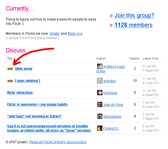
kika commentedha! It seems www.flickr.com uses the very same approach. See attached screenshot.
Relevant CSS:
and HTML
Comment #2
jcosters commentedGreat, but isn't it better to use em's instead of px's for font sizes in CSS?
If I'm not mistaken:
Comment #3
coreb commentedMoving from x.y.z queue to 6.x-dev.
Comment #4
zeta ζ commentedI think this has been addressed with
<span class="marker">new</span>for project issues.Comment #5
Anonymous (not verified) commentedAutomatically closed -- issue fixed for two weeks with no activity.