For example, on any of these pages:
http://beta.drupal.org/project/user/dww
http://beta.drupal.org/project/issues/user/dww
http://beta.drupal.org/project/issues
http://beta.drupal.org/project/issues/search
http://beta.drupal.org/project/issues/drupal
http://beta.drupal.org/project/issues/search/drupal
...
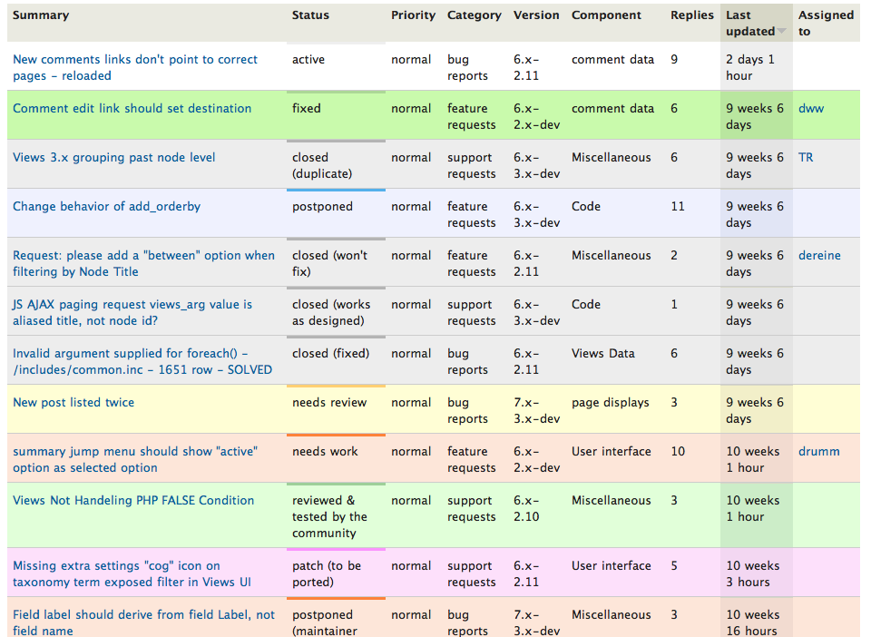
The color scheme is pretty intense, especially the darker green for fixed, the darker pink for closed (fixed), and the medium purple/grey for postponed, duplicate, and the various flavors of closed, etc.
These colors seems a bit out of place with the rest of the design of bluecheese, which is going for subtlety (yay). For some of the colors, the border is completely lost, too. I'm also a bit concerned about the contrast between the darker green and the blue for the text/links (actually the contrast isn't great on any of the current "strong" issue colors).
It'd probably be worth reconsidering these color choices and see if we can turn down the volume a bit more on some of them. It's still nice to visually distinguish fixed from RTBC, for example, so we can't just go to the totally light green for both of them. The difference in colors is intentional, even if the degree is not. ;)
Thoughts?
Thanks,
-Derek


Comments
Comment #1
dwwThis will also help on the dashboard. See
#936648: Make the "My issues" block (for the dashboard) more beautiful and functional
Comment #2
kjay commentedI've been playing with this a little on my local install. I think I have some ideas coming together but will need a little more time. Hopefully get something ready to discuss later today.
Comment #3
kjay commentedHere are some changes that are a bit of a shift from what we currently have but I think it would be helpful to try and make the lists as usable as possible, whilst keeping things looking good and 'in keeping' with the theme. This is a 'first pass' on this, so it would be good to hear what folks think.
dww has pointed out that the standard project issue colours are intense in comparison to the subtle approach of the Bluecheese theme.
Obviously, the problem with simply toning the colours down is that we will probably end up with a list where items of similar colour will be difficult to distinguish from one another, especially on low contrast monitors.
An additional problem with the existing list, as dww has also pointed out, is that the text is quite hard to read on some of the status backgrounds, a good reason to tone the colours back!
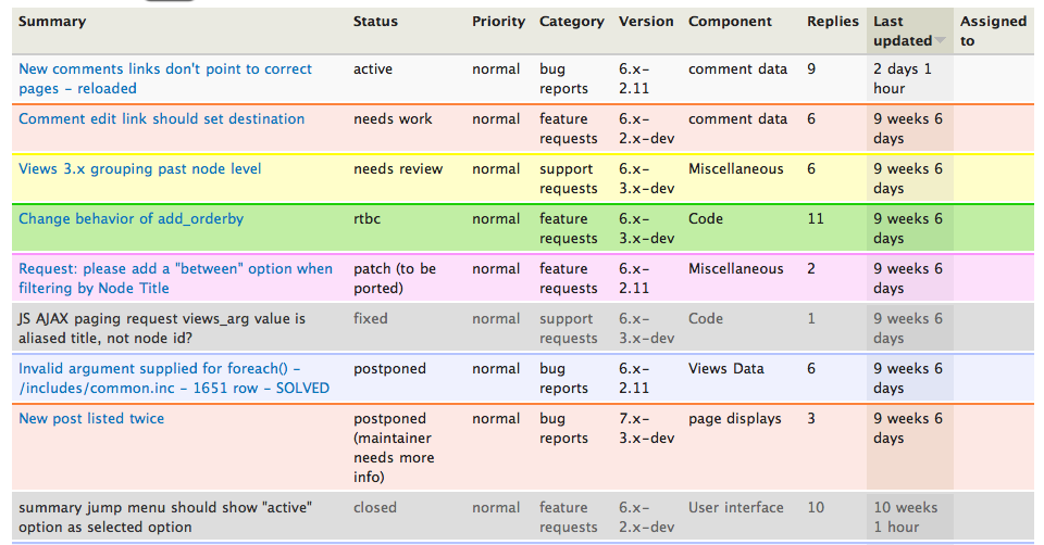
My idea, for which I've attached screenshots and a patch (currently an untidy first pass of this), is to use toned down colours for the backgrounds of rows but to really reinforce the status colour with a strong colour tone as a top border on each issue row.
Additionally, I have taken the reverse route with the active column to the existing approach of darkening the background colour tone for active cells. By setting the active cell top border to a deeper tone, we can roll back the background colour even further. Highlighting rather than 'bolding up' the colour. To finish it off, I've bolded the text for the active column, though perhaps this is going further than needed?
To aid readability, I've added a 3 pixel white margin at the foot of each row.
Be interesting to see what we think of this approach.
BTW, I've hacked some of the HTML in the screenshot to get a range of colours showing so the status tags don't match the colours in some cases, but it gives you the idea ;)
Comment #4
dww- I like the concept of strongly colored borders for this a lot.
- I like the 2 shades of green, that looks nice.
- Can we see the 2 shades of pink/red?
- Yellow looks fine.
- Definitely not bold for the active column.
- What about using some of the bluecheese small icons? Maybe that'd be better suited for #936648: Make the "My issues" block (for the dashboard) more beautiful and functional -- although it could work for both.
Could we add a bluecheese-appropriate set of yellow ones, too? At least the comment bubble. Then we'd have:
Active: No icon
Fixed, Closed (fixed), Closed (works as designed): Green star
RTBC: Green comment bubble
Needs review: Yellow comment bubble (would need this)
Needs work: Red ! (too strong? maybe a red/pink comment bubble?)
Postponed*: Blue comment bubble (?)
All other closed: nothing? Red error?
Should we split out the question of icons to a separate issue, or just handle it here to see how they fit in with the new colors + borders? Seemed better to keep it all in one place for now.
Thanks for working on this, kjay!
-Derek
Comment #5
kjay commentedGreat. I'll produce a further developed version later today.
Icons could certainly be interesting, I'm happy to see how they work as part of this thread and then if need be we can spin off as a new issue if they need further discussion?
Thanks Derek, much appreciated.
Comment #6
kjay commentedAttached is a screenshot of the same styling as per the version in #3 only this version has the status number (colour) and status names tweaked to show all colours currently styled.
The order is as per the select list on the filter with Duplicate, Won't Fix and By Design excluded since these carry the same colour as Postponed.
I'll start looking at the icon possibilities and removing bold styling on active column text.
cheers
Comment #7
kjay commentedI have experimented with adding icons for status and I've not reached a version that I feel is working in a way to justify adding them as yet.
With the versions I've produced locally, and it could just be the way I've chosen to implement them, it doesn't feel that the icons bring enough to the visual experience to justify them being there.
I think the idea could work well but will need more time and therefore I think you are right to suggest we split adding icons into a separate issue that can be looked at later. This will allow us to at least get the colour changes presented above discussed as the priority and perhaps implemented. You were right to suggest splitting the issue :)
thanks, Keith
Comment #8
dww@kjay: Cool, makes sense. Here we go:
#939420: Consider adding icons to issue listings
Comment #9
dwwComment #10
tr commentedI notice there is no color assigned to state "Closed (cannot reproduce)" (state-18), so that state shows up as white or grey depending on whether it's tr.odd or tr.even in the list. All the other states are targeted with CSS rules like
.project-issue tr.state-2{}, but there is no corresponding rule for state-18.Problem exists on drupal.org as well as beta.drupal.org. It's not clear to me whether this color is set (or not set) in the site theme or the project-issue module.
The state "Postponed (maintainer needs more info)" (state-16) also has this problem, but only on beta.drupal.org.
Comment #11
Bojhan commentedThis is starting to look like the right direction. I would recommend not using background effects on the selected sorting row, this should only be applied when changing it to something diffrent.
Comment #12
c4rl commentedThere is a small white gap at the bottom of each row visible in the screenshot from comment #6
Comment #13
kjay commentedAttached is the patch that covers the work as shown in #6. Additionally, c4rl has pointed out the 2 pixel bottom white border, I've revisited this and think it does look better with the standard tr 1 pixel bottom border of #D8D8D2.
In relation to #10, I've based the colours themed so far on the css that existed and checked this against the 'status' select filter. I've used the same colour settings for state 18 as used for regular closed (the same approach used for the 'postponed' settings) and also added colours for states 15 and 16 which were missing:
state 15 - 'patch (to be ported)' shares the same colour as state 14 - 'reviewed & tested by the community'
state 16 - 'postponed (maintainer needs more info)' shares the same colour as state 4 - 'postponed'
I have also rolled back the top border colour (for sorted cell) where it was #555 to a lighter shade.
Comment #14
merlinofchaos commentedJust want to interject that I like these colors and think the addition of a border is a necessity. Currently reading lists of issues on beta my eyes lose track of what I'm reading all the time. I personally prefer a thinner border but am not too argumentetive on that point.
Comment #15
kjay commented@merlinofchaos. I'm just working on this now a little more and funnily enough, was experimenting with a thinner border! Thanks for the feedback.
Comment #17
kjay commentedNew version attached with thinner top border. Tested in ie8, ie7, safari, firefox. IE7 has the typical border white space issue but the table is usable and layout is good. Might be something we can fix or gracefully degrade on a future patch.
Can we go for this?
Comment #18
Bojhan commentedscreenshot please.
Comment #19
kjay commentedsorry
Comment #20
dwwApplied this on a redesign test site:
http://solr.redesign.devdrupal.org/project/issues/search/drupal
...
Mostly looking good. I think this is probably good enough for now. We can always tweak this further after the initial launch. Any final objections before I commit/deploy?
Thanks!
-Derek
Comment #21
kjay commentedNo objection from me for a commit :)
thank you!
Comment #22
lisarex commentedLooks good to me!
Comment #23
dwwCommitted to bluecheese bzr. Should be out on redesign/beta in a little while.
Thanks, kjay!
Comment #24
catchI'm not clear if this was already pushed to d.o or not.
Either way I opened #945628: Issue queue contrast + 'your issues' bllock with this screenshot: http://drupal.org/files/issues/Desk%201_010.png to discuss the colour scheme, which was closed as a duplicate of this issue.
The contrast in the colours isn't enough to tell the status of an issue IMO - with RTBC / Fixed or closed / needs work next to each other I can see the difference, on their own I'd have no idea, this wasn't the case previously. There are also some css issues with the table borders, which adds some noise to the table.
Comment #25
dww@catch: Yes, this is live.
We could certainly just revert to the default colors in project_issue. But, they're pretty intense colors, and the rest of the redesign theme is aiming for subtlety, so they seemed very out of place with the rest of the site. I'm willing to reopen this for further consideration. Concrete proposals (with screenshots) would be most welcome.
Comment #26
Bojhan commentedActually somewhat suprised this was pushed on, I find #6 signifcantly better then the last patch. The gray border on top of each issue its border creates a wierd gradient cut off effect. Where as #6 greatly increases the scanability the last patch actually decreases it by lessening the vertical spacing.
The contrast to me could be fixed by going back to #6.
Comment #27
webchickUgh. We really need to do something about this, IMO. The lack of contrast between fixed/RTBC and needs work/closed has been screwing me up all day.
Comment #28
webchickAnd we can try #6, but that seems to suffer from the same problem. The darker borders do help a bit, though.
Comment #29
webchickI'm no designer, but I actually think using solid colours here is fine as long as they don't clash with the header (which our old colours did). I also think it would be fine not to lightly colour the active table cell, but can't remember how this was in Blue Beach. But if we removed that, we would be down to only picking one colour per status, instead of picking 2 of them (or 4, with borders) and make it far easier to pick colours that easily contrasted with one another.
In the interest of progress, here's one possible colour palette created by dorking around with the light/dark buttons on http://www.colorschemer.com/online.html using a base colour of the header text.
Comment #30
kjay commentedI'll keep working on this some more. The challenge here is that the blue text links become very hard to read over the background tints and so simply darkening up the background colours will reintroduce that issue. I will certainly post a new version here asap.
Comment #31
webchickAwesome. Thanks a lot, Keith!
Comment #32
c4rl commented@kjay Since the link color is the contrast problem, perhaps it could use a lighter background-color attribute on the anchors themselves, or simply have a white background color on the cells containing the links and the status color persist throughout the rest of the row (or simply the cell containing the status).
Comment #33
merlinofchaos commentedOne minor nit. For some reason, I don't really like that the border color changes on the active-sort column. Changing the background color is fine, but why the border?
Comment #34
kjay commentedThe original goal was to get colours more sympathetic with the subtle style of the theme. Obviously we are finding that the first attempt at this is not so easy to use and probably suffering across monitors. That was the idea behind adding the darker top border for each issue, a stronger colour without it becoming overwhelming or interfere with text contrast between the colours.
I did think this top border could be reduced from 3px to 2px but with #6 being flagged as perhaps an easier to use version, perhaps this was a wrong move. Also, the 2 pixel white border did help separate issues. In this revised version, I've reintroduced the style of #6.
In an attempt to maintain the more subtle colours, I have attached some screenshots that better separate the status colours used for RTBC / fixed and closed / needs work.
Perhaps, if we feel the colours are enough across monitors the borders are unnecessary. Otherwise, we are possibly looking at darker tones and employing some of the ideas c4rl suggests in 32 to deal with text.
thanks
Comment #35
dww- I think this is an improvement with the same border color on the active column, makes it less distracting
- I think 2px borders are probably enough, this seems a bit heavy
- We can't use grey for "needs work" -- there will be a revolt ;)
- We shouldn't use the same color for RTBC and to-be-ported. to-be-ported should either be purple, or perhaps just reuse 'needs work' pink
- I think the highlight color for yellow needs to be a bit darker
- I think the RTBC pale green and needs review yellow could both be a bit darker (for the row background itself, not the border)
Comment #36
kjay commentedThanks dww. Attached is a new screenshot and patch taking care of those points. The trickiest is closed vs needs work without going really red.
Comment #37
merlinofchaos commentedIt took a few seconds of looking at it to adjust, but I do like the white border + colored border. It adds real texture.
Question: Besides history, why is closed red? Should it really be red? Maybe it should be some muted color?
Comment #38
dww@merlinofchaos: Re: closed (fixed) == red. I was actually thinking the same thing. Maybe the non-fixed closed status values should be red, but closed (fixed) could be the same green as "fixed"?
Comment #39
avpadernoIf closed (fixed) must be a color that is different from the one used for fixed, I would make it a darker green. I agree that red is a color that makes too much contrast with the green color used for the fixed issues.
Comment #40
webchickDarker green for closed is interesting. Or even grey as in "we don't need to worry about these anymore."
But I think we need to keep some pinkish/reddish colour for "needs work" as in "danger danger, you need to something here."
Comment #41
webchickBtw is there a good reason the colour of "patch needs porting" and "postponed" got flip-flopped in #38? Or that "postponed (maintainer needs info)" gets the same colour as regular postponed rather than the "needs work" colour? I'm assuming those were just mock-up bugs, but I don't see a particular reason to go and change those on people. (esp. the "maintainer needs more info" one for the "you need to do something about this" reason as above)
Comment #42
dww@webchick: no, I think kjay just mixed up some status values. We should probably add comments to the CSS to name all the status numbers so we're clear on what we're doing. I agree that "maintainer needs more info" should look like "needs work".
Frankly, I think "to be ported" should also be the same light red/pink (if it's going to continue to exist at all). Really, this should be "needs work" and an issue tag, but that's another story.
Comment #43
gddHi my name is Greg Dunlap and I am red/green colorblind. Red/Green colorblindness in its various shades affects approximately 10% of the male population of the world. Some notable red/green colorblind personalities are Fred Rogers, Bing Crosby and Jeff Eaton.
So my comments are about the new color scheme to some extent, but may also reflect comments about the old one as well. I probably should have made some comments about this along the way during redesign but... i didn't. I don't necessarily want to hold this up but I'd like to start raising some awareness of these issues. A blog post is probably in order.
So my general comment is that while I appreciate everyone going for increased subtlety in the color scheme, this is absolutely the wrong direction to go as it wreaks havoc on the colorblind. As an example, in the PNG on #36, RTBC and Needs Review are virtually indistinguishable. Needs Work and Closed are also very close. Typically blue/purple also cause complete havoc to red/green colorblind individuals, however the instances here are reasonably distinguishable (for me anyways.) For the sake of comparison, the PNG in #36 is far far better than the one in #6 which basically has three colors to me. If you want to worry about accessibility for monochromatic colorblindness, try turning your screen to grayscale. G
As a general rule, the chart on this page offers a good guideline
http://en.wikipedia.org/wiki/Category:Articles_with_images_not_understan...
Only use one color from each of the five groups, make them as bold and primary as possible. In general I don't get too hung up on color issues, but this is a case where the color of a row is THE main way to identify an issue's status (the label in column 2 being the only other way possible), and it would be cool if it was as accesible as possible.
I personally would be happy if RTBC and Needs Review were made more distinct and the rest I can live with.
Thanks for listening!
Comment #44
catchRe-titling.
Comment #45
c4rl commentedI was going to make a similar remark to @heyrocker's comment #43 -- @greggles and myself are also colorblind.
"Patch" and "postponed" are pretty close as well.
Are other there other design possibilities rather than simply the overall color? For example, saturate the colors of the status column only -- text could be changed to white for sake of contrast. Or just saturate a thin strip along one side of the column (see attached).
Comment #46
Bojhan commentedI am confused, doesn't the last patch solve the issue.
Comment #47
avpadernoCould not the issue with colors be resolved by using a background icon, together the background color? I know that red/green blindness is the more common, but there are people who are blind to other colors as well; for example, my father is blind to blu/green colors.
As alternative, the used color scheme should not include the primary RGB colors. What happens if we use the CMY primary colors, instead?
Comment #48
kjay commentedI am working on a new patch to see about bringing all these recent points together.
thanks
Comment #49
Bojhan commentedAlright, I think the last patch was very close already -by accommodating the feedback of heyrocker by tuning the colors ( testing at http://snook.ca/technical/colour_contrast/colour.html or http://www.vischeck.com/vischeck// ) to verify. Although c4rl and kiamlaluno suggestions are good, I think adding an intrusive element like a colored vertical bar or icon(for other reasons) might be a bit to much at this moment. If we can just get the colors good, I would prefer us to not add extra elements.
Comment #50
kjay commentedI'm hoping I've got this right in terms of the colour tweaks being suggested here.
screenshot-issues-subtle-colour-936926-7.png is as follows:
1. 'Closed' (Red) becomes the same green or darker green as 'Fixed'
2. 'Maintainer Needs Info' should have same colour (orange) as 'Needs Work'
3. Discuss whether we keep the purple for 'patch (to be ported)' or also change this to the same colour (orange) as 'Needs Work'. This would put 'Maintainer Needs Info' 'Needs Work' and 'patch (to be ported)' all on the same colour
4. Yellow on needs review has been made fractionally more saturated
In terms of the issues being raised about the need for saturated colours, I think this will need more time to get right but as a starting point, what about the attached screenshot screenshot-issues-subtle-colour-936926-8.png? I have made the top border colours more saturated.
Going a step even further, grey-for-fixed-and-closed.png provides an example of how it would look if we followed webchick's point in #40 about going grey for closed and I've added fixed to that as well. This makes the colours available to the open issues. I also greyed most of the text a little.
Comment #51
gdd-8.png is a huge improvement over -7.png in terms of RTBC being more distinguishable from Needs Review. However I have to say I REALLY like grey for fixed and closed, especially with the greyed out text. This makes it easier to sort of gloss over those issues, which is what most maintainers probably want to do with them. It also opens up another color which we can use on the issues maintainers want to pay attention to.
So huge +1 to grey for fixed and closed, but if everyone else hates that then 8.patch is way better than what we had from an accessibility standpoint.
Thanks for working on this!
Comment #52
webchickI'd love green for fixed and grey for closed. Green makes me feel good. :) Grey means I can dismiss it.
Comment #53
catchFixed issues I usually want to look at, to see what patch actually got in, whether it needs re-opening, stuff like that. It also tells me it was only fixed recently - so I might have to cvs up or whatever.
Grey for closed is great.
Comment #54
Bojhan commentedYup, gray for closed rest seems good. Can anyone make a patch? I dont know how to cvs against a contrib
Comment #55
kjay commentedI'll do the patch this afternoon. Only concern is that by going green for Fixed, we reintroduce the problem of separation between rtbc and fixed. I think the answer here is to get the green dark and treat the text (if necessary) in a similar way to the fixed issues.
Comment #56
kjay commentedAttached are two versions.
The '-9' versions uses a very dark green that is based on the lime green defined in the MB colour scheme. I've done this version since we need to be sure that there is enough tone difference between fixed and RTBC as I mentioned in #55.
Hopefully, we can actually go with '-10' because I think the colours are more balanced.
thanks
Comment #57
kjay commentedSorry, I forgot to tag as needs review.
Comment #58
Bojhan commentedI am going to mark 10 RTBC, we can iterate further but this is a good improvement and worth committing.
Comment #59
dwwThere's no patch in #10. I'm not sure what you're RTBC'ing here.
Comment #60
avpaderno@Bojhan: Are you referring to bluecheese-issues-subtle-colour-936926-10.patch?
Comment #61
dwwSorry, right. I see Bojhan's talking about #56.10 now. However...
A) Wow, the original point of this issue was to make the colors cheme a bit more subtle. Granted, there's an influx of concern on colorblindness here, but wow, the more recent screenshots seem to SCREAM in ways that not even the original colors from project_issue did. :/
B) To my eyes, there's not much contrast between pink/orange (needs work) and purple (to be ported). I bet if those were side-by-side a lot of folks would have trouble scanning them.
C) I think I like grey for closed, but I don't think I like greying the text, too. That's just going to further piss off the folks from #941372: Improve text contrast - some colors don't meet WCAG criteria.
D) Do we want to differentiate closed (fixed) [safely ignore me] with other kinds of closed? Or do we just want all the closed (*) status values to be grey?
E) Once (if?) we finally converge on a set of colors we're reasonably happy with, we're also going to need to update the colors for the issue link filter (as in the span around the #941372 a few lines above). It'd be totally weird if those retained the old colors, and the issue queues went off in a different direction. I realize it's my fault since I forgot about this until now, but it definitely needs to be addressed before this is really ready.
Thanks everyone! Sorry this is so hard (and a bit painful). Wish I could do more than comment here, but I've had my hands full with so many other issues...
Comment #62
dww4:10am thinking outloud, beware...
I wonder if it'd be worth exploring a per-user preference for this. Then we could have a colorblind-friendly RAINBOW!!! version, a subtle color palette along the lines of what we currently have on the site (with the consistent border even in the active column, grey for fixed, and some of the other tweaks/corrections from this issue), and maybe just the default "classic" scheme from project_issue. We'd still need to pick one as the default for anonymous (and everyone who doesn't tweak the setting). But, I'm just wondering if it makes sense to solve the accessibility problem by giving folks who want it the option of a more intense color palette, while still leaving the default a bit more tame...
Technically it shouldn't be that hard. We'd just add a new profile field and something drupalorg_project_init() that loads the right drupalorg_project_issue_X.css file based on global $user. That shouldn't screw up the CSS cache too much, right?
Comment #63
Bojhan commentedI can understand putting it back to work, but let me explain one thing why I put it RTBC. It will be impossible for us to find suiting color schemes for all states, we simply have to many - it will always turn into a rainbow of screaming colors(if we want that). I think we should not be scared of some being to close to each other, that should not matter as long as they are not often occurring.
A) Yes, primarly fixed screams (I think this is fixable) - more importantly I think the screenshots we are referring to are misleading, its not a realistic situation.
B) Should be oke, these are not often occurring partners.
C) We can gray, but has to stay within contrast ratio's, if we handle the WCAG ratio here - we should be oke (graying is good for demoting importance)
D) I would definitely go for keeping all closed styles the same, the reasoning for closing has to be scanned anyway to make sense (not communicational by color).
E) Yes, seems like a follow up? Or part of a new patch I don't care.
@dww We can't do that, its against accessibility principles to have two versions of a UI, against other principles too :P Don't be too worried, we are really close to fixing this issue.
Comment #64
Everett Zufelt commented@dww
I haven't been involved in it, but the Fluid Project does have a concept of UI Options. Although it is important to make sure that the default UI option works well for the broadest set of users, it is acceptable to provide UI options to allow users to set preferences. This, IMO, needs to be done carefully.
I have been asked many times in the past if Drupal should have an accessibility settings page where users can set preferences. I think that this is a dangerous idea, but one that is worthy of discussion. I do prefer something like a UI Options page in Drupal, where all users can set UI preferences. This should not be implemented as an ad hoc solution, but as a carefully thought out plan where any module can hook into the UI Options control to register settings. Perhaps a UI Options module would be worth considering as a usability / accessibility improvement for D8. We can likely discuss this with the developers / UI designers at the Fluid Project to learn from their knowledge in this area before we attempt to implement our own.
Edit:
I started a discussion of this issue on g.d.o User Interface Options module. Continued discussion should likely go there and not derail this issue.
Comment #65
kjay commentedSince earlier versions, both the background colours and the top borders have become much more 'full on'.
Now that we have discussed the option for grey for closed, the original point by webchick in #27 about Needs Work and closed being too close is solved leaving us only the issue of fixed/rtbc if we are looking at trying to maintain the subtle feel of this we achieved in earlier versions.
So, if we can test a return to the more subtle use of colour on the backgrounds but keep the richer top borders and that might work on both levels.
I have time to work on this over this weekend.
thanks
Comment #66
dwwyay, thanks for your perseverance kjay! ;)
Comment #67
tr commentedIs there a reason that "active" is light grey (#f9f9f9) instead of white? This makes everything look "dirty" to me. I see this change was first introduced in #3, but there is no mention of it in any of the comments.
Comment #68
jhodgdonCan I suggest that someone run the suggested color combinations (foreground/background) through
http://www.accesskeys.org/tools/color-contrast.html
The current color combinations are not compliant with guidelines.
Comment #69
kjay commented@TR I will revisit this
@jhodgdon I will do this. I am going to be experimenting with this. We are going to need to return to more subtle colour or some other methods to get it compliant I suspect.
Comment #70
kjay commentedI think this is probably still 'work in progress' but I thought it would be useful to post a screenshot of one the (many) versions I have created today.
The attached version uses the same (or similar) subtle tones for row background colour as the current live d.o version. However, this version has richer colours for the top borders. I would like to leave this here for review to decide if this works in terms of colour differentiation.
The colour contrast tests for text on background are fine with the exception of the blue links. The bluecheese blue links on white background pass with the exception of AAA compliance according to http://snook.ca/technical/colour_contrast/colour.html. However, the moment we introduce background colours it starts failing. So, we are going to need to decide if we treat this blue link differently for the issues tables. It could go darker blue?
Now that 'closed' uses a grey background we have no issue with needs review being too similar to closed and the green I've used for fixed is reasonably solid and like 'closed' does not include a top border, which further separates it from RTBC.
I have also removed the grey text for closed for comparison.
So, I believe this patch improves on what is currently live but I would like to know if the top borders plus other tweaks are enough to differentiate issues for those who are colourblind.
thanks
Comment #71
dww#70 looks like a quite sane compromise, thanks!
I'm not sure how I feel about the lack of top border on certain status values. I can see what you're aiming for, but it also kinda just looks like a UI bug in a way (like we forgot to specify borders for certain status values). Not sure. But, this is minor, so don't let it be a distraction.
I'd be in favor of darkening the blue for links that are being decorated with issue status colors.
Thanks, kjay! We're almost there... ;)
Comment #72
webchickAgreed with dww re: border consistency, and the colours in #70 look effing awesome. THANKS!! :D
Comment #73
gddMy initial impression is that scanning the issues based on the border color rather than row color is kind of unnatural, but I would probably get used to it. I'm willing to tweak in followups as well.
Comment #74
kjay commentedI'm pleased the general view so far is that we are getting close here.
I've been trying things out that take the design of these queues even further but for now, I need more time before discussing anything. For now, it would be great to get the colours and usability improved. I feel like the changes presented in the attached screenshot and patch are in the right direction and shouldn't be too much of a leap from how things are now.
I have increased the contrast of the blue links by a small amount to get them to the same compliance level as they are by default. I have made this setting to be the same across all colours.
I have also added the borders back to closed and fixed. I agree these look better and claim I've been looking at this too long!
The attached screenshot shows an improved representation of the issues that I tested against and I've updated the status' to better match the ones in use on d.o (my local db is now old).
I have made all closed variants grey.
@heyrocker, it would be great to work together on this to further improve the way the queues work in terms of colour/usability.
@dww I would really like to get this 'used' a little before we start to think about commit, it would be useful I think to see how the colours work in 'real' issue queues. What do you think? Is there a staging install we could deploy to for some testing? Especially for cross-browser, which I've not had time to do extensively as yet.
thanks
Comment #75
dww@kjay: We've got a couple of staging sites for this sort of thing. I applied the patch to beta.d.o and cleared all the caches:
http://beta.drupal.org/project/issues/drupal
However, the site is currently being rebuilt. But, once that's done, this should be live there for folks to play with and review.
Thanks!
Comment #76
tr commentedThere's only one thing I don't like about #74, and that's the 4px wide borders between rows (2px top border, 2 pixel bottom border).
We went from 0px borders (bad) in the original rollout of the new design, then to 3px borders in the current design, now the proposal is to increase them to 4px. The wide borders make it look clumsy and cluttered to me.
Attached is a screenshot that shows the 4px borders from #74 alongside the same image with 2px borders (1px top, 1px bottom). Please take a look and see which one you think is better.
Comment #77
webchickI'm not really sure what was wrong with the old 1px black borders we had in the old design, but TR's skinnier coloured borders is a big improvement, IMO.
Comment #78
dwwdo we need a bottom border at all? how about 2px top 0 bottom?
if that doesn't look nice, yeah, I prefer #76 to #74.
WTF's up w/ beta? I've been away all morning/afternoon -- the site still says it's offline. strange. don't have time to investigate now...
Comment #79
tr commentedI'm not opposed to 1px borders, but the 2px bi-color borders give the page some depth because they look like a raised horizontal rule.
A 2px top 0px bottom border as suggested in #78 won't give the depth effect you see with a 1px white top 1px colored bottom.
Comment #80
dwwPut #74 on redesign.d.o but set the bottom border to 0px:
http://redesign.drupal.org/project/issues/drupal
http://redesign.drupal.org/project/issues/search/drupal
I'm very happy with it. I'm sure we could tweak this forever, but let's at least get something better than what we had before and what we have currently.
The colors of the borders for fixed vs. RTBC still seem not quite right. The RTBC border is so intense, it seems more like fixed to me. I almost think just swapping the two would be better, not sure. But, I'm happy to leave it as is, too.
Seeing it in action, I really love having all of closed as grey -- that's brilliant. I'm going to fold that upstream into project_issue I think. ;)
Re #79: I don't believe we're going for a 3D effect here. I don't really care about giving this page "depth". It's already visually dense/cluttered. Less pixels is better, IMHO. We want to be able to scan for status based on colors, and we determined the background was too subtle without the stronger colored border. But, I'd rather see more issues on a screen at a time than more borders and "chart junk".
Comment #81
Bojhan commentedInteresting the lack of a border-bottom seems to actually decrease the readability. This because the border-bottom makes it easier to distinguish septate issue rows. Thereby increasing the scanability and with that read ability of the issue queue, although its true that we don't want a 3D effect (a small height would do that), having it like http://drupal.org/files/issues/screenshot-issues-subtle-colour-936926-12... would make it easier on the eye to go through issues (it takes some getting used to, but to me seems more natural from a typographic perspective).
Comment #82
kjay commentedI agree with @dww in #80 that we could tweak this forever :)
I think that we should get the fixed/rtbc right and then get feedback from @heyrocker in terms of whether the screenshot in #76 is less or just as usable from a colour perspective.
I do agree that the thinner border looks better but the thick border was intended to make the page more usable.
Comment #83
kjay commentedThis latest version adjusts the grey background from being quite so full-on. I have also done work on the greens of 'fixed' and 'RTBC'. I have also adjusted the patch to use single pixel border and no white single pixel gap.
Comment #84
Bojhan commentedSorry, I still dont get it - thin lines, no white space. We are losing the elements that made it more usable?
Comment #85
webchickRight. I was suggesting above going back to a 1px black (or grey or some other neutral colour) border. If we're going to keep the coloured borders, the white bottom border is probably required for legibility.
FWIW, is what that looks like:
But I think the hard lines are too heavy for this design.
Comment #86
dww@Bojhan, webchick: If y'all read this issue fully, you'll learn that the strong colored borders were a compromise between subtlety and accessibility. The contrast between the row colors using more subtle, bluecheese-friendly colors wasn't strong enough for colorblind people to tell the difference. So we added a thin border of a more intense color to help people differentiate, even if the full row colors mostly looked the same.
I don't understand the claim that a nearly invisible 1px white bottom border helps distinguish the rows more than a 2 px top border from the issue below it. Look at the screenshots or actually try it on the beta site. I can't imagine how anyone could possibly be confused about where 1 issue ends and the next begins on beta.
Comment #87
Bojhan commented@dww I think you are confusing between possibility and actual behavior. Sure its possible to see the difference between one and another issue, however with the thicker border and thicker border bottom a user was for more able to see separate items. Please join me on IRC to discuss this, as it seems we are slowly simply going back to what we had + a minuscule border(which would be hardly acceptable for color deficiencies).
Comment #88
gddUnfortunately I am essentially offline for the next several weeks dealing with my move, so I won't really have time to continue tracking this issue. Perhaps c4rl or greggles can pick it up. Regardless, everything I've seen since then has been an improvement so please don't hold it up for me.
Comment #89
webchickThis isn't a confusion issue. It's an easy on the eyes issue.
#80 and redesign.d.o (particularly for "needs review") are screaming at me and jabbing my eyeballs with hot pokers. :P I did of course fully read this issue (wtf?), and know about the arguments/studies about colour blind folks. That's why I suggested a single, neutral colour for the borders, but it turns out it looks like crap with the design. And regardless, there remains the other 90% of the population that needs to deal with whatever we decide here, so we need to reach a compromise.
#83 is an improvement over what's currently deployed on redesign.d.o, and I could live with it if we tweaked the yellow border to be more akin to what's on d.o now. But without the whitespace separation we lose something from the earlier patches. Bojhan or someone else with more of a "design eye" could probably articulate a bit more than me.
Comment #90
c4rl commentedRegarding heyrocker's comment #88, I think the only improvement for colorblind folks would be to make the Needs Review less blue to be more distinct from RTBC.
Can Needs Review background-color FFFEE2 be changed to FFFED5? It's subtle, but it makes a big difference for me.
Comment #91
kjay commentedI think we need to increase the sense of space. That probably can't happen horizontally but can vertically. Everything is so crammed on these tables and by simply adding some vertical padding we can, I believe, get just as effective sense of separation as we were with a 2 pixel white border.
For example, this prototype table - https://infrastructure.drupal.org/drupal.org-style-guide/prototype/event... I think works really well due to the use of padding.
In terms of the coloured borders, they are adding more visual noise and whilst they do work, perhaps we can improve things further by relying on some other element or method, such as the attached screenshots to get something that works well?
screenshot-issues-subtle-colour-padding.png is I believe more readable due to the increased vertical spacing and I have attached a version that removes borders completely and uses the coloured icons (from the MB page furniture) to denote status colour.
@c4rl, I've tweaked that colour as recommended
Comment #92
dww@kjay: Again, thanks for your continued work on this issue! You keep trying to please everyone, which is amazing. Thanks!!
Ahh, icons... #939420: Consider adding icons to issue listings ;)
I think the thick/dark borders only on a certain column looks more like a CSS bug than a conscious design decision...
I'm sure it's personal taste, and we could go around in circles forever on this, but I'd much rather see more content on a single page (i.e. more issues without having to scroll) than add a bunch of padding so it "feels more spacious"...
I still think basically #80 + the specific color fixes from #83 would be fine. I'm tempted to just deploy that and be done with it.
Comment #93
dwwp.s. and fixing the yellow from #90 and #91... didn't mean to ignore you, c4rl.
Comment #94
kjay commentedI would like to help move us forward on this and so here are two patches / screenshots that are intended to bring together the last few comments.
Version: 14-a:
I have made the suggested colour tweaks including the yellow border and the yellow bg (needs review). I have also slightly toned back the orange border for 'needs work' and the blue border for 'Postponed', I agree that they probably were 'screaming' a little. Since we seem to be stuck on separation with 2 pixel border or not, I have included the 2 pixel border, once again, for reference since previous version removed this. It is simple to remove if we need to.
Version 14-b: I have also supplied a near identical version version that illustrates the same with the grey border only. Yes, this takes us away from having a strong colour but I am not even sure that only using a 1 pixel border works for colour blind reference anyway and we would probably be better off working separately on some other method, such as #91 icons for example, to achieve a stronger visual status reference. Perhaps one that doesn't rely on colour alone!
Comment #95
joachim commentedI can't tell the difference between those two images[*], but both look good!
(I've come over from #958938: sort column on tables has funny borders, and those screenshots also appear to fix the problem I reported there.)
[*] That's why I'm not a designer ;)
Comment #96
ruplThis might not surprise anyone, but after two years these patches don't apply :p
Could we get a re-roll or a general re-eval of the proposed change?
Comment #97
mgiffordShould these ideas be merged into #936304: [META] Style issue comments and we close this issue?