

Closed (fixed)
Project:
Drupal.org Redesign
Component:
Home
Priority:
Major
Category:
Bug report
Assigned:
Unassigned
Issue tags:
Reporter:
Created:
10 Oct 2010 at 01:58 UTC
Updated:
3 Jan 2014 at 02:04 UTC
Jump to comment: Most recent, Most recent file



Comments
Comment #1
eigentor commentedActually
is better ;)
Comment #2
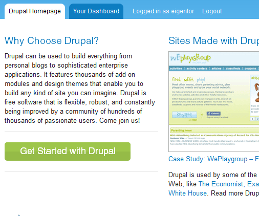
lisarex commentedAlso, on Firefox 3.6.x OSX, the text on the button isn't centered vertically; it seems too high within the button area. I'd be interested in seeing screenshots of it in other browsers...
Comment #3
redhatmatt commentedThe left alignment is clearly easy to do, but I have no direct access.
Look at issue http://drupal.org/node/941660
The many screen shots on the Download button apply for this issue as well.
Comment #4
eigentor commentedchanging title: should say left instead of right.
Comment #5
Mind Design commentedI believe this would be fixed using line-height instead of margins on the text. Of course, I have not seen the html and css, but I guess :)
Comment #6
Amazon commented@pusle please review this page about working on the redesign and request access: http://groups.drupal.org/node/81244
Comment #7
lisarex commentedLet's fix this.
Comment #8
kjay commentedI have just committed the attached patch to repair the line height issue in Firefox. Are we left aligning this button? The prototype http://drupalorgredesign.dev/home has it centred and I personally think it looks balanced in the middle. I'm more than happy to tweak if it is generally preferred that this be left aligned :)
thanks
Comment #9
c4rl commentedAttached aligns to left
Comment #10
c4rl commentedForgot I had commit access
Comment #11
lisarex commentedLeft alignment is in place, thanks c4rl! I still think the text sits too high within the button (see comment #2) Or is this just me? :)
Comment #12
lisarex commentedTagging for design review
Comment #13
tkeenoy commentedThe problem isn't the button, it's the rag on the text making the weight of that text feel like it's sitting too far left, thus making the button feel off center. This is a font rendering issue, and it looks fine in all browsers tested using MacOSX (Firefox, Safari, Chrome) and Windows 7 (IE 7-9, Firefox, Chrome).
What browser/OS was that screen shot taken from?
Comment #14
c4rl commented@lisarex
I agree with your comment #11. I bumped down the text position and committed this. Will check in IE.
Comment #15
gkatsanos commentedGuys,
Regarding button alignment: I understand the need for consistency, but I think the purpose of the prototypes' alignment was obviously to point out that this is a button. It got deliberately "out of the flow" or "out of the grid" in order to make it more attractive.
I think it should be back to the center.
WDYT?
Comment #16
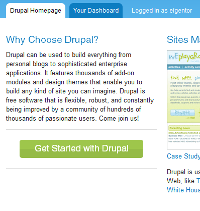
yoroy commentedAgreed with #15 and the original design; the button is not textual content that should be left-aligned but a call to action that wants to stand out. It really should be centered: https://infrastructure.drupal.org/drupal.org-style-guide/prototype/homep...
Similar things should behave consistently, different kinds of objects can (should) behave differently.
Lets be consistent with the original design here and roll this back. I do agree the text could be put a bit lower on the button but that's far less important than the button alignment.
Comment #17
yoroy commentedretitle
Comment #18
c4rl commentedMoved text down a bit and put button back in center to match design. Tweaked sprite to account for larger horizontal padding on button.
Comment #19
yoroy commentedThank you.
Comment #20
gkatsanos commentedThank you.
Comment #21
c4rl commentedMarking as fixed per review from @yoroy and @gkatsanos
Comment #22
yoroy commentedAre changes directly rolled out to beta.d.o? I'm not seeing the actual centered button there just yet (yes, I cleared the browser cache etc. :-)
Comment #23
lisarex commentedNot automatically. On redesign.d.o. it's scheduled every 5 mins, beta is a manual process, for the moment.
Comment #24
c4rl commented@yoroy I am able to now see the change. Will you confirm?
CSS is aggregated on beta.drupal.org -- I just talked to @drumm and a code update with cache clear is now scheduled every 10 minutes on beta.drupal.org so that CSS changes come through.
Comment #25
c4rl commentedYes, in accordance with @lisarex's comment, I've been using redesign.drupal.org rather than beta.drupal.org to see CSS updates since CSS aggregation is turned off and code update occurs more often.
r.d.o was down all morning, but it appears to be working again.
Comment #26
yoroy commentedYep, seeing it now. thanks again!
Comment #27
gkatsanos commentedPerfect !