
Closed (duplicate)
Project:
Drupal.org Redesign
Component:
Get Started
Priority:
Normal
Category:
Task
Assigned:
Unassigned
Reporter:
Created:
14 Oct 2010 at 08:46 UTC
Updated:
1 Jan 2011 at 17:37 UTC
Jump to comment: Most recent, Most recent file

Comments
Comment #1
lisarex commentedThe prototype shows a single book with description.
What we have currently is a static image. We need a whole strategy on keeping this section fresh.
Comment #2
heather commentedI can't figure out where this is that Bohjan points to
I see this at the bottom of the handbook page. Is this the area in question?
http://beta.drupal.org/handbook
Not sure where this comment should go, but are these "recommendations" or are these "paid advertisements"?
Comment #3
brianshumate commentedI think that the spot he's referring to is actually here: http://beta.drupal.org/start.
Comment #4
heather commentedBetter title maybe.
Thanks, Brian.
Comment #5
leahtard commentedAgreed that we need a whole strategy on keeping this section fresh, Lisarex.
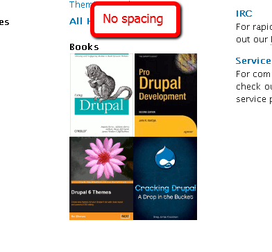
If this can't be done for launch, I have created a graphic with some space between the books.
Comment #6
c4rl commentedConverted to PNG to match existing filename. Should simply replace sites/all/modules/drupalorg/drupalorg/images/books.png
Comment #7
drummIt is one big link, not links to individual books. I did the original with no margins since it is one big link. Separating might look like multiple links.
I though of doing a photo of a few Drupal book on a shelf, but I don't have photo skills/time and it risks looking tacky.
Otherwise I'm in favor of any better graphic and/or text that says "you are going to see a big list of Drupal books."
(Promoting a specific book often has deals with publishers and other considerations. That is why the books at the bottom of the /handbook and right of /security are served through Google Ad manager and have a little disclosure below.)
Comment #8
c4rl commentedIf I may put on my design hat, since is it just one link we could do something fancier. See first attached graphic for a layered stack of books. Second attached graphic for layout sample.
Comment #9
Bojhan commentedI understand we do not wish to favor, however if you display a cover - people will assume that cover links to the actual book. Unless we do a different representation, we'r likely to go in the direction of linking the covers to the products or for Monday (since this is not critical) at least introduce the spacing.
@c4rl Thanks for your suggestion, I think that your idea better presents drumms thought of having several books show up together to indicate this is linking to several. However the visual presentation uses a style that doesn't fit the very clear vertical rhythm of this page, the "four blocks" of information - and hereby draws to much attention to the books.
Comment #10
c4rl commented@Bojhan Agreed. After investigating the prototype again, perhaps we could use a smaller multiple book graphic with some generic text? See attached.
Prototype: https://infrastructure.drupal.org/drupal.org-style-guide/prototype/getst...
Comment #11
lisarex commentedI like the graphic in #10. It just needs a wee bit more whitespace to separate it from the Drupal books text. I'd throw it in right now but we need some text, and I'm slightly braindead at the moment.
Comment #12
c4rl commentedAdded some whitespace to graphic. Attached versions at full and 1/3 column width. Let me know if these are insufficient or need revision.
Comment #13
heather commentedI like the scattered stack! That is nice. It especially suggests "many" and also didn't make me think *each book* should be a link.
Creative solution. :)
Graphic looks great. Go for it!
Comment #14
lisarex commented+1 Thanks c4rl!
Comment #15
c4rl commentedUnless we plan to use the large version of the books graphic, this probably needs some basic copy to correspond to the layout I described in comment #10. Anyone care to take a stab?
Comment #16
Bojhan commentedJust a thought, what about books stacked? like 4/5 stacked on top of each other?
Comment #17
lisarex commentedI've revived this as D7 issue over http://drupal.org/node/1011206#comment-3888200
We won't fix this for D6 books now that we're so close to D7 :)