Closed (fixed)
Project:
Views (for Drupal 7)
Version:
7.x-3.x-dev
Component:
User interface
Priority:
Normal
Category:
Feature request
Assigned:
Unassigned
Reporter:
Created:
10 Nov 2010 at 16:29 UTC
Updated:
1 Apr 2011 at 10:31 UTC

I've been spending LOTS of time with Views trying to arrive a solution that addresses the following concerns:
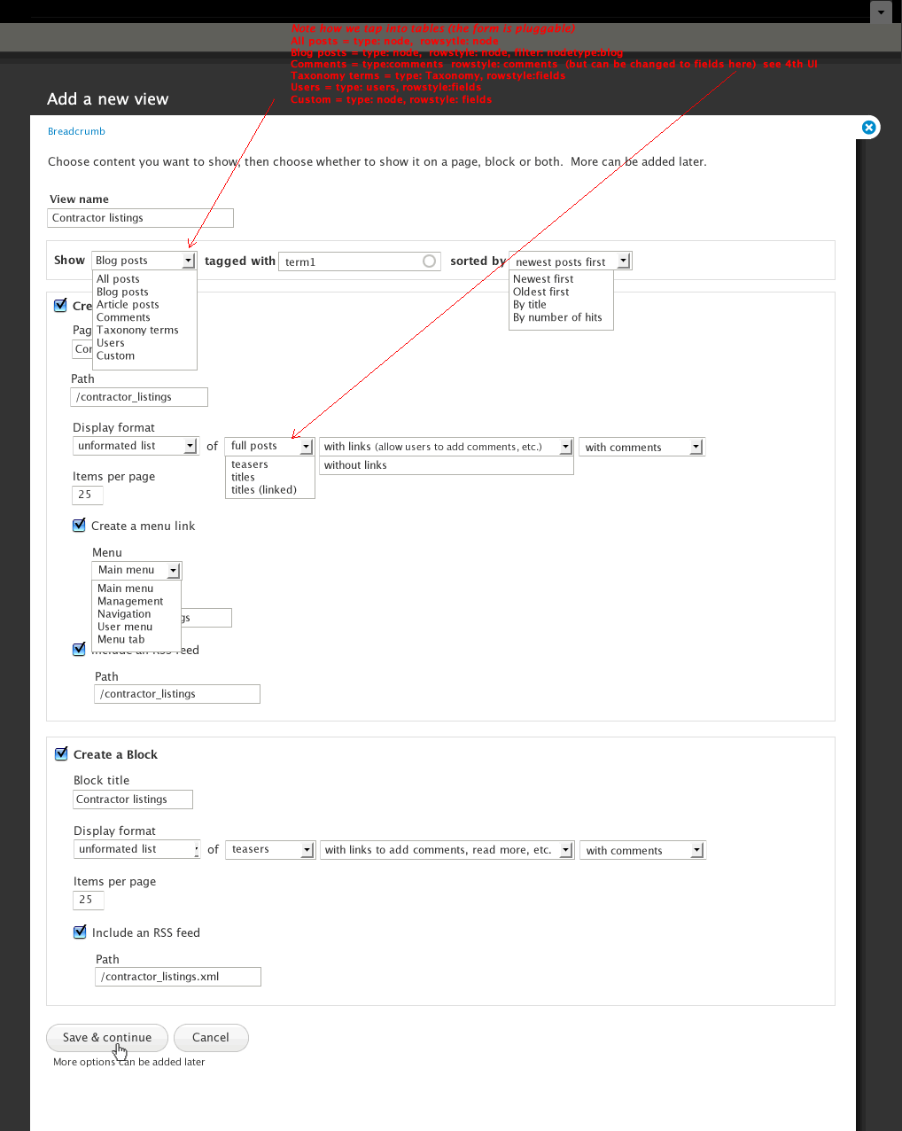
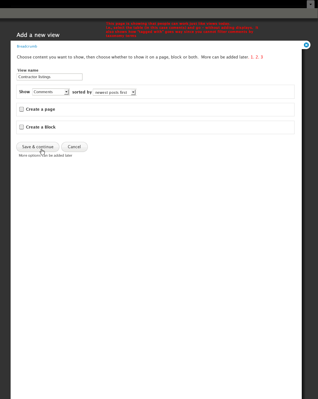
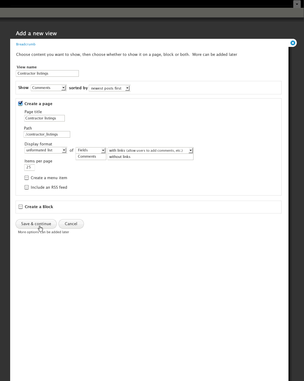
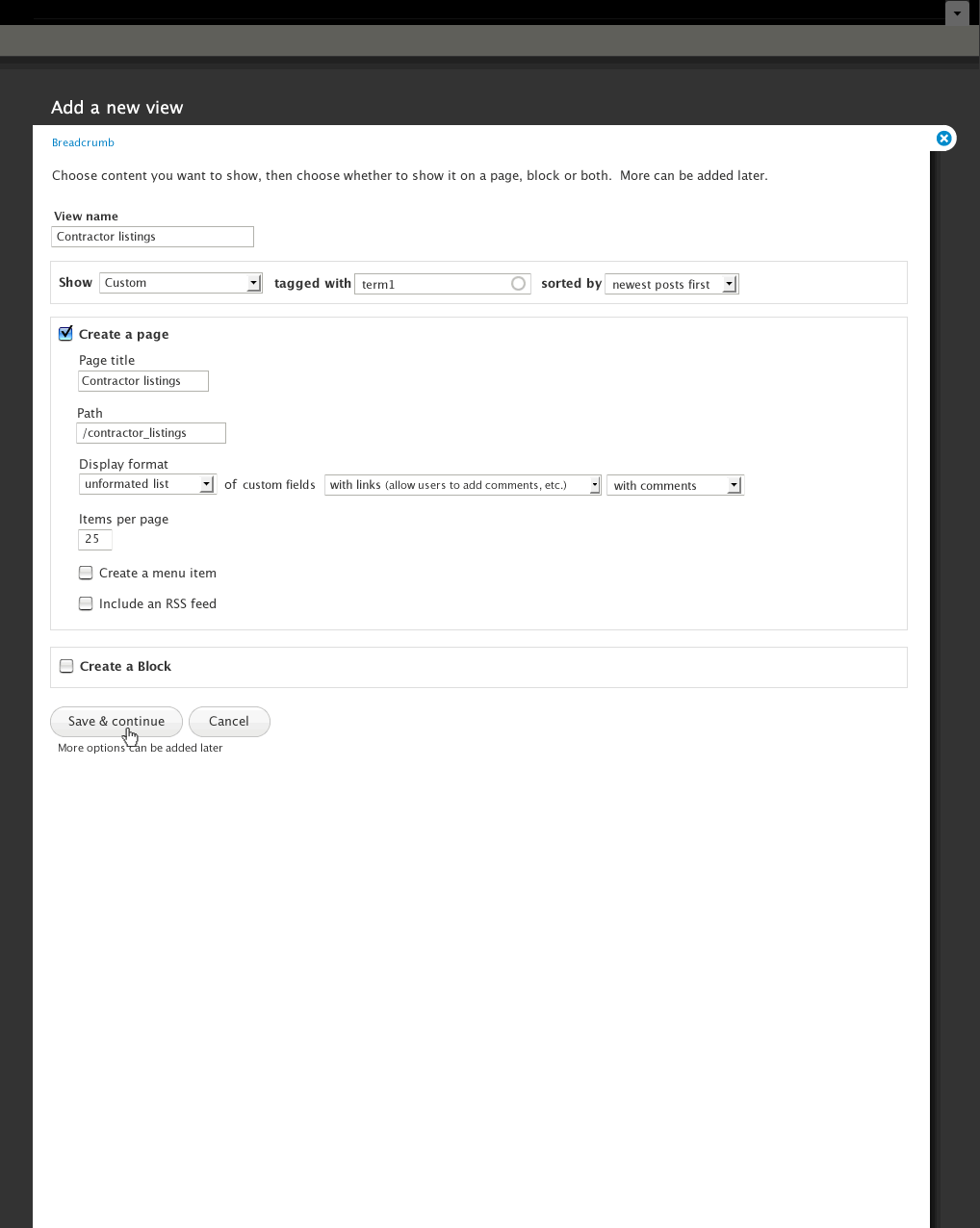
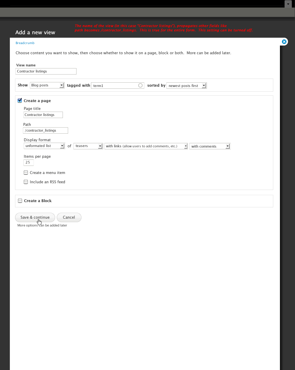
These designs are the first part of a series focusing on item 1 above. The design allows people to configure a View via a "Simple Views" like solution - negating the need to have both Views and Simple Views installed. The design allows users to choose to show blog posts, article posts, or elements from a different table, i.e., comments, users, etc., and all fields update accordingly. That is, if I choose to show blog posts, I can filter the view by taxonomy terms and reveal the posts as teasers, versus if I choose to show comments I can not sort by taxonomy terms and can only reveal the full comment or comment fields.

| Comment | File | Size | Author |
|---|---|---|---|
| 05_add_fields.gif | 26.62 KB | Noyz | |
| 04_add_view_no_displays.gif | 26.1 KB | Noyz | |
| 03_add_view_no_displays.gif | 22.38 KB | Noyz | |
| 02_add_view_full.gif | 50.07 KB | Noyz | |
| 01_add_view_default.gif | 30.63 KB | Noyz |

Comments
Comment #1
willvincent commentedI like what I see here, and I'm all for simplifying the views interface, but I think item #3 above must be stressed.. Simplification at the loss of functionality would not be an acceptable outcome.
Comment #2
merlinofchaos commentedFear not, I will enforce #3; loss of features is something I am very much against.
Comment #3
redndahead commentedAs the maintainer of views slideshow these comments are somewhat slanted towards how I would work with it.
1) I'm assuming somewhere else there is a more advanced interface and this is the "simple" interface.
2) I would like to expose options for the display for the simple interface. In my case it would be something like Transitions (fade, slide right, pinch, etc.) How would this be displayed on the form?
Generally I like the look. I think the hardest part will be finding good defaults. Thanks for getting this started.
Comment #4
merlinofchaos commentedWhat we see so far is only the 'create a new view' interface. It is analogous to the first page when you create a new view right now. It does not address what happens when you click continue.
Comment #5
redndahead commented@#4 Since it's including unformatted in display styles isn't it doing a little more than that? Or are you saying we should ignore that part for this post?
Comment #6
cbrookins commentedYes the design is doing more than just the 1st page of current views - but it is a wizard - and of course wizard's only present the 70-80% use case - and the remaining 20-30% happens after you press 'continue'
Comment #7
redndahead commented@#6 got it. Didn't really realize this was a wizard. I was thinking you would save this and the view would be created. Should have paid attention to the Save & Continue button.
Comment #8
bojanz commentedReally interesting idea.
Providing the most commonly used options while getting the full UI after "continue" seems like the best of both worlds.
Comment #9
merlinofchaos commentedIt also gives us a place to do some really common things. For node views we could generally default to using the published filter, which people want. We could avoid the UI annoyance you get right now where you create a view which assumes fields, but there are no fields, so you get validation errors until you add one. Little stuff like that can probably be handled with the wizardy thing.
Comment #10
cbrookins commentedOne other thing: A goal we discussed with merlin is to define an API so views add-in developers can define what "80% use cases" they expose via the wizard. e.g. they could add just enough to the list of Display formats, or sort options, for the 80% use case.
Comment #11
IceCreamYou2 commentedWhat if there were 3 buttons at the end of the "new view" form: "Save," "Save and configure," and "Cancel"? The "Save" button would just set up the view as configured on the "new view" form without even showing you the advanced settings, giving the 70-80% of people a lower barrier to entry. The "Save and configure" button would take you to the normal advanced settings page for the other 20-30% of people who want to go more in-depth.
Comment #12
bowersox commented#11 makes a good point. Some users will only ever want this simple screen. They may want to "Save" and never see the advanced screen. Moreover, when they edit their view in the future they will want to return to this simple interface again rather than going to the advanced one.
So maybe the buttons could be "Save", "Configure Advanced Settings", and "Cancel". Clicking "Save" will save the simple view and that's it. Clicking "Configure Advanced Settings" will take you to the advanced views interface where you can customize the powerful stuff (views attachments, relationships, etc). But if you return to edit a view that has no advanced settings, then you return to this simpler wizard-like interface. If you did "Configure Advanced Settings" then there is no going back and from then on editing that view is always in the advanced interface.
+1 for this entire UX design idea
Comment #13
IceCreamYou2 commentedI disagree with the idea of separating the two interfaces as entirely as is suggested in #12. There are essentially two workflows here: "create" and "configure." Users don't have to configure, but they do have to create. When you're done creating, you have the option of configuring, but you can never go back to the create form for something that has already been created.
Comment #14
Noyz commentedWhile #12 is valid, I have to agree with #13. Otherwise, this should just be a simple views replacement. The goal here is to orient people to the real Views, so that after configuring what they want to display on this screen, they can pick up and further edit on the next screen. However, I do agree that many will never need to do more, so the following screens DO take that in to consideration. You're getting a bit ahead of me though. I've worked through all of Views, but I'm only presenting the entry screens because there are some more things I need to work through in the downstream UI'.
Comment #15
pwolanin commentedDiscussing with Earl in IRC - we need some thought as to how the initial select box is organized. If there are 40 node types, the mock-ups no longer make sense because, for example, I'll have to scroll an inconveniently long way to get to Users.
Comment #16
Noyz commentedWhat do we think the average is? 40 is bad, but it's not horrible. 50 + is getting to be a problem - but is probably fairly rare. I tend to think the average is probably 10-15. So long these are decent guesses, I think we should stay on path.
Comment #17
IceCreamYou2 commentedIf you're expecting a select list with 40 options, that's probably an indication that the paradigm is wrong. Probably the choice is not between "blog posts," "article posts," and "users," but instead between "blog and article posts but not images," "image posts," and "users." So the idea of choosing a single content type for a view may not be the right one anyway.
In other words, I would say start with just the basic tables (node, user, taxonomy) in the "Show" select box, and dynamically show the most basic filters based on the table chosen. (For example I would say creating a view for certain taxonomy terms is a relatively rare use case since most people would just create one view with a taxonomy term argument; but node types definitely makes sense there as a common filter worth dynamically exposing.)
I also like the form element type I call "autocomplete select," where it's a multi-select box or a radio list plus a textfield, and the select/radio options get filtered down as you type in the textfield. However most of the time when you need to use something like that, there may be other ways to look at to reduce the number of options you have first.
Comment #18
merlinofchaos commentedInteresting commentary.
One of the basic use cases is a regular, newish site builder that says "I want to make a list of my blog posts." It's one of the most common cases, and we do want to make that one as easy as possible.
Because of the way types work, ecommerce sites (for example) can have an ungodly number of types because subtle differences between products have different data needs. I've personally worked on a site with over 60 content types. Those are outside the norm, but they do happen.
Some possibilities I can think of:
1) Include a setting on the node type page (defaults to on if not previously set) that controls whether or not this particular content type appears in the list. Total control by smart admins, basic case for others.
2) We have a smart algorithm. Do we have 10 or fewer content types? Include them all. Do we have 10 or more Look for an algorithm that might try to figure out which are the 'most important' content types. That might just be to create a list of really common content types. Pick up all of those until we reach some magic number, fill that out with others we don't know about in whatever order they show up. Try to watch similar names. Since sites with lots of content types might have most of them as product_* we might be able to detect this.
3) Ignore it and let the list get very large.
Comment #19
Noyz commented1. seems too far away. If I wanted a type to be included/excluded, I'd have to go well out of Views to complete. An alternative solution might be an option under Tools that allows you to choose which content types are included.
2. sounds promising.
3. might not be that bad either. Although I say that without any awareness to how many nodes an e-commerce module puts out.
Comment #20
merlinofchaos commentedFor 1), I'm assuming that mostly only expert-level sites will care about their types being excluded, and those expert level sites will have an easier time setting that flag when they create the content type than having to set it somewhere else.
Comment #21
Noyz commentedfor 1) Did I hear you say that e-commerce added all kinds of content types? If so, 1) non advanced users might also want to exclude. 2) if content types are created by default, people would need to leave views, find them and find where to exclude. Seems like it would be a lot easier to have a list under Views settings that allows people to include/exclude content types.
Comment #22
merlinofchaos commentedWhen I said e-commerce I meant sites that use it, not the module itself. It depends entirely upon the people building the site. If they add a bunch of different product node types that have subtly different data.
Comment #23
IceCreamYou2 commentedIt would be interesting to get some data on the bell curve of how many sites use a given number of content types. If over 95% of sites have under 20 content types, then ignoring the problem sounds reasonable.
However, I still believe that if there is a possibility that a significant number of users will have a bad experience, then the approach is probably wrong. For example in the currently suggested model, on a site with 60 content types it will be difficult to create a user view. There's no reason that the number of content types should affect how hard it is to create a user view.
I think there is a lot of potential in option 2 from #18, but I would do it a bit differently. If there are <10 node types, the currently suggested model works fine. If there are >= 10 node types, then have the first select box be just for the table, and dynamically display the node type filter if the node table is chosen. Because it's one thing if you have 60 node types in a select list that says it's for node types, and it's another if you have 60 node types plus some other stuff in a select list of indistinct purpose. Also I think that would be much less confusing than having some node types appear but not others -- it avoids the moment of "uh-oh, where did my node types go?"
By the way, node types aren't the only thing for which this could be a potential problem. User roles could be another one. It may make sense to have a view of Administrator users, a view of Authenticated users, a view of Content Creators, or whatever. But a lot of sites have lots of user roles and it doesn't make sense to show them all in a large select list along with node types, terms from certain vocabularies, etc. In other words there needs to be some distinct criteria to say "this filter is really that important that it can create a bunch more options in the top-level select list."
Comment #24
Noyz commentedI don't expect the drop down to blow out anything other than nodes. The goal is to optimize for the most common use case. If we cover every use case, then we've diluted the common case. Those who want to have a View of administrator users would select Users from the list, and further refine in Views. Perhaps users are just as common as nodes, but I'd want some data to back that up.
You do raise a very good point though. Creating a view should not be harder just because a site is large and has many nodes. I like you're suggestion, but think < 10 is a little too aggressive. After a quick poll here, 15 is the average, so I would think <16 might be a good starting point.
Comment #25
Noyz commentedThis is a link to some updated designs for this flow: http://viewsdesigns.drupalgardens.com/content/create-view-wizard
Comment #26
bojanz commentedThe new Ui has been committed to 7.x-3.x.
Mission accomplished.