
Closed (fixed)
Project:
Views (for Drupal 7)
Version:
7.x-3.x-dev
Component:
User interface
Priority:
Normal
Category:
Feature request
Assigned:
Unassigned
Reporter:
Created:
19 Nov 2010 at 22:18 UTC
Updated:
2 Apr 2011 at 22:41 UTC
Jump to comment: Most recent


Comments
Comment #1
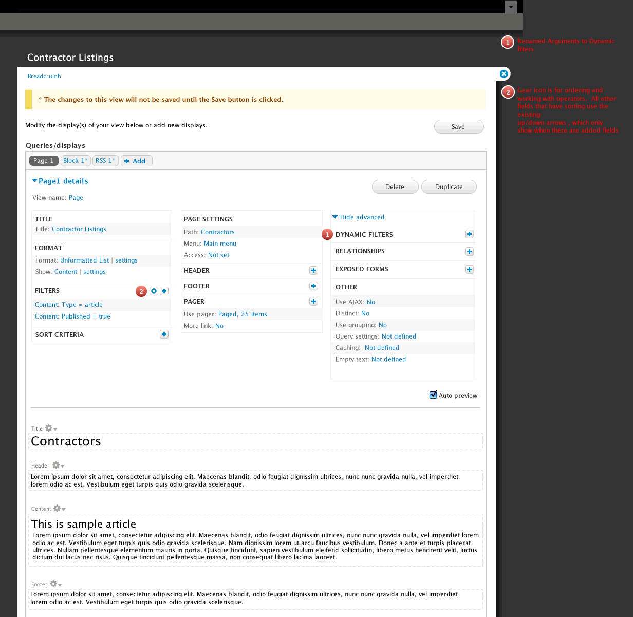
AdrianB commentedThis looks good! And I like the renaming of Arguments to Dynamic filters.
Comment #2
dawehnerSome questions/comments:
* Empty text isn't a area anymore?
* It should exist a place to input the arguments for the preview
* The search textfield in the add "field/filter..." is awesome
* When the overlay module is not enabled, are all the configuration overlays replaced by the current behaviour?
Comment #3
ethnovode commentedAwesome ! I like everything, especially : intelligent add/edit overlay and the new sections order. It looks easier/faster to do what we need.
Thanks.
Comment #4
Anonymous (not verified) commentedGreat job guys!
Greeting!
Comment #5
demeester_roel commentedGreat improvements!!
some remarks...
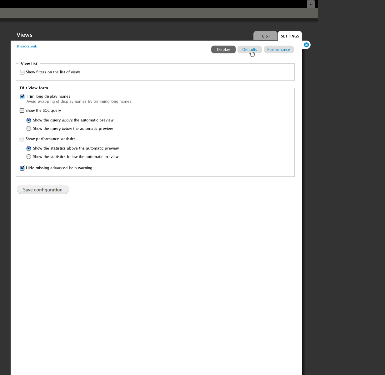
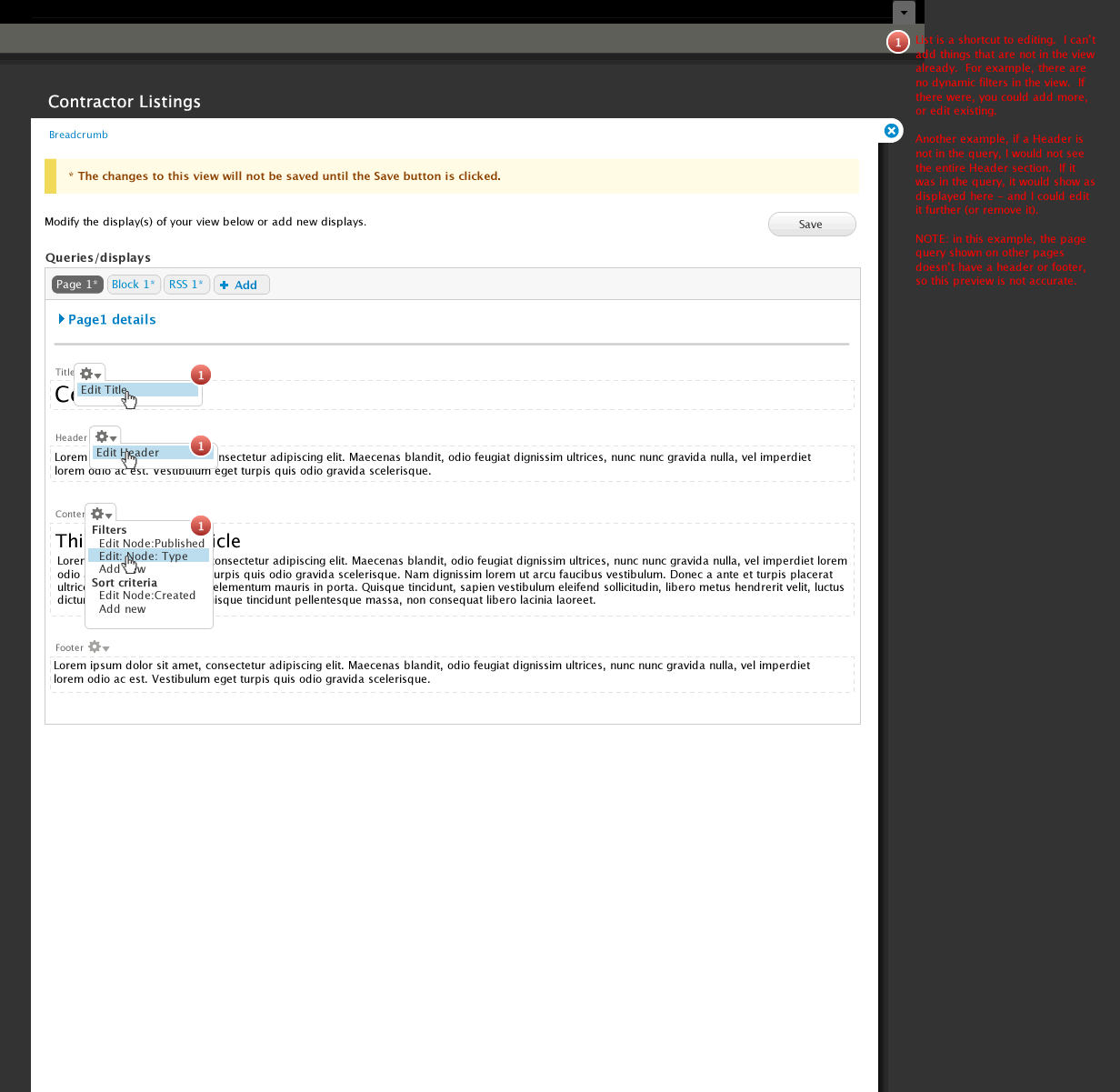
In 5_Page.gif
Is there a reason why the gear for changing settings on "Filters" is blue + right outlined
while the ones for title, header etc.. is gray and left aligned?
In 4_result.gif ..
There is bullet 3. "Save" only visible when view dirty....
Shouldn't that be "Save" only *enabled* when view dirty ?
Can't wait to actually use this new interface.
Comment #6
tsvenson commentedFantastic work guys, really like all the changes and can't wait to try them out.
Comment #7
dmitrig01 commentedI think this looks quite good. The one comment I had was where's the default display, and what if I wanted to create a view with only a default display.
Comment #8
ksenzee@dereine: The "overlay" would be a modal dialog created via ctools or jQuery UI, not an overlay.module overlay. It should work fine with or without overlay module enabled. I'm guessing the no-JS fallback would be the current behavior where the form is below the query editing area.
@dmitrig01: I think the answer is note #1 on mockup #4. If you created a view with only the default display, the default display would show up so you can edit it. You could also tweak your settings to always show default displays.
Comment #9
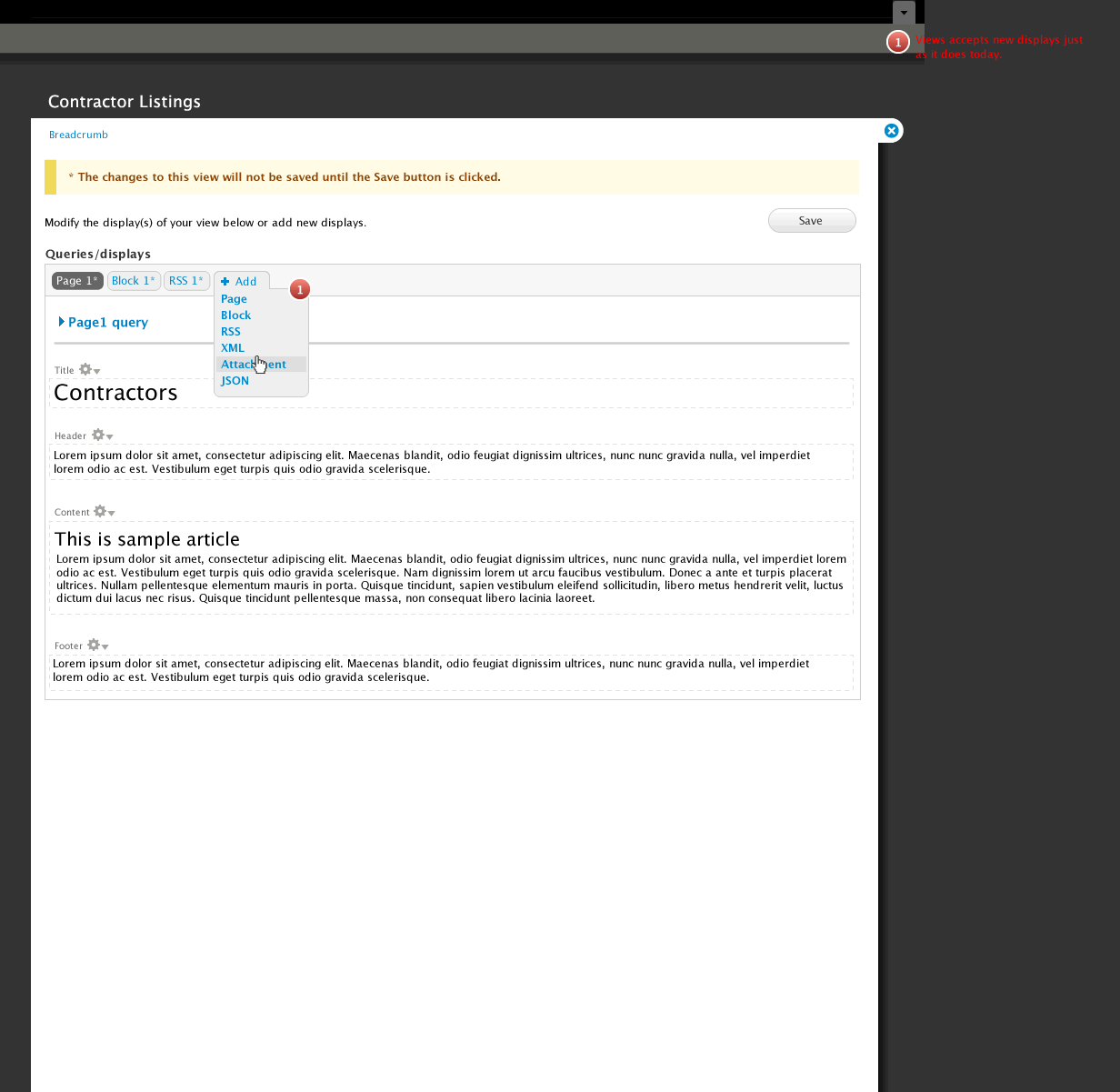
merlinofchaos commentedIn these mocks, we're calling the 'default' display the 'master' display. By default (heh) it will only be visible if there are no other displays. However, there is a checkbox on the advanced settings page that will make it always visible, thus retaining the behavior we have today.
I think I like this because the default display is very powerful for experienced users and very confusing for new users. The one downside is that I worry that some newer users may never learn how it actually works.
Comment #10
Fannon commentedWow, this looks great to me !
This is a great direction Views is heading!
Comment #11
hongpong commentedIn the #2 defaults it seemed like those checkoffs could use more help info - they look cryptic right now. Not sure if this is germane :) Good work!
Comment #12
davyvdb commentedWhat comes in column 1 / 2 / 3 (or is this number flexible) of the "view builder" page?
In 5_Page.gif you have in column 1 stuff like "title", "sort criteria", "filters", ... but these are in no way related. Probably the most used stuff is in column 1?
I would love to see "related" stuff together. I see 4 main areas/stages in building a view:
- Select what data is in the view (filters, fields, sort, dynamic filters, ...) = adding dynamic data
- Build the view (header, footer, title, empty text, pager, ...) = adding more static data (pager is an edge case here)
- Selecting style (but this could be together with part 2 = how does it look / how does it come out (format)
- Change behavior and internals (ajax, caching, ...) = how does my view behave?
Comment #13
Fannon commentedSuggestion: How about introducing a "default sort criteria" or some presets for this?
Otherwise you need to klick a lot, to be sure, that the (node) is published, sticky, sorted by date descending
Also i think that "descending" should be the first and default order, this is what i use 99% of the time.
Or is this misplaced in this thread?
Greets,
Simon
Comment #14
bojanz commentedThis is awesome, and I'm incredibly excited about it.
I like how the interface adjusts to various selected options, instead of showing everything in all cases.
A mockup is usually a starting point on which the developers build on, but this one is pretty solid as a whole, requiring more refinements than major changes.
I like the "master" display rename.
Definitely agree with this, the Save button should never be hidden, only disabled.
About the arguments => "dynamic filters" rename, "dynamic filters" is probably closer to telling what it is, "arguments" is a very opaque to new users.
Still arguments could use some work to make it more filter-like (why can't I select the operator for string arguments?), but that's another issue completely.
Comment #15
Noyz commentedAnswers to above questions.
#2.
A. Empty text is an oversite. With Page header and Page footer, i assume Empty Text is a lonely step child. I would see this as either and advanced option (not that its advanced, but it's also not an 80% use case), Or a setting that gets exposed, i.e, under settings, have a checkbox that reads "Enable to allow users to create empty text" Or something like that
B. It's not the overlay module. The overlay module makes the entire admin interface an overlay. This is different. I didn't expect this could be turned off, but if it could, it too would be a setting
#5
A. No good reason. There were all blue and right aligned at one point in time, but usability testing showed that the gears right aligned on the preview section were too far away. When I moved them to the left, that section started to look noisey, so I made them gray like other d7 gears. I probably need to turn all others gray too, but would side with usability over consistency.
B. Yes, probably. The one downside to that is that if disabled, it will look exactly like the Content Delete button that is enabled, but looks disabled (who's idea was that anyways!). Preferably, that delete button treatment should change so that modules like this can take advantage without breaking a pattern.
#7. Default is renamed to "master". Master only shows if there are no displays added, or if the administrator chooses to show the master. The only point of the master is to allow the user to propagate a change across displays, which we're now doing another way. So, it's really not needed. I only kept the concept around because a few people use just the master, and apparently there are modules that work with just the master.
#11. I didn't spend too much time on the actual content. More work is needed to make them less cryptic.
#12. The relationship is most used to least used & easy to understand to hard to understand
#13. Part 1 of the series should address this
#14. I had many conversations about arguments being more filter like. Unfortunately dynamic filters can be added to sort criteria too. If you have them in two places, you can no longer sort. This UI, coupled with a UI, that I'm working on as a replacement to arguments is the best solution I could come up with.
Comment #16
eporama commentedIn case anyone else couldn't immediately find it, part 1 is #967892: Design proposal for /admin/build/views/add or /structure/views/add
Comment #17
Noyz commentedI retract my Empty Text comment. Through a quick poll, this sounds like its being used quite frequently. I would like to come up with a better name though. Text is not empty :)
Comment #18
merlinofchaos commentedI called it "Empty text" because it is the Text used when the view is Empty. =)
Comment #19
JacobSingh commentedHow about "No results message" or "zero results message"
Comment #20
Bevan commentedThis is great! I feel like we've finally got something that works, scales and solves a lot of problems.
In my experience new users are not likely to leverage this feature anyway (because they don't understand it). They are likely to create almost-identical but separate views with 90% duplicate configuration. It would be nice to find a way to communicate this feature clearly. However the concept would be a stretch for someone who is only beginning with views and already has a lot to grapple with.
This can already be achieved by creating a view as a template and cloning it. I think it could be a useful feature for views to provide a basic node view with sticky and data sorts and a published filter, and (optionally?) use that when a site builder clicks "Add new view".
I agree, however many themes, override button appearance so heavily that the disabled state is the same as or very similar to the enabled state. This is difficult to solve technically because the problem is really in the theme layer. Perhaps views can set opacity on the disabled button or semi-opaque overlay on top of it.
Perhaps "Text for an empty view", "Empty-view text" , "No results text" or "No-rows text"?
Comment #21
bojanz commented"No results text / message"++
The mockups assume that we are using Seven. Other than Seven, I don't see that many admin themes being used (Rubik, a few more that might pop up), so the themes themselves can and should pay attention to the disabled button styling.
Mentioning Seven brings up the question: Are we considering this for the D6 version of Views too? Or D7 only?
Comment #22
merlinofchaos commentedD7 only at this time.
A backport is likely only with a D6 champion willing to drive it to completion. And I wouldn't even consider it until this is stable in D7.
Comment #23
phoenix commentedGreat work! Amazing to see this redesign. Can't wait to test it out.
Comment #24
Bevan commentedGood call.
Comment #25
SeanBannister commentedsub
Comment #26
bojanz commented#983272: Support click sorting for Field API fields just got it, the redesign overlords might be able to figure out something nicer in the redesigned UI :)
Comment #27
Fannon commentedWhen will those redesign Ideas be implemented in Views?
Greets,
Simon
Comment #28
bojanz commentedSimon,
The unofficial deadline is DrupalCon Chicago.
Acquia has started work on GitHub.
Comment #29
j. ayen green commentedWill there be any views-ui module snapshots before the release? And are the mock-ups reliable?
Comment #30
dawehnerYou can track the development on github. That's currently the only space where development happens.
Comment #31
j. ayen green commentedRight, looking there, but I only see one 7.x-3x tree, with one version of views-ui, which I assume to be the original UI
Comment #32
bojanz commentedEverything there is "the new UI", or at least the beginnings of it.
Comment #33
merlinofchaos commentedMy guess is that the 5 day mid-Feb code sprint will show us a giant burst of progress. I have vague hopes that what we come up with then will be committable to -dev.
Comment #34
itangalo commentedSubscribing.
(This work is awesome.)
Comment #35
Noyz commentedThis is a link to some updated designs for this. Not much change, just easier to update all the designs at once:
http://viewsdesigns.drupalgardens.com/node/6
Comment #36
dmitrig01 commentedThese look really good. The direction these are going is great.
Comment #37
Noyz commentedI started the design this way. I was an advocate for this myself, but deviated at some point due to some feedback that I can no longer recall. I'll look back into it and see what i can do.
I'm not to concerned with that. "template" means many things in many places. Themers at that are at the level of understanding templates and .tpl files should be able to differentiate. That said, Im open to other suggestions that would still help users grok this concept of code based views.
There are many many views that can be created without relationships and arguments. The reason they are hidden is because when exposed by default, new users have that much more to grok, and therefor Views becomes that much more intimidating. The section drops a cookie and stays open for users that understand the concept. I also agree with you that it doesn't completely resolve the problem. My research shows that people expect exposed filters, arguments and filters to be accessible and be more integrated together - but Views cannot handle this without going backwards in functionality a bit
any filters or fields assigned can be directly edited. New fields can be added. The default appearance of a view is collapsed (http://viewsdesigns.drupalgardens.com/sites/viewsdesigns.drupalgardens.c...), so people don't even have to interact with the UI that we know of today unless they choose too. So, I'd say it's exactly the opposite.
See callout #2 here: http://viewsdesigns.drupalgardens.com/node/6
Sounds like a module. For most views, this shouldn't be needed. Note the callout here: http://viewsdesigns.drupalgardens.com/media-gallery/detail/6/66 The whole point of these UI's is to reduce complexity on the surface.
Comment #38
bojanz commentedThe new Ui has been committed to 7.x-3.x.
Mission accomplished.
Comment #39
itangalo commentedWohoo! Congrats to everyone involved!
I've started publishing a screencast showing how to use Views from really basics to advanced configuration – with the new UI! I saw that the project page says that is no documentation available right now, so I thought that this could be of use.
It can be viewed here: http://nodeone.se/blogg/taming-the-beast-learn-views-with-nodeone
Comment #40
bryancasler commentedepic update!