
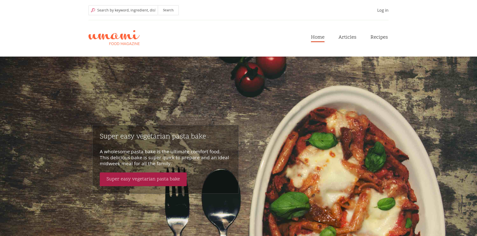
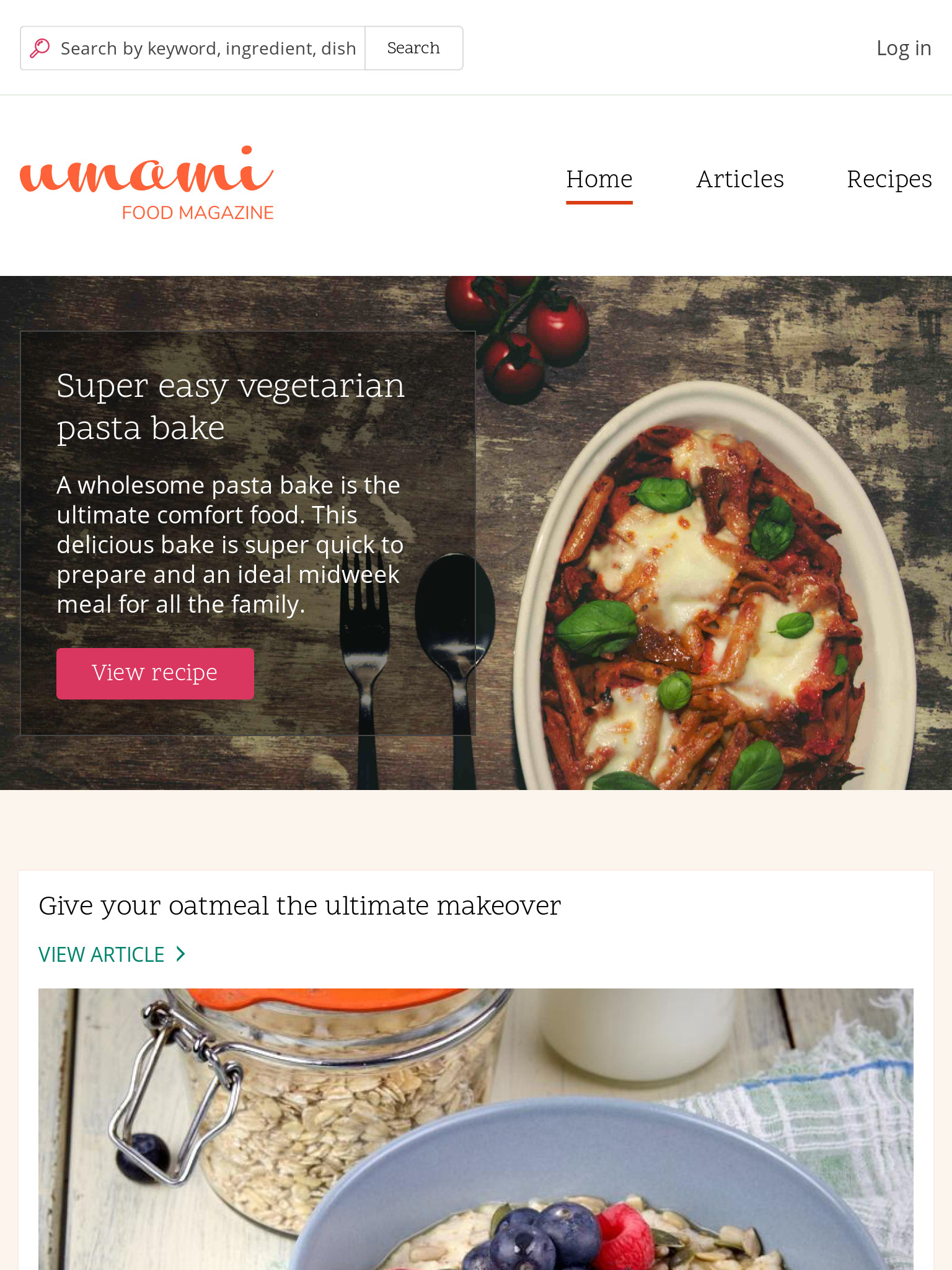
Banner Area Fails Color Contrast Testing
The banner on the front page fails contrast testing. Testing was conducted using the Color Contrast Analyzer plugin for Chrome.
Part of this is due to the unpredictable results of having text over an image. Variations in color can affect the legibility of text
The link button underneath the image also fails according to contrast testing with the Color Contrast Analyzer.
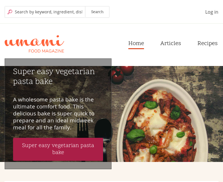
To fix the issue with the text, I propose two different solutions:
Add shadowing to text to increase the contrast as follows: text-shadow: 0px 0px 5px black, 0px 0px 64px black, 0px 0px 20px black;
or
Add a background color with enough opacity to enforce contrast and be aesthetically pleasing.
| Comment | File | Size | Author |
|---|---|---|---|
| #35 | umami-hero-banner-text-overlay-86x-2960795-35-1024x768.jpg | 638.55 KB | shaal |
| #35 | umami-hero-banner-text-overlay-86x-2960795-35-768x1024.jpg | 710.22 KB | shaal |
| #35 | umami-hero-banner-text-overlay-86x-2960795-35-1920x1280.jpg | 502.17 KB | shaal |
| #35 | umami-hero-banner-text-overlay-86x-2960795-35.patch | 1.81 KB | shaal |
| #29 | interdiff_24_29.txt | 712 bytes | shaal |


Comments
Comment #2
samsone CreditAttribution: samsone as a volunteer commentedComment #3
mgiffordThe Color Contrast Analyzer plugin for Chrome is better than most for gradients & background images.
This tool actually compares pixel by pixel color contrasts so that you can see (as per your image) what the contrast is on the page.
Thanks for highlighting this!
Usually it is a best practice to have a background (with some opacity sometimes) between the text and the image/gradient. Makes it easier to nail the color contrast.
Comment #5
kjay CreditAttribution: kjay commentedDiscussed with @eli-t at DrupalEurope. We should try overlaying the image with a CSS generated translucent dark shim (only for breakpoints where the text overlays the image). This shim could also use a vignette to avoid darkening the entire image. Easiest to experiment in the browser once we have a patch, we'll want to review the impact on the hero banner's look and feel.
Comment #6
melinda_ksz CreditAttribution: melinda_ksz at 1xINTERNET commented@mikael_ek, @mrmauriziorusso and me are starting on this issue now at Drupal Europe.
Comment #7
melinda_ksz CreditAttribution: melinda_ksz at 1xINTERNET commentedComment #8
mikael_ek CreditAttribution: mikael_ek commentedHere's a patch that add a gradient overlay which should darken the area below the text (if media query fits) and make it more readable. It's tested with Contrast Analyser.
Comment #9
jollysolutionsPatch in #8 fixes the banner text over the image. Have created a related issue regarding text in general.
Comment #10
lauriiiThis does affect the design quite a lot. It seems like @kjay already mentioned this on #5 but would be still great to get sign off from him.
There's also some stylelint warnings on the changes. You can see the failures by running command
yarn run lint:cssinside the/corefolder.Comment #11
HOG CreditAttribution: HOG at Skilld, Drupal Ukraine Community commentedComment #12
HOG CreditAttribution: HOG at Skilld, Drupal Ukraine Community commentedI fixed lint errors and added screenshot from Color Contrast Analyzer plugin after applying the patch.
Comment #13
andypostComment #14
HOG CreditAttribution: HOG at Skilld, Drupal Ukraine Community commentedI updated my previous patch, added double colons to 'before'.
Comment #15
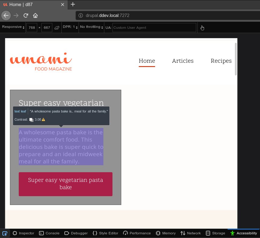
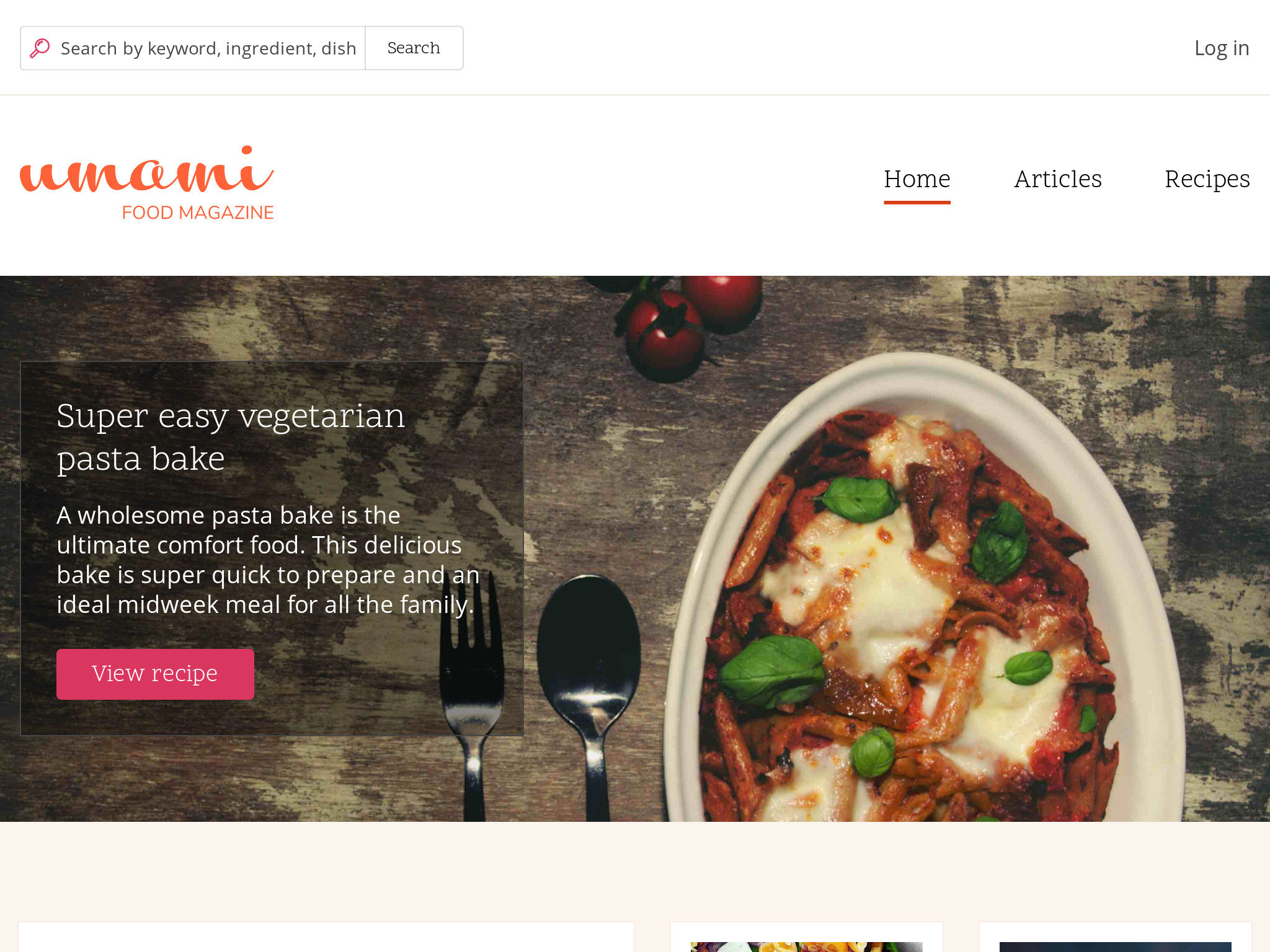
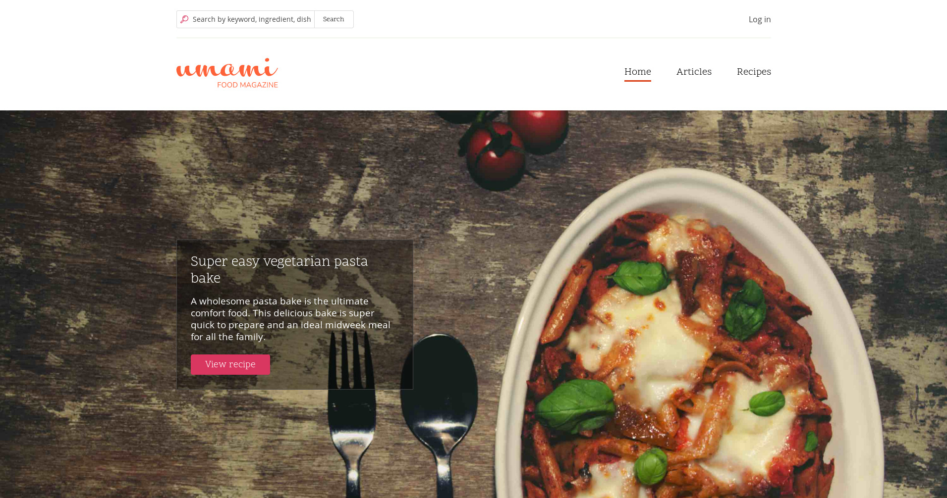
eleleka CreditAttribution: eleleka at Skilld commentedI did tests and code review for #14 and the image looks really dark with such mask. Also, this path doesn't resolve the link button contrast issue mentioned in issue description.
I've made another patch, that makes transparency dark background under the text and link button and a bit darker background for the link button (check screens). It passes Level AAA, Medium Bold and Large Non-Bold Text (4.5:1) WCAG, checked in chrome extension. And the button colors checked also in https://contrast-ratio.com/#white-on-%23aa1f47 service.
Comment #16
brucedarby CreditAttribution: brucedarby at The University of Edinburgh commentedPicking this up at #uoe-d8-contribution
Comment #17
kawo CreditAttribution: kawo at The University of Edinburgh commentedPicked this up at #uoe-d8-contribution with brucedarby
I've applied the latest patch and the transparency dark background under the text seem to fix the accessibility issues. It passes medium and large text with level AAA.
What one should take into consideration though is that there are differences in the contrast ratio for the dark background under the text. The result depends on whether one checks the light or the dark areas of the text box.
The dark parts get a contrast ratio of 17.9 whereas the light parts get one of 8.4. This can easily be seen in the letter "b" in "bake" where the background is a bit lighter. Nonetheless, the patch is a big improvement to the previous version and passes the accessibility testers that I've used. Moreover, the patch also fixes most of the contrast issues with the link button. It receives a contrast ratio of 6.8 and passes WCAG with AA.
#uoe-d8-contribution
Comment #18
kawo CreditAttribution: kawo at The University of Edinburgh commentedComment #19
alexpottThere's still be no +1 from @kjay as per #10.
This is the colour also used in core/profiles/demo_umami/themes/umami/images/svg/search.svg so by changing it we should discuss whether we should change the colour there too.
Comment #20
kjay CreditAttribution: kjay commentedNote: the patch in #15 no longer applies for me.
We discussed this issue in this week's OOTB call and agreed that given larger font sizes and a more refined responsive layout, the container shim style should look ok. If we also add a subtle border to the container then it should feel related to the styling of the cards used throughout the theme.
I have attached my suggested approach for styling this.
@andrewmacpherson mentioned that if the font size is >=18.5px it would qualify for the 3:1 contrast ratio compromise. In the attached guide visuals I have suggested we keep the opacity of the background shim as low as possible. I am not able to carry out a contrast test with my design file and so it will probably necessary to come up with a sensible opacity value when testing this in the browser.
If we can, I recommend we keep this block proportional within the banner space. Using larger font sizes with correct line height and plenty of margin (vertical) and padding for the container when we have the space to do so. I've included some grid explanations and I would imagine these will be interpreted into similar percentage widths for the block at each breakpoint.
Comment #21
andrewmacpherson CreditAttribution: andrewmacpherson as a volunteer and at Annertech commentedI like this direction!
To test the contrast ratio, set this up:
Comment #22
shaalI created a patch following #20 guidelines.
This is the problem that happens at 768px width, without changing min-height
To prevent the hero text going outside of the hero image I added a
min-height: 54vw;for breakpoint 48em to 60em,I tested in Firefox Nightly for the minimum background opacity required for a11y according to #21
Comment #23
kjay CreditAttribution: kjay commentedThis patch looks good and I have just a few minor suggestions for refinement:
Margin bottom for the heading should probably be dropped down to something like 0.5em to balance it with the margin bottom of the summary paragraph.
The following changes to the link introduce changes to our new site wide button defaults that were recently introduced by #2983568: Audit and improve focus styles across the Umami theme for logged out users. Was there a specific need to change the styles for the button?
The only other issue I noticed was that the summary block does not align vertically with left edge of the logo and cards at large+ size.
Comment #24
shaalI updated patch #22 to include these changes:
Screenshot of the result of this patch:
Comment #25
andrewmacpherson CreditAttribution: andrewmacpherson as a volunteer and at Annertech commentedThanks @kjay and @shaal. This is looking pretty slick.
Patch #24 review:
Nice, this agrees what @kjay worked out in #20.
Agreed! I arrived at the same number....
Comment #26
kjay CreditAttribution: kjay commentedThis looks good to me. I've tested in IE11, Edge 15, 16, 17 and 18. Chrome, Safari.
Marking RTBC :)
Comment #27
knyshuk.vova CreditAttribution: knyshuk.vova at Internetdevels, Drupal Ukraine Community commentedThe patch looks good and applies successfully. +1 for RTBC.
Comment #28
Gábor HojtsyDoes this currently have an RTL counterpart? If so that needs to be updated as well.
Did you want to add the 960px comment twice?
Should have newline at end of file.
Comment #29
shaalI created a new patch
margin: 0 0 0.5em 0;sets only margin-bottom, no special RTL update is needed)/* 968px */comment (and duplicate/* 768 */comment)Comment #30
andrewmacpherson CreditAttribution: andrewmacpherson as a volunteer and at Annertech commentedComment #31
Gábor HojtsyComment #33
Gábor HojtsyThanks all! Committed. It did not apply to 8.6.x though. If we are to fix it in 8.6.x, it needs a backport patch.
Comment #35
shaalI created a patch that can be applied to 8.6.x
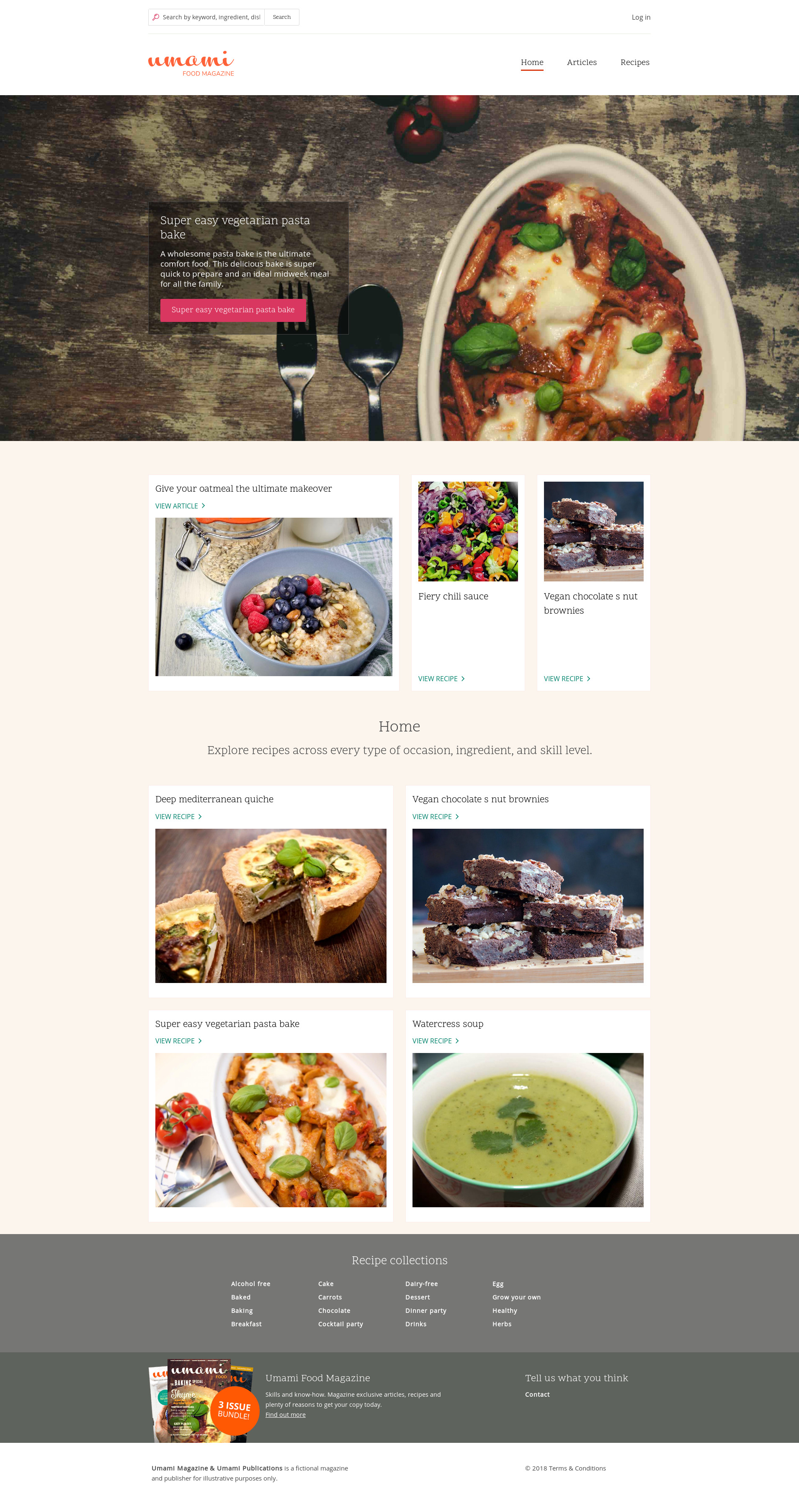
I added the following screenshots:
(768x1024)
(1024x768)
(1920x1280)
Comment #36
Gábor HojtsyComment #38
shaalRunning a retest on 8.6.x after #37 failed
Comment #39
tim.plunkettFixing tags
Comment #40
shaalPatch got committed 8.7 (but not to 8.6)
Comment #41
shaal