
 Support for Drupal 7 is ending on 5 January 2025—it’s time to migrate to Drupal 10! Learn about the many benefits of Drupal 10 and find migration tools in our resource center.
Originally submitted on Github
Problem/Motivation
Recent interviews and research exposed pain points around Drupal's admin experience of looking and feeling dated.
Proposed resolution
Implement new image field styles reusing existing components to create a favorable first impression of Drupal for evaluators and a better user experience for site authors. No functional differences.

Full Specs: https://www.figma.com/file/OqWgzAluHtsOd5uwm1lubFeH/Drupal-Design-system...
Remaining tasks
- Update patch styling to include time inputs
- Accessibility review
- RTL review (Right to Left)
User interface changes
All image styles will be changed, no functional differences.
Test Pages
- /node/add/article
- /user/1/edit?destination=/admin/people
- /admin/people/create
| Comment | File | Size | Author |
|---|---|---|---|
| #59 | imageWidgetScreenshots.zip | 22.18 MB | huzooka |
| #59 | imageWidgetScreenshots--high-contrast.zip | 2 MB | huzooka |
| #59 | interdiff-3021092-47-59.txt | 2.48 KB | huzooka |
| #59 | claro-image_widget_style_update-3021092-59.patch | 19.19 KB | huzooka |
| |||
| #58 | Screen Shot 2019-10-11 at 17.05.56.png | 115.35 KB | lauriii |


Comments
Comment #1
antonellasevero CreditAttribution: antonellasevero commentedantonellasevero created an issue. See original summary.
Comment #2
antonellasevero CreditAttribution: antonellasevero commentedComment #3
antonellasevero CreditAttribution: antonellasevero commentedComment #4
ckrinaDesign isn't finished yet.
Comment #5
ckrinaComment #6
antonellasev CreditAttribution: antonellasev as a volunteer commentedComment #8
ckrinaUploading designs. This is ready to start.
Comment #9
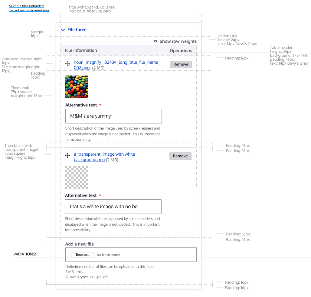
ckrina#3072660: Allow white transparent pngs to be seen in image-preview is related to this one and its suggestions are being integrated on the proposed design.
Comment #10
ckrinaComment #11
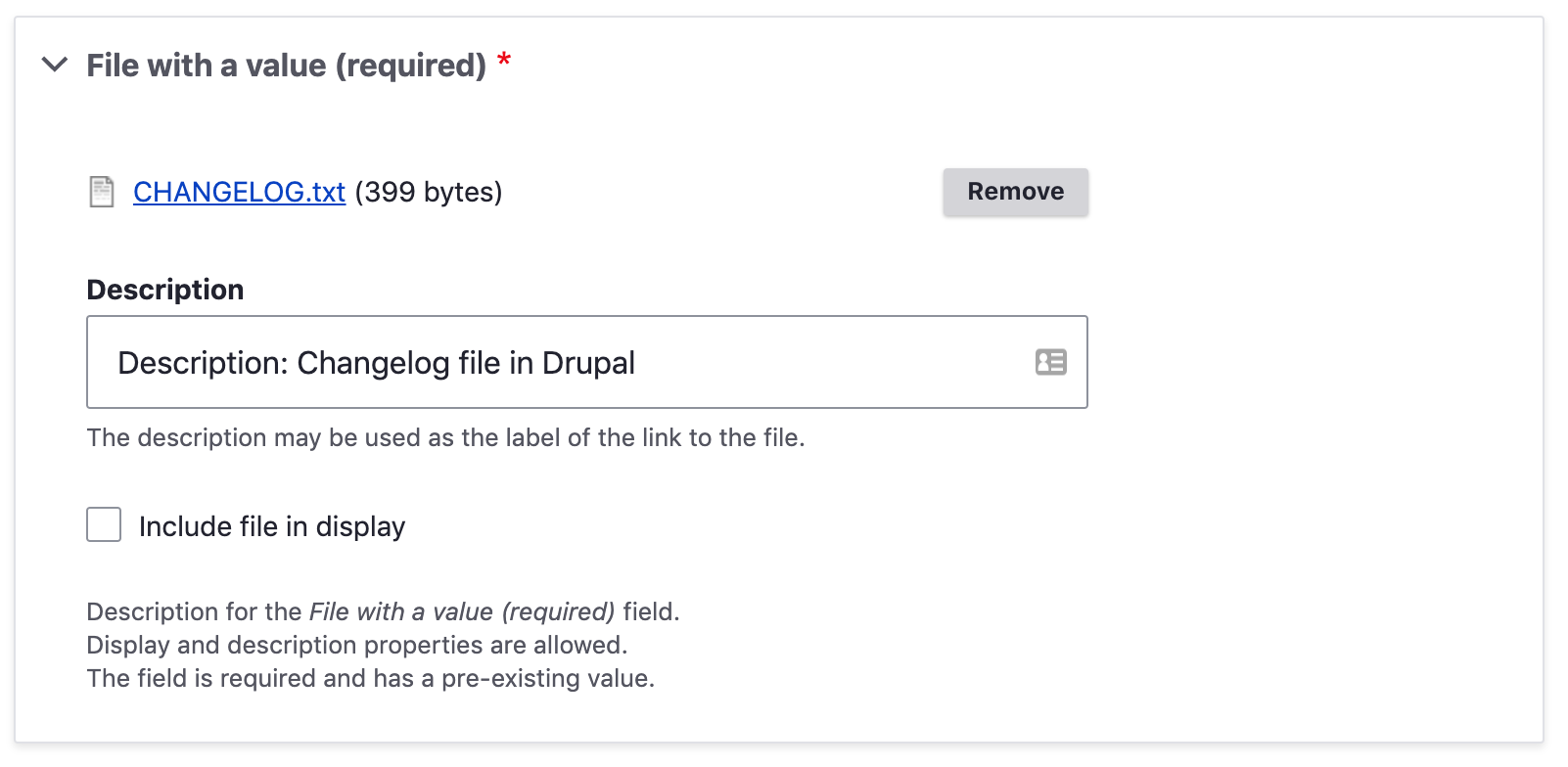
huzookaIssues I've found:
This can be achieved only by adding an another table row for the preview image and the alt (+title) input, but that would break the structure of the table (and would make the row rearrangement really-really difficult)
Comment #12
lauriiiComment #13
ckrinaAdding the updated design fixing this. Please use Figma to check spacing other specs, but here's an quick screenshot:
Comment #14
huzookaComment #15
huzookaThis is what we had previously (merged in the patches prior #20 in the File widget style update issue).
Comment #16
huzookaComment #17
huzookaAttached a Chrome screenshot with patch #15.
Comment #18
ckrinaFrom this screenshot and implementing the patch locally I can see some things that need work that you might already seen since you're working on it:
- The error message is too far from the fieldset it belongs too. It's actually closer to the previous element in the form.
- The icon file is missing.
- "Limited image with preexisting value" variation: if there isn't the field to upload another image, there shouldn't be the last bottom border for the table. Sorry this wasn't defined, I think it's the first time anyone thinks about it :)
- The description/alt text are always below the thumbnail, although in the design when there's only one value it should be placed on the right. Anyway, with the goal to have a uniform design I'd keep the same behavior on both for now.
- The space reserved for thumbnail is not square as in the designs (even it's vertical or horizontal), but since we already have this follow-up it could be addressed there: #3072660: Allow white transparent pngs to be seen in image-preview.
Comment #19
huzookaRe #18:
Yeah, this is not specific to this component, this is a general issue: #3082694: Extra space between message and content when content has elements with margin-top
I guess we have to re-validate and change the spacing of the messages.
Based on my last info, this should happen for image widgets.
Honestly, why?
I don't really like these kind of attitude: (i will exaggerate:) we define a component (table), and after that we have to introduce tons of variant for the component.
I'll check whether this is possible with acceptable amount of extra code, but if it isn't, I won't do this.
I want to solve this if it wouldn't be a problem. (This is why this issue was in NW.)
And this is okay. The user needs to know and see the aspect ratio of the image that was uploaded. It would be a really basic usability issue if we would make every image look like a square PNG with alfa channel and transparent borders on the right and left side.
Comment #20
lauriii#19.1 That issue has been solved now but I don't think it fixes these. I don't think the message margins are aligned with other spacings and it looks off on most pages. Let's open a follow-up for that.
#18.2 I thought it was intentional decision to remove the icon. Was there a particular reason for the change of mind on this? If we indeed should do this, would it be possible to update this to the design system as well?
Making judgments about other people like that hurts them. It's okay if you want to point out specific problems in the feedback, but you should assume the best intentions. I don't think @ckrina intentionally meant to cause trouble for us; I believe that she only tried to make sure the design looks good.
I agree that this isn't indicated by the design system and should be updated there as well.
#19.4 👍I think @ckrina pointed this out because #16 didn't indicate why this was moved to needs work.
#18.5 👍Let's discuss this in the follow-up.
Comment #21
lauriii@ckrina pointed out on Slack that she forgot that the icons were removed from the image widget. This addresses #18.2.
Comment #22
ckrinaThanks @lauriii for the comment and +1 to all your points.
3. The design reason why the bottom line of the table is not needed is because its purpose is to indicate where its limits are or to separate it from other elements. None of this situations are needed here, and it's just adding visual noise.
That said, this isn't a big deal so if its implementation is complicated a follow-up or even not implementing it are both valid solutions. It just needed to be pointed out and discussed.
Comment #23
huzookaRe #20, and @ckrina:
Please don't misunderstand what I wrote.
I raised my voice against the attitude, not against the person. I don't want to bee offensive. I just want to highlight this problem clear enough.
Re #22:
I don't agree. That line indicates where the table ends. Why do the default table needs those line and why this doesn't?
What if I remove that border? The bottom padding will be still there. The next step would be removeing the padding as well? And right after that we will notice that the dragging (and the dragged-last) color background looks a bit odd?
I still think that the default table styles are (more than) fine here as well, and wouldn't try to make an exception neither in terms of the UI design nor from CSS development.
Comment #24
lauriiiRe #23 & #20: I talked with @huzooka on Slack and we realized that there was some confusion in the translation. What @huzooka actually meant to say was that he disagrees with the approach, not the attitude. This makes much more sense and makes #20 sound much more reasonable 👍
Comment #25
huzooka@lauriii just highlighted that... well... this is my english.
The right word I should have used is
ATTITUDE, not approachAPPROACH, not attitude.Sorry for the misunderstanding.
Comment #26
ckrinaNo problem at all! :)
I think we should just ignore this edge case for now and give it a thought with time on a design perspective to discuss this properly and not block the issue on this.
So let's leave the line there and finish this component that is almost done.
Comment #27
huzookaComment #28
huzookaReview needed :)!
Notes:
Well, #3082694: Extra space between message and content when content has elements with margin-top not really helped us. (The approach is not the best as you will see even before and after applying this patch.)
Comment #29
ckrinaOn a design perspective it's perspective LGTM! 👍
Still needs proper code review.
Comment #30
huzookaI just added a patch that fixes the (status) messages spacing: #3086510: Proposal for (status) message spacing..
Comment #31
ckrinaSorry I changed the status to Needs work. I meant to keep it as Needs Review to get another pair of eyes reviewing the code.
Comment #32
ant1I don't know if this in scope of this issue but when a bigger preview image is set, the field next to the image become very small.
Comment #33
huzookaRe #32:
Well, yeah, I'd say this should be in the scope.
Comment #34
huzookaThis patch addresses the cases what #32 described:
If there is less space left next to the preview image than 60% of the parent div, the alt / title inputs are pushed to the bottom of the preview.
Comment #35
huzookaComment #36
huzookaPatch without rebase (and before applying the old-new standards).
Comment #37
huzooka...and now, the rebased one!
Comment #38
huzookaComment #39
huzookaComment #40
ckrinaI'm sorry I've found something I didn't see before: on small sizes there are no paddings on the fieldset when it's a multiple fields and it should keep the default ones defined for the fieldset component (smaller than the ones for desktop):
If there was only this feedback, I think it could be done in a follow-up.
Comment #41
huzookaRe #40:
Yes, it's intentional. See point 1 of "Differences from the design" at #3021094-21: File field style update.
If you use Drupal from a handheld device, it saves some space for us.
(The screenshot you shared lies a bit, because on touch devices every button has the default size.)
Comment #42
huzookaComment #43
lauriii🔬👁
Why do we need this?
🐎
I would keep these as one list. I don't think we have usually documented where variables are coming from (I know we have one other instance which we probably could remove in this patch since we modify that file already).
This might be something we should do in a follow-up, but the positioning of the description text is a bit off when the fields are shown next to the preview.
Comment #44
huzookaComment #45
ckrinaRe #41 I see the reason behind it and you're right, it's better to keep it like this to have more horizontal space for now, although my eyes hurt seeing it 😭.
I think we'll have to give it a thought on the design side in the future, but for now it's Ok.
Comment #46
ckrinaComment #47
huzookaRe #43:
I think that this helps recognizing that the pattern behind the transparent images does not belongs to the image.
[video]
I created that (postponed) follow-up for us: #3087331: Unify the description display approach of single and multiple cardinality file and image widgets
Beside these ^^, I also found and fixed an another IE11 issue.
Comment #48
huzookaComment #49
huzookaComment #50
huzookaComment #52
ckrinaComment #54
ckrinaThe background pattern was first introduced at #3072660: Allow white transparent pngs to be seen in image-preview and incorporated here. Crediting who worked on that issue here.
Comment #55
saschaeggiRE #47: I've created a follow-up design ticket to improve the pattern design #3087345: Improve transparent image background pattern usage
Comment #56
saschaeggiComment #57
ckrinaPer Slack discussion, @lauriii @saschaeggi and myself we'd remove the fixed position from #43.2 for now and open the follow-up Sasch created to discuss its implementation.
Comment #58
lauriiiThere's a regression on the file widget:
Before:
After:

Comment #59
huzookaPatter fixing removed, #58 addressed, screenshots attached (Safari screenshots are incomplete because of this).
Comment #60
ckrinaLGTM!
Great work, and thanks for the patience with the changes @huzooka!
Comment #62
lauriiiThis is the final beta-blocker. Thank you everyone for the great work! 🙏
Committed and pushed! 🚀
Comment #64
lauriii