
Review and improve the existing ones. Adding more details for the new items that are coming. #762462: Make footer background and sidebar block borders colorable
Make new ones.
| Comment | File | Size | Author |
|---|---|---|---|
| #27 | color-modifications-2.patch | 3.34 KB | jensimmons |
| #18 | color-modifications-1.patch | 6.54 KB | jensimmons |
| #13 | dark.patch | 810 bytes | tsi |
| #13 | snapshot.png | 40.76 KB | tsi |
| #9 | Welcome to IHSF | IHSF_1274672534624.png | 271.08 KB | dcrocks |


Comments
Comment #1
jensimmons CreditAttribution: jensimmons commentedComment #2
theresaanna CreditAttribution: theresaanna commentedComment #3
jensimmons CreditAttribution: jensimmons commentedWe don't really need *more* color schemes. We need the ones we have to be better. Especially with the new items that are colorable.
I totally want to do this — in the next week.
Comment #4
jensimmons CreditAttribution: jensimmons commented.
Comment #5
yoroy CreditAttribution: yoroy commentedIs the black 'Bartik' style the intended default?
Comment #6
jensimmons CreditAttribution: jensimmons commentedThe current black is the intended default. Having read your concern on the long Bartik issue, yoroy, I started thinking again about the header colors. I actually do agree that it's very heavy and dark — and doesn't give the feeling I originally intended. It's tough when the header has to fit any sized logo, and any length name. :P
I do not want to make 'blue lagon' the default color style. It's too Drupal-brandy. And too close to Garland. I love having it in the mix, for us Drupal fanboys and fangirls, but not as the default. The default needs to make a strong break with Garland and Bluecheese (the new d.o theme).
I want the default color scheme to be a black & white look. B&W designs put the emphasis on the site's content, especially when there are images all over the site. It's has been my intention since I started designing Bartik in July 2009 to create a B&W theme, so I feel very strongly about this.
I do, however, now want to to take another look at using the true black to extremely dark grey gradient as the default. Perhaps something lighter — grey or almost white — would be better. I plan to experiment this weekend as see if I can find something better than what's there now. And by experiment I mean spend 3 or 4 hours playing with exact hex numbers.
Comment #7
jensimmons CreditAttribution: jensimmons commentedupgrading priority
Comment #8
bleen CreditAttribution: bleen commentedtook a swing at a warmer color scheme ... all the ones we have now are cool. I'm not suggestion this as a possible default color scheme for Bartik. Patch attached.
Comment #9
dcrocks CreditAttribution: dcrocks commentedThis probably shouldn't be here but the appropriate issue is closed: http://drupal.org/node/783574. My eyes are old and weak so I set my browser preferred font size to 22. This appears to screw up the color module settings page for bartik(see attached). It doesn't have the same affect on other admin pages(content, modukes, etc.).
I think that any browser font size than the assumed one will cause that layout to distort/break.
ps. I didn't want to open a new issue when the old one is so appropriate but I don't know what would happen if I tried to add a comment to a closed issue.
Posted to and re-opened http://drupal.org/node/783574.
Comment #10
dcrocks CreditAttribution: dcrocks commentedAttached is another 'soft' color scheme. I have run into 2 problems:
1) The link colors are not being changed in the header area, resulting in contrast problems.
2) It is hard to change footer color without having sometimes dramatic impact on color contrast between the footer background color and text in the footer(and triptych?).
Colors.css and color.inc need some additional entries to fix these. I didn't make them here so that you can see the issue.
ps. my diff file is not from cvs.
Comment #11
bleen CreditAttribution: bleen commented@dcrocks #9: you can absolutely reopen an issue by setting it's status from closed->active ... That is what you should do in yor case. The advantage of this is that the same issue will live in one place but also that once you reopen the old issue, people who workedon that prob (and who would presumably be most qualified to help with your issue) will see that the ticket has been reopened in thier issue queue.
Comment #12
Jeff Burnz CreditAttribution: Jeff Burnz commented#8, bleen that looks great, I like the blocks with no borders, imo one thing that stands out for all the Bartik color schemes is the treatment of sidebar blocks does not fit will with anything but the default color scheme.
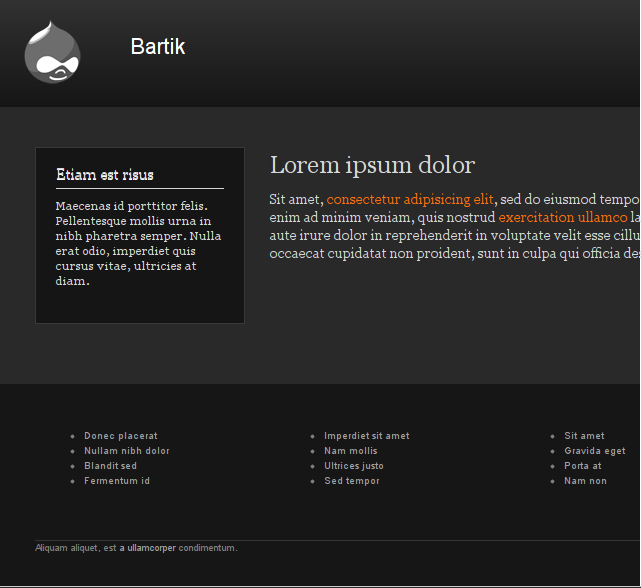
Comment #13
tsi CreditAttribution: tsi commentedHere is my go on a dark bartik scheme :
Besides the issues that dcrocks mentioned in #10 :
* Headers in general (not only in the header region) are not colorable (temporarily fixed in the snapshot).
* Teaser text color is being overridden when it shouldn't in style.css line 463.
* Tables bg is always white so : a. we should let it inherit the colorable bg or b. we should hard-code a color for the text.
why can't I embed an image here ? bleen18 did... :(
Comment #14
bleen CreditAttribution: bleen commented@tsi
ooo ... I really like that.
I think we should definitely get some of these bonus color schemes in before Bartik is added to core
Comment #15
snorkers CreditAttribution: snorkers commentedThis is a great theme - but the exact configuration of the color module doesn't warrant 'critical' status, as this is a bar to Bartick shipping in D7 in a future release (beta or otherwise). Working at a code sprint today, there was general agreement that this is a pleasant theme, and great for beginners to get going. We could spend months tweaking subtle variations of B&W but you will never get consensus on an issue queue.
My personal thought is that the header, sidebar, footer blocks should ship in a much lighter shades of gray if you want the content to be king, and it would differentiate this theme from the bluecheese, garland et al significantly enough to be included as a valuable starter theme.
Comment #16
eigentor CreditAttribution: eigentor commentedConcerning design stuff - that also touches color module - I started over here #826314: Design Review and improvement proposals.
Am with Jen as to the blue style is a no-go for default.
Experimentation is needed as to what elements to recolor - especially the headers could be worth trying.
Comment #17
jensimmons CreditAttribution: jensimmons commentedI'm working on this, and marked it critical, because imo the work I'm doing needs to be finished before Bartik is put in core. It's not quite the right meaning of "critical" — because, true, this isn't a bug that makes the project fail.... but then again, none of the php-code-centric tools on drupal.org quite fit the needs of designing and theming. So, I'm bending the purist meaning of "critical" and making it mean "This has to get done before we submit this to core."
Again, I'm working on this.
Comment #18
jensimmons CreditAttribution: jensimmons commentedI've been working on revisions to the color schemes that have been in Bartik for a while.
Blue Lagoon revised:
Plum revised:
I'm committing the revisions for these two.
Comment #19
jensimmons CreditAttribution: jensimmons commentedI changed a bunch of things in the main CSS files too, beyond the color schemes. Mostly for support of the new colors — and making the default layout more simple. This biggest change: getting rid of the image that was the background for the triptych, and using rgba instead (with no gradient, and no double lined top border). I also used a lot more rgba in the footer so that the text, lines and links blend into the footer background color better.
Changes committed. Take a look.
Comment #20
Jeff Burnz CreditAttribution: Jeff Burnz commentedSince my time is so limited right now I'll restrict myself to a basic critique.
* None of these I would call classically beautiful - rather more fugly in fact. To me the colors just don't work very well.
* What is the thinking or reasoning behind using RGBA? Seems we have a big inconsistency here - many colors use the HEX, others are RGBA?
* There's no neutral neutral scheme - like gray scheme - I would really want one, say you have a site where the images steal the focus.
* There's no high contrast scheme - one for users who want things to really be more accessible.
* I would very much like to see:
- a couple of blue schemes (lite and dark - blue being the by far the most popular color)
- a green (but not this sickly Fresh scheme).
- a red scheme.
- a neutral gray scheme.
- a high contrast scheme.
- the default scheme made to work with toolbar/shortcuts in every state, right now I think it looks weird.
- remove the purple scheme, purple is not popular color scheme for websites IMO, shouldn't such a prime position in core.
* Active local task tabs have a gray background - this should be transparent - it looks weird.
Yes this is a pretty harsh review, but these color schemes are not good, certainly IMO nowhere near good enough for core and not something I would consider a stunning representation of what Drupal can be (they should be stunning).
One thing that really disappointments be about this whole design are the incredibly boring sidebar blocks - I really have no idea why we have this dirt plain border that stands out like dogs balls in most of the color schemes - surely in all the Drupal community we can do better.
Comment #21
bleen CreditAttribution: bleen commenteddont forget about #8 & #9 in this issue
Comment #22
jensimmons CreditAttribution: jensimmons commentedJeff — this is a work in progress. I improved two color schemes: Plum and Blue Lagoon. The work I did over the last week is a great improvement. I'll be working on the default scheme and fresh next. And I have a couple others to add.
Sure I want them to be even better. It's a Work. In. Progress. Meanwhile, reading a comment like yours makes me want to do less for the Drupal community, not more.
And people wonder why designers don't participate more in Drupal....
Comment #23
jensimmons CreditAttribution: jensimmons commentedOK, here are the color schemes as they stand now:
Default Bartik:
Blue Lagoon:
Firehouse:
Plum:
Fresh:
Comment #24
jensimmons CreditAttribution: jensimmons commentedOr really, a better way to look at these color schemes, is to look at them the way they will be see by non-admin users.
Bartik default:
Blue Lagoon:
Firehouse:
Plum:
Fresh (in progress):
Comment #25
jensimmons CreditAttribution: jensimmons commentedI'm changing the name of fresh to "ice" — having toned down the greenish tone of the header.
Comment #26
jensimmons CreditAttribution: jensimmons commentedIce, full page, logged out.
Comment #27
jensimmons CreditAttribution: jensimmons commentedOh, I forgot to post the patch I made. Here it is.
Comment #28
eigentor CreditAttribution: eigentor commentedThis looks better. :)
So the direction now is to not use the gradient in the header at all?
As this is non-garlandy, probably a good idea.
I also played around a bit and tried to recolor some more elements.
The recoloring of only the link color may be an option, as it uses a very reduced coloring.
Fooled around with recoloring headers (only in content area) which did not really work out.
But your idea with having not-so-saturated colors for the header gives new possibilities here.
Comment #29
tsi CreditAttribution: tsi commentedPlease consider a dark one as well (#13)
Comment #30
Jeff Burnz CreditAttribution: Jeff Burnz commentedLooking really good, fantastic continuity across the different schemes - very stylish.
Jen sorry if I sounds too obtuse or harsh earlier, didnt really mean to come out as a personal attack, in my defense I was writing very fast and had a lot of things on my mind, I just wanted to push the issue along before this hit core (not wanting to deal with a bikeshead in core issue queue, I always felt this key design aspect should come from you, as the designer).
Comment #31
jensimmons CreditAttribution: jensimmons commentedre#28: eigentor — actually every one of these is a gradient. I'm just a believer in using subtle gradients instead of obvious ones. But the color picker is all set up for gradients, so people can do whatever they want. (Well, not in IE — in IE they are flat colors.)
The gradients are more obvious on some color schemes than others — see Blue Lagoon?
--------------------------------------
re#29: tsi — in order to make a dark theme (ie: a theme where the main body has a very dark background), we'd have to put almost everything into the color settings. Which would make the list way way too long. People are interested in a dark theme — I think that needs to be in contrib. Bartik dark.
So it's not going to happen in Bartik, 'cause it makes for a usability nightmare.
--------------------------------------
re #30: Jeff — I'm glad you are more happy now. :D Yeah, your earlier comments hit me hard. I figured you were having a bad day, and it came out wrong. Also figured I was having a bad day and heard it harshly. Well, and I feared your worst comments were true — that everything did look like total crap. But I think every designer always fears that along the way. I always do.
You've done a lot of fantastic work on Bartik, so it was harder for me to hear something negative from you. I want you to be happy with the theme after all your work on it! Plus, I knew I'd get things to the stage they are at now. And believe me, they were better the other day than they were compared to what was there before that! I think you just didn't see the evolution.
Comment #33
prezidentchimp CreditAttribution: prezidentchimp commentedSorry to be posting on this issue, but I've been trying to find the bit of css code responsible for the colour of the text in the footer for about five hours with no progress! Can someone please help me understand how the colour, or where the colour of the text in the footer, can be changed for use in pale footer blocks as in the example on #26? Also, if the colour modifications patch from post #27 is the important bit, can someone please let me know how (and to what) I should apply it? I'm afraid I'm from the much less than expert end of the the userbase spectrum.
Comment #34
prezidentchimp CreditAttribution: prezidentchimp commentedOh.. just a few more hours of playing with my new cssedit program and I think I've found it!
Comment #35
prezidentchimp CreditAttribution: prezidentchimp commentedOh, yes.. to help the next person who searches the forums for the same thing as me.. I found it in the styles.css file - the colour attributes of the #footer wrappers.
Comment #36
tsi CreditAttribution: tsi commentedOld and closed issue, I know, just wanted to say I've created a sub-theme for bartik with a dark color scheme, similar to the one suggested in #13 but with a complete set of color settings to fix the non-colorable parts.
It is available as a sandbox project here : http://drupal.org/sandbox/tsi/1114098
And an application to a full project was applied here : #1114114: Dartik
[Edit] - Now Dartik has a full project page - http://drupal.org/project/dartik
Comment #37
Nipper CreditAttribution: Nipper commentedWondering is there a way you can add drop down menus to the main links. I would really love to have that.
Comment #38
Jeff Burnz CreditAttribution: Jeff Burnz commented@Nipper - sounds like a support request for the forum or another issue, please don't open old issues that are closed unless its an update directly related to the issue. Open a new issue or ask in the forums.