
Looks like it's caused by .hierarchical-select-wrapper { margin: 2px; } in CSS. If I disable it with Firebug, the spacing looks almost identical to a normal select list (except maybe off by a pixel of vertical spacing.) Screen grabs with and without margin CSS, respectively, below.
| Comment | File | Size | Author |
|---|---|---|---|
| #9 | hs_views_expose_filter.jpg | 5.7 KB | Summit |
| #5 | 821948.patch | 1.01 KB | threexk |
| #1 | hierarchical_select_spacing_off_ie7.png | 1.47 KB | threexk |
| #1 | hierarchical_select_margin_removed_ie7.png | 1.41 KB | threexk |
| hierarchical_select_margin_removed_fx3.png | 4.31 KB | threexk | |


Comments
Comment #1
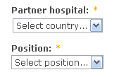
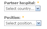
threexk CreditAttribution: threexk commentedSame thing in IE7. Could the CSS mentioned above be removed, or will it mess up the spacing for something else?
Comment #2
threexk CreditAttribution: threexk commentedOK, I put this under the microscope, and without the
margin: 2px;style Firefox 3.6.3 has too much space between the label and select list by one pixel. IE7 has identical space without the style.This is several pixels closer to identical than with the
margin: 2px;, so I'm still in favor of getting rid of it, unless there's something else affected.[Note that the Firefox screenshots above were from Firefox 3.0.19 (CentOS current version). The behavior is slightly different with it: there is too little space between label and select list by one pixel.]
Comment #3
Wim LeersThis is a wasp's nest to get right. It's not perfect, but it's as perfect as I could get it back when I originally wrote this. If you have improvements that do not cause significant breakage in other browsers, I'll gladly commit it though :)
Comment #4
Wim LeersComment #5
threexk CreditAttribution: threexk commentedHere is a patch that improves the situation. The field becomes perfectly aligned in Firefox, becomes almost perfectly aligned in Internet Explorer, and becomes worse or better in Safari depending on your perspective. I think the root problem here may be that CCK select lists themselves are not positioned properly in Webkit browsers (Safari, Google Chrome). More specifics:
Since Internet Explorer and Firefox are the top two browsers in market share, I think it makes sense to apply this patch at the detriment to Webkit browsers. (Although it does seem to improve the alignment vs. other CCK field types in Webkit browsers, so debatable that this is makes it worse for them.)
Comment #6
Wim LeersWith which themes did you test this? I want to make sure this has been tested in Garland. Then I'll commit this :)
Comment #7
threexk CreditAttribution: threexk commentedI originally made the change in Garland and saw improvement, but I got all the pixel offsets above in a modified Acquia Marina, which was a mistake. So, I rechecked them for Garland. Basically, the patch fixes Firefox and improves Internet Explorer in Garland, but makes Safari worse (and presumably other WebKit browsers.) It's a trade-off. Since Firefox and IE are more popular browsers, I am still in favor of making the change.
Unrelated strange observation with CCK and Garland: Some text field inputs appear 5 pixels below their labels and some appear 6 pixels below their labels, even though the fields have no noticeable difference (e.g., a first name and last name field with exact same settings.)
Comment #8
Summit CreditAttribution: Summit commentedSubscribing, having same issue, greetings, Martijn
Comment #9
Summit CreditAttribution: Summit commentedA picture says more than 1000 words, will this be solved using this patch? I added patch, but it didn't change my hs wrapper?
Comment #10
threexk CreditAttribution: threexk commentedSummit: Screen capture in #9 looks like a slightly different problem. This issue was about the alignment of the Hierarchical Select field compared to other CCK fields, rather than the sizing of the Hierarchical Select widgets.
Comment #11
Wim LeersSeems like you've really thought this through and tested it thoroughly. That's enough for me. Thanks for the hard work, threexk! :)
(And sorry for taking so long to commit this.)
http://drupal.org/cvs?commit=412110
http://drupal.org/cvs?commit=412112