
 Support for Drupal 7 is ending on 5 January 2025—it’s time to migrate to Drupal 10! Learn about the many benefits of Drupal 10 and find migration tools in our resource center.
Features
A list of features, roadmap, known issues, etc. can be found on the Fusion project page
Installing Fusion
If you've ever installed a Drupal theme before, you'll find that installing Fusion is just as easy. And if you haven't, don't worry: You'll still be fine! There are five simple steps:
- Download the Skinr module (the 1.x branch, as of March 2010), which gives you access to many of
Fusion's unique features - Download Fusion
- Enable the Skinr module
- Enable and set a Fusion subtheme (such as Acquia Prosper or the included Fusion Starter) as your site's default theme
- Give yourself permission to access Skinr's controls
- If you’re not the site's "super user" (that is, the person holding the first account created when you installed Drupal), you (or someone with sufficient permissions) need to explicitly allow you to use Skinr's features. Go to the user permissions page (e.g. http://www.example.com/admin/user/permissions), scroll down to the "skinr module" section, and check all boxes under your user role.
Add content
Your site needs content! You probably want to start out by adding a few nodes or menu items so you have some content to work with. You'll be able to do even more with Fusion when you've added your own blocks, views, menus, and more.
Configuration
When you're using a Fusion sub-theme, make sure that you always use the theme configuration settings for that sub-theme, not Fusion Core itself!
You can configure the display of items such as the site name, slogan, and logo on the configuration page as you would with any theme: visit /admin/build/themes, then click "configure" next to your theme to go to that theme's configuration page.
Note that Fusion does not support the standard "mission" field, as we provide a replacement "large, bold text" style for this that you can apply to a block and then place in any region.
Menus
Here is some basic information on creating menus and menu items: http://drupal.org/node/120632
Enabling primary link dropdown menus
Fusion supports dropdown menus for your primary links (and sidebar blocks, but we'll get to that later) using the Superfish plugin. Simply edit your primary links menu and set any parent menu items to "expanded" to enable the dropdown. This menu uses jQuery, but degrades to CSS-only when JS is not available, and for IE6.
General layout settings
Sidebars
You can change the width of both the right and left sidebars. and the content area will shrink or grow in response. You can also move the sidebars to both be on one side or another. Here's how:
- Visit /admin/build/themes, then click "configure" next to your theme to go to that theme’s configuration page.
- Scroll down to Fusion theme settings > General settings.
- Click Layout to expose the sidebar controls.
- Use the dropdown menus labeled “Select a different width…” to control
how wide the sidebars will be, then scroll to the bottom of the screen
and click “Save configuration”.
Fusion themes are switchable between fluid-width and fixed-width versions with just a few clicks. Here’s how:
- Visit /admin/build/themes, then click “configure” next to your theme to go to that theme’s configuration page.
- Scroll down to Fusion theme settings > General settings.
- Click Layout to expose the section labeled “Select a grid layout for your theme”.
- Select either “960px 16 column grid” or “Fluid 16 column grid”,
then scroll to the bottom of the screen and click “Save configuration”.
For the fluid width setting, there is a maximum width set of 1320px, meaning that even on a higher resolution screen, the page width will never expand beyond this size. It will also stop at a minimum width of 780px, but there is no guarantee that all themes may function properly at this size.
You can also customize how much of the page width is taken up by the theme, from 100% down to 85%. Experiment with these settings to see which looks best with your theme!
What the heck is up with these "units"? What's a grid?
Fusion's settings for changing sidebar or block widths might look a bit strange to you, because widths are listed as (for example) "2 units wide (120px/12.5%)". Here's what that means. The page is divided into 16 columns, regardless of whether you choose to make your theme fixed- or fluid-width. Each column is:
- 6.25% of the page's width in a fluid-column layout, or
- 60px wide in a fixed-column layout (which has a total width of 960px)
This grid system (similar to 960) has a lot in common with traditional newspaper layout systems. By mixing widths, you can develop some very impressive and attractive layouts, while still ensuring visual consistency. Try it!
Customizing layout with blocks
In order to take advantage of Fusion's layout options, you should be familiar with the basics of blocks, regions, and block visibility.
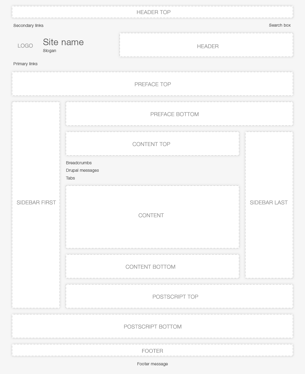
Fusion's regions are all collapsible. This means that if there are no blocks in a region, it will not be shown, and the remaining content will expand to fill its place. Here is a diagram of all of Fusion's regions, assuming all were visible (note there are also "node top" and "node bottom" regions that are only on full node pages).
Using block visibility, you can create dozens (technically, thousands... yes, we did the math) of different layouts by relying on these collapsible regions. By getting creative, you can create completely unique layouts for, say, your home page vs. category landing pages vs. individual node pages.
Block styling
Until you manually configure them (see below for more information), block widths will be set to evenly fill their containing region. For example, a region with a single block in it will be 100% of that region. With two blocks, their widths will be split 50/50.
Blocks also float left by default in a region. You can override this in the block settings.
Block widths and alignment
You can also adjust the width of individual blocks. The effect is similar to what you get through the Panels module, but much more lightweight. Here's how it works:
- On your site, go to admin/build/block
- Click Configure next to the block you want to adjust
- In the section “Skinr block settings” is a dropdown menu labeled “Width”. Its options range from 1 to 16 units wide. Select the one you want for this block
- There’s one obvious limitation: You can only make blocks as wide as the block region that contains them
You can also click on the small gear icon that appears when you hover over any block to quickly get to that block's configuration page. Not seeing a gear icon? Enable the "Display block configure links for administrators" option on the theme's setting page under Administrator Settings.
On a block's configuration page, you can also adjust its position and content alignment. Changing the position to "center" or "right" floats that block in the middle or to the right instead of the left. NOTE: You must set the block width narrower than the available space in the containing region in order for this to take effect, otherwise the block has no place to move to.
The content alignment option does a 'text-align' property on that block to justify the content of the block to the right or in the center. This does not depend on the width of the block.
Block styles
Fusion Core comes with a pile of useful block styles, and any particular Fusion sub-theme likely comes with even more. These handy generic styles are great for getting a quick start on your site and building a more attractive site in minutes!
You can set these styles on any block's configuration page:
General styles:
Text: large, bold callout style -- recommended as a "mission statement" style block with large text
Links: bold all links
Padding: add 30px extra padding inside block
Border: add 1px border and 10px padding
Equal heights: uses jQuery to equalize the height of any blocks with this style selected within a region -- you must select this style for all blocks within a region that you want to dynamically force to be the same height as the tallest block in that region
List columns:
2 columns (50%/50%)
3 columns (33%/33%/33%)
Put items in lists (menus, list views, etc.) in multiple columns
Menu layout: (these are great for footers!)
Single line menu with separators
Multi-column menu with bold headers (set menu items to Expanded)
List/menu styles:
Bottom border (no bullets)
Extra vertical spacing (no bullets)
Superfish menu styles:
Vertical menu (for sidebar blocks) -- also need to set the menu items to Expanded
Image floating styles:
These options will float ImageField images in content to the left or right and add margins
User login block styles:
Horizontal: puts user login block on a single line with label overlays (good for Header Top region)
Styling other types of content
Most of the styles above are also available as styles within Panels panes, Views, content types, and comments.
Recommended modules
The following modules are highly recommended as "Fusion-approved" for taking more advanced control of the output of your site.
Submitted By
Hide or change the format of the author and/or date on nodes and comments
Taxonomy Hide or Term Display
Control which categories or tags are shown on different node types
Page Title
Great for SEO – optimize the page title for nodes
Meta Tags
Edit meta tags for your front page, nodes, and views
Theme Settings - needs patch!
Customize the text and links for "Read more" and "Comments"/"Add comment" links, per content type
Menu Breadcrumb or Custom Breadcrumbs
Set up your site's breadcrumb navigation to match the hierarchy of your menu
Better Formats
Control input filters (Filtered/Full HTML) for different node types and comments, also adjust the help text shown by the comment form
Menu Block
Want to show the top level of a menu in your header and the child items in the sidebar, or any other combination of menu levels? This module is for you.
Special Menu Items
This module allows you to have unlinked menu items, such as the parent item of a dropdown menu
Print
Add highly configurable printer-friendly versions of pages to your site
Customizing your theme
Using local.css
Fusion Starter and Acquia themes (and hopefully other Fusion themes) come with a CSS file that you can place your changes in so that you can make customizations without hacking the theme. Open the file called "local-sample.css" and follow the instructions at the top.
For more advanced customization and building your own theme, see the section on Fusion sub-theming


Comments
Dropdown menu additional instructions
It took me a while to figure out why this wasn't working. You also need to enable the option in the theme configuration. You might want to add a note to that effect in that section.
Michelle
Good point
Thanks for the catch up.
Bilal
Acquia Prosper size modification
This is my site: http://library.iliauni.edu.ge/ilib. It's very 'large'. I want to change his size, punctually to cut borders punctually. I can change it and his borders were only one color (white) and not with header and footer menu rows?
how to change the hight between blocks
I have installed the fusion module. And I add two block which locate in the same region. But the problem is the gap between blocks is too large.
Not seeing any block styling options
On my D6 system I have the latest Fusion, Skinr, and Acquia Mariana themes installed. When I go to configure a block I don't see any of the block styling options listed above when I try to configure a block.
Is the documentation out-of-date or perhaps only for D7?
.
It's marked as being for D6. Best to put your question in the issue queue. Comments on handbook pages are frequently deleted.