
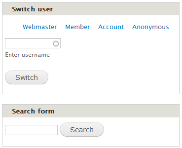
In the (Seven) Dashboard the Switch User block wastes a lot of space, see the attached screenshot. I've tried in vain to get the [Switch] button to align with the entry field, similar to the Search block. If the column is not wide enough, it should wrap below the 'Enter username', of course.
Can anyone help with this?
| Comment | File | Size | Author |
|---|---|---|---|
| #2 | devel.theme-switch_user_block.908830.2.patch | 1.5 KB | salvis |
| Dashboard-blocks.png | 5.39 KB | salvis | |


Comments
Comment #1
cindyr CreditAttribution: cindyr commentedTry adding this to your style sheet:
#devel-switch-user-form .form-item-username {
float: left;
margin-right: 1em;
}
Comment #2
salvis@cindyr: Thank you for your help — I'm sorry for letting this sit so long.
The Dashboard doesn't like the Switch User block anyway (it doesn't display the user list at all anymore). But no one has complained so far, so I assume no one wants to put the block into the Dashboard anyway.
However, the inefficient and ugly styling has bothered me on other occasions, too, especially in Seven, and whenever the block is put into the body or footer region. Having a column of user names just doesn't work so well in a wide region.
I think the attached patch should make things much better.
Comment #3
salvisCommitted to 8/7.