
 Support for Drupal 7 is ending on 5 January 2025—it’s time to migrate to Drupal 10! Learn about the many benefits of Drupal 10 and find migration tools in our resource center.
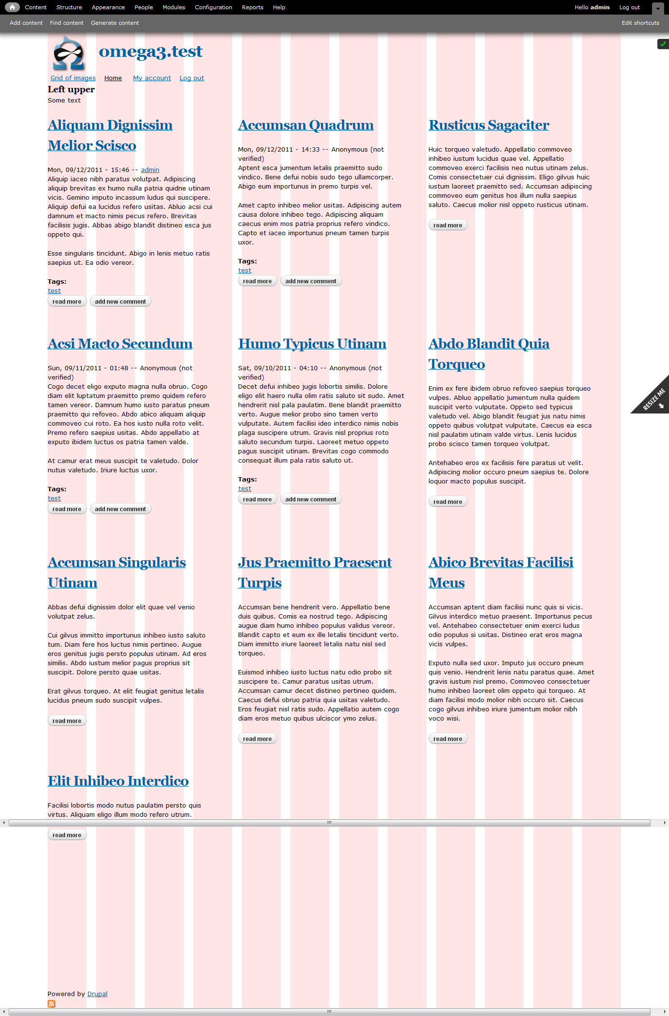
I have an Omega 3.0 page with a sidebar. In the main content area, I would like my listings of nodes to be displayed in 4 columns if the wide.css is used, 3 columns if normal.css is used, and 2 columns wide if I am in the narrow mode. What general approach would I take to doing this?
... is this just done just with css?
I want something like is found at http://colly.com/comments/carry_on_responsively/
... or, http://www.alistapart.com/articles/responsive-web-design/
Kevin
| Comment | File | Size | Author |
|---|---|---|---|
| #3 | wide.png | 320.43 KB | Argus |
| #3 | Normal.png | 307.42 KB | Argus |
| #3 | Narrow.png | 323.5 KB | Argus |


Comments
Comment #1
kevin-bcr CreditAttribution: kevin-bcr commentedClarification:
A better way to describe what I want: Not columns, but a grid with the number of columns in the grid changing -- like a photo gallery, but in this case a "gallery" of node items.
Comment #2
kevin-bcr CreditAttribution: kevin-bcr commentedOK. Here's what I have done. Does this seem correct?
In MYTHEME-alpha-default-normal.css ...
In MYTHEME-alpha-default-wide.css ...
I had to set a height to make sure each new row was aligned.
My question concerns whether (1) this css makes sense and (2) whether there is some other module, etc., that would do the job better.
Kevin
Comment #3
Argus CreditAttribution: Argus commentedSeems to be working fine the way you did it.