
 Support for Drupal 7 is ending on 5 January 2025—it’s time to migrate to Drupal 10! Learn about the many benefits of Drupal 10 and find migration tools in our resource center.
The current CSS forces images to be up-scaled beyond image style
a.media-gallery-thumb img,
.media-gallery-detail img {
  height: auto;
  overflow: auto;
  width: auto;  /* Make image take only as much as needed */
}
This also fixes gallery page line up issues.
| Comment | File | Size | Author |
|---|---|---|---|
| #16 | start-gal.jpg | 113.33 KB | MSR-Hamm |
| #16 | test1-gal.jpg | 69.27 KB | MSR-Hamm |


Comments
Comment #1
totap CreditAttribution: totap commentedDoesen't work for me well :/
"width: 100%;" is good if there is no conflict with others modules (i.e. Taxonomy tanslation).
"width: auto;" there is problem with resolution of thumbnails and their height
Comment #2
bkosborneWhy is the module messing with the dimensions in CSS at all? That should be up to the themer, or just use an image style that scales to the desired width. This really confused me.
Comment #3
bkosborneI was running into to other problems that made this one seem worse. Using a non-standard output theme (like Adaptive Theme), this module doesn't work that well.
Anyway - I understand that the width is 100% so that the images scale up to fit within their 'grid' width.
Comment #4
NancyDruStill present in beta7. This still fixes it.
Comment #5
Corbey CreditAttribution: Corbey commentedWhat css file are you putting this in? It doesn't seem to be doing anything for me..
Comment #6
NancyDruLine 385 of sites/all/modules/media_gallery/media_gallery.css
Comment #7
Corbey CreditAttribution: Corbey commentedHmm that's where I put it, but still nothing. I'm using Adaptive Themes, if that makes a difference?
Comment #8
NancyDruUse Firebug to fine out if it is being overridden somewhere else.
Comment #9
KirstenLangholz CreditAttribution: KirstenLangholz commentedAdding the following code to my theme css file did the trick for me:
.node-media-gallery.node-teaser { width: 25%; float: left; }
If you need four galleries in a row...
Comment #10
Corbey CreditAttribution: Corbey commented#9 worked for me, thanks!
Note: with Adaptive Themes (or maybe just Corolla) this needs to be changed to:
.article-media-gallery.article-teaser { width: 25%; float: left; }
Comment #11
ericinwisconsin CreditAttribution: ericinwisconsin commentedWhich file, specifically, is that put in to?
Comment #12
ericinwisconsin CreditAttribution: ericinwisconsin commentedOk, got it! I was confused by some people's comments about having to put it in their theme css file. (Which one is that, btw?)
I'm using the Corolla Adaptive Theme and so I put:
.article-media-gallery.article-teaser { width: 25%; float: left; }
On line 385 of sites/all/modules/media_gallery/media_gallery.css
This seems to have solved the problem!
BTW, it also seems to work with the Pixture Reloaded Adaptive Theme as well.
Cheers!
Comment #13
KirstenLangholz CreditAttribution: KirstenLangholz commentedDear Eric,
you should place the css code into the .css file of your theme. In case of an update of media gallery, all the changes would be lost again ;)
You should put it into css/page.css to keep it safe.
Comment #14
ericinwisconsin CreditAttribution: ericinwisconsin commentedThanks, Kirsten!
Comment #15
jenni4 CreditAttribution: jenni4 commentedWow! I've been learning drupal for a little over a week now and this is the FIRST issue to which I've found a resolution! Thanks 1000x's!
Comment #16
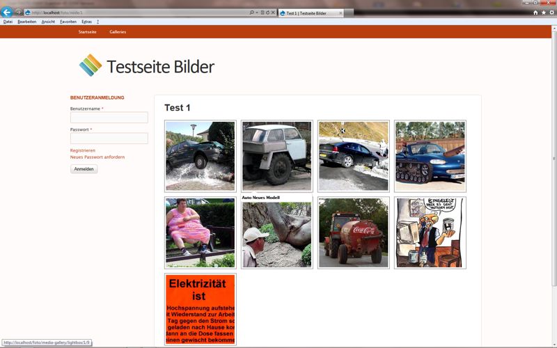
MSR-Hamm CreditAttribution: MSR-Hamm commentedDoes not helped me at all!
I have no problems with the size of the thumbnails when a gallery is shown (like test1-gal-jpg), my problem is on the starting page of all galleries (start-gal.jgp).
What can I do?
Comment #17
lsolesen CreditAttribution: lsolesen commentedThis is somewhat related to: http://drupal.org/node/1076192
Comment #18
Tobbetobbe CreditAttribution: Tobbetobbe commentedThe css change from NancyDru does solve the problem of images scaling up beyond their image style. But it creates other problems. As #1 "width: auto;" creates a problem with resolution of thumbnails and their height.
Also, with width: auto, images can display wider than they should on a gallery details page, causing the description not to show.
So, does anyone have an idea of how to avoid images to be scaled up on a gallery details page, without breaking other functionality of the media gallery module.
Comment #19
Tobbetobbe CreditAttribution: Tobbetobbe commentedOk, the problem with images displaying to wide on a gallery details page, could probably be solved with specifying the image style to the exact width that my theme uses on a gallery details page.
But how to avoid the width: auto affecting thumbnails?
Comment #20
lsolesen CreditAttribution: lsolesen commentedCould any of you please test with the latest dev. There has been fixes to the theme issues.
Comment #21
lsolesen CreditAttribution: lsolesen commentedClosing, as I guess it has been resolved in latest dev.