
 Support for Drupal 7 is ending on 5 January 2025—it’s time to migrate to Drupal 10! Learn about the many benefits of Drupal 10 and find migration tools in our resource center.
Problem/Motivation
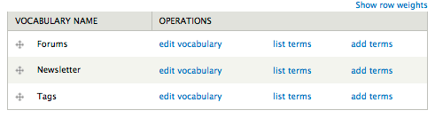
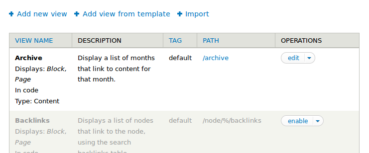
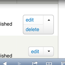
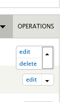
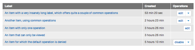
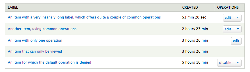
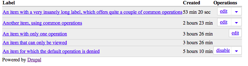
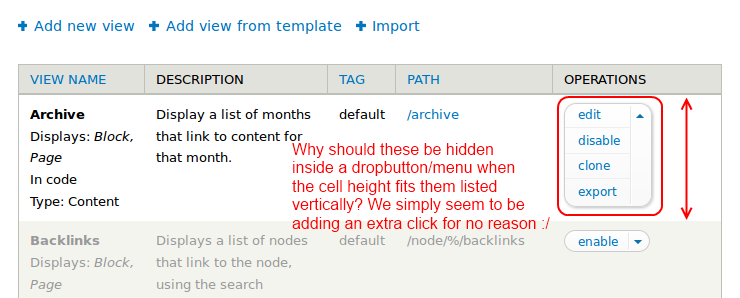
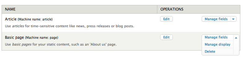
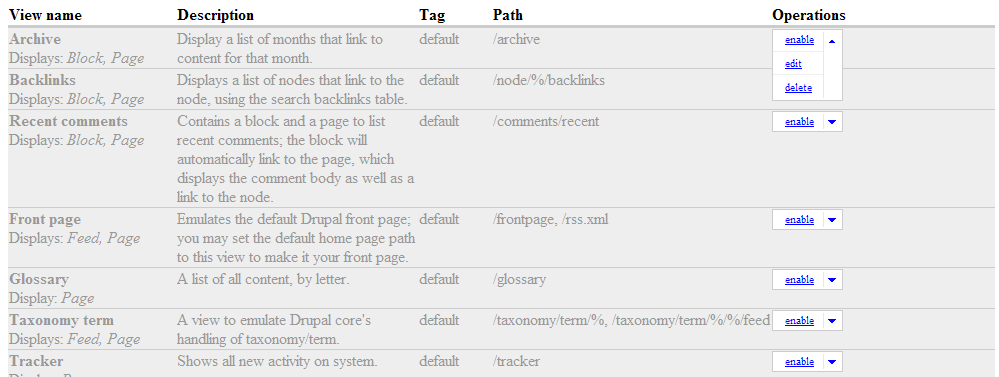
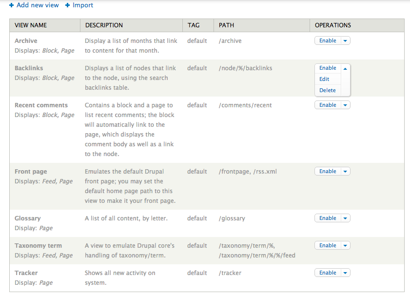
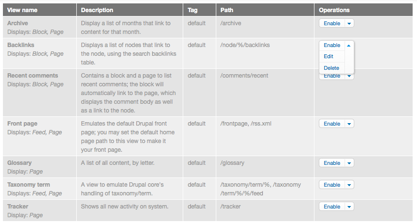
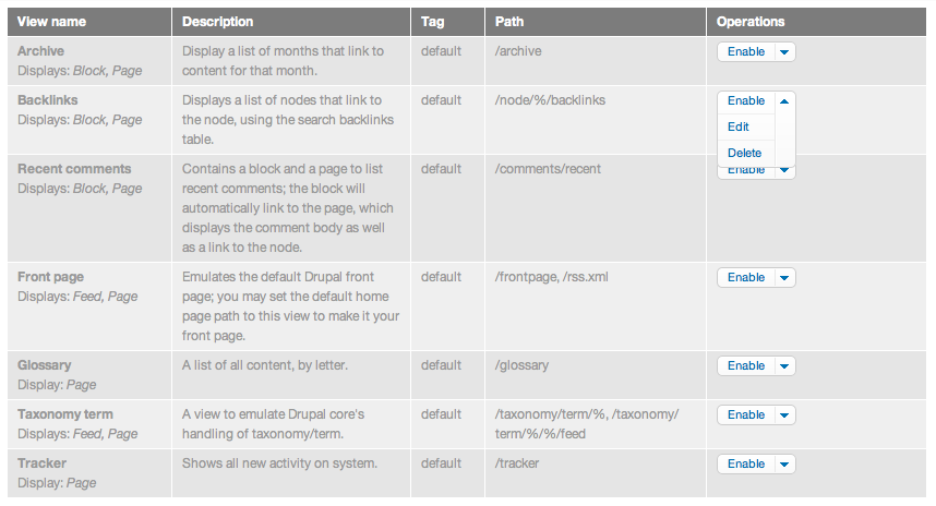
In the admin interface, listings of things -- such as nodes or views -- are often associated with several operations (edit, delete, enable, disable, export). Right now we list all the operations in a table cell next to each other:
Proposed resolution
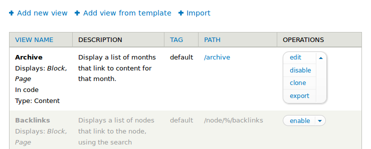
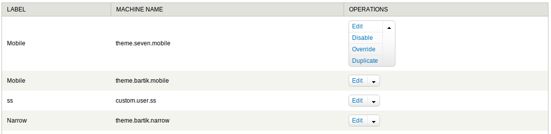
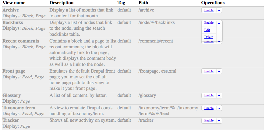
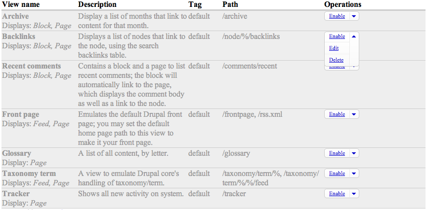
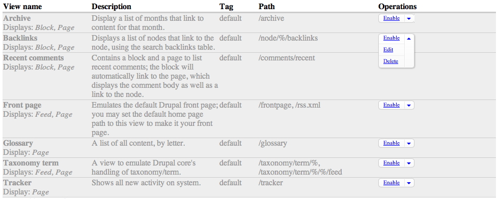
As part of the views redesign in D7, Noyz proposed a "dropbutton" pattern. In situations where one of the operations is more common than the others, that operation is presented as a button, with a dropdown arrow next to it. When you click the dropdown arrow, it reveals a list of secondary operations.
This dropbutton pattern is needed for views in core, but it should translate well to several kinds of listings. Candidates might include nodes (admin/content), taxonomy vocabularies (admin/structure/taxonomy), and menus (admin/structure/menu).
Remaining tasks
The code for the dropbutton as it's used in views lives mostly in ctools. There is some relevant css in views as well. It needs to be consolidated, possibly cleaned up (although IIRC it's in decent shape) and moved into core.
| Comment | File | Size | Author |
|---|---|---|---|
| #200 | dropbutton-1608878-200.patch | 2.28 KB | tim.plunkett |
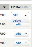
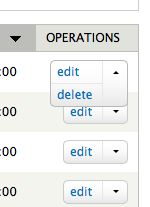
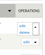
| #190 | i1608878-190_before.png | 16.62 KB | attiks |
| #190 | i1608878-190_after.png | 21.49 KB | attiks |
| #183 | core-js-dropbutton-1608878-182.patch | 20.08 KB | nod_ |
| #183 | interdiff.txt | 723 bytes | nod_ |


Comments
Comment #1
webchickRock!
Once we get this into core, #1480854: Convert operation links to '#type' => 'operations' is an issue for doing conversions.
Comment #2
webchickTagging.
Comment #3
nod_Possibly related to this issue: #1605960: Replace JS animations in core components with CSS transitions
Comment #4
Bojhan CreditAttribution: Bojhan commentedLooks like this is a better issue starter, as mentioned in the other thread. I agree, we should try and get this in - I look forward to a patch.
Comment #5
Dave ReidPart of me doesn't like the dropbutton pattern since you can't see what actions you can do until you click it, but I guess that's also kind of consistent with our contextual links pattern.
If we're going to be touching all the table operations, can we please, please sentence-case the links.
Comment #6
nod_Actually wouldn't we want contextual links to be dropdown buttons with edit shown by default? just an idea.
Comment #7
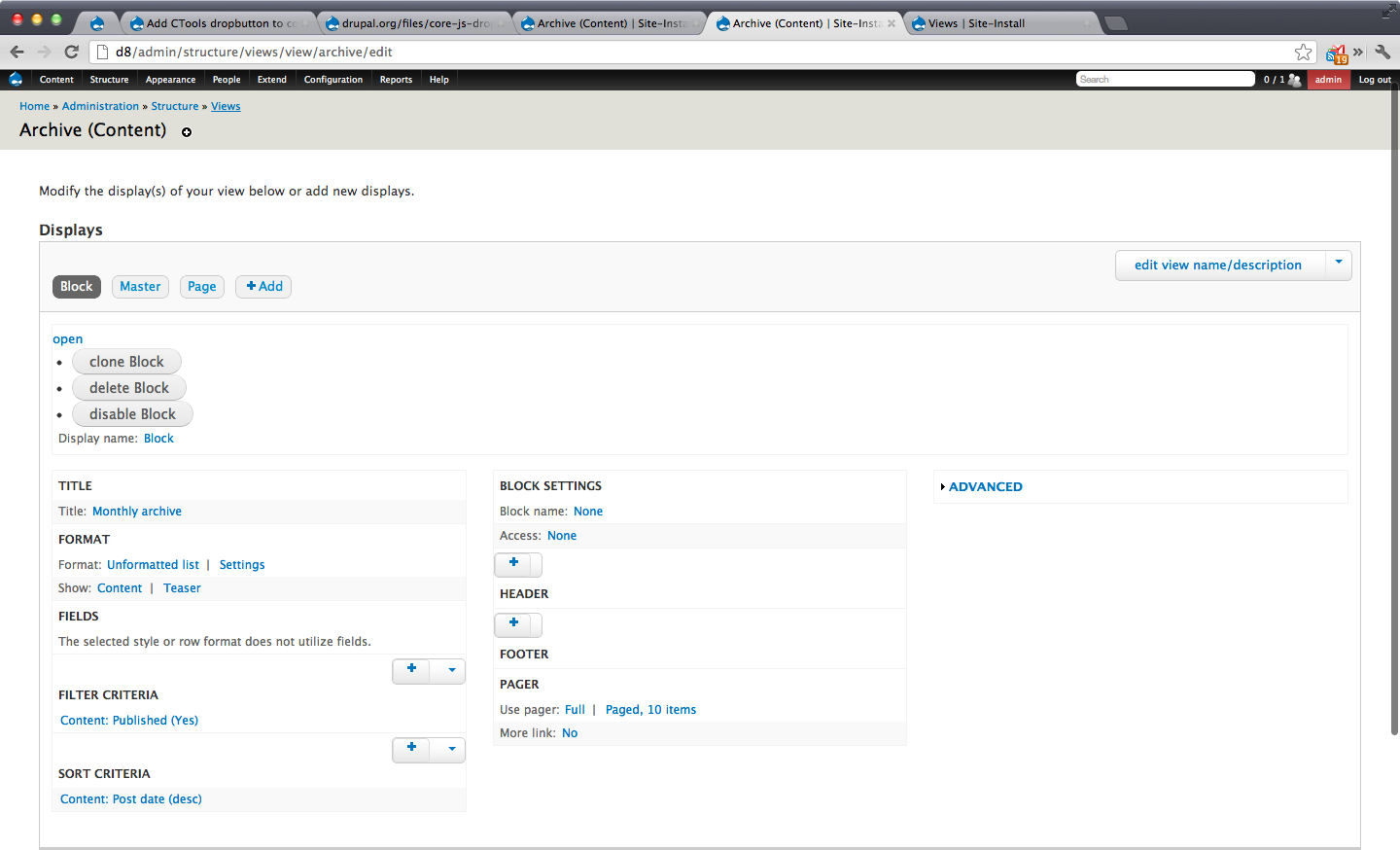
Everett Zufelt CreditAttribution: Everett Zufelt commentedI don't know that I believe the current dropbutton to be accessible enough for Core.
Perhaps it's implementation, but on admin/structure/views (using latest release) clicking 'open' puts focus to top of page. 'open' isn't very descriptive (open what?), and has no meaningful semantics to provide an indication that a selection of options will be exposed.
In short the dropbutton widget needs a lot of accessibility love before it is ready for Core.
Tagging for a11ysprint
Comment #8
gmclelland CreditAttribution: gmclelland commentedThis issue is similar #1480854: Convert operation links to '#type' => 'operations'
Comment #9
Jeff Burnz CreditAttribution: Jeff Burnz commentednod_ has a point here and its something I thought of immediately, that drop buttons and contextual links are almost the same thing, bar one being hidden by default, but could they not use the same or similar implementation?
Comment #10
ksenzeeI took a look at contextual.js and it's pretty simple: ~50 lines of code, no hover intent checking, just adds and removes classes on hover, click, and mouseleave. I don't see anything that makes sense to factor out and reuse for dropbuttons. Perhaps when dropbuttons are in, we could take a look at reusing some of its hover intent code for contextual links.
I don't see the focus problem when navigating via keyboard; maybe that's a screenreader only thing? The problem I do see when navigating via keyboard is that you can't tab to the primary link without first opening the whole list.
I'm going to work on a patch based on the current ctools code that converts one set of links - maybe taxonomy vocab operations. That way we'll have something to test accessibility against.
Comment #11
aspilicious CreditAttribution: aspilicious commentedIf accessibility is a problem we maybe should look at jquery UI menu http://blog.jqueryui.com/2010/06/jquery-ui-19m2-menu/
Comment #12
tim.plunkettComment #13
dead_armComment #14
dead_armThis is the core integration with tentative naming. I'm still working on the actual CSS improvements locally.
Comment #16
nod_Here is a quick review, no major problem, just nitpicking on a few things :)
Nice start though, was really starting to need that get in the queue somehow :)
Comment #17
nod_Adding tag to make sure we have some tests in place to verify the functionality once it's in.
Comment #18
dead_armThe patch attached should address all points in #16, as well as some of the accessibility concerns from @Everett Zufelt's comment.
Comment #19
tim.plunkettI ran this through JSHint and it came back clean.
Comment #20
aspilicious CreditAttribution: aspilicious commentedCan we have some screenshots please?
Comment #21
Everett Zufelt CreditAttribution: Everett Zufelt commentedCan I have a demo URL please, or a short list of steps to create a demo for myself.
Comment #22
tim.plunkettOkay, here is an updated patch, as well as a demo patch with the file name dropbutton-1608878-22-DEMO.patch to be used instead to see the dropbutton in action. It implements it on the content type page (admin/structure/types).
Comment #23
nod_We have
drupal_html_idto handle unique ids, no need for the static (unless I'm missing something?).The actual animation renders pretty badly.
Style is pretty bad in opera (read, no background), related to that, is the gradient necessary? We already have a button style, which is different from this one.
Comment #24
tim.plunkett@nod_ the static code likely predates the existence of the drupal_html_id function. It should definitely use that instead.
What core theme did you look at it in? Seven looks great to me.
Comment #25
dead_armUpdated code to use drupal_html_id() in order to replace ids, and did some other minor clean-ups. Also sentence-cased the links that were lowercase.
Comment #26
nod_Yeah for the other things It's not very important to get right now, which is why I haven't put it back to NW. unless someone finds some time to clean that up I don't see a big issue to go with that.
Comment #27
tim.plunkettThis will need a reroll due to #362889: Move drupal_common_theme() from common.inc into theme.inc
Comment #28
Dave ReidI'm curious how well this UI works on a mobile device. How easy is it to select the drop down list? Does it usually cause accidental clicks to the default action?
Comment #29
Bojhan CreditAttribution: Bojhan commentedI imagine for mobile devices, we need to make sure there is enough horizontal spacing between the link and the dropdown. It should be little different from two links close to each other.
Comment #30
Dave ReidI did a quick test with the current dropdown button in CTools 7.x and even when zoomed in on my phone, I found that I accidentally hit 'Edit' several times when I was attempting to hit the drop-down.
Comment #31
tim.plunkettAfter talking to @Dave Reid, I opened #1781740: Make the dropbutton more mobile friendly as a follow-up for #30.
Comment #32
dead_armRerolled the patch for the drupal_common_theme() change, and also fixed the styling in Opera (the original CSS omitted the Opera vendor prefix), which explains @nod_'s problem in #23.
Also attached are screenshots of the dropbutton in each core theme in Chrome 23, Firefox 12, Opera 12, and Safari 6 respectively on Mac OS X.
Comment #33
geerlingguy CreditAttribution: geerlingguy commentedI hate to be 'that guy', but how about IE?
Comment #34
tim.plunkett@geerlingguy Thanks for volunteering! :)
Comment #35
geerlingguy CreditAttribution: geerlingguy commentedIE8/XP screenshots attached. Need to move my laptop to the other room so I can attach to my drive with Windows 7 on it.
Comment #36
geerlingguy CreditAttribution: geerlingguy commentedI'm happy with it. Looks pretty nice in IE9, if I don't mind saying so myself!
Comment #37
geerlingguy CreditAttribution: geerlingguy commentedComment #38
geerlingguy CreditAttribution: geerlingguy commentedUntagging. Also going on the record saying that the background gradient seems to be unnecessary polish, imo, but I'm fine with it going in. IMO, that particular bit of fanciness is best left to individual themes.
Comment #39
tim.plunkettThe styling is split into the separate dropbutton.theme.css for easy overriding.
Comment #40
larowlanComment #41
Bojhan CreditAttribution: Bojhan commentedSo, this still needs both UX and A11y review.
Comment #42
klonosMinor thing: I don't know if we're touching the css part yet, but the 'Operations' column doesn't require all its width any longer I guess.
Seeing this move on is really good news for #538904: D8UX: Redesign Modules Page as well that could use this for the same column in the modules page.
Comment #43
klonos...sorry.
Comment #44
Sylvain Lecoy CreditAttribution: Sylvain Lecoy commentedI am not sure it will add usability as it will now be:
From a design standpoint, this is an excellent feature because it help clean up a busy layout.
From a user standpoint, it is extra steps, in my opinion, and contribute to add complexity because they are confusing, annoying and oftentimes dysfunctional (I am looking at mobile users).
Comment #45
catchAt first look a lot of the CSS looks like it belongs in Seven rather than in /misc?
Comment #46
Sylvain Lecoy CreditAttribution: Sylvain Lecoy commentedWe could have the following:
Having some default links: edit delete more...
The 'more...' section will contains seldom used functionalities, such as export, import, and would be a dropbutton.
This would not add complexity for common used tasks, and clean up the busy layout of operations.
I think its a good deal.
Comment #47
sunI'm glad that @Sylvain Lecoy brought it up already -- The reduction to a single operation indeed gets into the way of users who want to perform a non-default operation. It requires more clicks/interactions, but even more importantly, it requires more brainpower to execute the operation you want to do. It makes you think.
To make this dropbutton idea feasible, at minimum we'd have to ensure that the second best operation is directly accessible as well. Since it looks like the dropbutton will be primarily applied to Configurables on administrative pages, one simple and obvious way to do that would be to turn the title/label of the Configurable into a link to the edit page. (Configurables typically do not have a "view" page.) Thus, the user has immediate access to the two most common operations.
This problem is actually visible in the screenshots in #0 already, in which "edit vocabulary" competes with "list terms." You won't be able to prioritize one over the other, because the real priority varies for the actual roles of people working with a site.
So I think we need to take the full context of the main page content into account. The problem starts with not using the other existing columns effectively (e.g., leveraging the label as link).
Once you improve the general output, the next best question is consistency.
To begin with, is it legit to have operation links in the dropbutton that are only related to the configurable item in question (à la "list terms" and "add term")...? Typically, I'd expect a dropbutton to show me operations to perform on a particular item only.
Second, still in terms of consistency, will the user expect dropbuttons on all these administrative tables? And, what if there are no suitable links left to make sense of dropbutton elements?
Third, I don't think we have examples for this in core, but in general there's no guarantee that the current user has permissions to perform all operations. Thus, the dropbutton's default operation might change. Worse, there might only be one operation in the dropbutton.
(That said, the Modules page exposes the problem.)
Speaking of, how does a dropbutton look and perform with a single operation?
And what is the minimum amount of operations I need to have in order to make sense of a dropbutton?
We should probably ensure that the dropbutton operations (or at least the default operation) do not duplicate a link in one of the other table columns.
Lastly, the .theme.css appears too heavy. When looking at the screenshots, there's no difference between stark/seven/bartik. The dropbutton always looks like it was "tacked on later"; i.e., it uses a completely different styling in terms of colors, size, spacing, etc. Unlike contextual links, these dropbuttons appear in the middle of the page and are disturbing the theme's design. I'd like to see how the .base.css styling looks in Stark. Based on that, we should discuss what a minimal implementation can look like and apply that to .theme.css, and move the rest of the styles into the individual themes.
Comment #48
Kiphaas7 CreditAttribution: Kiphaas7 commentedThinking outside the box here, any reason why we're NOT making it into a native
<select>using JS? Selects have native mobile support (from personal experience with iOS, I would even say excellent). Bind event to choice and presto.Also, on an entirely personal note, I also found the dropdown from ctools to look really awkward midst clean themes like seven or bartik. Really heavy styling.
Sun raises a number of good points, including:
I think it should look like a single link. In other words, no dropdown. And I don't think JS should decide on that; simply don't assign the class in php.
Yea, that is an excellent suggestion. Which means most of the times only 2 links are needed. Which makes a dropdown questionable. :)
Comment #49
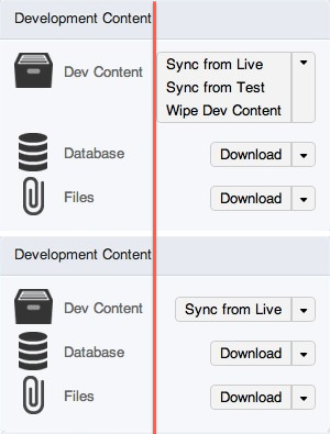
tim.plunkettSo, this issue is about adding the theme function to core. The current patch converts the content type page only as a demo, I don't necessarily think it needs to go in here. I very much agree that the dropbutton is not right for all scenarios.
If there are two primary actions, you could continue to have multiple columns. Make the most obvious choice its own button, and have the rest in a dropbutton, with the second most used choice on top.
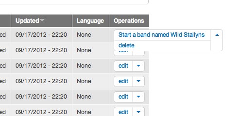
Here's a screenshot of that (which also shows what happens with only one link in a dropbutton)
I also agree about the styling being too heavy handed for Stark, but the question is how to deal with Seven and Bartik. Do we want different stylings for each? Duplicate the CSS between them?
Here is Stark with the two column approach with just dropbutton.base.css, no dropbutton.theme.css:

----
Also, please keep in mind that the design choices and styling here are taken directly from CTools/Views. They can be changed, no one here will be offended. If the gradient is dropped completely, that's fine. If the markup needs to be updated semantically, that's fine. If it's only used in two places in core, that's fine. But it is a useful interaction pattern that is worthy of conclusion.
Comment #50
klonosCouple of thoughts:
- Ok about the whole "only one link doesn't qualify for a drop-down" and "we simply add extra clicks" thing, but we still do it say for contextual "edit view" links with the cog icon (I realize this is not in core). I guess the reason/excuse behind that is in order to be consistent and/or to hide these links from being obstructive.
- If we are to not adopt this dropbutton idea after all, I'd like to suggest considering listing operations vertically. For the most admin tables that come to mind this makes sense since the content in the rest of the cells already extents/wraps to more than one line. I expect this to happen more often when in small/mobile screens
Comment #51
Dave ReidBecause contextual links are used in different contexts than a dropbutton. The two are very separate in purpose.
Comment #52
Kiphaas7 CreditAttribution: Kiphaas7 commentedIn addition to the question I posed in #48 why we're emulating native
<select>instead of actually using native selects: styling doesn't have to be a problem for mobile or other browsers:http://37signals.com/svn/posts/2609-customizing-web-forms-with-css3-and-...
http://formalize.me/
But then again, styling shouldn't be the main issue here.
Comment #53
Sylvain Lecoy CreditAttribution: Sylvain Lecoy commentedI think a great use case, is for the Publish button redesign:
Publish was the default value (i.e. default action), and when you click on the arrow on the right to expand the publish button, the preview action was shown.
http://drupal.org/node/1480854#comment-5747724
Frankly, for operations, I am not convinced by the dropbutton. Also, when you comparing to gmail and facebook, they are not dropbutton like the ctools one: they are dropdown menus. When you click on the button to expand the menu, it is not triggering an action, it is just showing a list of action, whereas when you click on the button to expand the ctools dropbutton, it triggers an action, and you have to carefully select the arrow to expand it: the closeness of two distinct action is really not a good practice for User Interfaces.
This is neither a standard, neither commonly used in the industry (I had to clarify that).
Comment #54
tstoecklerI think it was discussed primarily in #1480854: Convert operation links to '#type' => 'operations' and not here, but one thing that the last few comments seem to forget is mobile administration. While the picture shown in #50 might make sense for users with a regular sized PC or laptop screen, the whole thing looks a bit different on a smartphone, where both horizontal and vertical screen real estate is limited. I think when it comes to mobile administration Dropbuttons are a real winner because of the space saved in the default state.
I'm not in any way implying that this discredits the comments above or that we should favor mobile administration over desktop administration (not implying the opposite either, though...), I just had the feeling that that point was not considered above.
Comment #55
Dries CreditAttribution: Dries commentedTagging.
Comment #56
Noyz CreditAttribution: Noyz commentedI think a few of you are looking at the problem the wrong way.
The usefulness of a product is not only about clicks. It's about perception. Often perception is more important than actual usage because if people cant get over perception, usage doesn't matter. People think Drupal is hard - primarily because of perception. Seasoned users like us don't think Drupal is hard - were over the hurdle. We've been trained to know what actions exist and the meaning behind them. We know the difference between 'Mange fields' and 'Manage display' or "list links' and 'edit menu.'
Sacrificing a simple looking interface with reduced, focused actions (drop buttons) over a more complex looking interface with sometimes hard-to-differentiate actions is not a wise choice. It's a choice made by the informed thinking that the uninformed want quick access to ALL actions, even the actions they seldom use or don't understand.
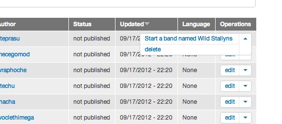
A bit of history... Acquia support and professional services are regularly interacting with everyday users - albeit through training new users or supporting existing ones. Every time we would engage with a new customer with Views, the customer would start asking about ancillary things like, "what's that icon do? how about that one? why export? what's clone mean?" These questions were asked, and had to be answered before people even understood what a View was. Now, with drop buttons, new users merely see:
- one 'Edit' link on the list of Views (5 choices down to 1).
- one 'Add' link on the various components of Views (2 choices to 1).
- one 'Edit View name/description' link on the display (6 choices to 1)
- one 'VIew page' link on the display (4 actions to 1)
That's an astounding 17 actions down to 4. I didn't get rid of them, I changed the perception of views from being crazy complex and confusing to something simpler and more focused. I still get thanked by folks in support and training as well as Drupalcon attendees for doing that because people are now able to focus on what Views does 80% of the time, instead of being distracted by all the other thinks Views can do if you do desire it to. Not only are they no longer distracted, but people are less intimidated. Perception is winning.
Comment #57
webchickRestoring tag.
Comment #58
james.elliott CreditAttribution: james.elliott commentedI'm a huge fan of the dropbutton control being added to core. It is very useful when used in the right context. The original post doesn't have the best example of this context, and many of you have pointed out some of the dropbutton controls weaknesses when used too often. This is a great article on dropbutton UX patterns. When to use them, why to use them, who has already used them. http://quince.infragistics.com/Patterns/Drop%20Down%20Button.aspx
#6
Contextual links are an entirely separate control with a very different use case than drop buttons. Adding drop buttons everywhere there were contextual links would add an enormous amount of visual clutter.
#44
I think you're missing something in your assessment of how users approach lists of options. It isn't very common to see people evaluating all their choices before making a decision. Usually they stop at the first thing that seems like it might be what they're looking for. A more realistic assessment of the mental steps to use a dropbutton is this.
A drop button is only an appropriate control if in the extreme majority of cases, the first option in the list is going to the be the one a user chooses. The example in the original post isn't a very good one for illustrating how a dropbutton improves the UI. The screenshot in #50 might be though. The vast majority of the time, I would assume, users looking at the views listing page want to perform the edit action on a view.
#47
Dropbuttons should only be used when the non-default action are seldom used in comparison to the default. It requires a single additional click/interaction. I'm not sure I buy the brainpower argument either. In the majority of proper uses, users won't be required to do anything but click the primary action. The options underneath it require no mental processing. For the odd case where a secondary action is desired, the amount of mental work required to open the dropbutton wouldn't be more than reading through a list of links in the first place.
You do an excellent job of dissecting exactly why dropbuttons wouldn't work for the example in the original post. There isn't a clear winner for the primary action.
A dropbutton with only 1 option available to a user looks like a normal button. It should fall back to a normal button gracefully.
#49
I think you summed up everything nicely. Dropbuttons are an excellent control to use in addition to existing controls. They should be selectively used where they make sense but not as a blanket change to every situation where multiple actions can be performed.
#53
A Publish/Preview button is an excellent use case.
Comment #59
larowlanPosting for reference: http://jqueryui.com/demos/button/#splitbutton
Comment #60
Kiphaas7 CreditAttribution: Kiphaas7 commentedThere was pushback to changing links to buttons in #1719640: Use 'button' element instead of empty links, even if they possibly make more sense semantically. In that issue, there seems to be consensus to use buttons for the markup but style them as links where appropriate.
Do note that in the aforementioned issue the case is links added solely via javascript, which usually only trigger actions while staying on the same page, so semantically it made sense to change them to buttons, but visually buttons were deemed too distracting, which was fixed by styling them to look like links again.
There seems to be similarities here (although in this case it's making links look like buttons), so possibly the current styling (or any future proposed styling) might be deemed too distracting as well; therefore tagging as "Needs usability review".
Comment #61
Kiphaas7 CreditAttribution: Kiphaas7 commentedWhile I think the idea of de-cluttering the UI by reducing the amount of links by a dropdown/dropbutton/dropsomething is a great idea, I'm not warming up to the current proposed implementation because:
Furthermore, in addition to the dropdown/dropbutton, I still think it might be worth pursuing reducing the amount of links by turning the label of table row into a link, as proposed by sun in #47.
Comment #62
tim.plunkett@Kiphaas7 In response to #61, please submit a patch if you'd like to see different styling. Also, your second point will be addressed in #1781740: Make the dropbutton more mobile friendly.
As far as #60, please read #56 and #58, thanks.
Comment #63
Kiphaas7 CreditAttribution: Kiphaas7 commented#56 and #58 do not adress the issue I brought up in #60, at all. The pattern of using dropbutton is advocated in #56 and #58, which I'm not disputing in #60. What I am disputing, is the visual change of turning links into buttons, which was fought in #1719640: Use 'button' element instead of empty links. Because it was deemed to distracting.
Comment #64
tim.plunkettThat issue was about the <button> element, and is not relevant here. If you're talking about the styling, then my comment in #62 stands.
Comment #65
Kiphaas7 CreditAttribution: Kiphaas7 commented#64:
Quoting Bojhan from that issue, emphasis is added by me.
I don't have an alternative ready, but that shouldn't prevent me from bringing up the issue?
Comment #66
Sylvain Lecoy CreditAttribution: Sylvain Lecoy commented#58 has convinced me. This would be a great asset and is needed by at least one great use case: the Publish (Save Draft) example for node publication.
Let's add it with the following guidelines in mind:
However, if we could please remove that rounded corner, it is a personal taste but it makes it really not looking good.
Comment #67
Kiphaas7 CreditAttribution: Kiphaas7 commentedForgot to add that, in all my posts here, I was just talking about the operations links. #66 is absolutely right it would work great for node publication!
Comment #68
Everett Zufelt CreditAttribution: Everett Zufelt commentedI have yet to be presented with a demo. Can we confirm that the proposed solution is accessible?
Comment #69
Bojhan CreditAttribution: Bojhan commented@sun and @Sylvain Lecoy Thanks for getting this discussion going, its important for such a vital interaction as this to make a considerate decision.
First of all, I don't really get how my comment in that other thread is related to this. These links are not themed this way for a decreased importance.
To give actual feedback on the thread, I am still for putting this into core although there are cases where you are choosing out of two common actions. The majority of administrative tables highly favor one primary action. However I am not worried about this, this is a con we knew is part of this solution - it will decrease effectiveness for when all you do all day is perform non-standard operations, but is fine for the 80% case.
What is the question is where do we apply this? I feel it shouldn't be a case by case basis, because that will make for a very varied experience. Which in my opinion is far worse, than having occasional places where the drop button is less effective than actual links. Because if we have this variety you are basically wondering on each listing page, what interaction you get. The guidelines outlined in #66 sound fine in theory, but I imagine contrib developers just choose whatever they like most and users just see sometimes its a drop button, sometimes its a link and don't understand at all why. I imagine the best practice would be to default to always.
Lets keep the styling discussion out of this, I don't think it helps much getting to the core of the discussion and it can easily be solved in a follow up or separate issue.
Comment #70
Kiphaas7 CreditAttribution: Kiphaas7 commentedThat was why I brought it up, and why I tagged it for needs usability review. Thanks for clarifying, seems I was wrong. No further objections from me :).
Comment #71
dead_armI moved the more specific styles (gradient, rounded corners) out of dropbutton.theme.css into the Bartik and Seven themes directly.
@Everett I've attached a patch that will demonstrate the dropbutton on the Content Types page.
Comment #72
Everett Zufelt CreditAttribution: Everett Zufelt commented@dead_arm
Thanks for the patch. Can you please tell me where I can go to test this. As one of the few people testing accessibility it is rather burdensome to set up a new environment for every patch/issue.
Comment #73
lpalgarvio CreditAttribution: lpalgarvio commentedlike it!
Comment #74
Wim LeersCursory review. Lots of documentation nitpicks.
@nod_ brought up the potential use of CSS transitions in #3. There hasn't been any response to it AFAICT. I don't see the point of adding JS to do these simple animations when you can do it without JS. Granted, it's very little JS, but at least the usage of CSS transitions should be *considered*.
Incorrect docs. See http://drupal.org/node/1354#themeable.
s/javascript/JavaScript/
JavaScript
s/wit hthe/with the/
s/if/If/
s/open/Open/
Indentation error.
Inconsistent comment locations.
Comment #75
Kiphaas7 CreditAttribution: Kiphaas7 commentedI'm not sure if this should be handled in a follow-up, but regarding the js:
(if nod_ is fine with the current implementation, then ignore this post)
Comment #76
nod_My thought is that this is a views dependency, the code is straight from ctools, core doesn't have to use it until it's accessible enough/relevant/etc. The only thing it needs from my point of view is a test scenario once it's committed: http://drupal.org/node/1777342. That's it.
You make a very good observations about the state of the code Kiphaas7, I agree with your review. Then again, that's a views thing and if views is blocked by this patch, it's just not worth it. I mean, obviously I'll be adding it to the clean-up table #1415788: Javascript winter clean-up and actually I'm event trying to make time to review views JS before it hits the core queue.
When/where/how to use that outside of views just doesn't belong to this issue, should be in #1480854: Convert operation links to '#type' => 'operations', not here. To me this is a "commit-and-run" patch for facilitating views in core. It'll sit next to jQuery UI waiting for us to use it and there is nothing wrong with that. That'll open some options for core, sure, but I don't understand why we arrived at 75 comments on this one (ok, I kinda do but that's not my point :p).
So yes, I'm ok with the code since it facilitate something I want. I will add it to the JS queue to fix what #75 and #74 outlined but that's not a blocker as far as I am concerned. I like views, I want views in core, and as ksenzee said the code isn't in a bad shape. We have much bigger issues to solve for JS before feature freeze than this one which can be taken care of after.
Comment #77
jessebeach CreditAttribution: jessebeach commentedSorry to swoop this issue. I've rewritten the code to use our current JS patterns. I'm taking comments #74-#76 into account now. Will have a patch in less than an hour.
Thank you to @dead_arm and @tim.plunkett for patches so far!
Comment #78
jessebeach CreditAttribution: jessebeach commentedSo, these are the changes I've made:
To test these changes, edit node.admin.inc starting near line 520 to
Replacing "links" with "dropbutton" in
links__node_operations. Eliminate the #attributes property as well.Then navigate to the path /admin/content.
Comment #79
nod_There are a few extra
,a couple of missing;and not using.attr()but that's details, I really like this patch :)Comment #80
Lars Toomre CreditAttribution: Lars Toomre commentedIf this patch is re-rolled, can we add type hinting here to each of the @param directives?
Comment #81
tim.plunkettTo fix #79-80 and a couple of my own tweaks.
Comment #82
tim.plunkettThanks so much @jessebeach, the JS looks amazing, and I like the simplifications overall.
Here are my changes:
.secondaryis a pre-existing class name, changed to.secondary-actionsto avoid conflictsCan someone else put up a demo site for Everett? My public-facing server is PHP 5.2 and I didn't have time for anything else.
Comment #83
tim.plunkettWhoops, forgot the docs fixes requested in #80.
Comment #84
tstoecklerI've applied this patch to a test Drupal 8 site. I've given anon permissions to view the content admin screen, please don't melt my server :-) Here it is:
http://hostmaster.tstoeckler.de/drupal-8-dev/index.php/admin/content
Comment #85
tstoecklerI just tried doing my own littel accessibility review, and noticed a couple things. Disclaimer: I'm a total accessibility noob.
A. I tried to use the dropbuttons with keyboard-only and a couple things were strange:
A.1. I was able to tab to the arrow that should reveal the other operations, but there was no dotted box around the actual element to indicate that it is activated.
A.2 This might be the same problem as A.1, but I was not able to actually activate the arrow in order to see the secondary operations.
A.3 Both visually and conceptually, I would have expected to tab to the primary operation first and then get to the arrow, but the arrow is first. This is probably related to the source order. This is probably also important for screen-readers who I would assume would also want to read the primary operation first and then the arrow.
A.4 This is minor, but the dotted box that surrounds the primary operation, when I tab to it, looks a bit off. See the attached screenshot.
Comment #86
tstoecklerHere's the super minor screenshot I forgot.
Comment #87
tim.plunkettI'm unfortunately having the same problem with this code, which I wasn't before.
Comment #88
Kiphaas7 CreditAttribution: Kiphaas7 commentedMinor nitpicks:
Could be part of the constructor?
I'm surprised this works, shouldn't Drupal be there as well?
Comment #89
Everett Zufelt CreditAttribution: Everett Zufelt commented@tstoeckler
Good accessibility observations. In addition testing with a screen reader (JAWS + FF)
- both the Open drop button and Edit links can receive focus
- pressing enter on Open drop button appears to do nothing
- Open drop button carries no real meaning (what is a drop button and why would I want to open it?) I think the jQUI might use the term button menu, but still I think the interaction pattern is somewhate different than that which we are going for here.
Comment #90
sunDidn't look at the code yet, but here's a user interaction / UX review issue:
In words:
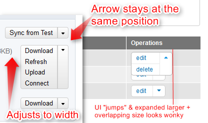
1) The arrow to expand the dropbutton does not stay at the same position when clicking it. So if you want to close it again without selecting an operation (because you clicked the wrong one or whatever), then you have to be very careful to actually hit the arrow again, 'cos it's at a different position now. That's a weird behavior, which I haven't seen on any dropbutton on the net yet. This might be a left vs. right alignment issue only. The screenshot contains a counter-example from Pantheon's admin UI, which doesn't show this behavior and seems to come closest to the UI/design of our dropbuttons.
2) The expansion in width/size when opening the dropbutton looks and feels a bit odd. For most Operations dropbuttons, it should be fine to use the longest operation label as the bounding border/max width of the entire dropbutton. We should allow themes to set a simple
max-width: 10em;on the closed dropbutton if they have tight width constraints (i.e., retaining the current width/size expansion behavior when the dropbutton gets opened), but otherwise, I think we should default to the automatic width derived from the longest operation.EDIT: Heh, didn't look at Pantheon's HTML source when I wrote this... theirs actually is CTools' dropbutton ;)
Comment #91
Sylvain Lecoy CreditAttribution: Sylvain Lecoy commentedJust bouncing from #59, why not considering http://jqueryui.com/demos/button/#splitbutton ?
Accessibility, Usability and Maintainability is granted by the jQuery UI team, leaving us the job to integrate, greatly reducing the introduction of potential bugs in Drupal.
Also, a quick note for #76, Views should not dictact decisions, although it will contribute to make Drupal a better product, we still need the best for core and we may consider alternatives approach if there is better solutions. Not that I'm saying CTools dropbutton is not, but jQuery UI solution seems good too (solves concerns of #85) and delegates maintenance and accessibility problems to their team. Moreover a lot of the jQuery UI library is already in core.
Comment #92
jessebeach CreditAttribution: jessebeach commented@Sylvain Lecoy, I got really excited when you linked to a jQuery UI component that does what we need. I'd rather reuse code than write new code. But looking at the demo, I don't see it functioning as one might expect. In fact, there's a major gap in that widget, namely, the drop menu itself. The second button fires a function that simply states (paraphrasing) "Put your menu solution here."
So the only thing we really get from this code is the buttonset function and the jQuery UI styling, which, as much as I like the prospect of reusing JavaScript, overriding the jQuery UI styles is a big PITA and this would be the first place that I know of where we use a jQuery form element UI component in core. Please prove me wrong so we can put in code we know will work and we can all jump back onto our blocked issues :)
Comment #93
tim.plunkett#91, have you actually tried to use the jQuery UI button code? The demo doesn't actually do anything, it doesn't actually provide a dropdown, and it's definitely not an out-of-the-box solution. It would require an equivalent amount of custom code, and still introduce a new UI pattern that isn't used anywhere else in core.
I believe @jessebeach is working on the accessibility issues mentioned above.
@Everett Zufelt, do you have a suggestion for what "Open dropbutton" should be replaced with? It used to just be "Open".
#90, that's a coincidence that it was a) right-aligned b) the longest string was the first item. If you click on the "Sync from Test" one you'll see what I mean:
Comment #94
Sylvain Lecoy CreditAttribution: Sylvain Lecoy commented#92 and #93, I am sad when my answer simply resumes to a google search, here is links I found:
Code actually needed:
HTML
CSS
JavaScript
http://www.instanceofanobject.com/2011/07/jquery-button-dropdown.html
Demo:
http://www.alexcode.com/blogfiles/jquerybuttondropdown/demo.html
Comment #95
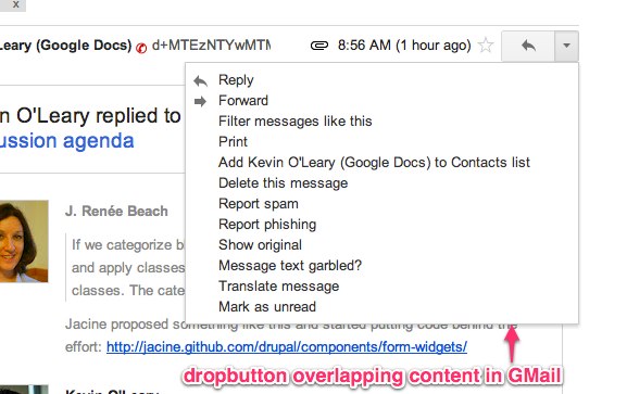
jessebeach CreditAttribution: jessebeach commentedre @sun #90-1: That a dropbutton overlaps other content on the page is something we see in applications like Gmail. It's an established pattern for this type of widget. It a dropbutton has a large number of secondary issues, it could push page content quite a distance down the page if it's positioned relatively instead of absolutely.
re @sun #90-2: I hope I got close to addressing the sizing/styling issues in this patch. The dropbutton should expand to accomodate the longest link item text. I've tried not to make too many assumptions about max and min width in the base code. Themers can set styling on the .dropbutton-wrapper and the .dropbutton-widget classes to adjust sizing mins and maxes. I played around a lot with the button at very small sizes. Ellipsis of the text often resulted in labels like this: "e..." and ultimately I went with
text-overflow: clip, the default, with a little margin on the right of each link to keep the clipping from butting up against the twisty toggle border. I'm not entirely sure how the widget styling isn't meeting your expectations, but it's something we can adjust more if you give me an A/B example of what you'd expect and how the current behavior doesn't meet that expectation.@sun, the dropbutton arrow moving is addressed in my next comment below; I'd like to revert that behavior back to what it was.
re @tim.plunkett #82: I would like to revert the switch from right:0 to left:0. Here is why. When we have a menu option with a very long title, the dropbutton will dart out to the right, moving the place where you clicked (the twisty) quite a distance from that place that was clicked. Again, the GMail dropbutton is right-anchored.
Left-anchored dropbutton

Right-anchored dropbutton
I'm extending the patch in #83 now to addresses comments since it was posted.
Comment #96
jessebeach CreditAttribution: jessebeach commentedMy GMail dropbutton image in #95 is broken. Attaching here.
Comment #97
jessebeach CreditAttribution: jessebeach commentedre @Sylvain Lecoy #94: hmmm, that code doesn't give me the warm-fuzzies. It's not written as a generic widget. It assumes one instance of a dropbutton, evidenced by the use of ID selectors in the delegation calls, and it's working at the document level to delegate event handlers.
The functions and objects are declared in a random anonymous function and inaccessible after execution. If we reworked this code to an OO model, I think we'd end up with something close to what we're proposing already, except with a lot less crufty stuff specific to whatever example this represents.
Our patch is getting to a good place. Just a couple more UX issues to come to agreement on, but I think we're close.
Comment #98
jessebeach CreditAttribution: jessebeach commentedResponses to comments:
re @tstoeckler #85 "A.3 Both visually and conceptually, I would have expected to tab to the primary operation first and then get to the arrow, but the arrow is first. This is probably related to the source order. This is probably also important for screen-readers who I would assume would also want to read the primary operation first and then the arrow."
I agree, except that the primary action item is part of a ul, so if it were to be first in source order, you would tab to it, then the twisty, press enter (open the secondary items), then tab backwards to the last item in the action list, through to the first. When the twisty is first in source order, it allows you to twist the secondary items open, then tab to the first item in the list and through them in their top-to-bottom order.
re @tstoeckler #85 "A.4 This is minor, but the dotted box that surrounds the primary operation, when I tab to it, looks a bit off. See the attached screenshot."
I removed an
overflow:hiddendeclaration that was hiding the focus glow.re #88 by @Kiphaas7, Drupal in the IIFE: this works because a closure has access to variables in its enclosing context, which in this case is the ready function, and that function's context is the
window, where theDrupalobject is defined. It's not completely necessary to pass Drupal to the IIFE as an argument and a quick look through other JS files reveals that we haven't been doing this, so I don't want to introduce an anti-pattern in this patch.Changes in this patch:
divwithaanchor tag in it to anatag with two spans in it. Now, the anchor tag is both the keyboard tab target and the trigger for opening the secondary items. That change required only slight tweaks to the toggle method that I think made it better.$('<div≥', {})DOM creation syntax with$('<div>').attr().html()creation syntax. This provides a slight performance increase.table.sticky-headerbecause the dropbuttons overlap it. Screenshot supplied below.Screenshot of the dropbutton overlapping sticky headers.
Marking as needs review.
Comment #99
jessebeach CreditAttribution: jessebeach commentedDoh! The patch in #98 included my testing changes to node.admin.inc. I removed that change and rerolled. Otherwise, no other changes were made to the patch in #98.
Comment #100
tim.plunkettI still wasn't able to trigger the dropbutton via a keyboard, it turns out it was because of the way the event was bound to the parent.
@tstoeckler, can you update your site for a demo?
Comment #101
nod_So if we're here to make things properly I'll do a proper review then :p
Can we make that simpler?
and this one too
Chaining madness.
@tim.plunkett it'd be better to keep using
.on()instead of the shorthand version of it :)Comment #102
jessebeach CreditAttribution: jessebeach commentedAfter a very long discussion of approaches to DOM creation and templating, I reworked the patch to use Drupal.theme to return the wrapping code for the dropbutton widget and the code for the twisty toggle.
This patch should address comments in #101 and hopefully get us all to a happy place.
I set up a test site: http://d8.qemistry.us/
username: drupalist
password: aN7583&P
This password is ephemeral. I will reset the account in a couple days, so test soon :)
Comment #103
tstoecklerJust tried out the demo. That works much nicer with only a keyboard! Awesome. It still feels a bit strange for the focus glow (I learned a new word today, thanks @jessebeach :-)) to jump to the twisty and then back left to the primary operation. I get why that is necessary, though and it's not terrible.
On thing that is also a bit strange, but also quite minor, is that if you're using a mouse and open on of the dropbuttons and then move the cursor somewhere else, the dropbutton closes. The same doesn't happen when you open a dropbutton with the keyboard (which works nicely now!) and then tab away. The dropbutton stays open in that case.
Comment #104
jessebeach CreditAttribution: jessebeach commented@tstoeckler, I'm not sure how to make the dropbutton close when tabbing off, since blur() will fire when the twisty is tabbed from if you go to the actions or if you tab backwards off the dropbutton. Probably possible with a lot more code and state tracking, but I would consider that an enhancement at this point if we could. Best to perhaps get the code in this far and start using it.
Comment #105
Kiphaas7 CreditAttribution: Kiphaas7 commentedIn response to point 6 of #98 (adding a z-index to fix sticky tables).
Fine with that as a stop-gap fix for now. However, there was an already existing bug with sticky headers, which might very well be related to this. So cross-referencing for sakes of bookkeeping.
#1780852: Sticky tableheaders bleed-through
Comment #106
tim.plunkettI was able to completely switch Views over to this new code, and it was SO much easier to do than before.
A huge thanks to @dead_arm and @jessebeach for all the code, and @ksenzee, @Noyz, @james.elliott, @nod_, @Everett Zufelt, and @Bojhan for their help along the way.
I'd RTBC, but I'd be happier if @Everett Zufelt gave it a try once more.
Comment #107
nod_It still doesn't pass JSHint
Comment #108
tstoecklerRe #104: Definitely we can do that in a follow-up, if at all. The JavaScript is so over-my-head that from my point of view fixing that could just as well have been a one-line code change, I simply cannot tell. That's why I mentioned it in the first place. If it is any more effort than that, let's absolutely forget about it.
Comment #109
Kiphaas7 CreditAttribution: Kiphaas7 commented#108: it's probably not a one line fix, because mouseover/mouseleave are not 1:1 mappable to focus/blur. in this case, it means that (assuming mouseleave is bound to the dropbutton containing element) wont fire if you move your mouse from the dropbutton to an element inside the dropbutton, because you're still over the dropbutton container.
Unlike focus/blur, which is not aware of positioning/dimensions, which will fire as soon as you move to a different element, even if it is visually inside the wrapping element.
As #104 suggested, this could be fixed by binding focus and blur on dropbutton containing element, and checking if blur on dropbutton container or any of it's children is followed by focus on any of the dropbutton container or any of it's children. blur starts the timeOut for closing, focus clears the timeOut.
(assuming blur always fires before focus, and the timegap between blur and focus is always less than the timeOut)
Definitely worth a followup, unless someone has a rock solid easy fix :).
Comment #110
catchNo-one's answered Kiphaas7's question in #48 about why this doesn't use a native
select, I'd be interested in the answer as well.Comment #111
jessebeach CreditAttribution: jessebeach commentedI've jsHinted the file. I had to add
Drupalandwindowto the list of arguments passed into the IIFE wrapper.No behavior was changed in this updated patch, just formatting to satisfy jsHint.
Comment #112
jessebeach CreditAttribution: jessebeach commentedre @catch #110: I personally went with a
ulstructure for 2 reasons:Comment #113
jessebeach CreditAttribution: jessebeach commentedre @tstoeckler #108: The JavaScript here may look complicated, but we're really just extending basic patterns. These issues are a great way to pick up new insight into your JS skills. nod_ has been introducing modern, module JS patterns into the Drupal codebase that'll keep Drupal relevant and attractive to front end devs for years to come. There's a lot of transferrable knowledge in dropbuttons.js.
Comment #114
Sylvain Lecoy CreditAttribution: Sylvain Lecoy commented#97 it was an example of an implementation of the jQuery UI splitbutton. Not the generic implementation of course.
I guess its more a philosophical disagreement on NIH vs. PFE, if in both case you are not neglecting quality making rapid assumptions about the technical decision, then go go go!
Comment #115
Kiphaas7 CreditAttribution: Kiphaas7 commented#110, #112: i mentioned the option for a select element purely for nice mobile integration. Basically one would only want the controls of the select element for mobile.
Because there is already a follow up for this (making it more mobile friendly) it doesn't have to hold up the patch for this reason.
Comment #116
jessebeach CreditAttribution: jessebeach commentedre @Kiphaas7 #115, I think that's a fine motivation, but agreed it shouldn't hold us up now. We can make improvements later. This patch solves a few immediate needs.
Comment #117
effulgentsia CreditAttribution: effulgentsia commentedI'm very happy to see this getting close to landing in core.
Is there a reason 'dropdown' needs to be exposed to Drupal as a direct theme function, rather than as a render element type in system_element_info()? We still have a limitation in Drupal that anything #attached within a theme function, template, or preprocess function, including new render elements made within those, is incompatible with render caching (#495968-68: Introduce drupal_render() cache pattern. Start using it for blocks). While we can consider that a separate core bug that shouldn't hold up this patch, we can sidestep it by exposing 'dropdown' as a render element type instead, unless there's a use case you know of where that would be insufficient.
Comment #118
sunFixed doc blocks and coding style issues.
Fixed duplicate selector in dropbutton.base-rtl.css.
Added test output for operations/dropbuttons to theme_test.module.
So we have a proper way to test this now, which should not only help @Everett Zufelt and others to review and try this, but also to properly test the various scenarios in which operations might appear.
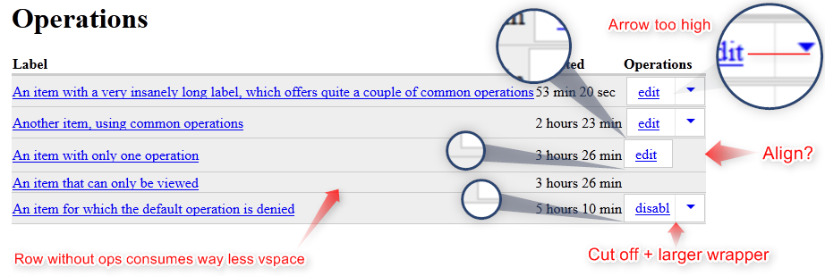
This revealed the following problems:
In words:
1) The spacing within the dropbutton container/wrapper to its border appears very/too large.
2) The arrow is not vertically aligned with the default operation.
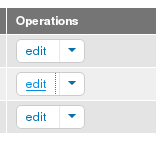
3) When there is only one operation, the dropbutton is not aligned right and generally appears displaced.
4) When there is only one operation, the dropbutton container/wrapper has a larger margin to the bottom than the dropbuttons with multiple operations.
5) The default operation gets cut off way too early.
6) When there are multiple operations, the dropbutton container/wrapper still uses the width of the default operation. It would be good to use the width of the operation with the longest label. We should only limit the default/closed appearance to a sane maximum width/length. But common operations (edit, disable, clone, delete) should fit into that maximum width. In other words, I understand the need for vertically expanding the dropbutton, but the horizontal expansion (when opened) doesn't give a good experience. The dropbutton should only expand horizontally, if a secondary operation has an extremely long label. Otherwise, the dropbutton container/wrapper should simply be wide enough already. Likewise, the default label shouldn't get cut off, unless required.
Lastly, I didn't look into @effulgentsia's review issue in this patch yet, but I agree that
A) it seems odd that we're introducing a new theme function for a list (which goes against our goal of eliminating these duplicate list theme functions)
B) "dropbutton" may happily be the name of the frontend library, but the functional pattern we're using in code on the backend is about "operations"
Comment #119
tim.plunkettPosting from my phone so I didn't look at the patch, but I have a thought.
Since it so closely maps to theme_links, we could make it theme_links__dropbutton (or theme_links__operations, that name makes some sense)
Comment #120
nod_Much simpler JS.
seems like it shouldn't be using negative angles in the gradient.
Interdiff from sun patch.
Comment #121
tim.plunkett#120 is a large change that goes back against everything we (@jessebeach, @nod_, @ksenzee) discussed in IRC, and it even goes so far as to break the Views implementation of #102/#118.
So, please disregard #120, #118 is the current patch in question.
Comment #122
nod_How does it goes against what we discussed? I just made the whole thing much simpler and faster on the front-end, the concepts are the same. It's the stripped down version of it.
I've said we should commit the ctools patch without working on it. If you guys want to clean up, don't stop halfway.
here is a patch for views that works. I don't understand how my patch broke things? Sure there are some crappy styles, it just means the CSS needs work.
Comment #123
tim.plunkettI would have rather it be committed before all this too, but it wasn't. Then in IRC you all discussed the best way of doing things, and AFAIK, agreed on one.
Then this complete rewrite of the preprocess/JS.
---
Here is Views with #118 + our implementation:
Here it is with #120 + #122
Can we go back to #118 please?
Comment #124
jessebeach CreditAttribution: jessebeach commentedMy objection to moving some of the HTML for this widget to the theme function is that we make it impossible to theme a dropbutton from the client without a trip back to the server.
Let's say I want to have a dropbutton in the toolbar at small screen sizes, destroy the widget at larger screen sizes, then re-initialize the dropbutton at window resize down to a small screen. I realize we don't have a destroy method in the widget (like a jQuery UI widget), but I was going to propose an addition to this code to do just that after we'd committed this issue. I can't theme a Dropbutton in the client without making an Ajax request back to the server for a theming markup under that patch in #120. In fact, I'm not even sure how feasible that would be. It would certainly be cumbersome.
I really really really want us to move client concerns such as widget structure management to the client. I realize that we're trying to optimize performance, but we're also trying to optimize flexibility and maintainability. A singular focus on performance loses us aspects of flexibility in this case and I also think maintainability because some of the HTML is now in PHP and some in JavaScript.
The only HTML that Core should be putting out in theme functions, ideally, are the basic HTML structures -- simple tags and classes on those tags to indicate to the UA that more complex presentation is desired if the UA can handle it. The construction of complex presentation widgets is a concern for the UA, because the UA knows about the context of presentation; the server does not.
I'd like to better understand @effulgentsia's comments in #117, review @suns updates in #118 and ultimately commit something close to what's in #118 given the legit display concerns that @sun raised.
Comment #125
Kiphaas7 CreditAttribution: Kiphaas7 commentedActually, core has a destroy method, though rarely used. .detach()
Comment #126
sunI really like and enjoy the energy and amount of open-minded thinking that went into this issue so far! :)
However. Sorry, I actually need to put the brakes on. :-/ At least on the current implementation.
After cleaning up the code in #118 and adding the test_theme module implementation, I actually went ahead and played with it some more. My starting point was to solve the problems I mentioned myself.
Tweaking the CSS/JS through the browser's console as well as the files quickly revealed that this current incarnation of a dropbutton is barely themeable — and worse, barely placeable. It is based on plethora of absolute positioned elements that are naturally removed from the normal flow entirely. The problematic part is that this includes the original/base/default operation link, not only the dropdown elements.
This means that a dropbutton cannot be used in all situations where flow matters — the most trivial example being a "Save" button (with a "Save as draft" secondary action) that lives right next/left to a "Preview" button.
I was also surprised to find this excessive amount of markup for every single dropbutton:
The visual testing output already showed that there's a significant, bogus difference between .dropbutton-multiple and :not(.dropbutton-multiple), among many other issues...
Given the problems (including keyboard/tabbing/accessibility) and looking at that complexity, I couldn't resist to hack on a heavily simplified version (which I'm merely attaching for posterity)... ;)
...only to find out about the actual problem, which invalidated also my simplified approach:
1) The primary/default action (including arrow) needs to flow with the content.
2) The combined list of all actions (including secondary) needs to be removed from the content flow and be layered on top of anything else. (It basically behaves like a dropdown menu à la admin_menu.) E.g., to "break out" of the table row the dropbutton is contained in.
(That said, this is on the assumption that we actually want that dropdown behavior, which wasn't really discussed yet! This matters, because my simplified implementation would totally work if we accept that e.g. a table row would vertically "grow" to make room for the operations when being clicked on. It matters even more, because that's way more easy to style and theme.)
The web didn't yield any new/fancy tricks to solve the problem of breaking out of the content flow in a controlled fashion.
So I started to search for actual dropbutton implementations to learn how they're solving it, and almost needless to say, Twitter Bootstrap [scroll down to "Split button dropdowns"] seemingly gets it right(er):
The important difference is that the outer DIV (or respectively, BUTTON[s]) can flow with the normal content, and only the inner .dropdown-menu is positioned absolute.
However, what Bootstrap is doing there is essentially nothing else than the classic and trivial dropdown menu pattern:
The "tricky part" is that we want the primary/parent item to be visually part of the list of child items, when the list/dropdown is opened; i.e., forming one list/container that exposes all actions, instead of two separate containers. This nitty-gritty detail absolutely matters. (and alas, leads to the question whether the same visual appearance couldn't also be achieved through "fake"-styling; but anyway...)
Still on the assumption that we actually want this, this kept me busy thinking for a while, on how to approach it best. Here's what I concluded:
Lastly, manual testing revealed that there are two completely irrelevant issues involved here, which at least I wrongly criticized for this patch:
td { vertical-align: top; }from browsers, even in 2012. We should discuss to add that as a default to system.theme.css.td.operations { text-align: right; }— the dropbutton itself has absolutely no business in deciding on its alignment/position among other elements in the container/flow.All of that being said, I'm confident that we'll be able to resolve these issues! :)
Comment #127
tim.plunkettWe cannot keep redoing all of our work to the whims of this issue. Please retag with VDC if this ever gets to RTBC.
Comment #128
Sylvain Lecoy CreditAttribution: Sylvain Lecoy commentedGlad that @jessebeach brought it up in #1541860-96: Reduce dependency on jQuery, jQuery UI splitbutton seems a wise solution.
You can have a look at a simple implementation here: https://raw.github.com/jquery/jquery-ui/5f4a6009e9987842b3a970c77bed0b52...
Comment #129
nod_all right, here is an updated patch based on #118, it works the same, better.
Views is fine, updated patch here for the submits that are using hardcoded HTML that my previous patch in #120 broke #1781406: Use the new Core dropbutton .
Basically I took the code from #120 and added that to my JS:
So yeah my patch wasn't that big a change after all and would have most likely been fixable with some CSS work.
Now there is data backing all that up. #118 average at 6.0ms to execute
DropButton, mine 1.6ms. That's for 1 button using Firefox profiler on my i7 cpu laptop. Now webchick was saying yesterday that front-end patches seemed to take a huge amount of time to get in (I guess that was about the responsive table issue). This kind of data is why I'm picky, making some script 3 times faster while keeping all functionalities just goes to show the script was too complicated to begin with.Haven't followed all of sun comments, I'm just here to say: here is good and fast js, use it, don't end up above 2ms/button and I won't get in the way. I still feel it's too slow but that's good enough for now I guess, without the class manipulation (patch #120) it can be down to 1ms. Remember that you have to x10 for mobile so it's not that trivial of an issue.
(edit) and it'd be pretty easy to not use jQuery for this one too, but that's another story.
Comment #130
andypostIt seems that we need a follow-up issue to re-order all dependencies in core's library?
Comment #131
nod_This is from the interdiff for the new library definition, the existing core libraries are properly ordered already.
Basically you put first the libraries that are creating a new global variable then the libraries that are just adding members to those existing variables, but that's unrelated to this dropdown issue, please open a new one is you feel this needs clarifying. Let's not overload this one.
Comment #132
tim.plunkettApparently drupal.settings was renamed to drupalSettings. Whatever.
Assigning to @jessebeach in the hopes that she can address #118
Comment #133
tim.plunkettRestoring tag.
Also, this is Views last hard dependency on CTools, so bumping.
Comment #134
nod_Trying to address some concerns from #118 not tested in a lot of browsers.
Comment #136
tim.plunkettI cleaned up a couple other things, between this and nod_'s last patch I think we're good.
Attached is an interdiff against #132, and new screenshots.
Comment #137
webchickTagging for Spark. We're hoping to leverage this pattern in several places, including the mobile toolbar.
Comment #138
tim.plunkettSince I think sun's concerns for the CSS were the only remaining issue, assigning to him for final review.
Comment #139
Everett Zufelt CreditAttribution: Everett Zufelt commented@tim.plunkett does your above comment mean that a full accessibility review has been conducted on the suggested approach?
Comment #140
tim.plunkett@Everett Zufelt, I'm sorry, you're right, my mistake.
So, @sun first, then accessibility, then done :)
Comment #141
jessebeach CreditAttribution: jessebeach commentedI set up a testing site for folks who want to review.
Site: http://d8.qemistry.us
User: drupalist
Password: &62N37aYZ67r
Page: http://d8.qemistry.us/admin/content
This is a temporary site, so don't create anything you want to keep.
Comment #142
jessebeach CreditAttribution: jessebeach commentedJust a small change. The
.dropbutton-widgetselector was repeated. I consolidated them.Otherwise, this patch isn't perfect, but it's a good first step. @sun, I agree the absolute positioning is heavy handed. I think we should address it when we add dropbuttons to various admin forms. Cool?
Comment #143
attiks CreditAttribution: attiks commentedThis looks great, one small thing when using a keyboard to navigate is that once opened and tabbing out, it stays open, hiding the button in the next row.
AFAIK that's something that can be addressed in a follow-up.
Comment #144
Fabianx CreditAttribution: Fabianx commentedTo address #126 and accessibility concerns and to be also more standards oriented the following markup could be used:
(based on the demo from http://d8.qemistry.us/admin/content)
Current markup
Markup with first action moved out
This would have the tab logic of: Edit -> More -> Delete
To do this the JS code would need to just create a new UL and insert the first element of the list into it. The theming does not need to be changed to support this.
To be more inline of what sun was proposing in #126 the following markup could be generated:
Markup with first action copied out
In this case the following CSS rule needs to be added:
The JS code in this case would need to create the UL and copy all non-secondary actions links to it, then add the class primary-action and add the "secondary-action" class to the first item.
Or have a primary-action class added by default markup, then switch the first primary-action over to secondary action.
In both cases there is no visible difference to the style from the current markup.
Tab Order here is:
Edit -> More -> Edit -> Delete -> ...
Thoughts?
The changes also are rather easily done in JS and backwards compatible while implementing the needed differentation from drop-down menu to the normal button component. (as asked by sun in #126)
It is also compatible with the best practices from both twitter bootstrap and JQuery UI.
Given that this is just an extension it could however also be implemented as a follow-up though.
Thoughts?
Comment #145
nod_It's all valuable feedback, it's all things that can happen post-feature freeze too.
The main issue I have with #144 is that creating a new ul in JS will just kill performance. That's not good. front-end performance is a core gate.
Unless there are major accessibility issues with the patch, let's get it committed and improve upon it in #1799498: Improve dropbutton.
Like jesse said, sun needs to review, then accessibility. In any case that's RTBC for me.
Comment #146
sunThe revised patch + output looks better, but I'm still very unhappy with the amount of absolute positioning going on.
However, in order to unblock progress elsewhere, we should exclusively focus on the PHP-side of things and get this committed. We can improve the frontend (CSS/JS) any time afterwards. (Alas, contextual links faced almost the same situation; the frontend parts got entirely rewritten after initial commit.)
So let's shift focus on how we're specifying these operations links:
'dropbutton__node_operations'looks odd and out of line to me. It doesn't specify that it's about "links", that it's about the specialized form of "operation links", and the specialization for "node" is reversed. I also think that "dropbutton" has no business in there, since that library is just one of many possible implementations. The most simple implementation would be nothing, just a simple list of links. That's my perspective and summary. Given this,'links__operations__node_type'; i.e., operation links are just a specialized form of links, and node type operation links are just a specialized form of operation links. The preprocessing that applies the additional attributes for the dropbutton library would be executed in atemplate_preprocess_links__operations()function. — However, we're not there yet; the theme system is not capable of allowing preprocessors for "sub-patternized" theme functions, only applying them to a particular sub-pattern. (i.e., to all 'links__operations*', but NOT to 'links'.)Therefore, in order to move forward here and not get blocked by that, as sad as it is, I think that introducing a #type
'operations'would make most sense.Again, note that we're applying a UL.operations class here, not .dropbutton. An additional .dropbutton class could be added by the #pre_render, but semantically the markup should just classify itself in a sensible way; if a dropbutton library wants to convert all those instances into dropbuttons, then it should be given the option to search for UL.operations.
It would use a #pre_render to perform the necessary adjustments to the render array structure, and possibly also, to make the #theme subpattern more specific:
Give or take some more preprocessing that happens in the current dropbutton theme function. (TBH, I don't understand why that stuff happens on the server-side.) Anyway, that's not important. What matters is to get the "public API" on the server-side sorted out, so this patch can land and Views & Co can implement and use it without having to rewrite anything when we're improving the implementation later on.
Does that make sense? What do you think?
Comment #147
jessebeach CreditAttribution: jessebeach commentedsun, I'm fine with that approach. effulgentsia mentioned that we'd want to move the registration of the dropbutton component into system_element_info to properly connect it into the cacheing system. I was going to wait until we got this issue resolved before introducing the improvement. We might as well do it now, though.
Comment #148
tim.plunkett#146 is the same idea as #117
Changing .dropbutton to .operations everywhere is just more work, but as long as we can maintain a working implementation in #1781406: Use the new Core dropbutton , we just need SOMETHING in core.
---
FYI, this was one of three core blockers for VDC, it's now one of two, and the only remaining CTools dependency.
Comment #149
Everett Zufelt CreditAttribution: Everett Zufelt commentedIs there a place where I can demo the current suggested front end implementation? I haven't tracked this entire thread and I don't know if any previous demo credentials provided are of the current implementation.
#143 Note, I don't think that one drop button hiding another is a defect that should be committed.
Comment #150
tim.plunkett@Everett Zufelt, here is the current testing site information:
Site: http://d8.qemistry.us
User: drupalist
Password: &62N37aYZ67r
Page: http://d8.qemistry.us/admin/content
As far as #143 goes, the following row is only visually obscured if you expand the previous row's dropbutton with a keyboard. As explained before, it's a very specific edge case that can be handled in a follow-up.
Comment #151
sunYup, I specifically took #117 into account when writing #146. I had similar thoughts right from the start, and additionally applied some cross-thinking with regard to new EntityListController changes. ;)
If you're down with #type 'operations', then let's just do that. The suggested #subtype property isn't well thought-out, but we can adjust that later on. For now, we just need a way for modules to say, "Here, got some operation links for ya. Render them however you think they should be rendered."
FYI: I slightly adjusted the prototype snippet in #146.
Comment #152
Everett Zufelt CreditAttribution: Everett Zufelt commentedTested the demo from #150
- The more link has no real meaning (see context belwo).
- I can tab to the More and Edit link, and when expanded to the Delete link as well
- When I press enter on More I am taken to the top of the DOM
Context:
The Operations cell reads
"More link
list of 1 items
edit link
list end"
My first question would be "More what?".
Comment #153
tim.plunkettIn response to #152, we can add a fragment to the link like #nolink, it's been done elsewhere in core. That should prevent you from being taken to the top of the DOM.
As far as it saying "More", perhaps "More operations" is enough?
#151, go sun, go!
Comment #154
Everett Zufelt CreditAttribution: Everett Zufelt commented#153, "More operations" seems odd still, since I haven't yet heard the first operation. is it incredibly dificult to position "More operations" after the first operation? Also, I think these should be buttons role=button rathat than links.
Finally, it would make sense that if "More operations" comes after the first operation, that either: 1. focus is moved back to the first operation when the list is expanded, or 2. that the remaining operations come after "More operations".
I know this is a lot to ask, but the UI pattern has confused me in Views, etc, and I consider myself a rather advanced user.
Comment #155
Bojhan CreditAttribution: Bojhan commented@Everett I think you are right though, its not a lot to ask. The experience should mimic that of the visual, which is to see the first operation and then the "more operations" link. Therefor it should also semantically read like that.
Comment #156
jessebeach CreditAttribution: jessebeach commentedSun, if you post an updated patch addressing the system_element_info issues, I'll tackle the HTML structure and styling issues from that.
Comment #157
effulgentsia CreditAttribution: effulgentsia commentedChatted with sun about #146 and raised concerns about renaming dropbutton to operations, because we may want to use dropbuttons in places other than operations. I'll post a patch later today capturing what we agreed to for others to review.
Comment #158
effulgentsia CreditAttribution: effulgentsia commentedThis adds both a 'dropbutton' type and an 'operations' type. They currently use the same #pre_render logic, but that can be changed in a follow up (e.g., if we want to add 'operations' instead of or in addition to 'dropbutton' on the UL).
Comment #159
tim.plunkettOnce again, this still works for VDC, with some minor tweaks.
Comment #160
sun@eff thanks! :)
The separation between #type dropbutton and operations looks like a nice addition and well thought-out to me. I'm happy and feel confident with making this the official public API. (That is, for now; only time will tell; and Twig as well as the generic Theme Component Library will have a serious impact on the final server-side implementation.)
Regarding the front-end, we still need to address most of #118, #126, #144, and also accessibility issues. This can and should happen in a follow-up issue.
The follow-up issue is required to exist before this patch can be committed, and should at least be a major task. Aforementioned comments + screenshots should be properly summarized in that issue. Any takers?
Thanks all.
Comment #161
Kiphaas7 CreditAttribution: Kiphaas7 commented@sun: the issue already exists, but does indeed need issue summarizing.
#1799498: Improve dropbutton
Possible the following comments should be added as well:#105, #109, #110
Comment #162
Everett Zufelt CreditAttribution: Everett Zufelt commentedI really don't understand committing work that we know not to be "done". That aside, I do not want to see this committed unless the a11y portion of the followup is 'Critical'. This change will degrade accessibility in D8 without addressing accessibility concerns.
Comment #163
Sylvain Lecoy CreditAttribution: Sylvain Lecoy commentedIts because Views has become a top priority project, bypassing a bit quality and reviews processes to be more rapidly integrated.
@jessebeach expressed his wanting to use jQuery components in #1541860-96: Reduce dependency on jQuery, he said he would rather bank on jQuery team than custom implementations, but no one seem here wanting to go in this direction/or investigating other solutions (Proudly Found Elsewhere?) whereas I believe jQuery will address some accessibility concerns.
Comment #164
Fabianx CreditAttribution: Fabianx commentedThe problem is until the API part of this is in, the VDC initiative is blocked and cannot have a core sandbox. By now this is one of two issues that are left ...
Only the public API is set as "done" for now. The markup, a11y, javascript speed etc. all need to be improved in #1799498: Improve dropbutton.
The same had happened with the contextual links for D7.
Comment #165
Fabianx CreditAttribution: Fabianx commentedUpdated issue summary in #1799498: Improve dropbutton added all concerns and comments and made major. (maybe make critical)
We can get this commited now then - I think.
Comment #166
Everett Zufelt CreditAttribution: Everett Zufelt commentedGood example, pretty sure that the contextual links from D7 still have major accessibility problems (see #849926: links wrapped in .contextual-links-wrapper divs are not accessible at all via keyboard alone also problems with screen readers). I am against this being committed w/o a11y issues being addressed. Forcing features is not a sufficient reason to give in on quality.
Comment #167
jessebeach CreditAttribution: jessebeach commentedre: Sylvain Lecoy #163, I definitely feel the tug to replace our custom code with jQuery UI. It is an existing library, like I noted, that solves many existing problems. Here are my concerns on this issue.
It's easy to read a comment as being dogmatic, but I hope that we can all be pragmatic about these issues. I try to be at least. Whether to use a library or roll our own code is always a decision based on the needs of the issue. I just wanted to be a voice of warning that rolling our own is not the only option -- it still remains an option though. We've got a lot of smart folks here. Our process, as much of a crucible as it can be, produces good code. We're not just clicking pieces together but hopefully pushing the bar forward as well.
And SHE said all this, not HE. :)
ref: #1541860: Reduce dependency on jQuery
Comment #168
jessebeach CreditAttribution: jessebeach commentedI'll address the issues in #154 in a patch and work with Everett Zufelt on a demo site (d8.qemistry.us) to get the interaction/structure fixed. This should not take long.
Comment #169
Lars Toomre CreditAttribution: Lars Toomre commentedre: #168 Thank you @jessebeach. I think it is important to incorporate Everett's concerns before the initial patch is committed. Thanks again for helping to make that happen.
Comment #170
Fabianx CreditAttribution: Fabianx commented@jessebeach:
Great! Here are some pointers summarized that might help:
* nod_ said that changing the markup via JS is too slow to be a viable option.
* There are concerns for users without JS and concensus was that it should be a simple list as markup.
I disagree with that.
Because:
* A drop button emphasizes the main operation.
* A drop button gives the possibility to also select other operations.
A non-JS layout IMHO should look like this:
Main Operation
Suboperation 1
Suboperation 2
Suboperation 3
The markup generated by Drupal could look like this:
Possible default styling could be:
* hide buttons
* emphasize .primary-action
and would such resemble a list without JS.
The JS code could be reduced to unhide the buttons and processing the clicks on more operations.
I can't see why the default output could not look like this and why JS needs to be used to create the structure in the first place.
That would automatically give the a11y requested have the correct tab order and would semantically also make sense. It is also like the default output of bootstrap and JQuery UI.
Just my thoughts now this is worked on again.
Comment #171
jessebeach CreditAttribution: jessebeach commentedSorry Fabianx, I didn't see your comment until I was well underway with changes. Hopefully my approach works as well. The dropbutton HTML looks like this before JavaScript is run:
and like this after JavaScript is run:
The difference being that the secondary actions toggle is inserted into the list as the second item. This has the benefits of leaving a plain, unordered list of actions if the dropbutton component isn't invoked on the list of operations.
The tabbing order is now correct: Primary action -> toggle -> first of the secondary actions...
I changed the text 'More' on the toggle to 'List additional actions'.
The toggle link is changed from an anchor element to a button element with the role attribute set to the value "button".
Demo site
Site: http://d8.qemistry.us
User: drupalist
Password: &62N37aYZ67r
Page: http://d8.qemistry.us/admin/content
Comment #172
jessebeach CreditAttribution: jessebeach commentedOh, and I should have addressed sun's concerns with absolute placement of the dropbutton by default in #171 above.
Comment #173
geerlingguy CreditAttribution: geerlingguy commentedScreenshots from major browsers attached. Looks and functions great for me, the button is much easier to click than it was back in the #100s patches. Only thing I couldn't test is accessibility, but pending that, I'd like to RTBC this version of the patch. It seems faster without the animation, too :)
Comment #174
geerlingguy CreditAttribution: geerlingguy commented...and one mobile screenshot from an iPhone with iOS6. The functionality worked fine on both my iPhone and iPad, though I had to zoom in a tad to get the tap to register on the dropdown arrow. I didn't hit the edit link, but a couple taps (without zooming in) just ended up highlighting the entire dropbutton.
Comment #175
cweagansMan, Drupal looks so much better in browsers that don't suck :)
I couldn't find anything wrong with the patch. It looks great and functions well. I second geerlingguy's RTBC.
Comment #176
tim.plunkettComment #177
mgiffordThanks for setting this back to needs review.
I did want to emphasize that it's the Drupal communities responsibility to do an accessibility review & not Everett's.
Accessibility reviews are time consuming work and a small group of people have been doing them pretty consistently for 3-4 years now. It's just not sustainable.
This is a big change and as a community we need to look at how to effectively address items marked "needs accessibility review".
Comment #178
Everett Zufelt CreditAttribution: Everett Zufelt commentedWorking well w/ JAWS 13 + FF 15. No longer drops user at top of DOM. Needs testing by keyboard only user w/o screen-reader.
Comment #179
mgiffordOh ya, I've set up a new issue in CTools #1791376: Review CTools Widgets for Accessibility
When there's a D7 module that we're looking to bring into D8 Core, then it's really important to do an accessibility and usability review of that module (in D7) before it (or parts of it) are brought into Core.
There are already some improvements here that should be brought back into the D7 CTools module. But as we all know it's a pretty powerful module.
Comment #180
larowlanTests fine as keyboard user.
Based on this and #178, removing accessibility tag.
Comment #181
tim.plunkettThis is great! It looks just as good, and the markup makes much more sense.
Comment #182
Fabianx CreditAttribution: Fabianx commented@jessebeach: Very nice work!
I like that markup a lot!
One nitpick that can be done in the followup. The current implementation does not degrade gracefully:
This is not compatible with browsers with Javascript turned off.
The dropbuttons do overlap ...
Correct CSS should be:
( or even .dropbutton-processed .dropbutton-widget)
because the absolute positioning should only be used if JS is turned off.
Besides that: Fantastic work!
Comment #183
nod_Added a
type="button"to the button, otherwise it behave like a submit button. We don't really want that to happen if the JS fails for some reason.Performance was slightly improved too, average went from 1.6ms (last time I measured it, back in #129) to init the dropbutton to 1.1ms with this patch. Probably something to do with the jQuery upgrade, I'll take it anyway :D
Also Jesse, awesome work, I'm so glad you stuck with it :)
@FabianX: the
-processedclass should not be used for styling, it'll go away to another attribute at some point.(edit) oh! the class magic stuff was taken out! awesome, that's why we're down to 1.1ms \o/
Comment #184
webchickAwesome work on this, folks!! Looks like the latest code incorporates everyone's feedback, has been checked for accessibility, is more performant, and also provides re-usable FAPI element. Doesn't get better than that. :)
Committed and pushed to 8.x. YAY!
We should make a change notice for this to let people know of this new UI pattern.
Comment #185
Bojhan CreditAttribution: Bojhan commentedActually, acording to the gates. I dont know if we still use that, it is required to document this as a pattern in our UI-pattern library http://drupal.org/node/1087090
Comment #186
nod_Draft here: https://drupal.org/node/1804896
Comment #187
geerlingguy CreditAttribution: geerlingguy commentedRevising the draft.
Comment #188
geerlingguy CreditAttribution: geerlingguy commentedPlease review the change notice.
Comment #189
andypostActually #subtype needs more clarification
Also it would be great to provide extended example of usage -
New element in drupal_common_theme()
There's 2 elements added
Only #type = operations used
Comment #190
attiks CreditAttribution: attiks commentedI'm using this for the breakpoints UI, but the row containing the button gets bigger (and the width of the column changes), I expected that it would be positioned in front of it. Can this be clarified in the change notice if it's the expected behavior?
Comment #191
sun@attiks: That's not the expected behavior. Can you create a follow-up issue, including a pointer to your code, and link to it from here, please? Thanks.
Also note that the show goes on #1799498: Improve dropbutton (but that's unrelated to the possible bug in your case).
Comment #192
attiks CreditAttribution: attiks commentedDone, #1805488: Dropbutton is causing a horizontal scrollbar to appear
Comment #193
sunI can reproduce #1805488: Dropbutton is causing a horizontal scrollbar to appear with theme_test module in HEAD/Drupal core.
It's entirely not clear whether the test results and screenshots in #173 were based on @jessebeach's most recent patch in #171 or an earlier version. Did that testing happen within 1 hour?
Also, @nod_'s interdiff shows a marginal change, but the actual patch size decreased by ~1KB. Equally dubious.
I suspect we tested the wrong patch, or changes got lost, or we committed the wrong patch.
Comment #194
nod_Jesse patch has headers and all, mine doesn't, read the patch the interdiff is correct.
Comment #195
geerlingguy CreditAttribution: geerlingguy commentedYes - I was using jessebeach's patch in #171 for my screenshots in #173; didn't notice any odd row-size-changing behavior.
Comment #196
attiks CreditAttribution: attiks commentedNo idea why I didn't try this before, but using same install, same browser it works on admin/content.
Only thing I notice is that after opening the operations I get an horizontal scrollbar, that isn't going away after closing the operations. Row height/Column width stay the same.
Comment #197
attiks CreditAttribution: attiks commentedProblem is caused by missing css, are we supposed to include this ourselves?
Comment #198
suner, what?! :-) How did this end up in Node module? ;)
Comment #199
Gábor HojtsyLooks like this is not actually about the change notice now and is a regular bug with where the CSS is placed and how it is added. @sun, since you transfered it back to needs work to fix it, looks like you want it resolved here, so modified the rest of the properties accordingly.
Comment #200
tim.plunkettThis merges the node.admin stuff back into dropbutton.base.css.
I'm confused about this discrepancy, I'll ask @jessebeach to chime in.
I tested this with #1480854-70: Convert operation links to '#type' => 'operations'.
Comment #201
attiks CreditAttribution: attiks commentedI tested this and it works for breakpoints
Comment #202
webchickOops. Yep, that does indeed make a lot more sense.
Committed and pushed to 8.x. Change notice is at https://drupal.org/node/1804896. This can be marked fixed then, I think?
Comment #203
sunThanks!
Everyone: Let's continue in #1799498: Improve dropbutton - we really need to improve the markup, accessibility, layout/styling and content flow issues.
Comment #204
jessebeach CreditAttribution: jessebeach commentedSorry for the confusion all (re: 198). I moved the absolute positioning CSS from the dropbutton to node.admin.css so that the dropbutton element wouldn't default to positioning inside a table cell. This wasn't immediately obvious from my comment in #172, but I'd meant it to be. My thought was that we were going to follow up placing dropbuttons in various other tables in Drupal and we could deal with the styling/placement issue then.
Comment #206
rudiedirkx CreditAttribution: rudiedirkx commentedWhy is showing all the options a problem? You'd think it's a good think a glance can see what's available. You'd also think another (unnecessary) click isn't better. There's room enough. Why not show the links? Drupal doesn't have enough hidden options?
I'm seriously asking. Why?
Comment #207
Alan D. CreditAttribution: Alan D. commentedDouble that.
But, related to functionality: Is there a way to have non-links as triggers? Use-case, a "Misc" tasks drop-down where you don't want a default operation.
Comment #207.0
Alan D. CreditAttribution: Alan D. commentedcrediting Noyz with the original idea