
Problem/Motivation
Drupal 8 wants to provide a much improved workflow for content creators. One of the most critical screens in this is the content creation page. This issue outlines a plan for implementing a new design for this page.
Latest breakdown of sub-issues for this
Per comment #292, revised per #319. Please work on feature issues first. These are all unblocked now, though 3 and 4 are tied together.
- [task] commited: #723392: Tame seven's reset.css
- [task] committed: #1238484: Ability to mark the form buttons to be of a specific type (so that they can be styled differently)
- [major][feature] committed: #1751606: Move published status checkbox next to "Save"
- [major][feature] committed: #1838114: Change node form’s vertical tabs into details elements
- [major][feature] committed: #1838156: Implement the two-column layout for the new create content page
- [task] Needs work: #1751754: Implement new form style for Seven, based on blueprint mockups.
The main issues that this design wants to solve are:
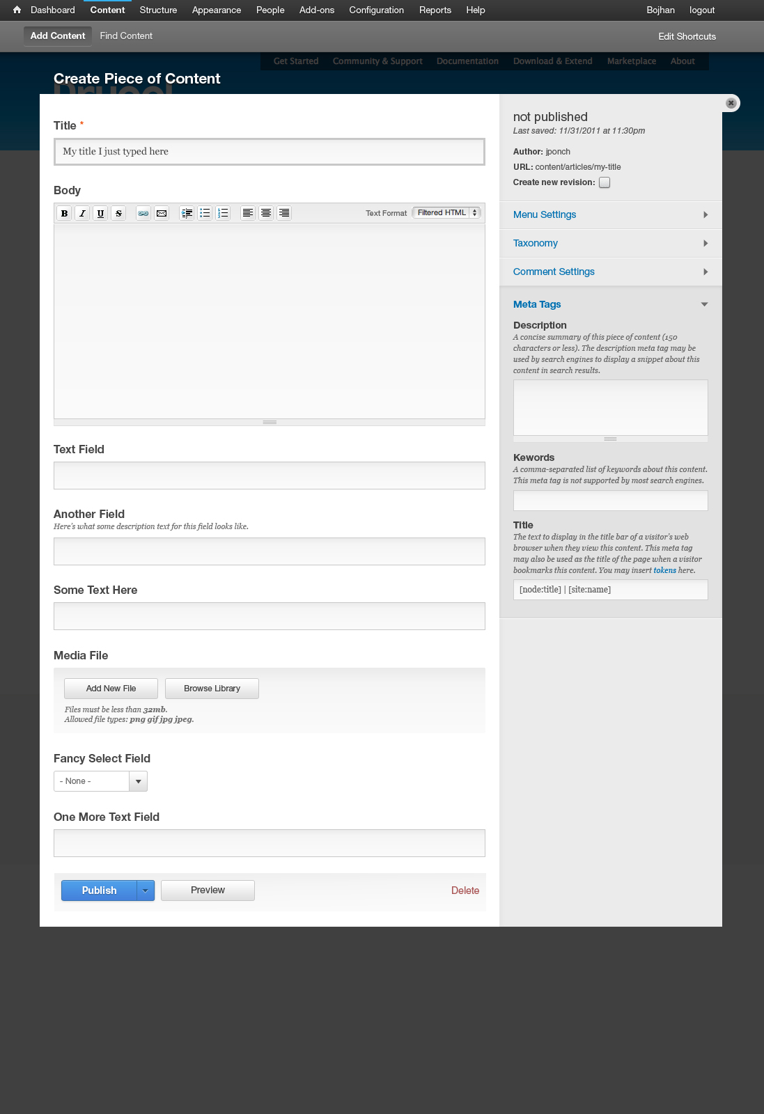
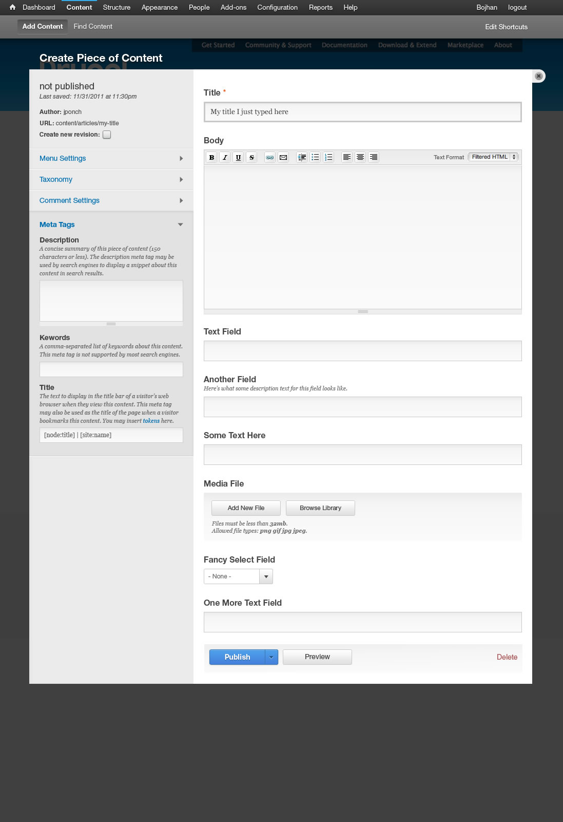
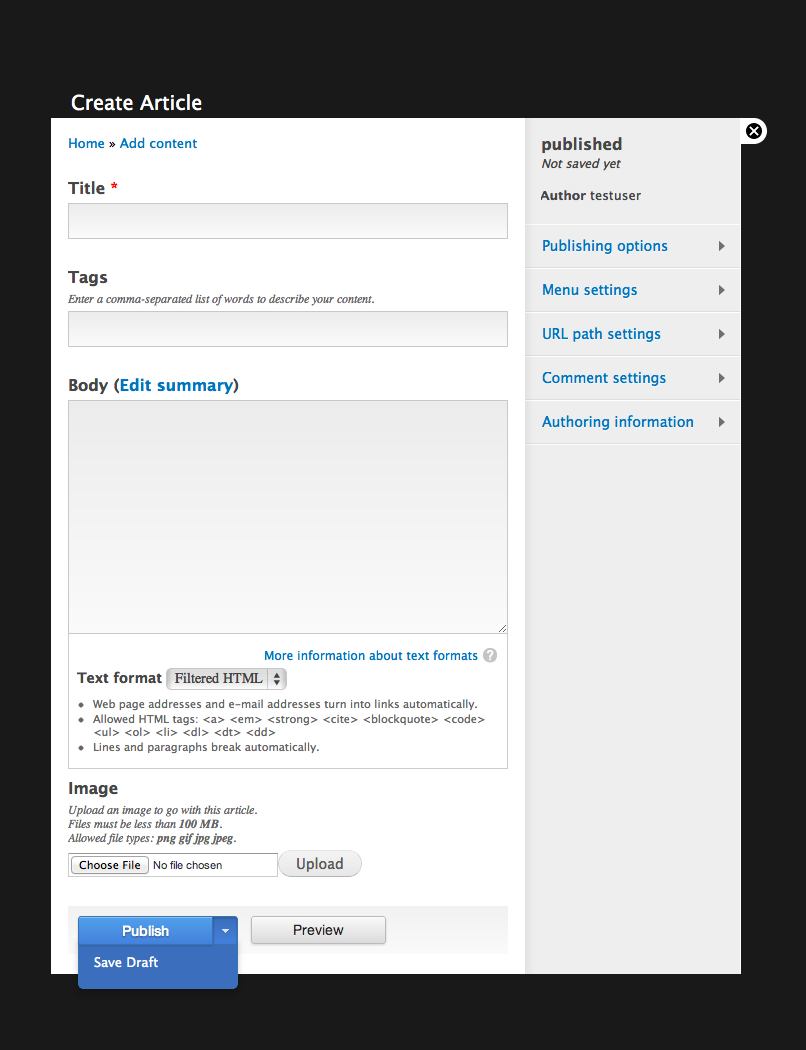
- Make the publishing status of the content item much more obvious: Move the publishing state selection out of vertical tabs and position it closer to the Publish/Save actions. Provide a clear status label in the sidebar.
- Provide clearer seperation between content and settings: Make the vertical tabs less screen-space consuming by moving them into a sidebar as an accordion.
- Update and expand the visual language of the Seven admin theme to express all of the above in a clear and elegant form.
There’s quite some background to this. We have documented our research and iterated on the design proposal.
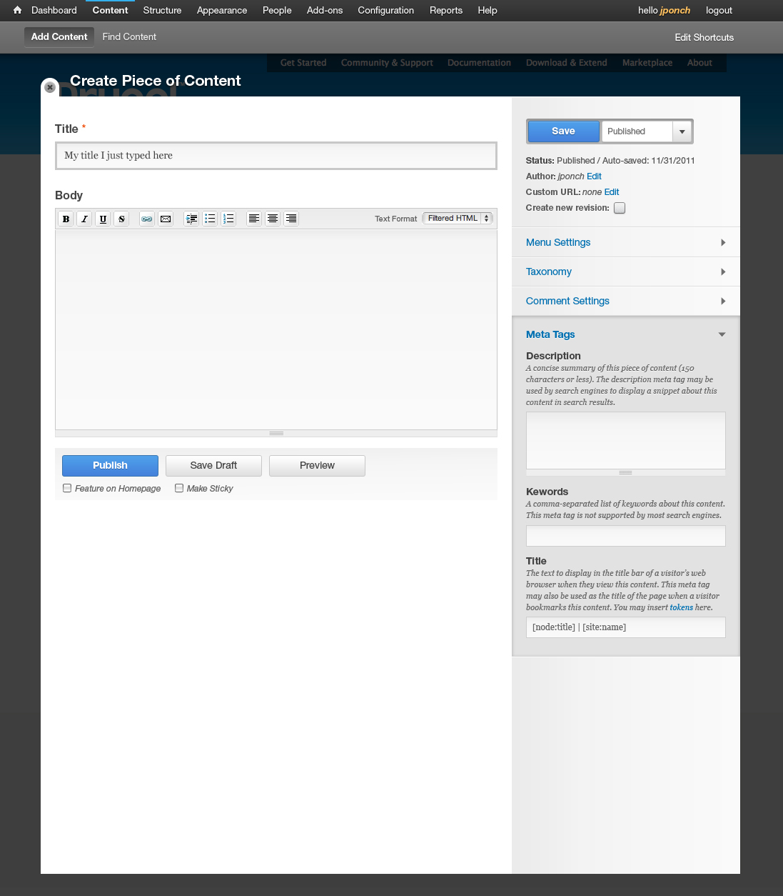
What we’d like to build is this:
From our analysis of the feedback on the research and design proposal, we made a few adjustments to our original proposal. See the discussion points below for the parts that need more detailed design work still.
Remaining tasks *Please see implementation plan below for critical work*
See comment #147 for the results of usability testing, this resulted in the following issues to be fixed:
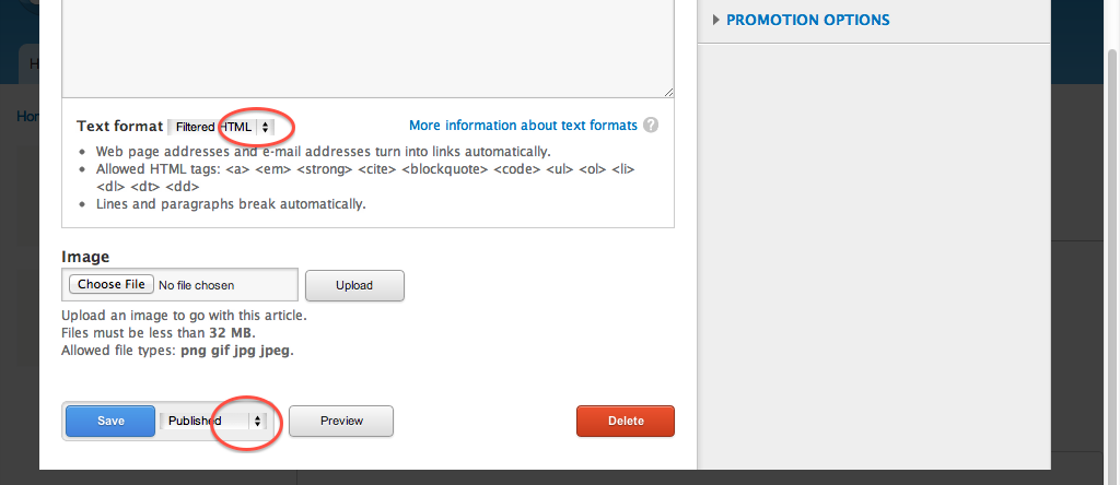
Publish state selection near saveVisual separation between accordions was occasionally hardError messages are often hidden from view (bug)- Text format has too much visual prominence
- Design how to handle tabs and secondary tabs in #763720: Visiblity of primary & secondary navigation
- #1562776: Edit Summary label is unclear to users
- #1562782: Menu settings on content creation are unclear
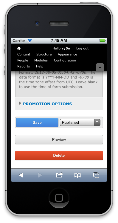
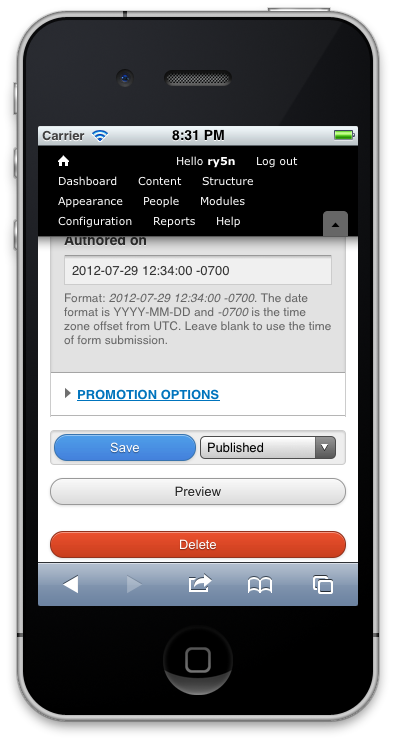
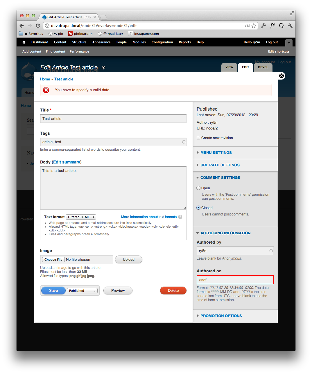
- #1562798: Its hard for users to provide valid input in the authoring date field
- #1562802: Allow for more images in article
- #1562804: "Sticky on top" is hard to understand
Further discussion
- #1510550: Placement of the Save button(s)
- #1510566: Allow for accordion tabs to be configured per content type
- #1510544: Allow to preview content in an actual live environment
- Media content creation UI
- How to make this all configurable? A Blocks & layout iniative use case.
Implementation plan *updated*
We need help in refactoring this from a prototype patch to a full fledged core patch. We have a first implementation a single core patch, but it needed to be split up into sub-issues in order to review, refactor and commit in more sensible steps. This is what still needs to be done before feature freeze:
- #723392: Tame seven's reset.css
- #1238484: Ability to mark the form buttons to be of a specific type (so that they can be styled differently)
- #1751606: Move published status checkbox next to "Save"
- Move the node form’s vertical tabs to collapsible fieldsets.
- Implement 2 column layout for node forms using either new Blocks & Layouts system or not, depending on time constraints. A mobile layout was never explicitly designed, but the original core patch implemented a responsive layout. Make sure this works well on small screens as we refactor!
- #1751754: Implement new form style for Seven, based on blueprint mockups.
Unfortunately these patches are interdependent – no way around that.
Go!
| Comment | File | Size | Author |
|---|---|---|---|
| #300 | createcontent-redesign-switched.jpg | 119.7 KB | mikkopaltamaa |
| #286 | 1510532-286-create_content_form--button-type.patch | 10.25 KB | mrfelton |
| #285 | 1510532-285-create_content_form-_no_reset-_no_reorg.patch | 48.11 KB | mrfelton |
| #274 | 1510532-274-create_content_form-_no_reset.patch | 67.46 KB | kika |
| #273 | new_reset_1.png | 48.76 KB | kika |


Comments
Comment #0.0
Bojhan CreditAttribution: Bojhan commentedUpdated issue summary.
Comment #0.1
Bojhan CreditAttribution: Bojhan commentedUpdated issue summary.
Comment #0.2
Bojhan CreditAttribution: Bojhan commentedUpdated issue summary.
Comment #0.3
Bojhan CreditAttribution: Bojhan commentedUpdated issue summary.
Comment #0.4
Bojhan CreditAttribution: Bojhan commentedUpdated issue summary.
Comment #1
Bojhan CreditAttribution: Bojhan commentedUpdated the summary, and created the relevant discussion tasks.
Comment #2
loophole080 CreditAttribution: loophole080 commentedMoved this comment to the design proposal discussion as suggested.
Was going to post there originally, but it moved more quickly than I expected from discussion to decision, just followed the activity... :-)
Comment #3
Bojhan CreditAttribution: Bojhan commented@loophole080 It is a little bit late to chime in, we discussed the fundamentals of this approach in research and design proposals. I would personally suggest you comment in design proposal with these concerns, not because they aren't valid but because most of them stretch beyond what we can effectively discuss in an issue - primarily if you want to discuss a conceptual new idea.
The only quick response I can give. The cons you express are real, it will occasionally mean the sidebar is rather empty (only access to one or two accordions) and scrolling in case of a lot of expanded accordion tabs. That does not necessarily mean this approach is wrong, every design decision also has cons and I hope the ones you express are not the 80% case, ideally the too many case can be countered by #1510566: Allow for accordion tabs to be configured per content type and the to few cannot really be countered other than custom configuration.
Comment #4
xjmIn addition to what @Bojhan says, I'm fairly confident it would be possible to make the layout responsive so that the sidebar column would do sensible things on mobile devices. (This is actually the first comment I made when yoroy mentioned the issue on IRC.)
Edit: Overall I think the design is great (I said this in IRC but I should probably say so here!) and I agree it would be best to get implementing this, and then iterate on it to address the weaknesses and potential improvements. :)
Comment #4.0
xjmUpdated issue summary.
Comment #4.1
Bojhan CreditAttribution: Bojhan commentedUpdated issue summary.
Comment #5
yoroy CreditAttribution: yoroy commentedHave a look at http://groups.drupal.org/node/218594 where we explore display of this page on small screens. (added link to issue summary above as well)
Comment #6
Crell CreditAttribution: Crell commentedMy only concern (which I know I've expressed previously) is that we make sure that we don't code ourselves into a corner where we assume that all content adding/editing is happening by site admins in an overlay. There are plenty of use cases where nodes, or at least some node types, are edited by mere authenticated users by the thousands who would have access to only a small subset of the fields and fieldsets in this page, and for them the form should appear as any other "normal" page on the site, without fancy sidebars or popups or whathaveyou.
As long as that is still straightforward to do (meaning I can continue to maintain the site that got me into Drupal in the first place :-) ), I'm comfortable proceeding with this approach and letting Bojan and yoroy loose to do their thing. :-)
Comment #7
loophole080 CreditAttribution: loophole080 commentedre #6 I think the scenario of having a role where people only have access to/care about the publishing options is quite a common one. The separated top toolbar for "publishing actions" idea is very handy for such a scenario, as well as the completely separated tab/page for other settings.
The toolbar could simply appear at the top of the content region and be independent of shortcuts or overlay functionality (or extended settings). It would also provide a good indicator that someone is in "editing mode", especially if it was very visually distinct, perhaps with some colour coding to re-enforce the publishing status?
I also found myself asking, even as a full admin, do I need to see all the settings on the same page as the content edit form? Why not separate them and keep the content edit form as clean as possible? Are we really gaining anything having the settings crammed in with the content edit screen?
Is it worth running a survey on this?
(see original post)
Comment #8
Crell CreditAttribution: Crell commentedloophole: My point is that the concept of an "editing mode" is specific to only certain workflows. Common workflows, sure, but not all workflows. I'm saying that I'm fine with proceeding with the plans that Bojan and yoroy have put together *provided that* they are done in such a way that workflows that do not have a distinct "now in editing mode" and "now in viewing mode" split are still straightforward to implement, as there are many of those, too.
Comment #9
svenryen CreditAttribution: svenryen commentedis the plan that the content and accordion parts scroll independently or together?
maybe we could consider letting the "Publish" "Preview" etc buttons being displayed at all time and let both columns above scroll independently,
so that the Publish button can be reached and seen easily?
Comment #10
yoroy CreditAttribution: yoroy commentedThat's why we need patches, no way to tell without proof of concept. Starting point is no fixed positioning of the sidebar. I'm very curious to see what happens when we keep the sidebar in view too.
Comment #11
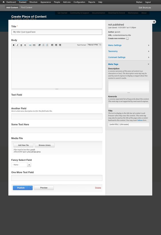
saltednutRegarding crell's comments: I agree that there are plenty of workflows where overlay is simply not an option. Forgive me, but is there a mockup or any discussion regarding this layout and how it is treated as a full page? I imagine it working very similarly, but it will be interesting to see what this ends up looking like when patches come thru.
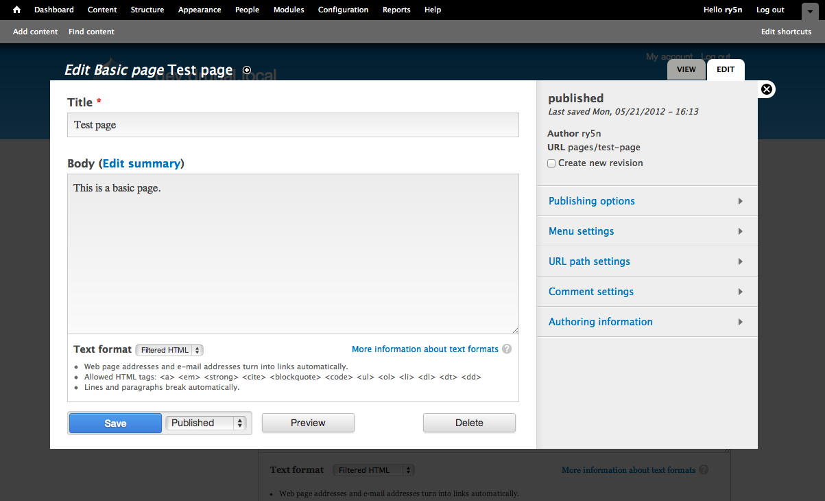
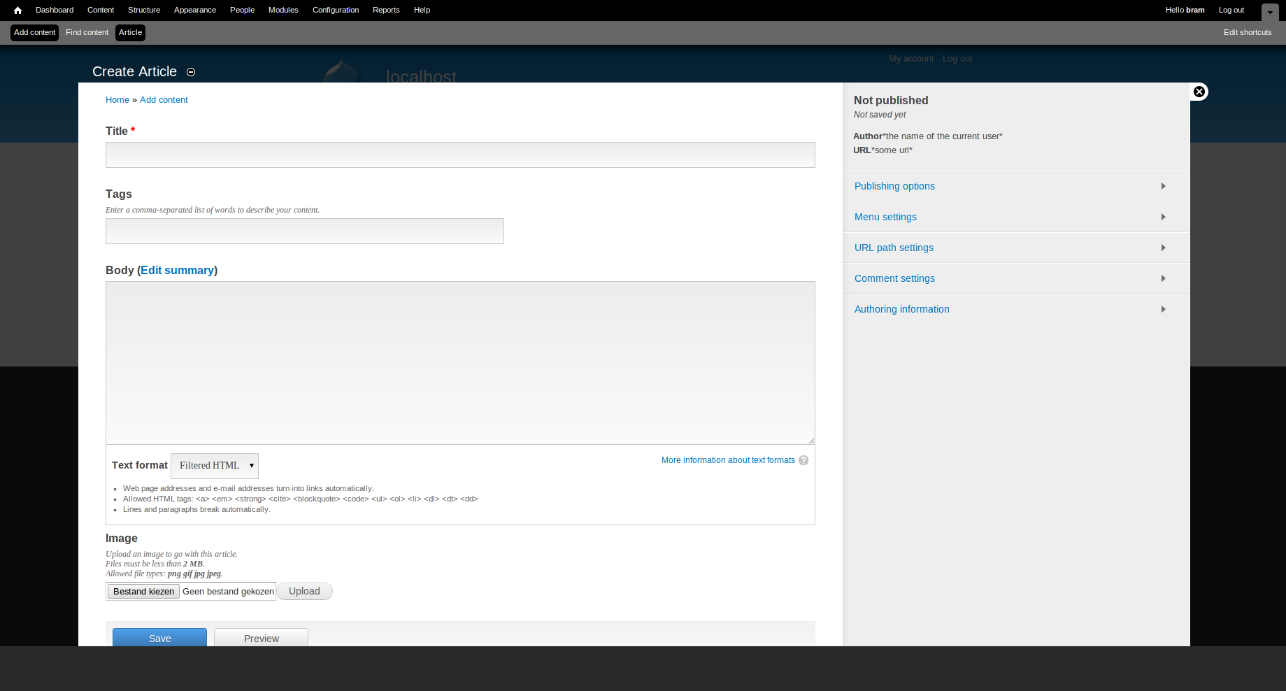
The mockup shows a large amount of extra fields on the example content type. This somewhat obfuscates what the design would look like for a default page node. Attached is essentially what people would be seeing upon first firing up D8 and editing a basic page. Note that the lengthy sidebar dictates a large amount of negative space below the content editing area.
I do not think this would affect UX. However, I do see it as an aesthetic issue that will be noticeable when creating entities of the most basic node bundles.Comment #12
saltednutUpon further consideration, I do think this sidebar will create UX problems. A few that come to mind:
Comment #13
yoroy CreditAttribution: yoroy commentedNo fair cutting out the custom content fields and leaving in the big expanded meta-tags in the sidebar :)
Comment #14
David_Rothstein CreditAttribution: David_Rothstein commentedI had the exact same thought when I looked at this - at least without the summaries, these look a lot like collapsible fieldsets from Drupal 6, and we know those had some usability problems.
I posted a comment at http://groups.drupal.org/node/217434#comment-727329 discussing this and a related issue further; since this is a design question (or at least somewhere between the boundary of design and implementation?) it may make more sense to discuss over there.
Comment #15
markconroy CreditAttribution: markconroy commentedPlease excuse the ugliness of my design (it's also my first attempt to add to this type discussion, so apologies).
I like my text area to approximate the size of my screen when the node is published (gives me a better idea of how things will look without having to click "preview" so many times). To this end, I'd like to see the sidebar tabs area removed.
I think a lot of real estate could be saved then by using something like the quicktabs module instead of the vertical tabs module (perhaps a "horizontal tabs" module). This would mean all tabs could be quickly viewed. They would, also, fill right across the screen if the sidebar is removed - so you could put about 6-7 tabs on a line. See the (rather ugly) screenshot:
Also, perhaps it might be an idea to change the "Publish" button to "Publish Now", the "Save Draft" button to "Save for Later", and "Preview" to "Show Preview".
Comment #16
aspilicious CreditAttribution: aspilicious commentedA note to everyone in here:
I advise EVERYONE to *read* the issue summary carefully. Once that is done you should realize that the proposed design in the intial post will be implemented. (with possibly some SMALL changes)
OH NOES I HATE THE DESIGN!
We can keep discussing forever, but lets start this issue off the right way - with a patch. That way we can test and make iterative improvements!
Thnx!
Comment #17
webchickYeah, we should keep this issue focused on implementing the design in the OP, to-spec. If there are further comments about the design, probably http://groups.drupal.org/node/217434 is the best place. Further iterations could be iterated on once the initial one is done.
Comment #18
karschsp CreditAttribution: karschsp commentedUnless someone tells me not to, I'm working on a (really ugly) patch to at least get us to a point where we can usability test this design, should have something later this evening.
Comment #19
yoroy CreditAttribution: yoroy commentedHooray, that's the spirit. Go karschsp!
Comment #20
RobW CreditAttribution: RobW commentedVery excited about this, I think it's going to be a great step forward. A couple of questions on non-layout goals for this redesign:
1. Is the end goal for site builders to be able to specify which fields go in the content area and which in the settings bar, or will settings be what is now in vertical tabs only?
2. Is this proposal meant for the overlay only, or both overlay and in-primary-theme use?
Comment #21
tarekdj CreditAttribution: tarekdj commentedHi,
I think the first thing to do is to put title filed, body filed, additional fileds and action buttons in a container. And put the vertical tab in another container. This will help creating the 2 cols layout. Any idea about coding this ?
Comment #22
karschsp CreditAttribution: karschsp commentedOK everyone. Avert your eyes. Just apply the patch and move along. :P
As mentioned in the issue summary, this patch is a first pass just to get us to a point where we can test some of the new design concepts...implementation details to be worked out later. There are some images commented out in the CSS since I'm not really sure how to add images to a patch.
Comment #23
dodorama CreditAttribution: dodorama commentedIt might not be strictly related but I wonder if it could make sense to have a template file for the node edit page like we have for nodes.
Comment #24
aspilicious CreditAttribution: aspilicious commentedThis one should apply better, and looks a bit more like the OP.
(optimized for overlay)
(code is still ugly and it's optimized for overlay, but it's a start)
Comment #25
yoroy CreditAttribution: yoroy commentedIt would be great if somebody could post a screenshot, it will be interesting to see how we progress towards the design.
Thank you for working on this!
Comment #27
tarekdj CreditAttribution: tarekdj commentedHi,
this is a preview + patch based on #22 patch. It adds some changes to node.admin.css
it's basicly somme css 3 gradient and shadows
Comment #28
tvn CreditAttribution: tvn commentedPatch from #24 can be seen here: http://dev.test567.gotpantheon.com/
login: testuser
pass: testpass
Comment #29
aspilicious CreditAttribution: aspilicious commentedtvn his site is based on patch #24.
#27 and #22, the OP doesn't want those save buttons on the right side, please just implement the picture in the summary. AFTERWARDS we can discuss other options.
Thnx!
Comment #30
tarekdj CreditAttribution: tarekdj commentedthis patch adds styles to patch #24
Comment #31
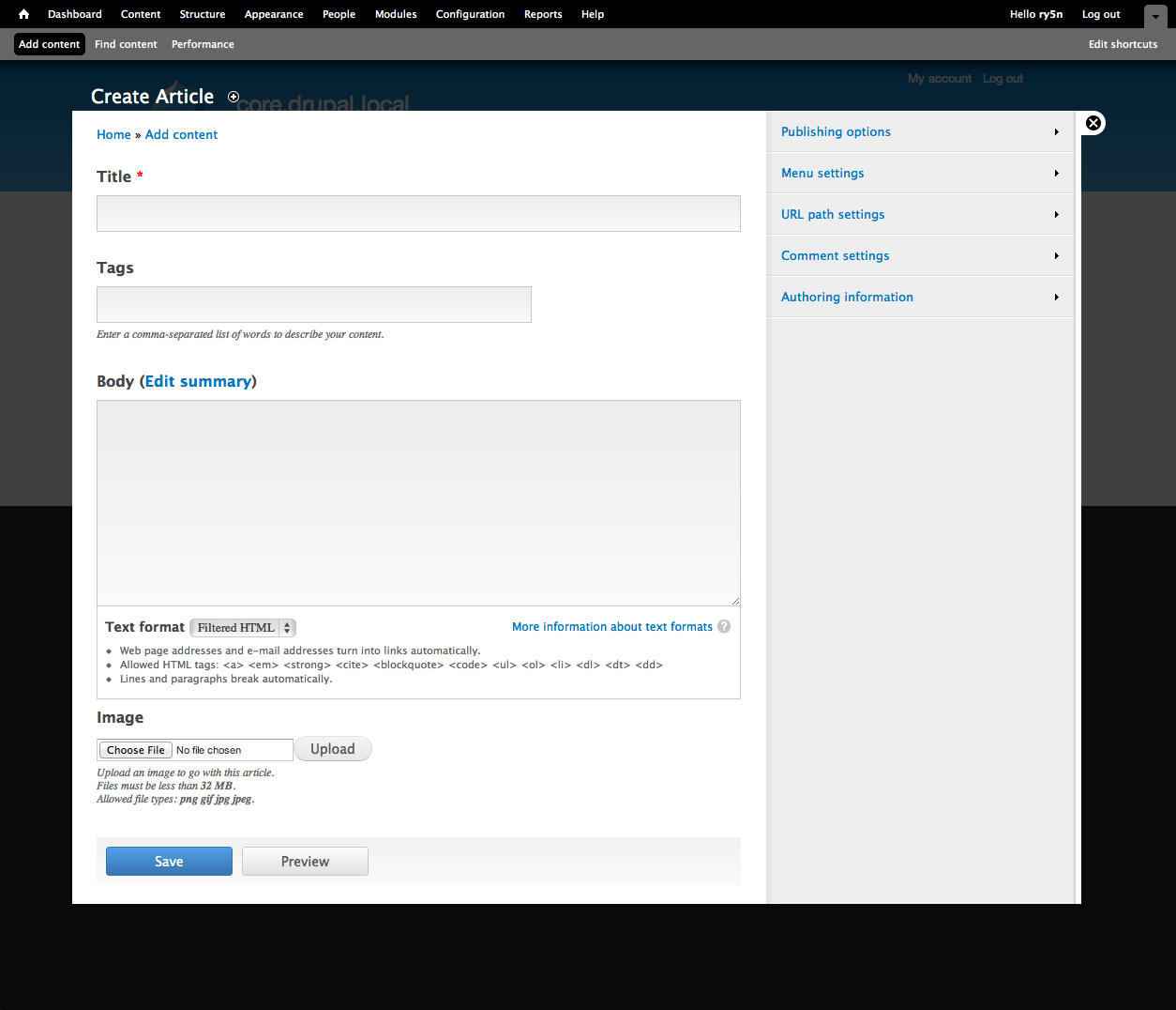
Bojhan CreditAttribution: Bojhan commentedMy feedback is determined from the demo site and the screenshot (neither #24 or #30 patches seem to work for me). In general this is moving exactly in the direction, that we want! This is getting really close to something testable, I would love if we could move closer to the image in the top in terms of styling. Because this allows us not only to test the concepts but also specific affordances (clues) the visual styling gives, and with that influences usability performance.
I would like us to improve on the following items:
Once there is a patch I can apply as well, I will help out with the detailed styling of font-sizes, colors etc. If anyone wants to give a crack at applying the styling to the form elements in the content area, that'd be very helpful.
I am coordinating with dcmistry, who has run up many Drupal usability studies - to get this tested. We are going to develop a plan over the weekend, and immediately start recruiting and scheduling participants.
Comment #32
quartsize CreditAttribution: quartsize commentedIs it intended that the sidebar accordion allow multiple panes open simultaneously?
Comment #33
jide CreditAttribution: jide commentedAn updated patch. We're getting closer.
I did not digg so much, but #group property is ineffective for the title "field", which causes some problems (but does the #group property works at all ?).
Comment #34
karschsp CreditAttribution: karschsp commented#group only works on fieldset.
Comment #35
eigentor CreditAttribution: eigentor commentedAh, I'd be a great fan if the save button more often would be blue in Drupal. You just cannot miss it. Kind of the anchor a new user clings to.
Comment #36
jide CreditAttribution: jide commentedOf course, seems logical now you say it :)
Seeing this :
$form['title']['#group'] = 'edit_primary';In the code confused me, wasn't sure if it was something new in D8.
I put the title field in $form['edit_primary'] instead for now (Yeah, implementation *really* sucks).
Here is an updated patch / screenshot.
Comment #37
jide CreditAttribution: jide commentedLast one for today. I also put actions in $form['edit_primary']. This is of course to quickly stick to the mockup without messing with CSS too much, and that's something we do not want when we will implement this, I hope I understood the intent well here.
Comment #38
Crell CreditAttribution: Crell commentedCan we please *not* post giant, over-sized images into every frickin' comment? Just attach them for us to click on, please. Otherwise this page will very very quickly become completely unusable. It already is forcing horizontal scrolling rather badly.
Comment #39
jide CreditAttribution: jide commentedYes you're right, sorry.
Comment #40
Crell CreditAttribution: Crell commentedThanks. Sorry if came off as snippy, but another thread that had large embedded images ended up as several megabytes to download every time someone posted a comment. :-)
Comment #41
jide CreditAttribution: jide commentedNo worries :)
Note: We'll have to remove
+ dpm($item['href']);introduced in #22.Comment #42
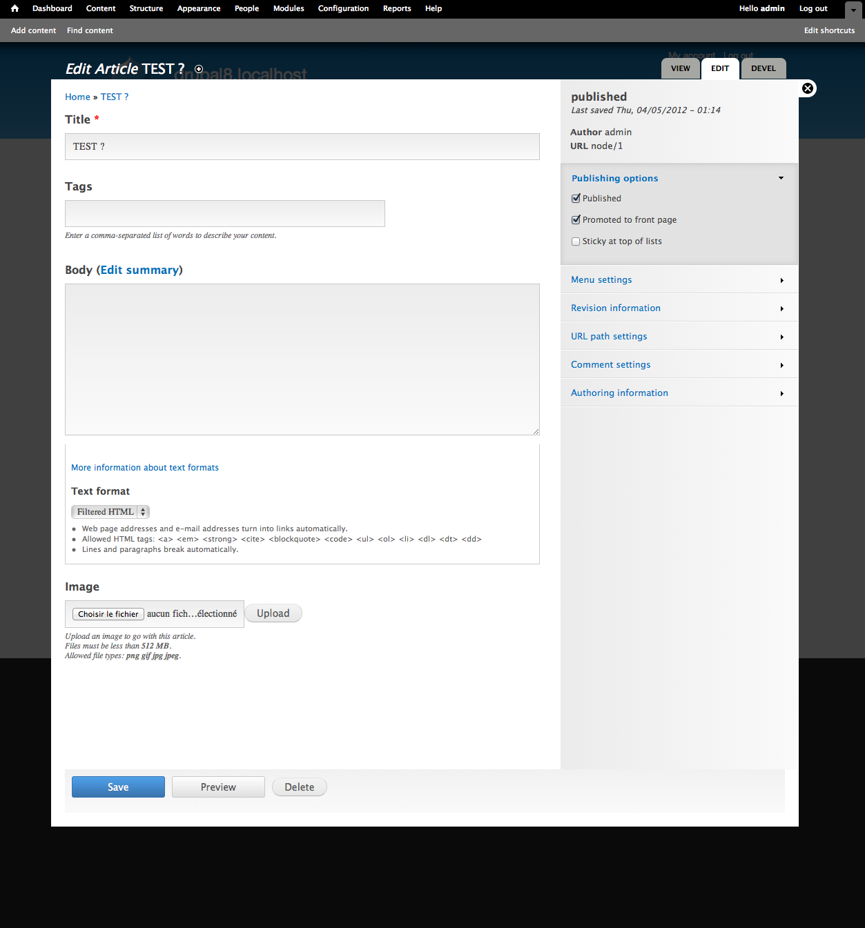
karschsp CreditAttribution: karschsp commentedHere's a patch which adds the revision section below the "node summary" and also removes some gradient backgrounds that were showing up on .node-actions and file form elements. Also removes the stray dpm() that was left in there.
Comment #43
yoroy CreditAttribution: yoroy commentedThis is progessing quickly, the latest screenshot looks great already. I'll have to play around with the actual patch applied to give detailed feedback. From looking at the screenshot, it seems to me that the whole text formats thing is just too much (even for a user/1 scenario) and the text field gradients seem a tad too heavy.
Again thanks to all who's working on this, it's really exciting.
Comment #44
tvn CreditAttribution: tvn commentedI've updated demo site with patch in #42
http://dev.test567.gotpantheon.com/
login: testuser
pass: testpass
Comment #45
tvn CreditAttribution: tvn commentedoops, didn't mean to change status
Comment #47
jide CreditAttribution: jide commentedUpdate.
@karschsp The gradient in .node-actions was intended, it's like in the mockup.
I used a different technique for placing the sidebar so that it is always expands to the height, without specifying a height in CSS. Fields in sidebar won't be too long anymore too.
There is a weird bug at the top of the overlay which causes an extra padding, but that was here before (although not visible because the were no gray sidebar before !).
Comment #48
jide CreditAttribution: jide commented@yoroy Gradient colors were color picked directly from the PSD ;)
Comment #52
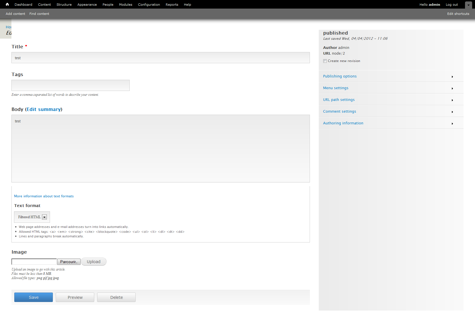
Bojhan CreditAttribution: Bojhan commentedI have removed a few oops comments. Wondering why I dont see a top sidebar when I am creating? It should be displayed on both display and creation. You can usually already fill author, and url could be auto filled or just hidden from view (lets not over-worry about that part just yet).
It seems like apart from that only 1) is an outstanding issue?
Comment #53
karschsp CreditAttribution: karschsp commentedI guess some clarification is needed on that top sidebar then. Is that supposed to be "display/informational purposes only"? Or should those values be editable? In the current patch, they are display only. To modify those values you need to click in the Authoring Information and URL Path Settings sections.
If they are intended to be display only (as they are currently implemented), then I'm not sure what value the top sidebar has on node/add forms vs. node/edit.
Comment #54
marcvangendI'll review more code later, just some remarks about the CSS for now:
Remove trailing spaces.
Use spaces instead of tabs.
Has is been "officially" decided that this is the way we create CSS gradients? If I'm not mistaken, there are more browsers we can support. The tool at http://www.colorzilla.com/gradient-editor/ produces the following CSS (cleaned up and re-ordered by me):
I'm not sure if the 'filter' rule for IE6-9 works on all elements, so let's test that. I also think it's good to decide what the background color should be in case gradients aren't supported (the "Old browsers" part).
Comment #55
jide CreditAttribution: jide commented@marcvangend If I'm not wrong (and I hope I'm not !), goal is not to have a good implementation, otherwise we are completely wrong here, I'm not even sure it shouldn't be in the theme layer, or anyway something completely different. Goal is to test the UI, afterwards we'll see if this is worth implementing well. So patch reviewing may be useless here. Otherwise I would be totally ashamed of the code I wrote :) TBH, it feels weird to write such dirty code for a core patch, but that's the point.
Bohjan, yoroy, can you confirm ?
Comment #56
marcvangend@jide, I think we're pretty much agreed there. Maybe I shouldn't have mentioned the spaces and tabs, but I figured that cross-browser compatibility is important when you want to want people to test the UI.
Comment #57
yoroy CreditAttribution: yoroy commentedjide: confirmed. I did ask marcvangend to provide some technical feedback, he wisely decided to limit that to some CSS issues :)
Comment #58
jide CreditAttribution: jide commentedHehe, Yes, indeed, makes sense then.
We should try and see if filters are a good option instead of a background picture fallback, filters can cause weird problems in some situations.
BTW, I'm surprised the tool does not generate the standard "-ms-filter" too (it should !).
And fixing tabs shouldn't be that hard :)
Comment #59
RobW CreditAttribution: RobW commentedIMO good css shouldn't really matter at this point. As devs, most of us testing will have a class A browser, and if we're a UI/X tester with a group of clients or test users we'll probably have control over the environment enough to specify a browser. Plus, implementation may change the underlying html structure, and then we'll need to revise css and all the time spent on little visual and cross browser tweaks will be lost. Dirty prototypes first, then structural and backend implementation, then design and theming (which is where I'd like to jump in)!
Progress looks great so far, and so fast! Nice work karschsp, aspilicious, tarekdj, and jide.
Comment #60
RobW CreditAttribution: RobW commented@#32: Yes, I think that multiple sidebar accordions should be expandable at once. There are settings that inform each other, and a user might want to look at multiple or copy and paste between.
Comment #61
markconroy CreditAttribution: markconroy commentedthis is excellent stuff. Well done. I take away what I said above with my (ugly) preview thing.
Comment #62
nevets CreditAttribution: nevets commentedWhy treat taxonomy as special since it is a field in Drupal 7 and I like the ability to place it on the form where I want instead of the system deciding where it goes
Comment #63
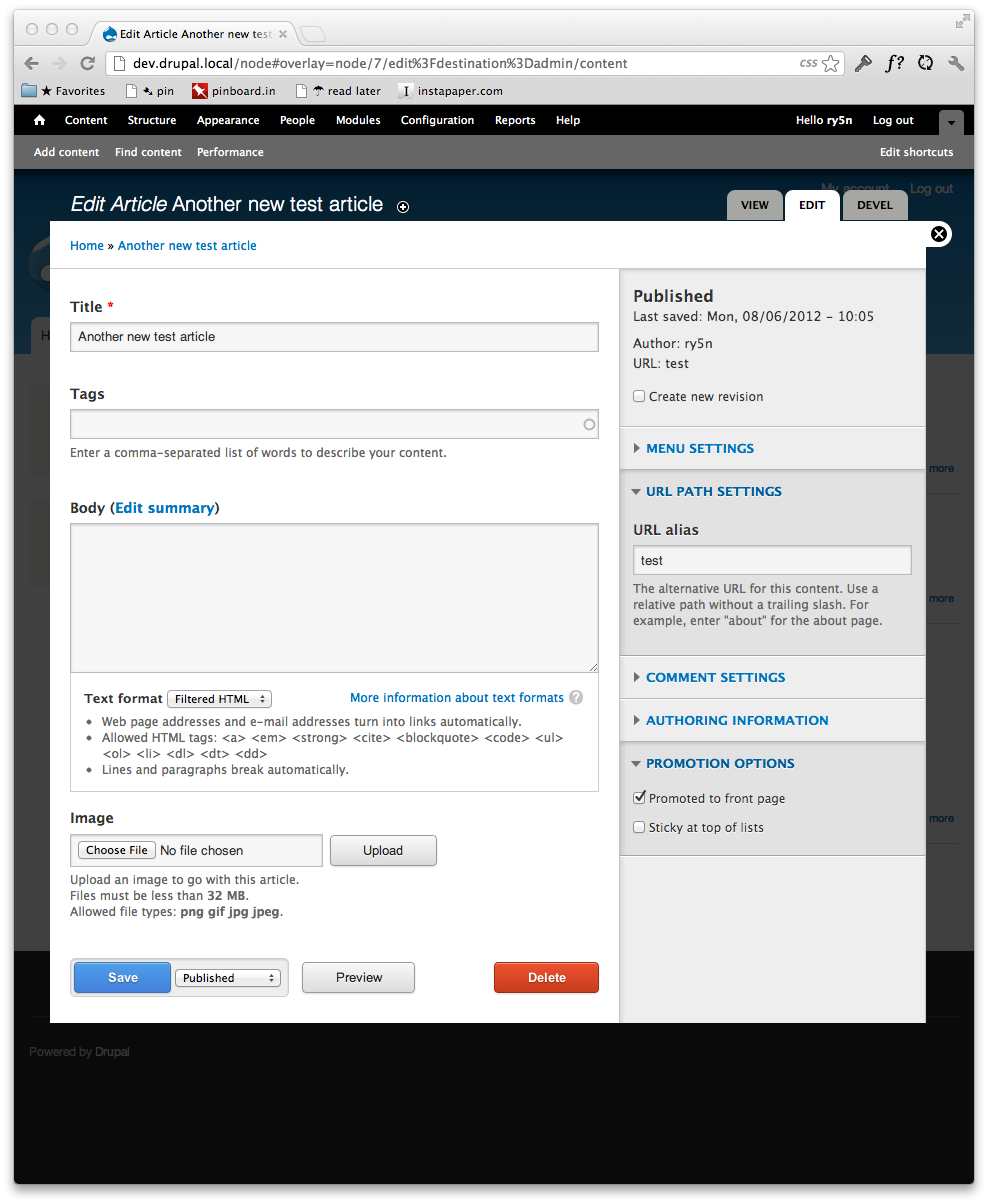
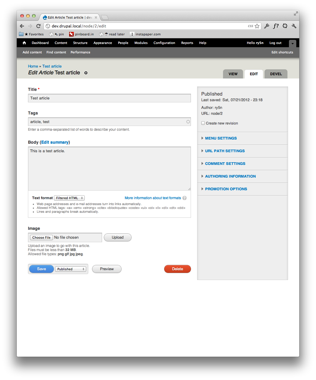
ry5n CreditAttribution: ry5n commentedOverhauled sidebar css, checking against admin screen without overlay, checking across browsers (latest Chrome, FF, Opera, IE + IE8). I’ve deviated very slightly from the mockup in terms of sidebar styling (sorry @webchick), but this can easily be changed to match if not deemed an improvement.
Still needs lots of work. Note two things:
Comment #64
xjmThanks @ry5n! That screenshot looks great.
The patch in #63 could use some cleanup to meet our coding standards. Few specific points:
-----------).Following these standards will make the code easier to review. Reference: http://drupal.org/coding-standards
Also, when you submit a new patch, you can set it to "needs review" so that it is automatically tested by our testbot. (For a CSS patch, this mostly makes sure it applies.) It can be set back to "needs work" afterward. Thanks!
Comment #65
ry5n CreditAttribution: ry5n commented@xjm Thanks for your patience re: coding standards. I’ve read through them now (silly of me not to have done before) and will submit an updated patch shortly.
Comment #66
David_Rothstein CreditAttribution: David_Rothstein commentedI thought based on the above that this issue wasn't going to worry about code reviews or coding standards yet (since it's still in the prototype phase)?
Not that it hurts to follow them, of course :)
Comment #67
webchickRight. Making up a "prototype phase" issue tag to reflect this. The point of this patch currently is only to get something we can touch and play with. Its goal isn't (yet) to be core-worthy. That'll come later, after we use this prototype to gather some data about user behaviour.
Comment #67.0
webchicklink to mobile version mockup
Comment #68
webchickI've also updated the issue summary to reflect that, since this is at least the 2nd or 3rd time that clarification has been made.
Comment #69
ry5n CreditAttribution: ry5n commentedEven though this is for prototyping, I though I may as well clean up the stylesheet to better match coding standards (patch content is identical). BTW, I’m not sure if I should be marking this `needs review` or just `needs work`.
Comment #71
tvn CreditAttribution: tvn commentedI've updated demo site with patch #47. Layout does not break on Menu settings anymore which is great.
Both patches #63 and #69 didn't work for me.
Comment #71.0
tvn CreditAttribution: tvn commentedUpdating the issue summary to reflect that this is just a prototype patch. (webchick)
Comment #72
Bojhan CreditAttribution: Bojhan commented@ry5n Congrats on your first core patch! Could the latest patch be updated, I am trying to apply it but can't get it to work?
It looks like we are a lot faster than my estimation, which is super good news! We are going to post testplan in the next few days, and invite everyone to help out usability testing this!
There is still one outstanding to do, the meta information in the top of the sidebar is not shown on creation. But only on editing, this is wrong, it should also display information on creation (Publishing state can be filled, Author can be filled - URL should probably update on AJAX?).
Comment #73
xjm@ry5n, looks like that patch is against your previous commit maybe? Perhaps that is also why your patch in #63 did not apply. See http://drupal.org/node/707484. If you'd like help creating the patch, you can join us in IRC in the
#drupal-gitsupportchannel. Thanks!Comment #74
xjmActually I just tested and confirmed that #63 and #69 are interdiffs. Rerolling them into a new patch.
Comment #75
xjmAttached is #47 combined with #63. Also tried to clean up the whitespace, etc. so that the patch is easier to review.
Comment #77
xjmMissed a few.
Comment #79
xjmRebased.
Comment #80
xjmComment #82
xjmThose are the correct fails. :) Carry on. Thanks again @ry5n!
Comment #83
tvn CreditAttribution: tvn commented#75 looks good, only lets remove white border on the right of sidebar to bring it closer to original design
Comment #84
mrfelton CreditAttribution: mrfelton commentedTry this one. I've made several adjustments to bring it more inline with the original visual, including:
- adjustments to font sizes in the sidebar
- adjustment to the gradient in the sidebar
- move the field description above the field
- remove the white border on the sidebar
- Adjust the menu collapsed arrow icons so they are larger and grey
Comment #85
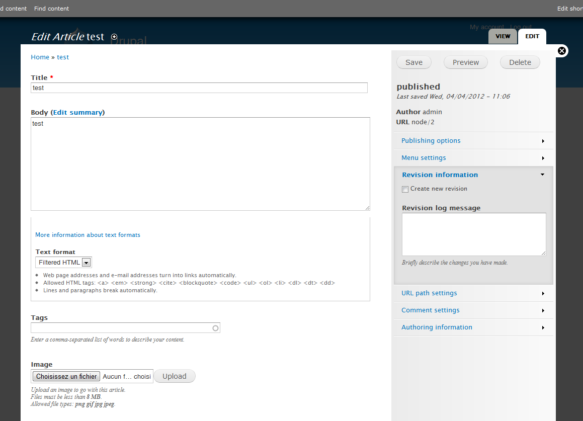
Bojhan CreditAttribution: Bojhan commented@mrfelton Can you make a screen? Did you go from #79?
I would love if anyone could fix the problem from comment #72 of top of the sidebar showing nothing on creation.
Comment #86
mrfelton CreditAttribution: mrfelton commentedYes, I went from the patch at #79. Here is a screenshot:
Comment #87
mrfelton CreditAttribution: mrfelton commentedNote, I'm not sure why the turned down arrow is showing the small icon still. I updated that image too. I think its a local caching thing.
Comment #88
mrfelton CreditAttribution: mrfelton commented@Bojhan re the problem outlined in#72, that looks like a completely new tab, right? It's not quite the authoring information, but not quite the publishing options either, but sort of something in the middle. Or, is it supposed to be a complete combination of the authoring information and publishing options tab?
Comment #89
mrfelton CreditAttribution: mrfelton commentedSlightly revised patch, ensures that text fields take up the full width.
Comment #90
mrfelton CreditAttribution: mrfelton commentedAnd the patch...
Comment #91
Bojhan CreditAttribution: Bojhan commented@mrfelton The changes are looking great! When you edit a page, you see some "meta information" in the top part of the sidebar just as in the issue summary. I basically want that on the creation on content too (I don't think we should go to the trouble of combining stuff, just yet). Lets just make sure we have the same top area on creation as on edit.
I have removed your image from displaying straight into the issue, to keep this issue scan able. It's not a standard practice, but for this issue it makes it easier for people to read.
Comment #92
aspilicious CreditAttribution: aspilicious commentedUse this for your summary
The text between * needs to be dynamic ;)
Comment #93
aspilicious CreditAttribution: aspilicious commentedExample
Comment #94
RobLoachI like where this is going, would making it responsive first help? Here's some attached screenshots.
Comment #95
yched CreditAttribution: yched commentedField API 'textifeld' widgets have a setting specifying the desired width of the input. Could we make sure that it doesn't get overriden by some hardcoded 100% CSS rule ?
Comment #97
mrfelton CreditAttribution: mrfelton commentedThis patch adds in the publishing information stubb to the top of new nodes.
Comment #98
mrfelton CreditAttribution: mrfelton commentedAnd the screenshot to go with it ^
Comment #99
Bojhan CreditAttribution: Bojhan commentedAwesome! Oke, I am going to mark this "prototype ready for testing" - and fill you in as soon as possible with a test plan :')
@RobLoach See http://groups.drupal.org/node/218594 , I don't think we should do that in this issue.
Comment #100
mrfelton CreditAttribution: mrfelton commented@yched: Not quite sure how to best do that. By default a size of 60 is applied. We can use [size="60"] to only set the width to 100% for that default size, ensuring that if someone changes it from the default 60 that their new size will be respected. Alternatively, perhaps we should remove the default 60. Why 60 anyway? Where did that come from?
Comment #102
yched CreditAttribution: yched commented@mrfelton: not sure where that 60 default size came from, very possibly comes from the early cck days.
Is it possible to target inputs having *no* explicit size attributes ? Then we could set the default size to 'empty' (= leave the default styling for this entity's forms apply) rather than an arbitrary 60.
Comment #103
mrfelton CreditAttribution: mrfelton commentedyes, I believe we could use :not([size])
Comment #104
RobLoachPlease hit #1277352: Responsive vertical tabs first, and try making this work for all vertical tabbed pages rather than just a bunch of custom CSS for node editing. This could actually be a detriment to what the Mobile Initiative is trying to accomplish.
Comment #105
aspilicious CreditAttribution: aspilicious commentedWait what? why is the node published and NOT saved lol
Comment #106
mrfelton CreditAttribution: mrfelton commentedGood catch! That's resolved.
I have also remved the default size of 60 from textfields, and updated the 100% width css so that it only affects elements with no width set. However, in doing this it has become apparent that its not just text fields that set a default size, but other fields also do similar things. For example, number fields set the size to 12, and doesn't give an option to change this. Not sure what, if anything, to do about that
I also spotted what I believe to be a bug in element_set_attributes, which is that attributes get set even if there is no value for them. For example, even after removing the size attribute, an empty 'size' attribute was still being added to the markup. So you would end up with something like this
instead of what I think you should have which is
Attached patch also fixes that, but I don't know if that will break other things or not. I guess the test suite will tell us that.
Comment #107
mrfelton CreditAttribution: mrfelton commented@Rob Loach I think the intent here is simply to get a prototype ready for testing. If the implementation is good, and deemed to be user friendly, then there are quite a few things with this patch that would need fixing up anyway. I'd say its more important to get something ready for testing quickly, than it is to ensure that css and other features are implemented in the best way possible or even in a way that is 100% compatible with the work being done in other tickets such as the one you pointed to. Any CSS coming out of this issue can be made more generic after.
Comment #109
Bojhan CreditAttribution: Bojhan commentedI have just had a meeting with dcmistry, to discuss the plans for testing. We are now developing a test plan, important dates are:
We want to test at least 5 beginners (no experience with Drupal), and 5 intermediates (some to a lot of experience with Drupal.
We will definitely need help to test enough participants! Let me know if you are interested in either doing testing, or sending us through participants we can test. It would help us greatly, if more people could test maybe one or two friends.
Comment #110
ryan.armstrong CreditAttribution: ryan.armstrong commentedI've got some friends who woud be in the group of people who would build a website, but who have never used Drupal before. I'd be more then happy to run a test. What do I need to do? How many people should I get?
Comment #111
tvn CreditAttribution: tvn commentedPatch #106 didn't work for me, so demo site is now on #97.
Comment #112
dcmistry CreditAttribution: dcmistry commentedRyan,
Superb! You can help us with testing/ and or recruiting. I should have a solid plan by tomorrow.
Stayed tuned!
Comment #113
stevectorI just closed an old duplicate: #472126: D7UX: Move buttons to right area, add content and meta selector
Comment #114
ryan.armstrong CreditAttribution: ryan.armstrong commenteddcmistry,
Awesome sound great, I'll keep an eye on this post. Also, feel free to contact me directly as well!
Comment #115
ryan.armstrong CreditAttribution: ryan.armstrong commentedQuick question regarding the scope of suggestions for this layout. For example, would be it out of scope of this task to suggest that the Authored On field use the jQueryUI date picker rather then then plain text string? Though the format is relatively strait forward (However, it does require an entire paragraph to explain it), I would imagine content authors wanting something more user friendly.
This might be out of the scope of this exercise, but I thought I would just mention it.
Comment #116
stevectorRyan, The JQueryUI date picker takes configurable formats. http://jqueryui.com/demos/datepicker/#date-formats
The difficulty is a separate element is then required for time of day. This might be easier if some of date module's functionality get into core: http://groups.drupal.org/node/221229
I'm uncertain on the scope question. I think it could be handled in a separate issue.
Comment #117
RobLoach#504524: Extend Authored on field with jQuery UI Date Picker ;-)
Comment #118
ryan.armstrong CreditAttribution: ryan.armstrong commentedHaha, well there ya go, thanks Rob and stevector!
Comment #119
ry5n CreditAttribution: ry5n commented@Bojhan @xjm Thanks for your encouragement :) I was away for a few days but I’m back; changes look good. I won’t be able to assist with user testing this time around but I’m eager to see the results.
Potentially important: one of the usability issues [previously noted](http://groups.drupal.org/node/214898#comment-716094) is confusing labelling of the save button. Solution in the mockup is this:
I wonder if we should make a rush effort to implement this in the prototype before user testing gets under way?
I’m willing to pitch in with some css over the next couple of days.
Comment #120
Bojhan CreditAttribution: Bojhan commented@ry5n We are going to start testing on Saturday, if you have some time today/tomorrow to make a patch - then we can probably incorporate the new buttons in the test.
Comment #121
xjmThis is so exciting! Thanks everyone. Should we make a core group announcement about the testing?
Comment #122
ry5n CreditAttribution: ry5n commented@Bojhan I have some time and can write the necessary markup and CSS no problem, but I’m not well-versed enough with Drupal and PHP to get the new markup into the form and have a working patch – at least not quickly. A more experienced contributor would have to help with that part.
Comment #123
ry5n CreditAttribution: ry5n commented@Bojhan Why don’t I write a static html/css snippet for the new buttons and attach it here. Then if someone has time before the testing sessions and wants to build it in, they can.
Comment #124
yoroy CreditAttribution: yoroy commentedry5n please do, maybe someone else can roll the patch based on your input then. Thanks!
Comment #125
ry5n CreditAttribution: ry5n commented@yoroy I'll get on it ASAP.
Comment #126
Bojhan CreditAttribution: Bojhan commentedCould anyone re roll the latest patch so it applies cleanly/no failed tests? We want to start applying the current one to the usability testing instances, so we can start preparing. (These instances can be updated, when new improvements are in before testing starts).
Comment #127
ry5n CreditAttribution: ry5n commentedRE: #119, I’m attaching some flat files that someone with more PHP and Drupal experience can roll into a working patch for the publish buttons. If the markup can be output as attached it should just be a matter of tacking on the css and
linking in the js. Correction: linking in the js AND activating the button dropdown with this jQuery:$('.dropdown-toggle').dropdown();.Note that I’ve thrown this together real fast (hence ported code from Twitter Bootstrap and overall messiness) but should suffice for testing.
Comment #128
ry5n CreditAttribution: ry5n commentedOh, forgot to include a screenie. Should look like this:
Comment #129
xjm@Bojhan, getting the patch to not fail tests will probably be a lot of work. I expect many of them codify the current user interface, and so to remove the failures we'd need to codify the new interface. I'd suggest doing the prototype UX testing first before going down that road.
Comment #130
lslinnet CreditAttribution: lslinnet commentedThis is some great work, seems like a step in the right direction.
I did have a few concerns about this:
Further more it would be nice if it was possible to make on of the accordion tabs unfolded by default.
Comment #131
millaraj CreditAttribution: millaraj commentedLooking fantastic and already a great improvement over what is already a step forward in D7 from D6. Congratulations already to those involved.
In regards to the accordian, it might be helpful if we only open one section at a time. So when a new section is clicked, it opens, and the presently open one closes. Might make for less vertical scrolling in the long run.
I'd agree with #130 in that the test examples are perhaps to basic to test properly.
One area that perhaps needs some attention is the "Text Format" area. Whilst it's helpful to be able to switch between different types of input, is it necessary to have all the text associated with it displayed for each one? e.g.
I'd say that perhaps the same goes for many of the fields. (image, etc). Perhaps they should be hidden behind some hover over popup to reduce the extraneous text on the screen that just confuses the eye? With the number of fields on display at the moment it's not really an issue, but with a large content type, it gets hard to see where the fields are and what's just extra instruction. If, for example, you had 5 different types of wysiwyg fields, you're essentially displaying the same information 5 times. As we move more towards mobile, perhaps this extra screen real estate isn't worth it?
Comment #132
mariomaric CreditAttribution: mariomaric commentedThis is looking very good!
I wanted to just propose follow up issue to resolve adding menu item in http://drupal.org/project/hierarchical_select style, or some other similar module that is trying to resolve this, IMHO, PITA issue..
Comment #133
dgastudio CreditAttribution: dgastudio commentedas alternative for menu management...
http://drupal.org/project/menuux
Comment #134
mariomaric CreditAttribution: mariomaric commented@kervi: Menu Browser is my second choice - BUT, something like this should be in core and is definitely making content creation experience better.
Comment #135
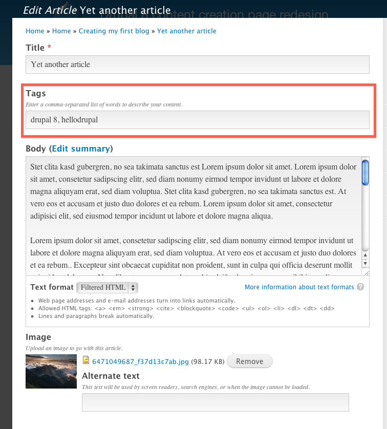
rovoThis may be completely unrelated to the task at hand, but after testing the demo( http://dev.test567.gotpantheon.com/ ), my initial impression was that I would have a better sense of what words I would Tag the entry with, after I entered the body of content. If it was a very long entry, I may even want to make tags while entering the content. In the later case, I imagine the tag entry being in the sidebar instead of above the Body text-area field.
Attached current iteration for illustration.
Comment #136
cpliakas CreditAttribution: cpliakas commentedSetting priority back to major unless there is a driving reason to do otherwise.
Comment #137
nevets CreditAttribution: nevets commentedI do not think tags belong in the sidebar, in general the sidebar holds administrative settings and is not seen by all users. I also like the D7 behavior that lets me place the taxonomy field where I think is appropriate on the form
Comment #138
rovoYour right, it can easily be moved in the admin. I was mainly referencing the original image posted for the design proposal at top, wondering about the switch from the Taxonomy in the sidebar to Tags above the content area.
http://drupal.org/files/createcontent-redesign.jpg
Comment #139
lslinnet CreditAttribution: lslinnet commentedAdding the ability to move fields widgets into the sidebar would be a major plus - as it happens that we decide to create administrative functionality as fields on a node.
What I am basically thinking is that we get a functionality like the nodeformcols module. (or at least a checkbox that allows you to define that it goes into the sidebar)
Comment #140
hmartens CreditAttribution: hmartens commenteduhmm...it would be SUPER if once you have uploaded your images, you can drag the images to where you want it in your post...that would be a super-awesome feature :)
THAT would make it easy for all drupal and non-drupal users to make their posts look great!
Comment #141
aspilicious CreditAttribution: aspilicious commentedThat is not the goal of this issue.
I know you all want to help but PLEASE keep issues in scope.
Thnx
Comment #142
Everett Zufelt CreditAttribution: Everett Zufelt commentedI took a look at the demo. A few comments from an accessibility perspective.
1. The vertical tabs (collapsed fieldsets?) come after the Save / Preview buttons, so they are very easy to miss as a screen-reader user.
2. There is a heading "Published" that seems to make no sense as a heading.
Comment #143
Bojhan CreditAttribution: Bojhan commentedThanks for the review, we are currently still usability testing (already did, 10 participants). But once we are done, and validated the concept works or not. I am sure we can tackle these accessibility issues, they appear not too difficult to solve.
Comment #144
Bojhan CreditAttribution: Bojhan commentedWe have almost finished our testing (9/10 participants), we are still looking for help testing/finding one more participant that isn't familiar with Drupal. Anyone can help out with this?
Comment #145
Bojhan CreditAttribution: Bojhan commentedWe have now tested all the participants, and we are working on the analysis. This is going to take shape this week, and we plan to release the findings this week!
As it currently looks, we will be updating the spec - but no further testing, which means that next week we can get rolling on improving the UI and moving to the fidelity of a full core patch!
Comment #146
ry5n CreditAttribution: ry5n commentedYay!
A big thanks to everyone who helped/is helping with the testing. Looking forward to the findings and rolling some new patches.
Comment #147
Bojhan CreditAttribution: Bojhan commentedThanks all for being so patience in awaiting the research results, but they are in! In general the tests went really well, both beginners as intermediate users understood the purpose of the sidebar and were able to use it effectively. We found a lot of specific issues around the summary, text formats and specific functionality in the accordions - but few problems with the overall design.
We would like to actually move this from just a prototype patch, to an actual core patch that is committable.
Below are the changes we would like to make reflecting the usability testing we have done:
A lot of participants still struggled knowing what “Save” would end up doing to their content. We could mark this as a high to critical issue in the testing, and probably a direct result of us not implementing the state dropdown near save, lets make sure we add that
We noticed as people went through opening the different accordion tabs one by one that they often left the previous one open, creating a visual effect where it was often hard to notice which fields belongs to which tab. This could be solved by throwing in a more distinct border area between tabs, a mockup for this is coming up.
It seems like there are a few bugs that were triggered during the testing - one of them was error messages. They are shown only half, and there were no visual indicators a field has an error.
We noticed no clear need for summaries below accordions in the testing we did. Although vertical tabs had this pattern to give people a clue on the settings, we never noticed in the testing we did on intermediates and beginners that people would actually pay attention to this summary. Therefore our current conclusion is that we do not need these summaries.
We noticed a small difference between earlier tests in that people were even more drawn to the text format settings than before. Perhaps this is due to form elements that we increased in size, again a mockup for this will be coming up.
We want to keep this issue focused on the actual redesign, so the specific problems that we found which where not necessarily related to this redesign we moved into separate issues.
#1562776: Edit Summary label is unclear to users
#1562782: Menu settings on content creation are unclear
#1562798: Its hard for users to provide valid input in the authoring date field
#1562802: Allow for more images in article
#1562804: "Sticky on top" is hard to understand
So lets try to address 1-5 in this issue, and go through the review process applicable for these kind of changes.
Comment #148
moshe weitzman CreditAttribution: moshe weitzman commentedFYI, accordions can be configured so that they always close the old tab when a user clicks on a new tab so that user only sees one open section at a time.
Also, I'd be sad to see those Summaries go away.
Comment #149
pfrenssenI would like to retain the summaries too, this is a major time saver. Imagine an experienced content editor that needs to verify some settings on dozens of nodes, and has to click open each accordion in each node to do so. I wouldn't remove features that are genuinely useful to power users just because it is not useful for beginners.
Comment #150
Everett Zufelt CreditAttribution: Everett Zufelt commented+1 on summaries. They are useful from an accessibility perspective. being able to access the summary without opening the tab and navigating to the form elements is great.
Comment #151
RobW CreditAttribution: RobW commentedI agree with the above three comments. As we try to make Drupal more user friendly for non-experts we should still remember that Drupal can power almost anything. The system needs options.
It seems like the solution is config to choose if the accordions allow one or more than one open at a time, display summaries only when provided, and don't provide one by default. A little work in some other project issue queues, but that's ok with an interlocking, extensible system.
Comment #152
Bojhan CreditAttribution: Bojhan commentedI am not hung up on not putting in summaries, if that's something the community wants. However so far we have not found any convincing data that people actually use it, other than a few occasional moments. So we can put it in for now, but even then lets get some activity going on all the actionable parts!
@ry5n, karschsp, jide any of you can push this forward again?
Comment #153
ry5n CreditAttribution: ry5n commented@Bojhan I’ve read through the results and sub-issues, just haven't had a chance to comment til now. I hope to have some time to post my thoughts later today, and to work on patches through the week.
Comment #154
ry5n CreditAttribution: ry5n commentedThe save/publish buttons have had several UI variants through the design process, and after reviewing things including the latest PSD and the screenshots on various threads I'm no longer sure which option if any has been chosen as the final design. The screenshot in the OP has the Save button as a split-button with 'Save Draft' as a dropdown option 'Save Draft', but the PSD and late in the design process the save widget is a normal button with an associated select element with publish options. Is one or the other of these preferred?
My inclination is towards the button + select combo since the publication state is immediately visible – new users will have a harder time missing it and probably an easier time manipulating it.
As an aside, the overall placement of the save buttons on this screen is still an open issue. My thoughts on that are over in that thread.
I'm planning on tackling issue 3 (those messages getting cut off) later this week.
Comment #155
Gábor HojtsyChanging the *issue title* changes the main issue title itself. It is not your comment subject.
Comment #156
ry5n CreditAttribution: ry5n commentedSorry about that folks. Issue title fixed.
Comment #157
ryan.armstrong CreditAttribution: ryan.armstrong commentedJust weighing in on the summary bit. I don't think we should remove the summary, as it is very helpful, and something that I have used on many sites, especially blog or resource sections. I just think we need to come up with a better term for it, and perhaps have some hint text on how to use it. I posted more detailed thoughts in the issue specific to it, I just wanted to throw my vote in here for not killing it, but making it better explained.
Edit: Link to my comment in more detail: More Detail
Comment #158
ry5n CreditAttribution: ry5n commentedNew patch addressing #147 (applies against the current 8.x HEAD). Includes the following changes:
- Ensure system messages are visible for node/add and node/edit screens (#147, point 3);
- Hide breadcrumb (as per comp);
- Improve visual contrast within accordion, especially between adjacent expanded settings groups (#147, point 2). Cleaned up CSS in the process;
- Ensure layout adjustments for accordion only apply when accordion is present (had been causing slight weirdness on node revisions screen);
Comment #159
ry5n CreditAttribution: ry5n commentedUpdated version of previous patch.
- Refactor accordion item styles to avoid them applying too broadly;
- Address bug in Chrome where shading artifacts may be drawn across the width and height of the viewport when select elements are animated into and out of view. Should be tested/applied throughout Core. See http://code.google.com/p/chromium/issues/detail?id=122035.
Comment #160
dgastudio CreditAttribution: dgastudio commentedHi everyone!
first of all, sorry for my english.
i have something to say:
all the redesign and rework of "new create content page" is really great and nice, but...
the proposed design separes CONTENT CREATION from CONTENT OPTIONS, right?
and it looks cool with default content type (title, body, tags)
but that about content type with a lot of fields???
take a look to my custom content type, done with the help of nodeformcols module (http://drupal.org/project/nodeformcols):

how i'll do the same with proposed redesign?
so, i think, you must rethink the concept.
1. move all the visual improvements, to new admin theme, like RUBIK for example.
2. create new module for drupal 8, that ALLOWS to user to DISTRIBUTE content creation page elements AS HE WANT, not as YOU think he want. I mean, the same that NODEFORMCOLS but for d8.
3. create a default preset for this module, that distributes page elements as you think they must be.
thank you.
Comment #161
pfrenssen@kervi, don't worry you will still be able to customize the node edit forms as much as you like. If you think about it, in D7 there is also a separation between the content and the options: the content was at the top of the page and the options at the bottom. This issue is about improving the default look and usability. If you are not happy with the default you can still change it in any way you like.
Comment #161.0
pfrenssenadded link to demo site (tvn)
Comment #161.1
Bojhan CreditAttribution: Bojhan commentedUpdated issue summary.
Comment #162
Bojhan CreditAttribution: Bojhan commentedAlright, I have updated the summary, lets keep working on this patch - there is no reason for it to stall, there is now data that confirms the approach works - all we need to do is fix the outstanding problems! Outstanding tasks are fixing the "publishing state" dropdown near save, accessibility bugs identified in #142 and code review. I will work on a design for text formats later this weekend.
Comment #163
Everett Zufelt CreditAttribution: Everett Zufelt commentedto add to my comment in #142, the Save button (etc) needs to be after the collapsed fieldsets in the DOM for screen-reader users, but tab focus still needs to be logical on the page. That is, when you tab through the page the visual focus needs to follow a logical flow.
Comment #164
ryan.armstrong CreditAttribution: ryan.armstrong commentedI wanted to throw out a quick idea. In some of the comps, we had the save/preview/delete buttons in the right sidebar at the top. I think it's a good idea to keep that there and add in some sticky functionality where it it is situated within the overlay but as the page scrolls up and it touches the top of the browser window, it "locks" to it and stays there until the user scrolls back up past it's original position within the overlay.
This would be similar to how the sticky tables work in Drupal. One thing that gets very annoying when editing content types either on a small screen, or with a lot of fields is constantly scrolling all the way down the page to hit save or preview. This would address that, as the actionable items would always be in the same position, upper right of the overlay (or page if overlay is disabled). Thoughts?
Comment #165
ry5n CreditAttribution: ry5n commentedI think it's an idea very much worth exploring. I posted a very similar idea here (it's one of the sub-issues for this one). Shall we discuss further there?
Comment #166
Wim LeersI just finished reading through this entire issue. Great work everyone! :) Especially awesome work by @ry5n considering that it's his first core patch!
Comment #167
jide CreditAttribution: jide commentedWhile it is great to see this moving forward, I'm worried with the way this has been implemented. Could someone tell me if the current implementation is still considered as a prototype or is this more or less the way it will be really implemented ?
Having form elements lying in different parts (in sub arrays of $form I mean) in the node module do not sound like a good idea to me. I think it should either be the theme's choice or through some sort of subsystem that would enable custom layouts for forms.
Comment #168
Bojhan CreditAttribution: Bojhan commented@jide I agree with your concerns, I have asked jacine to take a look at this.
Comment #169
ry5n CreditAttribution: ry5n commentedNow that we're out of the prototyping phase I have similar concerns about the CSS. At the moment it's pretty ad-hoc, with a lot of pretty hacky selectors. I'd really like to modularize it, and also see how his fits into the bigger picture. That is, presumably many of these styles should live in Seven, and maybe we even need a style guide incorporating the aesthetic updates and the corresponding markup/style patterns. I'm sure @Jacine could provide direction on that as well.
Comment #170
ry5n CreditAttribution: ry5n commentedYesterday I spent some time adding the publishing status control next to the save button. Having never worked with the Form API before, it was pretty easy :) [BTW thanks @Wim Leers for the shoutout.]
Results look OK, but to get the select element looking like the comp we'll have to decide to do more agressive form theming (again, I suppose this should be a decision made for Seven, not just this screen). I haven't really tackled the delete button. Finally, I did add a couple of lines to form_pre_render_fieldset() in core/includes/form.inc to make sure that collapsibles that are expanded when the page renders get the new 'expanded' class. Here's a preview of the patch at present:
Comment #171
JacineHey guys. First off, I'd like to say this is really awesome stuff.
Before I get into reviewing the actual code, there are 2 big concerns I have with this patch:
Now, I realize that this is more a prototype than an actual core patch, and as a prototype it's fine, but reviewing it as a core patch will probably be helpful to move this forward, so here goes.
It's not clear why this change is being made here, and frankly, I don't think it's related to this patch at all, so it should be removed. If there is a bug here, please create an issue for it (if one doesn't already exist).
This class is not needed. Targeting .collapsible will work for the expanded view and then .collapsible.collapsed below it will have the same effect. It could be a useful helper class, but again, this should be done in this issue. (personally, I think data attributes should be used in an updated implementation, i.e. data-collapsible="expanded/collapsed").
This doesn't belong here either.
This doesn't belong in this patch either. Personally, I think it needs to be changed, 60 is way too wide, especially for mobile, but this should be a separate issue as it affects many other places in core and isn't directly related to this patch.
None of this code belongs in node.admin.css. This implementation is for the Seven theme, so it belongs in the Seven theme. Of course, anything we commit here should be tested in Stark first and foremost, and if it is decided that Stark should use this design (the very basics of it) then whatever is needed for that, if anything, would go in node.admin.css.
This definitely does not belong in system.base.css. This purpose of this file is for the bare minimal styles that Drupal needs to function properly. None of this falls in that category, and belongs in the theme's CSS file. Arguably, one or two of these can be candidates for system.theme.css, such as label[for] and the select rules. However, this would need to be discussed, in a separate issue.
Please use rgba and include a fallback for IE8.
This is hacktasktic. I haven't actually applied the patch yet, so I'm not positive how/why it's being used, but we need definitely something cleaner here. :)
The spec version needs to be added at the bottom here.
The + selector isn't supported properly by IE8, so it's not going to work out here.
We shouldn't use !important here, because we don't really need it. If you decide you really want to use it in the Seven theme, it's okay, but definitely not in the module's CSS file.
Gotta use ems here, and only if it's in the Seven theme. Font sizing is not a good idea in module CSS.
I'm assuming this SCSS was pasted in by accident. ;)
These should be individual form items (#type => 'item') to the extent possible, otherwise this is a an altering/theming nightmare. It should definitely not be thrown into an element #prefix.
=======
So, there is a lot above to address (sorry), and I didn't really scratch the surface, because the patch really needs to be rewritten in the Seven theme's CSS file, and when that happens it will change quite a bit, but hopefully this review is helpful. I think that it'd be a really good idea to work with the mobile team as soon as possible as well.
Also, can someone please clarify if this layout is going to be applied to Stark? Personally, I don't think it should, but if that's in the plan, what should that look like? What about Bartik? This needs to be considered ASAP, so the code can be written properly from the start.
Comment #172
JohnAlbinFantastic to see this work progress past user testing! Super excited.
Thanks, Jacine, for pointing out the need for a mobile perspective on this. I'll get some of the Mobile Initiative peeps to jump in and help out. We can add in the necessary media queries and stuff to get this working on smaller screens. The patch needs a bunch of other clean-up too, so now's the time to get it all going. :-)
Comment #173
moshe weitzman CreditAttribution: moshe weitzman commentedFYI, we already have an accordion in core thanks to jQuery UI. See http://drupalcode.org/project/drupal.git/blob/HEAD:/core/misc/ui/jquery....
Comment #174
ry5n CreditAttribution: ry5n commentedThanks Jacine and John for your input. I’m keen to to start refactoring the css and moving it into Seven, but I want to be on the same page as others working on the theme for D8. I don’t see much major activity in the issues, but if anyone is aware of other work being done, please chime in.
Now would also be a good time to build out the Seven style guide, since this project (content creation screen) includes aesthetic updates that will apply across the theme.
Comment #175
yoroy CreditAttribution: yoroy commentedGreat work all, we've certainly made big leaps forward here. Also, approaching 200 comments in an issue where we're only now gearing up for actual implementation of the design :)
Lets outline a battle plan for moving this into actual implementation, create/link the relevant issues, post that to the summary in here and consider this the meta-issue for tracking progress in general. From what I read in the latest comments:
- Clarify the mobile-first approach for this design
- Formulate an approach that tackles the concerns in #167
- Decide on what the Stark version of this should be
- Decide on what the Bartik version of this should be
- Review design decions made here for their system-wide impact on Seven theme
- I don't know if accordions, CSS refactoring, new regions and whatnot should be split out into multiple issues or not. Instinct says to go for a first big patch that puts most parts in place, focussing on sound architecture. Use follow-ups for more detailed work on individual page elements, but please do advise.
Comment #176
jide CreditAttribution: jide commentedAbout the implementation, what are your opinions ?
For now, I see 2 options :
- Leave the node module form as it is (I mean before this patch), and let theme decide how they implement the form.
- Use some subsystem, I'm thinking of something similar to the #group property used for vertical tabs.
Thoughts ? Other suggestions / ideas ?
Comment #177
ry5n CreditAttribution: ry5n commented[Edit for egregious grammatical error :)]
Sounds good. @yoroy I think your instinct is right to keep the first big patch in this issue; I'll second that as an approach.
I feel like we should spend some time in some form discussing how this will impact Seven as a design system, but without an existing style guide I wonder if we could simply focus on clean front-end architecture, make the changes needed for the content creation screens (with styles changed globally) and see what breaks elsewhere. Then we can triage issues with something concrete. Does that make sense?
Comment #178
jide CreditAttribution: jide commentedAnother proposal for the implementation, something more radical :
We could have a system to compose any form inside layouts, merging efforts with the Blocks & Layout initiative UI (http://groups.drupal.org/node/227543), blocks being form parts. Node form would simply be a predefined layout.
That would be a great step towards something constant (anything that is displayed in a Drupal site could be composed using the same approach).
What do you think ?
Comment #179
ry5n CreditAttribution: ry5n commented@jide Even though I’ve been keeping tabs on Scotch and in particular that issue I still don’t have good grasp of the issues involved, especially the back-end architecture. Anyone else have implementation input, given the current state of Scotch and WSCCI?
Comment #180
webchickHey ry5n! I notice you're in Vancouver. I'm also in Vancouver (er, ish)! Are you coming to http://drupalcampvancouver.com/ this weekend? If so, maybe we could sit down for an hour or so and hash out answers to your questions? (And summarize here in the issue.)
Comment #181
ry5n CreditAttribution: ry5n commented@webchick I ’ll be there! And I would love the chance to sit down with you and work through some of my questions. I really appreciate that.
Comment #182
jide CreditAttribution: jide commentedTo quote @webchick's post at http://buytaert.net/spark-update-in-line-editing-in-drupal :
This makes me feel that a unified approach for layouts, including form layouts, is the right direction.
Comment #183
jide CreditAttribution: jide commented#1499596: Introduce a basic entity form controller is an interesting issue, too.
Comment #184
ry5n CreditAttribution: ry5n commentedAt Drupal Camp Vancouver this weekend I had the chance to chat with webchick about this issue which was really great. (Thanks webchick!)
Based on that discussion, I don't think we should wait on any of the major initiatives – Scotch in particular – since most of them are not at the stage where we can benefit. Since the changes to core are confined to this one form and the associated CSS, I think we should implement the changes as designed using what's currently available. If we do it right it might need some changes later for Scotch etc, but shouldn't be an outlier that needs special treatment. The one exception is the mobile initiative – we should make sure our implementation jives with that right away.
Assuming that makes sense, @jide: would you like to team up to work on this? Right now I'm in the early stages of integrating CSS changes into Seven.
Comment #185
cweagansI hate to throw a wrench in things, but would it be worth it to use this design for all of the new entity pages (for instance, the new taxonomy term page)? I know that they aren't really the content that this design was built for, but they are content in the site.
Or perhaps using this layout should be controlled by some flag in the form? That way, the entity pages that should use it can, and the entities that shouldn't can just use what we have right now?
Comment #186
jide CreditAttribution: jide commented@ry5n: I understand your point, and obviously waiting for other initiatives would hold the issue for a long time.
The only thing I'm afraid of is to get to a point where Scotch would eventually enable custom form layouts and a node form implemented in a different way which would lead to re-implement it, or leave it as is.
But :
- I think they did not think about form layouts yet at the Scotch initiative, we should ask them anyway.
- It may even not be feasible or a good thing (I think it would be !).
- In the hypothesis Scotch would allow layouts for forms, implementation could be straightforward enough to allow us to keep the CSS and markup structure if we did it now (or small / easy changes), so beginning to work on it now would not be lost time.
Bottom line, I agree, let's implement this at the theme level for now, we'll see where Scotch goes, but I personally would be in favor of doing as less ad-hoc things as possible in the perspective of keeping an eventual Scotch for forms in sight.
Separating layout and styling would be a good practice if we want to be able to re-factor things at some point.
I also agree with @cweagans, and that's why I did mention #1499596: Introduce a basic entity form controller which aims at having a generic form for all entities, although a global switch would introduce some "layout forms" specific APÏ, which I'm not too much in favor of.
Anyway, I'd be glad to help.
Comment #187
JohnAlbinIt's very likely, yes.
I think jide is correct in his direction, BUT the SCOTCH initiative is not even close to having usable layouts available to use.
Agreed! Not only do we need to separate the layout from the rest of the styling for a possible SCOTCH refactoring, we also need to separate it because we want it to be reusable for other forms. There's nothing "create content"-specific about this layout.
So there are a few levels of separation we need to address in this patch:
These things would reside in the system module until SCOTCH's layout stuff is ready.
Right now everything is in node.admin.css.
Comment #188
jide CreditAttribution: jide commentedYes agreed, whether Scotch will allow form layouts or not, separation of layout and styling will be beneficial and allow reusability.
I like John's proposal for the template / CSS structure, it makes sense and is clean. But shouldn't we have a CSS tied to the generic entity form instead of using system.XXX.css ?
I'm not even sure we should style anything at core's level, shouldn't we do this at theme's level instead ?
The layout-2-col.tpl.php template file would be a suggestion added through a preprocess function ?
Again, is there a reason we don't leave the node form intact in core and use the theme to add template suggestions and specific CSS ? Or was it the idea ?
Comment #189
jide CreditAttribution: jide commentedWhat I suggest :
That would lead to add the layout logic in each theme. So, what do you think ? Does the layout thing belong to each theme, so we could imagine some themes may want to have a different layout, or is 2 cols layout what core expects and it should be implemented at core's level ?
Comment #190
RobW CreditAttribution: RobW commentedI'm with jide; the layout needs to be at the theme level. 2-col is also probably not the best naming convention, seeing as how the mobile/small screen version won't be two columns.
To me it seems that the cross theme functionality prototyped in this issue is the user-configurable separation of content and settings/meta fields, the collapsing behavior on the settings section, and the publish state submit button grouping. Beyond that, things should probably be left as a blank slate for theme developers. Stark should definitely have the 2 column large screen layout (and whatever's decided on in mobile) with plain unstyled form elements, and serve as a model for other themes. Seven can duplicate the layout CSS (or use Stark as a parent theme, ooh maybe I'm getting carried away here), and include the visual style. But at the system level we should strive for as little design decisions and css as possible, and let interested developers write new admin themes without having to override or replace system CSS.
Comment #191
JohnAlbinAnd which module is responsible for the generic entity form? It's system, isn't it? Our CSS is organized by the module that adds it to Drupal.
You can't put the logic for adding the 2 column layout into the Seven theme, because that means ALL they CSS goes in seven/style.css. And that makes refactoring for SCOTCH much harder. SCOTCH isn't going to add layouts to themes. It's going to add layouts at the module level.
The separation I outlined allows SCOTCH to just grab the layout files out of system module. The separation also allows any theme to use a generic-looking 2 column layout (for example, our other 2 core themes, Bartik and Garland). And if the media queries in the layout don't work for a particular theme, they can override the stylesheet and pick better ones. Otherwise, every single theme has to re-implement the same code to get the benefits of this design.
BTW, I thought about the machine name a bit and came up with “layout-meta-sidebar”. Thoughts?
Comment #192
jide CreditAttribution: jide commentedI get your point John, but it is valid only if "form-enabled-SCOTCH" goes somewhere in the end. Otherwise, we would have layouts at module's level and no good reason for it IMHO.
To sum up :
- If SCOTCH will allow layouts for forms, we should anticipate and do layout at module level in the meanwhile, in a clearly separated part that will be easy to put out after SCOTCH lands.
- If it won't, we should implement it at theme's level.
Do you agree ?
So... I guess it's time to ask SCOTCH team what they think, what I'm going to do now :)
Comment #193
jide CreditAttribution: jide commentedI've posted http://groups.drupal.org/node/235738, let's see what happens now.
Comment #194
jide CreditAttribution: jide commentedWhoops ! what's with the tags ??
Feel free to support the idea on the group post, the more we are, the best chances are this happens.
Comment #195
David_Rothstein CreditAttribution: David_Rothstein commentedIn general, basic design decisions belong at the module level, and we already have great guidelines at http://drupal.org/node/1089868 that explain how to do that while still allowing particular themes to swap out the design completely if they choose to.
So why can't we just use that method rather than inventing a new policy?
It probably is the case that there's a gray area between module.base.css and module.theme.css that layouts could fall into, and therefore some rationale for a new kind of layout-only CSS file. But it's still not totally clear why this issue needs to be the one to introduce that.
As for which module this goes in, if we're talking about entity forms perhaps entity.module makes sense... although I can see the rationale for system.module too (if this is a generic layout that other non-entity forms might want to use as well).
Comment #196
jide CreditAttribution: jide commented@David, the guidelines are a useful resource, however while "basic design decisions" belong to modules, I'm not convinced that a node form layout with 2 columns is a basic design decision, but rather a strong one (a good one to me in many cases anyway !).
SCOTCH apart, to me a basic form as we are used to is the basic design decision and belongs to module level, while "layouting" the form is a stronger point of view and belongs to the theme. To me, it would be as legitimate to have 3 columns with some meta at the left and some other info on the right. Or 2 columns on the right, why not (you get the point).
I do not see how we could make a 2 columns layout form at the module level without introducing some layout specifics in the code, while I totally see this being done by the theme using hook_form_alter(). Yes maybe we'll have to do this for Seven and Bartik, but that's not such a big deal to me, and maybe leave Stark alone with the default form.
That said, all of this would be different if SCOTCH initiative will allow form layouts. In this case, it will neither the node/entity/system module nor the theme which will be responsible of the layout, that's why we considered having a temporary solution in this case.
Comment #197
ry5n CreditAttribution: ry5n commentedI'm going to have less time to work on this issue over the next three or four weeks. I'm taking Stanford's online HCI course, and it's requiring more of my time than I hoped. That doesn't mean I won't be here (I most certainly will), but I may not have a lot of time to write code until early July. ;_;
Comment #198
webchickNo problem, ry5n! Thanks for keeping us in the loop.
Here's a re-roll to the current state of the 8.x branch, at least code-wise. I'm not sure what to do about these other failures:
Comment #199
Bojhan CreditAttribution: Bojhan commentedJust an update, for this patch in terms of Seven styling. I think we want to do this in a few steps, so the individual form styling should not be part of this patch. The buttons and sidebar obviously are.
I am not sure what people feel its held up on, we want to apply this to the Seven theme as much as possible (almost nothing in system.css files if possible). Stark should remain the same.
fuby is workin on this, atm.
Comment #199.0
Bojhan CreditAttribution: Bojhan commentedey
Comment #199.1
Bojhan CreditAttribution: Bojhan commentedUpdated the todo's
Comment #200
fubhy CreditAttribution: fubhy commentedDid some code style fixes. Also, there were a lot of missing t()'s. I slightly changed the form and reduced the amount of markup for the info block. I also did the CSS for the form actions area and the delete button as well as some other minor changes.
Note: I can't test it on any other browsers than Chrome right now so it might look broken on IE or Firefox.
There are some things that I noticed while working on this patch which I didn't fix yet (not enough time :) ).
@todos:
- Add CSS3 Transition when showing / hiding the tabs (if possible).
- Extract the new fancy CSS from the node.admin.css to the theme layer. Everything that is not part of the basic content creation CSS should be in the theme imo.
- The published/not published select dropdown (the one next to the submit button) should be styled so that it looks more button-ish (as seen on the graphics).
Comment #201
fubhy CreditAttribution: fubhy commentedOops... My IDE doesn't like to edit CSS it seems. Also fixed a wrong margin / padding in the node summary pane.
Comment #203
ry5n CreditAttribution: ry5n commentedGo @fubhy! BTW don't miss @jacine's code review further back in the thread. There's a lot of refactoring to do. I really really want to work on this but as I mentioned above I just don't have the time at the moment.
Comment #204
jide CreditAttribution: jide commented@Bojhan, @fubhy, @ry5n: Should we create a separate issue for Seven theme styles that are not tied to the content creation page ?
Comment #205
Bojhan CreditAttribution: Bojhan commented@jide Yes! I am not sure about any of the specific form styling in this patch. We need to see how it looks on other pages.
From my point of view, we can separate out the buttons or keep it here - whatever works best.
Comment #206
ry5n CreditAttribution: ry5n commented@Bojhan @jide @fubhy Although my time is still limited, I created that issue to track wider theme changes to Seven. Bojhan: please change anything about it as needed.
Comment #207
fubhy CreditAttribution: fubhy commentedI am currently on holidays in spain (staying here for a couple of days the dev days). However, I will provide a second patch today or tomorrow once my girlfriend allows me to hack for a few hours :). I will include jacines review in this one and start splitting up the css and moving it to the files in which it actually belongs. That said, the upcoming patch is probably going to be an entirely refactored version of the original code.
Comment #208
David_Rothstein CreditAttribution: David_Rothstein commentedIf this is only applied to the Seven theme, then what happens to all other Drupal themes? We are going to keep the old experience (vertical tabs) for everyone else, but Seven will have a different experience?
I still don't understand how this will work if the default content creation experience in Seven is going to be radically different from the default Drupal content creation experience.
We could do it the same way we currently do it for vertical tabs. The module would be responsible for putting its form elements into two different groups (basically like they do now for vertical tabs), and the default theming would render those groups as two different columns. But a theme could easily swap out the two-column styling for something else.
Comment #209
RobW CreditAttribution: RobW commented+1 for #208. I was going to write up something similar, but you beat me to it.
Comment #210
Bojhan CreditAttribution: Bojhan commented@David I think you are right, we do want to allow other themes to have this with little to no effort.
Comment #211
fubhy CreditAttribution: fubhy commentedYes.. That is exactly what I wanted to go for. The question is whether we want to provide this as an actual UI component like the vertical tabs so it can be reused anywhere. I would +1 that ... However, if we do that, all the styling that comes with that by default should be really minimal as suggested by you guys. All the advanced, custom styling should go into Seven.
I am assigning this to me for now.
Comment #212
jide CreditAttribution: jide commentedThat's the other proposal I suggested in #176, and although I still have doubts on where this belongs (theme or module), David makes some good points.
But do you guys agree to do this in a simple/minimalist way for now until we know if SCOTCH will allow form layouts ?
Sorry if I look like I'm insisting, but I feel that we have a specific use case of something that could be reused and generic, and if we want to do this well, #groups won't be enough in the long term and we would miss an opportunity for the future IMO.
Comment #213
ry5n CreditAttribution: ry5n commented@jide I say we do that: keep it minimal, usable by other themes, and not do anything that we know will be hard later. But we still don't know much about how SCOTCH will implement things, so we have to do our best.
Does #group work as a general grouping mechanism? When I was thinking through how to do this, one of my questions was whether to use #group or nested fieldsets.
Comment #214
cweagansMay I suggest actually talking to the SCOTCH guys? I'm sure that they'd be more than willing to point you in a direction that won't turn this issue into a gigantic CF in the future when the scotch work is committed to core.
#drupal-scotch
Comment #215
ry5n CreditAttribution: ry5n commented@cweagans I've tried in a number of places, maybe not the right ones; haven't been able to get much in terms of concrete advice. Am going to ask EclipseGC directly.
Comment #216
EclipseGc CreditAttribution: EclipseGc commentedSo, after a conversation with ry5n and webchick in irc, my suggestion would be that this can be done fairly simply for the moment. The layout is less concerning to me than the components within it. You have the left content, right content, and then the buttons (whose placement I think you're still arguing over). What's important is that these 3 separate sections be really well thought out, dependency injected with appropriate information, and separated cleanly. From there, you can probably just put a theme wrapper around it. Something like:
http://pastebin.com/JV7yHDSF
If this isn't clear enough let me know. I would personally do a LOT more componentization, but I think that's more my problem than it is yours, so this is probably the bare minimum you need to worry about. As far as the layout itself, that's a separate concern, and I think as long as we conform to something that's pretty typically drupal, I'll have a clear path to migrate it to scotch.
Eclipse
Comment #217
David_Rothstein CreditAttribution: David_Rothstein commentedSounds like everyone is mostly on the same page then.
Regarding #group vs. $form['left'] and $form['right'], one thing to keep in mind is that #group is designed to be much easier to alter. If you want to move something in or out of vertical tabs, that's easy to do right now just by altering the #group in hook_form_alter(). Whereas if you have to physically move the array from $form['left'] to $form['right'], that will really complicate things for anyone else who is altering the form (because now they need to look for it in both possible places), plus it could mess up forms with a #tree structure, etc.
I don't think it's necessarily a showstopper, because there are other ways around this (e.g., you can move form elements around in a #pre_render callback rather than using hook_form_alter), but it's definitely something to keep in mind if we want people to be able to easily alter this via standard hook_form_alter() methods.
I imagine if you read through #323112: Vertical Tabs you can get more details on exactly why vertical tabs were implemented the way they were... I didn't take the time to read through it comprehensively myself, but I think the above is the gist of it :)
Comment #218
webchickJust including the pastebin from #216 in-line here since those things have a way of disappearing:
Comment #219
jide CreditAttribution: jide commentedI second David here, that's the implementation I was worried about, whatever happens next this will introduce bad things IMO. I'm strongly in favor of not changing the $form structure.
@cweagans Thanks for the IRC chan, good to know :)
Comment #220
EclipseGc CreditAttribution: EclipseGc commentedActually the bigger problem here is that we should be calling
But we can't do that because we need to pass the formstate along to node_left_form() because the formstate gets reset by drupal_get_form (which is a serious serious problem in my opinion, but I don't have the bandwidth to go change it). An alternative to this is to allow the configuration of the node array that is typically passed through formstate by functions like node_add to be passed through something that is NOT the formstate (i.e. more dependency injection). In this scenario no one would form alter the wrapper form, but would form alter the sub forms for the case you cite, which is actually the better solution and more more in line with scotch's end goals. The real problem here is that beyond this left/right paradigm you have fields and extras and buttons and stuff that all need the ability to be rendered in isolation from the rest of the form, and the other components with thing the form need to be smart enough to not re-render stuff that's already accounted for in other components. But I really don't feel like this thread needs to worry about that stuff since a lot of it is my problem and not yours... Still it's worth mentioning so that people know what's bouncing around in my brain when I see this. I didn't want to complicate your implementation which is why I kept it ridiculously simple, but I think the short solution is that $type needs to be an array that would normally be used as the pre-node array that is built by stuff like node_add() and not just a simple string stating 'page' or 'article'. This allows us to use drupal_get_form() instead of calling the form functions directly, and that allows us to do staged alterations as necessary.
Eclipse
Comment #221
Bojhan CreditAttribution: Bojhan commented@fubhy Are you still working on a patch? Otherwise unassign.
Comment #222
sunEarly feedback from (AFAIK) the most experienced person in this field: http://groups.drupal.org/node/235738#comment-775758
Comment #223
Gaelan CreditAttribution: Gaelan commentedWhat's with the redesigned Toolbar in the mockup? I like it, but I was wondering were it was from?
Comment #224
fubhy CreditAttribution: fubhy commentedI will be back home on the 28th and will provide a patch as soon as I get a stable internet connection.
Comment #225
ry5n CreditAttribution: ry5n commentedEclipseGc++
sun++
swentel++
Thanks all!
@fubhy: looking forward to seeing that new patch, and looking forward to joining in again as soon as I can.
Comment #226
chx CreditAttribution: chx commentedI can't see us releasing without this.
Comment #227
ry5n CreditAttribution: ry5n commented[edit: adding link to swentel's suggestions; edit 2: adding patch code to help with review]
I'm back on this now (and will be until it’s done)! Roughed this out starting from scratch based on swentel's suggestions, the idea being to marge back work from the prototype later. This patch makes the following changes/additions:
In a very narrow sense this achieves the basics but I’m sure it's not right. It needs review to determine:
Let's save the template name until no. 1 is solved.
Comment #228
rovoWhat is the vision for how this will integrate with Drupal 8 and compliment the new Spark initiative of in-place editing? Will this new create content page be mainly used for the initial creation of a page, but then the in-line editing will be used only for pages already created.
This probably seems obvious, but not really clear to me. Will they come together in some way?
Comment #229
RobW CreditAttribution: RobW commentedIn line editing will be separate from the create/edit content page. Inline can only edit single fields in place, while back/admin-end editing is for an entire piece of content at once.
Comment #230
swentel CreditAttribution: swentel commented@ry5n I like the idea - did a quick review and that's what I've been thinking of yes, nicely done! Check the template file though, there are tabs in there instead of spaces. Let's hope some other people get eyes on this technique as well.
Comment #231
ry5n CreditAttribution: ry5n commented@swentel Okay, great! @EclipseGc, if you have any feedback on this, please let us know.
I’ve fixed the tab indents in the tpl; will include that in a later patch. A couple of other questions:
form_altera bad idea for moving things around?What is the reason for doing the rendering in preprocess rather than in the template itself? Layout re-use?
And a question for anyone: with the additional_settings element now a regular fieldset rather than vertical tabs, can collapsible fieldsets still use #group to add themselves there? It seems to work, but I can’t find docs that say it should. I'm concerned this is not intended usage and could break.
Comment #232
swentel CreditAttribution: swentel commentedChanging the internal structure of the form can break validate or submit functions as it's possible that the values of field in the $form_state['values'] array are not in the right spot. It's also logical to me that the form structure should not represent or expose any kind of logic how or where fields are nested, whether it's a simple wrapper or a fieldset.
No real big reason. Instead of already rendering them in the preprocess function, we could just assign them and then call render() in the tpl file. That's more the D7 way, but that's probably going to change anyway. Layout reuse is indeed one thing. Also, if a variable is empty, wrappers will not be printed empty in this case, which sometimes happens in D7, especially in the page tpl.
Comment #233
RobW CreditAttribution: RobW commentedYou should definitely call render in the tpl and not before. Otherwise you're serving non-alterable chunks of markup at the theme level, which is the exact problem renderable arrays were made to fix. Core needs to always err on the side of maximum configurability/customizability.
Comment #234
ry5n CreditAttribution: ry5n commented@swentel, @RobW: thanks guys. I worked on this yesterday; more later in the week.
So far I've changed the preprocess function so it copies the
sidebarandactionselements into their own template variables and unsets them from the $form. Rendering in the template is clean and simple.The other way to keep the template clean while not rendering in preprocess sounds exactly like what @swentel suggested: a notation that maps render elements by name to regions in a layout definition. But I'm scratching my head a bit on that. Would it not end up being its own microsyntax, complete with a new drupal_render_layout function for use in templates? Please chime in if you have any insights.
This is what I'm planning next:
node_form()in node.pages.inc to reflect the new design (adding/moving elements); refer to prototype implementation and Jacine's code review;Comment #235
David_Rothstein CreditAttribution: David_Rothstein commentedThis is an important issue, but it shouldn't be labeled "critical".
As far as I know, "critical" would mean the current content creation screen is unusable (and people are getting completely stuck trying to figure out how to use it). But that's not the situation we're in.
Comment #236
ry5n CreditAttribution: ry5n commentedStill working on this, now on stage of theming for Seven. Hope to have a patch this week.
Comment #237
ry5n CreditAttribution: ry5n commentedFix priority. Didn't mean to change.
Comment #238
ry5n CreditAttribution: ry5n commentedI've been working steadily on this and have working code with most of the features complete, including initial testing across browsers and for mobile. However there is still quite a bit of work to do. Screenshots of present state are attached.
Of note:
Feedback on the visuals is most welcome as I get this code into a state ready for review.
Comment #239
dodorama CreditAttribution: dodorama commentedThis looks gorgeous!
Still, I have two remarks.
1. While I love Helvetica, I believe its readabilty isn't excellent particularly at small font sizes. So I'll probably won't use it for descriptions and any text longer than a heading.
2. The sidebar, particularly when not in the overlay, is styled very similar to the input forms (text fields, textareas). It almost looks like and editable field.
Comment #240
Everett Zufelt CreditAttribution: Everett Zufelt commentedCurious if feedback from 142/163 has been incorporated and how the button positioning was solved.
Comment #241
Bojhan CreditAttribution: Bojhan commented@ry5n I would also be interested if we addressed the accessibility concerns of Everett in #240. In terms of the visual decisions, I would recommend placing the error and breadcrumb in the left side rather than creating a "bar" on top in which its placed. It creates this strange 3 layer pattern of regions. While we purposely designed for only two.
I don't think we should change the font-family in this issue, as that carriers a lot more review across Seven. The rest looks mighty good to me, we will want to fix the buttons - but this could also be done separately (whatever you feel like doing).
Comment #242
ry5n CreditAttribution: ry5n commented@dodorama I agree in general about Helvetica as a UI typeface. Subjectively, it does start to be an issue at caption sizes. I actually like how it looks here, but if it were up to me I'd use PT Sans (with PT Sans Caption for small sizes) and something like Open Sans Light for main headings. @Bojhan I'll switch back to Lucida for the initial patch.
About the styling of the settings sidebar, I think you have a point. I'll see what I can do to differentiate them.
@Everett Zufelt I got the source/tab order fixed for the buttons by using three layout regions: the main fields and the form actions are floated left while the settings region is floated right. However, there are still a few minor tab-order issues I need to fix. I missed the problem with that 'Published' heading, so I'll be sure to fix that. Actually, you might be able to help. The section in question is the 'setting summary'. I want to have a screenreader-only fieldset legend for this section, but setting #title_display to 'invisible' on the #title doesn't apply the correct hiding classes. This sounds like something I should open a separate issue for, but if you know of a fix please let me know here.
@Bojhan I will also get rid of the header and make the buttons better match the comp as well. I have my own perspective on those but it can wait.
Comment #243
ry5n CreditAttribution: ry5n commentedFinally, a new patch! Tested in IE8, 9, FF, Chrome, Opera. Almost there, but I need feedback and assistance with two remaining issues:
Issue: remove the 'header' bar
Not sure how to do this with the current layout implementation. As-designed, the following things would need to be moved into the left-hand column:
Can't be done with css or with any alter methods (most of those elements in page tpl). Possible solutions include a) scrapping the layout at the form level and re-doing it at the page level or b) consider allowing the header bar to stay. Requesting input!
Issue: form does not redirect properly on successful submission
Steps to reproduce:
We should be redirected to the node again with a success message. Instead, we get the success message for a split second in an otherwise-blank overlay, and are then redirected to the node, with no message. The form action is successful though. I need help to solve this; not sure if the cause is even this patch.
Todo: finish RTL stylesheet updates
Some RTL styling is done, but need to complete and test. Would like to solve the above issues first.
Comment #245
ry5n CreditAttribution: ry5n commentedRe-rolled against latest 8.x with flags for binaries (images).
Comment #246
aspilicious CreditAttribution: aspilicious commentedWithout overlay the right side is not in the correct spot. The redirect problems is a core problem not related to this patch.
This changed the entire button styling in the seven theme (just as a note to others)
Comment #248
andypostthis scares me, I think this "default" form will be very hard to form_alter
Comment #249
ry5n CreditAttribution: ry5n commented@aspilicious Thanks for testing this. I've re-tested in Chrome, Opera, FF (all latest), IE9 and IE8 and positioning of the right sidebar seems correct and consistent. I did fix some aesthetic issues in non-overlay mode (patch attached). Note that there are media queries involved that will stack the layout below 900px, but if you're still seeing broken layout please post browser/version (and screenshot if possible).
This patch does make theme-wide changes (no sense having custom buttons for only this form). Note that I have taken a few small liberties with the design for contrast (accessibility), delete button styling (visibility) and have not e.g. implemented the custom select menus (overhead, maintenance, and honestly, lack of time). Other css changes end up applying theme-wide but any visual differences should be improvements only. If you find something that looks wrong, please post.
@andypost + core devs and themers: I'd be grateful for input on how to make this as easy to form_alter as possible. Feedback (and follow-up patches) are welcome. I'm honestly not the best person to polish the php, it's not my strong suit.
I'd love to hear from @Bojhan, @swentel and @johnAlbin on this, especially the header thing. If the design direction is indeed firm, I'd like to find a way to fix it.
Comment #250
ry5n CreditAttribution: ry5n commentedRe-roll with fix for extra margin-top on accordion.
Comment #252
Bojhan CreditAttribution: Bojhan commented@ry5n Can you provide a screen?
Comment #253
aspilicious CreditAttribution: aspilicious commentedhttp://www.diigo.com/item/image/1fbht/3q14 (without overlay)
http://www.diigo.com/item/image/1fbht/c6iq (with overlay)
I'm working on a full hd screen
Comment #254
Bojhan CreditAttribution: Bojhan commentedI would love if we can tackle, the issue I mentioned in #241 because I feel that the breadcrumb bar still creates a lot of visual clutter. We can just wrap the breadcrumbs. The "Not published" should be bold. I don't think its about design decision being firm, it actually looks better - because instead of three regions we can get away with only two making it appear more simplistic.
The without overlay style should probably see removal of the "box", instead it should be a bar that runs from the top to the bottom of the page - with that being closer to the overlay styling.
I think the Seven maintainer should give feedback on this, but we should probably keep all the form style changes out of this patch (input elements, buttons etc.) - because it creates some weird inconsistencies on other pages.
Comment #255
ry5n CreditAttribution: ry5n commented@Bojhan, it's more than just breadcrumbs that need to be moved: also messages/console area (form success/error messages), system help block, secondary tabs (even though not visible now) and the node preview content (screenshot with success message and node preview). Best way to do that is a new page template, I think. That's why I'm asking for implementation input.
Additional screenshots attached.

Comment #256
ry5n CreditAttribution: ry5n commentedI need to take a break from this for a few weeks for work backlog. Un-assigning until end of August though I'll be keeping close tabs. Til then, if anyone wants to take a crack at the last push, please do! I'm also in #drupal-contribute on-and-off if anyone has questions.
Comment #257
kika CreditAttribution: kika commentedCurrently you can apply latest patch using
Comment #258
mgiffordI do like the clearly red delete button associated with the screenshot in #255.
For colour blind screen reader users though it could be improved by adding a visual queue as well.
I haven't seen much progress on #606490: Drupal GPL icons - a softfacade initiative but it's a pretty important button...
Comment #259
ry5n CreditAttribution: ry5n commented@kika Thanks. I will have time to work on this again early September.
Comment #260
eojthebraveI re-rolled the patch for changes to how the node form is built and worked on the tests that were failing. Those should all pass now but I have a feeling I broke more. The main test breaking change is that we removed the "Published" check box in favor of a select list with 0 / 1 instead of FALSE / TRUE. So tests that attempt to set $edit['status'] = FALSE | TRUE (which works create with a checkbox but not a select list).
I'm also a little bit concerned about the huge amount of CSS changes in this patch a lot of which seem like they may just be cleanup.
Anyway. Handing this to the testbot to see what it says.
Comment #262
eojthebrave.
Comment #265
Everett Zufelt CreditAttribution: Everett Zufelt commented@ry5n
Is the source order node form, actions buttons, settings (fieldsets)? If so then the actions need to somehow come after the settings.
I think you're right, since legend is rendered by theme_fieldset it doesn't have the casing of theme_form_element to handle #title_display.
Comment #266
eojthebraveWell then. I guess it passes.
For reference in addition to re-rolling this for the new entity forms I also removed the "published" checkbox since there were two fields with the name 'status' and it was confusing things. So now we have just the select list next to the save button.
I also cleaned up some of the CSS for the edit summary, making labels bold and the last edited date italic and a few other minor CSS tweaks.
Comment #268
kika CreditAttribution: kika commentedTalked with @eojthebrave about likely split-off points for the path to be smaller and better digestable. First ideas:
- Push all code formatting / documenting changes to a separate patch
- Pull out global Seven CSS changes so they could be applied separately. That sub-patch could be a base for implementing primary and delete buttons everywhere. @bohjan: You mentioned there are issues about that?
- ...there are definitely more splitoff points...
Comment #269
kika CreditAttribution: kika commentedQuick code review
Small fixes
Does these snippets have to be in?
Deeper questions
Would it be cleaner to introduce a new container type here? (Ultimately we want to move away from the fieldsets #1168246: Freedom For Fieldsets! Long Live The DETAILS.). This could be a followup topic though.
Also, 'collapsibles' can easily be confused with FormAPI properties #collapsed and #collapsible.
Is core/modules/system/layouts subdirectory really needed? All the core templates live in module directories.
layout-form-3.tpl.php: is -3 suffix needed? Could form-2col.tpl.php or something be more descriptive?
I has been discussed if it makes sense to move NodeFormController form overrides to a upper level, EntityFormController, at least #button_type properties. It could be part of a followup though.
reset.css seems to be completely reformatted, it's very hard to see actual changes (what are likely not too numerous)
style.css and style-rtl.css likely warrant a separate review
Comment #270
kika CreditAttribution: kika commentedVisual review
There is not much to do for visual review, the progress so far is impressive. The spatial disconnect between top right status pane and low left "Save" widget is still a little bit puzzling but it should not hold this patch back.
New global bootstrap-esque form styling is nice. It might need a tiny bit of fine-tuning but it's definitely a go. Also liking how some of the initial controversial design choices are resolved. To make new styling to succeed it needs a separate issue (TBD).
Followup material: It would make sense to provide basic visual separation of primary, normal and delete #button_type in all themes including Stark.
Followup material: 2col responsible form layout is likely re-usable in other pages as well (other entity edit screens etc) and in non-form contexts as well so tech implementation should be as abstract as possible.
Comment #271
eojthebraveI agree that we should split this up in to multiple patches, if nothing else it makes it easier to review.
The code changes in which 'status' is using 0 & 1 now instead of FALSE & TRUE are necessary because we use a select field now instead of a checkbox and the select field. We might be able to do something like $options = array(FALSE => 'un published', TRUE = 'pubslished') but I haven't actually tried that yet. Not sure if it would work since a select list isn't really a boolean value like a checkbox is.
I can't really speak to the name or location of the template file but. I'm assuming that it's in the system module instead of the node module so that it can be re-usable by other modules that want to implement similar patterns.
Regarding the #button_type stuff, I'm inclined to make that part of the follow up. Just to allow us to get this wrapped up and working before tackling ALL the entity forms.
Comment #272
Bojhan CreditAttribution: Bojhan commented@eojthebrave Could you split it up? I woulnd't know which parts, to split it up into.
Comment #273
kika CreditAttribution: kika commentedHere's the version without totally rewritten themes/seven/reset.css. There are some small visual differences:
With rewritten reset.css
With old reset.css
Comment #274
kika CreditAttribution: kika commentedHere's the patch without reset.css changes. See spin-off issue #1747868: Modern CSS reset in Seven
Comment #276
kika CreditAttribution: kika commentedCommit of #1137782: Remove unused CSS in Seven theme that uses desktop-sized layouts broke the patch. For now test it with
This clearly shows how fragile are the monolithic patches like this.
Comment #277
eojthebraveUse $publication_state not $pub_state, we don't abbreviate variable names.
And this whole block could be updated to remove the } else { portion by just initializing the variables with the values from the }else{ statement.
We're not really using a fieldset so this documentation should be updated.
I'm not sure if this is needed or what the desired result is. For a few reasons. 1. The published field widget is now a select list not a checkbox. 2. We're not making use of the fieldset summaries in the new accordion (they're not accounted for in the mock ups)
Is there a reason to not do this using the shorthand. margin: -1px -1px 0;
Whitespace.
Lets save the css cleanup for another patch since this one is already going to be huge.
Again. This kind of cleanup should be for another issue.
I don't see how any of this applies to the changes for the content creation form.
Use $variables instead of $vars.
Uhm. There's a ton of CSS that I didn't review, mostly the form related stuff. For another day. :)
Powered by Dreditor.
Comment #278
kika CreditAttribution: kika commentedRe: tons of CSS. Let's split off unneccessary CSS changes ASAP.
Comment #279
ry5n CreditAttribution: ry5n commentedRE: #277: Some quick feedback on specific items from code review, FYI:
/core/modules/node/node.js
Fieldset summaries are still there, can be turned back on by adding a single class to the body (as some have expressed desire for the ability to do this). So JS has been updated.
/core/themes/seven/style.css
removing the `quote` selector because that is not an html element (let's just remove it now rather than clog the issue queue). The following lines with `code`, `pre` and `kbd` are gone because the new reset removed the need for them. I used normalize as per http://drupal.org/node/723392#comment-6260440 because I wanted to build the theme changes on top of something modern. I would consider that a blocker for this patch now rather than try to re-instate the old reset.
/core/themes/seven/ie.css
Margins are set individually on left and right because we don't want to accidentally reset top and bottom margins in case these values are not 0 in the main stylesheet.
Comment #280
RobW CreditAttribution: RobW commentedThis is a non-standard way of configuring options in Drupal. To avoid adding extraneous javascript and extra html that's never seen, this should probably be a configuration option on the back end.
Comment #281
ry5n CreditAttribution: ry5n commentedYou're right – that's a better approach. Unfortunately I'm not the best qualified to set that up. As we move this along I'm asking for help on all the back-end tasks. CSS is the only area I'd claim expertise.
Also RE: previous comments on the new template, naming is open for discussion – I always intended it to be renamed. Putting it in the system module was my best guess at making it re-usable by Scotch, after feedback from swentel, EclipseGc and JohnAlbin.
Comment #282
kika CreditAttribution: kika commentedAdding sprint tags. We need help on this - anybody from dcmunich coding sprint?
Comment #283
mrfelton CreditAttribution: mrfelton commentedThis issue has grown to an incredibly long size, with a patch that is about as long. What specifically are you looking for help with at this point?
Comment #284
Bojhan CreditAttribution: Bojhan commented@mrfelton I think we need to figure out how to split it up into sensable parts.
Comment #285
mrfelton CreditAttribution: mrfelton commentedI have cut out around 25% of this patch simply by removing los of the css cleanup and reorganisation that it was doing. Those are issues that should be addressed in a follow up patch that aims to standardise on css conventions and it not something that needs to be done as part of this issue. It just bloats the patch and makes it unreadable.
Attached patch applies cleanly against latest HEAD, and does exactly the same as the version in #274, but without the css style cleanup stuff (which was inconsistant anyway).
Comment #286
mrfelton CreditAttribution: mrfelton commentedThere is no way that this giant patch will ever get committed in its current state - it tries to do far too much, and touches too many different areas of the system. So, I've started trying to break this patch down into separate parts, so that we can actually think about getting some of this stuff committed.
I propose that we keep this issue as something of a meta issue, and create separate issues for the individual components, which I see as the following:
That may or may not be a complete list of the different aspects of this patch (let me know if I have missed anything).
First thing that I have is a new patch that handles just the new #button stuff. It does the following, which may or may not be too much for a single patch. I'd like to get some thoughts on that before creating a new core issue for it.
1) Adds additional logic into
theme_buttonthat injects newbuttonandbutton-*specific classes on buttons that have the #button_type attribute set.2) Sets #button_type of 'delete' and 'submit' on all EntityForms in EntityFormController.
3) Fixes the user account edit form so that it uses a standard 'delete' button instead of one called 'cancel' (this was marked as a @todo in ProfileFormController, and is needed to ensure that the delete button also get the button-delete class.
4) Adds basic button element styling for seven. Currently, it styles the buttons in the blueprint-esque styles as per the other patches in this thread. In some ways it may make sense to remove a lot of that css from this patch and do that in a wider Seven style update patch (point #5 above), although that would mean we would need some temporary styles for the new buttons and given that the goal is to make them look like they do in this thread I'm not sure there is merit to that approach or not.
The result of all that is the ability to use #button_type to give form buttons special classes, some nice new classes on form entity form submit buttons, and some styling in the seven theme to make use of the new classes so that form buttons are styled nicely.
---
Unfortunately, by breaking it down into smaller patches like this, I suspect that we may end up with several patches that are dependant on one another and need to be applied in a certain order. But, I still think we stand a much better chance of making progress this way.
Comment #287
kika CreditAttribution: kika commented@mrfelton I think the split approach is solid. Please post #286 to it's own issue or even better -- post it as a followup on #1238484: Ability to mark the form buttons to be of a specific type (so that they can be styled differently). For now, post it with all the fancy styling but it would be nice to remove that fluff and just take original Seven buttons and color them bit more blue (that CSS might even exist in current Seven style.css) and red. Yes, those are temporary styles but it's ok.
Form style touchup (incl. buttons) should go to the separate issue.
Comment #288
mrfelton CreditAttribution: mrfelton commentedPatch moved to #1238484: Ability to mark the form buttons to be of a specific type (so that they can be styled differently).
Comment #289
ry5n CreditAttribution: ry5n commented@kika, @mrfelton Thanks for working on this! (I’m sorry it’s so monolithic at the moment.) #286 covers most of the parts.
FYI there are still layout changes to complete (see #254) which means possibly a different approach to the layout template.
@Everett Zufelt Source order is 1) node form fields, 2) settings sidebar 3) actions. Tab order seems to be correct in my testing.
Comment #290
mrfelton CreditAttribution: mrfelton commentedNew issue created for the publishing options #1751606: Move published status checkbox next to "Save". List of tasks now stands as:
Comment #291
xmacinfoJumping in from another issue. Work being done here is impressive! Thank you very much.
Looks like the Save and Delete will have subdued colors, not as bright as the latest screenshots. I am eager to see what it will look like.
As for the Delete button format, do we need a full size button (last few screenshots) or a link (summary screenshot)? We might need to revise the summary screen if we need to use full size buttons.
Comment #292
mrfelton CreditAttribution: mrfelton commentedNew issue created for the updated form style #1751754: Implement new form style for Seven, based on blueprint mockups.. List of tasks now stands as:
Sorry, but all these patches are interdependent - I really can see no way around that.
Comment #293
kika CreditAttribution: kika commented> Implement Core's new Layout system (not sure how far along core is with this yet) to provide 2 column layout for node forms.
You can check out current Blocks & Layouts UI: http://drupal.org/sandbox/eclipsegc/1441840 "Admin > Structure > Blocks > Block Library" to see how eclipsegc acheives the 2col layout, I have not yet looked into it.
Comment #294
EclipseGc CreditAttribution: EclipseGc commentedoh, still totally cleaning that up, not really trying to replicate this so much as be close to it in spirit. Happy to swap my own layout long term when this goes in if it's reusable.
Eclipse
Comment #295
jide CreditAttribution: jide commentedTHAT would be awesome !
Comment #296
Everett Zufelt CreditAttribution: Everett Zufelt commentedPlease make sure that any relevant follow up issues receive the 'needs accessibility review' tag.
Comment #297
kika CreditAttribution: kika commented@mrfelton Any chance to see "5. Move node forms vertical tabs to fieldsets."? :)
Comment #298
mrfelton CreditAttribution: mrfelton commented@kika, Is it worth doing that until we know more about how the layouts will actually be implemented? Also, is there still open discussion about wether fieldsets are actually the right thing to use for this? Is there not a better scemantic HTML5 element that we could exploit that might reduce the need for so many browser hacks working around the cross-browser oddities of fieldsets?
Comment #299
kika CreditAttribution: kika commented@mrfelton See #1168246: Freedom For Fieldsets! Long Live The DETAILS.
Comment #300
mikkopaltamaa CreditAttribution: mikkopaltamaa commentedI think that the design proposed on issue summary is great.
However, I would change one small thing, which (IMHO) makes it a even more intuitive and easier to use. I would ghange the layout so that the meta information would be on the left side and the node fields on the right side:
Comment #301
Wim Leers#300: what's your reasoning?
Comment #302
pjcdawkins CreditAttribution: pjcdawkins commentedI guess #300 (proposing metadata left, content right) should be answered.
The fields you always need to edit for a new node are the content (e.g. title and body), whereas metadata can be ignored if there are sensible defaults. So you'd want to see, and read, and tab into, the content elements first.
Tabbing proceeds from left to right (in both LTR and RTL HTML, as far as I know). Additionally, if you're editing in a narrow version of your responsive layouts, the right-hand column drops below the left. Or, if for some reason the responsiveness of the design isn't working, and you have to scroll horizontally, it's the left-hand part of the page that is shown first.
In summary: users would want to edit content before metadata, and (although this is perhaps a flaw) left almost always comes before right.
Comment #303
xmacinfo#300: This left-layout is nice to the eye, but no, the meta column on the left adds a lot of confusion. The arrows pointing to the content area next to Taxonomy and other tabs give the false impression that clicking the arrow will change the content area.
We don’t have these problems with the original right-layout.
That being said, I am eager to play with the new content creation form in the future.
Comment #304
xmacinfo#302: In left to right layout (ltr), for many languages, the meta column would be expected on the left. But that may be dealt with in another issue.
Comment #305
jide CreditAttribution: jide commentedI don't agree, and I think it's the opinion of most people here: In LTR, we have the most important things first, the content, and then the secondary things, the meta. This is not an application / navigation sidebar.
Comment #306
webchickLet's not make additional design tweaks until the actual spec here is implemented.
Anyone up for giving that a stab?
Comment #307
mikkopaltamaa CreditAttribution: mikkopaltamaa commented#301: Some arguments supporting metadata before node fields:
1) Metadata is often presented before the actual content (like the issue information at the top of this page, or the commenting form below).
2) Not so easy to just click publish and forget filling the metadata (that happens quite often for me).
3) Looks better and simpler (personal opinion).
Comment #308
mikkopaltamaa CreditAttribution: mikkopaltamaa commented#303: This one is easy to fix. You could change the icons to be on the left side of the accordion labels. Example:
Note that browsers render the HTML5 summary element so that the icon is before label, and the same for the old fieldset element. That is a one good reason for swiching the icons to the left side, and it also solves the mentioned pointing problem.
Or you could use plus icons or something else. Examples:
You could also change the accordion into vertical tabs and add a new tab for node fields. That way the metadata fields would have more space and might be easier to fill for a user.
These are just suggestions, I don't have any strong opinions on this.
Comment #309
Bojhan CreditAttribution: Bojhan commentedCould we focus on solving the issues outlined in http://drupal.org/node/1510532#comment-6389382. I appreciate the comments considering changing the design.
However I want to be realistic here, although these comments are oke - we are not making any movement on the actual code, lets focus on getting the basis in. Because if we don't get any movement on this soon, we will not get it in in time for code freeze which is only like 10 weeks away.
Comment #310
jide CreditAttribution: jide commentedI may give this a stab in the next few days.
Comment #311
kika CreditAttribution: kika commentedFor #290, task 6 ("Implement Core's new Layout system to provide 2 column layout for node forms."), see #1787634: [META] Decouple layouts from themes
Comment #312
effulgentsia CreditAttribution: effulgentsia commentedRe #311: I don't think it's close enough. I hope we're able to get a Layout system committed to core before feature freeze (Dec. 1), but a) there's no guarantee of that, and b) it won't be much before then. It makes a lot more sense to me to try to get this issue finished independently of the Layout system and before the feature freeze, then once we have a Layout system, open a follow up issue to clean up the code to use it, which we'd have until code freeze (Apr. 1) to do.
Comment #312.0
effulgentsia CreditAttribution: effulgentsia commentedfurther cleanup
Comment #313
iantresman CreditAttribution: iantresman commentedThe two most important things for me, are that
For example, I often want to Create Content thus:
[_______________________________________]
And then I want to display the node thus:
Contact:
John Doe
5 High Street
London W1A 1AA
(31 Oct 2012)
Comment #313.0
iantresman CreditAttribution: iantresman commentedUpdate with latest implementation plan and todos from http://drupal.org/node/1510532#comment-6391940. Remove some old todos, keeping as much relevant info as possible. Emphasize approaching feature freeze.
Comment #314
yoroy CreditAttribution: yoroy commentedI added the list of sub-issues from http://drupal.org/node/1510532#comment-6391940 to the issue summary. It's these:
Aspilicious tells me the biggest potential blocking issue is maintaining accessible source-ordering with a 2-column layout when viewed in the overlay.
Would be great to see if we can untangle this in a way that lets us put the bare minimum needed in place before feature freeze…
Comment #314.0
yoroy CreditAttribution: yoroy commentedupdate with sub-issues
Comment #315
jstollerSorry I'm late to the party, but I want to make sure this issue takes into account the outcome of #218755: Support revisions in different states. Namely the new concept of a default revision, which is no longer necessarily the latest revision. The current mock-ups don't indicate how that will be handled. #1776796: Provide a better UX for creating, editing & managing draft revisions. was created to deal with this and appears to have a good deal of overlap with what's being discussed here, though it goes a bit beyond just the content editing page. These issues seem very interconnected.
On a related note, the "Create new revision" check box is extremely problematic. You can see #563550: Change "create new revision" check box for a discussion of this dating back to 2009. It just doesn't play well with workflows. At a minimum the phrasing should be flipped and replaced with a "Overwrite active revision" checkbox (or something along those lines). And this would need to be physically close to the submit button. Realistically, we'd all be better off if it just went away all together.
Even given our current two-state workflow, there are a number of options I see we need to consider.
If #1777388: Support arbitrary workflow states is implemented (please, please, please) and we have an arbitrary number of workflow states to deal with, then this can get real complicated. In #1776796: Provide a better UX for creating, editing & managing draft revisions. I proposed moving the publishing and unpublishing of existing revisions from the edit screen to the view screen. That would allow us to ignore 3 & 6. If we can accept that saving revisionable content will always create a new revision, then we can ignore 4-8. The two remaining options are easily handled with the drop-down selection button shown here, which will also easily scale to more advanced multi-state workflows.
Comment #316
lpalgarvio CreditAttribution: lpalgarvio commentedrelated:
#1537922: D8UX: Proposal for the Content Manager
Comment #316.0
lpalgarvio CreditAttribution: lpalgarvio commentedLinking Seven reset issue to original issue the one cited here was a duplicate); also adding a link to an issue webchick pointed to re: implementing layout.
Comment #316.1
ry5n CreditAttribution: ry5n commentedAdd link to new sub-issue: Move node form’s vertical tabs to collapsibles (http://drupal.org/node/1838114)
Comment #317
ParisLiakos CreditAttribution: ParisLiakos commenteddont see a patch to review?
Comment #318
cosmicdreams CreditAttribution: cosmicdreams commentedwould this issue be able to be implemented after feature freeze? I'm guessing no
Comment #319
ry5n CreditAttribution: ry5n commented@rootatwv @cosmicdreams This became a sort of task meta-issue because the original patch was big and hard to review. We have a number of sub-issues in various stages of completion. Would love help and/or reviews!
Comment #319.0
ry5n CreditAttribution: ry5n commentedCreated issue for implementing layout.
Comment #320
ParisLiakos CreditAttribution: ParisLiakos commentedThanks. thus changing title
Comment #320.0
ParisLiakos CreditAttribution: ParisLiakos commentedCleaned up list of sub-issues, marked feature issues bold and added issue type to focus work before feature freeze.
Comment #320.1
ry5n CreditAttribution: ry5n commentedUpdate issue status for major sub-issues
Comment #321
ry5n CreditAttribution: ry5n commentedI need help in particular with [feature]#1838114: Change node form’s vertical tabs into details elements. If this design is going to make it into D8, I need help from someone who knows Drupal's test infrastructure to help me fix failing tests in the latest patch.
I also need reviewers for #1751606: Move published status checkbox next to "Save" and #1838156: Implement the two-column layout for the new create content page which have green patches but need to get to RTBC before the end of the month.
Comment #321.0
ry5n CreditAttribution: ry5n commentedUpdating sub-issue statuses
Comment #322
Gaelan CreditAttribution: Gaelan commented#1838114: Change node form’s vertical tabs into details elements is green now.
Comment #323
XmhO CreditAttribution: XmhO commentedHi,
I don't know If this feature has already been suggested or not, but we definitely need a fixed "Save" button.
I can see that sometimes in your workflows, there is a "Save" button in the sidebar, and sometimes not. Maybe I misunderstood something?
But let's admit we have a really huge content type -for instance- and that in a node/%/edit page, you only want to edit the title. Isn't it horrible to scroll the whole page to save the content?
Comment #324
andypostSuppose this issue #1875994: [meta] EntityDisplays should be attached to summary with postponed #1875992: Add EntityFormDisplay objects for entity forms
Comment #324.0
andypostUpdating major issues statuses
Comment #324.1
swentel CreditAttribution: swentel commentedUpdated issue summary.
Comment #325
jstollerI thought people here should be aware of #1838918: Add 'published' timestamp to nodes, which is just waiting for a review from the usability team. Once committed, the new field added by that patch will need to be folded into the work being done here.
Comment #325.0
jstollerUpdated issue summary.
Comment #325.1
swentel CreditAttribution: swentel commentedUpdated issue summary.
Comment #326
omaster CreditAttribution: omaster commentedStarted looking at this sort of issue but we have been looking at it from an overall viewport for all pages. So we have started to develop patches to make the important buttons always visible on a page. early rough patches are available here. Obviously needs more work and input.
http://drupal.org/node/752482#comment-7159496
Comment #327
eigentor CreditAttribution: eigentor commentedI have posted some followups, which concern with balance between "meta" fieldsets and the content edit part and the bahavior of the meta fieldsets.
#2009932: Implement accordion behavior for meta fieldsets on node form
#2009930: Do not keep meta fields of node form open when they have a value
I am hesitant to add them to the issue summary, want to see how the reaction is first.
Comment #328
dlu CreditAttribution: dlu commentedMoved to node.module per #2050763-16: Refine "base system" component (notes on refactoring of "base system" category here: https://docs.google.com/a/acquia.com/spreadsheet/ccc?key=0AusehVccVSq2dF...).
Comment #329
xmacinfoTime flies fast and it’s time to set this to Drupal 9!
Comment #330
webchickWait, huh? Isn't it instead time to call this fixed? This was done a long time ago.
Comment #331
klonosWell, according to #319 (and the issue summary) we still have two feature requests and two tasks left before we can call this fixed. So I guess either set this back to active and wait for these last remaining issues to be fixed before you set this one to fixed as well, or move all issues to D9 and call it a day.
Comment #332
jthorson CreditAttribution: jthorson commentedklonos: All of the referenced issues (except 1751754) have initial commits, and are only open for minor followups ... I think the meta issue has outlived its purpose. :)
Comment #333.0
(not verified) CreditAttribution: commentedUpdated issue summary.
Comment #334
xjmComment #335
yched CreditAttribution: yched commentedCrosslinking to #2195675: Breadcrumbs push the sidebar down on node edit pages
(side effect of #1490402: Redesign tabs and the content header)
Comment #336
Gábor HojtsyThanks, removing from UX sprint now.