
Hi,
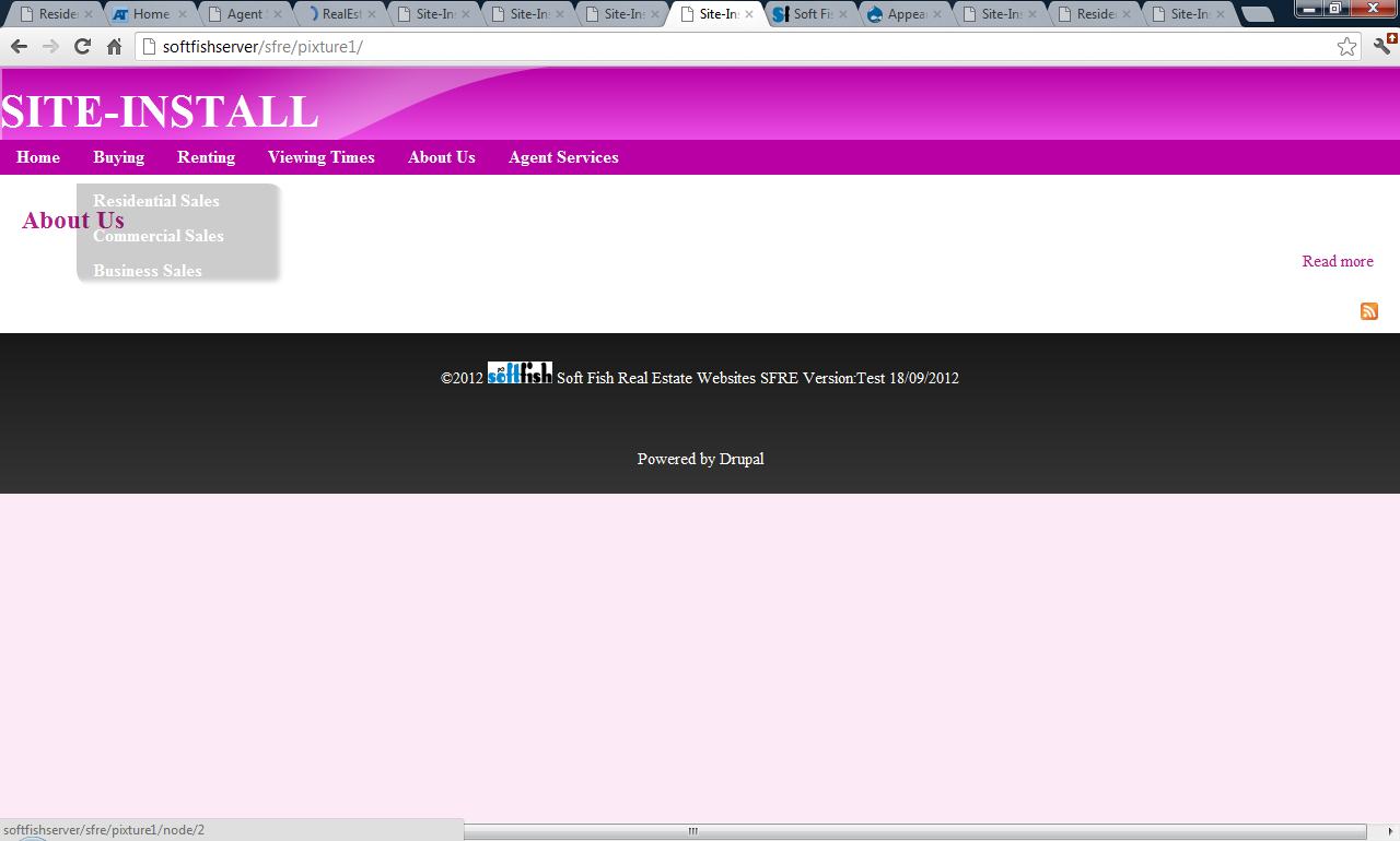
I have created a new site with Pixture Reloaded 7.x-3.0-rc1 and AT Core 7.x-3.1 and installed superfish menus. Previously I had used Pixture Reloaded 7.x-2.2 and AT Core 7.x-2.2. The drop down menus for these sites is quite different. Menus on the new site are translucent, soft edged, with rounded corners and coloured grey. The earlier version had solid menus with square corners and were coloured to matched the theme colours.
I have followed the installation instructions carefully and included screenshots.
Have I made an error with my installation?
Or is this different menu appearance intentional? If so is there any way to provide menu appearance similar to version 2.
| Comment | File | Size | Author |
|---|---|---|---|
| pixture7.x-3.0.jpg | 62.96 KB | Tokoh | |
| pixture7.x-2.2.jpg | 64.95 KB | Tokoh |


Comments
Comment #1
Jeff Burnz CreditAttribution: Jeff Burnz commentedThis is a bug in the documentation.
In 3.x AT subthemes you should use the "default" Superfish style, instead of the "none" style used in 2.x.
I will fix this shortly, it should read:
Comment #2
Tokoh CreditAttribution: Tokoh commentedHi Jeff,
That's hugely better.
Just a couple of minor things, firstly the drop down menus in the earlier version were very slightly separated from the root menus. This gap has become more marked with the newer version. Is this deliberate?
Finally the default logo seems to be missing from the latest version. This could be due to something I've done, but maybe not.