
 Support for Drupal 7 is ending on 5 January 2025—it’s time to migrate to Drupal 10! Learn about the many benefits of Drupal 10 and find migration tools in our resource center.
The tab panes struggle to contain their content when screen space becomes narrow.
I think in an ideal world we would conditionally load the vertical tabs css and javascript if the screen size is over a certain amount.
| Comment | File | Size | Author |
|---|---|---|---|
| #56 | Screen Shot 2012-10-13 at 12.45.57 AM.png | 47.32 KB | JohnAlbin |
| #56 | core-js-vtabs-mobile-1277352-56.patch | 1.03 KB | JohnAlbin |
| #55 | core-js-vtabs-mobile-1277352-55.patch | 509 bytes | nod_ |
| #51 | responsive-vertical-tabs-1277352-51.patch | 12.98 KB | quartsize |
| #46 | accordion.png | 35.34 KB | RobLoach |


Comments
Comment #1
Anonymous (not verified) CreditAttribution: Anonymous commentedThis sounds like an issue for the new mobile initiative to me.
Comment #2
drupalninja99 CreditAttribution: drupalninja99 commentedIt seems to me that vertical tabs maybe should auto-disable when the width is too small. It would be better I think to have the dropdown fieldsets you have without vertical tabs on mobile deveices.
Comment #3
kika CreditAttribution: kika commentedI propose to change vertical tabs into accordion when viewport is narrow. See the mockup below.
Also, there are similar patterns in the air in "Redesigning the Create Content page" discussion http://groups.drupal.org/node/214898, especially in the mockup http://groups.drupal.org/files/Sidebar-mockup-seven.png and http://groups.drupal.org/files/create-content-mobile.jpg but note that even after redesign create content page we have vertical tabs all over the admin interface so it needs a generic responsive solution.
Comment #4
kika CreditAttribution: kika commentedHijacking the title, sorry.
Comment #5
moshe weitzman CreditAttribution: moshe weitzman commentedAccordion looks quite sensible to me.
Comment #6
droplet CreditAttribution: droplet commentedEDIT:
Should we redesign it. or use exist collapse.js pattern ?(forgot it will show tabs summary)
Comment #7
headdragon CreditAttribution: headdragon commentedLooks good.
Comment #8
nod_just tagging to keep on my radar.
Comment #9
LewisNymanHeads up. Got a patch!
Simple conditional checking the width of the viewport. The patch looks massive because I've added code indentation but it's really just two lines for the if statement.
Comment #10
droplet CreditAttribution: droplet commentedDidn't test but I think it needs to be configurable. and resize handler ?
Comment #11
quartsize CreditAttribution: quartsize commentedHere's a very rough proof-of-concept of #3 in Stark. I would have preferred to have only one set of tab buttons, but I wasn't finding a way to make an accordion out of the non-interleaved setup, or vertical tabs out of the interleaved setup, so in addition to the li-tags, it adds h3-tags with the same contents between the fieldsets, and uses a media-query to display one set or the other.
Comment #12
dcmouyard CreditAttribution: dcmouyard commentedI agree with droplet that the patch in #9 this needs a resize handler. Making the width configurable would also be nice.
For #11, switching to an accordion view on small screens isn't necessary because the fieldsets can still be collapsible.
Comment #13
LewisNymanA resize handler? Do you guys really want to UI to dramatically change when the user resizes the window or changes orientation?
That sounds detrimental to UX rather than an positive addition.
Bear in mind this is a stopgap fix and once we are able to we won't even load the vertical tabs code unless needed.
Comment #14
aloyr CreditAttribution: aloyr commentedto add a bit to #13, do we really need configurable breakpoints for resizing? those are mostly driven by convention, no?
Comment #15
dcmouyard CreditAttribution: dcmouyard commentedThe reason I would like to use the resize handler is for accessibility. If somebody zooms a page enough, then the vertical tabs become very difficult to work with. Having it switch to collapsible fields is definitely preferred.
Having a configurable breakpoint would be nice because different designs use different breakpoints.
Comment #16
Bojhan CreditAttribution: Bojhan commented@dcmouyard I am not sure I am in agreement here, you are voicing for a very complex design both technically and UX - that is non-standard in core.. People do not want other interfaces, when you zoom - its a very common opinion from our accessibility team not to make special interfaces.
Comment #17
dcmouyard CreditAttribution: dcmouyard commentedWe definitely need to consider people with low-vision who zoom pages when dealing with UI patterns. Fortunately, it's usually an easy fix to cater to this group, especially using responsive design techniques.
Comment #18
Jeff Burnz CreditAttribution: Jeff Burnz commentedIt would be good if someone could explain exactly what would happen with this resize handler - give some examples of how this would be used in real life. It seems to me having a UI change on orientation change is a no go, not friendly and something to avoid. What about users with really big screens, lets say 27" and is zoomed right in, what happens then? What are we testing for here - window width or document width? What happens when the document width is wider than the window width (aka horizontal scroll/keyhole viewing)?
The problem with "vertical tabs zoomed right in" stems from setting the width of the tabs list in ems, so when zoomed it gets really wide, if this were in pixels, say using media queries, then it would by and large eliminate the issue, afaikt. Just thinking that it might make more sense to fix vertical tabs in some way, rather than changing the UI.
Comment #19
droplet CreditAttribution: droplet commentedJS side, technically is not complex. I think that more parts in CORE will be in the same way. width 640px and width 1200px are different styles. eg. Toolbar, Menu.
Vertical Tabs are the menu too.
Resize handler is equal to "@media (min-width: xxx)" in stylesheet. This is responsive design.
use case:
I opened a webpage at 800px but the design width is 1200px, then I do a resize to my browsers. I would like to see the standard vertical tabs.
and not all elements view at first glance. eg. vertical tabs at veryyyyy bottom of the page, "resize, different style,...etc XYZ" It do not affect any UX problem.
This is very common *responsive* web patterns.
Comment #20
LewisNyman#17
Do you mean setting the breakpoint in ems? That makes sense
Comment #21
nod_Perfect use-case that'll help me get rid of
Drupal.behaviors, thanks :)Comment #22
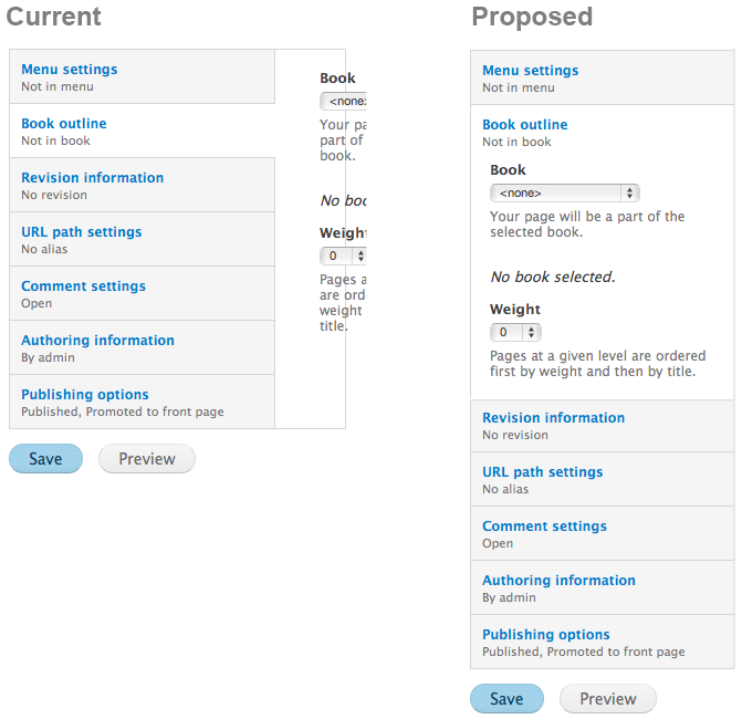
dcmouyard CreditAttribution: dcmouyard commentedLet's take a look at the node/add page to see this in action.
If vertical tabs is disabled, we just see collapsible fieldsets.
When it's enabled, we see vertical tabs.
Using the patch in #9, we see collapsible fieldsets unless the screen width is greater than 640px, at which point we see vertical tabs.
This patch, however, only checks the screen width when the page loads. If we change the screen width to 640px or less then we still see the vertical tabs and not the preferred collapsible fieldsets.
There are three main ways to change the screen width:
Manually re-size the browser window. Usually only people familiar with responsive design do this, so it's not a major concern.
Changing the orientation of certain devices. As Jeff Burnz mentioned, changing the UI on orientation change isn't good practice. If the UI becomes unusable on orientation change, however, then changing the UI is beneficial.
Changing the zoom level on non webkit browsers. This is the main use case for people with low vision.
So if you load the page then zoom in, we still see vertical tabs.
Ideally, we want a resize handler to trigger vertical tabs on or off at the specified breakpoint. So if we do zoom in enough, we'll see collapsible fieldsets.
Comment #23
Jeff Burnz CreditAttribution: Jeff Burnz commentedWhy do I want to see collapsible fieldsets just because I zoom in on the page?
How will we know content is not visible (off screen in some direction), and moreover, that this is not what the user wants?
dcmouyard - you said:
What breakpoint? How will we know what is the "right breakpoint". What will this magical number be and how is it arrived at?
Comment #24
dcmouyard CreditAttribution: dcmouyard commentedFor the same reason you want to see collapsible fieldsets instead of vertical tabs on a mobile device with a narrow screen. Read the initial issue summary.
Responsive themes adjust the layout to fit the screen. I'm pretty sure most users dislike horizontal scrolling.
That's why I would prefer to have the breakpoint be configurable instead of hard-coded. Whatever breakpoint we decide upon for small screens will also work for users that zoom.
Comment #25
Jeff Burnz CreditAttribution: Jeff Burnz commentedProviding a setting for a configurable breakpoint is not really a winning solution. First, discover-ability, where to put it, how to educate low skilled users to use it etc etc, its a can of worms. Lets not fall back on ye old "add another setting". I would much prefer to see us concentrate on making vertical tabs work rather than adding more UI cruft.
Remember, we only need to support 200% zoom for most users, we can't hope to support every edge case and should refrain from trying to do so. Also the main issue with VT is CSS, with of the tabs list set in ems, I know this is fixable with a little CSS in media queries.
And lets never fall back on collapsible fieldsets, the accordion pattern is nice, will leave that to our venerable UX team to deem worthy. Perhaps that (accordion) is a longer term type goal.
Comment #26
dcmouyard CreditAttribution: dcmouyard commentedThe fallback is simply not using vertical tabs. On the node/add page it's currently collapsible fieldsets, but in other cases it might be regular fieldsets.
Just setting the tabs list width in ems will not fix the issue. There might be a CSS fix using media queries, which @quartsize started working on in #11. If we're using JS to trigger vertical tabs, though, then we should to use a resize handler.
Here's some pseudo code for how a resize handler could work:
I think the main question now is whether we want to focus on a CSS media query solution to changing how vertical tabs work or use JS to turn on/off vertical tabs at some breakpoint. Using a JS-only solution would be easier to implement, but a CSS solution would probably have better performance.
Comment #27
droplet CreditAttribution: droplet commentedConfigurable is winning solution for both low skilled and adv users. Use Drupal.settings to trigger On/Off.
CSS side, no changes.
JS side, you have more options now = turn on / off for special case
Will D8 load separated media stylesheets for mobile devices?? D8 supports IE8, there is no matchMedia supports. Use the same fallback lib :)
==
only slightly performance impact on JS matching.
the exist lib we have vTab ON handler, so add a new vTab Off to it:
vTabs on = adding css classes and a UI tag for menu
vTabs off = remove vTabs css classes (show old collapsible fieldsets) and hide menu.
I bet @nod_ has more idea on configurable JS Lib in CORE. (the drupal way)
on mobile / tablet ?
Comment #28
LewisNymanWe don't need to use matchMedia to check the width of the viewport. Browsers have been able to check the width of elements for years. My original patch at #9 is checking the width of the root element. I don't see the benefit of using match media.
Comment #29
dcmouyard CreditAttribution: dcmouyard commented@lewisnyman - What I like about using
matchMediais that it's easy to add an event listener for when it changes. When adding an event listener foronresize. you need to set a time limit on how often you check it, otherwise browsers that continuously check it will overload and crash. I know we're only supporting IE8+, but we stilldon't want toshouldn't crash their browser.My psuedo code falls back on
documentElement.clientWidthfor browsers that don't supportmatchMedia.@droplet - Even on mobile/tablet devices. On webkit browsers page zooming doesn't trigger media queries because they want the keyhole effect, because it's easy to scroll on a touch device. I think they need to separate the traditional page zoom event from the touch pinch-zoom event. You want the former to trigger media queries, but not the latter.
Back to the main question though, should we focus on a CSS media query solution, or a JS-only solution?
Comment #30
dodorama CreditAttribution: dodorama commentedIs there any issue or discussion open on a global strategy on how to do responsive design in d8 (javascript or CSS) ?
Comment #31
nod_After thinking about it I'd go with the breakpoint.
matchMediawould be ideal but has poor browser support: http://caniuse.com/#feat=matchmedia and I don't know how well the polyfill works: https://github.com/paulirish/matchMedia.js/For discoverability, I say just put a
data-breakpointattribute on the wrapper element and make that a standard across core. If you need to change the value, we need a js wrapper that will fire an event to allow script to recalculate things with the new value. It's easy, it's clean and discoverable. How do you like this sideways solution?Comment #32
LewisNymanI don't see anybody asking whether we should use just JS or CSS but I think the answer here is it depends on what we are trying to adapt.
I don't see the benefit in a blanket "we are only going to only use JS or CSS" rule. Different tools are better for each situation.
It so happens for vertical tabs that disabling the vertical tabs JS gives you an accordion which is perfect for what we want on small screen devices. Hopefully in the future we won't load the file at all.
Comment #33
droplet CreditAttribution: droplet commentedDoes dcmouyard means use PURE CSS ? only use matchMedia polyfill (JS) to non-supported browsers.
I bring out a new issue, vTabs should be less JS depends: #1503072: Always show vertical tabs button(menu) links
and this one: #1502986: make vertical tab buttons support left/right/top/bottom placement
(if only 3 links, someone may like to show tab menu on the top instead other solutions)
Comment #34
dcmouyard CreditAttribution: dcmouyard commentedFor my CSS versus JS question, I was only referring to vertical tabs. As @lewisnyman mentioned, which method we use should be decided on a case-by-case basis.
Here are two approaches we can take to make vertical tabs work at small screen widths:
vertical-tabs.jsso that vertical tabs won't render below that breakpoint.#1 is easier to implement and would have better performance for mobile devices if we can use a script loader. I'll still argue for a resize handler if we go this route though… :-P
#2 is probably a better all-around solution, and we might be able to combine this solution with #1502986: make vertical tab buttons support left/right/top/bottom placement.
Comment #35
dodorama CreditAttribution: dodorama commentedI think it's worth looking at the discussion going on here about the create content screen cause it could make the vertical tabs pattern somehow obsolete. That would mean keeping collapsible fieldset or an accordion both for mobile and desktop.
Comment #36
yoroy CreditAttribution: yoroy commentedVertical tabs are used in other places in core as well, so not necessarily obsolete anytime soon.
Lets try and make some explicit decisions regarding breakpoints. Make them overridable, sure, but making them configurable (in the UI?) puts the burden on the user to make a decision. We should try and provide sensible defaults here.
It's hard to tell for me how much code complexity the resize handler would add vs. the gains we'd get from it. Again, I hope we'll get to a sensible and balanced resolution.
(I see many js-related issues that refer to some kind of script loader. #1033392: Script loader support in core (LABjs etc.) if you didn't know already :-)
Comment #37
mgiffordYou're probably going to use something like this:
patch -p0 < path/file.patch
But there are instructions here for how to do it from Git:
http://drupal.org/node/707484
Comment #38
quartsize CreditAttribution: quartsize commentedA reworking of #11 to use the
legends for the inner tabs instead ofh3s. Still very incomplete.Comment #39
yoroy CreditAttribution: yoroy commentedTriggering testbot
Comment #40
quartsize CreditAttribution: quartsize commentedHere's more, still only for Stark (for which I think the styles should be finalized before editing Seven and Bartik to match).
Does this look like a worthwhile approach?
Comment #41
RobLoach#40: responsive-vertical-tabs-1277352-40.patch queued for re-testing.
Comment #43
quartsize CreditAttribution: quartsize commentedFixed conflict with #1419968: Replace $('selector', domelement) with $(domelement).find('selector').
Comment #44
gmclelland CreditAttribution: gmclelland commentedHow about using this technique to detect the media query and respond accordingly?
http://www.springload.co.nz/love-the-web/responsive-javascript
https://github.com/JoshBarr/js-media-queries
I also started another issue for being able to detect the active media query #1621594: Media Query Detection
Comment #45
leenwebb CreditAttribution: leenwebb commentedIf vert tabs are transformed into accordions, please be sure to do screen reader testing and keyboard-only testing; some of the obvious solutions that work well with one of those technologies are problematic in the other.
(via Montreal Accessibility Sprint)
Comment #46
RobLoachOut of pure curiosity, I tried switching the vertical tabs completely with jQuery UI Accordion. Not sure how I feel about the result, although it is a lot less code.
Comment #47
nod_I'm really not in favor of putting jquery UI all over the place. This stuff will delay page load by at least 0.5s on mobile we need to chose performance or jQuery UI.
Comment #48
RobLoachAgreed! I wasn't really happy with it either.
Comment #49
LewisNymanThe latest patch doesn't apply.
Comment #51
quartsize CreditAttribution: quartsize commentedUpdated patch. Again, rough proof-of-concept, only styled for Stark.
Comment #52
quartsize CreditAttribution: quartsize commented"Needs review" for testbot.
Comment #53
moshe weitzman CreditAttribution: moshe weitzman commentedWould be good to post screenshot of latest patch, and update Issue Summary.
Comment #54
Bojhan CreditAttribution: Bojhan commented...
Comment #55
nod_Implemented solution outlined in #22. If screen is too small we don't execute vertical tabs and fall back to the default collapsed fieldsets. We're already using this pattern to kill the overlay on small screens. Once we know more about what we'll support for media queries and all we can improve the detection. Fow now it's a low-tech solution that works and works fast.
#51 is pretty nice in stark but it's pretty complicated for a result very much similar to what not using vtabs is like. What I'm asking is how much benefit we get from making a sort of responsive vertical tab when a 3 line patch can take care of the issue? Not trying to undermine the current patch, just wondering if a more simple and direct solution could work.
For screens of what it looks like, refer to #1277352-22: Responsive vertical tabs.
Comment #56
JohnAlbinI really like the idea of vertical tabs converting to accordions on small screens… scratch that.I really like the idea of accordions converting to vertical tabs on larger screens.
How about we commit the patch in #55 (which I just tested and seems to work fine) and then look into if its feasible for accordions to convert to vertical tabs. (I agree with earlier assessments that using jQuery UI for that is a no-go for mobile devices.)
Semantically, these things are fieldsets. So my first thought of writing them as details/summary HTML5 elements doesn’t make sense. (There's also accessibility problems with those elements. See http://html5doctor.com/the-details-and-summary-elements/ )
Actually, the only real difference I see between a list of collapsible fieldsets and a list of details/summary elements is the margin between the fieldsets. Hmm…
What if we removed the margin between collapsible fieldsets in the Seven theme? By adding this CSS after line 546 in core/themes/seven/styles.css:
Huh. Actually, this is starting to look a lot like kika’s “original proposal” design in comment #3.
I've updated Nod's patch to add some CSS to get it closer to that design. Am I crazy to think we can just use our normal collapsible fieldset JS with some CSS to make it look and act like an accordion?
Comment #57
Bojhan CreditAttribution: Bojhan commentedWhat is the height of these rows in pixels? As I am concerned about the size of hit targets, other than that this seems fine - I am wondering if it has any side effects though or only really occur on your mobile phone.
Comment #58
quartsize CreditAttribution: quartsize commentedIf I remember correctly (it's been awhile), the reason my patch has been so complicated is that I wanted the interface to be able to potentially take advantage of the space afforded by an orientation-change (and switch back, if the space goes away). Correct if wrong, but it looks like nod_'s patch achieves its simplicity by not doing that. Maybe the orientation-change support isn't worthwhile, but I figured I'd at least explain my monster.
Comment #59
JohnAlbin@quartsize: Hey, thanks for all your work! I thought until yesterday that we needed a monster to get this working. :-)
Comment #60
quartsize CreditAttribution: quartsize commentedSo I've thought/recalled more. I suspect some sort of monster is necessary if one wants the orientation-change thing. The five line solution in
attach()completely disables vertical tabs until another page load, so you'll just have wider collapsible fieldsets when you change orientation. And I'm not sure they should be styled like vertical tabs, because they don't have the one-tab-at-time nature of tabsets and accordions.So suppose you trap the orientation change / window resize event, and run vertical-tabs if there's enough space. You'd need code to reverse the effect if the dimensions change again, hiding the markup vertical-tabs.js must generate to make the document flow correctly, synchronizing the summaries, and uncollapsing the fieldset of the open tab while collapsing the others. I think that's the monster right there, the difference being that #51 tries to keep everything in sync before dimensions change, so it can be handled faster in CSS. The complexity isn't really in doing one or the other (accordion or vertical-tabs); it's in being able to switch between them without reloading the page.
And actually, I've been talking about orientation changes / window resizes that increase width. What happens with #56 if width decreases through the breakpoint?
So I think it boils down to: how do we want to handle dimension-changes (if at all -- I'm reading nod_ as saying it didn't bother the folks working on the overlay)?
Comment #61
nod_The main issue here is to have a working patch with the basic behavior in before feature freeze. Then it's just a matter of improving the already-in feature up until April.
The overlay thing isn't a great solution but the fact is that is unbreaks navigation on mobile (overlay just doesn't work on mobile). The orientation change and all should be taken care of globally, not just for this or the overlay. So until we get a proper and good enough way of doing that, we should keep it simple and make sure the experience is decent on mobile :)
Comment #62
quartsize CreditAttribution: quartsize commented"We don't have the time right now for such a solution, so just rely on page-refreshing" is certainly a possible answer for how to handle dimension-changes. If that's the route we're going, I'd favor #55 without the CSS changes, for my aforementioned reason (unless we're going to make the behavior analogous, but then we're complicating things again).
Comment #63
nod_+1 about the comments on styling and behaving as an accordion in #60
@quartsize, I personally don't have time for it but if you'd like to come up with a more generic way on how to handle that in a new issue, please do :) I'd be happy to help you with what I can.
Comment #65
Bojhan CreditAttribution: Bojhan commentedI am going to RTBC #55 , although we could go for better styling as sugessted in #56 - that has several issues and optimization (e.g. increasing the click area) that could we do post freeze. Let's first get this bug out of the way.
Comment #66
webchickOk, looks nod_, JohnAlbin, quartsize, and Bojhan are on agreement about the principles of #55, so committed and pushed #55 to 8.x.
But now I'm a little confused about what to do with this issue. it doesn't feel like it's really "fixed." At minimum, I think we need a follow-up for that "generic portrait to landscape orientation handling" behaviour. Looks like we also might want to make another issue (as a "normal task") to discuss further style changes that's not already at 60+ replies?
Marking postponed (needs more info) as a result. :)
Comment #67
nod_#1812298: Handle mobile orientation change for JS widgets ?
Comment #69
zmove CreditAttribution: zmove commentedIs there any 7.x backport of this planned ?
Comment #70
nod_Nope.
Comment #71
magnetive CreditAttribution: magnetive commentedThis not a Accordion Solution but for me, it's OK.
I made it only with CSS:
Comment #72
deanflory CreditAttribution: deanflory commented+1 for a D7 backport or contrib module. Please! Pretty please!
EDIT: Trying this sandbox now for D7:
https://drupal.org/sandbox/tkoleary/2236189
Comment #73
anil_89 CreditAttribution: anil_89 commentedI have used this css working fine for responsive tab. thank you for support.....
Comment #74
rcodina CreditAttribution: rcodina commentedI know this is not exactly a backport but if anyone is interested in having responsive vertical tabs on drupal 7 just check out Vertical Tabs Responsive module:
https://www.drupal.org/project/vertical_tabs_responsive
Comment #75
quicksketchAs an alternative to a generic solution (which looks like it's been postponed to 9.x in #1812298: Handle mobile orientation change for JS widgets), over in Backdrop-land @wesruv figured out how to accomplish this with no significantly different JS and just a media query: https://github.com/backdrop/backdrop-issues/issues/515. It does require restructuring the markup a bit however. But overall, it's a great solution that is truly responsive and is simple in its implementation.
I'm going to move this back to "active" if we wanted to pursue further improvement in D8.
Comment #76
wesruv CreditAttribution: wesruv at Lullabot commentedI wouldn't say 'necessary', so much as 'preferable'. I only added classes to HTML for nicer styles. Didn't end up changing markup.
Mobile is an accordion pattern with the legend as a toggle. This means the legend also gets a summary (so there are two summaries to update).
The desktop styles are more or less the same as 7 core, but with the added bonus of having max width on inputs actually apply in WebKit, Blink and Firefox.
Fieldsets and tables don't behave well with children that have max width... Because stupid reasons that are in the W3C spec :(
Documented all that in the Backdrop commit and accompanying video demo.
Comment #77
wesruv CreditAttribution: wesruv at Lullabot commentedMy solution probably needs to be postponed to 8.1.x per this: https://www.drupal.org/core/d8-allowed-changes#evaluate
But I'm going to try to make a patch this weekend, see if I can get it to work. I will postpone this after the patch goes in, because apparently the the tests I want to run for this patch should be on 8.0.x... or something.
Comment #84
jibran@quicksketch and @wesruv please open up a follow-up issue with the correct version.
Comment #86
deanflory CreditAttribution: deanflory as a volunteer commentedAny chance of a D7 version?
Comment #87
nod_Not in core, and even then, it's not a real responsive solution.
Comment #88
edurenye CreditAttribution: edurenye at Digitalist commentedWe should make that configurable, say you change the style of the tabs to have the text vertically and the tabs with less width, then you might not have this problem, but then in mobile with that fix everything is broken.
Comment #89
edurenye CreditAttribution: edurenye as a volunteer commentedI created this issue #2971840: Make responsiveness for vertical tabs configurable to fix the problem stated in the previous comment.
Comment #90
andrewmacpherson CreditAttribution: andrewmacpherson as a volunteer commentedcleaning up the a11y maintainer queue