
 Support for Drupal 7 is ending on 5 January 2025—it’s time to migrate to Drupal 10! Learn about the many benefits of Drupal 10 and find migration tools in our resource center.
Working with Omega
- Install and enable the Omega Core Theme
- Install and enable the Omega Tools module (admin/modules/). If you don’t already have it, you’ll also need the Ctools module installed and enabled. If you're a Drush user, you can skip the rest of these steps and quickly generate a subtheme of Omega using Drush.
- Go to admin/appearance, and click on "Create new Omega Subtheme"
- Add your preferred subtheme name.
- Check the “Install automatically” option if you want to create your subtheme in/sites/all/themes/ automatically, Apache needs write permissions to perform this operation. If the option is not checked, Omega Tools will generate a mysubthemename.tar file that can be downloaded after completing the steps. To install, simply unzip and place your subtheme folder into sites/all/themes.
- Choose your subtheme save destination, the default folder is sites/all/themes.
- Choose your base theme.
- Omega: Gives you two starterkit options, Omega-html5 and Omega-xhtml. HTML5 is a better choice in terms of long-term compatibility with the modern web’s changing browser standards. Choose Omega-xhtml starterkit if you have any particular xhtml requirements.
- Click Save and Continue, and fill the description and version of your theme. At this point you can click the Finish button, as the other options are still in development.
Let's Customize!
Grid Settings
Right off the bat, Omega comes with some pretty good default settings as you might expect. The responsive grid is enabled, and its built on the 960 grid system. You can however, switch to a totally fluid theme if you choose. If you're serious about being totally "out-of-the-box," you can still create a custom grid for Omega if you are really determined.
You can also play with the scale of the page. There is the option to disable scaling by the user, but I personally find it frustrating when the webpage has decided that I do not need to see something closer, or zoom in on an image. It's my device, let me zoom!
Media query settings can also be tweaked from this interface. If you find that for some reason it's not snapping to the tablet size for smaller tablets or some other reason, you can tweak the numbers. Be careful though, there are min and max device widths and various orientation settings. My advice is to make a quick copy of the default media query specs in case something goes awry. If that ship has already sailed, don't fret, I've got your back—Omega default media queries. *Note, there's also a big "revert theme settings" button at the bottom of the theme settings page, but that may not be helpful if you have dozens of other settings you don't want to lose.
Zone and Region Configuration

I won't delve into the details of Omega zones, as the Omega documentation already covers that. Instead, I'll walk you through the basics of adding a new zone to your theme.
Per the Drupal usual, define your new regions in the theme .info file first. This is found in your Drupal installation, sites/all/themes/theme_name folder. For example, here I've added a new region called "Footer Third" to my .info file. Then, clear your site cache (don't skip this)!
Next, instead of adding your new regions (or zones) in the page.tpl.php file, open up your theme settings, and click on the zone and region configuration tab on the left. You should see a list at the bottom of unassigned zones and/or regions.
When you choose a region, you can specify which zone you'd like to place it in. If it's a zone, you can specify what section to place it in. You can also choose weight and column count in this interface. In this example, I've specified the "Footer Third" region to be output in the Footer Zone. I've given it a weight of 3, so that it will follow the Footer First & Footer Second regions. I also updated all the footer regions to be 4 columns wide, so they will fit side by side in the normal or wide layout.
Don't forget to test out your site on different screen sizes after adding your new region to see how it reacts, and add CSS to adjust accordingly.

By default the region with the heaviest weight within its respective zone will drop below the other regions, the same way that blocks do. For example:
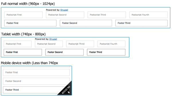
For those of you that are visual learners, I created a Photoshop file that demonstrates the Omega Theme sections, zones, and regions as laid out on a 960 grid. The Omega documentation provides a visual guide on how the regions stack up in the mobile view.
Debugging
This is where you can turn off all those handy debugging blocks that are floating all over your site, and the "resize me" image. I thought it was especially thoughtful of the Omega creators to simply allow you to turn off the grid overlay and debug blocks by default so they aren't always pestering you, but are only a click away with the little checkboxes on the right side of your screen—should you need them.
Toggle Libraries
Formalize - This library helps you to make consistent form styles across all browsers. How handy!
Media Queries - The magic sauce behind the Omega Theme. Why might one disable this? I have no idea.
Equal Heights - Enable this goodie if you'd like blocks within the same region to automagically become the same height. Great solution for those chunky footers everyone loves! Enable this option, save the settings, then go back into the configuration settings for a particular zone. Now you can force all the child elements of that zone to be equal heights, or you can set it per region.
Toggle Styles
The Omega creators are demonstrating their abundant thoughtfulness here. You can simply disable the included Omega stylesheets that you find are getting in your way while theming. Oh yes, and you can also disable stylesheets from contributed modules!!! For anyone who's ever worked with nice menus, or any other module that comes with it's own set of CSS wrapped up in the module, you can appreciate this touch as the icing on the cake, nay, the cherry on top. You can nuke these styles instead of having to override them! Morten would be proud.
Important note: when you need to add an additional CSS file for some reason, like if you want to put all your imported fonts in their own CSS file, or use LESS CSS instead, this is where you enable them. Read on to find out how to add custom CSS or LESS files.
Toggle Advanced Elements
Turn off unwanted elements like breadcrumbs, feed icons, or tabs. Or, quickly hide page titles, the site name or slogan (but keep them available for screen readers). Sure it's a simple "display:none" but it's one more thing you don't have to add to your stylesheets.
I'm not sure why this list of elements is separate from the other list that includes logo, main menu, secondary menu, user pictures, etc.. Perhaps they were tucked away so as not to clutter the UI with items you may not need to toggle as often.
Export Theme Settings
After all that hard work, it's a satisfying feeling to know you can export all those settings and place them directly into your theme.info file for safe-keeping. Just copy, paste, and of course commit your .info file into whatever revisioning system you are using to backup your work.
What About Internet Explorer?
Ah, our old friend. Just how well does IE interact with Omega? As you might expect, IE7 and IE8 do not interpret media queries properly, meaning that if you scale your browser window, it will still render the normal layout as if it were any other theme. Which I think is an elegant degredation, and not too big of a concern. After all, in real life we are not as thoroughly concerned about IE7 & IE8 desktop users with tiny browser windows. I'm not sure what kind of testing has been done on the Omega Theme on various mobile devices, but based on StatCounter, Opera mini is the largest mobile browser, followed by Android, and iPhone; all of which support media queries.
LESS Integration
If you work with CSS regularly and don't already know about the kind of joy that LESS will bring into your life, you should definitely check it out. For those of you already using it and loving it, just install the LESS module and then in your custom-html5.info file add your LESS CSS files like you would normally add stylesheets:
css[yourtheme.css.less][name] = My Project styles
css[yourtheme.css.less][description] = LESS CSS stylesheet for My Project.
css[yourtheme.css.less][options][weight] = 10
The LESS module will detect the LESS files (those with a .less file extension) and process them so that they are output as standard CSS. Since the majority of your theming work is done in the global.css file, you may find it's only necessary to create a global.css.less file (and not separate LESS files for the narrow, normal, and wide CSS files). I thought this was a happy compromise so I didn't have a bucket of files to wade through.
As a final and important step, go into your theme settings page and enable your new stylesheet in the "Toggle Styles" tab.
Omega Cake for Everyone!

If you're like me, you're extremely grateful for all the time and effort that was put into this marvelous theme. A big thank you to the developers & maintainers Jake Strawn, Development Geeks and Sebastian Siemssen. You guys deserve some serious cake. Advancing the web forward using HTML5 and responsive design is hugely important, and the Omega theme has a lot of greatness to offer. For more information, check out the Omega documentation pages, and join the Omega Framework group on Drupal.org.
And, when you're ready for even more awesomeness, be sure to check out the Delta module which allows you to make duplicates of your theme settings for any context on your site. Yep, it's amazing too.


Comments
Excellent write-up
Thanks so much for taking the time to summarize this all!
I agree this guide is full of
I agree this guide is full of good information. However it does not belong in this handbook. This handbook is the result of a consensus-driven effort by the Omega documentation team. Please understand that we have had several discussions regarding the format and structure of this handbook. This page now breaks the page-flow pattern we intended for the reader. The information presented in this blog post however good is a blog post
http://www.mediacurrent.com/blog/inside-look-omega-themeand does not belong in the handbook. We will gladly link to your blog post in the "external resources" section. But we must ask that this page be removed as it breaks the logical flow of the handbook which was painstakingly determined through consensus by the Omega documentation team.I understand your point
@banghouse, I can see your point with a lot of work having gone into the structure of this documentation. I respect that. I've actually read every single page of this guide carefully and came to this page as the last one, and I have to say the information on this particular page was the most helpful for me personally and contains some nice nuggets for adopting Omega into my workflow. Especially the part about being able to save settings in code (for revisioning). This was a big question on my mind: How to get a good workflow of dev->staging->production. My opinion would thus be, that I hope you can find a good way of keeping this page, inside or outside the structure of the documentation, and also to suggest that you could perhaps dedicate a special section of the documentation to the topic of saving/comiting Omega settings in code (analogue to Features). Peace...
---
IE stylesheets clarification
Just a clarification about legacy IE's using the NORMAL stylesheet: This document says that IE gets the "NORMAL" stylesheet. So you might expect that to include GLOBAL + DEFAULT + NARROW + NORMAL, as per usual Omega CSS layers. However, in some limited testing I did with IE8 in XP using a simple Omega subtheme generated by Omega tools, was that IE8 behaves as if it gets all of those stylesheets *except* NARROW. That is, it gets GLOBAL + DEFAULT + NORMAL.
Also note that legacy IE has a maximum number of stylesheets it can load, so you may need to aggregate your CSS files (in admin/config/development/performance). If you have aggregation on, you'll need to clear cache to see CSS changes.
www.indytech.ie
A Pint of Drupal
Is this a one page site?
Is it just me or how do you add content? I set up the theme and tried to add a page so the regions can have some thing linked and every page is using the theme. I thought it would be like other themes and have a custom front page and other simpler pages that actually contain the content that the front page pulls from. Can any one explain or is there a manual that explains how to use the theme not just set it up? Like how come the add content only has comments and newsletters?
Wish i found this earlier back in the days
was reading this older post and reminds me when Omega first came out, was super excited to use it and had my own problems, wish i have found this article back then would have helped me then, either-way Omega still rocks and with Bootstrap its a beauty what you can craft with Drupal or WordPress that is for sure, how ever nice article about Omega Starter kit for Drupal.