
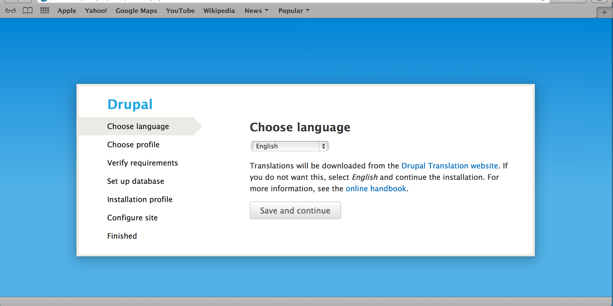
@tkoleary posted a whole set of mockups in #1260716: Improve language onboarding user experience that use a derviative of the Drupal wordmark (and Druplicon), discussed at #605710: Decide on if and if so, how to implement the Drupal wordmark in core. It also introduces a distinct theme for the installer that is not as basic as Seven. I'm merely re-posting it here to help focus the discussion there. I'd consider this should be in either the ballpark of the Design Initiative or if that only covers the runtime looks, then independent effort. Or abandoned. (I personally don't have resources to work on this).
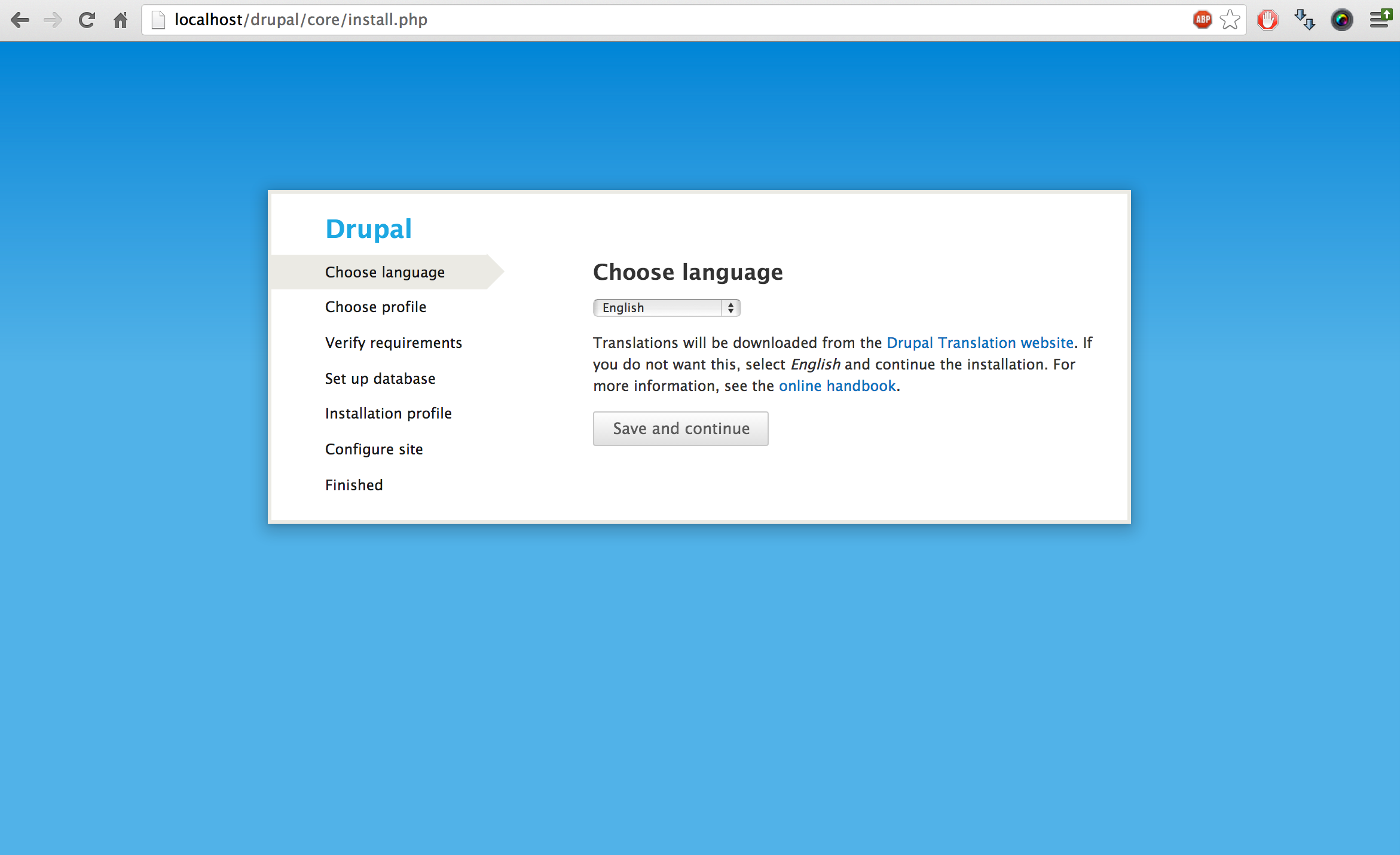
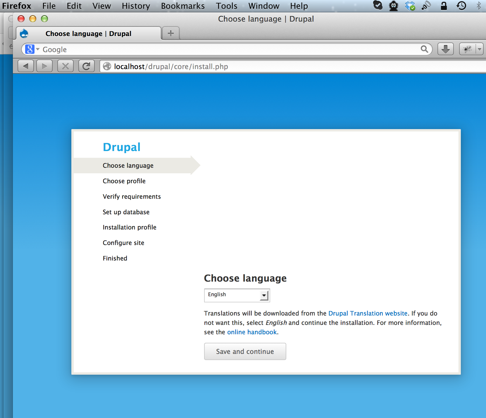
Current before screenshots (from #134)


Current proposed changes:
From #137

From #134 (more there)
Background:
The whole set of mockups can be found at:
http://drupal.org/files/01_detected_language.jpg
http://drupal.org/files/02_Language_ltr.jpg
http://drupal.org/files/03_Language_rtl.jpg
http://drupal.org/files/04_s04.jpg
(orig proposed) http://drupal.org/files/Drupal8Wordmark_0.png
Related
- #605710: Decide on if and if so, how to implement the Drupal wordmark in core
- #1591538: Clearly identify to the user what is happening during the install process
- #1260716: Improve language onboarding user experience
- #1351352: Distribution installation profiles are no longer able to override the early installer screens
- #1337628: Enhance language select form with textbox and other tools
- #1887800: Add mobile friendly meta tags to the maintenance page (See #149, some out of scope code moved there)
Follow-ups
| Comment | File | Size | Author |
|---|---|---|---|
| #178 | Installing_Drupal___Drupal.png | 220.91 KB | Gábor Hojtsy |
| #172 | installer-branding-1337554-172.patch | 20.36 KB | LewisNyman |
| #172 | interdiff.txt | 4.39 KB | LewisNyman |
| #167 | 1337554-163.patch | 20.13 KB | nilnullvoid |
| #167 | interdiff-161-163.txt | 978 bytes | nilnullvoid |


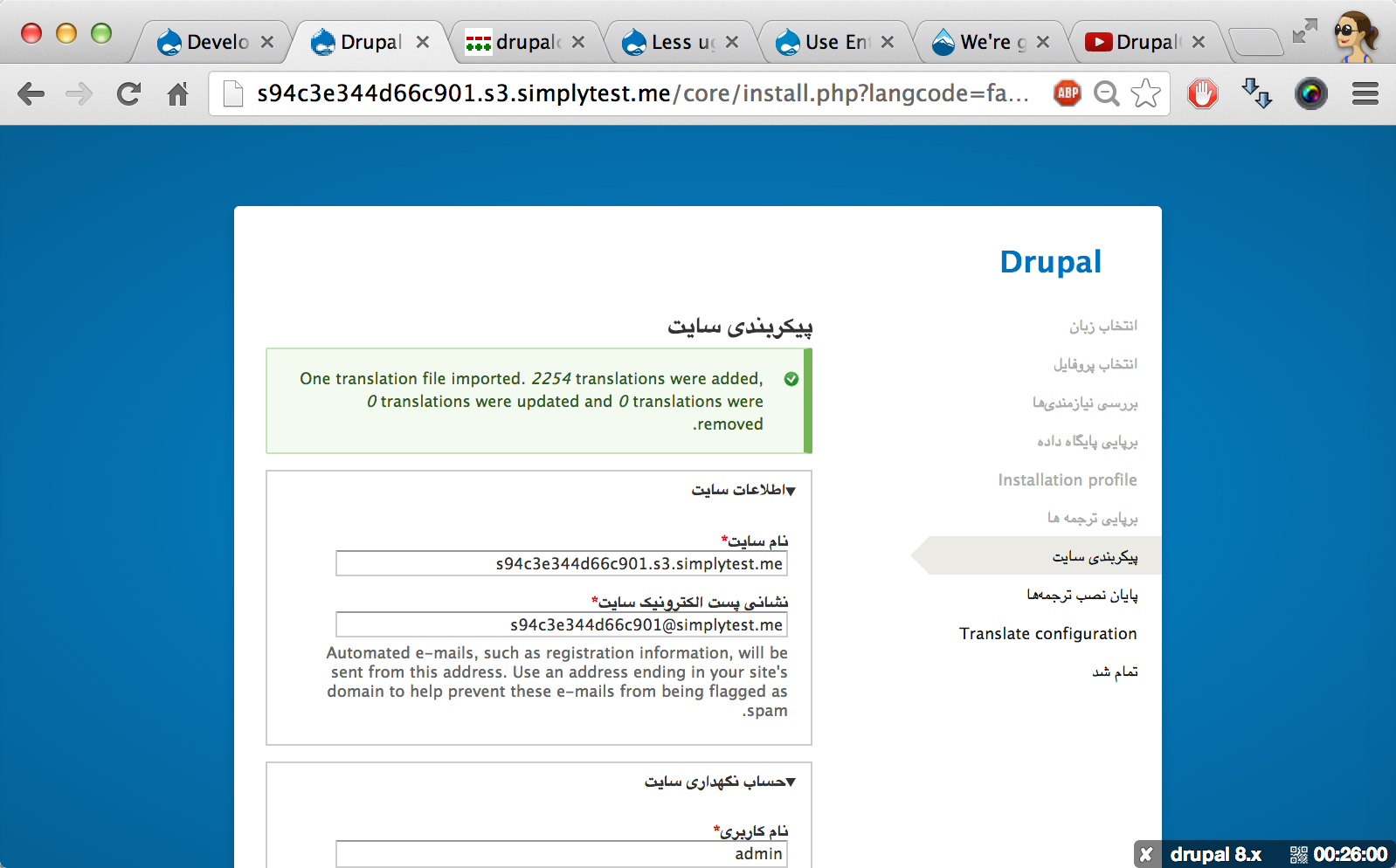
Comments
Comment #1
Gábor HojtsyComment #2
moshe weitzman CreditAttribution: moshe weitzman commentedLove it.
Comment #3
valthebaldImpressive!
Comment #4
Bojhan CreditAttribution: Bojhan commentedI have mixed feelings about it, I definitly love that it has more visual impact. But it does not really connect with other parts of our branding. We have decreased the visual impact of the installer on purpose, because it potentially is shown on every product from OpenAtrium, Drupal Commons to Drupal core.
I would love to know thinking behind this, before we proceed thinking about it more.
Comment #5
cossovich CreditAttribution: cossovich commentedThis looks awesome. I think the only important connection with the branding is the logotype and that remains intact... although I would question the 8 using the outline of the drop, I think that's stretching the style-guide somewhat.
Comment #6
webchickI think as long as the default branding remains overridable by installation profiles, this would be a really cool thing to do to make Drupal looks much more snazzy as first impressions. :)
I can't really evaluate the design itself, since all of my designs are blue boxes. ;) But tagging with the Design Initiative tag.
Comment #7
David_Rothstein CreditAttribution: David_Rothstein commentedThe default branding is currently not overridable by installation profiles, though. (And I'm not sure it ever can be, unless we want the theme to suddenly switch partway through the installer, after the profile is selected?)
So this is mainly something that would have to be overridden at the "distribution" level. It would be useful to add the concept of distribution-level overrides for a number of reasons, but we currently don't have it. Right now I think the only way a distribution can alter the installer theme is by setting the 'maintenance_theme' variable in settings.php, but most don't/shouldn't ship with that file. And even then, you can only specify the theme name (not its location in the filesystem) which means that you unfortunately can't use a theme that ships with the profile because it won't be found and used until a couple screens into the installer (once the profile is actually selected).
I think these are solvable problems, but it would take some work.
Comment #8
webchickWell, I was thinking of something as simple/janky as file_exists('custom_installer.css') or something. Which wouldn't ship with Drupal, but could be included in a distro.
Comment #9
Gábor Hojtsy@David_Rothstein, @webchick: well, David built tricks for #1260716: Improve language onboarding user experience which let profiles act on the installer before they are selected, so this concept can basically be extended (IMHO migrated) to real distro level settings, like defaulting to a profile instead of showing the profile screen and using a separate installer theme. Those distros who do care about their branding so much could override this then.
Comment #10
Gábor Hojtsy#1351352: Distribution installation profiles are no longer able to override the early installer screens is the issue for distro level settings, such as distro installer themes.
Comment #11
adnasa CreditAttribution: adnasa commentedbeautiful!
Comment #12
sphism CreditAttribution: sphism commentedOk, well there's some things i like, and some things i don't love so much.
I like the idea that someone completely new to drupal has an improved first impression from a new installer theme.
If you changed the installation to a different profile then it would be slick if the background branding faded to that of the profile.
As a graphic I like the mockup, one thing i don't love is that it seems like a pretty big non-repeating image which seems a little excessive.
I'm not sure why we would repeat the drupal branding twice so close to each other ??
It seems like too much space is graphic rather than usable, eg the database settings form will be all scrunched up, and there's nowhere that actual tells a new user what to do - What's an install Profile for example?
It would be nice to see some little ? help icons, eg what's the difference between minimal and standard ???
I see a lot of people wanting to ditch the druplicon from the branding, using the droplet shape for the 8 is a nice idea but it doesn't make for the most attractive figure 8.
The thing about the druplicon is that it's iconic, and memorable - there are probably huge discussions about this elsewhere but personally I'd like to see the icon updated and used in a slicker way, eg more Apple Lion, less Win 3.1
I think the main issue with having a strong brand on the install page is that drupal is a massively flexible system, it would be extremely difficult to sum that up in one graphic.
I was a bit surprised to see the drupal 7 install / update theme, seemed like a bit of a step backwards from d6.
Not sure what the solution is, but i'm happy to help if anyone wants any mockups.
Comment #13
chrisjlee CreditAttribution: chrisjlee commentedThis still going to happen? The mockups look great.
Comment #14
Gábor HojtsyDoes not seem likely, no :/
Comment #15
cweagansSo this then?
Comment #16
LewisNymanNot so fast!
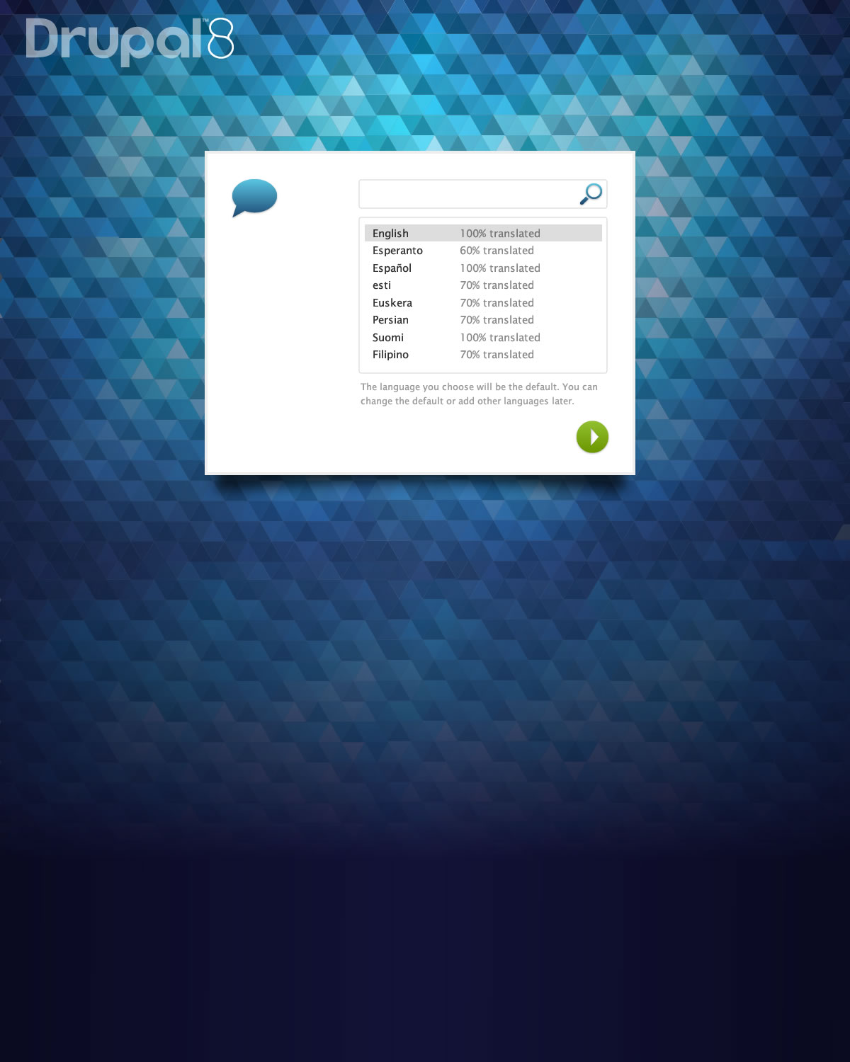
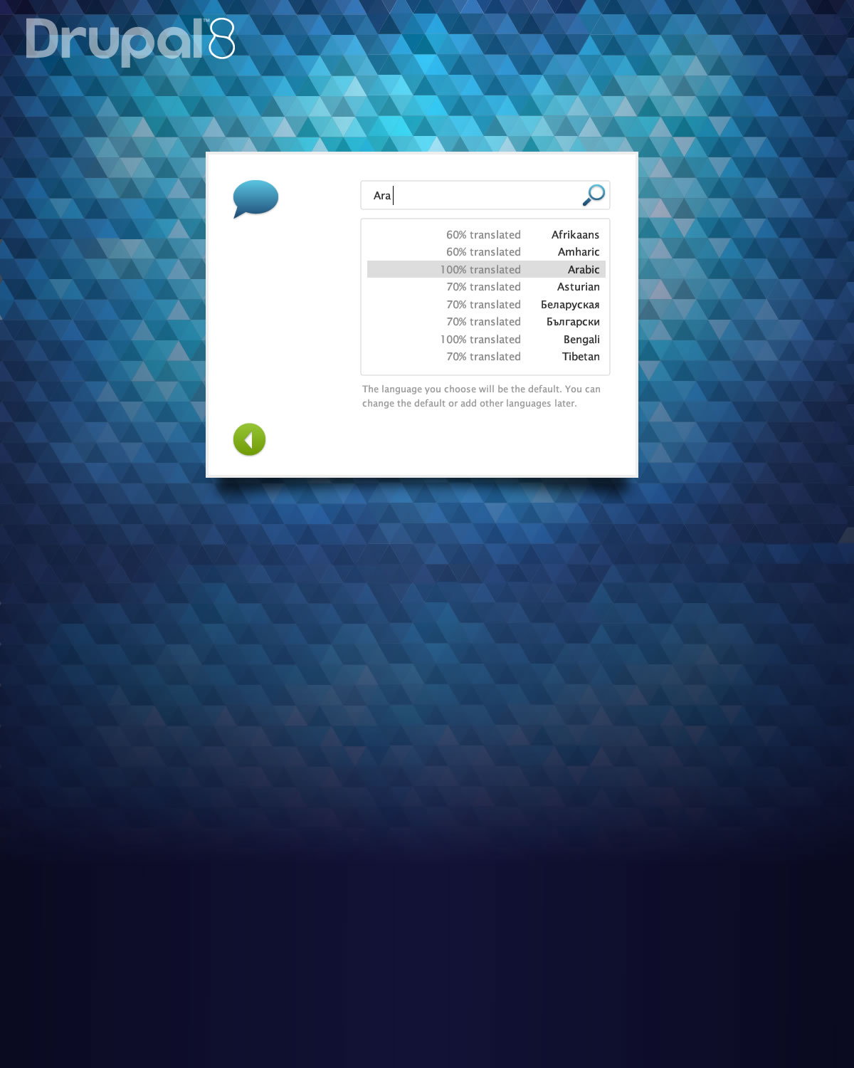
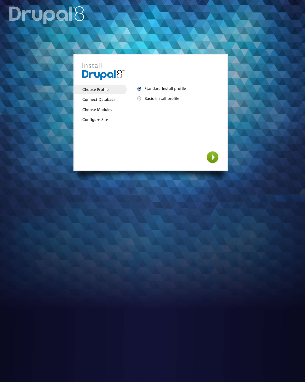
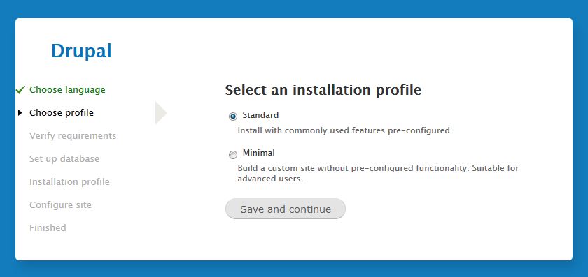
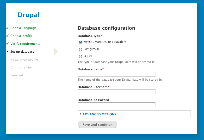
I had a bit of a play around with the screens provided, I tweaked the colors based on the new style guide proposal and went for a less distinctive background for now.
This is obviously a bit of a hack, I'm pretty sure I broke some stuff whilst trying to separate out theme_install_page. I need the actually psd to get any of the images at the right scale.
Comment #17
YesCT CreditAttribution: YesCT commentedFor the curious:
Comment #18
Wim LeersThere the proportions look kind of weird because of the shitton of info we we ask for — it looks even better on the very first screen:
Comment #19
tim.plunkettThere needs to be space around the Drupal wordmark equivalent to a full lowercase "a", see http://drupal.org/drupal-media-kit#usage-guidelines
This is not really something we can change.
I'd recommend dropping the "8" (no reason to date ourselves) and putting some space in there.
Also we'd have to solve the problem that this cannot be checked into version control or it would be GPL, but @LewisNyman says he has an idea for that.
Comment #20
Gábor HojtsyWow, that looks classy :)
Comment #21
tkoleary CreditAttribution: tkoleary commentedVery nice.
Comment #22
Bojhan CreditAttribution: Bojhan commentedI like that this is being pushed, I dont think this is D9 material. The background is far less expresive, which I think is in line with Drupal's branding and as webchick mentioned the installer can be overriden. See for example Drupal Commerce Kickstart, we did pretty much what is proposed here.
My initial review;
1.The surface area is a little small, this should be a lot bigger, currently "configure site" looks quite ugly, in such a small column.
2. The save button is quite small, we should adjust the style guide - because this won't even pass our mobile size standards.
3. The logo is awesome, but I would really recommend removing it from this discussion. We can get away, with really nice styling of the word "Drupal".
4. The background is a bit heavy, especially towards the top - lets tone this down a little.
5. I love the steps, I imagine that they can actually be styled as Kevin proposed. the > looks quite nice.
Comment #23
cweagansFor the record, the way that commerce kickstart did the installer theme override was hacktastic: http://drupalcode.org/project/commerce_kickstart.git/blobdiff/9a8bf95624...
This is sort of necessary because of how the installer works, but it might be worthwhile to add a hook for altering the installer theme if we haven't already.
I'd also love to table the discussion about whether or not to use the wordmark in core. That seems to be a whole different can of worms, and I'd hate for this beautiful installer theme to be held up over licensing discussions. We can have these discussions in parallel, and if we find some good way to include the wordmark, then we can drop it in later.
Comment #24
Gábor Hojtsy@cweagans: #1351352: Distribution installation profiles are no longer able to override the early installer screens could very well help with making the installer theme-able without hacks. It would allow pre-language/profile selection settings to take effect in Drupal.
Comment #25
tkoleary CreditAttribution: tkoleary commentedCSS3 gradient on background instead of image?
So:
body.install-page {
background-color: rgb(86, 179, 230);
background-image:-moz-linear-gradient(50% 0% -90deg,rgb(0,116,182) 0%,rgba(6,117,201,0) 100%);
background-image:-webkit-gradient(linear,50% 0%,50% 100%,color-stop(0, rgb(0,116,182)),color-stop(1, rgba(6,117,201,0)));
background-image:-webkit-linear-gradient(-90deg,rgb(0,116,182) 0%,rgba(6,117,201,0) 100%);
background-image:linear-gradient(-90deg,rgb(0,116,182) 0%,rgba(6,117,201,0) 100%);
padding-top: 10%;
}
Comment #26
David_Rothstein CreditAttribution: David_Rothstein commentedDefinitely agree. Especially since the parallel discussion already exists (linked to in the issue summary)... #605710: Decide on if and if so, how to implement the Drupal wordmark in core
Comment #27
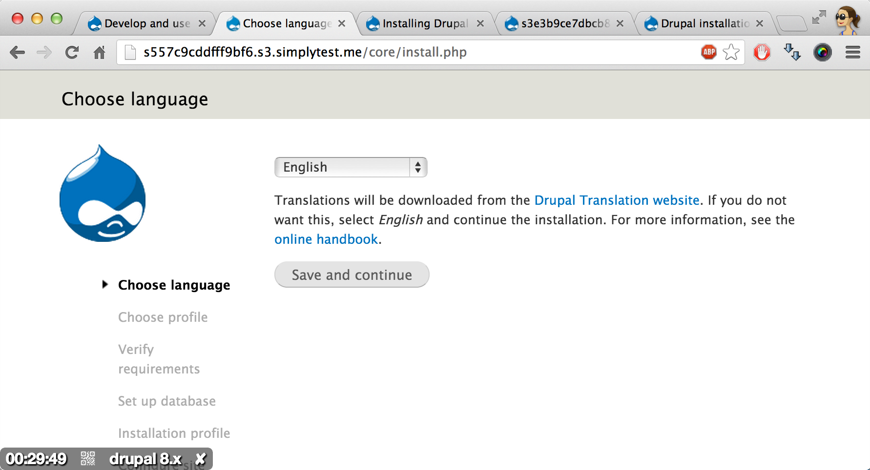
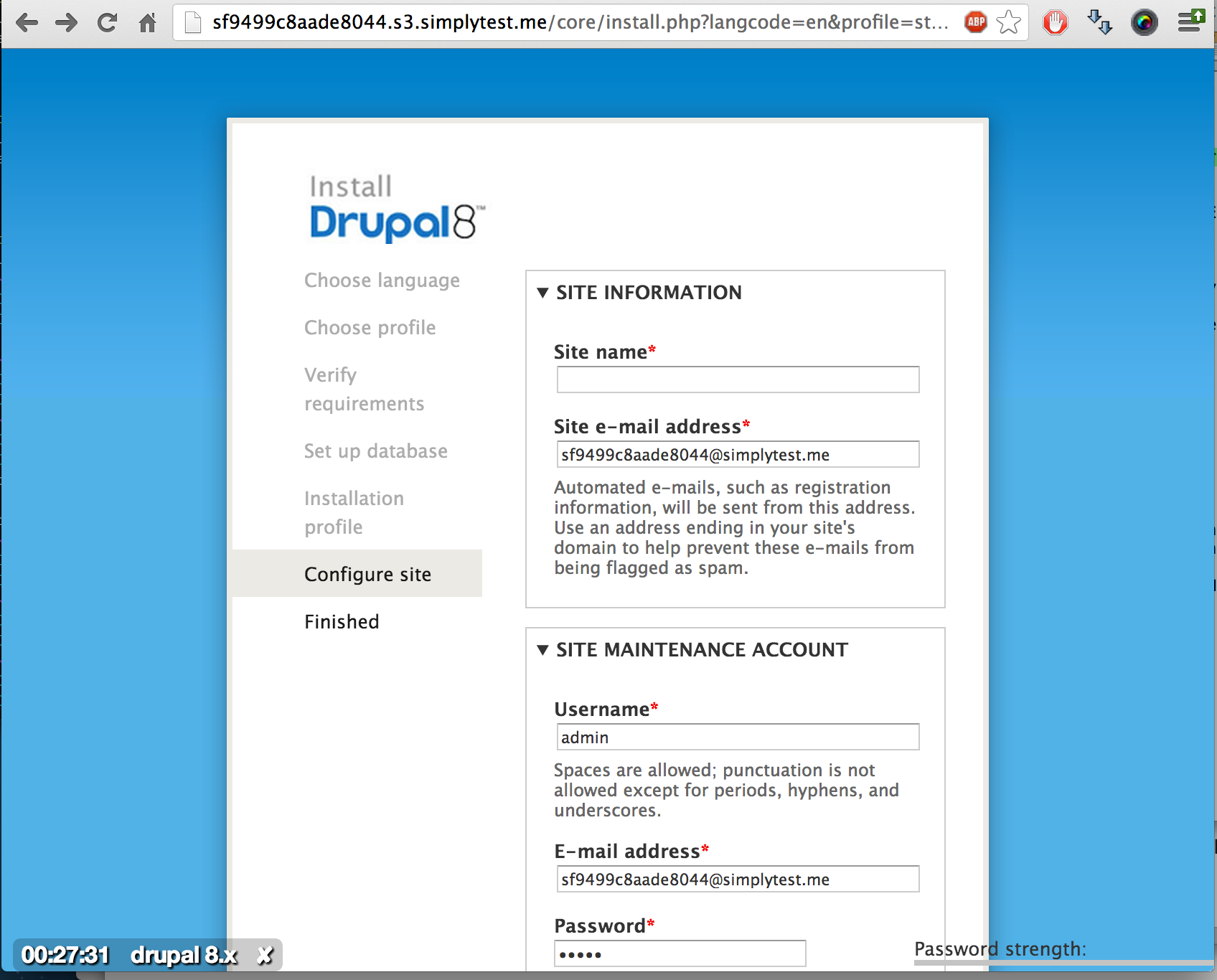
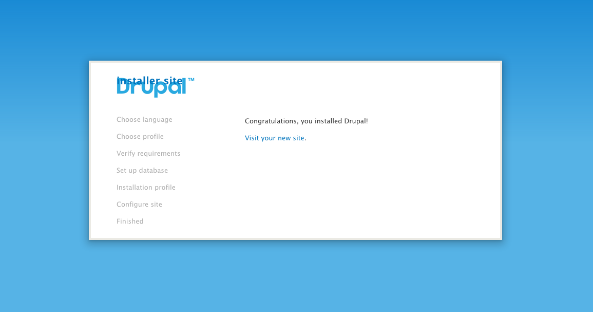
LewisNymanOk, I've addressed all the feedback under #25, #22, and #19. Try out the patch on simplytest.me
I completely agree with postponing the wordmark discussion. I do think we can get round it. I'm not being naïve, I have a degree in UK law including a dissertation on digital IP.
Comment #28
nod_It appears we can drop -moz and -o prefixes for gradients http://caniuse.com/css-gradients
Comment #29
tkoleary CreditAttribution: tkoleary commented@nod_
cool. And thx for the caniuse, hadn't seen that
Comment #30
geodaniel CreditAttribution: geodaniel commentedThis looks great. There's a minor issue with the background gradient in Safari (see attached), and both Chrome and Safari allow scrolling about three screens in width to the right, where the Drupal title is sitting.
Comment #31
Gábor HojtsyI reproduced the side scrolling in Chrome too. An overflow:hidden is missing on
body.install-page #site-name.Comment #32
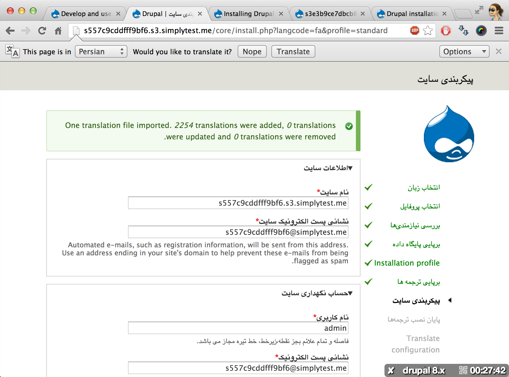
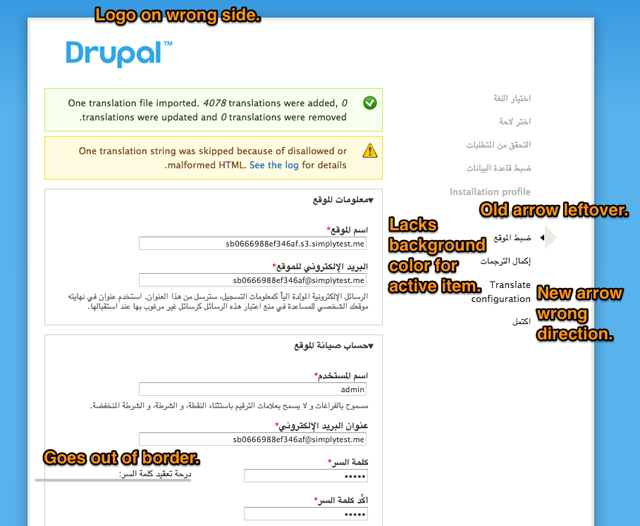
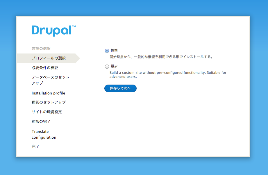
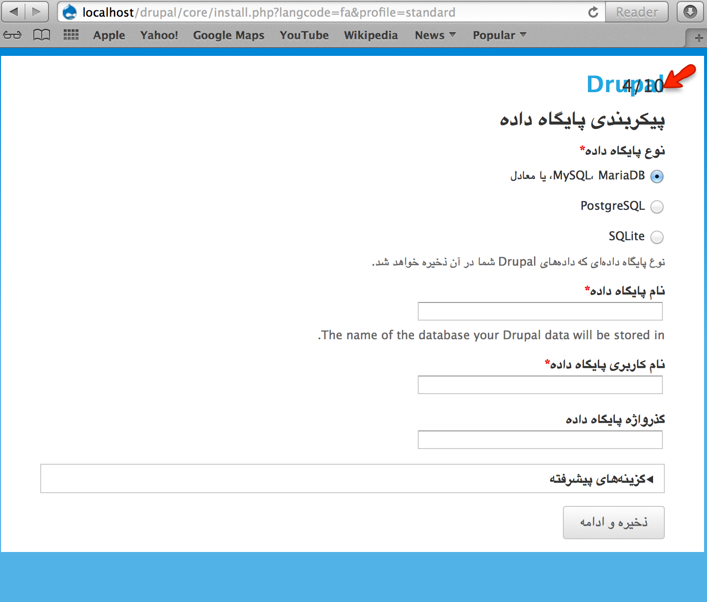
Gábor HojtsyAlso, looks good in foreign languages but let's keep in mind that some step text on the left might break to two lines. (This screenshot in Japanese, not everything is translated yet obviously).

Comment #33
lslinnet CreditAttribution: lslinnet commentedOn the last step the site name is on top of the Drupal (TM) logo.
else it looks very cool.
Comment #34
lslinnet CreditAttribution: lslinnet commentedHmm image failed, trying again.
Comment #35
Gábor HojtsyAlso I'm wondering if it would make sense to reuse some of the overlay/dialog "design language" from http://groups.drupal.org/node/283223#Overlay so that Drupal 8 is consistent in this regard. That does not really have a wizard design version where steps would be designated and the Drupal wordmark might look very odd in the title bar of the "overlay". Just throwing this out to inspire not to derail :D
Comment #36
yoroy CreditAttribution: yoroy commentedI like how this is evolving!
I notice that I miss a heading above the content part of the screen. Currently the name of the current step in the list on the left doubles as the heading for the actual content. I wonder if that is sufficient/ E.g. it feels a bit uncomfortable that your eye immediately hits a checkbox for 'Standard', without a heading above it.
It might be useful to introducte a heading independent of the label for the step. So that for the step 'Choose profile' we could have a heading 'Choose wich features to start out with'.
Probably a seperate issue but, yeah :)
Comment #37
YesCT CreditAttribution: YesCT commentedAlso related.. maybe what @yoroy mentioned in #36:
#1591538: Clearly identify to the user what is happening during the install process
Comment #37.0
YesCT CreditAttribution: YesCT commentedLink images not the issue to avoid people commenting at the wrong place.
Comment #38
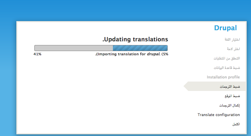
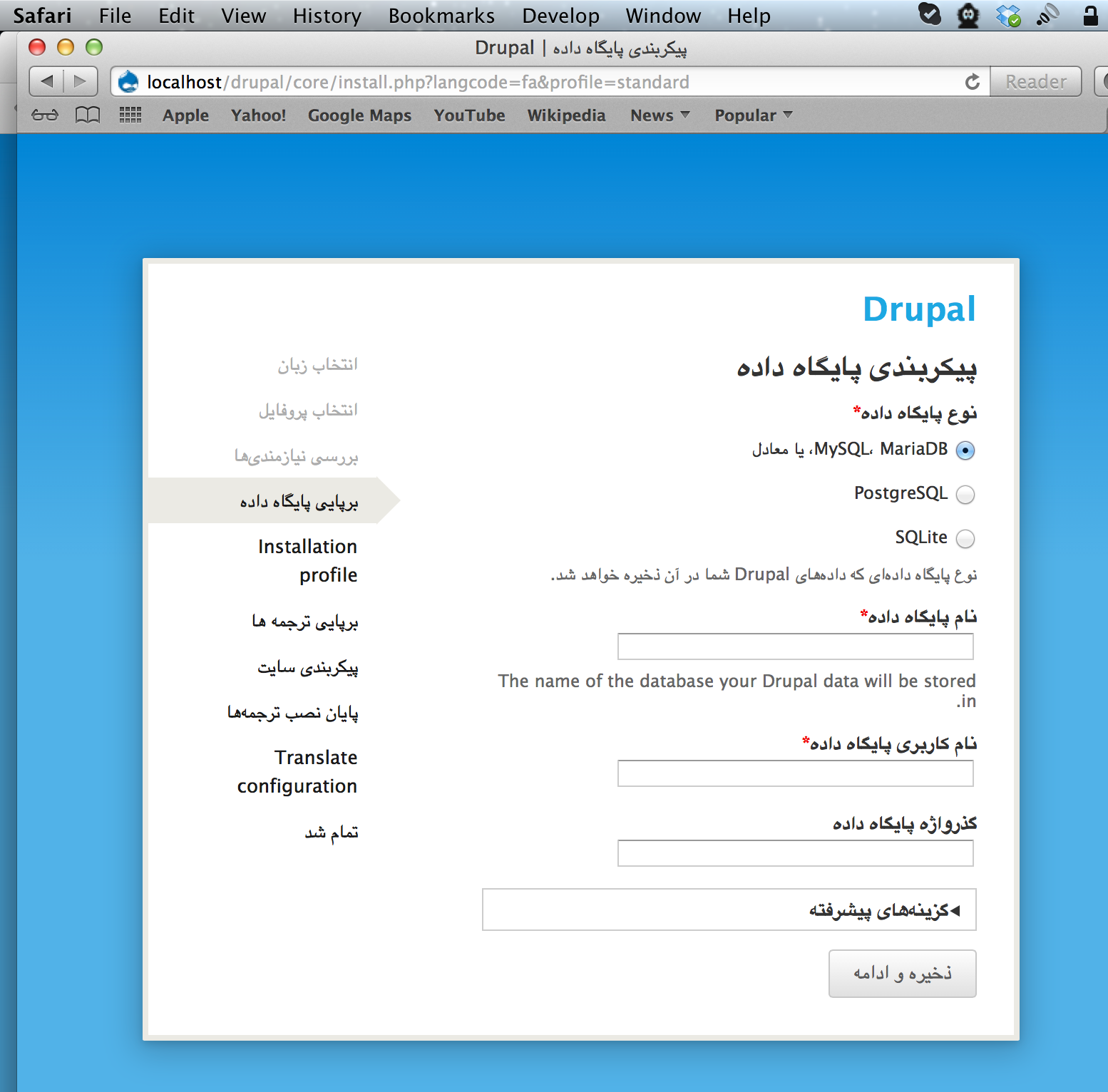
Gábor HojtsyTested with an RTL language as well. Although RTL is not yet applied ont he profile selection, it will be applied from the config screen onwards. Pick Arabic (third language in the list). On simplytest.me you can just click the buttons, no need to understand the language :)
Note that #1974040: When installing in an RTL language, it should be RTL from profile selection onwards aims to fix the installer, so it will be properly RTL already ont he profile selection step, right after language selection. Has a complete patch, needs manual testing there :) It would make testing this against RTL simpler.
Comment #39
LewisNymanThis patch fixes issues rasied in #30, #36, and #38. It looks pretty good on RTL now!
I couldn't figure out any design conventions from the new overlay that makes sense here, the transparent title doesn't look great with this background and the close button can't be used, it would be great to establish some multiple form conventions though!
Comment #40
Gábor HojtsyMuch improved indeed! Only found one more issue with RTL:
Also, the comment on the overlay/dialog style I also meant possibly loosing the backdrop here and adding rounded borders like the overlay? I don't want to delve into design by committee which is exactly why I'm referencing the already done style guide :) Not saying we should do it if others consider this fits well. It certainly looks very cool on its own.
Comment #41
ry5n CreditAttribution: ry5n commentedScreenshots are looking good! #35 makes some sense as follow-up. Although I quite like the styling here, for consistency it would still be nice to harmonise the styles with the Seven style guide (adapting visual cues in both directions).
Comment #42
LewisNymanAnother update, I added mobile friendly meta tags to the install page and it's looking nice on iPhone at least:
I've also fully replaced the Seven buttons with the ones from the new style guide, maybe a bad idea but at least we get an early view.
I tried to fix that remaining RTL bug but I couldn't get far along in the installer to test
Comment #43
LewisNymanHere's the RTL fix
Comment #44
tkoleary CreditAttribution: tkoleary commented@LewisNyman @ry5n
Looks awesome. You guys are rocking this issue.
Comment #45
aspilicious CreditAttribution: aspilicious commentedTested on nexus 4. Works perfectly.
Comment #46
LewisNymanI'm hoping someone will give this a decent code review :-)
Also:
I've opened an additional design issue fo the progress step:
#1983224: Brainstorm additional uses for the module installation step
We're probably going to have to break the button redesign out into it's own issue
Comment #47
Bojhan CreditAttribution: Bojhan commented@Lewis Yes, lets break that out. Also could the numbering, be larger on mobile? I tried it and it was a tad bit tiny.
I wonder if we should have a "green" indicator that a step has been done.
Comment #48
cweagansI took a look at this today. It looks wonderful! IMO, this is ready for RTBC if this one thing is fixed:
Duplicate comments.
Comment #49
YesCT CreditAttribution: YesCT commentedtagging novice to fix #48
other than that, is there anything blocking this that cannot be done in a follow-up?
Comment #50
XanoComment #51
Bojhan CreditAttribution: Bojhan commentedThe only followups this should create is to include the logo and the button. No other followups should be created, please keep in mind we are now in cleanup mode. Not, offload critical parts into followups mode.
We should check some of the alignment & visual styling. The blue introduced here kind of, doesn't match the progress bar. Let me review that later today.
Comment #52
YesCT CreditAttribution: YesCT commentedI think Xano did the novice fix. So removing the novice tag.
For others interdiffs are really nice:
see http://drupal.org/node/1488712 Or, http://xjm.drupalgardens.com/blog/interdiffs-how-make-them-and-why-they-...
They will make reviews easier to give.
Comment #53
YesCT CreditAttribution: YesCT commented@Bojhan Yep, no critical followups.
#40 and #47 would not be critical though..
Comment #54
cweagansI think this is ready.
Comment #55
Bojhan CreditAttribution: Bojhan commentedSigh, no.
The button style needs to be split out, because its not correct (the height is to low) as noted in #22, the steps need to be bigger as noted in #47.
Comment #56
Wim LeersFits in 80 cols, should be fixed.
Trailing period.
Trailing period.
This is not allowed in Drupal core AFAIK.
I personally much prefer it though: it's much more readable.
Blank line before. It's everywhere except here.
Why not
<!DOCTYPE html>and a simpler<html>tag?This PNG file metadata is unnecessary.
Please let http://imageoptim.com optimize it.
Install/maintenance styling doesn't belong in the normal seven theme.
It should be in a separate CSS file.
Same.
Has been unprefixed for a long time.
This too.
Here again and many more times in this file; should all be unprefixed.
Comment #57
LewisNymanHit list:
I didn't remove old prefixed CSS properties because that's a job for the CSS clean up initiative, I also didn't fix any code patterns that I had copied and pasted from the maintenance page theme functions.
Comment #59
XanoThe patch from #57 looks good visually in Safari/Mac 6.0.4, Chrome/Mac 26.0.1410.65, but not in FF/Mac 20.0, as visible in this screenshot.
Comment #60
LewisNymanBojhan pointed out a few bugs on IRC that were caused by moving the install CSS into it's own file. This patch should fix them. Thanks Xano!
I also increased the font size of the mobile step indicator and cut the title down to just ‘Drupal 8’ at Bojhan's request.
Comment #61
David_Rothstein CreditAttribution: David_Rothstein commentedHa, I wonder how close this patch got to being committed with that still in there? :)
Looks beautiful but here's a couple things I noticed skimming:
I don't think that documentation is right... (and same goes for the template_process_install_page() documentation)
This is like 100+ lines of code that is almost an exact copy of template_preprocess_maintenance_page(). That won't be fun to maintain. Can they share code instead?
I don't understand what's going on here exactly but it seems inconsistent. There should only be one site name...
We don't hardcode "Drupal" in the installer (at least not in prominent places like this one) because it breaks the branding of Drupal distributions; should use
check_plain(drupal_install_profile_distribution_name())instead. In case that function doesn't work correctly in Drupal 8 for the first page of the installer (I'm assuming it's broken until proven otherwise) I guess just patch the function to return 'Drupal' when $install_state['profile_info']['distribution_name'] isn't set, and that'll be good enough for now (leave the rest for #1351352: Distribution installation profiles are no longer able to override the early installer screens)?This change does mean that in the default case, "Drupal" will be printed rather than "Drupal 8". Which is better if you're trying to match the Drupal watermark that was removed anyway. (And also, anyone who actually cares about the "8" will already know.)
Huh? I assume that means this function is obsolete and can be deleted?
Comment #62
Bojhan CreditAttribution: Bojhan commented#1986074: Buttons style update
Comment #63
LewisNyman@David_Rothstein Thanks for the review, I don't know what I'm doing this deep in core code.
I've removed all the code from preprocess_install_page so it just calls preprocesss_maintenance_page. I've also created a function for adding mobile meta tags because that was being duplicated from preprocess_html. I've also made the other documentation and clean up changes you suggested.
Trying to call
drupal_install_profile_distribution_name()crashed everything but it's coming out as just “Drupal” right now which is good enough for me.Comment #64
YesCT CreditAttribution: YesCT commentedfixed a newline at the end of a css file.
Comment #65
YesCT CreditAttribution: YesCT commentedproblem in #59 is still there.
and still a RLT problem, especially with the step numbers.
0.
See screencapture movie. http://screencast.com/t/eoc5d6bf2O
1. firefox
2. firefox (like #59)

3. chrome

4. safari

5. rtl ... sidebar should be on other side.. right?
6. rtl with step numbers
Comment #66
LewisNymanOk I've first the issue with firefox on #59, thanks guys!
The RTL style sheets get loaded eventually... I thought this was fixed in #1974040: When installing in an RTL language, it should be RTL from profile selection onwards or have I broken it? Either way I've moved the install RTL styles in their own CSS file.
Comment #67
LewisNymanComment #68
Dries CreditAttribution: Dries commentedI like this a lot. Big improvement over what we have today and it is nice to refresh the installer.
Comment #69
Bojhan CreditAttribution: Bojhan commentedThe last patch is broken, @Dries you should test it before marking it RTBC :P
I want to fix some of the styling though, I dont like that we are 1:1 copying bluecheese although its nice for our branding of d.o to converge with the installer it deviates strongly from the blue styling we use throughout Seven. Lets see if we can bring that a bit closer to each other.
I am happy to work on a patch for this, I tried to but I cant install the patch cleanly. I can do it in time before Portland, assuming you want to demo this stuff :)
Comment #70
Bojhan CreditAttribution: Bojhan commentedTo show the bug:
Comment #71
Damien Tournoud CreditAttribution: Damien Tournoud commentedOne thing I noticed in Drupal 7 is that the CSS stack gets messed up because of the super hackish way the installer bootstraps the theme (basically, the theme gets bootstrapped twice). This is why the progress bars do not have a background in the first few stages of installing Drupal 7 (the order in the CSS stack is wrong). I wonder if the back-and-forth that happened in this issue is not just that.
Comment #72
LewisNymanIt looks like we've lost the ‘install-page’ class from the body. I think at one point I must of played with removing it completely, seeing as the CSS is conditionally loaded, and accidently committed it. It's easy to add back in but if Bojhan is going to suggest drastically different designs then I'll hold off submitting a patch until Portland.
By the way, I don't think there is any styling that is copied one to one from Bluecheese. The gradient is inspired by the Drupal branding but I feel like we should document our expectations for the brand journey from Drupal.org to Drupal Core. Intentionally creating such a contrast between the two seems counter intuitive.
Comment #73
tim.plunkettSee #1938430: Don't add a default theme hook class in template_preprocess() for why the class went away
Comment #74
Bojhan CreditAttribution: Bojhan commented@Lewis Could you make a patch I can work from? I dont know how to add the correct styling, now that the class is away. However I am not going to suggest drastic designs at all, just tweaking the color.
We are not intentionally creating a stark contrast, but we are differentiating - this is crucial as the d.o and Drupal core brand move, sadly d.o has proven quite inflexible to cope with new changes in design language, I'd like for Drupal core to be more flexible not being attached to d.o's branding is a major plus for that, additionally the d.o branding relies heavily on style elements that are not present in Drupal admin theme Seven theme. Things such as the blue header, would distract significantly when used for example in the overlay styling.
The reason Core (with that I mean Seven) has a more toned down look than d.o, is primarily because it has to kind of blend in, with the "site" and not feel like a separate system/design language - the whole idea was always to blend in, that's also why the installer was so toned down - this was to match this concept. The fact that we are deviating from that to create a more exuberant look, is fine - but it should stay somewhat in line with this central thought.
Because I feel this design choice made early in the Seven process, is the correct one. Over the years I have done my best to preserve this design language, as designers come and go - so do trends. So far we had very outgoing styling like fancy gradients pass by, and be presented for inclusion with core, and I am sure the next trend will be to metro-fy Drupal core. These trends are fine, and we should definitely not lack behind - but it should be a conscious choice, we can't introduce different styles across core or it would feel like a disjointed experience, and loads of that is in the details
I hope this sheds more light on, why I think there should be some contrast with d.o and how we can achieve this.
Comment #75
LewisNymanOk this patch seems to be working for me. Added the class in the Seven theme which makes more sense anyways.
Comment #76
Bojhan CreditAttribution: Bojhan commentedThanks, working on this.
Comment #77
Bojhan CreditAttribution: Bojhan commentedMy attempts to syncronize it more with Core styling, hope this gives some insight into where I think it should go. For one I'd like the name to use Drupal Blue, as defined in the style guide .
A)
Using a lighter variation on Drupal Blue.
B)
Using Drupal Blue as base background color.
C)
Using Drupal Blue as the highlight color.
Comment #79
David_Rothstein CreditAttribution: David_Rothstein commentedI'll try to look at it this week. Although last time I tried to install Drupal 8 (without this patch, not with it!) I wasn't able to install it at all so we'll see how far I can get...
Even with that fixed, that will still leave "Drupal" on the language selection screen with no way to override it there, and distros will not be happy about that change. In response to this I think we can reopen #1386394: Add back the ability for install profiles (or at least distros) to pre-select a language or modify the language-selection screen (or bump the priority of #1351352: Distribution installation profiles are no longer able to override the early installer screens).
Comment #80
Damien Tournoud CreditAttribution: Damien Tournoud commentedI don't actually think this is critical. There can really only be a single distribution on a Drupal installation, so patching core is a legitimate way to go. #1351352: Distribution installation profiles are no longer able to override the early installer screens would be a cleaner way to achieve the same goal, but it is not a deal-breaker not to have it.
Comment #81
LewisNymanI've only set the name to Drupal if the site name is blank. Is it not possible for a distribution to set the site name at install time?
It's also only in the Seven theme, if the distribution can change the install theme they can do what they want.
Comment #82
LewisNyman#77: installer.style_.A.patch queued for re-testing.
Comment #83
Bojhan CreditAttribution: Bojhan commentedA small update, I discussed this some more with r5yn. The Drupal blue is a bit dark to fade a gradient from, as shown in C and B. We probably need to experiment a little more. If this truly needs to be in before keynote, feel free to push it in.
However if not, lets just get it right the first commit - after all the tweaking isn't much coding work, just needs a little more design exploration, which I don't have time for today.
Comment #84
Gábor HojtsyNo hurries I think. The keynote videos are already done and alpha 1 is also cut. So this can take some time AFAIS.
Comment #85
Bojhan CreditAttribution: Bojhan commentedStill working on this, uploading patch to see if it works.
Comment #87
Bojhan CreditAttribution: Bojhan commentedHmmpf, what am I doing wrong? I am doing a normal diff.
Comment #88
LewisNymanWe're missing install-page.tpl.php and install-page.css. This happens because git isn't tracking the new files when you diff. I usually stage all files and then do
git diff --cachedComment #89
Bojhan CreditAttribution: Bojhan commentedOk, lets try that again
Comment #91
LewisNymanI took the patch from #75 and applied Bojhan's styling
Comment #92
David_Rothstein CreditAttribution: David_Rothstein commentedOK, here is a reroll fixing the distribution name issue as well as a few other small things. (To test the distribution name, you can put a line like
distribution_name: Some Distroin core/profiles/minimal/minimal.info.yml and after the Minimal profile is selected it will be used.)They can, but that wouldn't be until later on in the installer. Also, that points out a bug in the previous version of the patch (fixed in the attached); on the very last page of the installer the title was changing from "Drupal" to "My Site" (or whatever you typed in for the site name on the configuration screen). It should stay "Drupal" throughout.
I moved it out of the Seven theme in the attached patch, partly because of the above and partly because it seemed more natural there. If a distribution can change the install theme (I can't remember if they can) they can still override it the same way, of course.
Agreed, #1386394: Add back the ability for install profiles (or at least distros) to pre-select a language or modify the language-selection screen (the postponed issue) is major but not critical, and I don't think it should be critical. #1351352: Distribution installation profiles are no longer able to override the early installer screens is normal but could be promoted to major instead. It's a cleaner way to do it, although it might require changes to the drupal.org packaging script (then again, maybe not; you can patch core by adding that file too, I suppose).
Comment #93
David_Rothstein CreditAttribution: David_Rothstein commentedCouple other things I noticed:
We can't remove all this styling, can we? It breaks update.php (and probably other places too); see attached screenshots.
This looks almost identical to template_process_maintenance_page(); can't we just call that (similar to what the preprocess function does) instead?
Also, the one way they are different is that template_process_maintenance_page() has some code to handle RTL styling, and that actually looks like something we don't want to lose here...
Comment #94
LewisNymanThanks David! So the twig patches means this patch no longer applies. Let's wait until #1885564: theme.maintenance.inc (authorize.php) - Convert theme_ functions to Twig is resolved before adjusting this patch.
Comment #95
lucascaro CreditAttribution: lucascaro commentedUpdate the issue summary to replace the old screenshots with the newer proposed ones.
Comment #96
larowlanTagging
Comment #97
lucascaro CreditAttribution: lucascaro commented#92: core-1337554-install-branding-92.patch queued for re-testing.
Comment #99
lucascaro CreditAttribution: lucascaro commentedThe last patch uses .tpl.php files that have now been ported to twig, so it needs reroll.
Comment #100
Bojhan CreditAttribution: Bojhan commentedI have no idea how to twig.fy this, anyone can make a start?
Comment #101
jenlamptonRe-rolled patch to use twig instad of PHPTemplate.
Included David's changes from #93 above.
Updated the docblocks for preprocess functions to match #1913208: [policy] Standardize template preprocess function documentation
P.S. I didn't have time to test this, hope it still works! :)
Comment #103
Bojhan CreditAttribution: Bojhan commentedWhen using this I get
Comment #104
jenlamptonLooks like that patch was missing the install page template. whoopsie :) trying again.
I tested it this time, and, wow! This looks so much better :) A few minor nits...
Is there a way we can vertically center the white box in the middle like we do with the dialogues? It looks okay as-is for the first few screens, but when the longer ones scroll off the bottom of the page, and there's still 150px of wasted space at the top of the screen, it's less than ideal :)
It looks like we could use some more padding on the item-list on the left hand side. (see below)
Comment #105
David_Rothstein CreditAttribution: David_Rothstein commentedThe checkboxes to the left of those list items actually aren't supposed to be there at all (see earlier screenshots). I assume they reappeared due to adding back the
ol.task-liststyling in response to my comment in #93?So I guess it's a little more complicated than that; the
ol.task-liststyling needs to be there for update.php and other places, but it seems like it shouldn't be applied to the installer at all.Comment #106
ry5n CreditAttribution: ry5n commentedBojhan (at #83) asked me about styling of this closer to the Seven Style Guide. I did a design, but looks like it never got posted. It may help now.
Notes
- Don’t worry about text or form element styles; use whatever we currently have.
- The indent on the active step is intended to be an accessibility queue. Maybe the indent needs to be bigger, or another style choice made.
@jenlampton I could help with the vertical centering but it will have to wait a week or so at least; working on too many other things for core right now.
Comment #108
Bojhan CreditAttribution: Bojhan commented@r5yn I actually did, its just not as an image but as a patch :)
@David how do you envision we fix the list bug? Do I just remove the ol styling?
Comment #109
Gábor HojtsyThe design in #106 looks much more in line with the style guide and therefore sitting better with the rest of the Drupal 8 design as planned AFAIS. (I asked for that too in #40).
Comment #110
Bojhan CreditAttribution: Bojhan commentedI probably should have included a picture, but we did include this design from #89 and onwards.
I also have the HTML/CSS from r5yn for the background radius effect, which was the only part that still needed work in terms of visual design.
Comment #111
LewisNymanWe should adapt the task list mark up so we can change the classes for the install page. They are too different to consider sharing classes.
Comment #112
tkoleary CreditAttribution: tkoleary commentedThe Drupal logotype is made from custom vectors and is not a specific font, however, it just occurred to me that if we are making an icon font in the issue on supporting retina displays we could simply add the glyphs from the Drupal logo to that font and specify it for that text. Then at least for languages with Latin Scripts we would have the properly branded logotype.
Comment #113
LewisNymanIt's a tricky issue Kevin, the problem isn't completely with the copyright license. It's a trademark, so any imagery that represents the Drupal brand could potentially cause issues if it's included in core.
We still need to reconcile that trademark issue in, #605710: Decide on if and if so, how to implement the Drupal wordmark in core. There's no technical way to get around it here.
Comment #114
tkoleary CreditAttribution: tkoleary commented@lewisnyman: Commented in that issue
Comment #115
LewisNymanThanks for the patch Jen! I couldn't get it to patch cleanly, I noticed there was a ton of new changes that seemed to already be in core. I hacked away at it until it applied cleanly :-) I'll try and make changes for the comments above soon.
Comment #116
LewisNymanComment #117
Bojhan CreditAttribution: Bojhan commentedThe list is still a bit broken here? I am not sure how to fix that, is that just CSS or are we missing elements?
@Lewis I will trow in code for the shadow and background effect tomorrowish.
Comment #118
tkoleary CreditAttribution: tkoleary commented@bojhan
Without looking at the code it looks to me like this is using summary and details and the default expand details arrow afforadnce has not been properly hidden with CSS. I usually just do a negative left margin and set the div to overflow hidden for this, but Lewis may do it some other way.
Comment #119
LewisNymanWe're just getting some conflict between two identically weighted CSS selectors still I think. Hopefully I'll have time to sort out these classes soon.
Comment #120
lucascaro CreditAttribution: lucascaro commentedFYI: the patch from #115 still has the check marks:
Comment #121
LewisNymanOk, I've modified the theme function so you can pass a string into it so it will create a different CSS class from it. I'm not sure if that's the most elegant solution, but it fixed the problem.
Comment #122
Bojhan CreditAttribution: Bojhan commentedAwesome! Ok, so I did a few things to follow @r5yn's proposal in #106. I am not sure if I implemented this correctly, I struggled getting it to apply to the whole page.
I am not a big fan of making the active task highlighted in blue. Although we use it for "selection" purposes, it is a little much here - so much blue :) The gray balances it a bit, especially in combination with the buttons/fields that are also gray. With the busy background, I feel adding another color to the palette of this page might be a little too much.
Below is a screenshot:
Comment #124
Bojhan CreditAttribution: Bojhan commentedWith some help of larowlan I should have added the files to my diff.
Comment #126
Bojhan CreditAttribution: Bojhan commentedGotta keep those patches rollin.
Comment #127
lucascaro CreditAttribution: lucascaro commented#126: installer.style_.update.3.patch queued for re-testing.
Comment #129
Bojhan CreditAttribution: Bojhan commentedThis requires a reroll, if this gets some markup review, from a visual standpoint it would be RTBC.
Comment #130
LewisNymanThere were a few fixes required to the CSS, I've also vertically centered the page to see how it looks.
Comment #131
yoroy CreditAttribution: yoroy commentedComment #132
tkoleary CreditAttribution: tkoleary commented@lewisnyman
It's looking really good.
Couple of minor polish things:
-The background image should tile (see attached image). I would have re made it myself but I could not figure out how you got it in there. Guessing it's injected with js.
-Couple of Responsive things. At the smallest size I think we should introduce a MQ to reduce the padding on the container by 20px. (see attached images of before and after)
I also removed border on fieldsets but I think that issue needs to be global.
Comment #133
yoroy CreditAttribution: yoroy commentedOk. Needs work for the tiling bg and smallest size padding.
For the fieldsesets, I think that should be handled by the style guide issue for that element. (not sure it exists yet, see https://drupal.org/node/1986434)
Comment #134
YesCT CreditAttribution: YesCT commentedI ran into some errors while trying this on simplytest.me I wanted to try locally, and will in a bit, but I have not yet.
In the mean time, here are some screen shots.
before patch
before middle step rtl
These are after patch:
wide
regular
narrow
very narrow
rtl - note upper right corner seems not right spacing
install step 2 in english
Comment #135
LewisNymanThanks guys
I've addressed all issues found in #132 and #134.
I also added a minimum amount of spacing between the edge of the background and the white content section, long pages will not sit flush against the top of the viewport any more. I also found and fixed an RTL bug with the mobile step indicator.
Comment #136
Bojhan CreditAttribution: Bojhan commented@tkoleary Thanks, great tweaks. I think a small tweak we could do is to align the numbering (on small screens) better with the logo in both size, and positioning. I am however I am currently unable to make patches.
@lewis Thanks for the patch!
Should we mark this RTBC?
Comment #137
YesCT CreditAttribution: YesCT commentedmanually tested. Looks pretty good.

--
I took a look at the code and noticed some things to clean up. So patch attached. See interdiff for all changes. Just noted some here to reference the standards.
A bunch of comments were missing periods, which make them sentences.
https://drupal.org/node/1354#general
"All documentation and comments should form proper sentences, use proper grammar and punctuation,.."
when?
all the examples in https://drupal.org/node/1887862 show no spaces around the parenthesis.
@file needed for css files too. https://drupal.org/node/1887862#comments
(also line too long. should be less than 80 chars.)
Comment #138
YesCT CreditAttribution: YesCT commentedSorry for the noise. Noticed this missing period as soon as I submitted it. I'll cancel the previous test. Will let this test run.
Comment #139
Bojhan CreditAttribution: Bojhan commentedGreat! Any final checks before this moves to rtbc?
Comment #140
Gábor Hojtsy#138: 1337554-install-branding-138.patch queued for re-testing.
Comment #142
Gábor HojtsyDoes not apply anymore unfortunately.
Comment #143
larowlanStraight re-roll
Comment #144
Gábor HojtsyTested again. Looks amazing.
Comment #145
yoroy CreditAttribution: yoroy commentedYay! Lets do it! :)
Comment #146
tkoleary CreditAttribution: tkoleary commentedLooks AWESOME!
Comment #147
star-szrMinor docs and standards cleanup attached - see interdiff. Great work everyone!
Comment #148
alexpottWe're not really supposed to be adding @todo's ... how do we get rid of this function?
This is an extremely general place to been making changes for the installer as this is fires on every page. These meta tags are currently added in
template_preprocess_html()already.This also seems overly general as this adds these meta tags to the maintenance page as well as the installer... and this issue is not about ensuring the maintenance page is mobile friendly (although of course it should be)
Lets do this and not have the @todo
This class seems wrongly named and wrongly placed... the only place it's used is system template install-page.html.twig. Perhaps we should create a system.install.css and move all the install related stuff out of system.maintenance.css
Why bother with this... why not do just
<body class="install-page">Comment #149
LewisNymanThanks Alex! I've addressed your points:
@@ -3076,6 +3121,36 @@ function template_process_maintenance_page(&$variables) {<br>+ * @todo Remove this function.<br>+ */<br>+function template_process_install_page(&$variables) {I don't think we should be removing this function, we need to maintain a separation between maintenance and install theming. Once the CSS clean up hits they are going to share a lot less styling. This might be a todo that got accidentally merged in with some Twig stuff. (see #104)
+++ b/core/includes/theme.incundefined<br>@@ -2762,6 +2801,9 @@ function template_preprocess_page(&$variables) {<br>+ // Add mobile meta tags.<br>+ _theme_add_mobile_meta_tags();Yep, this was a bit of an out-of-scope optimisation on my part. We should leave this to #1887800: Add mobile friendly meta tags to the maintenance page. I'm happy to ship the this issue without mobile meta tags in the installer.
+++ b/core/modules/system/css/system.maintenance.cssundefined<br>@@ -45,8 +45,27 @@<br>+.maintenance-background {<br>+ background-color: #1275b2;<br>+ background-image:<br>+ url('images/noise-low.png'),<br>+ -webkit-radial-gradient(hsl(203, 80%, 45%), hsl(203, 80%, 32%));<br>+ background-image:<br>+ url('images/noise-low.png'),<br>+ -moz-radial-gradient(hsl(203, 80%, 45%), hsl(203, 80%, 32%));<br>+ background-image:<br>+ url('images/noise-low.png'),<br>+ -o-radial-gradient(hsl(203, 80%, 45%), hsl(203, 80%, 32%));<br>+ background-image:<br>+ url('images/noise-low.png'),<br>+ radial-gradient(hsl(203, 80%, 45%), hsl(203, 80%, 32%));<br>+ background-repeat: repeat;<br>+ background-position: left top, 50% 50%;<br>+ min-height: 100%;<br>+}Thanks for bringing this up, when I thought about it a little more I realised that we really shouldn't have any branding in system, I moved the styling into Seven and created an install.html.twig just for Seven. There's even more mark up we can strip out of the system install-page.twig file but I'd rather wait for the other page twig clean up issues to near RTBC so we can coordinate.
+++ b/core/includes/theme.incundefined<br>@@ -3076,6 +3121,36 @@ function template_process_maintenance_page(&$variables) {<br>+ * @todo Specify the elements in the array.I had a go at this, I copied the variable documentation from the maintenance function, which is fairly minimal because they are both quite similar to the 'page' functions.
+++ b/core/modules/system/templates/install-page.html.twigundefined<br>@@ -0,0 +1,84 @@<br>+<body class="{{ attributes.class }}"><br><br>+++ b/core/themes/seven/seven.themeundefined<br>@@ -143,6 +143,8 @@ function seven_tablesort_indicator($variables) {<br>+ $variables['attributes']['class'][] = 'install-page';Done
Comment #150
XanoComment #150.0
YesCT CreditAttribution: YesCT commentedadded related issue list to summary
Comment #150.1
YesCT CreditAttribution: YesCT commentedadded related
Comment #151
YesCT CreditAttribution: YesCT commentedchanging to needs review to let the testbot at it. [edit: heh. we really want it reviewed. cross post.]
Comment #152
wusel CreditAttribution: wusel commentedat #134 in picture http://drupal.org/files/rtl-middle-step.png ("before middle step rtl") and #137 there is another error too:
the green "help" region is not translated (it shows latin alphabet and not the chosen language).
Feel free, to open an issue for this.
Wusel
Comment #153
Gábor Hojtsy@wusel: whether strings are translated or not is not at all in the scope of this issue :) also if the string itself is available for translation on localize.drupal.org, then we don't even need a bug for it, the language team in question should work on translating it.
@Lewis/@alexpott: it is not clear for me whether you propose this for commit, the comment is vague enough whether you consider other issues should go in first or this should be revisited after commit. I think based on the amount of change here, this should be committed first and cleanups done later. It would be great to have this in the second alpha for something pretty exciting :)
Comment #154
LewisNyman@gabor I'm happy for the mobile meta tags to be added either before or after this patch in #1887800: Add mobile friendly meta tags to the maintenance page. They should not conflict with each other. The installer has already been designed and tested for mobile so it will not require another follow up issue. The installer page never had mobile meta tags so I don't consider this patch to be a regression.
Comment #155
Gábor HojtsyLet's get this in as-is then? :)
Comment #156
star-szrRemoving @see template_preprocess() per #2013094: [policy adopted, patch needed] Stop saying '@see template_preprocess()' in every twig file and correcting docs to point to the right preprocess functions. Sorry I missed that these docs weren't correct before (should be install_page, not maintenance_page).
Also minor tweaks to the preprocess docblock in line with https://drupal.org/node/1354#themepreprocess.
Hate to say it but shouldn't install-page-rtl.css have a @file docblock?
Comment #157
star-szrI brought it up, so I might as well try and fix it :)
Comment #158
David_Rothstein CreditAttribution: David_Rothstein commentedThe patch is still adding mobile meta tags in template_preprocess_page(), but @alexpott's review pointed out that they're already added in template_preprocess_html(). Does one of them still need to be removed?
Comment #158.0
David_Rothstein CreditAttribution: David_Rothstein commentedupdated screenshots in the summary, before and after
Comment #159
LewisNymanThis design in part and parcel of the new style guide, I've added it to the meta issue: #1986434: New visual style for Seven
Comment #160
alexpottI think this unnecessary as these are being added in
template_preprocess_html()Space of the front of line
Not sure about our coding standards for css indentation in media queries but this is inconsistent.. looking above looks like these classes should be indented with 2 spaces...
Comment #161
LewisNymanThanks guys. Fixed the above.
Comment #162
Gábor HojtsyAll right, found some whitespace problems:
Indented too much. Not 2 spaces.
These are well indented!
These not at all! I see you attempted to fix some of them, but not properly.
There should be one space before the LTR comment, not two.
Comment #163
nilnullvoid CreditAttribution: nilnullvoid commentedComment #164
chx CreditAttribution: chx commentedThe last mention of Druplicon was in #12. Congratulations to Drupal 8 for killing everything that made Drupal Drupal. Of course, Druplicon needs be thrown out otherwise people would think this is still Drupal. Why not rename the project while at it?
Comment #165
Gábor Hojtsy@chx: pre the patch the word Drupal did not appear (prominently) on most installer pages. Based on plenty of screenshots above, eg. https://drupal.org/node/1337554#comment-7533053 - post patch it looks like the word Drupal appears more prominent. This sounds like makes the appearance of Druplicon redundant and the installer more new-people friendly (not to speak of the design mismatch between the Druplicon and this new installer page design). I don't agree the inclusion of Druplicon on the installer page made Drupal Drupal or that the removal was made to annoy you personally.
Comment #166
chx CreditAttribution: chx commentedWell, it certainly have achieved that although annoyance is probably a very small word for what I feel.
But, I am just one voice and countless other issues made it into Drupal 8 that I fundamentally disagreed with. This is just one more and I have no doubt it'll get in, no problems.
I filed #2027039: Rename the project as a logical followup.
Comment #167
nilnullvoid CreditAttribution: nilnullvoid commentedAddressed concerns from comment 162 and reformatted the whitespace as requested.
Comment #168
catchAssigning to Dries.
Comment #169
Gábor HojtsyMarking RTBC for Dries as per prior being RTBC. Dries, see #164, #166 and concerns.
Comment #170
Bojhan CreditAttribution: Bojhan commented@chx I am not really sure why you are upset about removing Druplicon. As Drupal changes, so does it main branding elements. If you look at the evolution of any brand you will see the logo navigate towards clarity, there are only a few brands that can get away with just using a symbol (apple, microsoft, nike). We are not one of those recognizable brands, Druplicon instead doesn't feel recognizable at all for most new users - it feels like an odd alien looking down on them as they are installing, feedback we have heard a lot.
Therefor making this change, will actually increase the recognizability of Drupal, as people know immediately that they are installing Drupal. I understand that this could raise emotions - given that its been such a fundamental part of the installer for many years. But I disagree its defining of Drupal, what is defining of Drupal is much more functional (flexibility, clean api's, empowering the sitebuilder) - its not the logo used in the installer, I feel like most of your concerns are on the functional part.
Comment #171
LewisNymanLooks like my patch in #161 dropped some classes out of the install-page.html.twig. No idea how this happened. Check out the patch on #157 for the missing classes. It also looks like there are a few layout changes that have been affected by other commits. This needs a thorough eyeballing now.
Comment #172
LewisNymanFixed the Twig file. This needs a quick once over.
Comment #173
nilnullvoid CreditAttribution: nilnullvoid commented#alexpott requested that I test the installer with the latest patch. So I tested it before and after applying the patch.
Before the patch
The install process was pretty simple and basic. I selected the "Standard Install" radio button.
In the "Verify Requirements" page, I was told to create the sites/default/files directory and to copy default.settings.php to settings.php on the command line. This cannot be done in the browser if the install directory isn't owned by the www user.
In the next screen, the fields for "Database name", "Database username" and "Database password" are shown. These need to be filled in with the correct values in order to continue. Clicking on the "Advanced Options" button brings up the "Database host", "Database port" and "Table Prefix" settings. These should not be necessary unless the system uses unconventional settings. If all goes well the next window shows a progress bar while Drupal installs. This might take a minute or so.
Finally the "Configure Site" page is shown. Here you are instructed to remove write permissions on settings.php and files. The site will run with if you don't do this but it won't be as secure. Here an email address, a site username, password and a default country are added for the site. After this, the site setup is complete.
After the Patch
After installing the last patch, I ran the install process again. It ran exactly the same way. The only change was the template. It was much simpler, with a plain blue background and no Drupalicon.
Overall, the experience was very straightforward and painless. There are no other options during install and the site is ready to run right away. The only inconvenience was the need to have a terminal open at the same time.
Comment #174
nod_Tested also, that works.
Comment #175
Dries CreditAttribution: Dries commentedI think this installer is a big step forward. Great work!
I'm fine with removing the Druplicon from the installer. I'm not emotionally attached to it. I think adding the word 'Drupal' is actually a UX improvement as it shows people what they are installing.
If we want to keep the Druplicon, one way to accomplish that could be to have a welcome screen in the installer; i.e. a step or screen prior to the language selection screen. It could say 'Welcome to Drupal' along with the Druplicon. Another option could be to change the blue background to have a "Druplicon watermark". Any of these can be done as follow-up issues.
Comment #176
chx CreditAttribution: chx commentedThe watermark sounds a great idea to me, very unobtrusive. Thanks Dries!
Comment #177
klonosYes, druplicon as a watermark sounds a good compromise to satisfy those emotionally attached to it ;)
Comment #178
Gábor HojtsyStill looks great in Chrome.
Comment #179
alexpottCommitted 3506077 and pushed to 8.x. Thanks!
Comment #180
jessebeach CreditAttribution: jessebeach commentedReally gorgeous. Great work everyone!
I made a video of the install process so you don't need to run an install locally: http://www.youtube.com/watch?v=mpNfenVOhtA&feature=youtube_gdata_player
Comment #181
klonosJust gave this a quick spin over at simplytest.me and it looks really sleek! Thanx ;)
Comment #182
LewisNymanThanks everyone!
This installer looks a lot better with the new Seven Style Guide components. I've created a Seven Style Guide Initiative sandbox. The master branch contains the latest patches from all the style guide issues #1986434: New visual style for Seven. Check it out!
Comment #183
chx CreditAttribution: chx commentedI filed #2030027: Use the Drupal software logo in the installer
Comment #184
yannickooHey guys, great work but I don't like the how how the vertical aligning was solved. There is a much better way, check it out (and the blog post. With that way we wouldn't need any additional wrapper.
I created a follow-up issue for that #2032895: Follow-up use better technique for vertical centering.
Comment #185
Gábor HojtsyThe RTL orientation of the sidebar somehow got lost between this issue and #2015789: Remove language_css_alter() (RTL stylesheets) in favor of HTML 'dir' attribute.
See: #2033137: New installer sidebar not properly RTL.
Comment #185.0
Gábor HojtsyFixing @tkoleary's handle
Comment #186
David_Rothstein CreditAttribution: David_Rothstein commentedI just un-postponed #1386394: Add back the ability for install profiles (or at least distros) to pre-select a language or modify the language-selection screen (as previously discussed above), and also wrote a patch for it.
Comment #188
XanoSee #2084665: Clean up the DB configuration during installation for another attempt to make the installer more user-friendly.
Comment #188.0
Xanoadded the new issues since the commit