
this is a follow up for #1998528: Better UI for translation of configuration, the configuration Translation UI is not responsive and looks a bit strange on a Mobile Phone.
As the String Translation UI is also not responsive, this is not super bad right now. Will check with the Mobile people how to handle this.
| Comment | File | Size | Author |
|---|---|---|---|
| #7 | 1999156-config-translation-responsive-7.patch | 1.02 KB | Schnitzel |
| #6 | 1999156-config-translation-responsive-6.patch | 1.01 KB | Schnitzel |
| #5 | edit-site-info-responsive.png | 63.82 KB | nonsie |
| #4 | 1999156-config-translation-responsive-4.patch | 843 bytes | Schnitzel |
| #2 | Edit_german_translation_for_Kontoeinstellungen___local.drupal.jpg | 876.11 KB | Schnitzel |


Comments
Comment #1
Gábor HojtsyWoot, thanks!
Comment #2
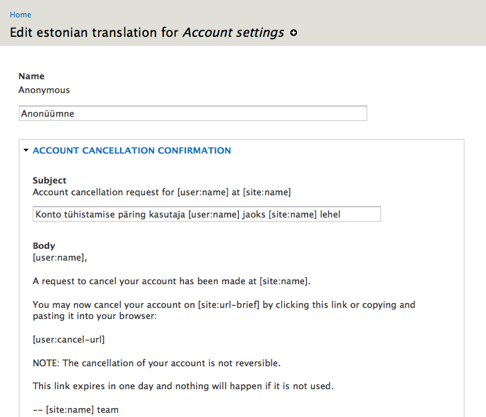
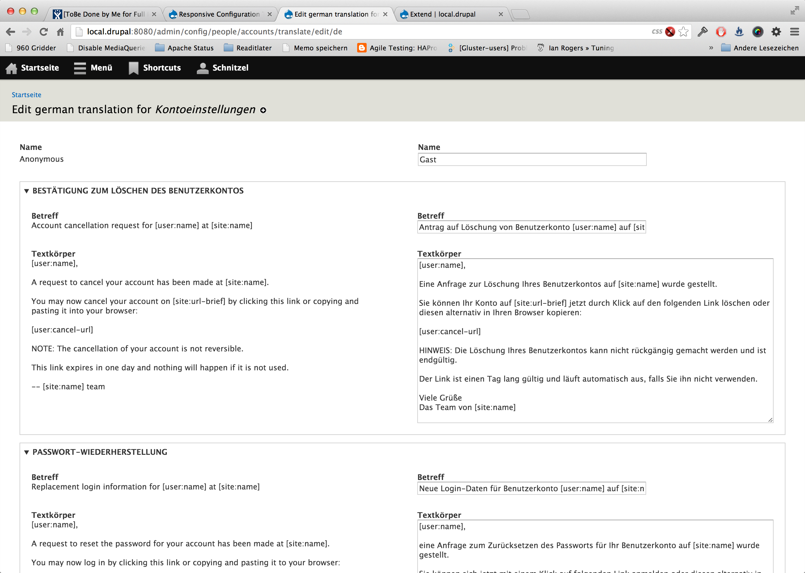
Schnitzel CreditAttribution: Schnitzel commentedHere a Screenshot how it looks in Responsive:
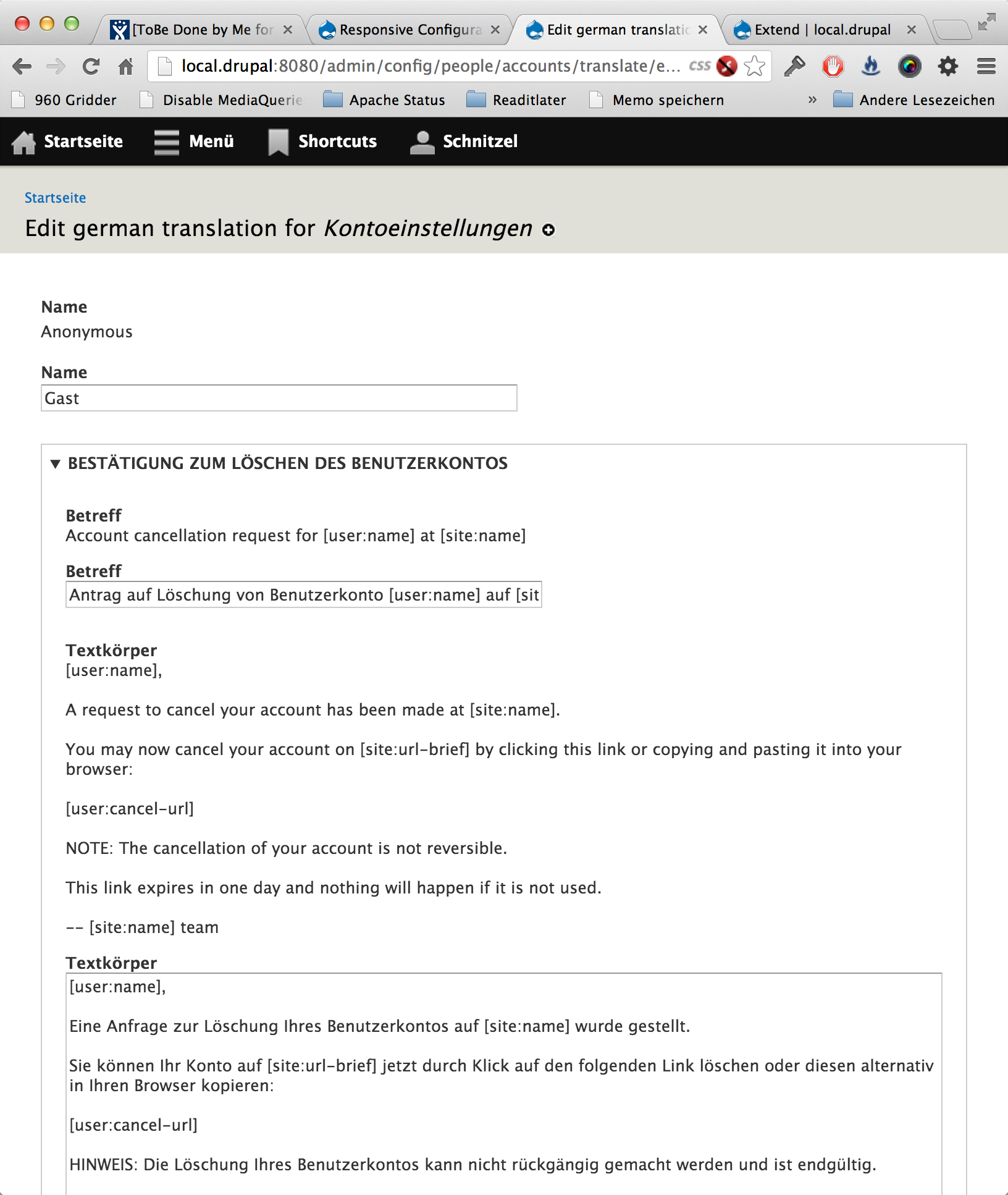
and here desktop:

Question:
- How do we explain the difference between Source and Translation?
Comment #3
Gábor HojtsyCan you post the patch please? I'd love to get people review this :)
Comment #4
Schnitzel CreditAttribution: Schnitzel commentedhere the patch for responsive, one change already: we're hiding the label on the translation in responsive
Comment #5
nonsieThis is what it looks like in responsive with the label removed for the translation which IMHO improves the UI significantly.
Tested in FF, Chrome, Safari but not in Opera. Breaks in IE8 but we do not care about that.
Comment #6
Schnitzel CreditAttribution: Schnitzel commentedthis is a new patch, which does exactly the same, just it does not use "display:none" it uses the same behavior as "element-invisible", which is better for accessibility.
Comment #7
Schnitzel CreditAttribution: Schnitzel commentedalso fixxing http://drupal.org/node/1952394#comment-7433042 (css issues)
Comment #8
Gábor HojtsyAmazing, thanks!