 Support for Drupal 7 is ending on 5 January 2025—it’s time to migrate to Drupal 10! Learn about the many benefits of Drupal 10 and find migration tools in our resource center.
Steps to reproduce
- Install Drupal 8
- Configure the wysiwyg editor so you can add h4 and h5 using menu item "format"
- Create a piece of content
- Format something with H4 or H5
- Save the article
What I would expect to happen
The piece of formatted text should be displayed as h4 or h5
What happened
The piece of text I had formatted was displayed unformatted.
Test instructions
Create a piece of content with all of the headings, h1, h2, h3, h4 etc sandwiched between paragraphs.
Check that the headings are styled different from each other and have a distinct hierarchy.
Also check that you can distinguish each heading type from the paragraph text.
| Comment | File | Size | Author |
|---|---|---|---|
| #27 | Screen Shot 2014-09-30 at 15.10.28.png | 38.62 KB | emma.maria |
| #27 | Screen Shot 2014-09-30 at 15.00.30.png | 146.78 KB | emma.maria |
| #26 | bartik-header-styles-2020081-26.patch | 513 bytes | Upchuk |
| #26 | interdiff-2020081.txt | 466 bytes | Upchuk |
| #11 | bartik-header-styles-2020081-11.patch | 511 bytes | BrightBold |


Comments
Comment #1
johnheaven CreditAttribution: johnheaven commentedRelated issue: Unable to add formatting in source unless the corresponding wysiwyg menu item is enabled
Comment #2
Wim LeersThis is in fact the same problem: different symptom, same cause! Again, see #1936392: Configure CKEditor's "Advanced Content Filter" (ACF) to match Drupal's text filters settings :)
Comment #3
PanchoCan't reproduce this one though.
Say, you added the "format" dropbutton to the WYSIWYG iconbar?
And you didn't remove
<h4>and<h5>from the "Limit allowed HTML tags" filter in the text format?And you're using exactly the same WYSIWYG text format you had defined with the "format" dropbutton?
Then, how can this be?
For now, tentatively marking this one active again.
Comment #4
johnheaven CreditAttribution: johnheaven commentedDoh! I've just realised what the "problem" is - the H4s are showing up in the HTML code (so not really a big bug after all), but in the CSS for the H4 element it says "font-weight: inherit". When I deactivate that using the DOM inspector in Chrome, the H4s are bold - so presumably it's not a bug but a suggestion for a change in the Bartik CSS?
I've reassigned this to be a Bartik issue - I'm pretty new to all this, so let me know if that's the wrong thing to do!
Comment #5
vollepeer CreditAttribution: vollepeer commentedBrowsers will render h4 headings with the same size and style than regular text. h5 and h6 headings are even rendered smaller than regular text (see attachment). This behavior is standardized across all modern browsers.
Should we override this default behavior using CSS and e.g. make all headings bold? The usage of too much heading levels isn't accepted as a good practice either...
Comment #6
johnheaven CreditAttribution: johnheaven commentedOkay, probably best to stick to browser standards! But the problem is that "Basic HTML" and "Restricted HTML" text formats don't allow any headings on a higher level than h4, so effectively it means that you can't have formatted headings using this filter (or at least not ones that display as you would expect). So it would appear that that's an issue with the text formats then? I'll move this issue to the filter.component module, rename etc.
Comment #7
johnheaven CreditAttribution: johnheaven commentedI just found that a similar issue has been discussed at length already, so I posted a comment on that thread: https://drupal.org/node/514008#comment-7587825
Comment #8
mgiffordFrom an accessibility point of view, the hierarchy has been important.
Particularly with comments, which is where filtered html is often used, you don't want them to have a higher ranking than the main content of the text.
Generally there's been just one H1. H2 tags are used for a lot of default content like block headers.
Thought I'd also point to the Drupal 8 Style Guide for Seven for reference. Although, this is more of a Bartik issue:
https://groups.drupal.org/node/283223
Comment #9
Wim LeersRemoving tags that are now proven to be irrelevant.
Comment #10
Wim LeersThis is not a bug/problem in filter.module. This is a matter of styling solely, hence this is a problem in the Bartik theme.
Comment #11
BrightBoldI took a look at this and was surprised to see that Bartik only explicitly declares h1 and h2. It seems to me we should not be leaving all the remaining header styles to the whim of the browser.
While @vollepeer is correct that browsers tend to render h4 at 1em, they are usually bold by default, providing the site visitor with a visual differentiation between the header and paragraph text. Because Bartik's header styles are not bold, this distinction has been removed so we need to do something else to provide the reader with a clue that this text is more important.
Here's my first pass at styling the other headers explicitly — I'm not really happy with it but I'm putting it out here for discussion. Hopefully we can figure out the right balance between retaining the Bartik aesthetic and finding a way to distinguish h4 from paragraph text.
Comment #12
Wim LeersThanks!
Comment #13
mgifford11: bartik-header-styles-2020081-11.patch queued for re-testing.
Comment #14
emma.mariaComment #15
emma.mariaComment #16
lokapujyaI don't think we should do the ALL CAPS thing.
Comment #17
LewisNymanWe need some way of distinguishing the headers from body text when they are that small. Some themes use bold, some use uppercase. Assigning to Jeff to make a stylistic decision.
Comment #18
emma.mariaComment 11 explains why uppercase was used for Bartik headings instead of bold text.
Comment #19
BrightBoldI'm happy to revise as needed once Jeff weighs in.
Comment #20
Jeff Burnz CreditAttribution: Jeff Burnz commentedWhat would be peoples general feeling about overhauling all of Bartiks font styles? In particular introducing a real modular scale, much improved whitespace handling and using 1rem base font size rather than 87%? In other words apply some guiding principles and those would be to use whitespace, font-size and weight and pretty much nothing else (maybe not even a specific font-family). Take it as read I am not afraid to change Bartiks styles.
With regards to this issue, the h3 still looks indistinct and to be frank I am not terribly excited by using text-transform - the main reason is that I would prefer Bartik moved more in the direction of minimalism, rather than more decorative, and rely on a more constrained set of design attributes e.g. font-size, whitespace and weight and not intriduce a fourth aspect such as case.
Comment #21
LewisNyman@Jeff I think we need an issue summary update. I can't tell exactly what the next steps are for this issue.
Comment #22
Jeff Burnz CreditAttribution: Jeff Burnz commentedIndeed, you sense my indecisiveness on the issue. IN short - is this worth fixing properly, or fix and repair this one heading. I am not sure, i.e. is Bartik worth saving and building into a proper, modern, base theme, or not?
I am happy to fix and repair for now - in which case the issue summary stands as is, aka, carry on. Patch is good, I need to test a little more however.
Comment #23
sqndr CreditAttribution: sqndr commentedWhat's the status of this issue, since the latest comments was from 3 months ago?
Comment #24
Wim LeersPer #21: the next steps weren't clear 3 months ago. So, the status is unchanged compared to #21, I'd say. NW for #21.
Comment #25
LewisNymanLet's go with upper case, it's a common way in indicate typographical heirachy and no one has proposed any other alternatives. A few minor fixes from #11:
We should be using 0.1em
Comment #26
Upchuk CreditAttribution: Upchuk commentedUsing 0.1em :)
Comment #27
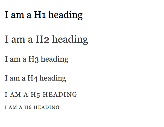
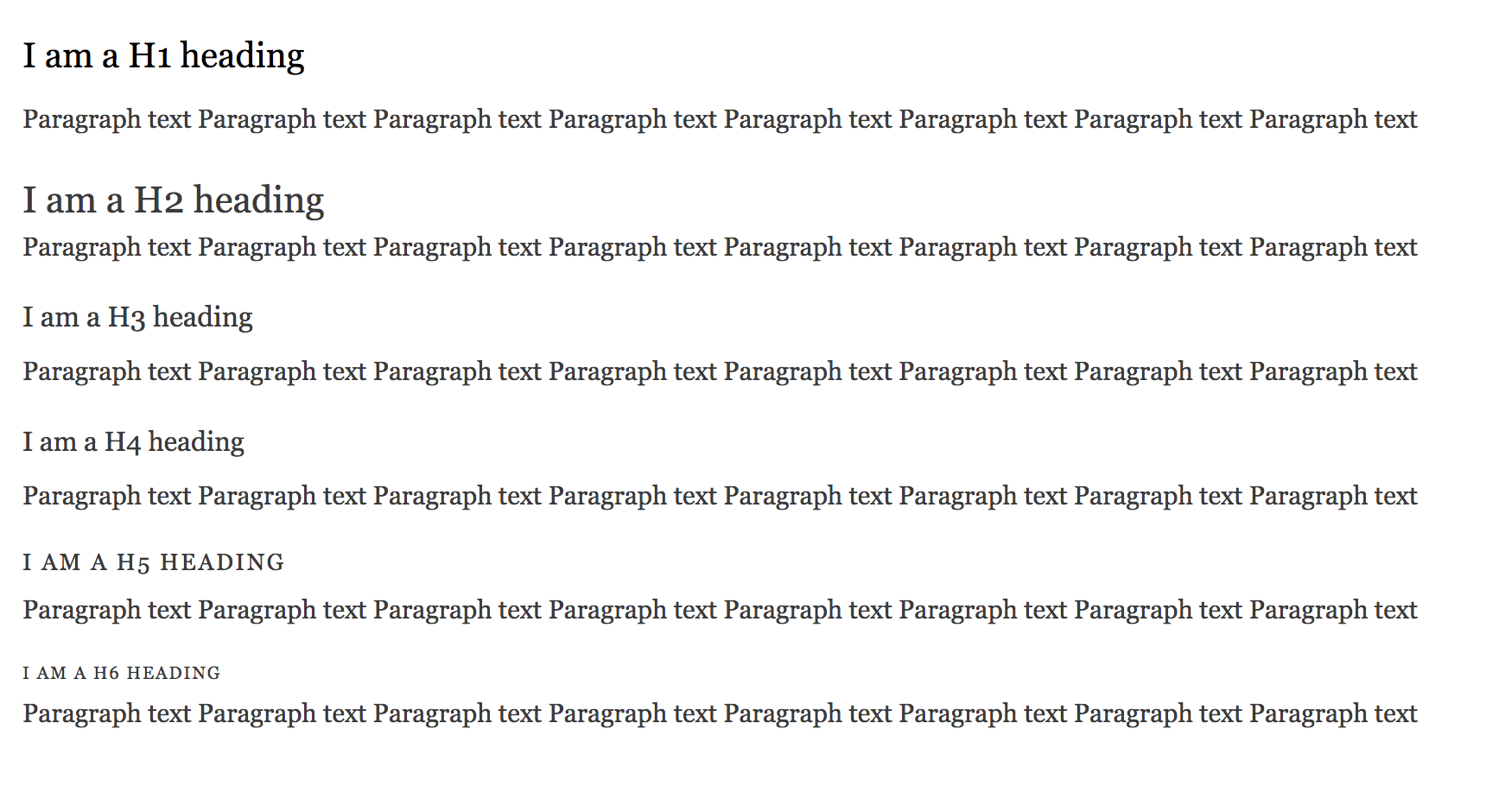
emma.mariaAdding screenshots to help reviews.
Headings side by side comparison.

Headings alongside paragraph comparison.

Comment #28
LewisNymanThank you!
Comment #29
alexpottCommitted 982db5f and pushed to 8.0.x. Thanks!
Comment #32
mgiffordJust correcting status.