
 Support for Drupal 7 is ending on 5 January 2025—it’s time to migrate to Drupal 10! Learn about the many benefits of Drupal 10 and find migration tools in our resource center.
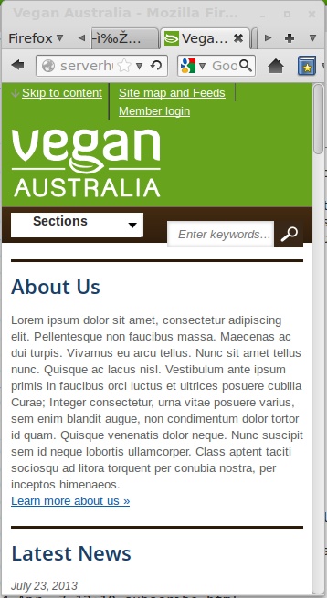
When viewed in a narrow window (either on iPhone or narrow Firefox window), the search box is vertically offset downwards by about 10-20 pixels. It should be vertically centred in the black bar, the same way the "Sections" menu is. See attached screenshot of narrow Firefox window.
| Comment | File | Size | Author |
|---|---|---|---|
| screendump_agov_small.jpg | 90.45 KB | gregmcf |


Comments
Comment #1
gregmcf CreditAttribution: gregmcf commentedURL of rc1 release showing problem: http://serverhub.dward.us/~veganaustralia/agov-7.x-1.0-rc1/
Comment #2
kim.pepperHi Greg,
Thanks for posting your issue.
It looks like the different logo size is affecting the margins of the search form in mobile size.
The quick fix is to resize your logo to match that of the agov logo that is part of agov.
The longer-term fix is to change the CSS so it has nothing to do with logo size :-\
Feel free to post a patch if you have a fix.
Kim
Comment #3
gregmcf CreditAttribution: gregmcf commentedThanks Kim. I resized logo to 212x70 (same as aGov) and it fixed the problem. I'll have a go at changing the CSS. Which file should I start looking in?
Comment #4
xtfer CreditAttribution: xtfer commentedJust to confirm, the padding around the logo is not optimal, so the size of the logo is important to get the layout correct. This is a known issue, but with a fairly easy work-around, as Kim has outlined.
Comment #5
pameeela CreditAttribution: pameeela commented