
Problem/Motivation
The introduction of configuration-based block plugins to Drupal 8 forced a complication of the blocks-by-theme-listing user interface under path admin/structure/block. It also introduced a new set of paths to manage blocks under the path /block.
Much time has been spent in issue debating how to improve the usability regressions in these interfaces and forms. We believe we have arrived at a minimal viable product design (with a few gaps), details in the issues linked from #1875252: [META] Make the block plugin UI shippable. Essentially we will separate the block placement UX flow from the block creation UX flow.
Proposed resolution
Invision prototype: https://projects.invisionapp.com/share/PEGD21X4#/screens
Separate the block placement flow from the block creation flow.
Currently the Place blocks button on the block listing page directs the user to a list of block plugins. The main action of this subsequent page is Add custom block. A particular block plugin is selected by again pressing a button labeled Place block, this time a row action in the block listing table.
The updated flow will expose a list of block plugins to the user on the existing block-theme listing page. The layout of the list will be analogous to the layout of the node composition page. Selecting a block from the list will prompt the user to provide the minimal set of configuration fields needed to create a new block instance and place it in a region of the theme.
The designs (invision and comments) should be used as to determine the exact UX of the block placement flow. Below are notes from our discussion with Tim Plunkett, effulgentsia and Kevin O'Leary about this project.
- Use the node edit screen (two columns) as the layout pattern for the block-by-theme-region listing and the list of available blocks to place.
- Placeable blocks listing in the sidebar will be:
- Grouped by “project”. Project will be an annotation -- “a straight API addition”
- Grouping and filtering works just like the Modules and SimpleTest pages.
- Clicking a block placement link from the list of placeable blocks opens a modal dialog with the minimal fields required to define a configurable entity.
- Use the Drupal modal.
- A newly placed block will float to the top of the list of blocks already in a region.
- If the region that a block is placed in is located off screen, the page will scroll to bring the newly placed block into view.
- Also, use Drupal.announce to tell a screen reader user that a new block instance has been placed in a given region.
Isolate the user-generated block creation flow
Pending design.
Currently, a user cannot create a block from a block type outside of the block placement flow. The action to create a block should be moved to the block-list-by-theme page. The two flows available to a user from this page will then be: create block and place block.
Rename Custom block types to Block types
Remove any instance of the word custom from the block UI forms and actions. #1920862: Rename custom_block.module to block_content.module: Rename custom_block.module to block_content.module
Accessibility
- Proper ARIA attribute markup applied to form UI components.
User interface changes
Yes, see the Invision prototype: https://projects.invisionapp.com/share/PEGD21X4#/screens
API changes
Original report by jessebeach
| Comment | File | Size | Author |
|---|---|---|---|
| #16 | Screen Shot 2013-08-10 at 4.50.14 PM.png | 53.97 KB | tim.plunkett |
| #16 | Screen Shot 2013-08-10 at 4.51.22 PM.png | 16.45 KB | tim.plunkett |
| #7 | block_categories.png | 258.5 KB | Berdir |
| #5 | aggregator_block_configuration.png | 79.57 KB | Berdir |
| #5 | aggregator_block_configuration_2.png | 94.38 KB | Berdir |


Comments
Comment #0.0
jessebeach CreditAttribution: jessebeach commentedadded 2014191
Comment #1
tim.plunkettFirst subissue: #2056513: Remove PluginUI subsystem, provide block plugins UI as one-off
Comment #2
tim.plunkettNext blocker: #2057725: Regular forms cannot be submitted when used as modal forms
Comment #3
xjmMarked #1871746: Add modal block browser as a duplicate of this issue.
Comment #4
tim.plunkettNext issue: #2058321: Move the 'place block' UI into the block listing
Comment #5
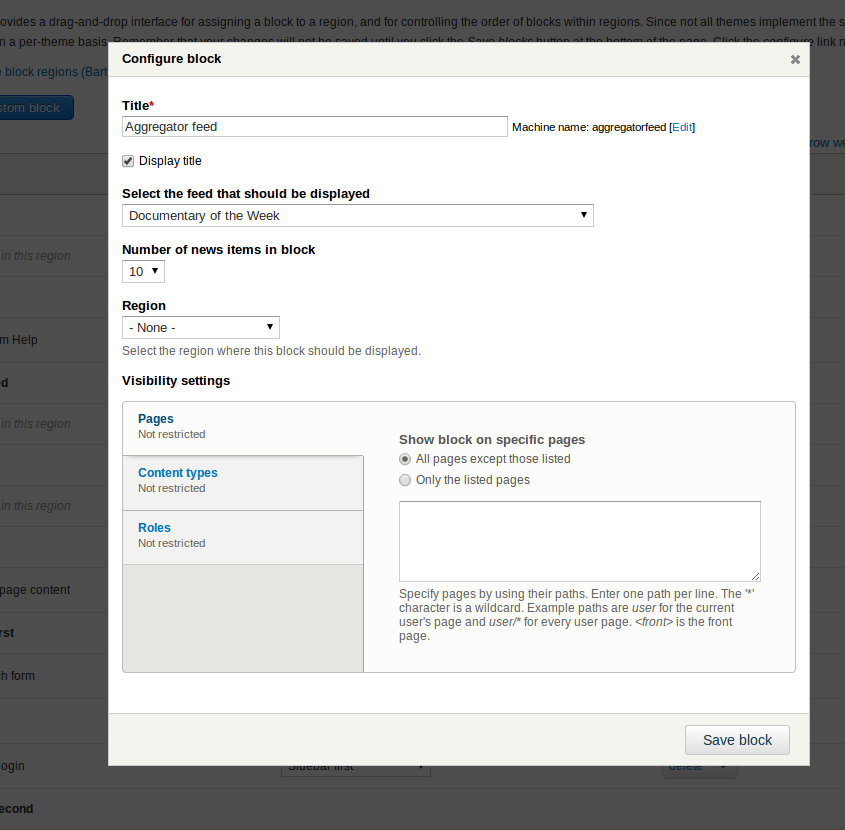
BerdirTesting what happens when you have a *lot* of blocks of a certain group. Imported 400 aggregator feeds and visited the block overview, this happens: https://dl.dropboxusercontent.com/u/2059345/aggregator_blocks.png (was too big to upload to d.o apparently). The Filtering works well, though.
#1888702: Use configuration selection instead of derivatives for some blocks only displays a single block and allows to select the feed on the configuration screen. See the two attached screenshots. The select there doesn't work well very either but that could be improved. Apart from not causing the first screenshot, this has IMHO also the advantage that it's more flexible. You could have two different blocks with the same feed and a different amount of feed items in it, for example. More details over there. Just trying to figure out if that's still possible in 8.x and if we want to do it.
Comment #6
webchickWe demoed #2058321: Move the 'place block' UI into the block listing to Dries today and he had some useful feedback. Here are the notes I took:
- It's a bit confusing that there are two ways of searching for blocks: categories and the search box. As a user new to Drupal, you're presented with the search box as the primary interface, but you don't know what blocks are available yet because they're all collapsed under categories that are, for the most part, nonsense (e.g. "node" and "system"). The interface is not learnable/discoverable. If you asked a user "What would you expect to see under 'System'?" they most assuredly would not come up with any of the blocks that are actually listed under there.
- Dries (wearing his new user hat) would prefer to simply see all blocks that are available, along with human-readable descriptions for those blocks, like the modules page (this is how WordPress presents its "Widgets" interface, which is basically the same thing). Jess pointed out that this doesn't scale with modules like Aggregator that might literally add 200 blocks, but the feeling was that if a module's doing that, it's a bug that should be fixed. Now that blocks can be placed multiple times on the page with different configurations, there's no longer a reason to do that.
- The fact that clicking a link added a block was not obvious at all. WordPress uses drag and drop for dragging from your block palette to your sidebar, and so a similar interaction here would work better. Either that or an explicit "Add" button. "+ " in the link text is not explicit enough.
- (minor) The title of the form you get when adding a block says "Configure block" rather than "Add block."
- (in another issue) The default operation on the blocks page should be "configure," not "delete."
It seems like this could use another round of design revision before we get too far into implementation. Kevin's back again on Monday, so I'll raise this with him. Also tagging Usability because my understanding was the current mock was a collaboration with the UX team.
Comment #7
BerdirJust a few comments/answers
- That would mean that #1888702: Use configuration selection instead of derivatives for some blocks is a bug, at least for those kinds of blocks where we can expect dozens if not hundreds on some sites.
- I think it's important to also test this in scenarios other than a default installation with just a handful of blocks. Imagine a large site with 10, 20 or more views blocks, 20, 50, 100? custom blocks, various contrib modules that expose blocks, .. Attaching a screenshot with a few custom blocks and views blocks and so on, imagine there are 100 in some of these categories (there are 400 in the collapsed aggregator category, but I already demonstrated that above... )
- To solve the problem with the useless category names, maybe we could introduce an optional category that can be any translatable string. That would mean we could use Content instead of Node, get rid of System and maybe the custom block module could group the blocks it provides per block type or something like that?
As a separate feedback, the way custom blocks work still feels quite confusing, especially combined with some bugs in the current patch in the other issue (for example that it displays the local action on the second form).
Comment #8
tim.plunkettNote that each block plugin can determine its own category, it is no longer tied to the module. This is shown in the patch, because the 5 system menus are moved from System to Menu. I also plan on opening a follow-up to expose the ability to change the category of a views block within the views UI.
Comment #9
Bojhan CreditAttribution: Bojhan commented@webchick It indeed was a collaboration between me and kevin on this one. So responding to your feedback.
1) Agreed, ideally its open by default. The search box is known item seeking, and the categories is for explorative seeking. http://bojhan.nl/task-focused-content for more background :). Both serve use cases.
2) I am not really sure about the idea of adding descriptions inline, it works well on a wide interface like Wordpress (they use the main area, with only a dozen of blocks). Doing that inline in the sidebar, will make the sidebar incredibly long and since its not a very wide column its likely a lot of text has to wrap. Can't we do something like show a description as tooltip?
3) I would love drag and drop, but previous conversations taught me that a bunch of blocks require configuration before being placed in a layout. If you know a way to circumvent this, that'd be great. There are also still a number of serious a11y difficulties with making drag and drop work on such a scale as this, but if we can solve that too. Again I would love for this to be drag and drop.
Agreed with all the other comments. To add a few:
4) We should probably have human-readable names for the block categories.
5) Should configure take place in a modal dialog to?
Comment #10
tim.plunkett1) Fine by me
2) I agree that it is too narrow
3) We cannot circumvent the modal in the current block workflow (not in scope here), and drag-n-drop leading to a modal is even more confusing
4) Sure, that's doable
5) Out of scope, but now should be trivial. I'll open a separate issue.
Comment #11
xjmAdded followup: #2061679: Add a tour for the improved block admin UI at admin/structure/blocks.
Comment #11.0
xjmadf
Comment #12
larowlanJust tested this on an Android. You can't press the save blocks button in the modal because when you scroll to the button, it jumps back to the top of the modal before you can press the button. Will file a follow-up on Monday as that isn't this issue's fault.
Comment #13
larowlanSo when #2058321: Move the 'place block' UI into the block listing goes in there will be no way to edit custom block content entities other than contextual links so we need a critical follow up to add a custom block content listing page. Not at computer but will add on Monday unless someone beats me to it.
Comment #14
webchickSay again? Wouldn't there be dropbuttons on their rows in the block placement table? If not, then that needs to be resolved before commit; we don't want to introduce anymore critical issues.
Comment #15
tim.plunkettAfter creating a new custom_block entity at /block/add, the only link to its edit form is from the contextual link once its placed, or from the place block page we're killing.
(Is there no custom block component? When are we going to get around to renaming that?)
Opened #2062439: Provide listing of custom block entities, I guess that's a blocker now.
Comment #16
tim.plunkettComment #17
larowlanSorry
Comment #18
tim.plunkettNo worries, #2062439: Provide listing of custom block entities now has a patch with test coverage. Shouldn't slow us down at this point.
Comment #19
jessebeach CreditAttribution: jessebeach commentedWe're blocked on a design cycle. Kevin O'Leary will post some ideas soon.
Comment #20
dcmistry CreditAttribution: dcmistry commentedKevin shared the designs at the UX happy hour today and he made some changes based on the feedback on the fly (isn't he awesome). Once he shares the re-design with an updated invision link, I would like to walk through the task flows to make sure we are making a significant impact in terms of UX within the scope/ resource constraints that we have.
Comment #21
tkoleary CreditAttribution: tkoleary commentedRevised designs (rough) are in the invision prototype here: http://invis.io/PEGD21X4
The prototype flow is a pretty linear walkthrough but includes the essentials of the design.
Comment #22
Dries CreditAttribution: Dries commentedI looked at the designs a week ago and then again at the design in #21 yesterday. The design in #21 still has some pretty major UX issues. I suggested an alternative solution to Kevin. He is going to try and mock it up so we can evaluate it.
Comment #23
tkoleary CreditAttribution: tkoleary commentedRevised designs are here: http://invis.io/G3GULW7B
At this point Dries, Angie, Jen Lampton, Bojhan, Yoroy, Dcmistry, GaborHojtsy, Wimleers, Jessebeach, sdboyer and Tim Plunkett have all weighted in. I think this design is pretty close to where we need to be.
I have left several notes as comments throughout the prototype (labeled Acquia, since I'm logged in to the corporate account). Please leave your own comments here to maintain a single record.
Comment #24
webchickMarking back to needs review for the design in #23.
Comment #25
tim.plunkettFor the record, I did not review any of these designs yet.
Comment #26
tim.plunkettIt would be helpful to have a list of related issues this design includes. There is plenty of stuff in there related to Views that is out of scope, as well as a great deal of UI elements related to the Layout module, which is about to be deleted.
Having a full list of issues this design encompasses would help clarify the scope.
Comment #27
Bojhan CreditAttribution: Bojhan commentedFirst of all, thanks Kevin for all this work its a massive challenge improving this design, while managing all of the scope problems - but still fundamentally improving the UX.
I agree with @tim.plunkett here that we should have a clear discussion what's part of the scope and what is part of the ideal solution. This is basically a technical/design PM kind of thing that needs to be figured out. Things that immediately jump to mind are; 1) is the layout selector possible, 2) do we need a new sidebar to the left, 3) do we need the labeling changes (changing views to content list), etc.
I also suggest to post a little backlog, on what the design changes are made upon feedback. I have always found it very hard to follow the new invisions when I happen to not attend one UX meetup. I'd be nice for others to get an idea of where we are going.
Comment #28
jessebeach CreditAttribution: jessebeach commentedI'll work with Kevin to assemble a list of issues. I'll post them as a draft list before entering them.
Comment #29
tim.plunkettA majority of the design seems to hinge around #1787956: Make blocks relate to layout instances instead of themes, a Drupal 9 issue.
Comment #30
webchickHere's a break-down of the prototype by "must-have", "nice-to-have", and "eh, probably not" ;) [Still in progress]
https://docs.google.com/document/d/1v-qADlsb6v_1JY2VQWKDEpiLXjWXyDqHReEx...
Comment #32
Bojhan CreditAttribution: Bojhan commented@Kevin Angie asked me to drop my feedback, since I can't attend the meeting. I consider many of these discussions, very similair to the discussions we had in https://groups.drupal.org/node/160144, https://groups.drupal.org/node/227543, and the many blocks discussions around BADCamp. Its a little disheartening to see so little of that knowledge being transferred to this issue, but I know thats the curse of design in open source.
1) Block library is an integral part of the experience, I would not descope that. However key is determining what level of "functionality linking" we can achieve if for example a block is a view, being able to go and edit the view should be possible. If this level of linking cannot be achieved, I would honestly not even make it part of this effort, because you end up with a rather useless list of items since you can't provide the useful edit experience, forcing people to still go elsewhere. I see that this is a can of worms, but we should take into account that descoping it will negatively impact the UX - as part of the holistic experience is now missing.
2) I think that having a "Disabled" category on the page would be a huge mistake. Basically every test up till now we found that people do not find the categories at the bottom, and even if they do know it - its still a bit of a weird experience. The whole "disabled" concept was also terribly confusing in Drupal 7, because you could still be using the blocks in another theme/dashboard, and blocks automagically show up there. I think having "region" as required although perhaps a little awkward, will be the better intermediate solution in terms of actual usability until we get a beautiful drag and drop.
3) Block categories and the (add new in this category) is essential part to the experience. I fear this is still a bit light on the details side of how this works, since its entirely possible that a category holds functionality coming from different modules/add/edit interfaces. I have no idea how to resolve this.
4) Having a "recent" category would be incredibly useful. Something that surfaced in many of the blocks library discussions, I would pursue anything that makes this more useful. It is likely a lot of people will use this much more than any categorisation we provide.
5 ) Custom UI elements.
5.1) Block's sidebar on the left side. I frankly see no good reason to do this, other than a personal preference of where the sidebar should be. We have already established a pattern of the sidebar on the right, and have done extensive work for that to look and work correctly. I see no point in duplicating that work, moving it to the left with different styling and also having competing visual elements (the sidebar and the vertical toolbar) close to each other like that (which will impact scanability). I understand that you might disagree with this, but I really want to avoid introducing all kinds of new interface patterns on every page.
5.2) The vertical tabs as a sidebar in the modal. I think we should re evaluate the usefulness of this, it undoubtedly looks very nice - but in our content page creation redesign we listed clear rationale and research why we thought the sidebar would be able to hold most module provided functionality. I do not know if that is the case for vertical tabs for blocks, the primary element (listing pages) will likely wrap awkwardly. Similar to 3.1, I wonder how much of this is a personal preference - because our vertical tabs function and work just fine, this again would require a new interface pattern we don't have elsewhere. Does this degrade similarity to the sidebar on content creation or not? How does it deal with many large elements, etc. If we introduce new elements like this, it often creates a list of followups.
That's all :) Hope this helps.
Comment #33
webchickCommenting briefly only on the left-vs-right sidebar thing.
We do usually put sidebars on the right, *however* we do that for essentially "you can safely ignore this" stuff. e.g. advanced settings on the node form.
On the blocks page, in contrast, this is an essential piece of the UI and, at least until your site is already built, pretty much the only thing you'll be doing on this page. Mixing primary vs. secondary actions in the right sidebar is confusing—I initially missed the block library altogether on that page because my eyes had been trained to ignore that stuff on the right (iirc that sidebar on the node form was put on the right for exactly that reason; so we could let people focus on the important parts of the form which are to the left).
Comment #34
tkoleary CreditAttribution: tkoleary commented@Bojhan
I totally agree, but it needs to be a separate issue. Can you create it?
I have also argued this but I understand from Tim that it's non-trivial and as such out of scope. I'll dig in further at the meeting.
I think we all agree that this is a good thing but again it needs a separate issue because Tim can only do so much and we need to get others involved to get this stuff done. Can you create an issue for that as well?
Yes, the recent category is in the design and I believe it is in scope. Per my discussions with Tim though it's not a robust time checking algorithm, just a simple rule "Show X number of blocks with the most recent created dates and never remove them unless newer blocks are created"
The primary reason for doing this is that Add actions throughout Drupal are on the left. I am not fundamentally opposed to having it on the right but, since it's a simple code change and there's no consensus, I suggest we do a split test and see which works better for users.
Comment #35
webchickOk, timplunkett, tkoleary, jessebeach, xjm, and I just had a call to go over this again (yes, on a Sunday, because that's how much we love Drupal!) in more detail, especially on implementation challenges.
Kevin's created a much more simplified version of the prototype at http://invis.io/F5GZ9QGW, and https://docs.google.com/a/acquia.com/document/d/1v-qADlsb6v_1JY2VQWKDEpi... is now more-or-less accurate picture of what we're hoping to produce to close out this critical.
Major changes since #23 (might not be all of them, but I tried :)):
We discussed how to get to the goal, which is not to be completely lost after you just created a block about how to actually get it on the page. We decided that the way to handle that is to include the mechanism to place the block on the page from the place where you create it. So for example, in Views, we could add a region selector into the flow to create a block display, or have a drop-button that says not just Save View, but also "Save view and place block" or something.
I think that was most of it. Kevin will be presenting this to the UX team during office hours tomorrow to get their feedback, too.
Tim will also need some support from the UX team on how to properly categorize all of the blocks in Drupal in order to fix the categorization issue. He can come up with a list of all of them to help kick things off.
Comment #36
klonos#2074191: [META] Add changed timestamp tracking to content entities will add timestamps to content entities. Why go only half way and not do it for all entities since we need it here as well? I mean, would there be (serious) performance implications.
Comment #37
tim.plunkett"Recent blocks" is not directly related to entities at all. It's about the plugins. And derivative-based plugin discovery has no knowledge of the previous list of plugins, if any plugins have ever existed before, or what causes them to exist, let alone what time they came into existence :)
Comment #38
klonosI see. Thanx for taking the time to reply.
Comment #39
tim.plunkettNext subissue: #2078341: Restructure Block UI and custom block pages
Comment #40
tim.plunkettNext one: #2078601: Move the block placement browser to the left of table and collapse it
Comment #41
tim.plunkett#2078951: Highlight the row of block that was just placed
Comment #42
tim.plunkett#2079037: Use two columns for the place block form
Comment #43
tim.plunkett#2079761: Use a template for the block listing page to simplify the form is now a blocker for the other issues, please review that if you can.
Comment #44
tim.plunkettI will not be posting any code here, FYI
Comment #45
tim.plunkettOpened #2083871: Allow menu blocks to be placed from the menu page and #2083877: Add a theme selector to the place block form, the latter of which is downright critical.
Comment #46
tim.plunkettPotentially the last two issues?
#2087219: Allow views blocks to be placed from the Views UI
#2087211: Move the 'Add custom block' local action to be in the place blocks sidebar
Comment #46.0
tim.plunkettUpdated issue summary.
Comment #47
yoroy CreditAttribution: yoroy commentedAdded #2089613: Apply machine name ui pattern in the Place Block form
Comment #47.0
yoroy CreditAttribution: yoroy commentedadd link to 2089613
Comment #48
jessebeach CreditAttribution: jessebeach commentedI added the remaining, blocking issues to the issue summary.
Comment #48.0
jessebeach CreditAttribution: jessebeach commentedadded
#2085201: Use sensible block categories (rather than module-name categories)
#2087823: The "link" styling of the Place blocks available blocks listing is not appropriate to indicate an action
#2087211: Move the 'Add custom block' local action to be in the place blocks sidebar
#1956448: Use the block instance title on the block admin listing
Comment #48.1
klonosadded #2100643 and ordered issues cronologically
Comment #48.2
jessebeach CreditAttribution: jessebeach commentedremoved #2087211 and #2100643
Comment #49
klonos...moved related issues to their metadata section.
Comment #50
klonosComment #51
webchickWith the commit of #1956448: Use the block instance title on the block admin listing and #2085201: Use sensible block categories (rather than module-name categories), along with the rest of the patches that have already gone in up above, I think this UI is now sufficiently fixed to the point that it's shippable. There are still some remaining issues in the Block UI Overhaul tag, but they all seem to be a) somewhat subjective, b) fairly minor cosmetic tweaks, or c) some combination of both.
Ergo, FINALLY officially closing out this long-standing issue. GREAT work, everyone!!
Comment #52
klonos...the point of having meta-issues (parent issue actually now that we have issue relations) is to keep them open till all their children/follow-ups are closed. Till that is actually done, this issue is not fixed - only partially/mostly fixed (but I realize we currently do not have such a status).
Comment #53
jessebeach CreditAttribution: jessebeach commentedComment #54
webchickNo, the critical issue as stated in the issue summary is, in fact, resolved. The remainder of those issues were "nice to haves" opened as individual problems got dug into more, but aren't actually part of closing this critical issue by themselves, so while they're related (and it's fine to call them out as such), they're not "sub"-issues of this one.
Comment #56
tkoleary CreditAttribution: tkoleary commentedReopened so that those who weighed in on this issue can review the UX regression child issue: #2372163: Focused pane in the right column of node edit may not be an expanded pane
Comment #57
tkoleary CreditAttribution: tkoleary commentedReopened wrong related issue