
 Support for Drupal 7 is ending on 5 January 2025—it’s time to migrate to Drupal 10! Learn about the many benefits of Drupal 10 and find migration tools in our resource center.
Posting patches as I go; it's a work in progress.
Changes
(Each round builds upon the previous round.)
- Round 4 (#30):
- Use the hand cursor when hovering an editable field.
- Fix toolbar pointer's background color.
- Round 3 (#26):
- Only transition the
opacityproperty on the buttons, not everything, because that caused glitches with the new CSS. - Apply Bojhan's changes in such a way that Seven-specific changes now live in the Seven theme.
- Only transition the
- Round 2 (#16):
- Make it possible for the admin theme to override Edit entity toolbar's default styling.
- Add blue pencil icon to entity toolbar, and stop bolding the field label.
- Refine field 'outlines' (box shadows, really).
- Reintroduced hover state for the close button, as well as a 'pressed state'.
- Round 1 (#2):
- Adjust the style of in-place editing CKEditor instances.
- Updated entity toolbar labeling.
- Make the toolbar much lighter.
- Fix slight horizontal movement of entity toolbar for padded textual fields.
- Replace the close icon with a Libricon SVG equivalent.
- Fix 'doubled' fields: instead of an outline around the field itself *and* around the form in-place editor "pop-up", only keep it around the currently interacted element.
Reference screenshots
- Reference screenshot #1

- Reference screenshot #2

Polish round #1 screenshots
- Reference screenshot #1
- Reference screenshot #2

Polish round #2 screenshots
- Reference screenshot #1
- Reference screenshot #2

- New hover/pressed styling for the "close" button


Polish round #3 screenshots
- Reference screenshot #1

- Reference screenshot #2
Polish round #4 screenshots
- Reference screenshot #1

- Reference screenshot #2
| Comment | File | Size | Author |
|---|---|---|---|
| #36 | edit_polish-2080217-36.patch | 33.54 KB | Wim Leers |
| #30 | edit_polish-2080217-30.patch | 33.53 KB | Wim Leers |
| #30 | edit_polish_round_4_ref-1.png | 46.76 KB | Wim Leers |
| #30 | edit_polish_round_4_ref-2.png | 49.17 KB | Wim Leers |
| #26 | edit_polish-2080217-26.patch | 32.1 KB | Wim Leers |


Comments
Comment #1
Wim LeersReference screenshots for in the issue summary.
Comment #2
Wim LeersPatch attached for round 1. Uses
git format-patchso you can assess the individual improvements.Improvements in this round:
Screenshots: see attachments, also in the issue summary.
Comment #2.0
Wim LeersInsert reference screenshots.
Comment #3
aspilicious CreditAttribution: aspilicious commentedNot a themer at all. So I could be wrong :)
Not an expert but will ther e be a fallback for png? If we want to tweak drupal 8 for our client to support ie8 in the frontend we need some kind of fallback icon.
Does this work for all the browsers we support?
Isn't better to use a span with a css class to apply the boldness.
whats wrong with "border: none"
Comment #4
Wim LeersOkay I should've been far more explicit: this is not yet ready for review!
A good review, but just too soon :) I'll address it as soon as it is complete.
Comment #5
Wim Leers.
Comment #6
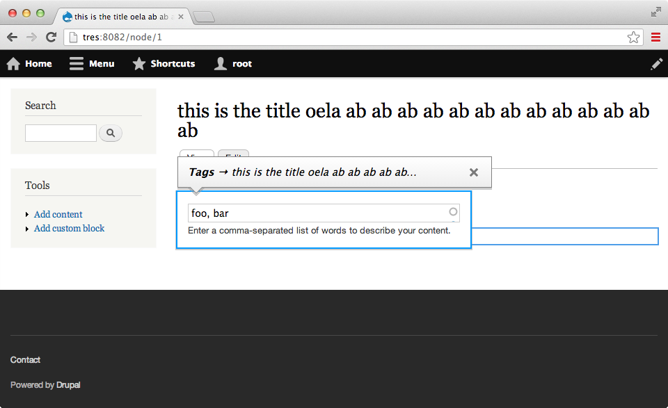
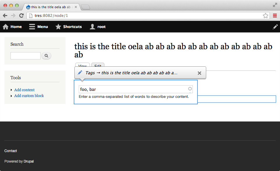
aspilicious CreditAttribution: aspilicious commentedOne small thingie that annoys me but I'm not sure if it can be fixed. When hover field_tags you get the nice not to hard border color. When you click you get a popup with another border.
==> 2 boxes with borders fighting each other.
Expected behaviour:
Only put focus on the top layer. I'm not interested in all the other layers and they distract me.
Comment #7
Wim Leers#6: yes, that's fixed already in #2 :) ;)
You can also see this in reference screenshot #1! :)
Comment #8
tkoleary CreditAttribution: tkoleary commented@Wim Leers
Looking good. :)
Comment #9
aspilicious CreditAttribution: aspilicious commentedI also mean all the other borders from the other elements. They aren't of any use anymore. When you save or close you need to click quick edit again.
Comment #10
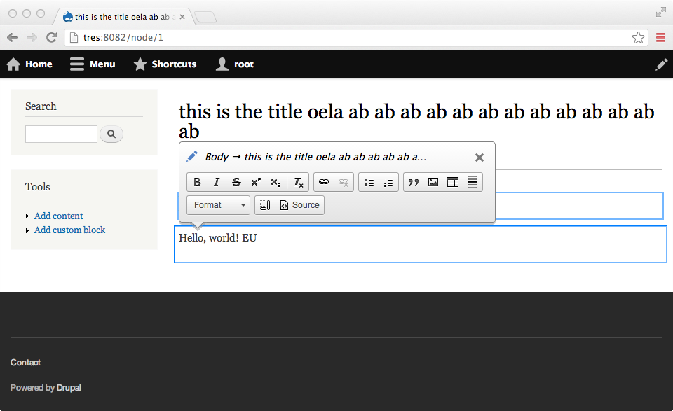
Wim Leers#9: No. The whole point of #1678002: Edit should provide a usable entity-level toolbar for saving fields is that you can jump from in-place editing one field to another field *without* having to click the "Save" button anymore after changing every field. And to let the user know which other fields he can edit, the outlines around other fields must continue to exist even while editing a field.
Comment #11
aspilicious CreditAttribution: aspilicious commentedAha interesting! :)
EDIT: although that leads to strange situations:
I quick edit the tag field. I change a value but don't change. I switch to the body. I change some text. I press save.
Both tags and body are changed.
When refreshing, tags are reverted.
Just a note...
Comment #12
Wim Leers#11: if you find bugs, please create a new issue. This issue has now been sidetracked a lot already ;)
Comment #13
tkoleary CreditAttribution: tkoleary commented@Bojhan
You asked for the invision design which I thought I had already posted. It's here: http://invis.io/QBH9N85K
Changes mainly clean up some heavy-handed styling and bring it in to sync with seven style guide.
Comment #14
tkoleary CreditAttribution: tkoleary commented@Bojhan
Re: seven style. Specifically the button colors, gradients background, fonts and icons.
Comment #15
Bojhan CreditAttribution: Bojhan commented@Kevin That looks great, happy to see the style guide integrated like that! I have a few small suggestions, I will try to mock them up tomorrow :)
Comment #16
Wim LeersRound 2.
Patch attached for round 2. Uses
git format-patchso you can assess the individual improvements.New improvements in this round (on top of the improvements in round 1, see #2):
Screenshots: see attachments, also in the issue summary.
#3:
In-place editing requires
contentEditable, which does not work reliably in <=IE8/Android 2.x. I.e. wherever in-place editing can work, SVG is supported. Finally, we only support IE8 for end-user browsing, not for administration, let alone for advanced features like in-place editing.border: noneis what I tried first. Then it turned out this did not have the desired effect — if some other CSS definesborder-left: SOMETHING, then settingborder: nonewon't override that. Hence I had to list all of them :(I think that means your concerns are now answered?
Comment #16.0
Wim LeersInsert polish round #1 reference screenshots.
Comment #18
Bojhan CreditAttribution: Bojhan commentedOk, lets see how many mistakes I made. I spend about 2 hours on this, mostly minor tweaks - nothing fancy. Below is a list of changes:
1) Added border radius (4px). I wasn't sure why all the corners where strong, the style guide specifies more softer corners. Given that the actual CKEditor buttons do this as well. I added the correct border radius to buttons.
2) Border color : #BDBDBD. The color that is used for the current border is too strong, making it stand out too much. I added the style guide specified border color also used in VT's and other containment elements.
3) Adjusted font size. It had a "hard" font size, I have no idea why this was - and it was quite big compared to all other administrative items. I aligned it with the toolbar size and simply threw away the definition.
4) Size of pencil icon. When the text changes the pencil icon also needed to change in size, this was because it would otherwise feel too big compared to the text.
5) Save button. This looked kinda like a hybrid, it used a similar shade to the style guide but not exact. I simply copied over the style guide CSS, and this also adds a significantly more noticeable hover style. The "clicked" style also seemed very "special", I haven't seen this elsewhere in core and you can still click it so I removed it.
6) Exit button. There is no standard for this yet, but the transparent background looked very odd to me. Its also not a style we use anywhere else in core. Therefor I went with just accentuating the button using the Drupal Blue. I tried the selection color but that looked rather weird.
7) Highlight colour for editable fields. I never liked the fact that we are using two shades here. It made it more "busy" than needed. Therefor I removed the second styling, from my point of view this makes the border less busy. I did this for focused and error too.
During testing I noticed a few bugs (not all of them directly related to Edit inline), Wim already told me a few of these are on his planning to open:
- The throbber is really ugly.
- The source option doesn't open in a core dialog.
- The "Loading" indicator when you add an image occasionally popsup at weird places (e.g. behind the entity toolbar)
- The initial position and width of the Entity toolbar is rather distracting (Wim will open an issue about this, once this polish work is done)
- It's often somewhat confusing how to "trigger" the inline mode, perhaps we can change hovering over a field into a hand to serve as indicator.
Comment #19
tkoleary CreditAttribution: tkoleary commented@Bojhan
I'm ok with all of that except the border.
The reason for the hard border is that, unlike anything else in the style guide, this floats on top of many different types of content of any color or background. The border from the styleguide always sits on white.
Without a stronger border the toolbar just fades into the content:
Comment #20
tkoleary CreditAttribution: tkoleary commented@Bojhan
Also, in your patch the icons are not loading as you can see.
Comment #21
Bojhan CreditAttribution: Bojhan commented@tkoleary Sure, though I am not sure it makes much of a difference when you are floating above text like that. I have experienced that moving around with the inline editing as really jarring - because it jumps around the whole time.
Comment #22
tkoleary CreditAttribution: tkoleary commented@bojhan
Jesse Beach is working on a fix for that
Comment #23
Bojhan CreditAttribution: Bojhan commentedCool :) Well looking forward to that then.
Comment #24
nod_tag.
Comment #25
Wim LeersI'm on this, will reroll tomorrow.
Comment #26
Wim LeersIn #16, I added this:
Bojhan's changes in #18 are about making Edit's default styling match the Seven theme. But really, all the "Sevenisms" belong in the Seven theme, because a different admin theme may be installed. So I moved all of Bojhan's changes in #18 over to
core/themes/seven/edit.cssif they were Seven-specific. See below.This is clearly Seven-specific, so moved this to Seven. I also removed 2 useless
border-radiusdeclarations that you added.How is
1.1ema "hard" font size? If everybody thinks the smaller size is fine, I'm fine with keeping this adjustment of course. This is not Seven-specific.I think the button looks out of place in general and it definitely feels to dark. I talked to Bojhan and he said it should be like the styles being introduced at #1986074: Buttons style update, minus the extreme roundedness there. He apparently didn't copy it all CSS declarations from there, because after doing that, it now looks much better.
Of course, moved into Seven, because this is highly Seven-specific.
Sadly, Drupal Blue on the close button conflicts with the Save button above. It's not unlike combining red and orange. Bojhan said in chat he'd look into this. For now, I'm not changing anything about this: it's the same as Bojhan's patch in #18, i.e. a black close icon upon hover. And I honestly think that's fine to keep. Furthermore, the 2px top margin on the save button also shifts this button downwards, making it positioned far too low. Fixed that.
Also Seven-specific of course.
I share your desire for simplicity. But both of these are problematic on various backgrounds, including dark backgrounds. On Bartik, just change the background color of
#main-contenttodarkgrayor to see what I mean. So for now I reverted this, until that concern is answered in your simplified version.Round 3.
Patch attached for round 3. Uses
git format-patchso you can assess the individual improvements.New improvements in this round (on top of the improvements in round 1 & 2, see #2 and #16):
opacityproperty on the buttons, not everything, because that caused glitches with the new CSS.Screenshots: see attachments, also in the issue summary.
Comment #26.0
Wim LeersUpdated for round 2.
Comment #27
Wim LeersI forgot to answer these:
Agreed, we should improve that. We can do that in this issue.
And that won't change. But we should make the styling match: #2090937: Seven theme: style CKEditor-native dialogs to match Drupal-native dialogs.
I haven't seen this happen yet. That sounds like a bug. When you find the steps to reproduce this, please create an issue.
Issue opened: #2090945: Polish entity toolbar's positioning .
So it's the cursor that should change upon hover. That's easy to fix. You can change that here too. That'd not be Seven-specific of course.
Comment #28
Bojhan CreditAttribution: Bojhan commentedOk, reviewing this. Overall the improvements look great :) I am happy to see all the parts getting such detailed feedback, this makes me happy and makes it so much easier to provide these kind of reviews. Some nitpicks that I could find:
1) The pointer doesn't continue the gradient, causing it to look somewhat weird (like you just cleaned it ^^). Perhaps the gradient can continue.
2) Lets turn the cursor into a hand, this probably needs you to use it for a short while to know if it feels right.
3) I asked r5yn to provide us with a new throbber icon.
4) Lets leave the exit icon as is for now, I'd like to use our Drupal Blue or Highlight color - but it needs more tweaking/playing with gradients. I tried to do this, but its a bit tricky.
5) The dark side, of this patch. The highlight color, I agree that in dark themes this is suboptimal. However I don't think its much more suboptimal than the way contextual links look in dark themes. Currently it looks bad on both light and dark themes, I am tempted to optimize for one (like we did with contextual links) rather than making a suboptimal look for both. The ideal solution would be for us to provide two styles, one for dark themes and one for light themes and people can just easily implement one or the other (other theme variations, frankly just require a custom style). I'd imagine that is follow up, so for now I'd like to improve our light version and remove the second color. I am open for discussion on this one though, I know what I am proposing here is quite a big followup.
Great to see followups for all the other issues, we identified!
Comment #29
Wim Leers:)
The only pointer I know is the mouse cursor. In other words: I have no idea what you're talking about :P I didn't touch any of the background gradients AFAIK. Can you explain this a bit more?
So these are the two changes that I understand how to make.
When these 3 points are addressed, this patch is ready to go in your mind?
Comment #30
Wim LeersBojhan explained point 1 in chat, it's now fixed. Point 2 is also fixed.
Point 3 is problematic: the proposed single color outlines don't distinguish between a field that can be in-place edited but is not highlighted versus one that is highlighted (i.e. when hovering or editing). We definitely need that distinction IMHO.
Furthermore, when comparing the single-color (Bojhan's) vs. dual-color (Kevin's, and in current patch) outline, I feel that the dual-color outline actually feels better, cleaner, crisper. So, I am *not* implementing this and I want Bojhan + Kevin to come to an agreement on what it should be. Right now only an incomplete solution has been proposed.
Round 4.
Patch attached for round 4. Uses
git format-patchso you can assess the individual improvements.New improvements in this round (on top of the improvements in round 1, 2 & 3, see #2, #16 & #26):
Screenshots: see attachments, also in the issue summary.
Comment #30.0
Wim LeersRound 3.
Comment #30.1
Wim LeersRound 4.
Comment #31
tkoleary CreditAttribution: tkoleary commented@Bojhan
This fails if the background color is the same color as the border
Comment #32
Wim Leers#31: that doesn't really help move this forward. Bojhan made design changes in #18, you said you were okay with all of them except with the toolbar border's color. So you okay'd this specifically, because you were fine with everything else, this is part of everything else. I'm saying in #30 that I'd question whether this dual-color outline is good. I'm asking for the input from the two of you.
The input I need:
Comment #33
Bojhan CreditAttribution: Bojhan commented@tkoleary So, all fails if the color is the same as the background. There is really nothing you can do, unless you want a border thats adaptive to the background (goodluck to Wim :D with that).
The basic concern that I had was really the highlight color and selected color are virtually the same, its a blue and slightly darker blue - this difference can be hard to distinguish. I also noted that the "dual-color" outline made it significantly busier than needed. In many visual designs the 2nd color, if you are using a border with two colors is only slightly more or is used as shadow effect. In this case its actually used to emphasize, from my point of view is the highlight already pretty in your face - there is no need to emphasize it more.
Comment #34
tkoleary CreditAttribution: tkoleary commented@Bojhan
Not sure I was clear. The purpose of the two outlines is that there will never be a case where you don't see it (since the background can't be both colors).
Do you suggestions on what the two colors should be to keep them in line with the style guide?
Comment #35
webchickNo longer applies. :(
Comment #36
Wim LeersRebased.
Comment #37
Wim LeersThe one thing we still had to resolve was the border around the field thing (see #30–#34). It's extremely minor and something that can be solved later on, it shouldn't hold up all the other improvements in this patch, all of which are much more important.
Both Bojhan and Kevin agreed with this.
It still applies cleanly to HEAD. Bojhan or Kevin, please RTBC :)
Comment #38
tkoleary CreditAttribution: tkoleary commentedRTBC!
Comment #39
Wim LeersThis is Kevin's first RTBC I think — @Kevin: you need to change the status field! :)
Comment #40
webchickAWESOME. So excited to see this patch go in! :D
Committed and pushed to 8.x. Great work, all!
Comment #41
Wim Leers.
Comment #42.0
(not verified) CreditAttribution: commentedOverview of all changes.