
 Support for Drupal 7 is ending on 5 January 2025—it’s time to migrate to Drupal 10! Learn about the many benefits of Drupal 10 and find migration tools in our resource center.
Problem/Motivation
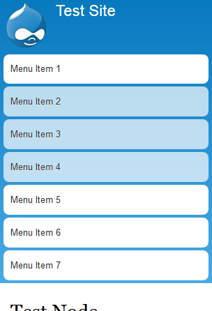
Main menu fills all height of window on smartphones up to 460px width.
See screenshot below.
Proposed solution
Make the main menu collapsible and give possibility to expand/collapse it.
Almost the same solution was implemented and commited to the Responsive Bartik D7 theme. See #1873156: Make menu collapsible on small screen resolutions
Please see screenshots below.
Collapsed:
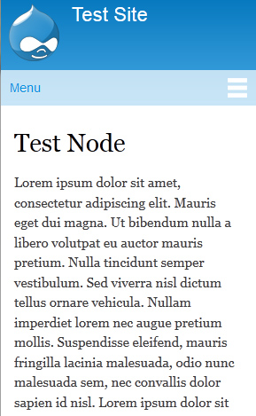
Expanded:
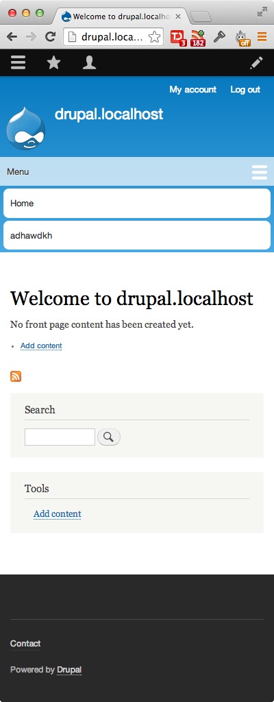
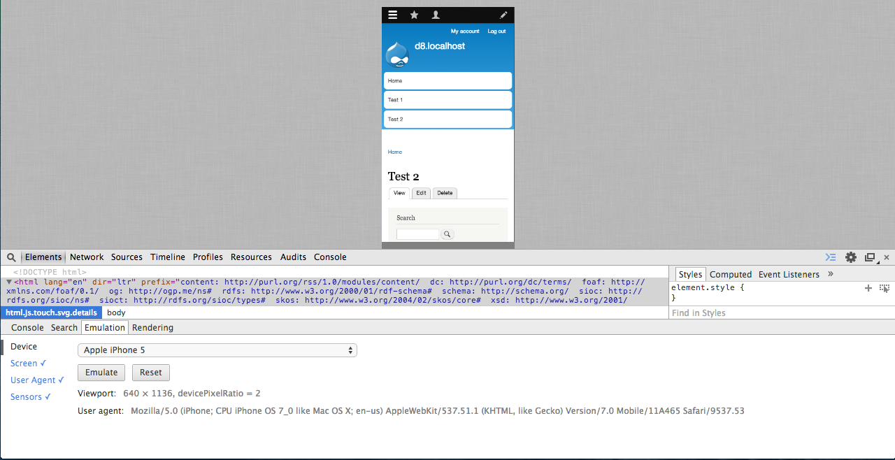
How to test
This section explain the recommended way to test:
- Apply the patch
- Clear all caches
- Using Google Chrome emulation to test it on one mobile device
Related issues
- #1192044: Convert Bartik's layout to mobile-first and responsive
- #1873156: Make menu collapsible on small screen resolutions
Remaining tasks
Review the patch
| Comment | File | Size | Author |
|---|---|---|---|
| #120 | bartik-made-menu-collapsible-1880488-119.patch | 4.02 KB | LewisNyman |
| #120 | interdiff.txt | 644 bytes | LewisNyman |
| #118 | Screenshot 2014-06-01 12.17.06.jpg | 67.53 KB | LewisNyman |
| #118 | bartik-made-menu-collapsible-1880488-118.patch | 4.02 KB | LewisNyman |
| #118 | interdiff.txt | 2.77 KB | LewisNyman |


Comments
Comment #1
Konstantin Komelin CreditAttribution: Konstantin Komelin commentedPatch attached.
Comment #2
webchickTagging with Mobile to get this on the right peoples' radars.
Comment #3
Konstantin Komelin CreditAttribution: Konstantin Komelin commentedOkay, thanks!
Comment #4
Konstantin Komelin CreditAttribution: Konstantin Komelin commentedHad problem with RTL language demo but now it's working.
Comment #5
nod_See how it's already done in vertical-tabs.js resize event is expensive to use and that's probably not worth it. For now it only checks at page load.
Comment #6
Konstantin Komelin CreditAttribution: Konstantin Komelin commentedThanks, nod_. I'll look at vertical tabs approach.
Comment #7
nod_Also try to use
<button>that's the right element for the job, not an empty<a>:) some examples at #1719640: Use 'button' element instead of empty linksComment #8
Konstantin Komelin CreditAttribution: Konstantin Komelin commentedI've done improvements according to #5 and #7.
- It checks client width at page load only (wo resize event handling)
- Replaced
<a>with<button>Attached new patch and updated the demo http://d8.komelin.com.
One issue I see now is menu hides on portrait <-> landscape switching.
Any ideas?
Comment #9
nod_can you use
.on('click', function…instead of.click(function…?Comment #10
Konstantin Komelin CreditAttribution: Konstantin Komelin commentedReplaced
.clickwith.on('click'. Updated demo.Comment #11
rteijeiro CreditAttribution: rteijeiro commentedI am afraid the patch is corrupted by a png image.
Please, review it.
Comment #12
Konstantin Komelin CreditAttribution: Konstantin Komelin commentedRe-created patch with command:
git diff --full-index --binaryChecked with command:
git apply -v --check bartik-1880488-12.patchResults:
Comment #13
Konstantin Komelin CreditAttribution: Konstantin Komelin commentedComment #14
rteijeiro CreditAttribution: rteijeiro commentedSorry but the patch gives me errors when applying:
Could someone test it too?
I am trying to see what's happening.
Comment #15
mjohnq3 CreditAttribution: mjohnq3 commentedThe above patch applied cleanly for me except for the whitespace error.
Comment #16
mbrett5062 CreditAttribution: mbrett5062 commentedI am wondering if we can take a similar approach to the collapsed menu button as Twitter Bootstrap.
Replace the PNG image with an HTML button and some simple CSS.
HTML
CSS
This would allow the button to be styled if the user wishes to override defaults.
Comment #17
rteijeiro CreditAttribution: rteijeiro commentedHi, I finally applied #12 patch, removing the collapsible-menu.js and toggle.png files, but now the menu completely disappeared.
Should I have to enable or config some modules?
Comment #18
Konstantin Komelin CreditAttribution: Konstantin Komelin commentedNo, you shouldn't. You should clean up your source base from the patch changes, pull latest changes from 8.x branch, and then apply patch again (if you wish).
Comment #19
rteijeiro CreditAttribution: rteijeiro commentedTried again to test but no luck.
My menu disappears after patch apply. I will see what is happening.
Maybe someone could test it too.
Comment #20
Konstantin Komelin CreditAttribution: Konstantin Komelin commentedRe-created the patch using
git diff --binary.It does work. I've applied it to the demo site sources http://d8.komelin.com/.
Comment #21
Konstantin Komelin CreditAttribution: Konstantin Komelin commentedTake a look at
http://www.responsinator.com/?url=d8.komelin.com
Comment #23
Konstantin Komelin CreditAttribution: Konstantin Komelin commented#20: bartik-1880488-20.patch queued for re-testing.
Comment #24
djroshi CreditAttribution: djroshi commentedFor your consideration, this is my attempt at a css-only implementation of this design, which I threw together as part of the drupalcon sydney code sprint.
Comment #25
djroshi CreditAttribution: djroshi commentedI have revisited the css and tidied it up a lot, removing superfluous css and a bunch of unneccessary
body:not(:target)identifiers - leaving the minimum required to ensure that this functions well in browsers that support :target and degrades nicely in those that don't...Comment #26
djroshi CreditAttribution: djroshi commentedLooks like toggle.png was omitted from the last patch, otherwise this patch is the same as #25
Comment #27
mjohnq3 CreditAttribution: mjohnq3 commentedI applied the latest patch on my local installation of D8 and also on a sandbox on http://simplytest.me/. In both instances at the screen size that triggers the collapsible menu, it does not toggle. Clicking on the menu button will open the menu but it cannot be closed.
Comment #28
djroshi CreditAttribution: djroshi commentedI haven't used http://simplytest.me/ before - I can see that being quite useful, thanks.
I think back in #24 I had it so clicking anywhere that wasn't a menu item would close the menu. In #26 the menu only closes if you click the menu button. I don't really mind either way (as long as it works, of course) so please let me know which behavior you think is best...
I tested #26 against Drupal Core 8.x on http://simplytest.me/ and it seems to be working OK for me. So far tested in Safari, FF, Chrome.
Comment #29
mjohnq3 CreditAttribution: mjohnq3 commentedI reapplied the patch in #26 on a http://simplytest.me/ sandbox and found that clicking on the menu button will open it but the menu can only be closed by clicking on the menu area not the button.
We need a few other people to test this - both approaches - the javascript version and the css only one.
I personally have no particular favorite. Both appear to work, are sound, and are generally in use, although the js is probably more common.
Comment #30
djroshi CreditAttribution: djroshi commentedI have reviewed #20 and I can confirm that it does work - however on a device with javascript disabled the menu disappears completely.
I am hoping this patch will fix the issue with the button not triggering menu close.
Comment #31
mjohnq3 CreditAttribution: mjohnq3 commentedYes, great, the menu works fine now with the above patch.
If we use the javascript approach, the menu would need to shown as is, not hidden, if js were not enabled on the device. I believe the OP was aware of that.
Comment #32
Konstantin Komelin CreditAttribution: Konstantin Komelin commentedTested #30. It works great. Thanks djroshi!
Advantages of CSS approach (#30):
- It works with disabled JS
- It works with changing of device orientation Portrait <-> Landscape
- We don't have to load 'drupal' and 'jquery' libraries for every page
Advantage of JS approach (#20):
- The toggle effect looks a bit sexier (slideToggle('fast'))
I see an improvement for #30. Please take into account margins of toggle button.
Attached screenshot.
So I'd love to see #30 in core. But I think we need some more testing on devices. I tested it on WinPhone7 only.
Comment #33
djroshi CreditAttribution: djroshi commentedThank you for the feedback :)
I think with the right-hand margin, my browser scroll-bar was getting in the way a bit. I have set it back to 10px as per the original design.
I have also wrapped a couple of hard-coded strings in t() functions.
Comment #34
Konstantin Komelin CreditAttribution: Konstantin Komelin commentedUsed SimplyTest.me to test #33.
The toggle button is not visible. But I might be wrong.
Comment #35
mjohnq3 CreditAttribution: mjohnq3 commentedI tested #33 on SimplyTest.me also. The menu button doesn't appear.
Comment #36
djroshi CreditAttribution: djroshi commented#33 generates a corrupt toggle.png file - hence the disappearing menu button. No idea how that happened. Hopefully this one works...
Comment #37
djroshi CreditAttribution: djroshi commentedI have tested #36 on simplytest.me and the menu button is back. Yay!
Comment #38
mjohnq3 CreditAttribution: mjohnq3 commentedLooks good.
Comment #39
Konstantin Komelin CreditAttribution: Konstantin Komelin commented#36 doesn't support RTL languages.
Comment #40
djroshi CreditAttribution: djroshi commentedRTL breaks the standard bartik responsive menu too by the way :)
We actually have a bit of overlap happening here:
http://drupal.org/node/1804446
What I have done is pulled a section of that patch (the main-menu stuff) into #40 (and modified it slightly) so that this issue can address the remaining issues with the bartik responsive main menu.
I hope this is OK?
Comment #41
Konstantin Komelin CreditAttribution: Konstantin Komelin commented#40 works well for me.
Comment #42
mjohnq3 CreditAttribution: mjohnq3 commentedPatch #40 looks good to me too.
Comment #43
carwin CreditAttribution: carwin commentedTested, patch applies cleanly with one insignificant whitespace error. Patch works as designed and solves the problem.
Marking RTBC.
Comment #44
jibranI tested it works great.
But I think we need
e.preventDefault();orjavascript:void(0);Comment #45
djroshi CreditAttribution: djroshi commentedWhy?
Comment #46
jibranBecause it will stop browser from bubbling up when menu icon is clicked.
Comment #47
djroshi CreditAttribution: djroshi commentedThere is no javascript in #40 - these click events need to be handled by the browser.
Comment #48
webchickSounds like this needs more discussion?
Comment #49
djroshi CreditAttribution: djroshi commentedPatch #40 uses CSS to toggle the menu. It does so by using an anchor href and the CSS3 :target selector. The menu opens by navigating the browser to "#main-menu-links" and closes by navigating to "#".
Of course "#" is commonly misappropriated as a href for elements that are solely used as javascript triggers. In these cases javascript:void(0) and e.preventDefault() is used to stop events being handled by the browser.
I would appreciate an explanation from jibran as to how exactly his comments are at all relevant to the patch provided.
Comment #50
jibranSorry for not being clear. Let me explain myself.
see site logo is not visible only menu items are showing at the top.
e.preventDefault();orjavascript:void(0);it would look like thisbrowser will scroll down and site logo is still visible.
So all I am saying is that page have to remain at its original place and it should slide down to accommodate menu items.
And IMHO menu items should appear under menu icon not the other way around. So adding the usability tag for more opinions.
Comment #51
djroshi CreditAttribution: djroshi commentedPlease read #32 for a brief comparison of the CSS and JS approaches, and review #20 if you are interested in a javascript implementation.
The CSS approach is obviously limited by cross-browser issues. The menu items all have fluid height which is difficult to animate in CSS and the use of the :target selector results in a page jump to the named div. That said it's very, very lightweight, doesn't require javascript to be enabled, and is designed to degrade nicely if browser doesn't support the CSS :target selector.
Also, I have to say. You click the menu button - it jumps to the menu. OMG.
I think I have already explained why
e.preventDefault()andjavascript:void(0)are not applicable solutions. If you are not convinced then I guess you will have to try it, and see for yourself that it completely breaks the functionality. If you are going to tell the browser to not respond to click events, you better have a script or something that does - or else guess what? Nothing happens.As for menu items above/below, I'm not really bothered either way.
To sum up, #40 has been tested as working by four people besides myself. It has two known "issues", the page jump due to named anchors, and the lack of a slide animation. Both these issues directly reflect the trade-off between the CSS and JS approaches.
IMO Bartik should be lightweight and functional. Loading jquery on every page just to enable slide animation for a toggle menu that only appears on mobile devices just doesn't seem right to me...
Comment #52
jibranOk let's try
Comment #53
Konstantin Komelin CreditAttribution: Konstantin Komelin commented#52 Collapsing doesn't work at least in FireFox and Chrome. Q.E.D.
Comment #54
djroshi CreditAttribution: djroshi commentedThis should maybe fix the page jump issue. However cross-browser compatibility now depends on both
:targetand adjacent sibling~CSS selectors being supported. I would be interested to see how well supported this is on mobile platforms. Tested in Firefox, Chrome, Safari, and Opera.Comment #55
mjohnq3 CreditAttribution: mjohnq3 commentedTests fine using a sandbox on simplytest.me on Chrome 25, Firefox 19, and Opera 12.5. It also works correctly with IE9 and IE10 but there's a slight visual anomaly, (stray text appears below the word Menu when its opened) as shown in the attached screenshot.
Comment #56
djroshi CreditAttribution: djroshi commentedHmm, I was using a slightly newer version of the -999em hack to hide that text. Maybe the original will work better? Sorry I can't test in IE at the moment :(
Comment #57
Konstantin Komelin CreditAttribution: Konstantin Komelin commentedTested #54.
Desktop:
Mobile:
Comment #58
jibranIt is working fine in IE9, IE10, Chrome 25, Firefox 19. Thanks for the changes.
Comment #59
Konstantin Komelin CreditAttribution: Konstantin Komelin commented#56 works well in the latest desktop browsers (Windows) and IE9 on WinPhone7.
Comment #60
jibranAdding tag.
Comment #61
mjohnq3 CreditAttribution: mjohnq3 commented#56 works correctly in IE9 and IE10.
Comment #62
nod_dup of #1490402: Redesign tabs and the content header ?
Comment #63
ry5n CreditAttribution: ry5n commentedSo nod_ pointed me here. I’ve done a redesign of the way our navigation tabs (e.g. at the top of the overlay) wok on small screens. Very similar to the standard approach to responsive navs, and to the interaction pattern applied here. However, my solution uses JS to detect available space and switch layout accordingly. Uses CSS animations for performance on small screens.
A demo is available here: http://drupalcode.org/sandbox/ry5n/1932040.git/blob_plain/ec02de3c6a05ef...
I wonder if we could decide on a best implementation for core? A basic solution that if needed, one or both (navs/tabs) can extend?
Comment #64
Konstantin Komelin CreditAttribution: Konstantin Komelin commented@ry5n, we have at least two working solutions in this issue:
1) #1 jQuery.resize is used to check size. Works everywhere, supports landscape -> portrait switching.
2) Excelent solution without Javascript dependency #56. Works. Tested.
You suggested 3d. Let's compare them.
Comment #65
Konstantin Komelin CreditAttribution: Konstantin Komelin commentedShortened url of @ry5n demo: http://goo.gl/ZLa5f

Should be better now:
Comment #66
Konstantin Komelin CreditAttribution: Konstantin Komelin commented#63 doesn't look very responsive on Windows Phone 7. I guess due to lack of meta:viewport tag
Comment #67
Konstantin Komelin CreditAttribution: Konstantin Komelin commentedBtw, now it's possible to generate QR code for simplytest.me sandbox url by clicking special icon on the timer panel.
Comment #68
ry5n CreditAttribution: ry5n commentedI’ve added a viewport meta tag and fixed some JS bugs in my implementation. Demo of the new commit is at http://bit.ly/YLcw6U
To compare all three approaches, I’m only looking at code and the post in this issue; it looks like both #20 (the most recent JS-based patch) and #56 need re-rolls.
#56. CSS-only approach: no JS needed (nice). Some of the CSS selectors look more complex than they need to be, but that doesn’t detract from the approach. Downsides mentioned in previous comments are the lack of an open/close animation and the jump caused by scrolling the page to the named anchor. I would have to try a demo to see if the experience was acceptable. Sometimes named-anchor jumps are disorienting.
#20. Basic JS approach. Obviously requires JS. Has a nicer animation for open/close (although animating in JS on mobile can perform poorly, i.e. low FPS).
An additional downside of both approaches is they depend on specific media queries to toggle layout, so both would need manual tweaking if and when the menu items change.
#67. This one :)
Advantages: falls back to a stacked nav when no js. Touch targets larger on touch screens. Layout switch happens automatically based on the actual rendered size of the element (no media queries to manage). Has a nice slide animation; uses hardware-accelerated CSS transitions for smooth performance on CPU-constrained devices (which is where it would be seen).
Disadvantages: complex. Depends on jQuery, Modernizr (touch, csstransitions). Uses several custom jQuery plugins (they are modular though, none is particularly complicated). Does use a window.resize handler. In reality though, if we assume folks won’t resize their window, the performance cost of having the resize handler is still zero :) And if the window does resize, it doesn’t break.
For me, it comes down to a couple of things. Drupal’s admin UI (Seven) needs to provide a really good experience. That means speed, but also avoiding aesthetic and usability issues (potentially) with the CSS approach. Again, I’d need to demo it to see. If we want to go with a single approach for responsive navs in Core, it should be one that can support all core themes.
So: should we build a common responsive nav implementation? If so, my tentative vote is for JS with auto-layout.
Comment #69
Konstantin Komelin CreditAttribution: Konstantin Komelin commented> if we assume folks won’t resize their window, the performance cost of having the resize handler is still zero :)
This is actual for #1 as well. I mentioned it instead of #20 because #20 doesn't use resize and therefore doesn't support landscape <-> portrait switching.
If you wanna see how the similar approach (#1) works take a look at Responsive Bartik theme demo http://drupal.org/project/responsive_bartik
I personally prefer #56. The named-anchor jump is not disorienting users because the anchors are close to each other.
Let's see what other guys think.
Comment #70
ry5n CreditAttribution: ry5n commented@konstantin.komelin
Yes absolutely. My argument about resize handlers applies generally.
I looked at responsive_bartik, but it doesn’t seem to include the changes proposed here. I also tried http://d8.komelin.com/ but I don’t see the expected behavior. Do I need to log in?
I’d like to try both of these out, either a demo or reroll. Can someone oblige?
Comment #71
Konstantin Komelin CreditAttribution: Konstantin Komelin commentedhttp://d8.komelin.com/ is not up to date.
Reroll is probably ideal variant because we will be able to use simplytest.me for applying patches and seeing results in action.
Comment #72
Konstantin Komelin CreditAttribution: Konstantin Komelin commentedWritten message to @djroshi about #56
Comment #73
djroshi CreditAttribution: djroshi commentedReroll of #56
Comment #75
Konstantin Komelin CreditAttribution: Konstantin Komelin commentedThanks djroshi! #73 looks good.
Comment #76
djroshi CreditAttribution: djroshi commented#73: bartik-1880488-73.patch queued for re-testing.
Comment #77
ry5n CreditAttribution: ry5n commentedThanks for the reroll! I still think we need JS rather than hard-coded breakpoints to switch the menu layout, for flexibility reasons. But now that I’ve tested this, I feel better about the CSS-only solution for the toggle action. It works well; the only disconcerting thing is that the menu appears above the trigger, rather than below. I feel like the place where my attention was focused shouldn’t jump away, and I should be able to tap the same spot to reverse the action.
I also realized that if we were to use the CSS-only approach as a general solution for core it would need to work inside the Overlay (because of the nav tabs). But the Overlay uses special URLs like /#overlay=admin/content, which is probably an issue since there’s already a fragment in there.
Comment #78
nod_Overlay doesn't work well (at all?) on touch so we just get rid of it when that's the case (I think some code needs to be updated for that to work well but that's the idea).
I wouldn't worry too much about responsive things inside the overlay. There shouldn't be any.
Comment #79
ry5n CreditAttribution: ry5n commentedThat’s true. In an ideal world it’s not only about touch or screen size, since we could still have a set of tabs that don’t fit across the overlay (especially with the toolbar in vertical mode), but I guess if it works enough of the time, it’s OK.
Comment #80
djroshi CreditAttribution: djroshi commentedCan we get get a consensus on whether the menu should appear above (as per konstantins original design) or below the menu button?
Comment #81
Konstantin Komelin CreditAttribution: Konstantin Komelin commentedMuch time has passed. I'm giving you guys opportunity to decide.
Comment #82
jibran#73: bartik-1880488-73.patch queued for re-testing.
Comment #84
rteijeiro CreditAttribution: rteijeiro commentedRe-rolling...
Comment #85
rteijeiro CreditAttribution: rteijeiro commentedPatch re-rolled.
Have talked with LewisNyman and maybe we should refactor this empty divs.
Comment #86
djroshi CreditAttribution: djroshi commentedSure. What do you suggest?
Comment #87
LewisNymanHaving read through the issue now, I think the CSS only approach is a decent improvement, the JS based tabs solution is still being implemented in Seven and maybe at a later date we could look at solving it in the same way. I don't think it's a major problem here though.
Let's fix the final UX issue and call it done.
Above.
Comment #88
djroshi CreditAttribution: djroshi commentedOK I will provide a patch with the menu below the button so we can do a proper comparison...
Comment #89
rteijeiro CreditAttribution: rteijeiro commentedComment #90
emma.mariaPatch #85 applies but the menu no longer collapses when you try to close it whilst on the same page no matter where you click and also still shows as open on page refresh. It only collapses again when you navigate to another page. Seems to definitely need more work.
Comment #91
Konstantin Komelin CreditAttribution: Konstantin Komelin commentedHey! I will be happy to continue working on it.
-- Konstantin
Comment #92
Konstantin Komelin CreditAttribution: Konstantin Komelin commentedImproved #85
Please review.
Thanks,
Konstantin
Comment #93
ohthehugemanatee CreditAttribution: ohthehugemanatee commentedpatch applies cleanly, and the menu is collapsible.
But the toggle.png icon does not appear on my dev environment, because the url generated for it doesn't include the port number (I work on http://localhost:8080/). In css/style.css:618
This produces "background: url('http://localhost/core/themes/bartik/images/toggle.png') no-repeat scroll 0% 0% transparent;" . That URL doesn't get me anywhere. :(
Comment #94
ohthehugemanatee CreditAttribution: ohthehugemanatee commentedComment #95
sqndr CreditAttribution: sqndr commentedWhy are we using a png image instead of an svg? Anyway ... seems like there's lot's of *.png's in Bartik.
If you're adding a new image: you should also get you're image optimised using something like ImageOptim. http://cl.ly/image/1f0f0v3k1e1u
Comment #96
sqndr CreditAttribution: sqndr commentedYeah. So - there already is an svg image (hamburger.svg) in core in the toolbar. Why aren't we reusing that one? It's *.svg, so it's retina-ready and it's already in the core http://cl.ly/image/1k3p2h3X0a0J
Comment #97
Konstantin Komelin CreditAttribution: Konstantin Komelin commented@ohthehugemanatee thank you for review!
I've tested the patch on 8080 port, it's working fine. It can be a local cache issue.
Anyway, the PNG will be replaced soon (see below).
@sqndr,
I will try to recreate the patch with the hamburger.svg. Thx for the suggestion.
-- Konstantin
Comment #98
sqndr CreditAttribution: sqndr commentedSomething like this.
Comment #99
Konstantin Komelin CreditAttribution: Konstantin Komelin commentedImproved #92.
Replaced PNG with existing SVG.
Please review.
Thanks,
Konstantin
Comment #100
sqndr CreditAttribution: sqndr commentedYeah! This looks good to me. Nice job!
Comment #101
Konstantin Komelin CreditAttribution: Konstantin Komelin commented@sqndr,
Thanks! Can we set the issue to RTBC?
Comment #102
rteijeiro CreditAttribution: rteijeiro commentedI think we should use classes instead ids.
Anyway everything looks fine. Attached a couple of screenshots.
Comment #103
Konstantin Komelin CreditAttribution: Konstantin Komelin commentedThanks @rteijeiro for the review. I'll replace IDs with classes.
Comment #104
rteijeiro CreditAttribution: rteijeiro commentedAfter discussing this with konstantin.komelin we found that ids are required for this solution.
Then it's a RTBC for me.
Comment #105
Konstantin Komelin CreditAttribution: Konstantin Komelin commentedGreat! Thanks to everyone who was involved!
Comment #106
alexpottThis looks great - however I'm not 100% convinced by the menu appearing above the toggle - that seems counter-intuitive to me since the thing you've just clicked is always going to move and to close it if you didn't mean to open the menu you're going to have to scroll.
Comment #107
Bojhan CreditAttribution: Bojhan commentedI man not sure I understand that part either. Most menu buttons are persistent. The reason we place it above on Seven is because the visual design doesn't really allow for it to be placed below. For Bartik I am not sure if we need to do this.
@Lewis could you elaborate more?
Comment #108
Bojhan CreditAttribution: Bojhan commentedComment #109
LewisNymanAfter reading my comment, I must of confused myself. One word answers must not be my strong point...
We definitely do want the button to stay in the same place. I've updated the summary to include this remaining task.
Comment #110
Amad Tababa CreditAttribution: Amad Tababa commentedComment #111
Konstantin Komelin CreditAttribution: Konstantin Komelin commentedRemoved irrelevant information from the issue description.
Comment #112
Amad Tababa CreditAttribution: Amad Tababa commentedThe batch ( bartik-made-menu-collapsible-1880488-98.patch ) I have tested this patch and seems work fine for me with different device. this is a screen example with emulator S4.
Comment #113
Amad Tababa CreditAttribution: Amad Tababa commentedComment #114
Amad Tababa CreditAttribution: Amad Tababa commentedComment #115
alexpottAfter discussion with me and @Bojhan in #109 @LewisNyman says
So this can not be rtbc.
Comment #116
Konstantin Komelin CreditAttribution: Konstantin Komelin commentedThanks guys. Unfortunately, it was designed to have the toggle button at the bottom, so I can't help to remake it.
@Amad Tababa, your device emulator is not a real device emulator. It can behave differently in some cases. I recommend either testing on real devices and official emulators of manufacturers or at least using BrowserStack.
Comment #117
LewisNymanThis is my fault in a way. I'll sort it out.
Comment #118
LewisNymanWoo.
Comment #119
LewisNymanComment #120
LewisNymanSorry! I forgot to test desktop. Please review this patch.
Comment #121
ekl1773This looks good to me- tested with emulators, menu collapses appropriately, code looks good to me.
Comment #122
Bojhan CreditAttribution: Bojhan commentedOk, lets get this in!
Comment #123
nod_No JS hey, we should have more patches like that :D
Comment #124
alexpottCommitted c20145f and pushed to 8.x. Thanks!
Comment #127
iMiksuCleaning up drupalcampfi tags.