
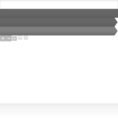
Currently collapsed fieldsets are hard to discover as they have no indicator of any kind, they are just a grey box. This normally looks ok, but when used in a more complex form they become even harder to find and use. Adding in some level of icon / arrow to better indicate there is an available interaction would improve the usability.
| Comment | File | Size | Author |
|---|---|---|---|
| #6 | 1782512-rubik-collapsible-fieldset-icon-06.patch | 1.54 KB | haydeniv |
| #1 | bleeds.png | 6.04 KB | wbobeirne |
| Screen Shot 2012-09-12 at 11.51.31 AM.png | 8.66 KB | jec006 |


Comments
Comment #1
wbobeirne CreditAttribution: wbobeirne commentedLooks like there was already some existing code for this, I just fixed it up and re-themed it a bit. Let me know if I stepped on the toes of some functionality I was not aware of. Attached is a patch that should give the following output:
http://cl.ly/image/0P2O0f2M0K1u
The images were just a quick placeholder I whipped up. Someone feel free to replace them. Also, I'm not sure how you're supposed to include images in a patch file, so attached is the revised bleeds.png with those placeholders.
Comment #2
wbobeirne CreditAttribution: wbobeirne commentedComment #3
wbobeirne CreditAttribution: wbobeirne commentedMy apologies, the previous patch included a dpm. Attached is a DPMless patch.
Comment #4
haydeniv CreditAttribution: haydeniv commentedThis does not apply anymore. Please re-roll and I'll get it committed. Thanks!
Comment #5
eugene.ilyin CreditAttribution: eugene.ilyin commentedGood idea. Patch #3 works great for my Rubik 7.x-4.0-beta8. Please commit it.
Comment #6
haydeniv CreditAttribution: haydeniv commentedThis was partially fixed with #1389704: Icons for collapsible nested fieldsets always hidden
I like how this one works better though with the layout of the icon.
Comment #7
haydeniv CreditAttribution: haydeniv commentedCorrect status.
Comment #8
haydeniv CreditAttribution: haydeniv commentedcommitted: e624bca
I really like how this feels on the fieldsets.
Thanks!
Comment #10
donquixote CreditAttribution: donquixote commentedRegression:
This change causes the Views UI to look weird, with duplicate borders.
The original purpose of this CSS was that nested form-wrapper elements don't have their borders pile up.
(Maybe
.form-wrapper > .form-wrapperwould be safer)admin/structure/views/view/*/edit/* looks weird now. And probably some other places too.
Comment #11
kyletaylored CreditAttribution: kyletaylored commentedI'm pretty sure that #10 was fixed in #1388114: Views admin styles for Rubik.