
Updated: Comment #122
See details about the Usability Study at http://groups.drupal.org/node/163894
This issue contains suggestions and attempts to modify the display of these to fields to make it clear to the user how to 'update' the account password.
Problem/Motivation
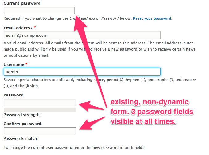
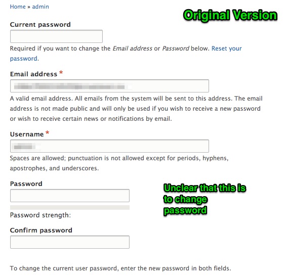
During a usability test, users logged into Drupal could not determine how to update their account password. Users did not understand that the existing 'password' and 'confirm password' fields on the user/edit page served the purpose of a password update.

Proposed resolution
Proposed resolution from #176 and #177:
It might be simpler and lead to better user experience if we create a separate form for changing the password and e-mail address.
Now we have 3 different forms instead of one single form doing a lot of stuff at one single place.
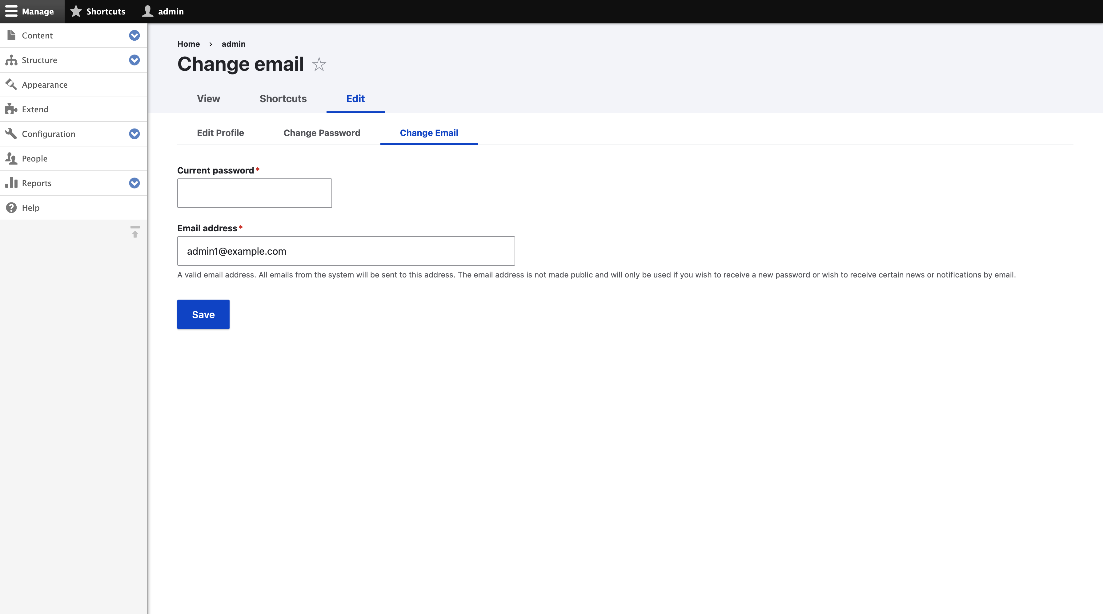
Edit Profile form:-
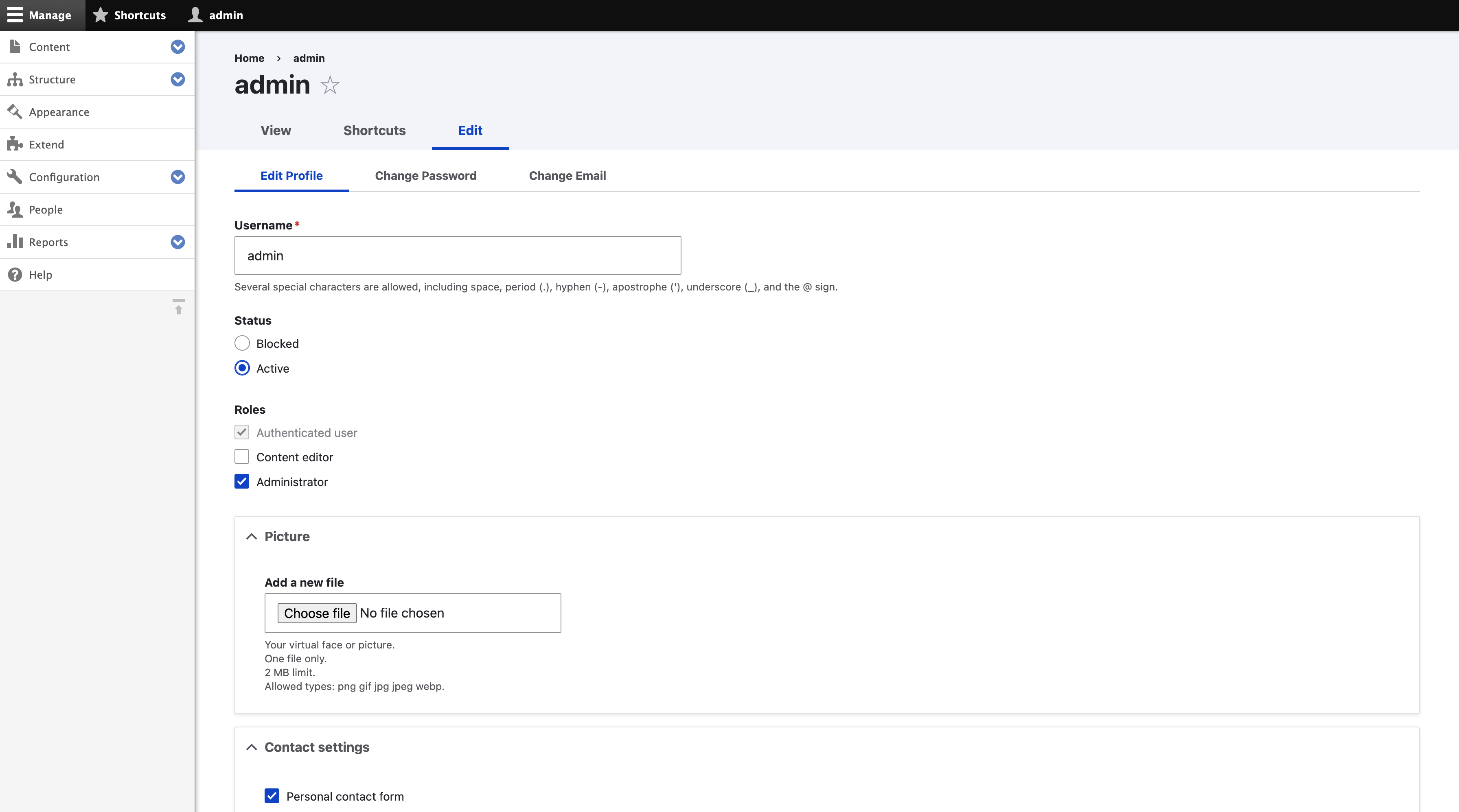
Change password form:-
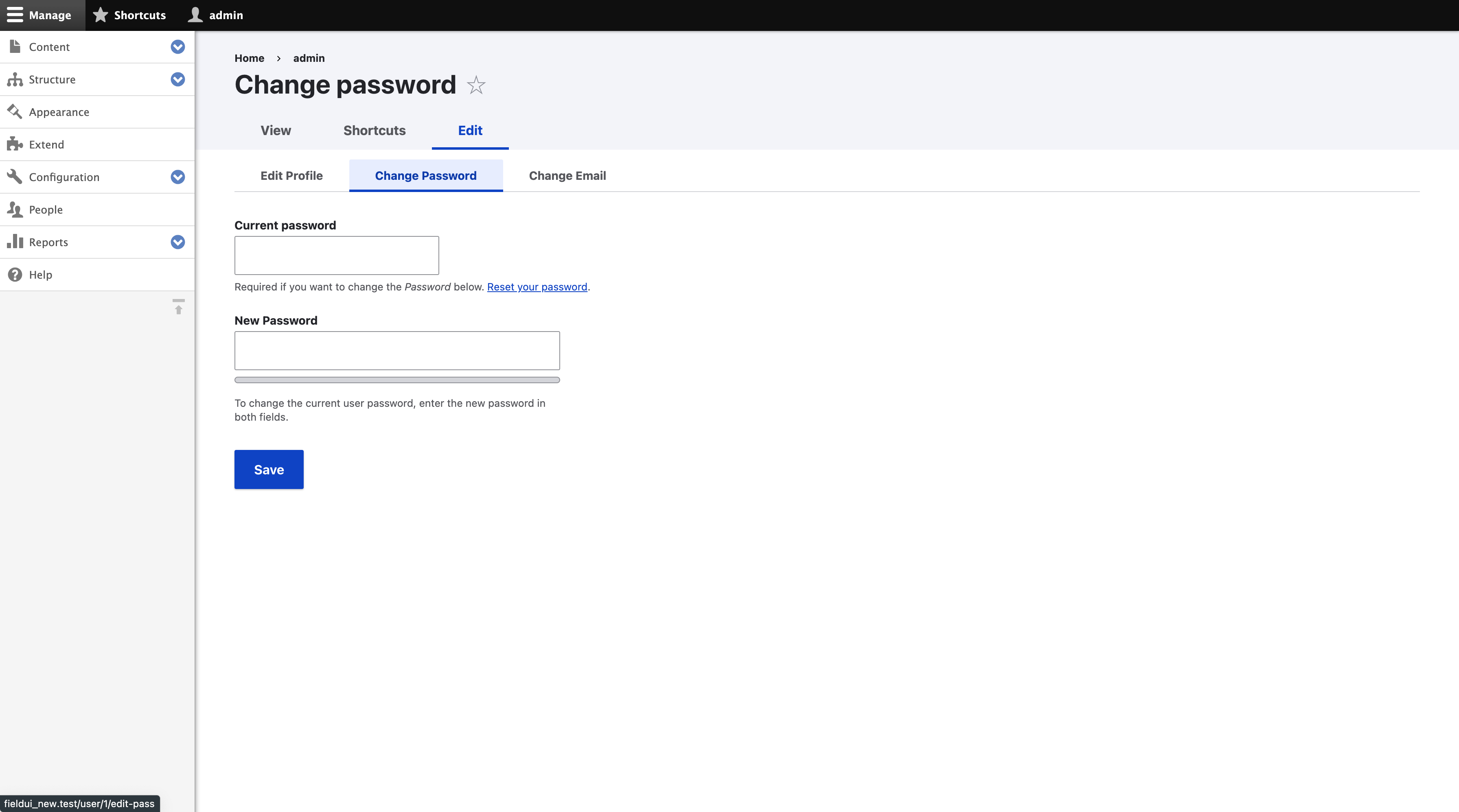
Change email form:-
Previous/alternative proposal summary
1. Change the name of the field to "New Password"
Suggested in #11
2. Move password fields to the end of the form
3. (rejected) Move password fields into a fieldset
See #19. Concern is that users do not put in the old password when changing a password, so they have to fill out the form again.
4. (rejected) Move password fields into a collapsed fieldset
Same concerns as for fieldset.
5. Move everything but password, email, and username fields to their own tab
See #9
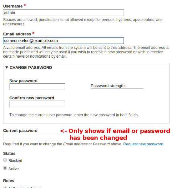
6. Modal: On submit, if either the email or password field has changed, a modal appears prompting the user to fill in the previous password field.
See #70
Remaining tasks
Review the MR 5686, decide if this solution works. If not asses other solutions, e.g. #70.
| Comment | File | Size | Author |
|---|---|---|---|
| #203 | 1259892-nr-bot.txt | 90 bytes | needs-review-queue-bot |
| #189 | Change email.png | 280.43 KB | Utkarsh_33 |
| #189 | Change password.png | 297.28 KB | Utkarsh_33 |
| #189 | Edit profile.png | 343.55 KB | Utkarsh_33 |
| #170 | interdiff_168-170.txt | 7.38 KB | jidrone |
Issue fork drupal-1259892
 Show commands
Start within a Git clone of the project using the version control instructions.
Or, if you do not have SSH keys set up on git.drupalcode.org:


Comments
Comment #1
lnunesbrActually in D6, this information is under Account Information fieldset, and in D7, there is no wrapper for this kind of information.
Maybe aggregate all the user info in a wrapper (could be a fieldset), would become more friendly. And when the user goes to edit its profile, there is no information for the user, for example, where exactly he is, because the title is its own username, and bellow, follows the user edit form, with no additional information.
Comment #2
juampynr CreditAttribution: juampynr commentedHere is a small patch to group user fields in an "Account details" fieldset.
It is visible when an authenticated user edits his account, or when an anonymous user creates an account.
Comment #3
Shyamala CreditAttribution: Shyamala commentedThe Patch adds "Account details" field set to the user account edit page. It enhances the user edit page, but does not fully resolve the usability issue of the forgot password section. May be the way the user section can be edited itself must be relooked at. Moving Change password to a separate TAB definitely will be a step forward.
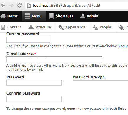
Comment #4
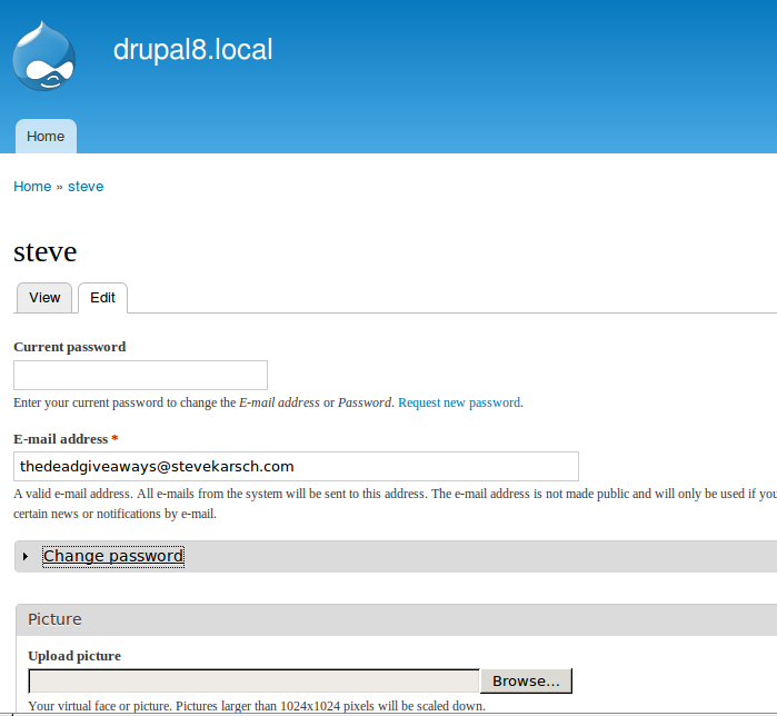
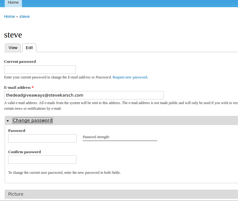
juampynr CreditAttribution: juampynr commentedHere is a patch in which a "Change password" tab has been added to the user account page. I have removed the change password fields from the edit account page, and verified that:
* A user can register when the email verification is disabled.
* A user can change his own password.
* The administrator can change a user's password.
* The administrator can change his own password.
I still need to review and update user tests. Will provide another patch by the end of the day, but reviews and guidance are very welcomed.
Comment #6
lnunesbrAdding an additional tab might be a good idea.
Comment #7
droplet CreditAttribution: droplet commented@#4, not a good idea. I suppose everything could be edit under EDIT page.
#993592: Vertical Tabs on User Account Edit page
Comment #8
yoroy CreditAttribution: yoroy commentedSome screenshots would help review this.
Comment #9
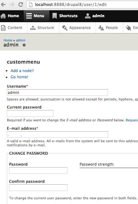
juampynr CreditAttribution: juampynr commentedI have seen that this issue has been discussed before. After reading the related issues the feeling I get from the conversation is that what bothers most is that "it does not look pretty". We have proven with a usability test (mentioned at the issue description at the top of this page) that the current situation is very confusing for a new user.
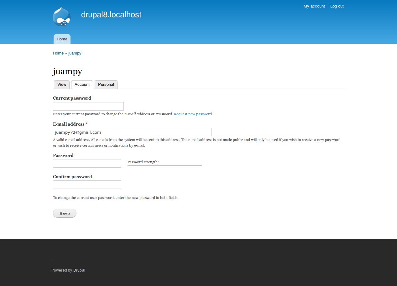
Here is a new patch where all fields in the user/*/edit page which are not username and password have been placed in a new page "Personal". In doing so, I have realized the following:
* Having all fields together leaded to a lot of messy checks in the code to see in which context we were. Some of them have been removed.
* Same for the functional tests. There were some assertions just to verify that there was not a collision with a field appearing where it did not have to do it.
* The forms actually look more organized. Here are some screenshots of the Account tab and the Personal tab, as opposed to the current Edit page with all the fields in one place.
Comment #10
juampynr CreditAttribution: juampynr commentedChanged version to 8.x-dev.
Comment #11
droplet CreditAttribution: droplet commentedsuggest change "Password" to "New Password"
Comment #12
juampynr CreditAttribution: juampynr commentedChanged status to "needs revew". Plus the patch again so it passes under the testing bot.
Comment #14
juampynr CreditAttribution: juampynr commentedHere is an updated patch that fixes the failing tests.
Comment #16
juampynr CreditAttribution: juampynr commentedUpdated patch. User language field set will have to stay at the user account page as it is used to set the default language for new users.
Comment #17
klonos...subscribing. I still like #993592: Vertical Tabs on User Account Edit page better though.
Comment #18
bryancasler CreditAttribution: bryancasler commentedsubscribe
Comment #19
karschsp CreditAttribution: karschsp commentedWhat about simply putting the password fields in a collapsed Change Password fieldset?
Comment #20
juampynr CreditAttribution: juampynr commentedhi @karschsp, that was suggested in comment #2, but rejected because the password field at the top and the email fields are tied to the change password fields, and the usability tests demonstrated that users who tried to change their password and upload a profile picture, but failed on retyping the old password had to fill the form and select the picture again.
There is quite a bit of logic related to the password field (change, reset, ignore on first login...) and that is why it should be separated. either on hirizontal or vertical tabs.
Cheers
Comment #21
Bojhan CreditAttribution: Bojhan commentedI am honestly not sure about any if the suggestions here, can we not redesign the visual hierarchy for it to stand out without using fieldsets?
Comment #22
juampynr CreditAttribution: juampynr commented@bojhan, can you suggest an alternative with a graphic or wireframe?
Comment #23
kscheirer#19: 1259892.019.patch queued for re-testing.
Comment #24
kscheirerRetesting against latest HEAD since it has been over a year.
Comment #26
star-szrTagging as reroll (and novice) and moving to user.module component.
It looks like the code for this has moved to Drupal\user\AccountFormController::form() but the same change should still be possible.
Comment #27
Kevin Morse CreditAttribution: Kevin Morse commentedHere you go.
Comment #28
andymartha CreditAttribution: andymartha commentedIn a fresh installation of Drupal 8, the patch 1259892-d7-27.patch in #27 by Kevin Morse DOES create a fieldset with label around the change password fields. Core functionality seems to work properly. Users still have to enter their own password in the "current password" field above the "change password" fieldset to change their password. See screenshots.
Comment #29
alexpottIt doesn't seem like anyone has answered @Bojhan's question in #21... is there a way we can do this without a fieldset? Or is using a fieldset the right thing here?
Comment #30
Bojhan CreditAttribution: Bojhan commentedWe do not really use "fieldsets" to get more priority. Please keep in mind in how different this is used, basically adding a element from core sounds like a really bad idea. At the very least this should be Bartik specific. Does this have to do with position. E.g. should it always be the last on the page?
Comment #31
tim.plunkett#27: 1259892-d7-27.patch queued for re-testing.
Comment #33
AaronBaumanDoesn't sound like there's much consensus on an approach yet.
Here are the suggestions so far:
1. Change the name of the field to "New Password"
2. Move password fields to the end of the form
3. Move password fields into a fieldset
4. Move password fields into a collapsed fieldset
5. Move everything but password, email, and username fields to their own tab
FWIW, Wordpress does #1 and #2 (which incidentally would have the smallest footprint in terms of changing this form).
Comment #33.0
AaronBaumanAdded anchor to link.
Comment #34
madison.major CreditAttribution: madison.major commentedComment #35
madison.major CreditAttribution: madison.major commentedComment #36
madison.major CreditAttribution: madison.major commentedComment #37
neetu morwani CreditAttribution: neetu morwani commentedPatch rerolled successfully.
Comment #38
rob3000 CreditAttribution: rob3000 commentedFollowing on from bojhan -> https://drupal.org/comment/7396608#comment-7396608 there should be another way to do this witout a fieldset.
Comment #39
rob3000 CreditAttribution: rob3000 commentedComment #40
YesCT CreditAttribution: YesCT commentedput back the list of proposals, but noted which were rejected, and tried to explain why.
Comment #41
LewisNymanHow about using a header in combination with the “new password” label? Here's a quick mockup

Comment #42
joshi.rohit100Recreated patch as last patch at #37 failed to apply..
Comment #44
amitgoyal CreditAttribution: amitgoyal commentedPlease review patch to fix test case failures as reported in #42.
Comment #46
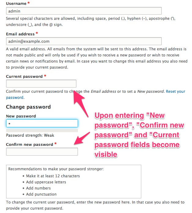
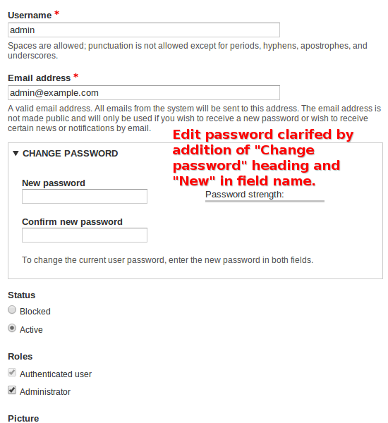
fenstratHere's another approach:
1. Move new password into a "Change password" details/fieldset. A "Change password" heading as per #41 seems better but we went with a fieldset as it seem to group them semantically.
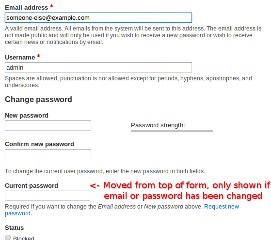
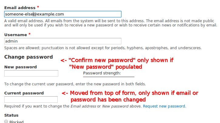
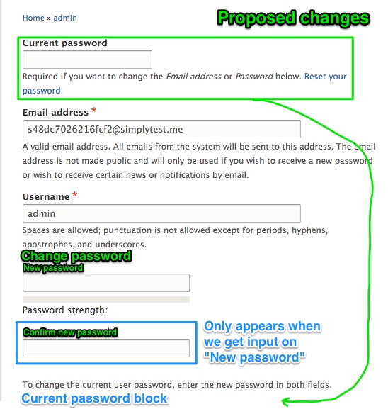
2. Change new password label from "Password" to "New password". This required editing form.inc to allow an optional 'title1' and 'title2' property to be passed into the 'password_confirm' element.
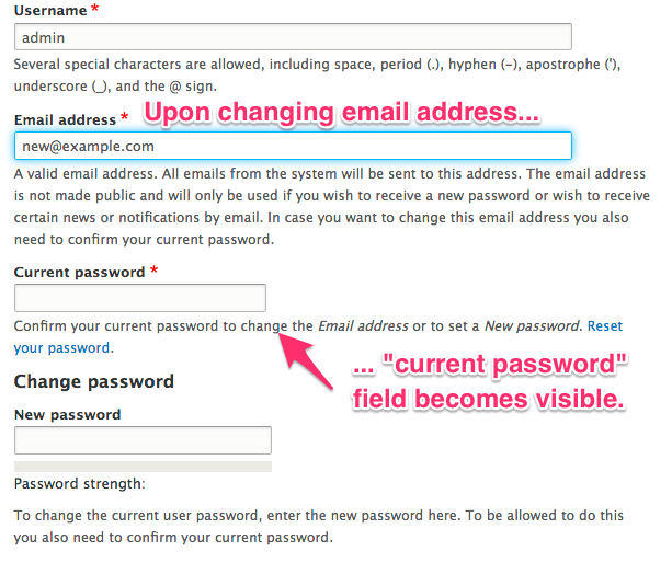
3. Move "Current password" to below "New password" and use the #states system to show it only when "Email address" or "New password" fields change.
A few of us thrashed this solution out as part of the Drupal Gold Coast sprint.
Comment #47
fenstratFixing image order.
Comment #49
fenstratHere's a different approach from #46:
1. It gets rid of the details/fieldset around "New password" as well as moving Username back to be right before "New password". Doing so allows UserAccountFormFieldsTest tests to pass. Field order is important here because as that test states "Verifies that the field order in user account forms is compatible with password managers of web browsers.".
So the approach now is:
1. Change new password label from "Password" to "New password". Added a "Change password" heading to it using '#prefix', ugly, but I can't see a better way right now.

2. Move "Current password" to below "New password" and use the #states system to show it only when "Email address" or "New password" fields change.
Comment #51
LewisNymanThis design change works well for the change password task, but it looks like it will introduce a new problem when someone changes their email address. I'm not sure how to solve both. Maybe cutting down on some of the description text will make the other elements clearer?
Comment #52
fenstratThis should fix up the failing tests.
@LewisNyman appreciate that the distance between Email and Current password is an issue. Not sure we could cut down on the descriptive text as it's all pretty important? I originally moved Email under Username but as noted in #49 this breaks UserAccountFormFieldsTest->assertFieldOrder() which specifically tests username is right before password to ensure browser password managers work with the form. I still think this patch improves the current situation a great deal.
Comment #53
realityloopBased on the screenshot at #49, my main observation is that there seems to be too much space between the descriptive text and the Confirm new password field
Comment #54
fenstrat@realityloop Yeah that's the same observation @LewisNyman had in #51. What about moving the Current password under Email?
Comment #55
realityloop@fenstrat personally I'm ok with the moving of the current password field to the bottom of the screen, I think your logic about it only displaying if the email or password field changes makes sense..
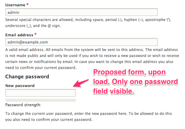
I'd also almost ask the question should the Confirm new password field only appear after you populate the New password field..?
Comment #56
amit.drupal CreditAttribution: amit.drupal commented@fenstrat Your patch are working fine.
Much Space between the descriptive text and the Confirm new password field.
I have suggestion - Use Collapsible fieldsets in change Password field .
Comment #57
fenstrat@amit.drupal a collapsible fieldset/detail for Change password is the approach we tried in #46. For the reason this was abandoned see #49. Additionally, unless it defaulted to collapsed (not very usable I'd say) it wouldn't fix the vertical space problem.
@realityloop Interesting suggestion, only show the Confirm new password if New password is populated. Gains us vertical space and it seems like a good use of the #states system. Attached implements that. Thoughts?
Comment #58
realityloopI really like the changes here, just a few thoughts...
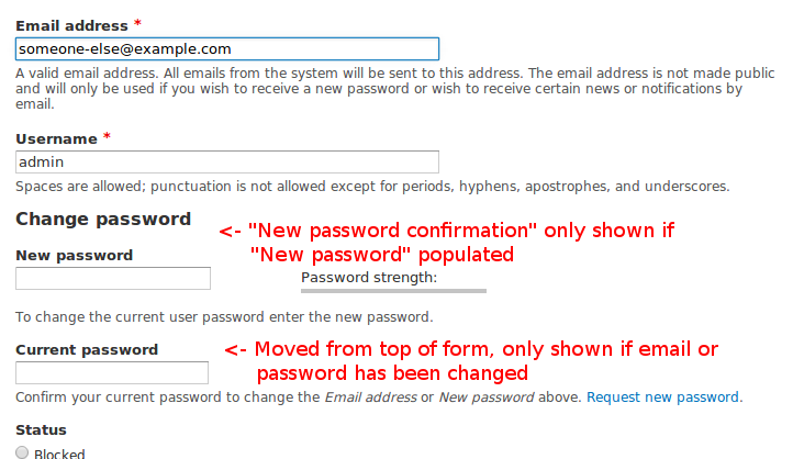
May I sugggest this be renamed to "New password confirmation"
I think this may need to be reworded if the 2nd field is initially hidden?
I wonder if it may be clearer to say 'Confirm your current password to change the %mail or %pass above. !request_new.'
Comment #59
fenstrat@realityloop Thanks for the review, all good points. I've implemented them in the attached patch.
Comment #60
fenstratComment #61
a_thakur CreditAttribution: a_thakur commentedThe patch works fine. Though, a Current Password fieldset (non-collapsible) would be better with Current Password, New Password and Confirm New Password.
Comment #62
fenstrat@a_thakur Putting "Current password" into a fieldset with New password wouldn't really work as it needs to be shown if Email is edited. Or have I misunderstood you?
Comment #63
realityloopI've tested #59 and am happy with the changes, I think this is ready to commit. nice work @fenstrat
Comment #64
fenstratGreat, thanks @realityloop.
As noted above a few of us thrashed out this approach as part of the Drupal Gold Coast sprint.
Comment #65
webchickNeat, I like this improvement a lot for passwords. The only issue is with e-mail addresses, we now have a huge visual disconnect between the field you're changing and the field that you must now fill out ("Current password" ended up "below the fold" for me so I never caught it, only after submitting the form and getting an error.)
I'm wondering if we could make the weight based on the #states system, so if you last touched the "Email" field, the Current Pass would show up just below it, versus if you last hit the "New password" field, it'd show up down there?
"New" capitalized by itself looks a bit silly. :) Maybe "New password" field?
Also, in one place we're using the translatable button names, in another place we're not. Let's make both places make those consistent. AFAIK we don't translate anything in assertion messages, so maybe check around in HEAD to figure out which one we should pick.
Comment #66
realityloopMy spidey senses start tingling at the idea of changing the weight of a form field mid edit, can we get some input from the usability team before doing this?
Patch attached that does the updating of New password, I forgot to remove the t(), will upload fixed patch shortly.
Comment #67
realityloopupdated patch
Comment #68
fenstratThose "New password" and t() changes look fine, thanks @realityloop.
I'd also baulk at the idea of moving a form field around mid edit (on top of the fact that I'm pretty sure that's not supported by the #states system?). Most interested in the opinion of @Bojhan or someone else from the usability team.
Comment #69
YesCT CreditAttribution: YesCT commented@webchick
I couldn't really see button names that in the patch.
Maybe meant the argument (the field label) to the assert string?
I'm not sure taking the t() out like in #67 is the thing to do.
In fact, if the assert string is t()'d,
Then I think the field label should be also...
So I think that should use a t()'d arg like
for: New password
-------
For sure the "message" for the assert ( 'Password needed to make profile changes.') should *not* have t(). See a child of #500866: [META] remove t() from assert message.
There are a bunch of asserts with t() in them in core:
[edit: better pattern and the number result]
ag "assert(Raw|Text)\(t\(" core/modules/*
is just some. (where some = 651)
Comment #70
LewisNymanI have a new idea:
On submit, if either the email or password field has changed, a modal appears prompting the user to fill in the previous password field. It would be impossible to miss because you can't progress without filling it in, and we don't have to worry about placement of the field.
What does everyone think? I'm not sure how to implement this in Drupal, as a pure JS solution is sounds quite simple.
Comment #71
jhedstromThis needs a reroll.
Regarding the use of the
t()function in #69, rather, theString::format()method should be used.Comment #72
AkshayKalose CreditAttribution: AkshayKalose commentedRerolled from #67
Comment #74
AkshayKalose CreditAttribution: AkshayKalose commentedUpdated rerolled patch.
$config['prefixes'][$options['language']->id
to
$config['prefixes'][$options['language']->getId()
Comment #75
YesCT CreditAttribution: YesCT commentedThanks.
To show the difference between two patches that apply, interdiffs are super nice.
https://www.drupal.org/documentation/git/interdiff
Comment #78
adci_contributor CreditAttribution: adci_contributor commentedHowever these bouth is unable to apply now :P
Rerolled from #74.
Also attached 72-74-interdiff
Comment #79
mirie CreditAttribution: mirie commentedIt looks like this patch is adding 2 new form element attributes #title1 and #title2. Will this be confusing since these are not part of the Form API?
Comment #80
blacklight4 CreditAttribution: blacklight4 commentedI'd go with:
Login
username
Specify "user@email.com in username box
password
Change password (if desired)
Current password
New password
Confirm new password
Comment #81
doakym CreditAttribution: doakym commentedpatch does not apply and
i cant test this patch in simpletest me http://simplytest.me/project/drupal/8.0.x?patch[]=https://www.drupal.org...
"An error occurred while patching the project."
Comment #82
YesCT CreditAttribution: YesCT commentedadding the generic usability tag so this does not get lost.
Comment #83
ibonelli CreditAttribution: ibonelli commentedThe "simpletest me" worked for me now, so I guess something changed? (I'm referring to comment #81 which says it doesn't)
In any case it works now and I see most working. What seems missing (when I test) is the change from "Password" to "New password"... But the rest seems to work as expected as far as I can tell.
On message #59 I see the mockup as it was originally intended, then there is a different rough mock up on #80. But none is applied. I agree with the #80 suggestion of "Change password (if desired)" and will modify code so it looks like that.
Comment #84
ibonelli CreditAttribution: ibonelli commentedSo I created the new patch that I'm attaching over here. There were two changes instead of one:
This is consistent with the design originally proposed and comment #49. So I'm submitting for review. Thanks!
Comment #85
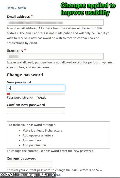
mgfong CreditAttribution: mgfong commentedI tested the new patch at #84 and is working as proposed.
1. Original version
2. Proposed changes
3. Changes implemented
Comment #86
webchickSo from a usability perspective in terms of changing a user's password, this makes a ton of sense. However, you also need to enter "Current password" in order to change the e-mail address (this is in the field description), and with the text field that far down, this is no longer clear. So I worry we'll get UX problems in the opposite direction now. Hm.
Could we maybe get a few people who weren't involved in this issue to test changing their email address in D8 with this patch applied and see how they fare?
Comment #87
YesCT CreditAttribution: YesCT commentedsome img were duplicated in the summary.
took out duplicates.
also re-ordered to make more sense.
I will review this now.
Comment #88
YesCT CreditAttribution: YesCT commentedI think the reason for moving the current password below the email and new password fields is because we are hiding it until the user types something in either field.
If we left it at the beginning, hidden, then it would show, but the user may not notice it because they are scrolled down.
with it after, they have a chance to see it on the way to the save button.
I wonder how the aria accessibility of this is. I'll try that as well.
I also have someone new to the issue to test it.
Comment #89
victorkane CreditAttribution: victorkane commentedI tested patch #84. I changed my account name and saved. I saved the email and upon error (red message) telling me to add my current password, that field (it does have help text I just hadn't read it), I added my current password, and the change worked. I then went to change my password. It was easy to see where to place the new password + confirmation. Then I knew to add the current password as well and that worked too.
However, my immediate subjective impression was that my experience has always been, when changing passwords on different accounts, that there is a link somewhere to change your password. When you press it, my natural expectation was to expect to put the old (current) password first, and then the new password and confirmation of new password.
So I went to look for corroboration on some sites. I changed my yahoo account, but it did something completely different. When I clicked on change your password, it had me login again. A successful login took me to a page where there were two text inputs only, New Password and Confirm your new password.
So I went to a well-known dating site and lo and behold, it's way of doing things (both for changing email and for changing password) turned out to be exactly like the patch #84:
In conclusion, if the idea is to include many account details on the same page, and for the current password to be requested only upon attempting to change email or password, patch #84 seems to have the proper usability.
Comment #90
YesCT CreditAttribution: YesCT commentedI used the mac voice over and listened to the form.
Having the current password after the email and new password seemed to work really well. I didn't have to worry about the hidden field being shown and me not hearing it.
Comment #91
YesCT CreditAttribution: YesCT commentedlooks like some other changes from another issue might be in this patch.
Maybe in #66 -> #67
and the changes to url routing are not in the interdiff...
I will try and take them out now.
I will also make a tests only patch to see what the fails look like on that.
Comment #92
YesCT CreditAttribution: YesCT commentedtook out some url generator stuff.
@realityloop do you know what issue that code might belong to?
setting this to needs review to see what the bot says.
I have some other small changes to make. I will do that now. Do not need this reviewed just yet.
Comment #93
YesCT CreditAttribution: YesCT commentedjust a comma for grammar was accidentally taken out earlier.
Comment #94
YesCT CreditAttribution: YesCT commentedlooks like an earlier reroll made a mistake. we should not add back in functions that were removed.
this was removed in #2306429: Remove user_access()
which I found by doing:
git log -S "Determine whether the user has a given privilege" core/modules/user---
I will try and fix that now.
[edit:]
Actually I dont see that function being called in here.
So I will just undo it.
Comment #96
YesCT CreditAttribution: YesCT commentedComment #97
YesCT CreditAttribution: YesCT commentedin #69 I had wondered if the arg should also have t()
ag "assertRaw\(t\(.*array.* t\("
looks like there are only 6 like that... and it doesn't matter since our tests run in english unless they are specifically about language or translation. so let's just leave it.
---
However, the contraction "it's" is in a line we are already changing (in response to a request from webchick to use '"Name of the field" field'. Since that line is already needing to be changed, we can fix it and say "it is" instead of the contraction. I'll do that now.
Comment #98
YesCT CreditAttribution: YesCT commentedthis changes it's to it is
--
OK. I think this actually needs a full review now.
Comment #99
gobinathmAssigning to myself for a complete review
Comment #100
mpdonadioOK @gobinathm said he was going to do a full review, but can someone update the IS why a fieldset around the final solution was rejected and explain how the lack of a fieldset doesn't cause a11y problems? I searched through the comments several times, but didn't see this (just earlier suggestions of putting a fieldset around what was there). I'm half tempted to set it back to Needs Work for this.
Comment #101
YesCT CreditAttribution: YesCT commented@gobinathm if you have any questions, or a partial review, please post it. :)
unassigning since it has been a while, so it is clear others can work on this.
Comment #102
YesCT CreditAttribution: YesCT commentedadding tag based on #100
Comment #105
mpdonadioLooks like this needs a reroll. Did a quick test, and there are merge conflicts, so I don't know if this is truly a novice task.
Comment #106
siva_epari CreditAttribution: siva_epari commentedPatch rerolled.
Comment #108
fenstratHere's a reroll of #106 that should pass tests.
I've gone through all comments again and updated the issue summary trying to account for all the feedback.
@mpdonadio Re: wrapping the solution in a fieldset: I can't see how it'd work if only the email is changed, in which case the Confirm password field needs to be shown, and including it in a fieldset with the New password (which in this case remains unchanged) doesn't seem to make any sense. Also, @Bojhan's stated he's not in favour of fieldsets: "We do not really use "fieldsets" to get more priority".
Comment #109
fenstratComment #110
mpdonadio#109, my comment about a fieldset didn't have to do with priority, but more with accessibility, eg http://webaim.org/techniques/forms/controls and http://www.w3.org/WAI/tutorials/forms/grouping/, especially for screenreaders and non-traditional input/output devices where the legend and being able to tab over the fieldset are important..
I think this is RTBC, but I won't set it w/o one of the Accessibility leads chiming in about this.
Comment #111
fenstratThanks for clearing that up @mpdonadio. I can't really comment on the accessibility of a fieldset, however practically speaking I'm pretty sure one wouldn't makes sense here. If you update only Email then Current password will be shown via #states. If New password and Current password are grouped into a fieldset then Current password is sitting in a fieldset that doesn't really have bearing on what the user was trying to do (i.e. change their Email), because a New password isn't being set. Hope this makes sense.
Comment #112
fenstratHmm, trying to display the last patch only.
Comment #113
Truptti CreditAttribution: Truptti at Axelerant commentedTried verifying the issue with the patch '1259892-59-improve_user_password_edit.patch' in #112 , but the patch failed.Attached snapshot for reference.Updating status to Needs work.
Comment #114
Truptti CreditAttribution: Truptti at Axelerant commentedComment #115
mpdonadio#113, when that happens add the Needs Reroll tag. BTW, I't usually best to use `git apply --index` with Drupal patches.
Comment #116
drupradPatch rerolled from #108
Comment #117
drupradCorrected description single quote with /' and queued for testing
Comment #119
mpdonadioI took a quick look at #117 and I think there were problems with the reroll. @pradeep.singh, how did you approach this? I may take a stab at this tonight.
Comment #120
mpdonadioI am going to re-reroll this tonight.
Comment #121
mpdonadioReroll of #108
Someone should double check the hand merges. Also, I am not sure why, but I had to manually add `use Drupal\Core\Url;` back into AccountForm.
Comment #122
fenstratReroll of #108.
This has been through quite a few reviews as noted in the Issue summary. It'd be nice to see if we can get sign off on this approach as it's seems like an well accepted solution outside of Drupal.
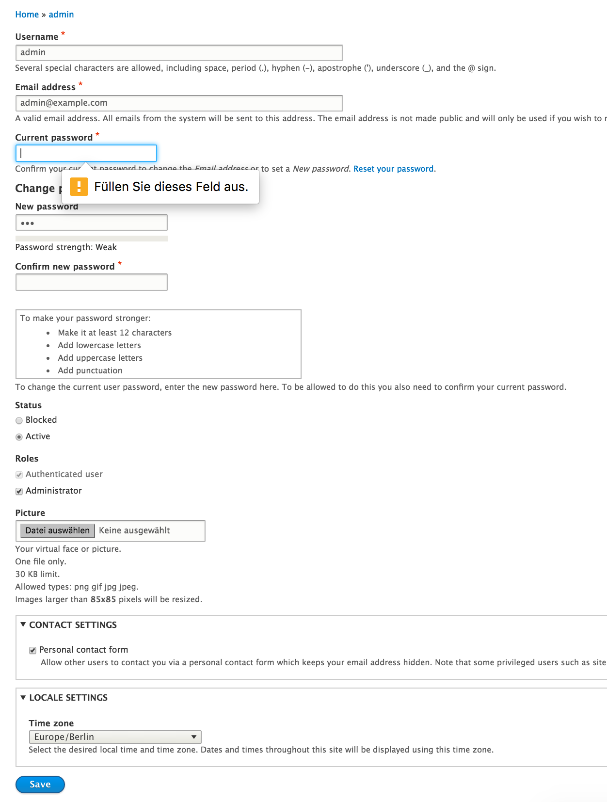
if (!$form_state->get('user_pass_reset')) {that was not needed.Comment #124
pixelmord CreditAttribution: pixelmord at Wunder commentedReviewing this I can say a few things:
So I will create a patch that incorporates these changes and then we can review how that feels from a usability perspective.
Comment #125
pixelmord CreditAttribution: pixelmord at Wunder commentedSo here's a patch that incorporates the suggestions from #124:
Check the screenshots for the HTML5-validation of the fields (German text, but you get the picture)
Comment #127
pixelmord CreditAttribution: pixelmord at Wunder commentedI had to adjust the tests that assert the order of the fields in various forms so that the new order is tested correctly.
So attached there's a new patch.
Comment #128
pixelmord CreditAttribution: pixelmord at Wunder commentedMarked that for UX review
Comment #129
fenstratThanks for working on this @pixelmord.
Overall this is certainly a better approach than what exists now and really needs UX review.
I think reordering the name and email fields as well as moving current_pass under email is a decent compromise. It ensure that when current_pass is shown it is never too visually far away from the field that triggered the show.
Nice addition on marking current_pass required if name or email changes.
No need to keep '#title' here (as setting it does nothing), it should simply be changed to '#title1'.
There's inconsistencies in the "... you also need to confirm your password." message. One starts with "In case ..." and the other "To be allowed to ...". Now current_pass becomes required why not simply remove these from the descriptions?
Nit, should be "new password" not "password" to match code comment above.
Comment #130
Bojhan CreditAttribution: Bojhan as a volunteer and commentedComment #131
pixelmord CreditAttribution: pixelmord at Wunder commentedSo since this contains string changes, I put version to 8.2.x.
@fenstrat: thanks for your code review, I will see to do those corrections mentioned.
I lean towards to keeping the hint that you will have to provide your password, just to make it clear before the field will be revealed. However that should also be part of a usability review.
Comment #132
Bojhan CreditAttribution: Bojhan as a volunteer and commentedThis kind of just feels like exchanging one problem for the other :) But its in line with Angie's review, so fine way to move forward.
Comment #133
pixelmord CreditAttribution: pixelmord at Wunder commentedAs promised in #131 I introduced some changes
@Bohjan: Thank you for the usability review! I see your point that this solution is may be not the ultimate best what we can do, however I think it improves the current solution significantly.
I can imagine that we can come up with an even better solution eventually, but I have the strong feeling that that will require more drastic changes to the form and the design pattern that we use. To be able to go done that road we definitely need a conceptual and design step before. Therefore I propose to go forward with this solution and consider opening a follow up issue that opens up a discussion about we could improve that more drastically. E.g. using a modal form that concentrates the user's focus on the desired action and filling the necessary fields.
Comment #134
fenstratChanges look good. Just one nit:
For this code comment '#title1' needs to be $this->t() not t().
Comment #135
Manjit.SinghNice catch :) Here are the changes.
Comment #136
Manjit.Singhopppss forget to attach interdiff. So here is that.
Comment #137
fenstratOk I think this is RTBC. This addresses @webchick's concerns from #86 and has @Bojhan's UX sign off in #132. Is it perfect? No way. However it is certainly an improvement on what is there now.
Comment #139
fenstratNot sure what happened in #138, tests seem to still be passing.
Comment #141
fenstratHmm failures seem unrelated.
Comment #143
xjmThanks @pixelmord!
When creating screenshots for issues, please crop the image to only the relevant part of the screen. It's helpful to also annotate the screenshot to indicate the key changes. Otherwise, it's hard for reviewers to understand what the proposed UI changes are. I updated the contributor task instructions to try to clarify these key points: https://www.drupal.org/node/1859584/revisions/view/9218398/9888925
Some of the screenshots in the summary are also out of date, and others seem to be many duplicate copies (?). I've removed them. The issue summary also seems to be out of date. Finally, the final patch differs from what @Bojhan signed off on.
So, let's get some small, clear, annotated before-and-after screenshots to illustrate the proposed change, update the summary so it reflects the current status, and also indicate what has been changed since the usability signoff so we can see if we need another UX review.
Thanks everyone for your patience and ongoing work to make our administrative UIs easier to understand!
Comment #144
xjm(Removing more out of date images and saving issue credit.)
Also, this looks nonstandard; we do not do this anywhere else in core and these keys are not very meaningful. I see @mirie already asked about this choice in #79, but no response to that question other than "it's fine" essentially, which I'm not sure I agree with. :) At a minimum, let's use more specific key names, or better, let's look to see if there's a better pattern to use elsewhere in core.
Comment #146
AaronBaumanRe changes between #127, where Bojhan signed off, and #135 -- there are exactly 2, both described in #133. Specifically, those 2 changes are:
1. Default "pass2" #title changed from "New Password" to "Confirm Password". AccountForm "pass" #title unchanged between patches.
2. AccountForm "pass" #description changed from:
to:
Taking a stab at rewriting issue summary, including screenshots, then will provide re-rolled patch and address "#title1"/"#title2" concerns.
Comment #147
AaronBaumanAfter looking through Drupal's other core elements, I agree that using "#title1" and "#title2" is confusing. In this patch, I've changed "#title1" back to "#title", and introduced a new attribute "#title_confirm" which better explains its purpose.
There are no core form elements whose attributes make sense to use instead of "#title2", and there's no directly analogous pattern form which to borrow. However, there is plenty of precedent for introducing one-off attributes, outside of Form API, for example: Table introduces #header, #sticky, and #responsive; Pager introduces #quantity, #parameters, #route_name, #tags; MachineName introduces #machine_name, etc.
Re-rolled patch attached, otherwise equivalent to #135
Comment #149
AaronBaumanComment #150
fenstratThanks for picking this up @aaronbauman, this is RTBC.
The name of the
#title_confirmattribute makes sense.Again, this addresses @webchick's concerns from #86 and has @Bojhan's UX sign off in #132.
Comment #152
xjmThanks for the updated screenshots @aaronbauman! That's quite helpful. The screenshots are very clear and the text and arrow annotations explain the workflow.
In the future, please provide an interdiff when you update a patch.
As a release manager, I am still asking for usability signoff on the final version of this, even though signoff was given on earlier versions. I understand that the changes may seem small, but it does actually matter that the final patch receive usability review in its final form, especially for a change specifically for usability and especially for such an important form.
I definitely agree that the problem this issue is trying to solve is a usability issue, but I also agree with @Bojhan that this feels like trading one problem for another, so it really should have more usability testing to see if we can't come up with something better. Really, the workflow illustrated in the screenshots in the summary seems way too complicated to me. I think hiding the current password field is just complicated and confusing. Also, being coy and only revealing the confirm password field after the new password is entered makes it seem like we are just moving the finish line on the user. Every website I ever remember using has the confirm password field already visible when the first one is shown.
I do agree with the idea of the "reset your password" link dynamically exposing the two fields to change it (at the same time). I also think these fields should appear directly under the current password field rather than somewhere strange and far away. Can we reduce the patch to just do those two changes? If some contributors are really convinced that all the other stuff is worthwhile, we could split that into a followup, and get the minimal improvement in to actually improve this form rather than stalling on a complicated change with multiple aspects that has at best halfhearted usability and product signoff.
So, for all these reasons, tagging for another usability review. I bet the usability team could go over this in one of their weekly meetings as a group. They can evaluate whether to implement my suggestions, or go with the current patch, or something else.
Finally, this issue is also tagged for accessibility review, which is also a core gate, and it hasn't received that yet. Thanks!
Comment #153
AaronBaumanThank you for the detailed feedback, xjm. In general I agree with the sentiment that we're just trading one problem for another.
This statement, in particular, got me thinking:
I reviewed 10 of Alexa's top sites, and every single one of them offers a single, dedicated form to change one's password. The user experience of a single form with two password fields is very straightforward, so there's no reason for the shenanigans outlined in this issue.
We've been going around in circles on this issue for more than 5 years. In the meantime, the companies who employ thousands of people to focus on usability and accessibility have converged on a consistent pattern. Let's remove the "change password" fields from the user edit form, and move them to a standalone form.
In addition to providing users an experience to which they're more accustom, there are many other advantages:
Comment #154
wturrell CreditAttribution: wturrell as a volunteer commented+1 for moving to a separate form.
As others have mentioned previously, one of the problems with passwords on same form as everything else is the annoyance of having to retype them all if there is an error elsewhere.
I'd also be interested to know if there's any measurable difference in usability between 'Reset your password' (our current standard) and 'Forgot password?' text.
Comment #155
dmsmidtComment #156
yoroy CreditAttribution: yoroy at Roy Scholten commentedWe discussed this during yesterday’s usability meeting: https://youtu.be/OaeH-dEe4GE?t=14m24s
Current situations is indeed not good. The solution this patch now arrived at adds too much "magic" with the hiding and showing of the password fields.
The ultimate proposal to move both change email and change password to separate forms is the way to go. Thank you @aaronbauman for doing that research! Creating these new pages and the links to them from the account edit page is definitely a task for 8.4 and needs some design work (what will the links to these pages look like?)
If we want to add some improvement to 8.3 we need to stay within this account edit page and look into reordering the fields into a more sensible flow.
The challenge in staying on this page is that we need the current password for two different operations: change email, change password.
What about grouping the 3 password reset fields in a fieldset? I created a short video sketching out an idea for that: https://www.youtube.com/watch?v=gcr3AMuqNaU
Comment #157
AaronBauman@yoroy, i think this is a good proposal for 8.3
A couple points of feedback:
1. This doesn't address @xjm's concern about "moving the goalposts"
Personally, I think if "current password" is revealed on focus of email field (rather than on change), it would address this concern.
2. I can further anticipate feedback that having a duplicate "current password" field is not a great UI.
If there were some additional magic to make sure that the user only has to enter "current password" field one time, then I think this would be a good solution for 8.3.
I mocked up a crude prototype of this UI proposal:
https://jsfiddle.net/pufc9rrg/
and recorded a brief video of how this might work:
https://youtu.be/hS8yQlAbJlA
Maybe this is too much javascript magic for one form?
If we remove all the javascript magic, this approach would at least accomplish xjm's other suggestion:
Comment #158
xinyuma CreditAttribution: xinyuma at Open Social commentedThis design pattern could be a solution https://www.drupal.org/node/2883755
Comment #163
jidrone CreditAttribution: jidrone at Mobomo for Vibrent Health commentedHi everyone,
I would like to restart the work on this patch separating the forms as suggested in #156
This a starting point, I know some tests will need to be updated and new ones added, so I will continue working on this.
Comment #164
jidrone CreditAttribution: jidrone at Mobomo for Vibrent Health commentedMaybe the last one failed because I didn't pull the branch before creating it.
Comment #165
jidrone CreditAttribution: jidrone at Mobomo for Vibrent Health commentedRemoved trailing whitespace which caused patch errors.
Comment #166
jidrone CreditAttribution: jidrone at Mobomo for Vibrent Health commentedMy previous patches were directly from core directory, now I fixed that, hoping this will make the patch to apply.
Comment #168
jidrone CreditAttribution: jidrone as a volunteer commentedUpdated some tests
Comment #170
jidrone CreditAttribution: jidrone at Mobomo for Vibrent Health commentedSome adjustments.
Comment #176
AaronMcHaleMy gut feeling is that the user edit form is doing too many things, the user can change their: username, email address, password, time zone, contact preferences, roles, status, and that's just what core provides out of the box.
A common pattern we see now a days is to separate these out into multiple forms, this is better because it reduces cognitive load, making it easier to understand what the form does, and is aligned with the principle of not having one form doing too many things. We see this pattern on social media sites (e.g. Twitter), and with other common services (Microsoft, Google, etc).
For instance, the process of changing your password has a different and more involved workflow from changing your time zone, it would make a lot more sense to move password related fields into their own form, e.g. a "Change password" form.
Or perhaps we move everything that requires entering the current password into a "Login details" form, and everything else stays on a "Account settings" form.
In doing that, it becomes much clearer to communicate to the user "everything on this form requires you to confirm your current password". Following this approach, fields like: username, email address, password; Are moved to the "Login details" form; While fields like: time zone, status, roles, etc; All stay on the "Edit" form. While we're at it, we should rename "Edit" to "Account settings", because that makes a lot more sense to a user.
Comment #177
benjifisherUsability review
We discussed this issue at #3250458: Drupal Usability Meeting 2021-11-26. That issue has a link to a recording of the meeting.
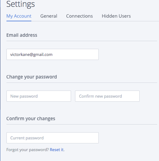
As @AaronMcHale said in #176, we agreed that it might be simpler and lead to better user experience if we create a separate form for changing the password and e-mail address. Only that form will need the current password to be entered.
At the same time, we thought that we should reconsider the page and tab titles, navigation to the form(s) and more. Instead of expanding the scope of this issue, we decided to add #3251513: Update the user-edit pages and make it the parent of this issue.
Comment #179
AaronMcHaleComment #180
benjifisherWe discussed this issue at #3252601: Drupal Usability Meeting 2021-12-10. That issue will have a link to a recording of the meeting.
@jidrone demonstrated his current work, based on the suggestions we made in #176 and #177. We agreed that it was an improvement, and suggested a few further tweaks.
Comment #183
AnybodyI just wanted to create a UX issue like this. The "current password" field should definitely only be shown, if it's needed, otherwise it confuses regular users a lot.
Similar request: #1857398: Move the request for current password on email/password change to a modal dialog.
Very much appreciate the work here and from #180! Let's push this forward asap.
Comment #187
Utkarsh_33 CreditAttribution: Utkarsh_33 as a volunteer and at Acquia commentedAll the tests are fixed.Marking it needs review for an initial round of reviews.
Comment #188
narendraRNeeds IS update for proposed solution along with SS.
Comment #189
Utkarsh_33 CreditAttribution: Utkarsh_33 as a volunteer and at Acquia commentedComment #190
Utkarsh_33 CreditAttribution: Utkarsh_33 as a volunteer and at Acquia commentedI have attached the screen shots for the updated approach that we are adopting and also updated the proposed resolution in the issue summary.
Comment #191
Utkarsh_33 CreditAttribution: Utkarsh_33 as a volunteer and at Acquia commentedComment #192
narendraRCurrently administrator can change email/password without filling `current password` for other users. This case is missing.
Also I am not sure but splitting form in multiple forms may impact api's and may require framework manager review.
Comment #193
Utkarsh_33 CreditAttribution: Utkarsh_33 as a volunteer and at Acquia commentedComment #194
smustgrave CreditAttribution: smustgrave at Mobomo commentedRemoved the tags from almost 8 years ago that I don't think bring much value today.
NW for the failing tests,
Been almost 2 years since the usability review, may need another look when near complete as this will be a big change.
Comment #195
Utkarsh_33 CreditAttribution: Utkarsh_33 as a volunteer and at Acquia commentedI have addressed all the feedbacks and all the tests are now passing.Marking it NR for another round of review.
Comment #196
narendraRWith latest changes, email field is now started appearing on 'Edit profile' page.
Comment #197
Utkarsh_33 CreditAttribution: Utkarsh_33 as a volunteer and at Acquia commentedI reverted the change, now it appears conditionally as it was in the older version.
Comment #198
worldlinemine CreditAttribution: worldlinemine as a volunteer commentedAt the request/suggestion of @smustgrave in the Drupal Slack #UX channel the UX group discussed this issue while gathered today and we considered the latest patch. In general we agree and confirm the patch is an improvement in useability though we need to work on some specific recommendations for the text of labels and the URLs for better consistency. We will be addressing this issue further at our meeting next Friday so please feel free to join us with any suggestions or concerns.
Comment #199
Utkarsh_33 CreditAttribution: Utkarsh_33 as a volunteer and at Acquia commentedComment #200
Utkarsh_33 CreditAttribution: Utkarsh_33 as a volunteer and at Acquia commentedComment #201
narendraRAll threads are resolved. Changes looks good to me. Waiting for accessibility & Usability review
Comment #202
smustgrave CreditAttribution: smustgrave at Mobomo commentedFyi, just showed a client this and they loved the cleanup. We don't do a lot of user customization as they usually don't ask for it but they said this made it clearer for them.
Comment #203
needs-review-queue-bot CreditAttribution: needs-review-queue-bot as a volunteer commentedThe Needs Review Queue Bot tested this issue. It no longer applies to Drupal core. Therefore, this issue status is now "Needs work".
This does not mean that the patch necessarily needs to be re-rolled or the MR rebased. Read the Issue Summary, the issue tags and the latest discussion here to determine what needs to be done.
Consult the Drupal Contributor Guide to find step-by-step guides for working with issues.