 Support for Drupal 7 is ending on 5 January 2025—it’s time to migrate to Drupal 10! Learn about the many benefits of Drupal 10 and find migration tools in our resource center.
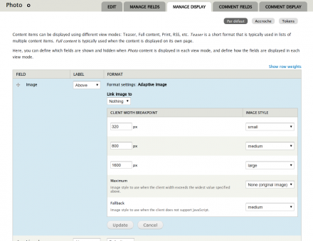
The Client-side adaptive image module helps build responsive web designs with fluid images by providing an Image field formatter that allows you to select appropriate image styles for various client widths. With this module, you can ensure that for each Image field only the most appropriately sized image gets downloaded by the client.
You can serve light images to mobile users while still providing the best quality images to visitors equipped with large screens.
Some highlights:
- Per-field configuration (for each view mode).
- Relies on JavaScript but provides a clean fallback for clients lacking it.
- No cookies required.
- No external libraries required.
- No extra server configuration needed.
- Does not attempt to perform any client OS detection.
- Reverse proxy cache friendly.
How it works
Image selection rests solely on the client's side, hence the name of the module. Unlike some other adaptive image techniques, the server takes no part in the image selection process. Instead, the module provides the list of candidate images during page generation, and the client picks the right one through JavaScript (or through a fallback if JavaScript is not enabled).
The technique used by this module was inspired by Mairead Buchan's article Creating responsive images using the noscript tag and her finding that children of the <noscript> tag are rightfully not added to the DOM when JavaScript is enabled.
What the module does is basically this:
- Wrap a fallback image in a <noscript> element.
- Attach references to alternate images to the <noscript> element using data attributes. Data attributes are an HTML5 feature but work in older browsers as well.
- Using JavaScript, retrieve the client's width, pick the right image from the data attributes, and insert it in the document after the <noscript> element. Note that we're referring to the client's width rather than the document's width or the window's width. That's because the width is retrieved using the document.documentElement.clientWidth property, which behaves inconsistently across browsers.
- Watch for window resize events, and replace the images when appropriate.
Similar projects
You might be interested in the following Drupal modules, which provide similar functionality using different techniques and/or architectures:
Credits
This project has been sponsored by: Whisky Echo Bravo
Project information
1,536 sites report using this module
- Created by David Lesieur on , updated
Stable releases for this project are covered by the security advisory policy.
Look for the shield icon below.
Releases
Development version: 7.x-1.x-dev updated 12 Mar 2021 at 07:59 UTC


