
 Support for Drupal 7 is ending on 5 January 2025—it’s time to migrate to Drupal 10! Learn about the many benefits of Drupal 10 and find migration tools in our resource center.
Mothership comes packed with a couple of small functions that should make your life easier as a themer.
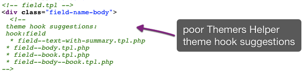
Poor themers helper
With this little snippet setting, Mothership will output the hook suggestions as a comment in the markup. This only works for page.tpl, node.tpl, block.tpl and field.tpl
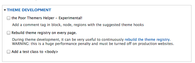
poor theme helper to the rescue
Rebuilding the theme
When you get tired of doing $drush cc all day to clear the cache.
Thank you Zen theme for providing this cool little feature :)
body test class
Show us your grid. It can be very practical during development to have a test class in the body tag to render a grid.png etc during the building phase and to be able to quickly remove it when you're done.
To use this in your css just do something like this:
body.test {background: pink;}
Maybe pink clashes with your design, or maybe pastels in any hue make your eyes bleed candy-coated marshmallows or maybe you prefer greyscale. Whatever floats your boat.
body.test {background: #eee;}
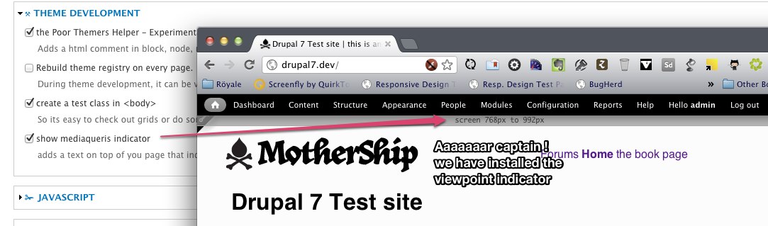
MediaQuery indicator
To make your life a little bit more simple when you need to target one of the 1000 different mobilphones, screens and tablets that a Mothership based site supports - it can be a great value to figure out what size you are actually working on.
By using the "mediaquery indicator tool (tm)" Mothership adds a little css magic that writes the breakpoint you are currently looking at.
We use the following popular breakpoints: 320 - 480 - 600 - 768 - 993 - 1383
If you wanna add your own its really easy by using the following css
@media only screen and (min-width: XXXpx) and (max-width: XXXpx){
  body::before{ content: "foobar: were between heaven & hell";}
}


Comments
This article has been linked
This article has been linked to from a more general source about Drupal theming. That was quite confusing and took me a second to realize that I am in a sub page of Mothership theme how-to docs.
Thanks to all for all the contributions and efforts here and everywhere else on Drupal.org!
You all rock! ~ dqd (formerly diqidoq)