
There is an error in the design of the node edit form from a user interface usability perspective:
The Delete button is the last one.
That makes the Delete button very easy to be clicked, much more easier than Submit.
The expected design would be to have Delete as the middle button and Submit as the last button.
| Comment | File | Size | Author |
|---|---|---|---|
| #23 | NodeEdit.png | 6.06 KB | quietone |
| #23 | Node.png | 8.15 KB | quietone |
| #13 | NodeEditButtonsDrupal7.png | 5.2 KB | Tor Arne Thune |
| #12 | seven-buttons.png | 9.28 KB | heather |
| #12 | garland-buttons.png | 7.63 KB | heather |


Comments
Comment #1
TDobes CreditAttribution: TDobes commentedComment #2
cosmicdreams CreditAttribution: cosmicdreams commentedYes, this is definitely a usability issue. An alternative to the above suggestion would be to make Submit a button and delete a link. I think that's the way it is now. Am I wrong?
Comment #3
ximo CreditAttribution: ximo commentedIn Drupal 6-beta1 (what I have at hand), the buttons are in this order: Preview, Submit, Delete
I agree with nsk that this is bad design from a usability perspective, but not necessarily because of the order of the buttons, which is quite logical if you think about it (first you preview, then you submit, eventually you may delete). I think the issue with usability is that they all look exactly the same. See the paragraph on Primary & Secondary Actions here.
Styling the buttons could be done with CSS on the theme level, but on a code level, the button that has the primary action should be assigned a class indicating so. I also think the Delete button should be styled somewhat red, to clearly indicate that it does something horrible to the node ;)
Comment #4
ximo CreditAttribution: ximo commentedI just realized that Preview is the default action for the Node form, which is a good thing! To let you know what I'm talking about, I've made a mockup of how the buttons could be styled. It can probably be done better, but it gives you an idea of how this could look.
Comment #5
elv CreditAttribution: elv commentedThe order used here is what's almost always used on websites. It's because when you use the tab key, the first button you hit is the leftmost one. It follows the source order.
I think the default "submit" button should be the rightmost, and the destructive ones like "Delete" on the left (Mac style), but the tab order in browsers forces the opposite. Unless you float all of them right, that is, but this can be done at the theming level.
Comment #6
cosmicdreams CreditAttribution: cosmicdreams commented@ ximo: +1 for the change of styling on the delete button. Great idea
Comment #7
gaele CreditAttribution: gaele commentedThe article ximo links to suggests styling the delete button less prominent. This means faded instead of red.
It also suggests that the default button should be the first one (it "should vertically align with the input fields"). I don't know which button is default: preview or save.
So I like the idea of adding a class to the primary button, but I don't like the delete button being red.
Comment #8
elv CreditAttribution: elv commentedI'm with agele on this one. The delete button should be less visible, "greyed out". Red is the danger color, but it also attracts the eye. As the other buttons don't have a particular color, they would have less visibility.
Comment #9
ximo CreditAttribution: ximo commentedI agree! Should've read the article more carefully :)
Grey it is!
Comment #10
ximo CreditAttribution: ximo commentedPreview is the default action for the form, so it's in bold as you can see. It's also the left-most button which according to the article is correct.
(Had a typo in the filename of the latest mockup, should be "now" and not "not")
Comment #11
Anonymous (not verified) CreditAttribution: Anonymous commentedThe user experience project is closing so this issue is being moved to the usability component under the Drupal project
Comment #12
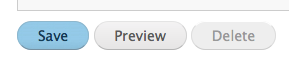
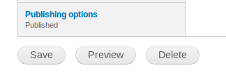
heather CreditAttribution: heather commentedLooks fixed in the Seven theme. But it's not fixed in Garland or other theme.
I like the idea of the Preview and Save as buttons and Delete as text. What happened to that idea?
See screenshots attached.
In Seven admin theme:
In Garland (or other without styling)

Comment #13
Tor Arne Thune CreditAttribution: Tor Arne Thune commentedIn my opinion this is a task, and not a bug. Also attaching a screenshot of the current state of the Node Edit form in Drupal 7 (using the Seven theme).
Comment #14
dawehner.
Comment #23
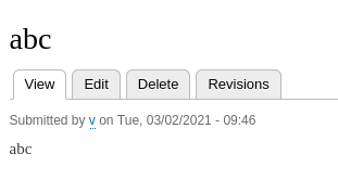
quietone CreditAttribution: quietone as a volunteer commentedThe node delete buttons are much different in 8.9.13.
On the a node page
And the node edit page

Based on that this has been fixed, closing as cannot reproduce.
As always, if that is wrong reopen the issue by setting the status to Active and explain what still needs to be done. Thx.