
Part of my effort is to update a few of the visual styles that look incomplete. I have only been able to spend a few on this, but did figure out a few things we could optimize in this screen.
This does not solve any usability issues, therefor it should be considered a minor issue - it does however have a big impact on the "first impression" that people get.
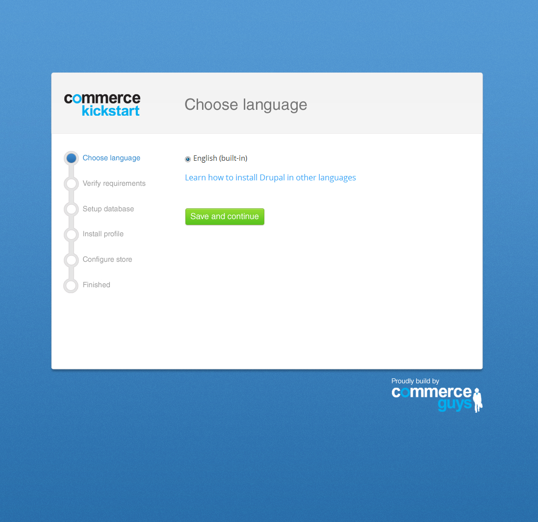
I have made a number of large changes:
- Overall updated the design to be more fresh, and less gray. It seems that the branding we use in the admin interface, is more focused around the bright blue - I made this a more prominent element.
- Aligned the page title with the logo, this because originally the page title looked like it was hanging above. Using a bar you create a visual landmark where one can orientate from.
- Changed the design for the wizard, to bring them out a little more.
- Did minor touches to the button, this could probably be done theme-wide. Removing the white border, which made it look pixelated.
I have also attached several options for the background, I prefer option 1 because it matches best with the overall color scheme. I have only spend a few on this, I can imagine a graphic designer could make a more intense and beautiful background pattern.
As always the source files are attached for reference.
| Comment | File | Size | Author |
|---|---|---|---|
| installation.psd | 7.53 MB | Bojhan | |
| option6.jpg | 124.74 KB | Bojhan | |
| option5.jpg | 115.51 KB | Bojhan | |
| option4.jpg | 112.27 KB | Bojhan | |
| option3.jpg | 130.05 KB | Bojhan |


Comments
Comment #0.0
Bojhan CreditAttribution: Bojhan commentedbetter
Comment #0.1
Bojhan CreditAttribution: Bojhan commentedattached source files
Comment #1
GuGuss CreditAttribution: GuGuss commentedNice shot !
My preferences are #1 and #5.
Comment #2
bojanz CreditAttribution: bojanz commentedVery nice! I agree with GuGuss.
Comment #3
GuGuss CreditAttribution: GuGuss commentedComment #4
dudenhofer CreditAttribution: dudenhofer commentedI went with #1 because #5 would be harder to make a repeatable background pattern.
Pushed updates here: https://code.drupalcommerce.org/#/c/218/
This also includes updating the button styles theme-wide as suggested.
Comment #5
bojanz CreditAttribution: bojanz commentedMerged. Awesome!
Comment #6.0
(not verified) CreditAttribution: commentedbetter