
I have done a first revision of redesigning the inline adding of variations. I have reduced the amount of visual cues and increased a number of visual landmarks to make it easier to distinguish between different items. Again pushing this out early because of time constraints, this is a big change and I'd like to have time for feedback and possibly iteration on it.
We are trying to solve two big issues here, both will greatly impact the efficiency of store administrators:
Until clicking “save variation” people don’t really know what's going on, and how its creation a variation. - Critical
People tend to get confused, when they have several variations open. They are thrown of by all the visual cues (titles, fieldsets, etc.). - Moderate
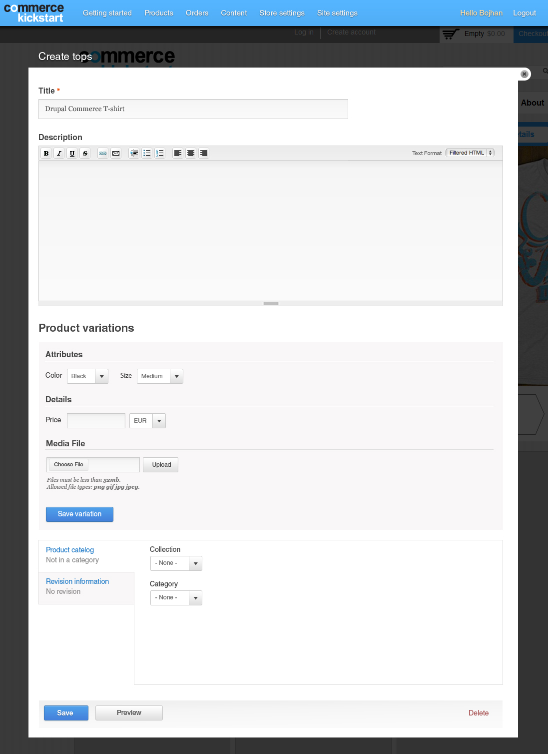
Creating a new product
The solution is to visually revamp the screen, by reducing the amount of cues. For example the field sets carried too much weight, and the border around each table row too little weight. For the screen below I'd like to see the following changed:
- Save variation should be blue, for it to stand out more and get people to click it.
- Remove the "No variations have been created. At least one variation is required." text. It is confusing and doesn't help people understand what is going on.
- Remove the "Add new variation" text from initial adding - it creates two titles, very close to each other, making it harder to scan. It could be there when there are other items, and you are creating another
- Remove the heavy background from fieldsets and replace this with a simple
<hr>like border. This should create more balance, and draw less attention to the bars and more to the actual fields - Reduce the height of the Body field (and possibly rename to Description)
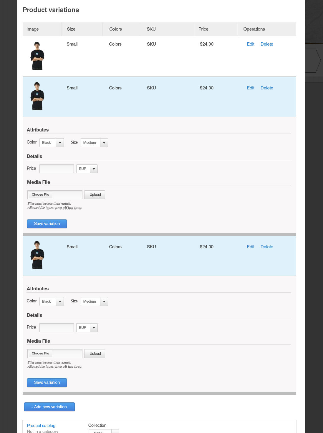
Variation Editing
That's all for creating products, the real hard part is solving the issue of being able to quickly scan the page when there are multiple variations opened. People really struggled with this so I propose adding a few more visual landmarks to make this easier.
- Add a bottom bar, this should create a fairly "hard separation" between the rows. This could also be accomplished by adding white space between two rows - but that requires a prototype, because that could potentially be "jumpy".
- Gray border around each row when collapsed.
I have reduced the weight of the table headers, this is something to be fixed in another issue.
EDIT: I noticed I missed the > that is used to show that the thing below relates to the row, feel free to keep that in there.
* We shouldn't change the visual styling of buttons/tables unless described above. It's just faster to reuse my existing D7 Seven PSD than try to recreate each part of the DC admin theme.
| Comment | File | Size | Author |
|---|---|---|---|
| #6 | before.png | 65.61 KB | bojanz |
| #6 | after.png | 53.78 KB | bojanz |
| products-expanded.jpg | 174.19 KB | Bojhan | |
| product-create-variation.jpg | 206.76 KB | Bojhan |


Comments
Comment #1
GuGuss CreditAttribution: GuGuss commentedComment #2
dudenhofer CreditAttribution: dudenhofer commentedI pushed some style updates here:
https://code.drupalcommerce.org/#/c/204/
This should include all of the updates except:
Comment #3
GuGuss CreditAttribution: GuGuss commentedCool !
So now, I guess bojanz can have a look to handle those 2 last things to remove if really needed !
Comment #4
Bojhan CreditAttribution: Bojhan commentedReally needed :)
Comment #5
bojanz CreditAttribution: bojanz commentedI've merged Aaron's CSS work.
The string changes still need to be done.
I need to talk to Bojhan about "No variations have been created. At least one variation is required." so I can decide how to remove that text (whether to remove it from IEF, or just from Kickstart, etc)
Comment #6
bojanz CreditAttribution: bojanz commentedAre we fine with this?
Seems to me that there's too big of a space between the heading such as "Details" and the field such as "Price"
EDIT: Okay, looks like that is caused by my changes, so Aaron should be able to fix it.
Is having just "Product variations" as the title confusing? Do we want to change it when there's only one add form shown?
Comment #7
bojanz CreditAttribution: bojanz commentedAlso, it seems that the inline forms are missing the background from Bojhan's mockups.
And the current CSS makes every table row gray, which means we lost striping.
Comment #8
bojanz CreditAttribution: bojanz commentedOkay, Bojhan approved this. Made some changes so that the "Add new variation" title is shown instead of "Product variations" when there's only the add form on the page.
Assigning to Aaron for CSS work.
The commit is at: https://code.drupalcommerce.org/#/c/223/
1) My fix broke some of the CSS (the padding on the IEF form is a bit odd), that needs to be fixed.
2) We need to tweak the titles ("Product variations", "Add new variation"), they are oddly sized compared to other text on the page, and the "Product variations" one is too far away from the IEF table.
3) We need to port as much of the CSS as we can to IEF itself, here: #1700554: Address UI testing feedback
For example, the bar at the bottom of the form, etc.
The goal is to have IEF looking good on Seven as well, since it's becoming a very popular module.
Once that is done, the patch in the Kickstart make file should be updated (it is added in change #223).
Comment #9
dudenhofer CreditAttribution: dudenhofer commentedI pushed some css updates in a patch for review on https://code.drupalcommerce.org/#/c/223/
Also some seven fixes here: http://drupal.org/node/1700554#comment-6278784
Comment #10
bojanz CreditAttribution: bojanz commentedMerged, thanks!
Comment #11.0
(not verified) CreditAttribution: commentedUpdated issue summary.