
This is a sibling of #1701652: Rebuild and retheme the product listing view for argumentation on the design decisions seen, check out that issue. Any additions are noted below.
Table
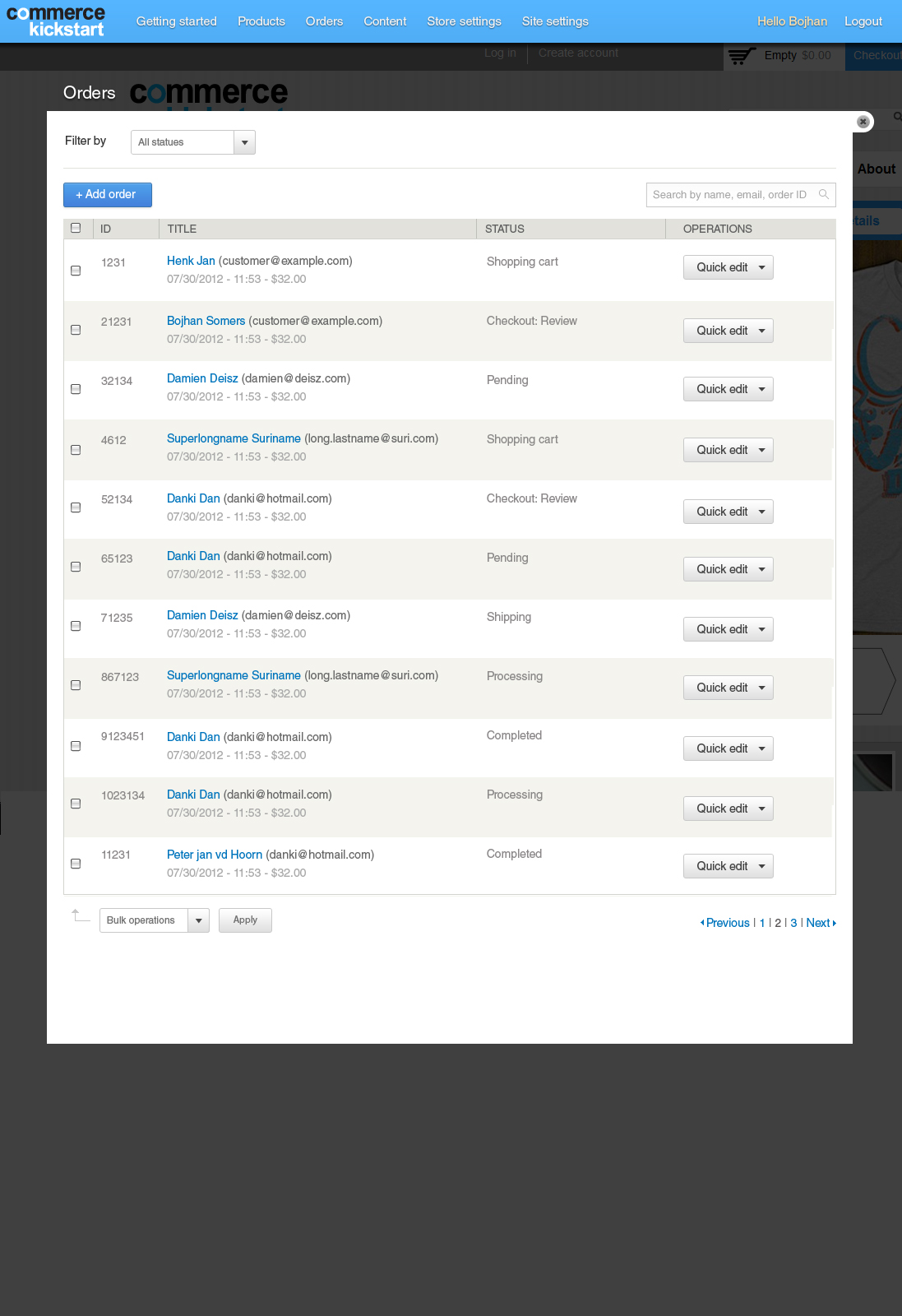
I have made a number of changes to the table layout, I am not 100% sure about this yet - but I feel we the table is very intense horizontally - where name is the only visual landmark that stands out. I have turned this around a bit, and put all of the meta information around the name.
- All information centralized around the name.
- Most prominence on name and e-mail, and less prominence on amount and creation date
Filters
There is now only one filter, I incorporated the other filters into the search box. I would love some feedback on additional filters, I imagined date of purchase?
| Comment | File | Size | Author |
|---|---|---|---|
| #14 | Screen Shot 2012-08-10 at 1.39.51 PM.png | 90.45 KB | dudenhofer |
| #13 | order_listing.png | 72.56 KB | GuGuss |
| #6 | ck-product-help-expanded.png | 105.84 KB | joshmiller |
| #6 | ck-product-help-expanded.psd | 1.74 MB | joshmiller |
| orderlisting.jpg | 311.18 KB | Bojhan |


Comments
Comment #1
GuGuss CreditAttribution: GuGuss commentedThis looks cool !
Comment #2
Bojhan CreditAttribution: Bojhan commentedAdd date selection.
Comment #3
GuGuss CreditAttribution: GuGuss commentedtagging
Comment #4
GuGuss CreditAttribution: GuGuss commentedI don't think we need a design here.
@vasike : Can you add the date filters with date picker which look the same as in the discounts page !
Comment #5
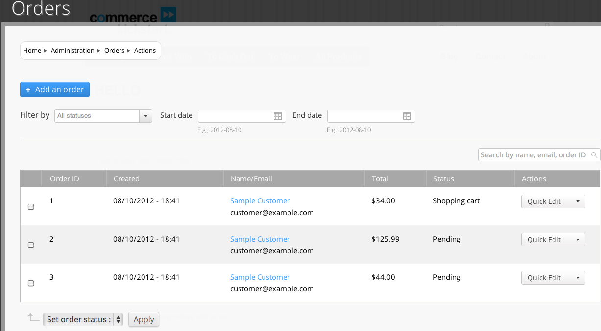
vasikeRebuilt the Orders page for the new visual style:
(the same approach as for #1701652: Rebuild and retheme the product listing view)
- Search box, Filter by multiple fields: new filter in Views module (use the dev version of views)
- use the Chosen library (http://harvesthq.github.com/chosen/)
- Added the label : "Filter by", i used the Product Displays Content type filter label from views settings.
Requires a CSS for inline display.
commit : https://code.drupalcommerce.org/#/c/266/
needs theming. Aaron's theming, ;).
Comment #6
joshmillerDudenhofer --
This is image that we were posting and discussing in IRC... (psd is attached as well)
Comment #7
vasikeDate popup issue: date filters don't trigger the ajax search.
there could be some related issues:
#1512928: When using an exposed date view filter with popup and autosubmit, form is not submitted on date selection
&
#1694988: Fix auto-submit for enhanced text text fields
Comment #8
GuGuss CreditAttribution: GuGuss commentedLet's close that one and open a new one for the date popup issue : #1717596: Date popup view filter does not work with autosubmit !
Comment #9
Bojhan CreditAttribution: Bojhan commentedThere is a bunch of stuff that is not implemented as designed, I imagine that's because it needs more discussion or simply the implementation had some difficulties
<hr>used to divide them. I designed it like this to create more balance and to pull the add task close to the table, this has always been the pattern in core.We should probably seek to discuss other changes to the table with GuSuss.
Comment #10
dudenhofer CreditAttribution: dudenhofer commentedJust an FYI, I have recommitted some styling fixes mentioned here. That was wrapped with this fix http://drupal.org/node/1722096#comment-6334406
The style fixes included aligning the bulk operations arrow, re-adding the horizontal line below the filters, and putting the search back below the horizontal line. I don't want to position the +Order with CSS because any help toggles would mess that up. Not sure if those should be pulled into the vbo view headers or something?
Comment #11
Damien Tournoud CreditAttribution: Damien Tournoud commentedLet's make sure to implement this in a reasonably generic fashion. If possible all the admin views should have the same styling.
Comment #12
bojanz CreditAttribution: bojanz commentedAgreed. We should test by creating a new VBO view at admin/whatever, and checking if the styling is correct.
Comment #13
GuGuss CreditAttribution: GuGuss commentedThis is the current look.
I agree with Bojhan on the remaining stuff :
I'll assign that to bojanz since he'll work on changing those admin views (Products, Content, Orders) to use Search API.
Comment #14
dudenhofer CreditAttribution: dudenhofer commentedAlso attached is a custom VBO admin view to show the styles apply. They should be globally targeting elements within the .views-exposed-form -- except the search fields which have been targeted to be positioned below the other filter options only on the order and product management pages.
Comment #15
bojanz CreditAttribution: bojanz commentedWe can't remove "E.g., 2012-08-10" without patching Date (it's a #description added in a #process callback), so I've left it alone for now. It can be a followup (#1732902: Remove the help text below date filters on the Order backoffice view)
The "add order" button has been added and is now waiting on dudenhofer to style it a bit (as noted in the "product listing" issue).
Renamed "Order ID" to "ID" and "Actions" to "Operations".