
Servus from Vienna!
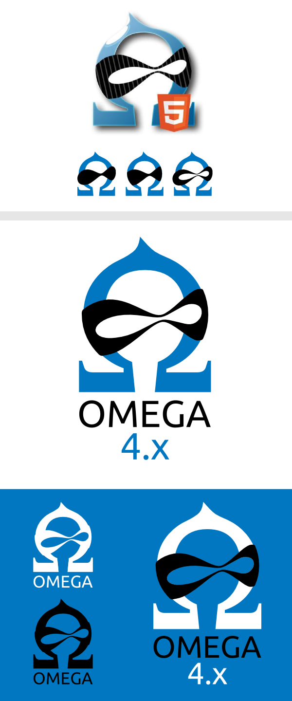
I have done some work on the Omega logo and designed a "new" slicker version of it.
The current logo looks good and I like it but I think it could be smarter...
I think the gradients, grid lines in the mask (these are not recognized...) and the use of too much colors could be solved nicer...
So I have tested some combinations and ended with this version.
![]()
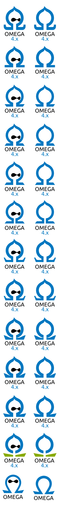
and here some versions and thinking
![]()
If there is need in putting some more time to this I am your man ;)
And if it is not welcome, no problem I just wanted to give it a try!
In the attachments there is also a vector svg file with my adapted version.
Omega ninja ftw! :)
| Comment | File | Size | Author |
|---|---|---|---|
| #13 | omega_old_vs_new.jpg | 23.42 KB | Grienauer |
| #10 | 4x.png | 8.16 KB | Grienauer |
| #6 | testing_omegas.png | 150.96 KB | Grienauer |
| #6 | out_of_4-eyes.png | 161.57 KB | Grienauer |
| #6 | omega_idol_v3.png | 19.9 KB | Grienauer |


Comments
Comment #1
fubhy CreditAttribution: fubhy commentedPushing this to 4.x and raising the priority. I want to have a new project page by the end of the week including the logo. Also, Omega 4.x currently uses the ThemeGeeks logo which it shouldn't. So replacing that is of high priority too.
Comment #2
GrienauerI am "rethinking" the logo and post results soon ;)
Comment #3
msmithcti CreditAttribution: msmithcti commentedHey Grienauer! The logo at the top looks great! I really like how it's clean, simple and stripped down - just like Omega 4 ;). I'd be interested to see what other ways the text could be incorporated in and around that logo.
Looking forward to seeing what else you come up with!
Comment #4
dasjohi grienauer, thanks for your work!
i have used this now for https://twitter.com/omega4issues
here's some feedback:
1) the new logo feel too static to me. the centric position of the tip of the "O"mega, makes it feel static in comparison to the dynamic "old" version of the omega logo that hat the tip on the left side.
2) the edges seem too sharp for my taste. i think the shape is too complex for such sharp edges.
the attached image was a quick iteration for a omega4issues logo until i discovered this issue :)
Comment #5
fubhy CreditAttribution: fubhy commented@Grienauer can you upload the latest examples that you shared with us on Skype?
Comment #6
GrienauerAttached some new Version to get omega a new face...
here some tests I made generally:
Outcome best of 4:
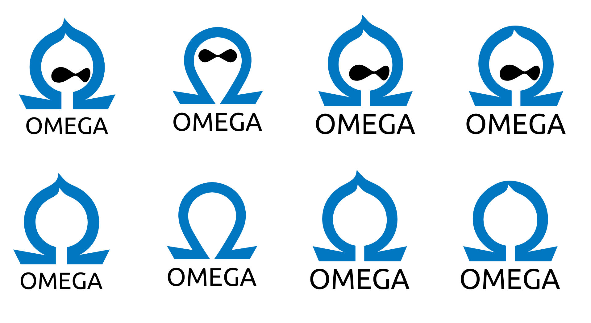
also with the option of killing the eyes to have a more business like style because lot's of people dislike the druplicon...
I want to have both one for the community (with eyes) and one without for "boring" business stuff
and my favorite (because it looks like an futuristic idol, is slick and looks like a rocket which is starting:

comments are welcome :)
Comment #7
Grienauerthis version is more static... maybe... but now the tip is the same as the druplicon uses... so this is more consistent...
at my newest post I discarded the logo again and done something new and slicker (I think)
:)
p.s.: @dasjo the twitter account https://twitter.com/omega4issues is suspended :(
Comment #8
dasjofirst i was kinda sad, because omega-icon lost the thumbs-up
but hey, #7 looks cool!
Comment #9
vegansupreme CreditAttribution: vegansupreme commentedTry putting 4.x inside the circle.
Comment #10
GrienauerIt unfortunately does not work... for me...
also at the black font 4.x version I see a silly clown face ;)
Comment #11
vegansupreme CreditAttribution: vegansupreme commentedAgreed. Just seems like too much neg space to waste...
Comment #12
rteijeiro CreditAttribution: rteijeiro commented#10 for me is the best. Keeps the shape of both the druplicon logo and the omega symbol. Great work!!
Comment #13
GrienauerDesign is not really possible in open source...

I have discussed the logo with @fubhy and lots of others and designed new one, discarded some,... finally we had some possible candidates but the final decision is mine...
Don't compare the logos together, but consider them as separate works.
there are lots of possible interpretations of the logo, and this I love about the logo.
from a spaceship/rocket which starts his journey into the space with a loud woooohooo shout and dust from the recoil at the bottom - it was a kickstart ;)... to a rising drop,... of course an omega symbol,... an druplicon which moves up,... there are lots of interpretations ... and all fits...
a new logo is always a change... and lots of people don't like changes because a change is unfamiliar... so please only constructive criticism and no shitstorm! and I hope there will be more "I like the logo" postings then others :))
Comment #14
dasjoi like, high 5
Comment #15
tdwhite CreditAttribution: tdwhite commentedI really do like it. In reference to #6, I don't think there needs to be a version without the eyes for "boring" or business stuff. Looking at the selected version in #13 I see it as being abstract enough that it works well for viewers that aren't familiar with the core Drupal icon. It is minimalist, a stripped down logo which represents Omega 4's approach to getting down to business.
Bravo!
Comment #16
Grienauerthe new Omega Logo against some background colors...
http://grienauer.com/test/omega/
I think without transparency it works best!?
Comment #17
fubhy CreditAttribution: fubhy commentedThanks!!! Commited http://drupalcode.org/project/omega.git/commit/b217a3a